Efficiently Simplifying Navigation, Part 1: Information Architecture

Email Newsletter
Weekly tips on front-end & UX.
Trusted by 182,000+ folks.


 Custom Web Forms for Angular, React, & Vue. Your backend.
 Celebrating 10 million developers
Navigation, as crucial as it is to the user experience, is merely a means to an end — the end being to consume content. This is why users have very contrasting expectations about content and navigation. While content is supposed to be unique, surprising and exciting, navigating to it is supposed to be as simple and predictable as possible.
This series of articles, divided into two parts, is a four-step guide to efficiently simplifying the navigation experience, by analyzing the type and amount of content as well as choosing and carefully designing the right type of navigation menu.
Four Steps To The Ideal Navigation System
To build a usable navigation system, a website designer has to answer four questions, in this particular order:
- How do I best structure the content?
- How do I best explain the navigational choices?
- Which type of navigation menu is best suited to accommodate the choices?
- How do I best design the navigation menu?
The first two questions concern the structuring and labeling of content, which is often referred to as information architecture. Information architects typically visualize the results of their efforts in a site map diagram.
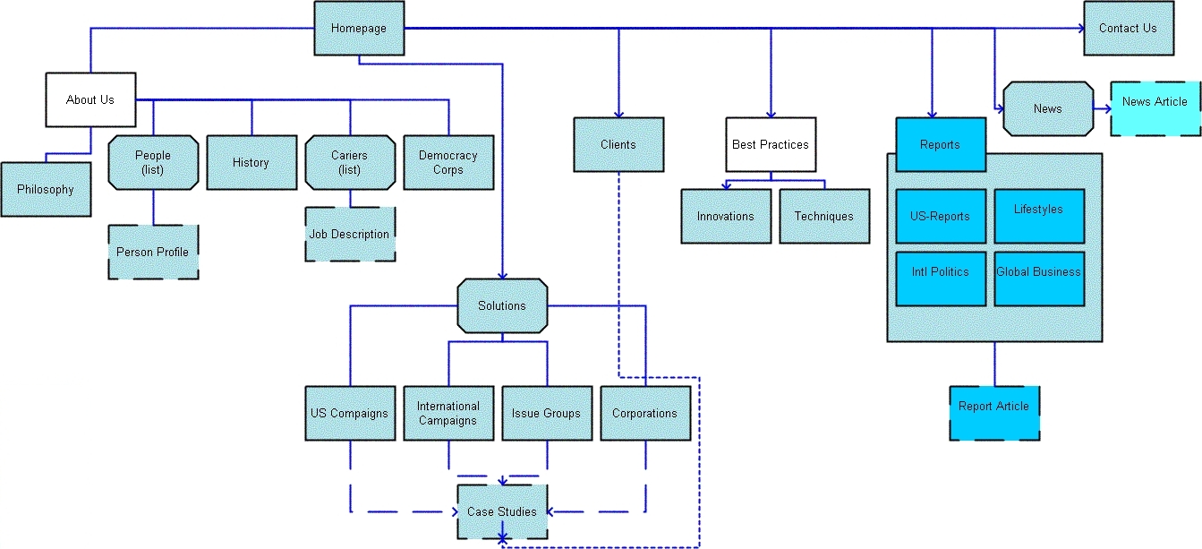
A site map diagram gives an overview of the navigation structure of a website. (Image: Web Tuts)
However, for reasons that will be explained in detail during the course of this series, just providing a site map to navigate would not provide users with the best possible experience. Designing a custom navigation menu that properly accommodates, arranges and progressively discloses their options is also important, thus allowing users to comfortably find, browse and skip choices.
Designing such a navigation menu can be achieved by answering the third and fourth questions mentioned above, which refer to the interaction design of a navigation experience. The first two questions will be addressed in this first part, the latter two in the second article.
Structuring The Content
To properly structure the content of a website, first consider how users look for information, and then structure the content in a way that best aligns with those preferences.
How Users Look For Information
When a user is looking for something — be it a car, recipe, financial service, item of clothing, news article, fitness exercise, entertainment video or any other item or piece of information — they may or may not know the exact name of what they’re looking for. If we assume that users will always know the exact name of what they’re looking for, then we could argue that the best way to take them there would be to provide them with a large A-to-Z index or simply have them type in a search field.
Of course, things are not that simple. As will be explained in more detail in part two, even if users always knew the exact name of what they’re looking for, both an A-to-Z index and search have inherent interaction problems that make them inadequate as the primary or sole means of navigation. Moreover, users often do not know the exact name or do not even care about the item or its name; rather, they have a keyword or feature related to what they’re looking for.
The first step to safely guiding users to the right content, then, is to aggregate and categorize the types of items on the website.
Meta Data As The Foundation Of A Navigation System
The information collected about an item or piece of content is typically referred to as meta data — that is, information about information.
Without getting into specifics, items may belong to distinct meta data categories, whether a category is the political focus of a news article, the display size of a monitor, the director of a video, the collar type of a shirt or the degree of difficulty of a fitness exercise. Of course, multiple items may also share categories, such as price, popularity and publication date.
Users could browse content via these meta data categories. However, as we will see, giving users every possible way to browse content is not necessary or even helpful. Doing so would at best clutter the interface and slow down and complicate the navigation process and, at worst, would confuse, tire and annoy users to the point that they simply abandon the website.
Carefully consider whether and at which stage to show categories to users.
Three Types Of Meta Data Categories
To decide whether and when to present a meta data category, divide your categories into three groups: crucial, optional and irrelevant.
The challenge of information architecture is that classifying a category as crucial, optional or irrelevant very much depends on the preferences of the target audience, the website’s purpose and even the volume of content. However, once you’ve settled on a proper categorization, a few simple rules will help you decide when to show which categories.
Crucial Categories
Crucial categories are ones that would be important to all targeted users. These categories are rare, but there seems to be at least one crucial category for every item, which simplifies both the work of the designer and the navigation experience for users.
Determining Crucial Categories
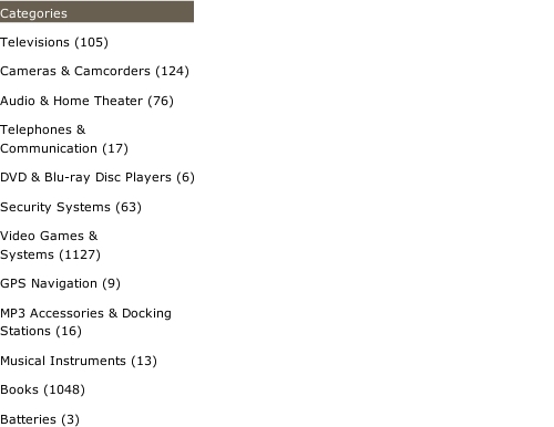
A small selection of meta data categories for recipes might be “course,” “main ingredient,” “special diet,” “occasion,” “cuisine” and “cooking time.” Of these categories, the only crucial one would be “course.” Not everyone is on a special diet and not every meal is a special occasion, but almost everyone on any given day separates their meals into appetizer, breakfast, main dish, side dish, salad, dessert, etc.
Because the course would be important to all targeted users, it should be the first category presented to them.
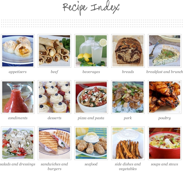
“Course” is a crucial meta data category for recipes. (Image: Our Best Bites)
However, as mentioned, the target audience or website’s purpose might affect the classification of categories, especially on niche websites.
For example, “cuisine” would not be relevant to all users who visit a mainstream website about recipes. But if a website collects the best recipes from popular cuisines around the world, then “cuisine” could very well be a crucial category for the target audience, whether in addition to “course” or replacing it as the only crucial category. In any case, because “cuisine” is the main theme of the website, showing it first (instead of “course”) would be appropriate.
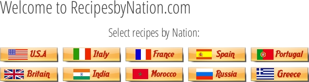
Niche websites have different crucial categories of meta data. (Image: Recipes by Nation)
Arranging Crucial Categories
The examples above address only single crucial categories. However, a set of items might encompass multiple crucial categories.
Take apparel. One crucial category could be the type of clothing, such as “shirts,” “pants,” “shoes” and “sweaters.” Another crucial, and mutually exclusive, category would be gender, “men” and “women.” A third could be the occasion, such as “casual,” “work” and “dress.” We could have more crucial categories, but we’ll leave it at that.
The question, then, is how best to accommodate and resolve potential conflicts between multiple crucial categories.
At first, placing all crucial categories on the same top level might seem logical. After all, they are all crucial. However, the opposite should be done. Crucial categories are best implemented one after the other, on succeeding levels. To better understand this, let’s look at the information architecture of the website shown below.

A horizontal bar is often used to list the type of products that a website offers. (Image: LL Bean)
A horizontal navigation bar lists the types of products available from LL Bean, such as “home accessories,” “hunting and fishing,” “outdoor gear,” “footwear” and “clothes.” However, the designers did something different for “clothes.” Clothes tend to fall into the categories of “men” and “women,” but rather than list a dozen types of clothes in the horizontal menu, the designers decided on a crucial category with fewer values. The user simply starts off with “men” and “women,” and then they get to see all of the types of apparel available in the drop-down menu, which allows for more options than the horizontal bar.
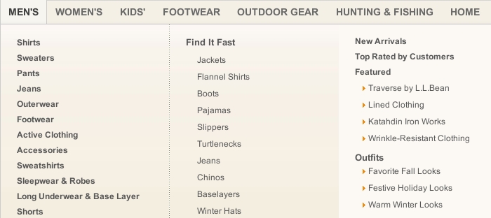
Using a crucial category with fewer values for the main navigation bar frees up space. (Image: LL Bean)
This presents a slight inconsistency in the information architecture, but the designers accepted it to free up space in the horizontal bar. The solution is fine as long as the inconsistency does not confuse users, which is unlikely in this case. However, placing the category “footwear” (which, understandably, distinguishes between footwear for “men” and “women”) on the same horizontal bar is not as sound a decision.
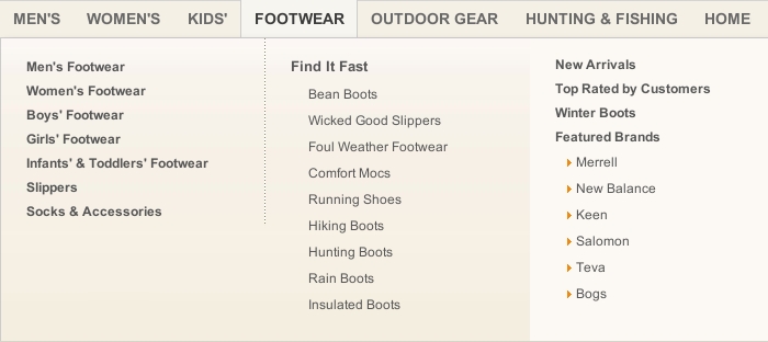
Crucial categories should be presented one after the other, not next to one another. (Image: LL Bean)
The problem with this solution is that two crucial categories have been placed on the same level. Both “Footwear → For Men” and “Men → Footwear” are direct paths. However, because both categories are crucial, users have to look through both anyway. But because they are placed on the same level, users are asked to choose between them, which undermines the assumption that both categories are crucial. Thus, one of the above paths could be removed — probably “Footwear → Men.”
Optional Categories
If multiple crucial categories exist, then the number of items might not necessitate their inclusion. If a website has no more than a dozen clothing items, then the designer could simply have users choose whether to see all clothes for men or women and be done with it.
In many cases, though, the opposite happens. Even after all crucial categories have been exhausted, an abundance of items might still be left. So, additional categories would have to be introduced to allow users to further filter the content. This is where optional categories come into play.
Optional categories are important to some but not all users. For example, two meta data categories for “cars” could be “number of doors” and “fuel type.” Some people are fanatical about fuel type and couldn’t care less about the number of doors. Others feel exactly the opposite.
Prioritizing Crucial Over Optional Categories
As a rule, optional categories should be presented after users have gone through the crucial categories.
However, many retail websites, such as for fashion and electronics, list brands (an optional category) on the same level as the type of product (a crucial category).
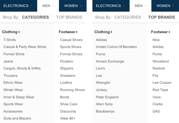
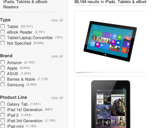
Crucial and optional categories should be shown on separate levels. (Image: Flipkart)
The problem with this approach is that if users select a brand on, say, a clothing website, they could be faced with hundreds or thousands of items, and they would still have to choose a type of clothing in order to narrow down the content. So, placing optional categories on the same level as crucial categories creates redundant paths, increases the complexity of choice and clutters the navigation.
Offering many filters is not bad. But rather than give users many navigational options at once from the outset, present them with a few crucial options first, and then, once they’ve exhausted those, introduce optional values.
Thus, in the example above, removing the brands from this level and having users select only a type of clothing first would be better. Then, on the next level, give users the option to select a brand.
Optional values should be presented only after users have selected crucial values. (Image: Flipkart)
Dynamic Filters
As mentioned, crucial categories should be presented one by one on succeeding levels. Optional categories are best offered all on the same level.
The only exception is that if the optional categories are mutually exclusive, then they should be shown on the next level in the same menu as the crucial categories. If the optional categories will likely be combined, however, then they should be implemented as dynamic filters.
In the screenshot below, notice how Sears lists crucial categories in the breadcrumb trail, while optional categories are implemented as dynamic filters.
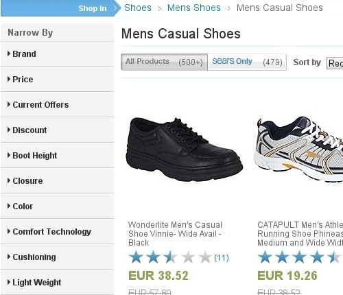
Optional categories that are likely to be combined should be implemented as dynamic filters. (Image: Sears)
This distinction between crucial and optional categories can be explained as follows. Every category is a filter to the available content, while dynamic filters are dynamic because they enable users to select and change multiple values on the fly. In contrast, in a traditional, levels-based navigation system, the user would have to move from one level to the next to select a value. If the categories are crucial, then this would not be a problem, as illustrated above. But with optional categories, the situation is different.
When a user is looking for a shirt, many optional meta data categories can play a role: “brand,” “collar type,” “sleeve length,” “fabric,” “pattern,” “pockets,” “discount,” “price,” “rating,” “popularity” and so on. Knowing exactly which of these many categories a given user would be interested in is difficult. Someone could be interested in none, a few or all of them.
Rather than send users through all of the optional categories, one after another, regardless of whether they are interested in them, the designer could provide a list of dynamic, optional filters on the same level. Thus, users would be able to select only the categories they like.
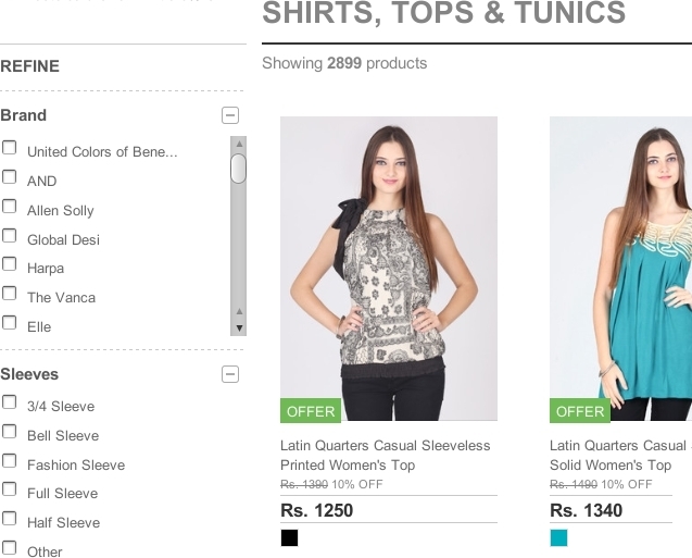
In contrast, consider the website shown below, which does not distinguish as clearly between crucial and optional categories. Instead, it implements all categories as dynamic filters, including crucial categories.
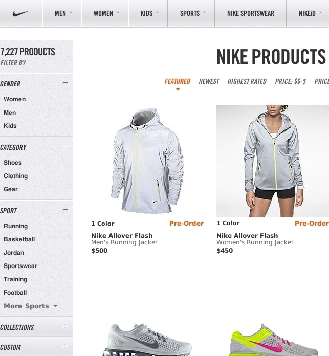
Crucial categories should not be implemented as dynamic filters. (Image: Nike)
This lack of distinction leads to a couple of problems. First, it takes up vertical space and pushes the other optional filters down, requiring the user to scroll more frequently to view and alter the values.
Secondly, a dynamic filter is known as a “heavy metal” widget: It’s powerful but a hog on resources. Whenever a user selects a single value, the list of results is refreshed to match. This makes sense for providing feedback, but it does not make the interaction any faster. The same result could be achieved much more quickly simply by having users select the same crucial values from a traditional menu.
In fact, Nike’s designers do provide such a menu, allowing us to test this assumption and to compare the speed and efficiency of both interaction models within the same interface.
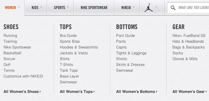
Crucial categories are best implemented in a traditional navigation menu. (Image: Nike)
Mutually Exclusive Categories
Dynamic filters are necessary only if the optional categories are likely to be combined. If the optional categories are mutually exclusive, then they should be implemented on the next level in the main navigation menu.
In the screenshot below, the Daily Express asks users a crucial question on the first level: to pick a topic of news, such as “finance,” “entertainment” or “lifestyle.” Then, on the main page of a selected section, users are given a digest of the latest news on that topic. Checking the three or four latest articles is all many users want to do. For those who want to delve into a particular topic, subsections are listed below the first level.
Mutually exclusive optional categories are best implemented as an additional level in the main navigation menu. (Image: Daily Express)
The subsections above can be regarded as mutually exclusive because an entertainment project is usually released either as a book or as a film or as a TV show, etc. Of course, combinations are possible; a book could be made into a movie or a stage play. But would users likely want to see a digest that matches these combinations? If so, then dynamic filters make sense.
Be aware that the answer to this question will depend less on the type of items than on the volume and diversity of items, as well as the particular interests of the target audience.
For example, users would probably not look for a breakfast recipe that is Chinese and low fat and Christmas-themed. Rather, they would look for a breakfast that is either Chinese or low fat or Christmas-themed. So, optional recipe categories are unlikely to be combined in general. However, if a website has thousands of recipes and the targeted audience has very particular preferences, then giving them the more powerful dynamic filters would be helpful.
A large and diverse amount of content as well as particular user interests could warrant dynamic filters. (Image: Food52)
Finally, consider a third group of meta data categories.
Irrelevant Categories
Irrelevant categories are categories by which no targeted user would likely want to browse the content. However, these categories are not irrelevant to the overall user experience.
Two meta data categories for a collection of articles could be “word count” and “image count.” If these categories were implemented as columns in a database, a content strategist could examine the values in these categories and conclude that most articles are too long and lack images, which could be a reason why many users abandon the website before they finish reading the articles. The content strategist could then discuss this matter with the designer or client, which could lead to improved content. Yet, while these categories might yield valuable information for the designer, users would likely not want to browse the articles by “word count” or “image count.”
In short, irrelevant categories should not appear on the website. They would be ignored, would clutter the interface and might even confuse users. The sheer volume of items, though, could turn an irrelevant category into an optional one.
For example, “word count” would usually be an irrelevant category by which to browse articles. But the website shown below has amassed so many articles over the years that the designers thought it necessary to add article length as an optional way for users to filter the content.
Sheer volume could turn an irrelevant meta data category into an optional one. (Image: Time)
The websites above that showcase recipes or apparel are suitable for explaining the subtleties and importance of prioritizing categories, because they typically require many meta data categories. But they do not illustrate one problem that most designers have to face at some point, especially when designing for a corporation.
Corporate Product Categorization
Most recipe websites collect recipes indiscriminately and then leave it to the designer to categorize them. But corporations often have their own internal way of categorizing products. This can lead to conflicting needs.
Consider first a crucial meta data category for cars. You would have a category based on size or lifestyle, with values such as “compact,” “wagon,” “sports car,” “sedan,” “limousine” and so on. This category is crucial because every type of car caters to a particular lifestyle, one that is important to almost everyone who drives a car. A compact, for instance, is small, cheap, easy to drive and easy to park in the city. A wagon has a lot of trunk space, well suited to families. A sports car caters to another distinct lifestyle. And so on.
Yet, many car companies categorize their models in their own way. BMW, pictured below, follows a number-based classification scheme (1, 3, 5, 7, etc.).
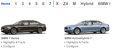
Sometimes, a corporation’s categorization works well. (Image: BMW)
While a corporation’s internal classification schemes can cause usability problems, BMW’s scheme actually makes the information architecture more usable. Despite being corporate, the scheme is quite well known to the general public, and the numbers progress logically according to car size, more or less in line with the common scheme of classifying cars as compacts, sedans, limousines, etc. In this case, anything other than the corporation’s categorization might alienate, rather than help, users.
This next example is not as straightforward. Opel likewise lists its car models according to its own internal naming convention.
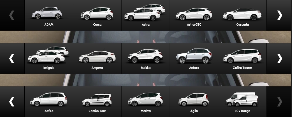
Internal categorization is not always obvious to external users. (Image: Opel)
The problem is that the structure of this product line-up is not clear, and it is not made easier by the fact that users have to interact with a slider to see all of the models (although this problem relates more to interaction). Users have no easy way to understand how the products relate to each other and, thus, have no easy way to filter them according to preference.
If the categorization scheme does not work well for users, then a familiar external one must take precedence over the internal one.
Notice how Volkswagen (below) has its own way of naming and categorizing car models: “Jetta,” “Passat,” “Touareg,” etc. But the company prioritizes a common external categorization scheme over its corporate one. The result is a menu that is easy to understand and that enables users to focus on the part of the line-up that they’re interested in.
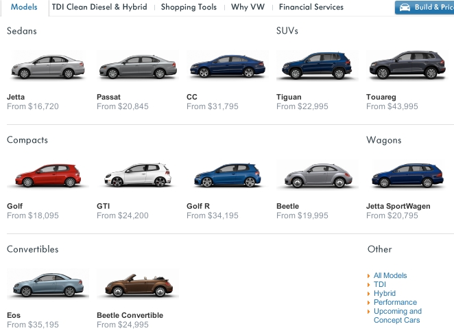
Prioritizing a common categorization scheme over a corporate one can make a navigation menu easier to understand. (Image: Volkswagen)
Of course, a client might not like to see their corporate classification scheme relegated to second place. However, as the information architect who has been hired to make the content on the website easily accessible, you are responsible to communicate this necessity to the client.
Explaining Navigation Options
Structuring the navigation options according to user preference is an important step in simplifying the information architecture of a website. But if users cannot understand their options in the first place, then even the most sophisticated structure will be in vain. So, take a moment to consider how best to explain the navigation options.
Give users only as much information as they need to understand their options. Anything more risks tiring them, cluttering the interface and slowing navigation, even to the point of abandonment.
Don’t give them too little information either. If users have to guess where links point to and then are disappointed by where they end up, they will soon lose confidence in the interface and leave the website.
Designers can choose from three methods to explain navigation options:
- labels;
- labels and pictures;
- labels, pictures and descriptions.
To choose the right method, assess how familiar the labels are to the target audience.
Labels
If the labels you would use are very familiar, then they alone will suffice. Large pictures and long descriptions are not necessary to explain what “jeans,” “shorts,” “shirts” and “jackets” are.

Labels suffice for familiar items. (Image: Rock Revival)
While keeping labels short is commendable, brevity should not be achieved at the cost of clarity. Acronyms and jargon, such as UX and BMI (body mass index), could work as long as the target audience is familiar and comfortable with them.
Sometimes, though, a term alone may be clear but the context in which it appears makes it ambiguous. Many websites of large organizations contain persistent horizontal navigation that points to aspects of the organization’s main work as well as context-sensitive vertical navigation that points to sub-departments. This can lead to duplicate labels. The University of Bath (pictured below), includes the label “Research” in the global horizontal menu at the top and in the narrower vertical menu on the left.

Large organizations with many sub-departments are prone to duplicate labels. (Image: University of Bath)
While this could confuse users, careful design will avoid ambiguity. In the screenshot above, the menu heading “Explore the Department” is a good hint that the “Research” label below it refers to the department, not to the university as a whole. To be absolutely sure, we could lengthen the label from “About Us” to, say, “About This Department.”
Another way to give labels context is by adding numbers that indicate how many items are in a given category.
In some menus, the number of items in a category is displayed with the label. (Image: BJ’s)
These numbers are frequently included as values in dynamic filters.
In many interfaces with dynamic filters, the number of items in a category is displayed with the value. (Image: eBay)
While many users like seeing such figures, consider carefully when to actually show them. For instance, guessing how much content a website has just by looking at the home page is usually difficult. So, explicitly showing how much it has could win over users, because they would think, “Surely, this website has something for me.”

Quantifying the volume of content on the home page can persuade users. (Image: O’Reilly)
Of course, you probably wouldn’t want to disclose such a figure if your website does not have much content yet.
Likewise, when a user is browsing categories and is interested in a certain topic, they will want to explore the relevant category even if it has few items and even if another, less relevant category contains more items. If anything, displaying numbers at this point would slow down the browsing and clutter the interface.
In certain situations, statistics can impede users. (Image: Digistore, Ministry of Education, New Zealand)
The same goes for dynamic filters. Would users select a category according to the number of items it contains? If so, then displaying the numbers makes sense. If not, then the only kind of feedback you should give is to gray out or remove values that have zero items.
Otherwise, once users have selected a category, displaying the number of items in that category or, in the case of dynamic filters, displaying the number of items that match the selected values is useful information.
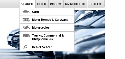
Icons are another type of element that is sometimes appended to labels. When well crafted and recognizable, they can be a very useful addition. While not necessary to explain the user’s options, icons makes it easier to process and distinguish between the options. In the screenshot below, I’ve removed the icons from the menu entries. Notice how the labels are still enough to explain the options. Everyone knows what “cars,” “motor homes,” “motorcycles” and “trucks” are.
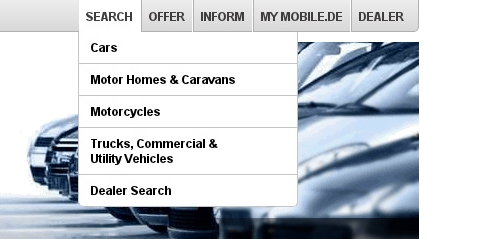
Labels alone very often suffice but take longer to process.
However, putting icons next to labels makes it easier for the user to recognize and distinguish between the options.
Icons make it easier to process and distinguish between options. (Image: Mobile.de)
Icons alone can cause confusion, though. Even if an icon is familiar, users might be uncertain about what it represents in a particular context.
Labels And Pictures
Labels and icons work well for familiar items. For less common ones, images are required. Consider brand names. In the screenshot below, car models are represented as plain text in the menu.
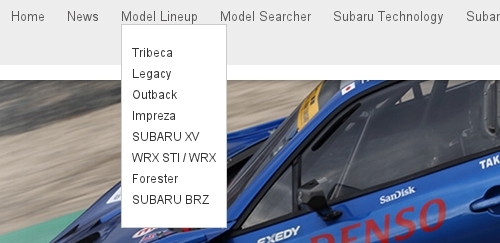
Brand names require more than just labels to be understood. (Image: Subaru)
However, I don’t know what a “Tribeca” or “Legacy” is. So, the labels are not enough to help me decide which product to explore. Labels with pictures, as shown below, are a better solution.
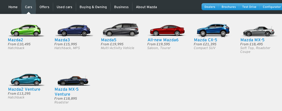
Labels and pictures are a better way to explain unfamiliar terms. (Image: Mazda)
When to use pictures or icons in navigation menus is an interesting question. Obviously, to explain a very specific item, such as “13-inch Macbook Pro” or “Samsung Galaxy Note 3,” nothing but an actual picture of the product will do.
Explaining a product category is not as simple. In some menus, the categories are explained with icons.
In some menus, icons are used to explain categories. (Image: Flipkart)
In other menus, those same categories are explained with pictures of actual products in those categories.
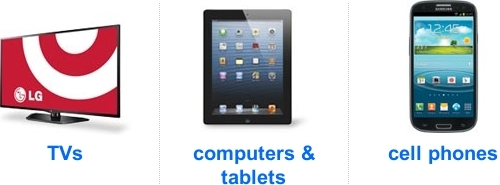
In some menus, pictures of actual products are used to explain the categories. (Image: Target)
For product categories, icons are more appropriate than pictures. A well-drawn icon makes a menu look much more professional than a recycled picture of a product.
Also, using a picture of an actual product to represent a category could raise questions among users, subconsciously. “Why does this particular product represent this category?” “Is this the best they have?” “Does the range of products center on this particular kind of item?” “If I am not looking for this kind of item, then is this not a good website for me?” These apprehensions would be reinforced if the first items they see in a category are very similar to the one they saw in the menu. An icon, by contrast, simply communicates that a category contains a certain kind of product, nothing more, nothing less.
The trick with icons, though, is that they have to be of a certain standard. An icon can easily look amateurish if not drawn well. And if it is not readily recognizable, it could even confuse users. So, while icons are better suited for product categories, if you’re not confident that you can make them professional and recognizable, then you’re better off with pictures.
Labels And Pictures And Descriptions
Sometimes, even labels and pictures are not enough to explain products. Service providers with complex solutions, such as banks, insurance brokers and ISPs, often give their products names like “50 Plus” and “Web on the Go.” A large picture of a married couple talking to a broker or a girl talking on her smartphone might not be enough to indicate the service being offered. For such products, a description of a couple of lines and a label and picture are most helpful.

Complicated products might require labels, pictures and descriptions to be understood. (Image: Naspa)
Headlines and titles of articles are a different kind of label that may or may not require accompanying images and descriptions.
Many authors suggest front-loading headlines with key information and keeping them as short as possible.

A common recommendation is to keep headlines short and to front-load them with key information. (Image: BBC)
While the headlines above are short and to the point, this style of writing has its risks and is not appropriate for every website.
The first question is whether and how to write descriptions. The BBC’s headlines are actually accompanied by descriptions, but I removed them in the picture above to isolate the headlines. The shot below restores the descriptions, which you’ll notice are basically verbose rewordings of the headlines, without substantially new information.
Descriptions should contain information not already conveyed by the headlines. (Image: BBC)
If headlines are supposed to be packed with key information, as they are above, then descriptions would not be required. If anything, users would be slowed down by reading them because they could just as well have navigated to an article after reading only the headline.
However, showing headlines alone or writing headlines in that style is not always best or even advisable. If an article is merely a short news report about an event, then a headline such as the BBC’s is a good choice. But if an article goes into more detail, then a headline, picture and description could be more effective and engaging.
The headline in the screenshot below is more catchy than informative, while the key information is delivered in the couple of lines below. Also, a picture has been added to set the tone of the article.
Labels, pictures and descriptions are often the best way to explain in-depth news articles. (Image: World)
Understanding what this article is about from the snippet is not hard. Moreover, by using the headline as an efficient attention-grabber and the descriptions to explain the article and the picture to set the tone, the entire snippet gives the author much more room not only to inform the user but also to convey the perspective of the article.
Finally, consider advice often given about headlines, which is to write them so that they are easy to understand outside of the context of the website. After all, a headline can appear in search engine results, in social media and in other articles. Some authors even go so far as to devise formulas for this purpose.

Many authors try to write headlines that are understandable beyond the original website. (Image: Baymard Institute)
Just be careful not to create redundant information when adding context to a headline.
The headline pictured above does not provide enough context because the website is about Web design, and multi-column layouts could play a role in home pages, menus, articles and more, not just in forms. So, “Form Field Usability” primarily adds context within the original website. Writing for outside context is not always necessary, though, because other people who refer to the headline will be eager to provide their own context.
Search engine developers know that users will eventually abandon them if search results do not meet the users’ expectations. So, they constantly work on increasing the relevance and success rate of their results, whether by adding rich snippets, pictures or previews or simply by improving their algorithms — that is, by adding context. Likewise, if a headline were to appear in the “recommended reading” section of another article, that article would provide the necessary context. Finally, in social media, a headline shared by a person or brand that someone follows is unlikely to be seen as ambiguous.
In Sum
Information architecture — that is, the structure and labeling of content — is the foundation of usable navigation. Designers can efficiently simplify a website’s information architecture by structuring content in a way that naturally narrows and supplements the navigation options of the target audience, as well as by explaining those options in a way that minimizes the cognitive load on users.
The recommendations given in this article can be summarized by the following two lists, broken down into “structuring content” and “labeling items.”
Structuring Content
- Collect and categorize meta data about the type of items you want users to navigate to.
- Group the meta data categories as crucial, optional or irrelevant. Crucial categories are important to all, optional categories are important to some, and irrelevant categories are important to no targeted users.
- Present only a single crucial category, with its values, on the first level.
- If the items on the second level do not exceed a certain amount, then additional categories are not necessary. Otherwise, offer the next crucial category, one by one, on each subsequent level.
- After exhausting all crucial categories, present a page that lists all items that match the user’s selection to that point.
- If the remaining items still exceed a certain amount, then present optional categories all on the same level.
- If the optional categories are mutually exclusive, implement them on an additional level. If the optional categories are likely to be combined, implement them as dynamic filters.
Labeling Items
- If the label for an item is familiar, it will suffice by itself. Keep labels as short as possible, without sacrificing clarity. Present the total number of items on the home page and on the category page, but not in between. Consider icons, too, which make it easier to process and distinguish between the options.
- If the labels are not familiar, consider adding pictures. Use icons to explain categories, but only if the icons are well drawn and recognizable. Otherwise, use pictures.
- For complicated services and products, consider adding pictures and descriptions to the labels. The descriptions should provide genuinely new information and not just reword the labels. Also, be careful not to create redundant information when adding context to a headline.
Once you’ve simplified the architecture, users should be able to interact with the choices to their satisfaction. Thus, you will also have to design a navigation menu that accommodates the choices and that makes the interaction comfortable. The process of designing navigation menus will be discussed in part two of this series.
Other Resources
You might be interested in the following resources:
- “Information Architecture 101: Techniques and Best Practices,” Cameron Chapman, Six Revisions
- “Classification Schemes (And When to Use Them),” Donna Spencer UX Booth
- “Information Architecture for News Websites,” Stijn Debrouwere A series of six articles.
- “Designing for Mobile, Part 1: Information Architecture,” Elaine McVicar UX Booth
- “The Elements of Navigation,” Petter Silfver, Smashing Magazine A guide to simplifying and testing labels and icons.
- Smashing Magazine icon packs
Further Reading
- The Elements Of Navigation + 6 Design Guidelines
- Responsive Menus: Enhancing Navigation On Mobile Websites
- Can User Experience Be Beautiful?
- Sticky Menus Are Quicker To Navigate
 (al, il, mrn)

