How To Make An Effective Style Guide With Adobe Fireworks

Email Newsletter
Weekly tips on front-end & UX.
Trusted by 182,000+ folks.


 Celebrating 10 million developers
 Custom Web Forms for Angular, React, & Vue. Your backend.

I started with style guides like any other obsessive-compulsive designer: with the desire to make it simple to maintain and grow a design. Plus, knowing which component to use in a given situation is nice, too, right? Since making this a regular practice, I’ve found it’s been like having a nice combination of a CSS class and a pattern library all in one.
One of the first questions, understandably, is why use Fireworks for a style guide? Well, for me, it’s mostly because of symbols and styles. Sure, you could use similar things in Photoshop, but I find Fireworks’ implementation to be smarter.
Here’s why I love it:
- Symbols update everywhere, and you have to update them only once.
- Symbols have states, which let you easily show things such as selected and unselected states.
- Symbols may be placed on a single page for easy editing.
- If the styles are for the Web, you can easily export them as CSS.
This article is all about understanding why you would want to set up a style guide using Fireworks, and you’ll also get a little starter template that I like to use.
Important note: Fireworks’ future is uncertain, as Adobe decided to feature-freeze it in May 2013. There are rumors of Adobe working on a replacement, but nothing definite so far. I’ve spent the last few months with an alternative, Sketch, and found it to be… well, pretty fantastic! It’s a young Mac app but shows promise. Also, while Fireworks (CS6) is unlikely to receive any major updates in future, it is still distributed and supported by Adobe and should work on the latest Windows and Mac machines. You can read more about Fireworks’ future in this pretty detailed article.
A Style Guide?
What is exactly a “style guide”, and why would you want to create one? Let’s start with a brief quote from a well-known encyclopedia:
"A style guide or style manual is a set of standards for the writing and design of documents, either for general use or for a specific publication, organization or field. The implementation of a style guide provides uniformity in style and formatting within a document and across multiple documents."
The biggest reason to create a style guide? The sheer amount of time you’ll save. Depending on the size of the project, reproducing your changes could take minutes or hours. Imagine designing a game, a complex website, a mobile app or a large corporate intranet: having to update one element that appears on dozens or hundreds of pages would be a tedious, madness-inducing task. You have better things to do, like look at cute cat pictures — why waste your time doing the same thing over and over again?
A style guide helps you to maintain a consistent look over time, and Fireworks can save a lot of time.
Instead of wondering how to style headings, you could look to the style guide for answers. As your design grows and you add elements, putting all of the elements on one page will help to ensure that they look like they were all crafted by the same hand — or at least look consistent. The secondary benefit is that you won’t have to solve the same design problem multiple times.
If you work on a team or for a client, handing off the document to someone else is very easy. You’ve already done the work of specifying how things should look; so, anyone else can step in and pick up where you left off.
Speaking of which, if you’ve ever applied a CSS class or ID to an HTML element, then you’ve basically written a style guide — even if you didn’t necessarily formalize it as such.
When you’re presenting a design to a client or team, use the style guide to guide your presentation. A lot of people are talking about style tiles, style prototypes and element collages these days; there’s no reason why a style guide can’t fit in there. It’s a great way to help someone visualize what a product will look like without having to design every screen.
Who Uses Style Guides Anyway?
The short answer is: a lot of people. Companies use them; banks generate reams and reams of documentation on how the logo should be implemented and which pixels should go where. While extending a brand across a wide range of products and services is complex, a small company typically does not need such extensive documentation yet still would benefit from consolidating its design standards into a single set of guidelines, a style guide.
The Basics
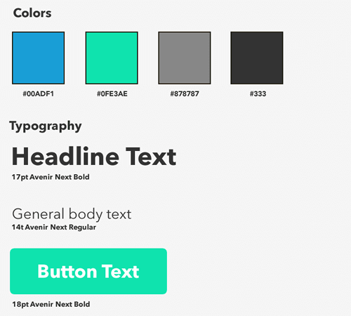
So what should be included in a style guide? Well, I usually put these few things in mine:
- headings;
- text size of body copy;
- links (don’t forget visited links if you’re making a website!);
- sizes and treatment of images;
- logo;
- important modules, like headers and carousels.
If you’re making an app, the list might be a little more extensive. I’d also include elements such as:
- button types and styles;
- navigation bar styles;
- table styles;
- icons.
Fireworks is not the most suitable application for defining such things as animations, CSS transforms and transitions, or non-Web-font families (or CSS styles in general, although Fireworks does export CSS code, if needed). These are a critical part of the experience but might be better defined with a prototype or the like.
(Some specifications of motion design are useful in a style guide — such as easing, timing, gradient, rotation, and scaling end points — but an interactive prototype would demonstrate these much better than a static image or document.)
All that being said, the size of the style guide should fit the project. If you’re making a simple app, you could probably keep it lean. If you’re working for a financial institution, then it might need to be substantially bigger and more prescriptive. The format and level of detail are up to you.
If you’re developing a mobile app, ensure that the design and development team is familiar with the human interface guidelines of the relevant device or platform. Apple, Google, Microsoft and others publish guidelines to ensure quality and consistency. The guidelines are geared to designers, but you might want to ensure that your team understands things like the minimum touch size for buttons (44 × 44 pixels for iOS, by the way) and the standards for typography and icons.
I try to keep everything on one page in Fireworks, because exporting slices is much easier if all elements are on the same page (more on that later). The alternative is going to each page, exporting an image, checking that I’ve put it in the right folder, and then cursing myself if I’ve accidentally saved it to the wrong spot.
Speaking of which, aren’t slices in Fireworks awesome? Without them, we’d have to do something like this:
- copy symbol to new document,
- paste symbol,
- trim canvas to fit,
- save symbol,
- close,
- repeat 50 times (getting sadder each time).
Clearly, no one would want to do this. If slices were a person you could hang out with at a bar, I’d buy them drinks all night.
Use symbols and styles as often as possible. With them, you can easily create something once and update it throughout the document. (By the way, Fireworks doesn’t always honor updates to styles inside of symbols. Sometimes you’ll have go into each symbol and refresh the style individually. It’s a bit of a drag, but it happens so rarely that I’m not bothered.)
A Quick Primer On Symbols, Slices And Styles
Symbols
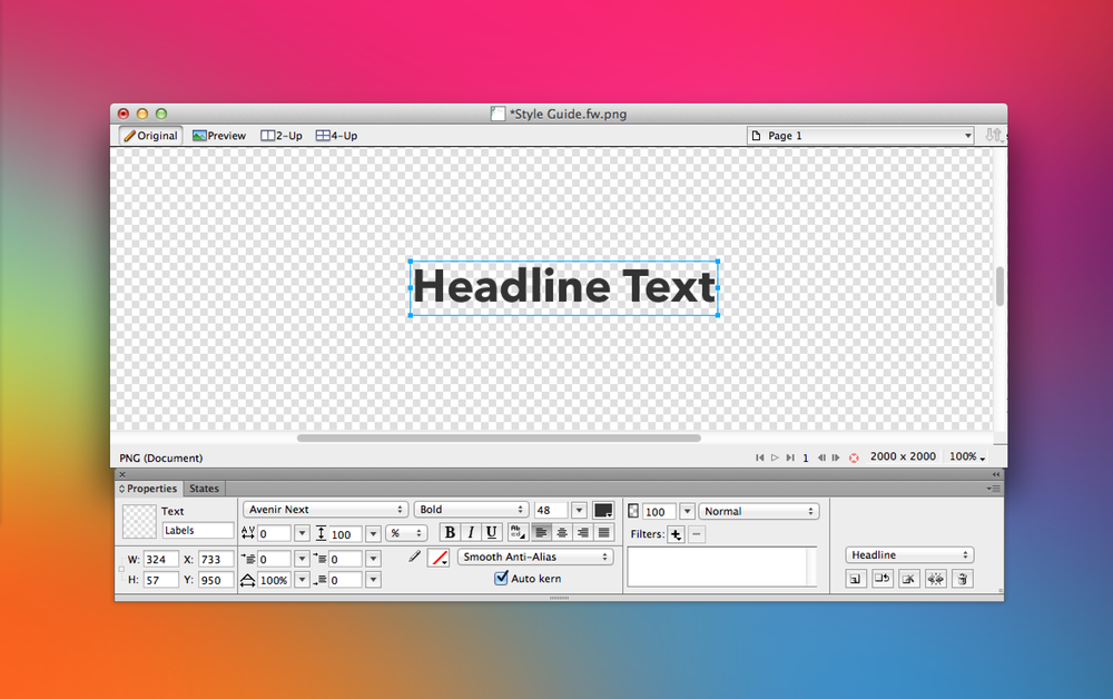
Use a symbol when a UI element repeats throughout the website or application. The usual candidates are buttons, icons, images and logos. A symbol has states, too, giving you the flexibility to display various states of an element (for example selected and unselected) or just to test various iterations of an item.
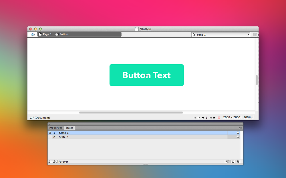
Symbols are helpful and even have states! (View large version)
To convert an element to a symbol, simply select it and go to Modify → Symbol → Convert to Symbol… (or press F8).
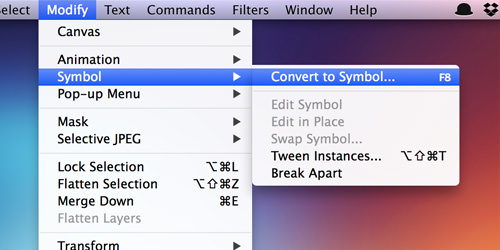
Convert an object to a symbol.
In the “Convert to Symbol” dialog, you can define the type of symbol (graphic, animation, button), whether to enable 9-slice guides, and whether to save the symbol to the common library:
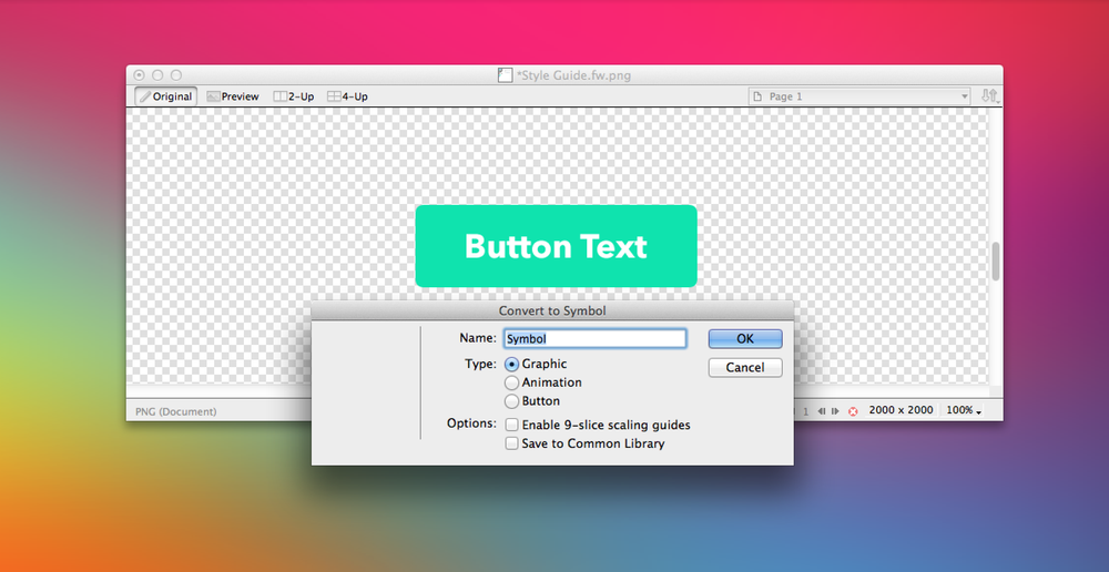
The “Convert to Symbol” dialog. (View large version)
Styles
I generally reserve styles for text (font family, size, color, drop-shadow live filters, etc.) and buttons (color, appearance, etc.).
A style may define font size, color, font family, live filters and more. (View large version)
For example, if you add borders or live filters (for example, drop-shadows) to an image or button and want them to be easily reusable, make them styles. Also, symbols may contain elements with styles.
Slices
Once your symbols are set, create a slice for each element. Fireworks’ naming convention is not human-friendly (it comes from old Web layout practice: [Document Name][Row Number][Column Number]). So, look to the all-powerful Properties panel to create your own names for slices.
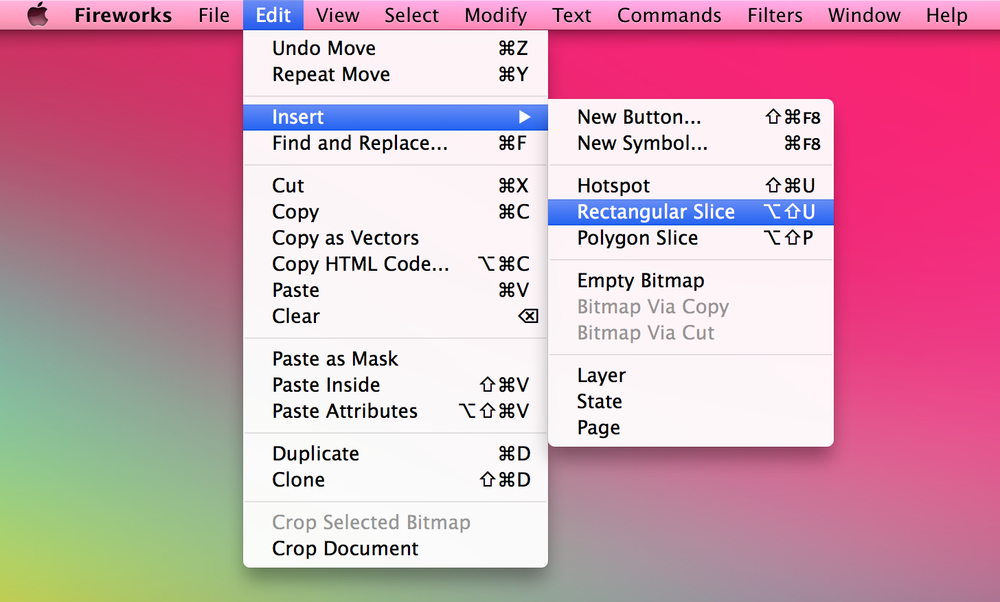
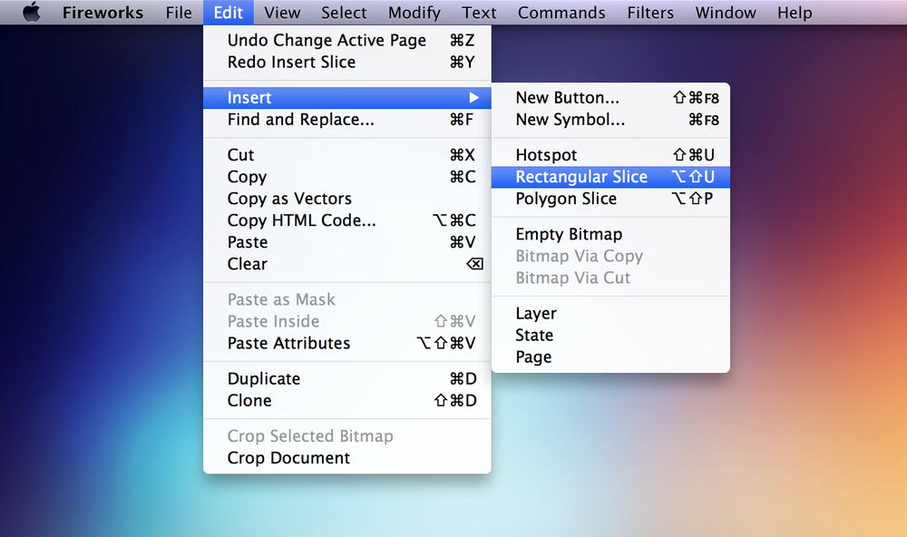
Insert a rectangular slice an an object. (View large version)
Useful tip: You can highlight multiple elements and create individual slices for each one. Simply select all of the elements on the canvas, and go to Insert Rectangular Slice → Multiple slices! It’s a real time-saver.
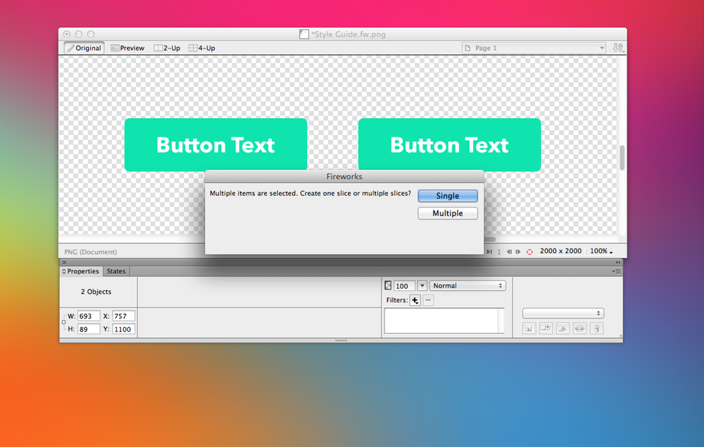
To create multiple slices, select multiple objects on the canvas, select “Insert Rectangular Slice,” and then the “Multiple” option. (View large version)
Resolution-Independence
If you’re creating an app, try to work with vector graphics whenever possible, which make it much easier to scale icons infinitely to higher-resolution devices. I’ll have to gloss over some finer points, such as ensuring that icons scale down well.
Useful tip: The Icon Design Handbook has you covered on that front. It has has great tips on making beautiful icons. Also, Ivo Mynttinen teaches quite a few things about designing icons with Fireworks.
So, how do we achieve this in Fireworks? Sure, we could drop in regular and @2x versions, but vectors can be exported as SVGs, courtesy of Aaron Beall’s handy Export extension.
Useful tip: Another article on Smashing Magazine gets a little nerdy talking about “Resolution Independence With SVG.”
Usually when designing for the Web, an icon font is most helpful. I have nothing but love for IcoMoon, which creates an icon font from SVG graphics that you upload, for free. Icon fonts currently have some limitations, such as individual elements being confined to one color. So, if you need multiple colors, gradients and so on for your icons, then exporting an SVG or a @2x PNG might be best. (Note: SVG is supported in Internet Explorer 8+ and in recent versions of all other major browsers.)
When To Start Preparing The Guide?
Picking the right time to build a style guide isn’t an exact science. I usually start once I’ve determined a direction for the project. Creating it first usually wouldn’t make sense because I’ll often experiment with fairly different ideas. Doing twice the work doesn’t appeal to me.
You also don’t want to end up a slave to the process early on. Creativity should be messy, weird and fun — bottling all that up in a style guide too early on would really break your groove and stifle the design. The style guide should reinforce your creativity and, therefore, should come second. Don’t wait till the end either, because you want it to guide the rest of the process.
In short, don’t do it too early, but don’t wait until you’ve finished the design. Having to duplicate objects from page to page is a good sign that you should create an asset (i.e. with symbols) or define a style (i.e. with styles). My style guides usually start out as a working canvas: Design elements and type treatments that I like will hang out on the canvas until I decide they should be standardized (and become part of the style guide) or discarded.
Using symbols and styles early on also means that you won’t have to apply endless updates if one icon changes. I’ve overlooked doing this a few times and probably said some words that I regretted as I went back to adjust each little mistake afterwards.
Getting Started With Your Style Guide
Before creating the canvas, keep in mind that it is a living document, so you’ll need to help it grow, pruning here and adding there.
“How Do I Set One Up?”
The short answer is, whatever works for you. I’ll share what works for me, and you can build on it. Or throw it away. It’s fine, really. Your mileage will vary according to what you’re creating.
I’ll open a page at the beginning of the document. Once I’ve gotten a sense of the direction of the design, I’ll put some of its elements on this page and make styles and symbols out of them.
Then, I’ll lay out a few common elements. If we were making an iPhone app, they would be the following:
- colors;
- typography;
- icons;
- interface elements.
A Starter Style Guide
Good friends help by telling; best friends help by sharing. Because we’re basically besties at this point, I’ll share a style guide that I made for a simple app. Inside, you’ll find the following:
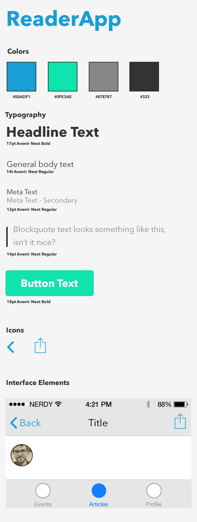
- elements page, with icons, images and font examples;
- home screen;
- detail screen for articles.
Teehan + Lax has made its own UI PSD for iOS 7 that is perfect for getting an app style guide going. Even though the file is not in a native format of Fireworks, it can be easily opened in Fireworks; all of the elements are vectors and so are perfectly editable. (Fireworks can read PSDs pretty well in general, with just a few minor limitations.)
OK! We’ve got our interface elements. Now, create a document that is 2000 × 2000 pixels.
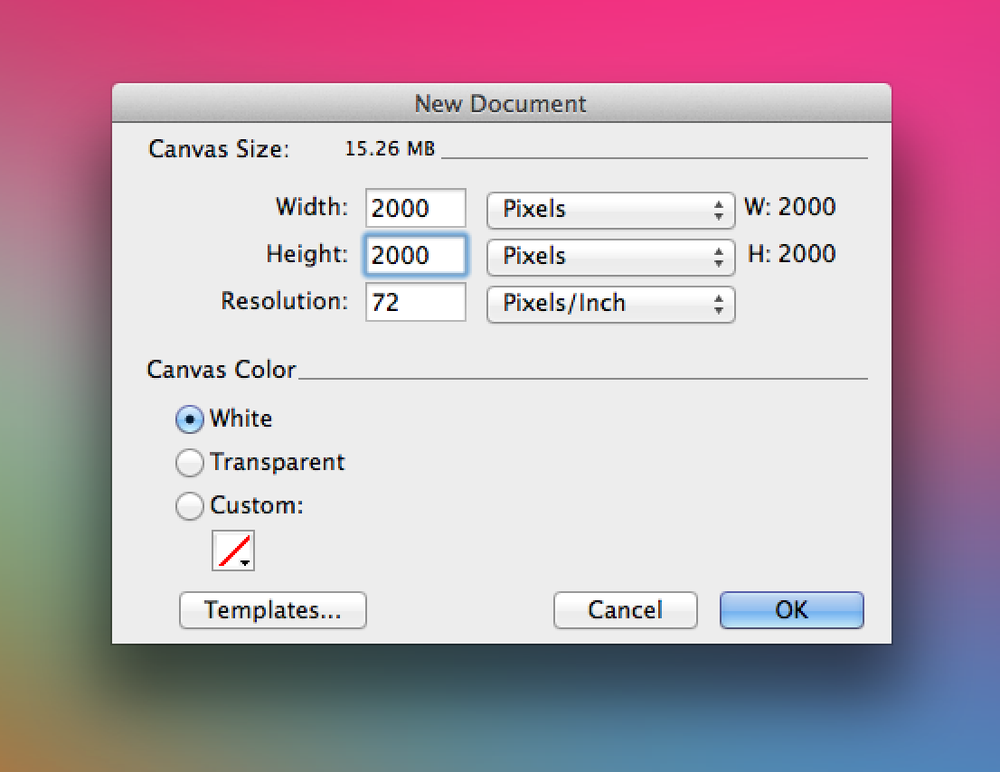
Create a new 2000 × 2000-pixel canvas for our style guide. (View large version)
You might not want to give the style guide the shape of an app or website, or else a client or team member might think that they’re viewing an actual app.
Drag in some interface elements and start experimenting! Depending on the scope of the app, you’ll be dragging in various elements. Here are a few that appear in almost every app I make:
- status bar,
- menu bar,
- action icons.
Once you’ve determined a direction, there’s no reason why you can’t begin to customize this style guide to match the feel of your app. It’s a nice way to ensure that everything you’re designing works holistically. Plus, your client will appreciate the details.
I’ll also start to use the guide for some production duties, like saving assets. When designing for iOS, ensure that the normal versions of icons look as crisp as the @2x versions. I’m a big fan of “Snap to Pixel” when working with icons (go to Modify → Snap to Pixel or type Control/Command + K) — it helps with keeping things looking sharp at small sizes. I fully admit that this is a case of designer’s OCD, and I’m OK with that. I’ll create the normal-sized versions later in the process, when I’m ready to send over some assets to the developer. No sense in creating extra work for myself early on.
Also, I design at the @2x resolution by default because I find that scaling down for smaller resolutions is easier than scaling up. Remember, though, that your font sizes and other elements will be double their normal size when you do this. When working with text, specify in the style guide the intended type size, not what Fireworks says. (When scaling text along with the document’s overall size, Fireworks will change its size, but the Properties panel might not report the actual new size. It seems to be an odd limitation of Fireworks’ text engine).
Your Style Guide And Production-Ready Assets
Here’s where it gets more fun. Now that your buttons, logos and other elements are in the style guide, you can easily highlight them and creates slices. If you’re working on a project that requires higher-resolution assets, then duplicating your symbols on the style guide’s canvas and exporting them directly from that page is simple.
Select all of the elements to be sliced, and then go to Edit → Insert → Rectangular Slice. (Remember what I said earlier about human-unfriendly slice names?)
Create rectangular slices. (View large version)
Note: When Fireworks asks, choose “Multiple,” or else it will create a single large slice.
Slices are ready to be exported whenever you’re ready! You can even give slices their own export settings (PNG32, PNG24, PNG8, GIF or any custom format — for example, PNG8 with a limited number of colors, JPEG Progressive with a set quality, etc.). The settings will be saved in the Fireworks PNG file, so exporting and re-exporting assets is very easy.
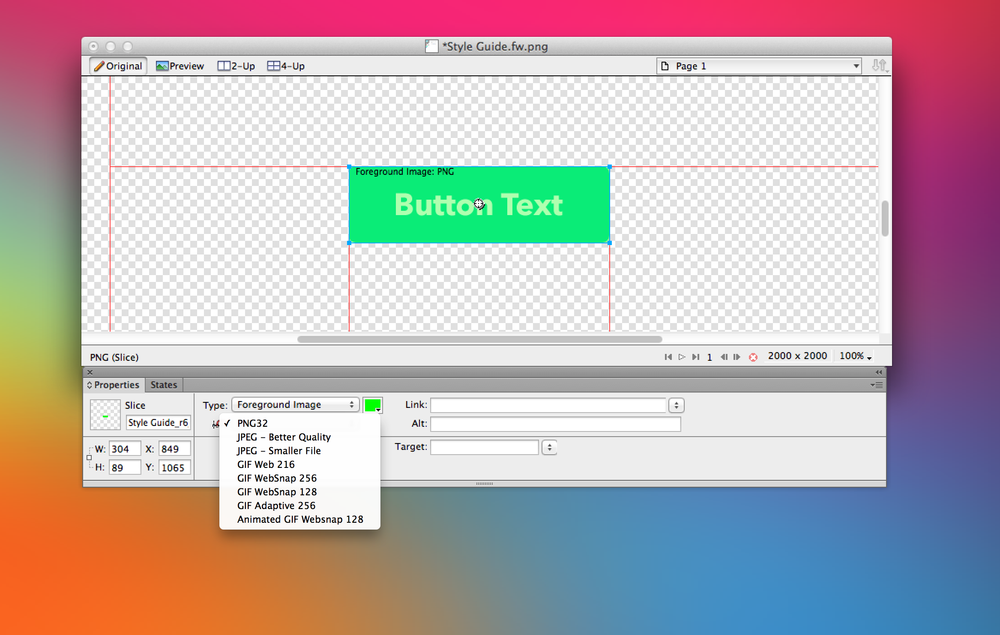
Each slice may have its own export settings, which are remembered by Fireworks. (View large version)
Sample Style Guide
After some experimentation, et voilà! A shiny new style guide! The following three screenshots show mine:

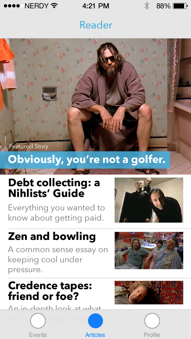
The “article” page of my style guide. (View large version)
The “article list” page. (View large version)

The elements page. (View large version)
In case you missed it, you can download my starter style guide via Dropbox.
Helpful Tips For Working With Fireworks Style Guides
I usually have a few panels open in Fireworks:
- Pages,
- Layers,
- States,
- Styles,
- Document Library,
- Properties.
The Pages, Layers and States panels help you to navigate quickly through the Fw PNG file. I use states to prototype designs for a particular view or page, and each view or page will have its own page in the document. I’ll generally make a master page (containing the chrome and unchanging elements in the design, such as the menu or tab bar) so that I have one less thing to paste in the page.
Styles are helpful because you can select an element and immediately apply a style to it.
The document library holds all of the symbols, and it’s an easy reference point if you need to drag something onto the canvas. I find myself just copying symbols from an existing page. (Quick aside: Fireworks has some issues with trackpad scrolling in panels, but you Windows geeks should be just fine with scrolling, I hear).
Finally, the Properties panel gives you complete control of the properties of all types of objects, including vector objects, bitmaps, symbols, auto shapes, vector masks, slices and more.
Closing Thoughts
Style guides, in their various shapes and sizes, are a critical part of any project, and using one brings many benefits, including the following:
- keeps the project visually and functionally consistent as it grows;
- keeps you from having to repeat the same task over and over;
- helps the developer understand how to build what you have designed, so they’ll ask you fewer questions;
- makes it easier to grow or modify the website or application.
In short, if you’d like a consistent, healthy app, then don’t overlook style guides. A guide converts design styles into values and standards of coding, and it could be invaluable to your project.
If you use Adobe Fireworks in your daily design workflow and have any questions about how to build a style guide, let me know on Twitter or here in the comments — I’d be more than happy to help! I’d also be glad to hear of your own experience with making (and updating) style guides.
Other Resources
If you’d like to dig a little deeper into style guides and other neat things that you can do with Fireworks, here is some reading:
- “Creating a Pattern Library With Evernote and Fireworks,” Kris Niles, Smashing Magazine
- “Useful Fireworks Techniques and Features for Large Design Teams,” Kris Niles, Smashing Magazine
- “Design Cutting-Edge iOS Apps With Adobe Fireworks,” Ivo Mynttinen, Smashing Magazine
- “UI Style Guide Template (PSD),” Tony Thomas, MediaLoot
- “Style Guide,” Wikipedia
- “Icon Design Handbook,” Jon Hicks
- “Developing a Design Workflow in Adobe Fireworks,” Joshua Bullock, Smashing Magazine
- “The Present and Future of Adobe Fireworks,” Michel Bozgounov, Smashing Magazine
Further Reading
- Creating A Living Style Guide: A Case Study
- How To Design Style Guides For Brands And Websites
- Smashing Magazine’s Style Guide
- Automating Style Guide-Driven Development
 (mb, al, il, mrn)

