Khajag Apelian: Type Design Is Not Only About Drawing Letters

Email Newsletter
Weekly tips on front-end & UX.
Trusted by 182,000+ folks.

 Celebrating 10 million developers
 Custom Web Forms for Angular, React, & Vue. Your backend.


Having started his career studying under some of the best typographic minds in the world, Khajag Apelian not only is a talented type and graphic designer, unsurprisingly, but also counts Disney as a client, as well as a number of local and not-for-profit organizations throughout the Middle East.
Even more impressive is Khajag’s willingness to take on work that most people would find too challenging. Designing a quality typeface is a daunting task when it’s only in the Latin alphabet. Khajag goes deeper still, having designed a Latin-Armenian dual-script typeface in four weights, named “Arek”, as well as an Arabic adaptation of Typotheque’s Fedra Display.
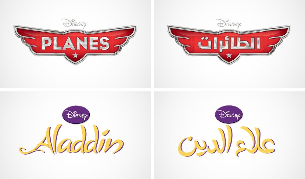
 Given his experience in working between languages, it’s only logical that Khajag’s studio maajoun was chosen by the well-known and beloved Disney to adapt its logos for films such as Planes and Aladdin into Arabic, keeping the visual feel of the originals intact.
Q: Could you please start by telling us more about some of the typefaces you’ve designed?
Khajag: Well, I’ve only designed one retail font, and that is Arek. It started as my final-year project in the Type and Media program at KABK (Royal Academy of Art, the Hague). Arek was my first original typeface, and it was in Armenian, which is why it is very dear to me. I later developed a Latin counterpart in order to make it available through Rosetta, a multi-script type foundry.
Another font I designed is Nuqat, with René Knip and Jeroen van Erp. Nuqat was part of the “Typographic Matchmaking in the City” project, initiated by the Khatt Foundation between 2008 and 2010. In this project, five teams were commissioned to explore bilingual type for usage in public spaces.
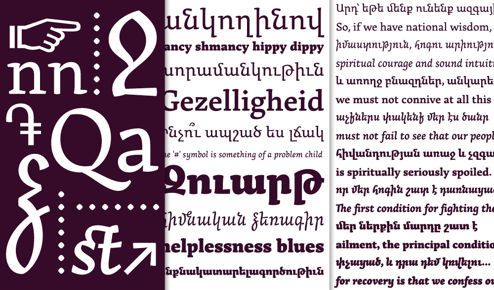
Arek is a dual-script Latin-Armenian typeface family in four weights, with matching cursive styles. (Large preview)
I’ve also worked on developing the Arabic companion of Fedra Display by Typotheque. The font is not released yet but will be soon, hopefully in the coming year, so keep an eye on Typotheque if you’re interested.
Q: How did you start designing type?
Khajag: We had a foundational course in type design at Notre Dame University in Lebanon (NDU) during my bachelor’s degree. Actually, it was more like a project within a course, where we were asked to design an “experimental Arabic typeface” — something that was quite basic and that didn’t really involve type design, which I later realized when I entered the Type and Media program. So, that was the first project I worked on that could be considered close to designing type. The outcome is nothing to be proud of, but the process was a lot of fun.
Then, I started to work more and more with letters, although I never knew I could develop this interest, let alone study it later on. I only found out about the program at KABK during my final year at the university, when NDU graduate Pascal Zoghbi came to the school to present his Type and Media thesis project. That did it for me — two years later, I was there!
Typographic Matchmaking 2.0 parts 1-3. (Watch on YouTube)
Q: Tell us about the course at KABK. Did you focus only on designing Latin typefaces, or were you able to develop your skill in designing Arabic faces, too?
Khajag: The year at KABK was one of the best times I’ve had. It was intense, rich, fun and fast. It’s incredible how much you develop when surrounded by teachers who are considered to be the top of the typographic world and classmates who were selected from different places around the world, each bringing their own knowledge and experience to the table.
During the first semester, we tackled the basics of type design in calligraphy classes, practicing and exercising the principles of Latin type. We mostly learned the fundamentals of contrast, letter structure and spacing. This continued over the year through sketching exercises, designing type for different media and screens, and historical revivals.

A couple of type-drawing exercises on TypeCooker. (Image source)
Adapting these principles to the specifics of other scripts, like Arabic and Armenian, had to come from a more personal learning effort. But despite their modest knowledge of these scripts, the instructors are capable of guiding you through your final project. At the time, I decided to go with Armenian for my final project, but others have worked with other scripts, and the results have been strong and impressive.
Q: How do you keep the spirit of a typeface intact when moving from one language to another? Is it easier to maintain this feel when designing the Latin counterpart of an Armenian typeface, as you did with Arek, or when moving from Latin to Arabic, as you’re doing with Fedra Display?
Khajag: I think each project presents its own challenges to translating a certain spirit in different scripts. In the case of Arek, I started designing the Armenian without thinking about designing a Latin counterpart to it. So, my focus was entirely on one script. The process involved a lot of investigation of old Armenian manuscripts, from which my observations and findings were translated into the typeface. This naturally created a very strong spirit that I had to retain when I moved to designing the Latin counterpart.
Armenian and Latin letter proportions and constructions have certain similarities, which helped with the initial drawing of the Latin letters. I later had to reconsider some details, like the x-height, the serifs and the terminals, in order to achieve the ideal visual harmony.
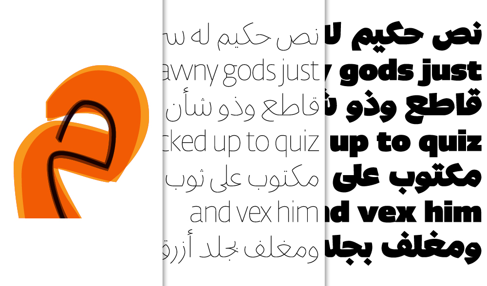
This Arabic adaptation of Fedra Display. (Large preview)
In the case of Fedra Display Arabic, the spirit of the typeface was already there. The challenge was to translate the extreme weights of Fedra Sans Display to the existing Fedra Arabic. The Latin font is designed for headlines and optimized for a compact setting. These were important to retain when designing the Arabic counterpart. I experimented a lot with the weight distribution of the letterforms, something that is an established practice in the Latin script but not in the Arabic.
I had to find the right width and the maximum height of the letterforms in order to achieve similar blackness while maintaining the same optical size. Whereas, for the hairline, it was necessary to keep the compact feature of the Latin without undermining the Arabic script. A set of ligatures was designed to further enhance the narrowness of the font.
Q: Do you design only Arabic typefaces? If so, is there a particular reason for that?
Khajag: Besides Arek and a few other small projects I’ve been involved in, I mostly work with Arabic. The first direct reason is where I live, of course. Most of the time, clients in the region need to communicate in two languages, and that’s usually Arabic and English, or Arabic and French. The other reason is the number of Arabic fonts available compared to Latin fonts. Usually, when looking to communicate in English, I can find a way to do it through existing Latin fonts, but that’s not always the case with Arabic.
Although, I have to admit that a lot of good Arabic type is emerging in the design world nowadays. Still, there aren’t that many Arabic typefaces, and with time the good ones become overused and everyone’s designs start to look similar. This is why I look to differentiate my work through type. I do not always design complete functional typefaces; rather, I often develop “incomplete” fonts that I can use to write a word or a sentence for a poster or a book cover, and different lettering pieces here and there.
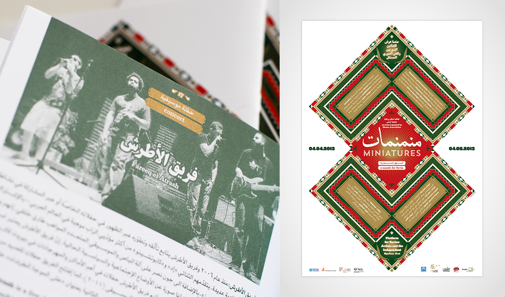
The identity poster and catalogue for “Miniatures: A Month for Syria” event, organized by SHAMS. (Large preview)
Q: Do you prefer to design Arabic typefaces that hold true to the calligraphic origins of the script, or is it more interesting to depart from those origins somewhat, as you did with Nuqat?
Khajag: I think Nuqat is quite an extreme case of departing from calligraphy. I consider it an experiment rather than a functional typeface. In any case, I don’t think I have a particular preference for typefaces to design. I am very much intrigued by the process, and in both cases there are some quite interesting challenges to tackle. A big responsibility comes with designing a typeface that must remain true to its calligraphic origins, something that comes with a lot of history and that has reached a level of perfection. And when you depart from that, you go through an abstraction process that can also be a fun exercise.
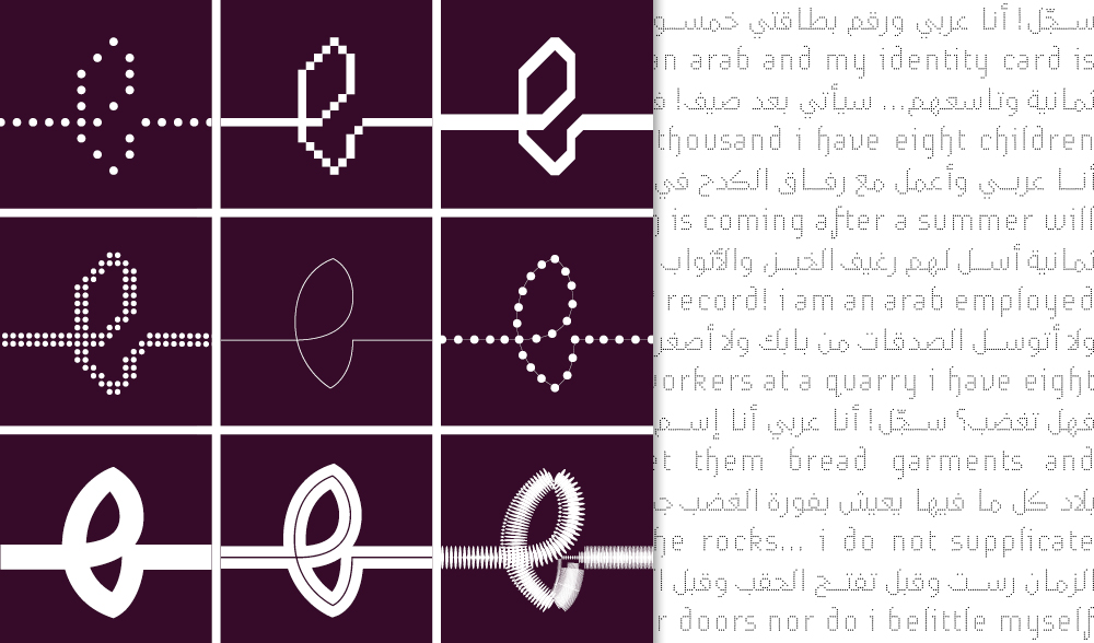
Nuqat is a display typeface designed by Khajag Apelian and René Knip for the “Typographic Matchmaking in the City” project, initiated by the Khatt Foundation. (Large preview)
Q: Where does your love of typography and graphic design come from?
Khajag: Like most teenagers about to start university, I was confused about my subject of study. At the time, I was part of a dance troupe with a friend who used to be a graphic designer. I liked her quite a bit and thought I could enroll in graphic design to be “cool” like her! I didn’t know what graphic design was about at the time. And so I enrolled. The foundation year was all about color theory, shapes and composition. It wasn’t until the second year or so that I started to realize what design was really about. Luckily, I loved it.
Later on, I took courses with Yara Khoury, and thanks to her I really got to appreciate typography. Yara was heavily influenced by different European schools that put typography on a pedestal, and she managed to transfer that to me and to other students. At NDU, we were exposed to the work of various designers from the Bauhaus and Swiss schools, and we were trained to capture the details and understand the function of type within graphic design. I was particularly fascinated by how one can go all the way from designing something that goes unnoticed by the reader to something that is very present and expressive, all just with type.
Q: Did you enjoy the visual departure from the Arabic culture you were surrounded by and brought up in, into the Modernist European one you were learning about? Did you ever find the aesthetic difference between the two difficult to navigate?
Khajag: Very much, actually. It wasn’t difficult to navigate per se, but rather overwhelming, maybe? Everything in the Netherlands is designed, and many of those things are featured in books as exemplary design. I had always been exposed to this through books and the Internet, but actually being immersed in it was another experience. One funny incident was when I spotted a police car for the first time, knowing it was branded by Studio Dumbar. I was so excited, I almost wanted to take a picture with them.
Q: How did you start off in the design industry? Could you also describe your role at your current company?
Khajag: My first job as a designer was in branding with Landor Associates in Dubai. I worked there for around a year, before going to the Netherlands for my master’s. After graduation, I extended my visa for a year and worked freelance with several Dutch design studios on projects that involved designing with Arabic. My work partner, Lara, was also living and working in the Netherlands at the time, and both of our visas were about to expire. Right before coming back to Beirut, we worked together on a cultural project with Mediamatic. We got comfortable working together and thought, Why not start a studio when we get back to Beirut? And so we did.
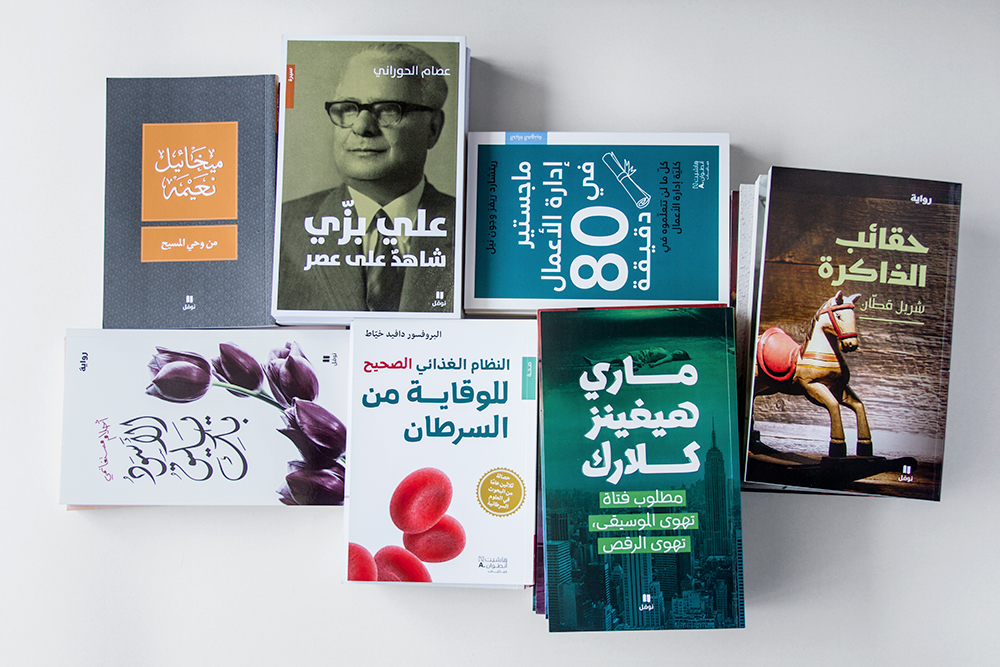
Book cover design and guidelines for Hachette Antoine, a regional publishing house that maajoun has been working with for over three years (Large preview)
When we started, we were highly inspired by Dutch business models, such as Mediamatic and O.K. Parking, which often initiate their own cultural or educational projects and events, sometimes funded through their commercial practice. This business model was somewhat new to us at the time. Things have changed since then, and many design agencies nowadays have their own cultural or educational projects, sometimes referred to as “R&D” or “corporate social responsibility”. Far from being a corporate strategy, we like to think of our side projects as a channel to exchange knowledge with other designers in our area.
Our commercial practice, on the other hand, is focused on editorial design, lettering and type design. Our studio is rather small (most of the time, only the two of us), which means we both have to do a bit of everything, even accounting!
Q: What have been your biggest achievements till now?
Khajag: I consider maajoun to be one of my biggest achievements to date. I love what we do. When you work on fun projects in university (whether cultural or experimental), everyone tries to make you feel like you should enjoy it as much as you can because you won’t get to do much of it in the “real world.” That’s not true. At maajoun, we work on interesting projects, we take the time to experiment, and we have fun!
Publishing Arek with Rosetta would be another big achievement. Arek is the first typeface that I seriously developed, and I am really happy it is out there and available to the public.
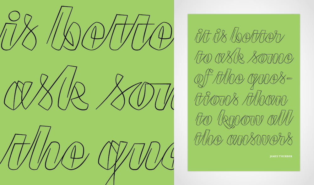
Maajoun’s submission to GrAphorisms, a project initiated by SHS Publishing (Large preview)
Q: You’ve done some work on Arabic versions of logos for several Disney films. Are you able to share with us what that process has been like?
Khajag: Arabic logo adaptation is becoming more and more common in the Middle East and North Africa, whose markets big international brands are trying to reach. Disney is no exception. We were asked to design the Arabic versions of the logos for several Disney films, including Aladdin, The Lion King and Beauty and the Beast.
We usually start by analyzing the original logo, its visual characteristics and some distinctive shapes; most importantly, we try to extract some cultural references from the lettering technique used in the logo, whether it has a 1960s retro feel or some elegance in a classical serif. We then try to translate these both visually and conceptually to the Arabic. This helps us to create a logo that works well visually with its Latin counterpart, without compromising the essence of the Arabic script.
Maajoun’s adaptation of Disney logos to Arabic script (Large preview)
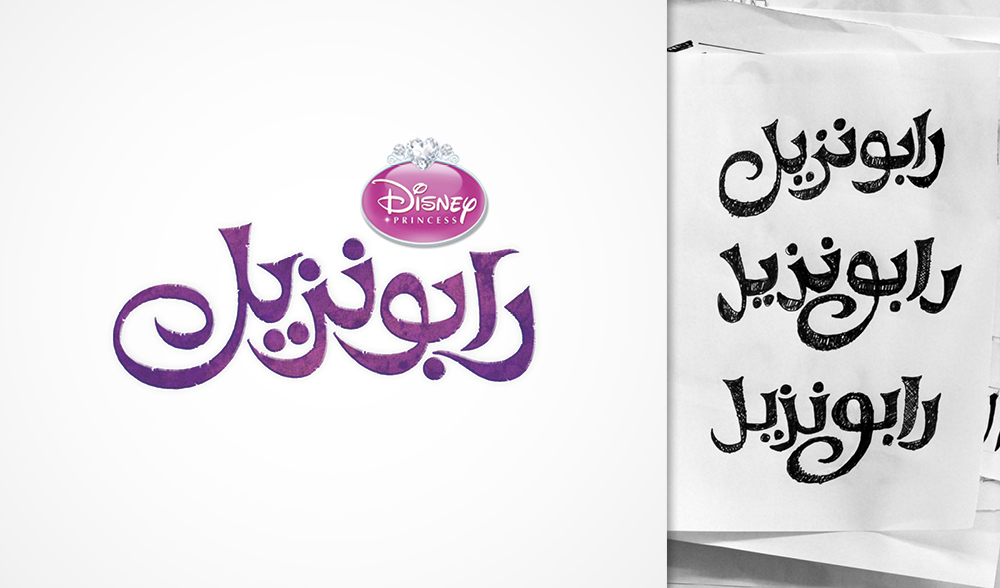
The Arabic adaptation for Disney’s Tangled (Large preview)
Q: Is there a way for readers to know what conferences you’ll be speaking at or attending, or workshops you’ll be organizing?
Khajag: Kristyan Sarkis, Lara and I decided a few months ago to start a series of Arabic lettering workshops, which we’ll try to carry to different cities every now and then. We started during Beirut’s Design Week in June 2013 and had another session in July. We are having another one around May in Beirut, so those who are interested can stay tuned to our Facebook page.
Also, the Khatt Foundation usually organizes a workshop on Arabic type design at Tashkeel in Dubai. I usually take part in this. It’s an intensive nine-day workshop. The first three days concentrate on Arabic calligraphy and lettering, while the next six days are on Arabic type design. I also usually announce these things through Twitter (@debakir and @maajoun) or through maajoun’s page on Facebook.
Q: What advice would you give to young readers out there who are interested in becoming a type designer?
Khajag: Go for it! But know that type design is not only about drawing letters. It involves research and a lot of technical work.
Related Resources
- “Calligraphy Qalam” An introduction to Arabic, Ottoman and Persian Calligraphy.
- “Arabic Typography” Online portal for typography, design, trends, inspiration and visual culture in the Arab world.
- “Arabic Typography” Pascal Zoghbi’s blog, based on contemporary Arabic typography.
- “Arabic Typography” Nadine Chahine’s blog on Arabic type today.
- “Arabic Typography & Type Design” Open forum on Typophile.
Further Reading
- The Art Of Hand Lettering
- Beautiful Handwriting, Lettering and Calligraphy
- An Interview With Type Designer Akira Kobayashi
- Designing A Font Based On Old Handwriting


