Rethinking Mobile Tutorials: Which Patterns Really Work?

Email Newsletter
Weekly tips on front-end & UX.
Trusted by 182,000+ folks.


 Celebrating 10 million developers
 Custom Web Forms for Angular, React, & Vue. Your backend.
Pattern libraries are a great source of inspiration and education for designers. But common practice doesn’t always equal best practice. In this post, we’ll look at why many common tutorial patterns are ineffective and how you can leverage game design principles to increase user engagement.
After the release of the first edition of Mobile Design Pattern Gallery, Intuit asked me to speak with its mobile team. I spoke at a high level about the value of patterns across industries (fashion, architecture, software and others) and how they are a useful teaching tool.
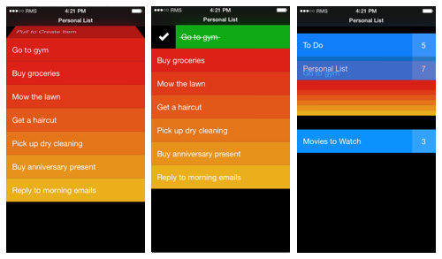
Alissa Briggs, a senior UX manager at Intuit, followed my talk with a case study from Snap Payroll. Imagine my surprise when she walked through each of the “invitation” patterns from my book Dialog, How It Works, Tour and Transparency, and showed how they failed to onboard users effectively. Users were confused or frustrated (or both) by these extra “helpful” screens.
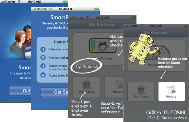
Some of the test concepts from Intuit’s Snap Payroll tutorial (from “Dialog, How It Works, Transparency and Tour”) (Large preview)
Shortly thereafter, I was working with RetailMeNot, tasked with designing its iOS and Android app tutorial. The product team wanted to make sure that users were clear about the value proposition of the tool and knew where to access certain actions (favoriting a store, saving a coupon, etc).
We thought that a very short tour (three steps) or a video demo might work. Some of the stakeholders really liked the idea of a transparency, so we tested that as well. But instead of engaging users, these designs just frustrated them.
One of the RetailMeNot test participants said:
"I just want to get in the app and start exploring."
In summary, user testing showed that users skip or otherwise ignore dialogs, tours, video demos and transparencies. At best, users find them a minor inconvenience. At worst, the patterns significantly aggravate new users who are trying to get into the app.
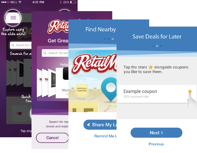
Some of the test concepts for RetailMeNot’s tutorial: transparency, video demo, three-step tour (Large preview)
Why Do These Patterns Fail?
So, why don’t these patterns work? I turned to the field of game design for answers. Game designers have always known that you can’t drop new players into the middle of a firefight and expect them to enjoy the experience. Most players would be dead before figuring out how to fire their weapons and fight back.
In game design, some methods of driving deep engagement are much more effective than others. The same holds true for mobile apps. While the stakes might not be (virtual) life or death, the frustration that users experience when they don’t know how or what to do is the same. And when that happens to too many of your users, it’s game over for your app.
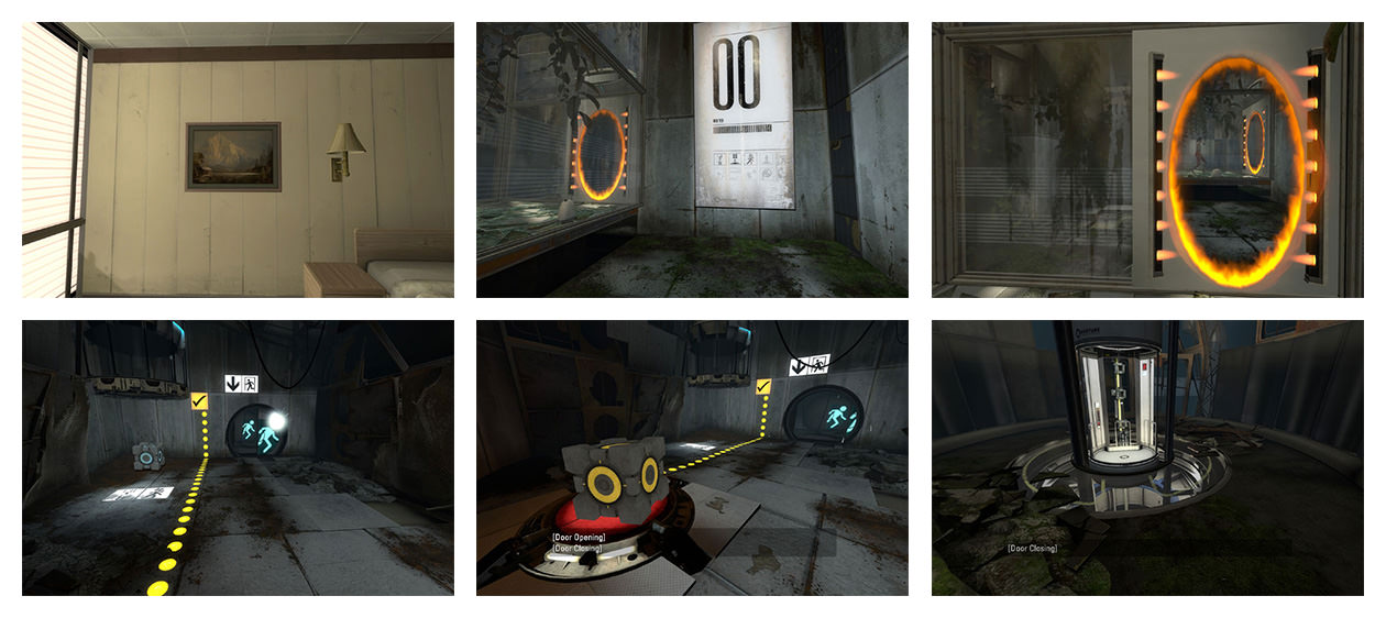
Portal offers a safe environment for players to figure out the controls while advancing in the game. (Large preview)
Extra Credits’ online video series thoughtfully looks at various aspects of the gaming world from an insider’s perspective. “Tutorials 101” is one fantastic video in particular that every app designer would do well to watch. (Get past the annoying chipmunk voice narration — it’s worth it.)
“Tutorials 101” lays out some basic rules for crafting an effective game tutorial that we can extend to the world of mobile design:
- Use less text.
- Don’t frontload.
- Make it fun.
- Reinforce learning through play.
- Listen to your players.
Rule Number 1: Use Less Text
When we want to explain something, words often seem like the easiest tool to use. But when we want the user to learn something, the written word is often a turn-off. According to “Tutorials 101,” we should avoid relying only on text because “it kills pacing, it destroys immersion, and it will often be skipped by the players who need the tutorial the most.”
Too much text makes for a “tell, don’t show” approach, which works against the strengths of mobile apps. Instead, tutorials should “show, not tell”; they should be interactive, so that users learn by doing. When someone practices an action beforehand, they’re more likely to remember how to do it when they need to than if they’d merely been told how to do it.
Here are some examples:
Boomerang Vs. Mailbox
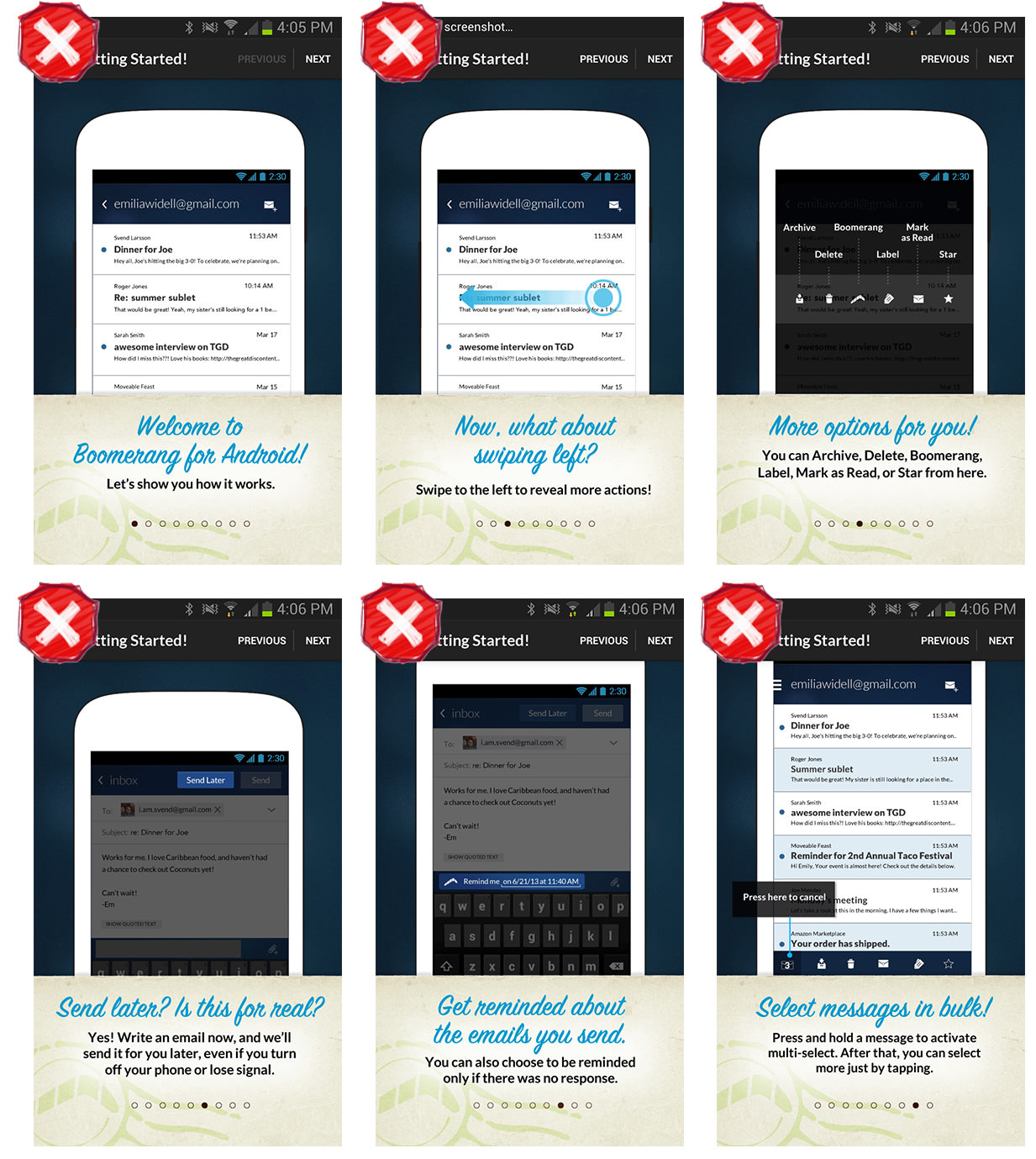
Boomerang for Android has too much text (see also rule 2: “No Frontloading”). (Large preview)
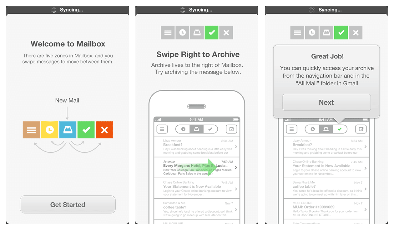
Mailbox for iOS’ tutorial text encourages the user to learn by doing. (See video) (Large preview)
DigiCal Vs. Fantastical
In DigiCal for Android, the text is abstracted from the activities it describes. (Large preview)
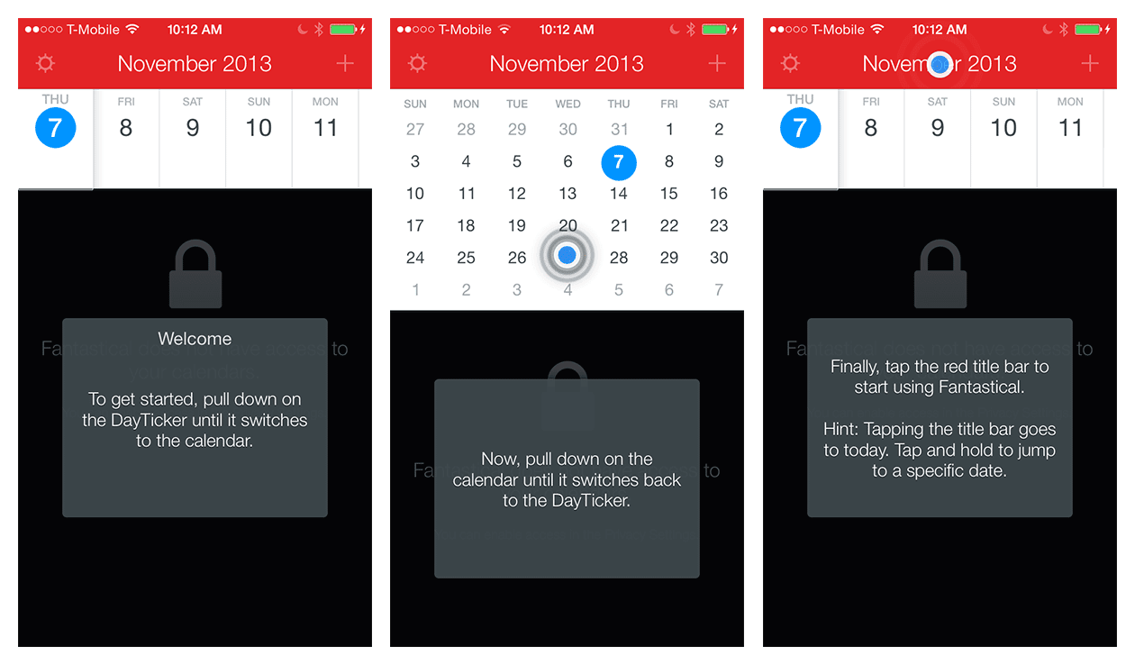
In Fantastical for iOS, the tutorial invites the user to work through the gestures that they need to learn. (See video) (Large preview)
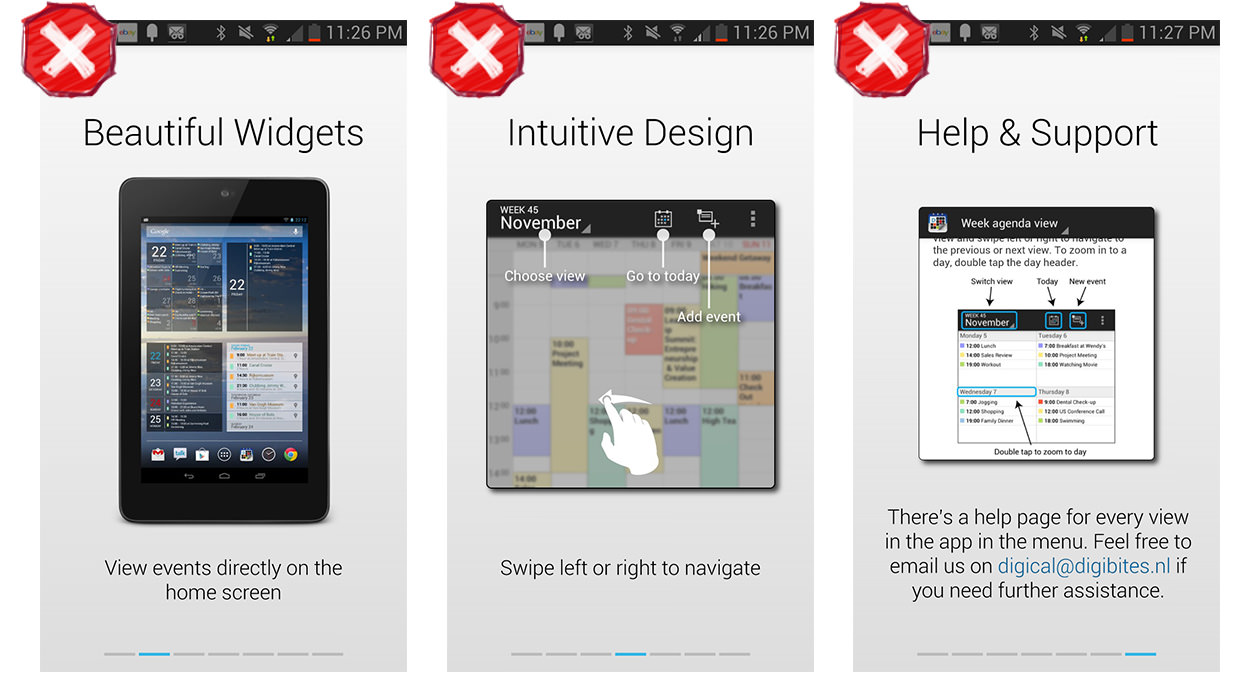
Catch (2013) Vs. Clear
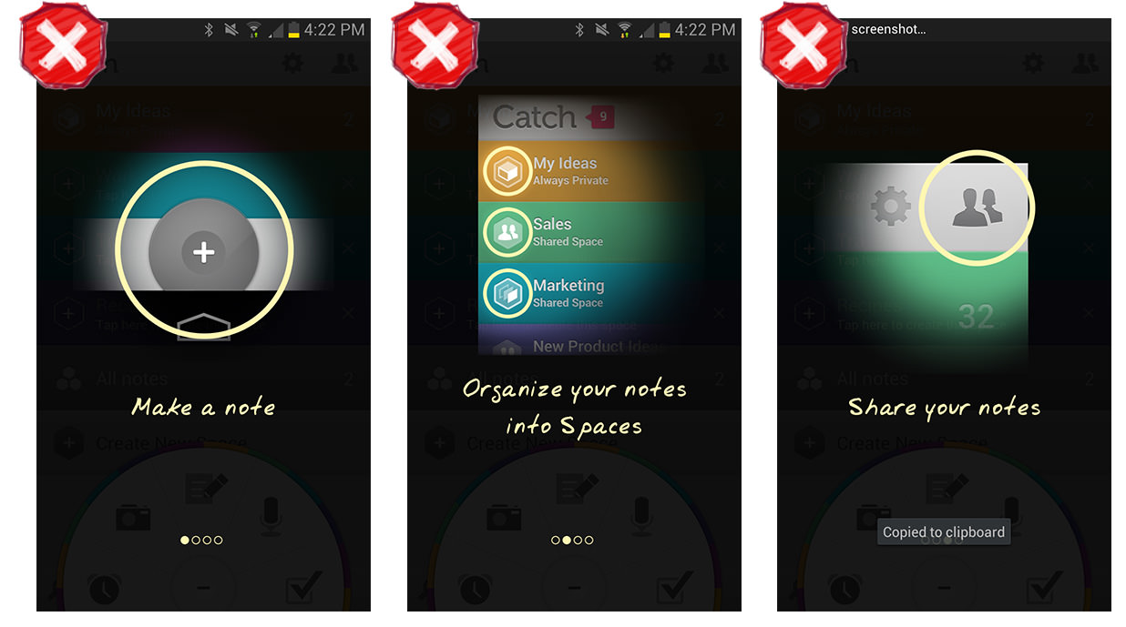
Catch for Android’s tour describes features and actions but doesn’t let the user try them. (Large preview)
In Clear for iOS, the default view is preloaded with tasks that the user learns by doing. (See video) (Large preview)
Resist the urge to use text if there are ways to show rather than tell. Use text to prompt the “cause,” and let the user observe the “effect” by doing.
Rule Number 2: No Frontloading
“If you frontload your tutorial and teach the player everything at the beginning,” Extra Credits says in “Tutorials 101,” “they’ll be overwhelmed with information and undersupplied with engagement.” Replace the word “player” with “user” in that sentence, and its relevance will be obvious to app designers.
Rather than overwhelm users with information that they will probably forget by the time they need it, provide the information in short, easily digestible chunks precisely when they need it. Remember that you’re making a first impression here. Wouldn’t you rather make a first impression that leaves users wanting more rather than less?
Dooo Vs. Todoist
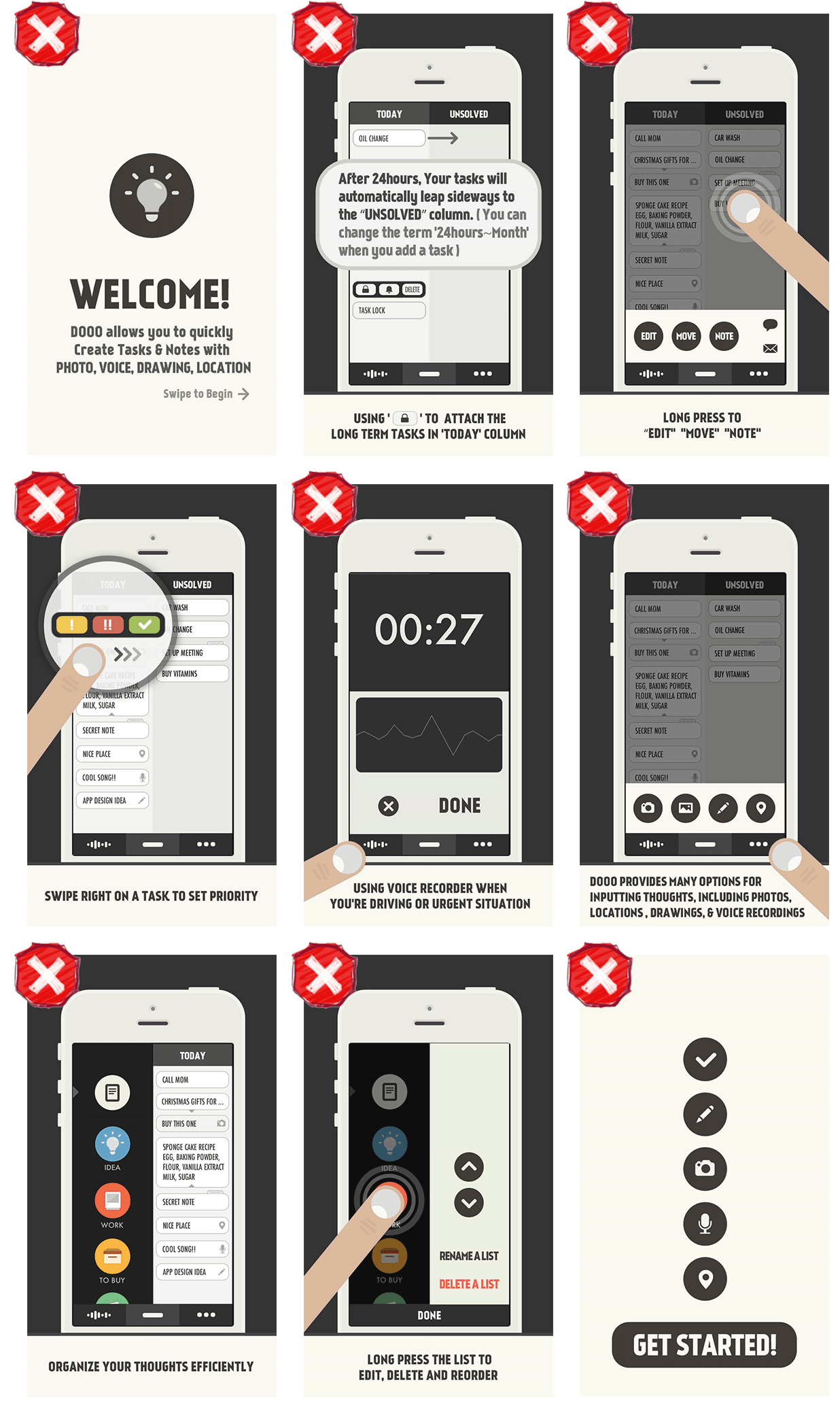
Dooo for iOS’ frontloaded information goes on and on for an overwhelming 11 pages. (Large preview)
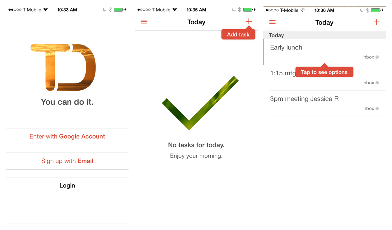
In Todoist for iOS, a tip invites the user to add a first task; then, another prompt introduces the options menu. (Large preview)
UserTesting’s recent post “Six UX Lessons Learned From the New Facebook App, Paper” affirms that “users love a guided tour” — “guided tour” meaning a series of interactive tips during the user’s first experience.
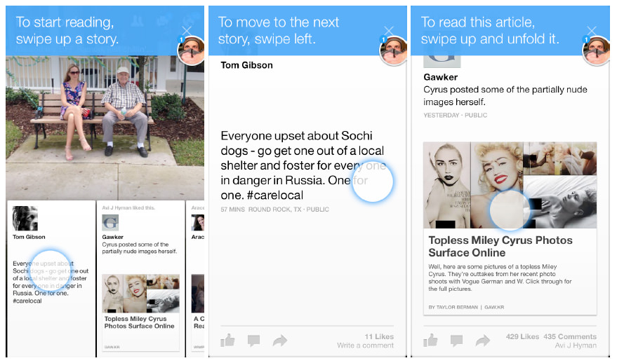
Facebook’s Paper app uses interactive tips in the context of a flow. (Large preview)
Don’t overload users up front with all of the information they will ever need. Give it to them in bite-sized chunks, just where and when they need it.
Rule Number 3: Make It Rewarding
Actually, you may recall that the rule from “Tutorials 101” is “Make it fun.” Of course, “fun” is not appropriate for all apps. But when the video’s narrator says, “Your tutorial should be as engaging as any other part of your game,” we can see that in every other sense, this rule applies to our world.
Even if we can’t make learning our apps fun, there are certainly ways to make it rewarding and flow seamlessly into the app’s overall experience. And a good way to do that is with interactivity that enables the user to actually accomplish things. This imparts a sense of agency that reinforces what the user learns.
Even when “fun” is not the right tone to strike, instilling a sense of playfulness is still sometimes appropriate. Let’s look at two apps that take different approaches to this, NBC News and Flipboard, the latter of which exemplifies the right approach. Despite its “playful” font on the five transparency screens, NBC’s tutorial still feels like a lecture. Flipboard, on the other hand, feels dramatically different on first being opened.
There is no instructional text, and the bottom half of the screen playfully flips up a bit, teasing you with a peek at some content before flipping down again. After it does this once more, you’ll probably get the hint that you need to swipe up to reveal the underlying content. But if by then you still haven’t swiped, you’ll get an embedded invitation that says “Swipe up to continue.”
Every subsequent flip transition reinforces the swipe gestures that a new user needs to make in order to explore the content in their Flipboard. Playful and rewarding.
NBC News Vs. Flipboard (2013)
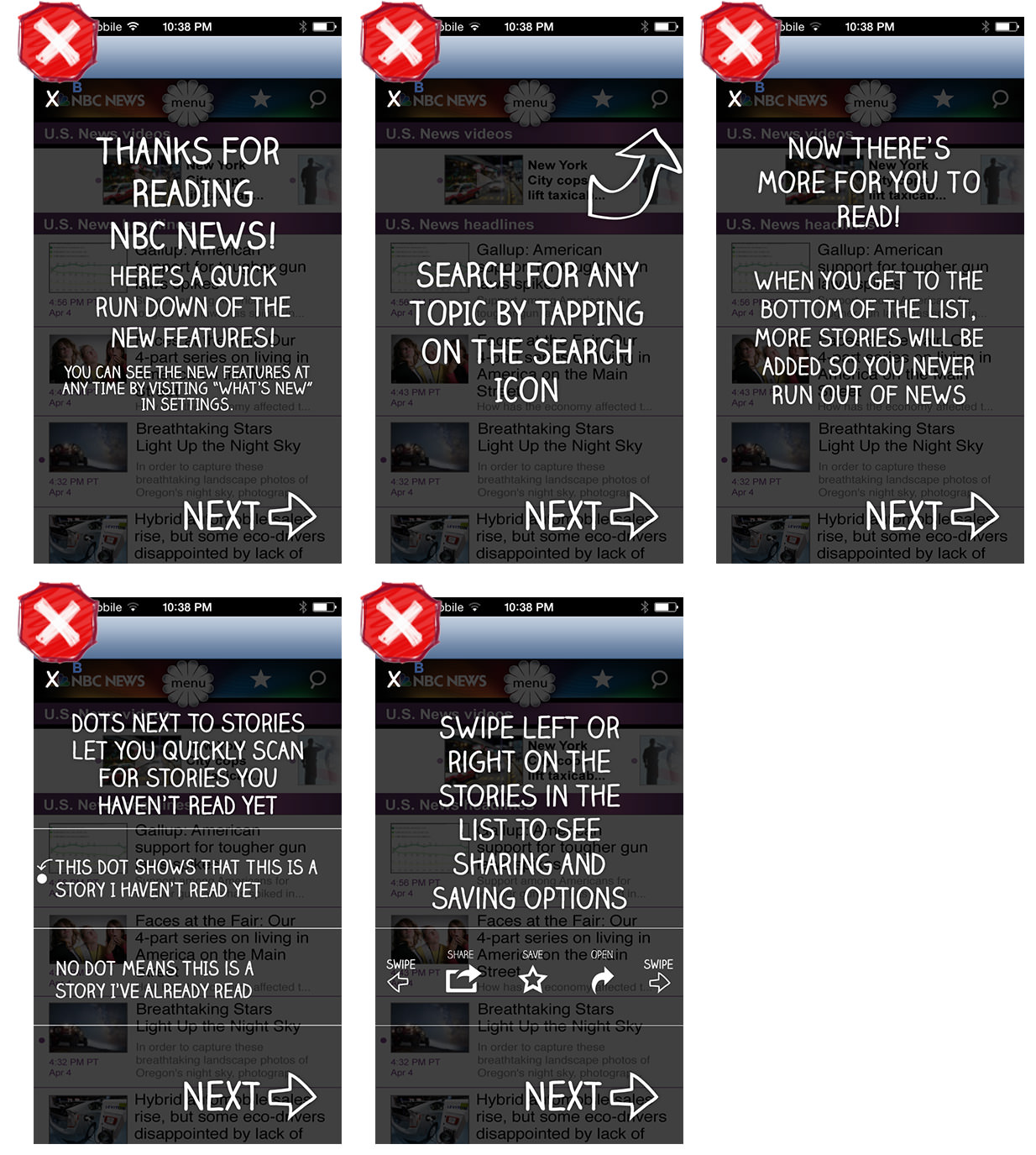
NBC News for iOS has a playful font, but the long lecture isn’t rewarding. (Large preview)
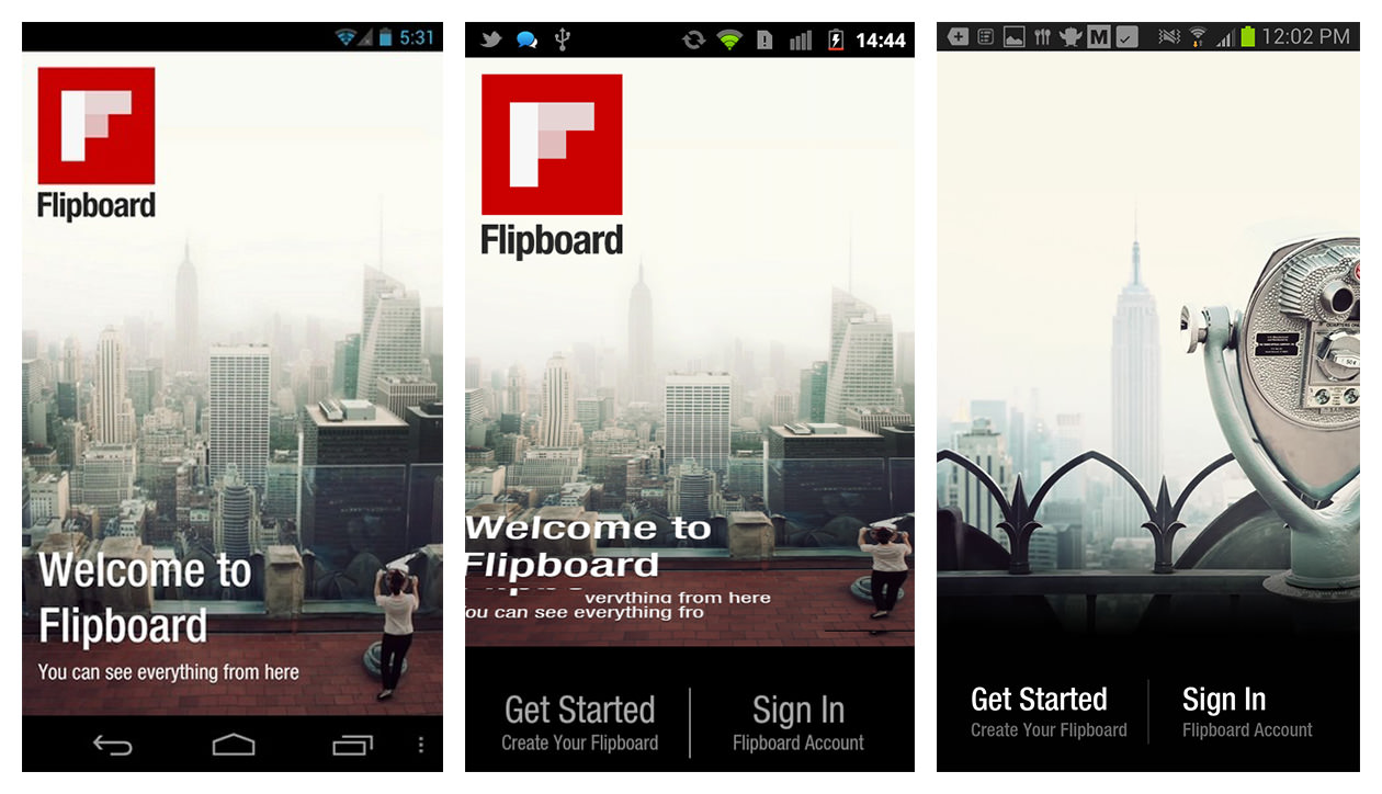
Flipboard for Android and iOS embeds playful prompts to engage the user and reinforce the key gestures needed to navigate the app. (See video) (Large preview)
Make deeper engagement with your app rewarding. Consider adding elements of playfulness where appropriate, and create a sense of urgency by enabling users to learn by doing.
Rule Number 4: Reinforce Learning Through Use
Remember those “A-ha!” moments in science class when you came to understand a concept by testing it in a simple experiment? That’s what we’re talking about here. Of course, the teacher had explained the concept to you, but it was by performing the experiment that you actually learned it.
The same idea applies with tutorials. And if you follow the first three rules, this reinforcement will largely take care of itself. It could be as simple as accompanying an action demonstrated in a tutorial with a very subtle bit of visual or aural feedback.
Then, when the user subsequently performs the action, the same feedback would reinforce what they have learned. (If you do use audio feedback, provide a way to turn it off so that it doesn’t become annoying once the user is familiar with the app.)
This rule complements the “No frontloading” rule. Rather than trying to show off everything in your app at once, craft an experience that invites the user progressively deeper into the app. By revealing more advanced features over time or by giving unexpected “rewards” as they progress, you’ll reinforce what the user learns as they use the app.
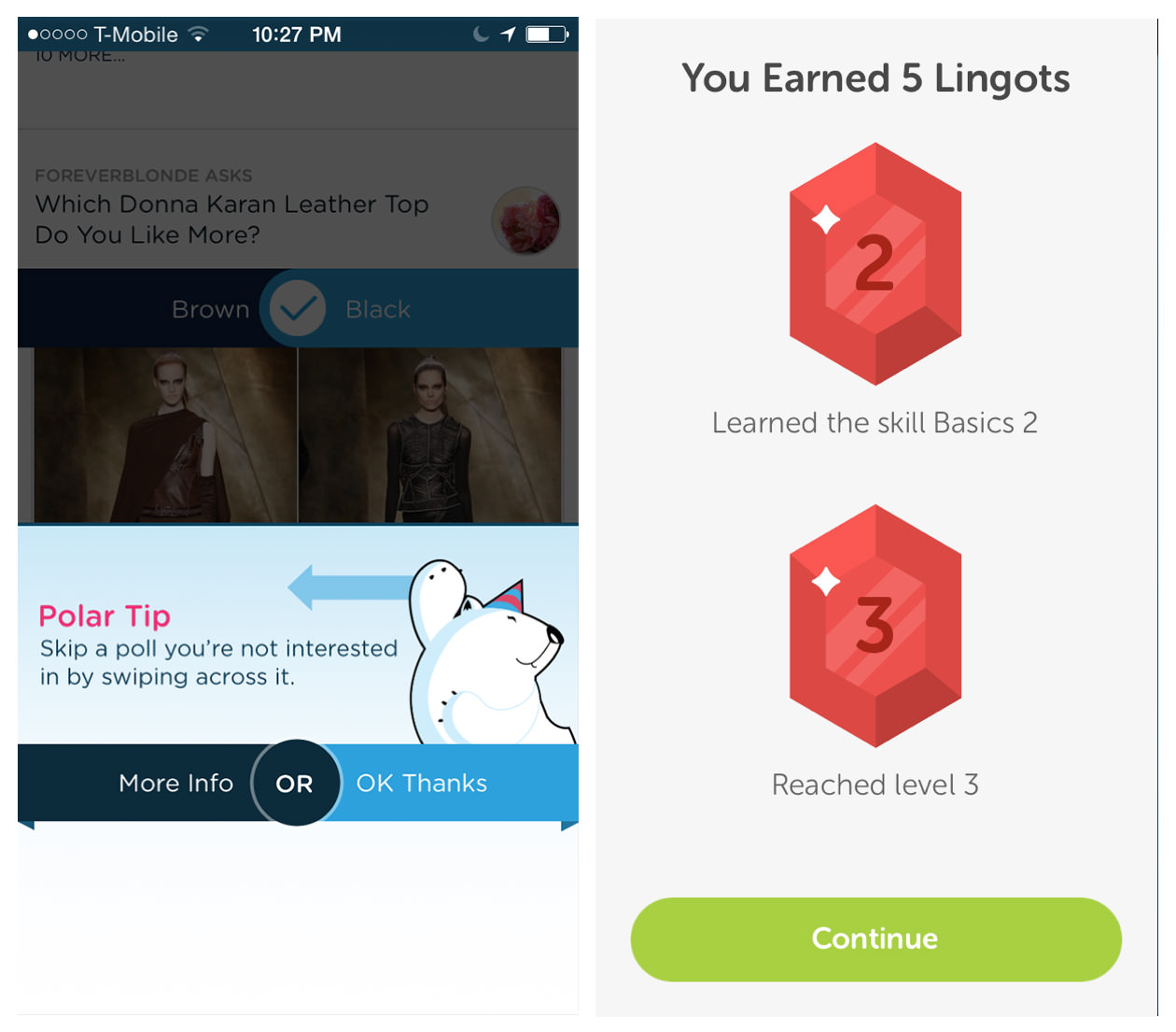
Polar offers a tip to power users after a few polls have been answered. Duolingo users earn rewards and level-ups by mastering skills. (Large preview)
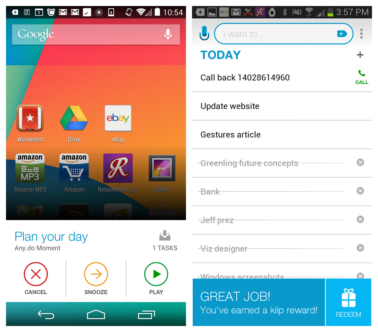
Any.do puts a widget on Android’s home screen to encourage engagement and offer spontaneous rewards. (Large preview)
Learning isn’t a one-time thing. Using an app should reinforce what the tutorials have helped the user learn.
Rule Number 5: Listen To Your Users
Considering that you’ve been deep inside your app, building and refining it for months, who is the best person to explain how it works? Probably not you, according to “Tutorials 101,” whose narrator says:
“When you’re a designer who’s been working on a project for a year or two, it’s very easy to think things are intuitive or obvious that are actually totally incomprehensible.”
Simple, properly conducted user testing will reveal any stumbling blocks. Observe your users to see where they get stuck and where they have problems. Listen to their comments as they interact with the app. Don’t question them until later; if you question them as they are using the app, you will likely lead them unconsciously to the answers you want to hear.
The designers of Snap Payroll ultimately discovered through user testing that a guided experience, or contextual tips, yields the best results. And after four rounds of testing at RetailMeNot, we arrived at the same findings.
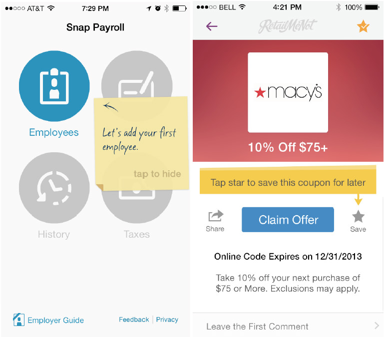
Snap Payroll’s contextual tips tested very well with users, as did RetailMeNot’s. (Large preview)
Familiarity blinds you to what users need to learn. Let users show you themselves through unbiased user testing.
Dive Deeper…
- Mobile Design Pattern Gallery: UI Patterns for Smartphone Apps, Second edition, Theresa Neil
- “Gamification Design: 4 Phases of a Player’s Journey,” Yu-kai Chou
- “4 Experience Phases in Gamification (#2): The Onboarding Phase,” Yu-kai Chou
- “First-Time User Experiences in Mobile Apps,” Krystal Higgins
Further Reading
- Smart Responsive Design Patterns
- Design Patterns: When Breaking The Rules Is OK
- Boost Your Mobile E-Commerce Sales With Mobile Design Patterns
- Taking Pattern Libraries To The Next Level


