Mobile And Accessibility: Why You Should Care And What You Can Do About It

Email Newsletter
Weekly tips on front-end & UX.
Trusted by 182,000+ folks.


 Custom Web Forms for Angular, React, & Vue. Your backend.
 Celebrating 10 million developers
Mobile has revolutionized the way we use the web. This is especially true of disabled users, for whom mobile devices open the door to a whole new spectrum of interactions.
And they are taking advantage of it. A July 2013 survey (PDF) of adults with disabilities done by the Wireless Rehabilitation Engineering Research Center found that 91% of people with disabilities use a “wireless device such as a cell phone or tablet.” Among these users, screen reader usage is common, even on mobile devices.
A study of 1782 screen reader users done by Web Accessibility in Mind (WebAIM) in 2012 showed that 71.8% used screen readers on their mobile devices. And we’re not talking about only a handful of people. The 2010 U.S. Census found that nearly one in five people have a disability!
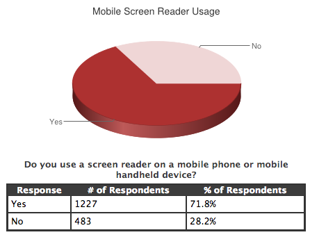
The results of WebAIM’s study of screen reader users (Source: WebAIM)
Despite this, many basic best practices for accessibility are forgotten on mobile websites. Developers implement complex solutions such as responsive design and responsive images, yet forget about basic techniques such as image replacement. Therefore, disabled users — who have a difficult enough time on the desktop — are frequently presented with interfaces that are at best frustrating, and at worst, impossible to use.
While accessibility can be a complex topic, following a few best practices goes a long way towards building accessible sites and applications. In this article we’ll discuss a few practical measures that address the most common issues disabled users encounter. Specifically, we’ll look at the importance of the following:
- making sure everything works with a keyboard,
- marking up forms semantically,
- providing plenty of contrast,
- ensuring that screen readers know what your controls do,
- testing your website on an actual screen reader.
We’ll see that following these best practices leads to a better experience for everyone, not just disabled users. Let’s get started by looking at a piece of hardware rarely considered in the mobile space: the keyboard.
1. Make Sure Everything Works With The Keyboard
While we usually associate keyboards with traditional desktops and laptops, the situation is no longer that simple. Microsoft’s Surface tablet has a keyboard built into the cover, Bluetooth keyboards are made to work seamlessly on iOS and Android, and some keyboards can even be rolled up for traveling.
Keyboard navigation on mobile websites has become increasingly important also because more websites are built responsively. Because these websites serve the same markup to all devices, the keyboard must function correctly, even if the vast majority of visitors use a touchscreen.

Keyboard support is important, even on mobile. (Image: Shane Pope)
Try putting your mouse away and visiting your website. Can you perform all tasks using only your keyboard? If not, then neither can keyboard users. Two main problems break keyboard navigation on the web. Let’s discuss each.
Not Using The Correct Element For The Task
Web browsers are really good at making keyboard navigation work automatically, as long as you use semantically appropriate elements. In particular, the following elements are focusable by default: <button>, <a> (with an href attribute), <input>, <select> and <textarea>. For these elements, keyboard navigation just works without any extra effort. However, developers frequently fail to use these elements appropriately, specifically <button> and <a>.
Buttons should be used for controls that perform actions, whereas links should be used for controls that navigate users to other documents. However, developers often incorrectly use generic elements, such as <span> and <div>, for controls that perform these actions. Consider the iPhone landing page of Fidelity, a banking institution.

Are those buttons on Fidelity’s iPhone landing page or not?
The two controls on this page sure look like buttons, but they’re actually generated by the following markup.
<div id="download_button">
    <div id="download_text" onclick="goToStore();">Download the Fidelity App</div>
</div>

<div id="no_thanks_button" onclick="goHome();">
    <div id="no_thanks_text" onclick="goHome();">No thanks</div>
</div>
Because of this, keyboards will not navigate to these controls. They would, however, if the controls were marked up as actual <button> elements.
<div id="download_button">
    <button id="download_text" onclick="goToStore();">Download the Fidelity App</button>
</div>

<div id="no_thanks_button" onclick="goHome();">
    <button id="no_thanks_text" onclick="goHome();">No thanks</button>
</div>
While this most commonly happens with buttons, links are often misused as well. Consider the popup that people see when visiting American Express’ home page on an iPad:

American Express shows this popup to iPad users on its home page.
Despite the “Click here to download the American Express app” being a simple link, American Express uses the following HTML:
<div class="asl-link" role="link">
    <div class="asl-app-store" title="...">
        Click here to download the American Express® App
    </div>
</div>
The linking is done in JavaScript, with a click handler that changes window.location. Because a <div> is used, keyboards cannot access the control, but they would be able to if an <a> element were used.
<div class="asl-link">
    <a href="..." class="asl-app-store">
        Click here to download the American Express® App
    </a>
</div>
(On a related note, the “close” button in American Express’ popup is also a <div>, so keyboard users can neither perform that action in the popup nor close it.)
American Express could also have used the Apple approved method of informing users that an app is available with an apple-itunes-app <meta> tag.
<meta name="apple-itunes-app" content="app-id=myAppStoreID, affiliate-data=myAffiliateData, app-argument=myURL">
In general, browsers provide keyboard access automatically for semantic elements. But what if you’re using elements more complex than a simple <button> or <a>?
Writing Your Own Complex Widgets
As web developers, we often use widgets for complex interactions in our interfaces. We do this sometimes to work around deficiencies in a platform (for example, to build a more customizable <select> element) and sometimes to build a powerful UI element (for example, a grid, tab or chart).
Let’s look at replacing a <select> element. On the surface, this seems like an easy widget to write:
- Create a
<div>. - Create a
<ul>, with an<li>element for each replacement<option>. - On a click of the
<div>, open the menu. - On a click of an
<li>element, transfer the value back into the<div>.
Easy.
However, consider all of the keyboard controls that a native <select> element has:
- The space bar opens the menu of options.
- The up and down arrows open the menu and cycle between options.
- The page-up and page-down keys cycle through whole pages of options in long lists.
- The “Escape” key closes the menu.
- Typing in values while the element has focus will trigger autocompletion options.
Suddenly, replicating the native <select> element has gotten significantly harder. Not to mention that we have to ensure that screen readers can access the options and read them at the appropriate time.
To make these complex interactions possible, a special set of HTML attributes is available to provide the necessary context to screen readers. These are known as Accessible Rich Internet Applications, or ARIA attributes.
The main ARIA attribute, role, tells browsers and assistive devices the general type of an object — for example, dialog, slider or alert. From there, a number of aria-* attributes are used to provide more detailed information about an element’s state. Below is a boilerplate for developing an accessible <select> replacement.
<span tabindex="0" id="button" role="combobox"
    aria-expanded="false" aria-autocomplete="list" aria-owns="menu"
    aria-haspopup="true" aria-activedescendant="option-1"
    aria-labelledby="option-1" aria-disabled="false">
        One
</span>

<ul aria-hidden="true" aria-labelledby="button" id="menu"
    role="listbox" tabindex="0" aria-activedescendant="option-1"
    style="display: none;">
        <li id="option-1" role="option" tabindex="-1">One</li>
        <li id="option-2" role="option" tabindex="-1">Two</li>
        <li id="option-3" role="option" tabindex="-1">Three</li>
</ul>
Screen readers use these ARIA attributes to help keyboard users operate these controls. For example, because this example’s <span> has a role of “combobox”, VoiceOver on OS X reads “You are currently on a combo box, type text or, to display a list of choices, press Control-Option-Space.” VoiceOver knows what choices are available because the <span> has an aria-owns attribute set to “menu”, the id of the <ul> that contains the options.
But as you can see, there are a whole lot of ARIA attributes to account for; therefore, because of the difficultly of getting this right, most developers are better off using a JavaScript UI library for such controls rather than building them themselves. Many big libraries ensure that these controls are accessible by applying appropriate ARIA roles and keyboard shortcuts automatically. For example, jQuery UI’s upcoming selectmenu and Kendo UI’s DropDownList both generate accessible <select> replacements.
This concludes our look at supporting keyboard navigation on the web. While this set of guidelines is by no means comprehensive, it should help you get the most important parts of your website working properly. For a more thorough list of keyboard accessibility, see the W3C’s complete guidelines.
Next, we’ll look at another often abused best practice: building semantic forms.
2. Mark Up Forms Semantically
With the proliferation of single-page applications — especially mobile ones — a diminishing number of websites use native HTML form submissions. Instead, data is submitted to the server by JavaScript-initiated XMLHttpRequests. While nothing is inherently wrong with this, using the same semantic markup that you would use if the data were to be sent with a native HTML form submission is still important.
Most screen readers have entire modes dedicated to form interaction that require forms to be marked up correctly. Consider this log-in form:
Username: <input type="text" id="username" name="username">
Password: <input type="password" id="password" name="password">
<button>Submit</button>
<script>
    document.querySelector( "button" )
        .addEventListener( "click", function() {
            // Send AJAX request to log user in
        });
</script>
While this form will log users in, it has a few problems that would make it painful for power users and impossible for impaired users to complete. Let’s look at the issues in turn.
Associating Labels With Inputs
Most screen readers require that form elements — <input>, <select> and <textarea> — be associated with <label> elements that describe them. Each <label> element should have a for attribute that corresponds to the appropriate form element’s id attribute, as shown here:
<label for="field">Field:</label>
<input id="field">
As is, our log-in form does not have this association, which would trip up assistive devices. Below is the user name <input> that we’re currently using. Note that there is no <label>.
Username: <input type="text" id="username" name="username">
When this user name <input> gets focus, the screen reader NVDA simply reads “Edit text, blank.”
This is common in the wild, unfortunately. Amazon, for instance, has a trimmed-down website, amazon.com/access, that is “optimized for screen readers and mobile devices.”
The website is appropriately simple, with a single search box and a short list of links. Ironically, though, despite directing screen reader users to this page, Amazon has not given its search <input> a <label>; thus, many screen reader users will have no idea that the <input> can be used to search.
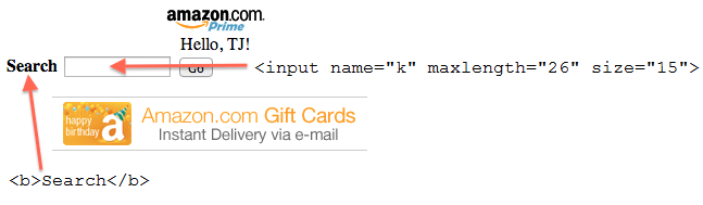
Amazon’s accessible website does not associate the “Search” label with the text box.
(Note: As with browsers, screen readers vary in their support of markup patterns. In the example above, VoiceOver does read the “Search” text, but NVDA does not. We’ll discuss compatibility testing later in this article.)
We can easily solve this problem in our sample form with a few <label> elements:
<label for="username">Username:</label>
<input type="text" id="username" name="username">

<label for="password">Password:</label>
<input type="password" id="password" name="password">

<button>Submit</button>
<script>
    document.querySelector( "button" )
        .addEventListener( "click", function() {
            // Send AJAX request to log user in
        });
</script>
Now all screen readers will associate each form element with a label that describes it. This practice is beneficial to more than users of assistive devices. All browsers are smart enough to transfer clicks on <label> elements to their associated <input>, <select> or <textarea> elements.
Ever had trouble clicking a 10 × 10-pixel checkbox to accept a service’s terms of use? On websites with semantic markup, you can click a checkbox’s far larger label instead. On mobile devices, bigger targets help fat fingers hit them:
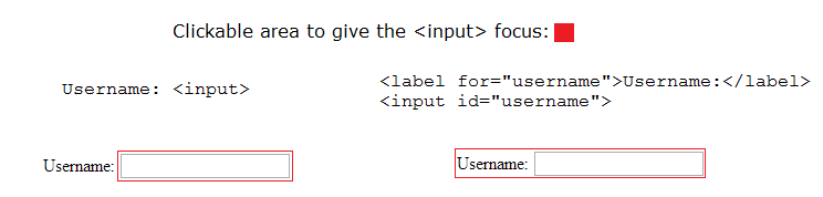
Clicking a label gives focus to the corresponding control.
This solves one problem with our log-in form. But there’s still one more issue to discuss.
Handling The “Enter” Key
Have you ever noticed that some log-in forms on the web can be submitted by pressing the “Enter” key in a textbox and some cannot? What makes the “Enter” key work for a submission?
Submitting with the “Enter” key is known as an implicit submission, and it is supported by all browsers — even mobile ones. There are only two requirements to making implicit submission work.
- All
<input>elements need to be in a<form>. - If the form has more than one element —
<input>,<select>or<textarea>— then the<form>must have a “Submit” button.
Our sample form already has a “Submit” button (the default type of <button> is submit). Therefore, we only need to add a <form>.
<form method="POST">
    <label for="username">Username:</label>
    <input type="text" id="username" name="username">

    <label for="password">Password:</label>
    <input type="password" id="password" name="password">

    <button>Submit</button>
</form>
<script>
    document.querySelector( "button" )
        .addEventListener( "click", function( event ) {
            // Prevent the default form submission
            event.preventDefault();

        // Send AJAX request
    });
</script>
A couple of things to note:
- When implicit submission occurs, the browser performs a click on the
<form>’s “Submit” button. Therefore, listening forclickevents on the “Submit” button to perform submit actions is still safe. You could, alternatively, listen for asubmitevent on the<form>. - Even though JavaScript will intercept the form’s submission,
method="POST"is still explicitly declared. In case JavaScript fails (because of unsupported browsers, network issues, etc.), we don’t want the browser to submit aGETrequest that would place the user-supplied user name and password in the query string.
Enabling implicit submission saves mobile users some clicking. The image below shows two <input> elements, one in a <form> and one not. Note that the <form>-based example can be submitted while the <input> has focus — no need for additional taps or hunting for a “Submit” button.
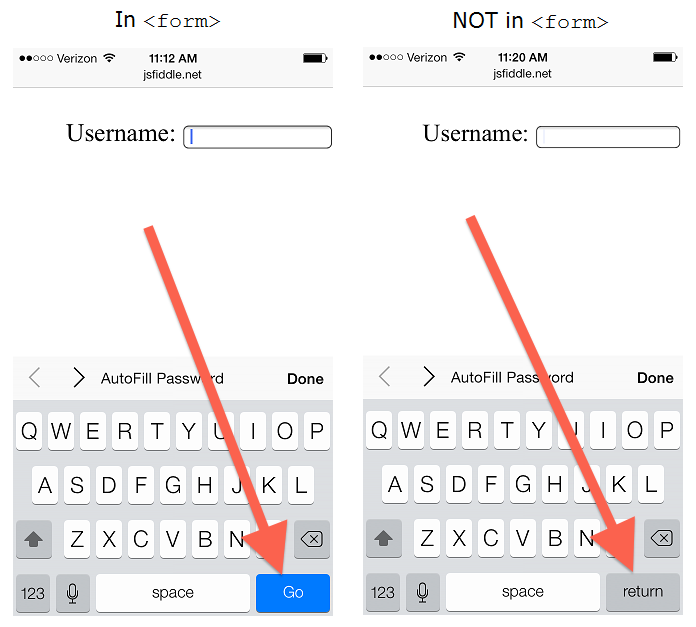
Implicit form submission works only with true form elements.
This concludes our look at building accessible forms. As with keyboard access, these guidelines are far from comprehensive, but they address some of the most common problems with forms today. For a more complete list of best practices, check out the W3C’s guidelines for collecting input from users.
Next, we’ll look at a problem that most smartphone owners have experienced at some point: low contrast.
3. Provide Plenty Of Contrast
If you’ve ever used your phone outdoors, especially in harsh sunlight, then you’ve struggled to read the screen at some point. This is not unlike what some users with vision disabilities experience all of the time.
When designing any website, remember that most users will not be visiting it indoors on a high-end monitor like yours. This is especially critical for mobile websites because of the wide variety of contexts in which people use their phone.
How do you make your website adapt to these contexts? Unlike more subjective aspects, contrast ratio can be calculated, and the W3C puts numeric guidelines for these ratios in its “Web Content Accessibility Guidelines” (WCAG), a series of recommendations for making web content more accessible to individuals with disabilities.
The WCAG defines three levels of conformance: Level A, Level AA and Level AAA. According to the specification, for a website to conform, Level A requirements must be met, Level AA requirements should be met and Level AAA requirements may be met.
The Level A contrast ratio is set at 3:1; Level AA is set at 4.5:1; and Level AAA is set at 7:1. As a point of reference, the specification recommends a contrast ratio of 4.5:1 for users with 20⁄40 vision, which is common among elderly people.
This means that we should make our contrast ratios at least 3:1 and, ideally, 4.5:1 or greater. But, how exactly do we calculate this?
Calculating Contrast Ratio
Luckily, Lea Verou has created a tool to calculate contrast ratio easily.
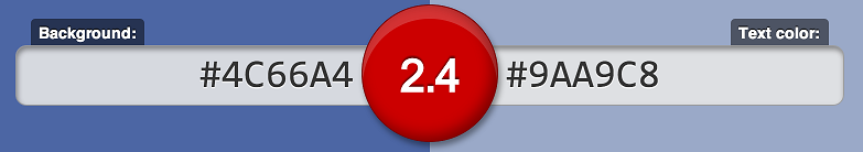
It’s simple to use. Input a background color and a text color, and the tool will output the contrast ratio:
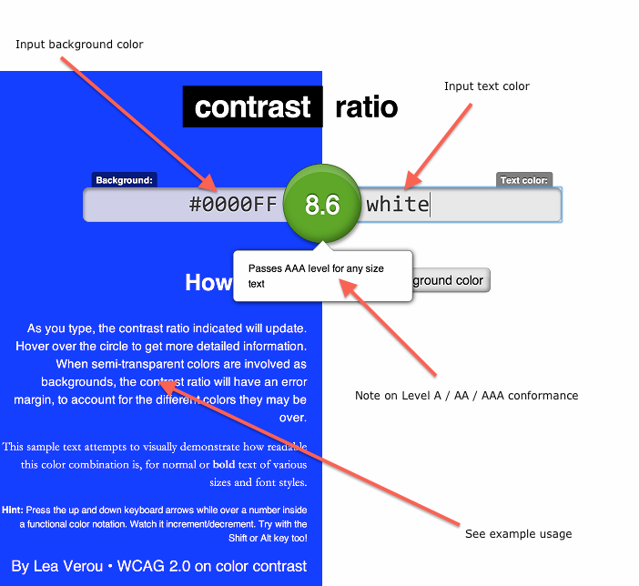
Lea Verou’s tool determines the contrast ratio between text and its background.
A couple of things to note:
- The tool supports any CSS color that the browser supports. So, keywords (e.g. white), HEX, RGB, RGBa, HSL and HSLa are all accepted.
- The tool generates unique URLs as you input valid values. For developers, this feature is perfect for telling designers that their gray on light-gray design is a bad idea.
While high contrast seems like common sense, plenty of poor contrast can be found in the wild, even on major websites. Square’s footer fails Level A:
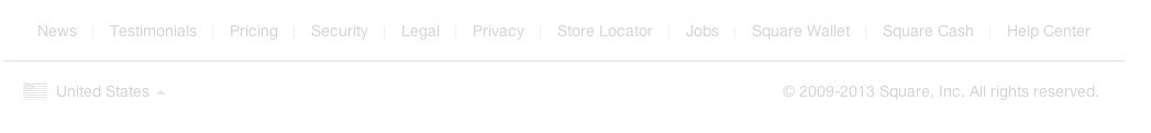
Square’s footer has very low contrast.
Square’s footer fails Level A.
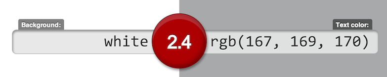
Even Facebook is guilty. The links in its header on the desktop fail to meet Level A as well:
The text in Facebook’s header has very low contrast.
Facebook’s header fails Level A.
To summarize, giving all of your text a contrast ratio of at least 3:1 (and, ideally, 4.5:1 or greater) will make it accessible to people with vision impairments, as well as make it more readable for everyone. Lea Verou’s tool is perfect for calculating contrast ratios and sharing the results with others.
To find out more about conformance levels, the WCAG has a formatted checklist of criteria for each level.
Next, we’ll return to discussing screen readers — specifically, making sure they can understand our websites.
4. Ensure That Screen Readers Know What Your Controls Do
Earlier, we looked at a WebAIM study that shows that 71.8% of screen reader users also use a reader on their mobile device. In this same study, users were asked for the most common problems they experience on the web. Third and fourth on this list are the following:
- links or buttons that do not make sense,
- images with missing or improper descriptions (
alttext).
(First and second on the list are Flash and CAPTCHAs. Please don’t use either.)
The following snippet shows both of these problems.
<style>
    button {
        background: url('search.png') no-repeat;
    }
</style>
<button></button>

<img src="ABC123.jpg">
The <button> would not make sense to a user on a screen reader; nothing would be read. For the <img>, screen readers would literally read ABC123.jpg, which is not very helpful.
The fixes for these problems are well documented. For the <button>, we can add text to our control and use one of many image-replacement techniques to make the text invisible to sighted users. The snippet below shows one of these techniques: applying a large negative text-indent rule.
<style>
    button {
        background: url('search.png') no-repeat;
        text-indent: -9999px;
    }
</style>
<button>Search</button>
The fix for the <img> is as simple as adding an alt attribute that describes the image.
<img src="ABC123.jpg" alt="A view of the trees outside my window in Lansing, Michigan">
Despite these problems being well known and easy to fix, they continue to be abundant across the web. To prove this, let’s look at some actual websites. I live in the great US state of Michigan, known for its association with the “Big Three” automakers: Ford, GM and Chrysler. Surely, these large companies have produced accessible mobile websites that don’t violate these practices… right?
Case Study: The Big Three Automakers
Let’s start with GM. Its mobile website is shown below. The appended text in quotation marks shows what VoiceOver on OS X actually reads when the corresponding element is selected.
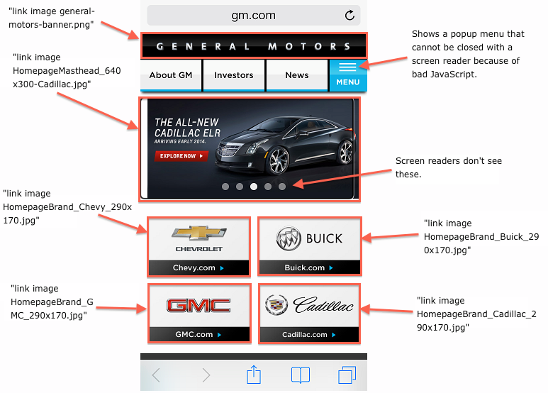
GM’s mobile website has accessibility issues. Items in quotation marks are what VoiceOver on OS X actually reads.
As you can see, GM’s website relies heavily on large images that serve as links to additional content. Unfortunately, GM provides no text for these links, so screen readers are limited to the information they can find in the images. GM does provide alt attributes for these images; but, strangely, they are set to the images’ file names. For example, here is the source for the Cadillac image:
<img title="HomepageBrand_Cadillac_290x170.jpg" height="85"
alt="HomepageBrand_Cadillac_290x170.jpg" class="side-gutters"
src="/content/dam/gm/Global/master/mobilesite/en/home/Homepage/HomepageBrand_Cadillac_290x170.jpg">
Thus, when this image is selected, VoiceOver literally reads “Homepagebrand underscore Cadillac underscore two nine zero x one seven zero dot jpeg.”
GM fails our tests, then. Next, let’s try Ford, whose mobile website is shown below.
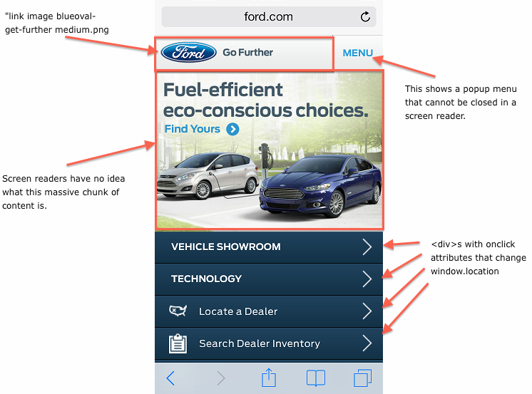
Ford’s mobile website also has accessibility issues. Items in quotation marks are what VoiceOver on OS X reads.
Ford has some of the same problems as GM. Its banner is a link that has no text and an image with no alt attribute; so, VoiceOver reads “index.html image.”
Below this, Ford has a fancy 3-D cube effect with images of its vehicles. Unfortunately, this is implemented with a number of <div>s, with background-images and JavaScript that takes the user away on click. Therefore, screen readers have absolutely no idea what’s going on in this large portion of the screen. VoiceOver on iOS just beeps when you touch this “cube” that takes up half the screen.
Finally, the “links” at the bottom of the screen are not actually links; they are <div>s with onclick attributes that change window.location to navigate the user. Thus, these controls are inaccessible from the keyboard and are confusing for screen readers.
Just when you thought things couldn’t get any worse, let’s look at the last of the Big Three automakers, Chrysler. Its mobile website is shown below.
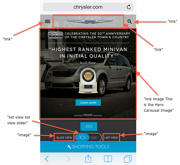
Chrysler’s mobile website, too, has accessibility issues. Items in quotation marks are what VoiceOver on OS X reads.
You can see that almost nothing on Chrysler’s website provides any context for screen readers. We are reminded of the importance of meaningful alt attributes. Here, the one alt attribute that is provided — “This Is the Hero Carousal” — is less than helpful. Worse, all images in the carousel have the exact same alt attributes; so, screen reader users would have no idea that different links are being presented. To add insult to injury, the word “carousel” is spelled incorrectly (“carousal”), causing it to be mispronounced.
These carousel images occupy over half the space on an iPhone screen and are almost certainly the most clicked-on items on the screen. An alt attribute should tell users something about the image they’re seeing, as well as where they will go if they click the link. For example:
<img src="/path/to/TnC.jpg" alt="Learn more about the J.D. Power 2013 award-winning Chrysler Town & Country">
This tells screen reader users what the link is for and what they will see if they select it.
Unfortunately, examples like these are far too common. Even though many accessibility best practices are well documented, they are frequently forgotten — even on big websites and especially on mobile.
Why?
One reason is that the consequences of violating these best practices are not obvious. To sighted touch users, all of these websites operate fine. Secondly, no good way exists to automate your website’s accessibility. The W3C’s validator will warn of missing alt attributes, but it cannot test for more complex scenarios, such as icon buttons and lack of keyboard functionality. It also cannot test whether the alt attributes are actually meaningful.
Because of this, we must trust all web developers to learn and remember to use accessibility practices that have no apparent benefit. As we’ve seen in this case study, frequently they don’t.
But all is not doom and gloom. We’ve seen that applying a few easy-to-implement best practices can drastically improve the accessibility of your sites, and open them to a new, surprisingly large audience. That building accessible sites builds a better experience for everyone.
But if the W3C validator cannot catch accessibility issues, how do you verify that you’re applying these best practices correctly? As it turns out, the best way to test the accessibility of your site is also a great way to gain insight into how disabled users interact with it — by using a screen reader.
5. Test Your Website On An Actual Screen Reader
Most web developers have a slew of browsers and devices to test their websites, yet few know how to use a single screen reader. Unfortunately, this has led most developers to treat accessibility guidelines as some sort of voodoo. They conjecture about what’s best for impaired users without actually testing their theories.
This is a shame, because the best way to discover whether your website is accessible is to try it out as an impaired user would. Personally, I’m not sure why screen readers are shrouded in mystery; they’re actually quite easy to use.
If you’re on a Mac, type Command + F5 to activate VoiceOver. Navigate around this page with the Tab key and see what’s read. You can also press Control + Option plus the left and right arrow keys to target content that is not in the tab order. There are more advanced controls available, but you can get the idea with these basics.
If you’re on Windows, you can download and use NVDA for free. JAWS is the most popular paid reader; it has a demo mode that you can try for free.
Mobile devices are a tad different because there is no keyboard by default. Therefore, using a screen reader forces you to reconsider how you interact with your device. Let’s explore this by looking at the screen readers built into iOS and Android — VoiceOver and TalkBack, respectively.
Using VoiceOver On iOS
VoiceOver is iOS’ primary accessibility aid for all applications, not just the Web. Because most users don’t use it, VoiceOver is disabled by default. To enable it, go to Settings → General → Accessibility → VoiceOver. You’ll see the screen shown below.
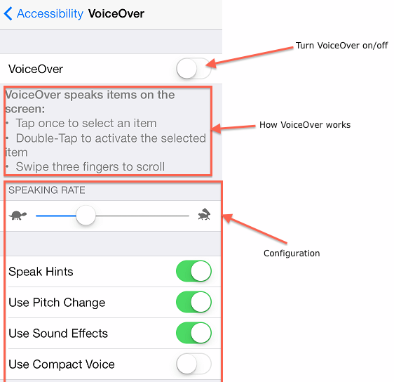
The settings screen for VoiceOver on iOS
Be warned — once you turn it on, VoiceOver will fundamentally change the way you interact with the phone. Therefore, you must learn the basics; otherwise, you won’t be able to turn VoiceOver back off.
Once VoiceOver is on, a single tap on the screen will select an item but will not activate it. For example, if you tap on the Safari icon, VoiceOver will read “Safari” but will not launch the application. After a selection, a double tap is needed to actually start the application. This makes sense if you consider the perspective of someone who cannot see the icon. They would need confirmation that they’ve selected the correct item before activating it.
The other important difference with VoiceOver is that you have to use three fingers to scroll. Why? Because while in VoiceOver mode, iOS listens for one-finger “flick” gestures in all four directions:
- “Up” Move to previous item based on rotor setting
- “Down” Move to next item based on rotor setting
- “Right” Move to previous item
- “Left” Move to next item
What’s this “rotor”? We’ll get to that in a moment. First, try flicking left and right on the screen to move between available items. These flicks let vision-impaired users discover what’s on the screen without having to tap around.
Things get more interesting with VoiceOver’s rotor, a means of configuring how to navigate between items on the screen.
To activate the rotor, rotate two fingers on the screen as if you were turning a dial. The rotor and its default options are shown below.
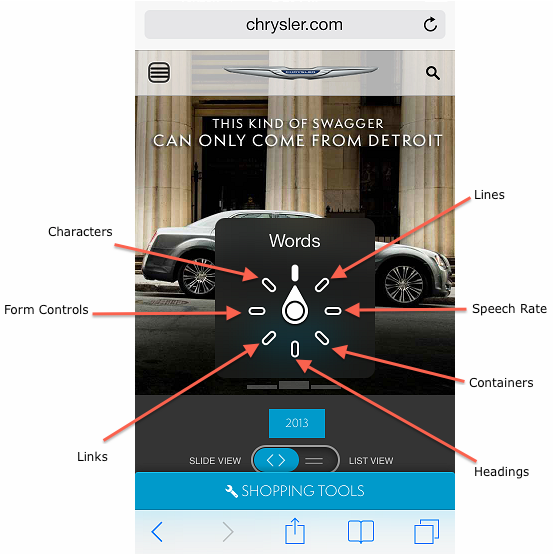
The rotor control in VoiceOver for iOS
By setting the rotor, you can change how up and down flicks navigate the page. For instance, if the rotor is set to “Links,” then up and down flicks will cycle between links on the page and nothing else. In this sense, the rotor acts as a filter, enabling users to sift through the type of content that they’re interested in.
The rotor shows the importance of semantic markup. If your links are not actually <a> tags, then they won’t show up in the rotor setting for “Links.” If your form’s controls are not actual form elements, then they won’t show up in the rotor setting for “Form Controls.”
As you can see, using a screen reader forces you to fundamentally change how you use and approach the web on a mobile device. Play around with any websites you maintain to see how well you can navigate and accomplish tasks. As an added challenge, once you’re familiar with VoiceOver, try closing your eyes and see what you can get done.
Using TalkBack On Android
Like VoiceOver, TalkBack is an accessibility service for vision-impaired users that is native to Android devices. Because most people do not need the service, it is also disabled by default. To enable it, go to Settings → Accessibility → TalkBack and tap the switch shown below.
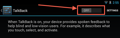
The settings page for TalkBack on Android
Again, be warned. Once TalkBack is activated, you’ll at least need to know the basic controls to turn it off.
TalkBack’s controls are extremely similar to VoiceOver’s. One tap selects an item, and a double tap activates it. Scrolling with TalkBack requires two fingers (recall that VoiceOver requires three), and TalkBack listens for the same flick actions to move between items on the page.
While TalkBack has nothing comparable to VoiceOver’s rotor, it does support a number of additional gestures to customize the navigation.
Wrapping Up
In this article, we’ve discussed a number of best practices to improve the accessibility of your websites. How do you apply this information to your existing or new websites? Here are a few action items:
- Keyboard
- Make sure that all tasks can be performed using only the keyboard.
- Use semantic elements —
<button>for buttons and<a>for links. - If you’re having trouble making complex widgets keyboard-friendly, consider using a framework.
- Forms
- Use the actual
<form>element. - Associate all form elements (
<input>,<select>and<textarea>) with a<label>. - Make sure the “Enter” key can be used to submit the form.
- Use the actual
- Contrast
- Ensure that all text has a contrast ratio of at least 3.0, using Lea Verou’s Contrast Ratio. Ideally, all text should meet this criterion, but focus on the main content first.
- Images
- Include
altattributes that describe the images.
- Include
- Links and buttons
- Always give these controls readable content. If the content should not be shown to sighted users, then use an image-replacement technique to hide it.
While this list is not comprehensive, it does provide a number of practices that are easy to implement and that address the most common problems affecting disabled users. Furthermore, we’ve seen that adhering to these guidelines benefits everyone, not just the disabled.
Finally, the best way to test your website is on an actual screen reader. By taking mere minutes to learn some commands, you will gain insight into how a good portion of the population interacts on the web.
Resources
- “Web Content Accessibility Guidelines 2.0,” W3C If you’re looking for a more comprehensive checklist than what’s provided in the conclusion above, this is it.
- “Shared Web Experiences: Barriers Common to Mobile Device Users and People With Disabilities,” W3C Web Accessibility Initiative This page describes the issues that people with disabilities encounter on the Web and how they are addressed by the W3C’s guidelines and specifications.
- “Talk To Me,” Jörn Zaefferer These slides are from Zaefferer’s 2013 talk on making websites accessible.
- Contrast Rebellion An amusing look at why contrast is important on the web.
- “VoiceOver Getting Started,” Apple The official guide to getting started with VoiceOver on OS X.
- The Accessibility Project A nice collection of accessibility tips.
- “You Can’t Create a Button,” Nicholas Zakas Zakas explains when to use
<a>and<button>elements.
Further Reading
- Notes On Client-Rendered Accessibility
- Accessibility Originates With UX: A BBC iPlayer Case Study
- Accessibility APIs: A Key To Web Accessibility
- Making Accessibility Simpler, With Ally.js
- The WAI Forward
 (al, il, mrn)

