A User In Total Control Is A Designer’s Nightmare

Email Newsletter
Weekly tips on front-end & UX.
Trusted by 182,000+ folks.
 Register for Free
 Celebrating 10 million developers
 Custom Web Forms for Angular, React, & Vue. Your backend.

How do you balance the creative control you give to the users, the usability of the product they make with your tool and the flexibility of that tool?
We designers have always had a problem of handing over creative control to the general population — the basic users. There are two reasons for this. The first is obvious: We are the ones who are supposed to know the principles of design and usability. Some of us were born with this feeling of what feels and looks right, while other designers have learned it — at least good designers eventually have.
The second reason is that, unlike users, we see the world in another way. We see what can be done to improve the things we use every day. For example, we might remember a restaurant not by its name or location, but by its poorly chosen typeface for the logo, as Tobias Frere-Jones recalls in the movie Helvetica.
In simple words, designers should be the ones who know what’s right and should know how to fix it when it’s not.
But other people also have a gift of aesthetic feeling, a gift to recognize beauty. It turns out that we’ve had it for a long time, and we need it in our daily lives. We believe that products that look good also work better, taste better and are more trustworthy. Zoltán Gócza has gathered quite a few points to demonstrate that aesthetics are important to people.
Ordinary users, then, just like designers, recognize beauty and know what’s right and not right. This is not where the problem of handing over creative control arises. The problem is that they don’t know the principles that designers do. There’s nothing to guide them to create something both functional and beautiful. Most of the time, they just put together a bunch of stuff that they think looks cool and end up with something like this:

This is an extreme example, but you get the point. I wonder how many poorly designed PowerPoint presentations you have seen during your college years (if you studied at a non-design college). I know I’ve seen way too many poorly chosen typefaces and colors combined with unsuitable backgrounds and animations.

Unlike designers, ordinary users know what’s right but don’t know how to fix what’s not right or how to create something that looks and works right from scratch.
It’s The Designer’s Fault
In his famous article “Simplicity Is Highly Overrated,” Don Norman states that users want many features, not simplicity. Other designers disagree.
The truth lies somewhere in between. Users want a lot of features, even though they won’t use most of them. Adding features makes a product more complex, which can lead to misuse and frustration.
We keep adding features until our products and tools become very complex. We do it to build flexible tools, because that’s what users want, right? But we forget in the process that users don’t know the basic principles of design that would guide them to create a usable, good-looking product. They also don’t have the time or simply don’t want to read our instructions on how to use the tool. This means that they’re using our flexible and complex tool to create a product that is neither usable nor good looking.
But there is a way. We can guide users simply by limiting their creative control, which also makes for a simpler tool.
User’s Creative Control In Digital Publishing
Where I work, Wondermags is a digital publishing platform that empowers even basic users to create beautiful magazines with little effort. We’ve been thinking of how much creative control should be given to our users. We want our magazines not only to look nice, but to be readable and enable an enjoyable experience throughout the process — from creation to consumption. That’s why we thought that guiding the user — by limiting their creative control — would be a good way to achieve this. Other tools simply offer too much control to basic users, who don’t know what to do with it.
The Basic User
But who is this basic user that I keep mentioning? We see them as young to middle aged, with basic to average computer skills and average or even above average creativity. They made one of those bad PowerPoint presentations you saw but were very happy with it. They probably saw some very nice presentations at one time and really liked them; but when they had to create one by themselves, they had no principles to guide them.
PowerPoint provides a lot of options and is very flexible; a lot of magical stuff can be done with it. But the furthest that our basic user would go to create a better presentation is to find a template online, modify it a little and then add their content. And PowerPoint’s flexibility makes a slideshow quite easy to mess up — even from a good-looking template.
In his book Simple and Usable: Web, Mobile and Interaction Design, Giles Colborne calls basic users “mainstreamers.” He says they use technology not for its own sake, but to get the job done. They learn only a few key features and just want to feel in control.
The User’s Control
For a long time, creative control was completely in the hands of the designer. Graphic designers were the ones who designed books and magazines. But since the rise of personal computers and the Internet, more and more people have gained the ability to create, write and publish.
The majority of computer software is complex and flexible. Even the applications in Microsoft Office, which the general population uses every day, are very complex. They are professional applications and offer practically unlimited control, and a user needs some knowledge and has to follow some principles in order to create a usable product with them. Let’s look at a chart.

The relationship between the tool’s flexibility and the user’s control is linear. The more flexible the tool, the more control the user has.
- Low flexibility In this case, the tool is specialized for one task, and the user is very limited by it. So, low flexibility means low control for the user. The tool would be great for the general population — basic users — but it could also feel too limited.
- Medium flexibility This would be either an intermediate tool meant for one task or a basic tool meant for numerous tasks. A medium level of flexibility also means a medium level of control. The tool would be intended for intermediate users.
- High flexibility This tool would be very advanced, with a high level of flexibility and control. It would be specialized for one or more tasks and would be made for professionals.
However, for a tool to be more flexible, it also has to be more complex.

And the more complex the tool, the more knowledge a person requires to properly use it. That knowledge, along with the principles, is what will guide them to creating a usable product.
The sweet spot between a tool’s flexibility and complexity and control for basics users lies somewhere between points 1 and 2. Let’s look at an example.
Tool Usability: Instagram And Photoshop
Everyone loves beautiful photos. And for a long time, the only way to get beautiful, professional photos was to hire a professional photographer. Photographers are advanced users. They take photos and edit them in various advanced applications — usually Photoshop, which is highly flexible and complex and offers a high level of control.
Instagram, on the other hand, is a simple and basic applications. It enables users to take photos and add photo effects to them. The result is a nice-looking photo. Instagram is very low on flexibility and offers little control to the user. But from the user’s point of view, the result is of high (or higher) quality and is achieved with little effort.
Users don’t know what they want. They don’t really want numerous features. Instead, they want quality. They want simple products that are easy to use and that don’t make them feel stupid.
Let’s put Instagram and Photoshop on our chart.

As we’ve seen, Instagram, with its limited control, enables the user to create a product that is perceived to be of higher quality. Even though the tool is basic, it delivers an enjoyable experience. It offers just enough control for the user to feel in control.
Photoshop is meant for professionals and advanced users. It is highly complex and sophisticated and offers almost unlimited control to the user. But the user needs to know how to properly use it be familiar with principles of photo editing. The result depends heavily on it. A tool this complex offers a low level of usability to basic users.
Users want to feel in control and be guided at the same time. When someone is forced to use a tool (for whatever reason) but doesn’t really know where to start, they’ll get frustrated. We’ve all been there, but designers will take the time to learn how to use it. We make money by using these tools. Others don’t really have the time or interest to learn it. And if they do take the time, they will often feel like it’s wasted, as John Maeda explains on his blog The Laws of Simplicity.
Having said that the sweet spot for basic users lies between points 1 and 2, let’s see what this looks like on a graph:

In this case, the tool would be focused solely on basic users.
- Simple and inflexible The tool affords limited usability to the user.
- Moderately complex but more flexible Usability at this point starts to fall. The tool is more appropriate to intermediate users.
- Highly complex and flexible The tool is so complex that a basic user wouldn’t even know where to start, affording them little or almost no usability.
The problem is that finding that sweet spot, where the person is able to use the tool and feel in control, is very hard. Let’s see what designers can do about it. We can guide the users in two ways.
Guiding The User
As Giles Colborne puts it in this book Simple and Usable: Web, Mobile, and Interaction Design, “Mainstreamers don’t want to build it from scratch.” That’s why a complex tool wouldn’t suit basic (or “mainstream”) users. They wouldn’t even know where to start. It’s up to us, designers, to somehow guide them.
Teaching the User
Good design is as little design as possible — this is one of the 10 principles of good design laid down by Dieter Rams. The product you’re designing should be as simple as possible and not be burdened by non-essentials. The best product is one that doesn’t need a manual of instructions. The likelihood that a user would read a manual is low for one of two reasons:
- either the product is common and the user has already operated something similar (say, a washing machine);
- or the product is complex and unusual and the user doesn’t have the interest or time to learn it (say, Photoshop).
Limiting User’s Control
Instead of making the tool flexible and complex, requiring pages of instructions, the designer could simply limit the user’s control. How much to limit the user will depend on the target audience. If the product is meant for basic users, then users should be somewhat limited. They won’t need a professional tool, but rather a simple tool that feels natural to use without (or with few) instructions.
Limiting control entails cutting features. But you don’t have to leave out all of your best ideas. If a feature would make the product more useful without complicating it, then keep it. You could follow Giles Colborne’s strategies for simple and usable design by removing, re-organizing, hiding or displacing features.
In seeking the balance between simplicity and complexity, John Maeda came up with 10 laws of his own. The simplest way to achieve simplicity, he says, is through thoughtful reduction. He breaks this principle down into three methods: shrink, hide and embody. Advanced users are more likely to seek out hidden features, so the product could still be interesting even to them.
A Combination Of Both?
Both of these approaches are quite radical. Stripping a product down to its core, without any instructions, might prove confusing. The user might launch the application and have no idea of what is possible. Short instructions that guide the user are quite common in smartphone applications.

Google follows a good method with its products. It lists new features in a pop-up dialogue, which usually is unobtrusive. The user will usually have the option to open a tour that presents more details about the new features.

Guiding By Limiting Control
So, if you don’t want your users to create something that resembles an old MySpace page or a painful PowerPoint presentation, then consider limiting their control and guiding them with short instructions.
Finding that sweet spot between control and usability is difficult. Start with something simple and upgrade it later, rather than start with something complex and remove features that fail. Also, a simple tool is much easier to modify than a complex one.
Ways Of Limiting Control
There are many ways to limit the user’s control. One is to simply remove features that aren’t necessary or give too much control. For example, justifying the alignment of text in any Web-based tool is a bad idea. It just doesn’t work on the Web, so why add it to your tool?

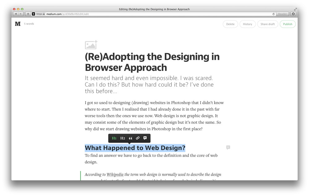
Medium’s editor is simple and limited but enjoyable to use. It has no text-alignment settings or typeface options, and it has only two levels of headings. This way, authors on Medium can be sure that their articles will look amazing.
Another faux pas is aligning paragraphs to the right, which goes against readability rules (except in languages that are meant to be read that way). So, in a Web-based text editor, we could prevent the user from setting this for paragraphs, keeping it for headings, quotations and the like.
Tumblr removes features, too. Aligning text in its editor is impossible because alignment is dictated entirely by the styles.

Another way to limit control is by hiding or displacing features. As we’ve learned, intermediate and expert users are likely to explore features. They will scour all of the menus and options to see what’s available, finding all of the hidden gems. The Tumblr example above demonstrates this for an advanced feature: editing the HTML. WordPress goes even further and hides a dozen features behind a submenu that has to be activated by clicking an icon.

A popular way to limit users is by predefining themes and plugins. A basic user doesn’t want to start from scratch, so guiding them with predefined themes is a good approach. We see this on all major publishing platforms.
The idea is that the designer is the one who creates the theme (or at least sets the typography and general styles). The user simply has to add their content, thus increasing usability.

Another method is place different limits on different users. Basic users could have access to a free version that has basic features. It would feel natural and easy to use. The user would be limited in what they can create — for example, selecting from predefined themes or color palettes or making minor changes. But the tool would satisfy their needs.
Users who aren’t happy with those limits could upgrade to a version that is more flexible and complex. That tool would have advanced settings that make it more useful for intermediate and experts users — for example, creating a custom theme or choosing any colors.

How Do Others Do It?
Let’s compare some of the tools we’ve mentioned.
Publishing Platforms
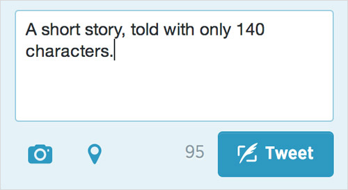
Twitter affords minimal control. In its case, all users embraced the limit, which has made Twitter what it is today: a simple and quick way to share of short messages and ideas. In the beginning, users could merely publish messages with a maximum length of 140 characters.
Later, hash tags, replies, and image and video attachments were added. Twitter has been redesigned recently to look more like Facebook and Google+. Nevertheless, Twitter’s core remains simple and limited, which is why users love it.
Medium is a publishing platform that focuses on high-quality content. The platform itself is limited. But authors achieve what they want within these limits. Medium’s developers want people to write high-quality content in a beautiful, non-distracting environment. Once again, users embraced the limits, and their articles look amazing and are easy to read. It’s a win–win for both sides.
I’ve always thought of Tumblr as a much simpler version of WordPress. For that reason, I’ve never really used it. Tumblr comes with predefined themes and plugins. It’s a very good platform for basic and intermediate bloggers. And authors can create custom themes, so it’s also suitable for advanced users.
WordPress also started simply but quickly grew into a powerful blogging platform. It’s now available in two versions for different target groups: Wordpress.com for basic users, and self-hosted WordPress for advanced users. We’ll take a closer look at WordPress later.
Text Editor
Notepad or TextEdit (depending on your operating system) are probably the simplest text-editing tools. They’re very basic but can be used to do a lot. They can be used to create a document for any language of code — I started coding websites with them. But they’re too basic to really be used for serious coding.
Google Docs is my preferred tool for creating and editing documents because of its balance of features and simplicity. Its features are very similar to those of Microsoft Word and Apple’s Pages, but its interface is much cleaner, so it’s simpler to use. Compare Google Docs to Microsoft Word:
Microsoft Office is, in my opinion, one of the most misused tools. And that misuse leads to frustration. I’ve seen many users who don’t know how to do basic things in Word — such as create a table of contents or set heading levels. Many people still do these things manually.
Presentation Applications
Slid.es is a Web-based tool for creating presentations. The interface is much simpler and cleaner than Microsoft PowerPoint’s. But it’s not as simple as it looks at first sight. Many advanced features are hidden or displaced. The tool is flexible, but its developers have managed to keep the interface simple. For example, a user could end up creating something like this:
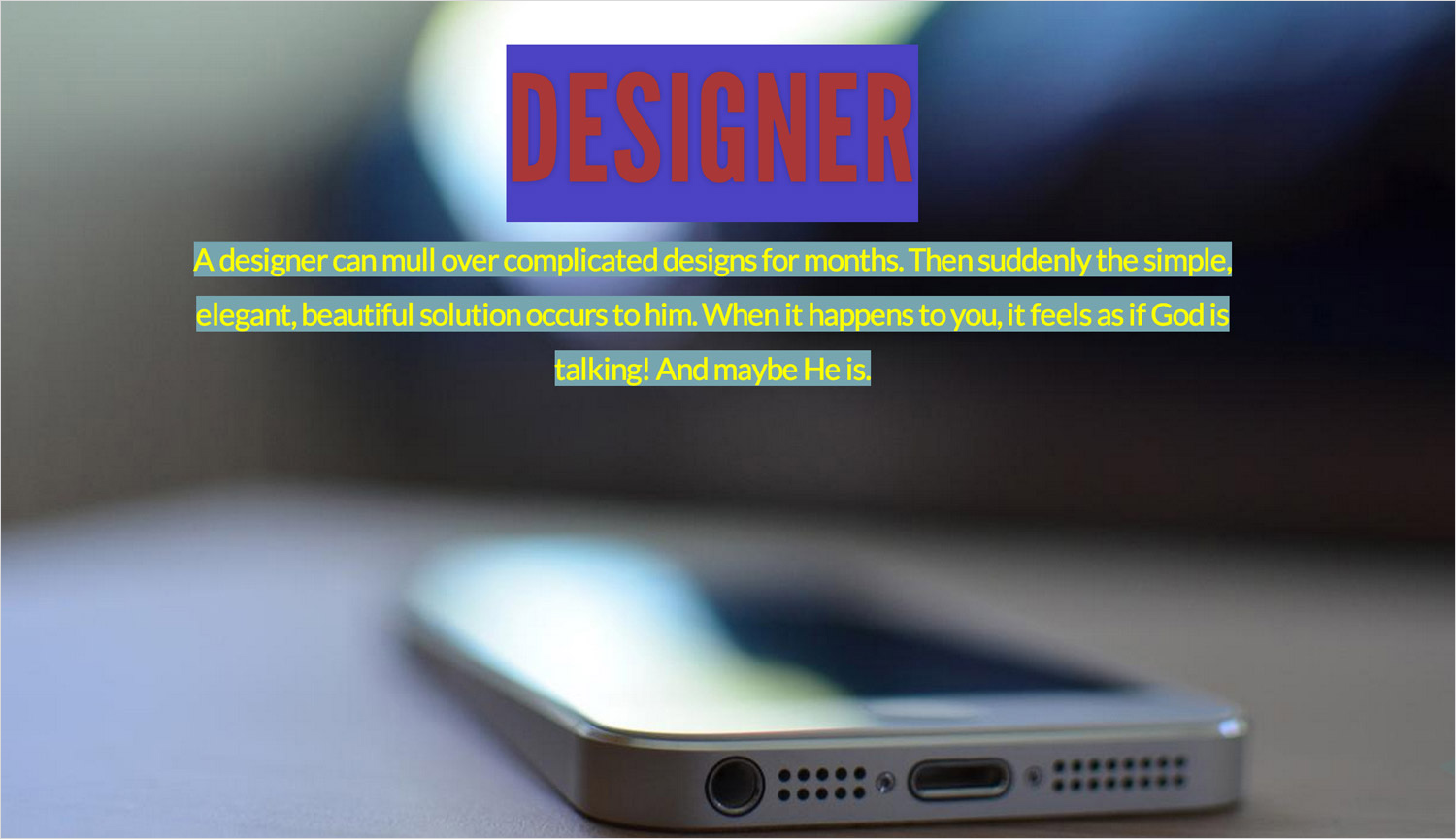
It’s readable and the background photo is nice, but the slide is awful. You don’t want users coming up with that.
PowerPoint is another tool in Microsoft Office that I find too complicated and misused. It’s even more flexible than Slid.es and gives the user almost total control. That’s why so many bad PowerPoint presentations are out there. It’s meant for professionals, but (like Word) is mostly used by people who don’t know how to use it properly. Most users don’t know the principles by which they can create effective presentations.
Limit By How Much?
The question that remains unanswered is how much to limit the user. There’s no right answer. The only way to answer it is to find that sweet spot for yourself. But here are some ways to go about that.
Research And Start Simply
Before doing anything else, research thoroughly. Find out what competing tools are already out there. What do people use them for mostly? What problems do they have with them? Find out by researching the support forums for the products.
Also, define your target users. While designing for intermediate and expert users is easier, most users are at a basic level.
Start with a simple idea and create a prototype. In doing so, cut features that aren’t necessary, especially ones that complicate your product without adding much value.
Test With Target Users
The next step is to test with basic users. Test early and test often to see whether you’re missing your goals. A/B testing is perfect for this. Send a simple version of your product to one group of users and another more flexible version to another group. The feedback you get will be priceless. You might find that the product should fall somewhere between the two versions.
Remove What’s Unnecessary, Add What’s Needed
If you find that some features distract users or are not deemed useful, remove them. If most users want a particular feature, consider adding it. But remember that users don’t always know what they want. Also, add features that you think users would find useful or that would solve a problem for them (if prototype testing has proved it).
Allow Intermediate And Advanced Users To Customize
Once basic users are happy, consider adapting the tool into a professional version. This is a cool way to get advanced users on board.
What About Advanced Users?
"Experts are rarely insulted by something that is clear enough for beginners. Everybody appreciates clarity." – Steve Krug
We mentioned that advanced users are more likely to seek out features. Steve Krug believes that advanced users appreciate simple products, too. If you include advanced features in the pro version of your product, or as a customization, you could convince advanced users to try it out.
Allow Customization
Advanced users could grow frustrated with your limits. To satisfy their needs, consider allowing for customization.
I consider myself an advanced user, and I found Wordpress.com too limiting. So, I went for the ultimate in customization by downloading the WordPress software and setting up a self-hosted website.
That’s what advanced users like. They will take the time to explore features, customizing an application to its core. They want to be able to change it. The basic version of the product simply won’t do it for them. Allow them to break the limits set for basic users.
Ideally, we would offer three levels of customization. WordPress is a good example again:
- Select color palette, make minor theme customizations Users on Wordpress.com may select a color palette for their website and change the image for their header section, logo, etc.
- Select themes and plugins On Wordpress.com and self-hosted WordPress websites, users may install themes that completely change the look of their website. They may also install plugins that add features to the website.
- Create themes, customize core features, add features The most advanced users get the highest level of customization. They may download WordPress, manually install it on their own server and customize it however they want. They may also create their own themes, develop their own plugins and even change WordPress’ core files.
WordPress shows that satisfying the needs of all three types of users is possible. It started as a simple publishing platform but has evolved into much more. Its high level of customization make it very suitable as a content management system, but only for advanced users. The version served to different user groups can and should vary.
But My Client Wants Features!
Every designer has been there: working on a project for an enthusiastic client who has a lot of crazy ideas for features. It’s a tough position to be in. Perhaps this client will take your career to a new level. If so, do you have to do whatever they say? How do you convince them that starting simply is best, that fewer choices is better than many?
- Cultivate a relationship based on respect and your authority as the designer. They are paying you for your knowledge and experience, so let yourself be heard. The designer’s job is not to say yes to every crazy idea. If you’re not afraid to say no, then they won’t see you as their puppet. Tell them that you’re a designer, not a pixel pusher. Believe me, it works.
- Back up your arguments and advice with examples. Show them examples of simple products that people love. Explain to them why they work and why people love them so much. The products don’t have to be related to theirs — you just have to prove your point.
- Remind them that simpler is less expensive. Explain to them that starting with a simple product means lower costs and a more flexible foundation on which to build. If they realize later that they’ve completely failed to define their product, then restarting will be easier — and more cost-efficient, too.
Our Limits
"Enabling everyone to automatically earn money with their knowledge, skills and stories." Wondermags’ vision statement
We decided to start with a simple and limited product. We’ll eventually have testing sessions and a closed beta version. The goal is to see whether our tool is simple enough for basic users and to see what kinds of products those users come up with. Based on the results, we’ll make adjustments.
Once we decide who our basic users are, we’ll guide them with instructions (as few as possible) and by limiting their control. Here are a few ways we plan to provide an enjoyable experience.
Removing Features
We decided to allow users to choose a color palette for the background, text and text background, rather than pick any color. The idea is to prevent them from coming up with something like we saw in the Slid.es example above. The colors, borders, buttons and so on will be completely predefined by styles.

Predefined Styles
The other limitation is popular with digital publishing platforms. The user selects from a range of predefined styles, which then apply a color palette, typefaces, margins and borders to the content.

Predefined Plugins
The magazines on our platform will be put together with blocks of predefined plugins. The user will put their magazine together piece by piece, filling in the content very simply.

Different Limits For Different Users
Features will be added in future releases, and the platform will be available in basic and pro versions. The pro version will provide more control for advanced users.
Customization
Finally, we allow advanced users to create their own styles, similar to WordPress, Tumblr and other publishing platforms.
Simple Tools As Extensions Of Ourselves
In this article, we’ve covered the following:
- Users want to create beautiful and useful products but usually don’t know how.
- The designer’s job is to find the balance between providing flexibility, usability and guidance to the user.
- Providing instructions and limiting control are two ways to guide the user.
In the end, it all depends on what you’re building and for whom. The general population finds simple tools more useful and easier to use. Overloading a complex product with instructions that people won’t have time to go through is a very bad idea. People are being forced to use software at work that frustrates them, but they try to cope. Do we really want our users to cope with the tools we design for them?
"The more complexity there is in the market, the more that something simpler stands out. And because technology will only continue to grow in complexity, there is a clear economic benefit to adopting a strategy of simplicity that will help set your product apart." – John Maeda
Designers have to find that sweet spot between flexibility and control. Users should get an enjoyable experience and be able to create a useful product with the tool. Our tools should be an extension of people’s lives, not the other way around.
Further Reading
- Client Experience Design
- All You Need To Know About Customer Journey Mapping
- The Realities Of UX Design Within The Luxury Industry
- 10 Principles Of Effective Web Design


