Breakpoints And The Future Of Websites

Email Newsletter
Weekly tips on front-end & UX.
Trusted by 200,000+ folks.

 Register!
 Flexible CMS. Headless & API 1st

When the iPhone came out in 2007, the demonstration of its web browser by the late great Steve Jobs gave the not-so-subtle impression that Apple wasn’t too perturbed about its users pinching to zoom and swiping to scroll as part of the browsing experience. Responsive web design aimed to solve this problem by smartly applying flexible grids, fluid layouts and, of course, media queries.
However, responsive web design has turned out to be somewhat of a case study in the law of unintended consequences, with one of the perverse unanticipated effects being breakpoint paranoia. But even without the undue influence that media queries exerts on your selection of these breakpoints, it dawns on you after much introspection that these might not be the droids we’re looking for.
In this article, we’ll look at breakpoints beyond screen size and explore different possibilities and practical approaches to using them to create truly adaptive experiences on the web.
Threshold Dynamics
A threshold is the point or level at which something begins or changes. Thresholds can be found and felt virtually everywhere in the physical world: stopping at a traffic light, choosing skimmed milk over full cream, two sugars instead of three, uncouthly opting out of the teacup ride at Disney World, etc.
Thresholds define us because they define actions, and actions determine outcomes. Being able to identify the right thresholds sets you on a course for better outcomes, especially when you know exactly what needs to be done within each threshold. It’s akin to doing the right thing at the right time.
Our foresight to conceptualize — and enable — new thresholds where there were none will open up a new vista of actions vis-à-vis outcomes. The freedom and flexibility we acquire from this will only help to fulfill our innate desire for incremental awesomization, which will drive us to create even better websites that provide better user experiences.
Today’s Breakpoints
In web design today, the thresholds we fixate on the most relate almost exclusively to screen size. The major challenge over the last few years has been designing for mobile devices, and, with screen size being the obvious focal point, our primary intent has been to adapt the layout of our web pages to tally with the specific display characteristics of the target environment.
In responsive web design, the predominant method of defining these breakpoints is by setting media queries.
@media screen and (min-width: 240px) and (max-width: 320px){
   body { background: red; }
}
The markup above clearly identifies two thresholds (240 pixels and 320 pixels) that constitute a range within which an action will be triggered (in this case, changing the background color to red). It’s quite straightforward in concept.
Medusa Queries
“As we augment the abilities of people to accomplish their tasks, we should be careful not to needlessly curtail what they can do.” – Jeremy Keith
Media queries, it turns out, are extremely rigid. Usually, you are forced to employ breakpoints in ways that are not exactly intuitive nor inline with your core design aspiration. In other words, you have to fit your design aspiration to its capabilities. So, you may have a vibrant imagination about your own thresholds, but more than likely media queries won’t let you apply them the way you envisage.
Defenders of media queries should understand that efficiency is what makes any effective effort laudable. Spending many minutes or even hours tweaking those pesky directives and then having to re-tweak them each and every time you want to make an adjustment is nothing short of a recursive nightmare. What’s so wrong with setting breakpoints based on broad categorizations of mobile devices (such as smartphone, tablet, etc.)?!
In the article “Designing for Breakpoints,” Stephen Hay suggests defining breakpoints based on device classes. Spurred by a few assertions, I embarked on a mini-research project that I later converted into a blog post to prove this right or wrong. And in a recent poll that I conducted on whether media queries should target device classes, about 54% of respondents said yes. But there’s no intuitive way to do this with media queries even if you wanted to.
In my humble opinion, from the web designer’s standpoint, the feature set of media queries is incomplete. And it is so because designers have an imagination and an appetite for many more breakpoints than media queries can currently provide (and probably ever will in future).
The New Breakpoints
As mentioned a little earlier, our ability to find and set new thresholds will determine our ability to conceptualize new actions that we can set a trigger to. By so doing, we can introduce more tweaks into an inherently static and inflexible environment.
Breakpoints In Contextual Web Design
The websites of tomorrow have to be more than responsive — they have to be contextual, too. These concepts of flexibility and fluidity have to transcend screen size. The age of the one-size-fits-all website will have to come to an end and be replaced by websites that also adapt to the needs and expectations of users.
To enable this feature, we have to conceptualize more thresholds, but first we need to find out what parameters to track. In Nick Finck’s insightful presentation on “The Contextual Web,” he highlights four aspects of context in web design: user, task, environment and technology. Of course, all four are a treasure trove of extrapolations, but what should we really focus on?
We could ask literally hundreds, even thousands, of questions about users, their tasks, their environment and what technology they have access to. However, we have to base these questions on our current and overt abilities to obtain data on these four parameters. Some possible questions could be:
- What are the physical abilities of the user? If the user is vision-impaired or hearing-impaired, we would need to add more accessibility features that would enhance their experience.
- Where is the user’s general location? Knowing where the user is gives us a good idea of their culture, economic status, demographic, etc.
- What time is it in the user’s location? People are usually creatures of habit and are probably more likely to perform certain actions at a certain time.
- What is the user’s device? A phone is not a tablet, and a tablet is not a PC. Different devices have different capabilities and will be used for different tasks.
- What does the user have an affinity for? What the user likes (and dislikes) will play a strong part in helping us to prioritize and deliver content.
There are ways to answer the questions above with the technology available in browsers today. And if not, then we really need to work harder to build them in, especially considering an issue as important as accessibility.
So, how would we design a website to be contextual? How would we visualize breakpoints in a contextual sense? Here’s one scenario.
Let’s suppose that it’s 6:00 in the morning, and your alarm goes off. You hobble to your kitchen to get some breakfast, before getting ready and heading out to work. You fancy eggs, but you open the fridge and there are no eggs. So, you settle on something else, but you want to order some groceries so that they’re ready to be picked up on your way back from work. You fire up the website of an extremely large department store chain from your Internet-connected refrigerator to get this done.
Are you impressed simply because this website is responsive? Is getting the best deal on electronics a priority for you at this point? Do you really want to be reminded that some of the few items you “recently viewed” on said website were Lincoln Logs and a Spider-Man toothbrush holder? I mean, it’s 6:18 am, and you’re browsing from a fridge. Does it take a rocket scientist to figure out that maybe grocery items should be a category worth prioritizing?!
I’m sure there are numerous other scenarios like this, and it’s easy for someone who isn’t familiar with web technology to get frustrated with how websites still seem to fall short of their expectations. But for those of us who do, should we still be making excuses, or should we be trying to push the envelope further?
The New Methods
“Media queries allow authors to test and query values or features of the user agent or display device, independent of the document being rendered.” – Editor's Draft, W3C (3 June 2014)
I was recently perusing the “Media Queries Level 4” draft specification to get a sense of where things are headed. I must say that I’m not very excited with the direction, and there just doesn’t seem to be much innovation here.
From the abstract of the document, we get a clear definition of what media queries are as a method. However, I just can’t understand why there is no evolution of media features to reflect present — and possible future — realities.
What’s wrong with having device-class media features like phone or tablet? They seem like obvious choices, and, according to the poll referred to earlier, web designers want that feature set. Some would argue that those might not be “things” in the future, but that is hardly believable, given that cars, TVs, computers, refrigerators, watches and spectacles are still “things” that people find useful today. And when are we really going to see a resolution to the question of element queries?
In my opinion, media queries (as a tool for web design in a multi-device world) simply can’t maintain any sort of equilibrium with the creative trajectory of contemporary web designers, and they are a morally indefensible standard for web design going forward. Maybe we should look at alternative approaches; I’d like to suggest a few. They’re not that complicated, and all we’d need are a HAT, a COAT and a TIE.
HAT Trick
We’re probably all familiar with CSS class selectors at this point. They are one of the most commonly used selectors in web design.
.muttley .do_something {…}
What I don’t understand is why we don’t use these classes more than media queries to build mobile-friendly websites?
It seems to me that designing websites for many different situations would be so much easier and faster if browsers employed HTML attribute tagging (HAT). Basically, this would involve the browser placing specific parameters in the class attribute of the <html> tag (in the process of the page being loaded), which would enable the web designer to leverage these classes in their CSS markup.
Some of these parameters could include the following:
- device group fixed, mobile, home, wear, auto, etc.
- device class. PC, phone, tablet, TV, fridge, car, watch, etc.
- input device coarse, fine
- bandwidth high, medium, low
- orientation portrait, landscape
- viewport width and height in device-independent pixels, to the nearest multiple of 40, with an alphabet prefix for compliance
- local date and time in
ddmmyyyyformat for date, and 24-hour representation for time - time zone UTC offset
- general geo-location continent and country codes
More parameters could be added based on anticipated need. In addition, all parameters would be abstracted to the DOM window object to make them easily accessible via JavaScript.
So, suppose someone was using a Nexus 5 phone over a 4G LTE mobile network. The browser would add the relevant tags to the page, leaving us with this:
<html class="mobile phone coarse high portrait v360w v640h d07052014 t0900 utc_a af_ng">
And if they changed the phone’s orientation to landscape, the browser would statefully update the tag, giving us this:
<html class="mobile phone coarse high landscape v640w v360h d07052014 t0900 utc_a af_ng">
If this happened, the web designer would have a lot of options to quickly adapt their web pages across numerous logical breakpoints at literally the speed of thought. Let’s consider one working example.
I was recently testing a pricing table that is not unlike tables seen on a lot of SaaS websites these days. The table is three columns and is built using ul tags with floated li tags.
Below the pricing table is some FAQ content, also with a multi-column layout.
Obviously, these multi-column elements would not look as good on all mobile devices as they would on a desktop. So, in the spirit of responsive web design, we would have to adapt them to the dimensions of a smaller screen. And the way we would do this is by showing these two visual components in their full multi-column glory only when the web page is being viewed on a tablet in landscape orientation.
The logic behind this is that we would expect a tablet in that orientation to have enough screen space for the whole table to appear as intended. If those conditions are not met, then we’ll collapse the columns to be linear and vertical.
The basic CSS for our pricing table is this:
ul {
   margin: 0;
   padding: 0;
   list-style: none; }

ul li {
   float: left;
   width: 33%; }
So, leveraging HAT, we would implement these features using the following markup:
.mobile ul li {
   float: none;
   width: 100%; }

.mobile.tablet.landscape ul li {
   float: left;
   width: 33%;}
That’s it! Just disable the floated layout elements for all mobile devices, and then re-enable them for tablets in landscape orientation. Simple aspiration, simple solution. Do you want to try doing the same thing with media queries? Say hello to Dr. StackOverflow for me!
Clearly, employing this approach has benefits. Efficiency is one major benefit; you’d spend less time building websites because you wouldn’t be wasting ridiculous amounts of time crafting media queries, not to mention all of the testing of mobile devices that goes along with that. Secondly, maintaining your markup would be easier because everything would be inline and there would be no needless duplication. Thirdly, you would have the opportunity to explore many more use cases because there would be more parameters that serve as thresholds for more logical breakpoints.
COAT Of Many Colors
Everyone seems to be fascinated by analytics. Website analytics programs, such as Google Analytics and MixPanel, all try to give a good picture of who has visited your website, how long they stayed, what websites they came from, what devices they used, etc. What this data won’t tell you is what content the visitors have an affinity for.
You could, of course, use cookies to track visitors to your website, but then you’d only be able to determine what they like on your website that day or week or month. You wouldn’t be able to accurately determine the specific content they care about, nor might you be able to do anything about it before they leave.
Tracking content affinity and adapting content to said affinity could really help us build websites that truly adapt to people’s desires. To really obtain this data, though, the data-collection mechanism needs to transcend any one website. That is, all websites would need to build this affinity profile in a collaborative and transparent way.
COAT stands for “cumulative and open affinity tagging.” It’s simply a shared method of understanding the things visitors have an affinity for and then building a profile of that affinity. Here’s how it would work:
- Someone visits a bunch of websites regularly. Some are news websites, some are sports websites and some are blogs. Each web page would have a
COATmeta tag. - The browser (via a COAT sub-engine) would read this meta tag and incrementally store its value in a reserved, protected and read-only localStorage variable (which could be named anything) in a comma-delimited format. So, for the websites that our user visits, the value might be
news:info:1,sports:soccer:2,blog:tech:3. - If the person visits another sports-related website, the website would read (and update) their affinity tag from localStorage. It sees that the person is amenable to football, and so gives more priority to football content on the home page.
Armed with this insight, we could tweak a website’s home page to better cater to the different needs of users in a highly specialized way.
COAT data would comprise a single comma-delimited string in the following format:
{category_1}:{sub_category_1}:{popularity_1},…,{category_n}:{sub_category_n}:{popularity_n}
Here, category is the broad classification of a type of content; sub_category enables further classification; and popularity is a measure of the frequency of visits. So, if our user visited a tech blog 30 times a month and visited the football section of a sports website 5 times a day, then we would end up with this tag:
blog:tech:30,sports:soccer:150
This is merely an example; the classification system would be defined and maintained by the greater web community. A number of safeguards would be in place, too. For example, if a website didn’t define a COAT meta tag, then it wouldn’t be able to read one either. Also, if the user was browsing in private mode, then COAT would be disabled.
COAT wouldn’t track any personal information. The intent is not to figure out who a person is and where they might be, but to get a broad picture of the kind of content they like (and how much they like it), so that websites are able to personalize their browsing experience.
TIE In
Let’s face the fact: JavaScript is awesome. It’s not very approachable to most web designers, but its capabilities are simply immense, and it holds the key to websites doing great things in the future, even as its contribution to website functionality today is not in question.
HTML and CSS are a great duo for building websites, having been so for quite a while now. However, only HTML seems to have been allowed to maintain a relationship with JavaScript. Granted, CSS is “a style sheet language used for describing the look and formatting of a document.” But as things stand today in a world dominated by web-enabled devices, a lot of the factors that determine the look and feel of a website have gone beyond the realm of CSS.
As a result, CSS needs to be allowed to “friend” JavaScript and ask for its help in performing certain tasks. There really should be a way to link Javascript functionality directly with inline CSS rules. One way would be via transcendent inline expressions (TIE). TIE would provide a mechanism of linking CSS rules with JavaScript expressions, opening up even more amazing opportunities for website functionality.
Let’s look at a simple example. Suppose we had a testimonials component in the sidebar of our home page:
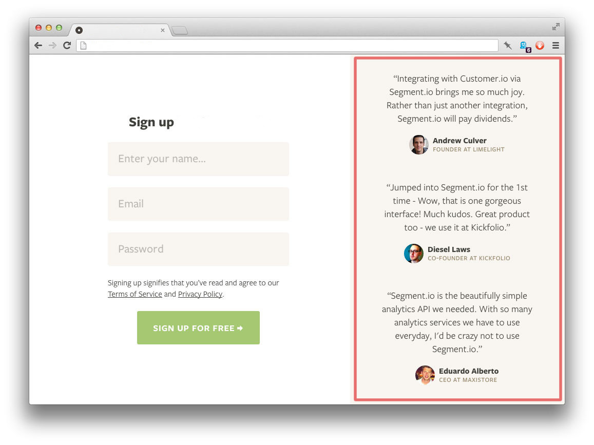
We want to drop this same component into the main content area of another page, somewhere where we have more width to work with:
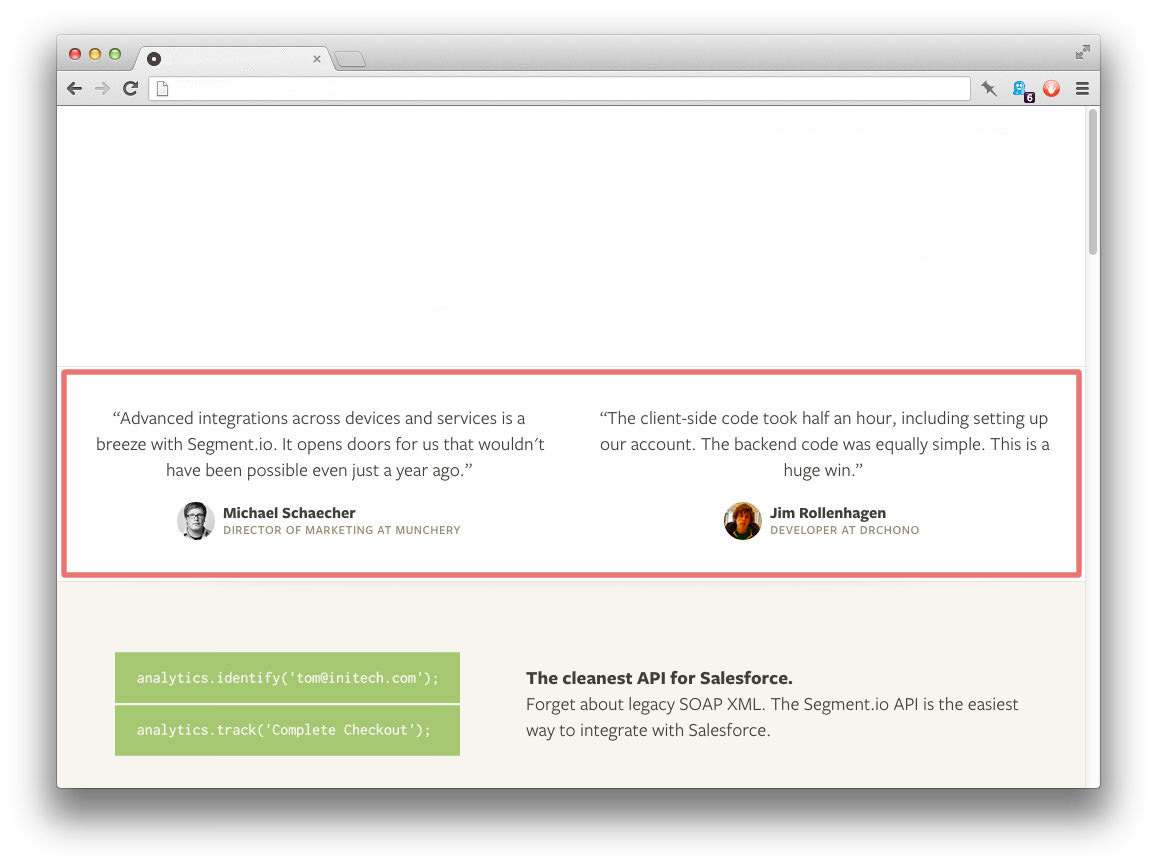
This is called modular design, and conceptually it’s a very simple idea. However, we’d have a pretty hard time implementing this in CSS (as Ian Storm Taylor found), because there isn’t a straightforward way to apply CSS styles to the testimonials component based on the size of its container.
This scenario is what has sparked the clamor for element queries, the overriding need being a way to define reusable modules that adapt to the size of their containers. If CSS natively implemented some sort of TIE functionality, then we might be able to write a simple expression in CSS to make this happen:
.testimonial { … }
.testimonial[expr="if @parent:width less than 200px"] { … }
.testimonial[expr="if @parent:width between 200px and 500px"] { … }
For the first ruleset, we would style .testimonial as usual. For the second ruleset, the expression could mean that, when the width of the parent element of .testimonial is less than or equal to 200 pixels, then apply the corresponding declarations to that DOM element (i.e. the parent element). The same goes for the third ruleset, whereby the declarations are applied when the parent element has a width of 201 pixels to 500 pixels.
Basically, CSS would merely provide guidance on what to do, while JavaScript would do the heavy lifting that CSS isn’t well suited for. Instead of writing the CSS rulesets for styles and then jumping over to JavaScript to activate them, we would simply do both via an expression in CSS. Because we’re working on the same DOM element, it makes sense for there to be some easy and intuitive way to both style and activate it (i.e. the DOM element) directly from CSS.
Any such TIE implementation should be robust enough to enable web designers to implement features at virtually the speed of their creativity. In other words, if they can imagine it, designers should be able to achieve it — or something close to it — almost instantaneously.
Putting It All Together
Let’s consider a scenario that shows how all three would fit together when building a website.
By the time you read this, the World Cup will be on, and football fans from around the world will have gathered in Brazil to experience the thrills of the Copa Mundial. Let’s assume you are one of those fans and are in Sao Paolo, having brought your smartphone and Google Glass with you.
A popular online sports destination that happens to be covering the event would usually blanket its website with World Cup features at the expense of other sports events going on elsewhere in the world. The website will employ the three methodologies explained earlier in order to deliver a very special user experience.
After building various content components, the website’s developers should be able to do a few things without much stress:
- Optimize the website exclusively for Google Glass, providing a simpler, slimmer interface for easier navigation. In addition, adapt the color contrast to the time of the day (i.e. switching to light text on a dark background at night), using the device-class parameters of HAT.
- Provide more content on local attractions in different cities in Brazil (for example sports bars, other viewing centers, etc.) only if the access device is a smartphone or tablet and happens to be in Brazil (using the location parameters of HAT).
- Lead with pre-game analysis, team and player profiles, and merchandise if the user visits the website within six hours of an upcoming match (using the time parameters of HAT in combination with TIE).
- Lead with match highlights and post-game analysis if the user visits the website within 12 hours after a match ends. Provide different layout designs for match highlights on smartphones and tablets using the same code base (using the device-class parameters in HAT).
- Lead with golf features in a more prominent location than football if we determine (via COAT) that the user likes the former more than the latter. But still display match highlights in a sidebar with a narrower pixel width (styled in a modular fashion using the TIE features in CSS).
- Default to the regular format of content if we can’t determine whether the user prefers football or another sport.
As you can see, the permutations and opportunities of a highly personalized and carefully weighted user experience are abundant and easily implementable if all three methodologies are considered. We wouldn’t necessarily have to use them all, but it’s nice knowing that they’re there if we wanted to.
The Polyfill Way
“You can’t always get what you want. But if you try sometimes, you just might find, you get what you need.” – The Rolling Stones
Where would the web design community be without polyfills? Even the best-intentioned technology doesn’t always work as intended, and sometimes it has gaps in functionality. “Just chill and polyfill” would be the operative mantra in these situations, and the last few years have indeed been a veritable polyfill-palooza.
All of the features outlined so far in this article are merely ideas and are not earmarked in any upcoming draft specifications of CSS or media queries, so you couldn’t use them right now even if you wanted to. However, that doesn’t mean we can’t do something about it in the meantime.
Restive.JS
I mentioned earlier that I was using a plugin to build a website. Well, that would be Restive.JS, a jQuery plugin that I developed about a year ago that embraces and implements the HAT principle. Using built-in options of breakpoints, classes and a special feature named turbo_classes, Restive.JS populates your <html> or <body> tag class attributes with values that make it easy for you to adapt a web page’s layout via inline CSS to more natural design cues.
Once you get the basic idea, using it to build new responsive and adaptive websites is pretty easy, as is adding said features to existing websites. I recently wrote a tutorial on “How to Make Any Website Responsive,” which you can peruse at your leisure.
You can also learn more from the GitHub readme.
A Note On Tolerance
As creative and technical professionals, we need to be open to other people’s opinion. Often a crowd will move towards a position simply because of punditocratic consensus, without pausing to question the fundamental reasoning behind it.
Take device detection. Some say it’s a bad practice. My question is why? Is it because it is deemed unreliable? We can make it reliable. Is there a fear that it is not performant? Then we can cache data. Solving big problems should be an inclusive effort, and using the process of elimination to rule out methods could come back to bite us if someone is able to improve on that method.
Creativity is an insatiable hacker. As long as imagination continues to spur the industrious, then the best tools and methods will eventually give way to better ones. Maintaining a clear and tight focus on the task at hand — and its successful completion — shouldn’t prevent us from being robust with our toolset. As the great Abraham Maslow said, “If all you have is a hammer, everything looks like a nail.”
In Closing (But Moving Forward)
More of everything isn’t necessarily a good thing. But, when it comes to breakpoints, “the more the merrier” does ring true. As humans, we take actions based on specific triggers between specific thresholds. Defining more of these thresholds would open up opportunities to create websites that adapt in so many ways beyond screen size, and that exploration will turn out to be instructive.
However, as we open up new frontiers with new breakpoints, we should do so in a way that is both user-friendly and efficient for the web designer; the robustness of our methods shouldn’t make us less nimble. With the way web standards work, we’re probably going to have to polyfill our way to the promised land. But that shouldn’t stop us from building awesome websites that work on every device and in numerous user scenarios.
Front page image credits: Restive Blog.
Further Reading
- Looking Beyond Common Media Query Breakpoints
- Logical Breakpoints For Your Responsive Design
- Automatically Art-Directed Responsive Images? Here You Go.
- Creating Content Wireframes For Responsive Design
 (al, ml, mrn)

