You May Be Losing Users If Responsive Web Design Is Your Only Mobile Strategy

Email Newsletter
Weekly tips on front-end & UX.
Trusted by 200,000+ folks.


 Flexible CMS. Headless & API 1st

You resize the browser and a smile creeps over your face. You’re happy: You think you are now mobile-friendly, that you have achieved your goals for the website. Let me be a bit forward before getting into the discussion: You are losing users and probably money if responsive web design is your entire goal and your only solution for mobile. The good news is that you can do it right.
In this article, we’ll cover the relationship between the mobile web and responsive design, starting with how to apply responsive design intelligently, why performance is so important in mobile, why responsive design should not be your website’s goal, and ending with the performance issues of the technique to help us understand the problem.
Designers and developers have been oversimplifying the problem of mobile since 2000, and some people now think that responsive web design is the answer to all of our problems.
We need to understand that, beyond any other goal, a mobile web experience must be lightning fast. Delivering a fast, usable and compatible experience to all mobile devices has always been a challenge, and it’s no different when you are implementing a responsive technique. Embracing performance from the beginning is easier.
Responsive web design is great, but it’s not a silver bullet. If it’s your only weapon for mobile, then a performance problem might be hindering your conversion rate. Around 11% of the websites are responsive, and the number is growing every month, so now is the time to talk about this.
According to Guy Podjarny’s research, 72% of responsive websites deliver the same number of bytes regardless of screen size, even on slow mobile network connections. Not all users will wait for your website to load.
With just a basic understanding of the problem, we can minimize this loss.
Mobile Websites Are From The Past
I’m not saying that you should not design responsively or that you should go with an m.* subdomain. In fact, with social sharing everywhere now, assigning one URL per document, regardless of device, is smart. But this doesn’t mean that a single URL should always deliver the same document or that every device should download the same resources.
Let me quote Ethan Marcotte, who coined the term “responsive web design”:
“Most importantly, responsive web design isn’t intended to serve as a replacement for mobile web sites.” — Ethan Marcotte
Responsive, Mobile And Fast
We can gain the benefits of responsive design without affecting performance on mobile if we use certain other techniques as well. Responsive web design was never meant to “solve” performance, which is why we can’t blame the technique itself. However, believing that it will solve all of your problems, as many seem to do, would be wrong.
Designing responsively is important because we need to deal with a range of viewport sizes across desktop and mobile. But thinking only of screen size underestimates mobile devices. While the line between desktop and mobile is getting blurrier, different possibilities are still open to us based on the device type. And we can’t decide on functionality using media queries yet.
Some commentators have called this “responsible responsive web design,” while others consider it responsive web design with a modern vision. Without getting into semantics, we do need to understand and be aware of the problem.
While there is no silver bullet and no solutions that can be applied to every type of document, we can use a couple of tricks to improve our existing responsive solutions and maximize performance:
- Deliver each document to all devices with the same URL and the same content, but not necessarily with the same structure.
- When starting from scratch, follow a mobile-first approach.
- Test on real devices what happens when resources are loaded and when
display: noneis applied. Don’t rely on resizing your desktop browser. - Use optimization tools to measure and improve performance.
- Deliver responsive images via JavaScript while we wait for a better solution from browser vendors (such as
srcset). - Load only the JavaScript that you need for the current device with conditional loading, and probably after the
onloadevent. - Inline the initial view of a document for mobile devices, or deliver above-the-fold content first.
- Apply a smart responsive solution with one or more of these techniques: conditional loading, responsiveness according to group, and a server-side layer (such as an adaptive approach).
Conditional Loading
Don’t always rely on media queries in CSS because browsers will load and parse all of the selectors and styles for all devices (more on this later). This means that a mobile phone would download and parse the CSS for larger screens. And because CSS blocks rendering, you would be wasting precious milliseconds over a cellular connection.
Replace CSS media queries with a JavaScript matchMedia query on devices whose context you know will not change. For example, we know that an iPhone cannot convert to the size of an iPad dynamically, so we would just load the CSS for it that we really need.
We can also use feature detection, such as with Modernizr, to make smarter decisions about the UI and functionality based not only on screen dimension.
Responsiveness According To Group
While we can rely on a single HTML base and responsive design for all screens when dealing with simple documents, delivering the same HTML to desktops and smartphones is not always the best solution. Why? Again, because of performance on mobile.
Even if we store the same document server-side, we can deliver differences to the client based on the device group. For example, we could deliver a big floating menu to screens 6 inches and bigger and a small hamburger menu to screens smaller than 6 inches. Within each group, we could use responsive techniques to adapt to different scenarios, such as switching between portrait and landscape mode or varying between iPhones (320 pixels wide), 5-inch Android devices (360 pixels) and phablets (400 pixels and up).
Server-Side Layer
The last optional part of a smarter responsive solution is the server. Server-side feature detection and decisions are not new to the mobile web. Libraries such as WURFL and Device Atlas have been on the market for years.
Mixing responsive design with server-side components is not new. Known sometimes as responsive design and server-side components (RESS) and sometimes as adaptive design, it improves responsive design in speed and usability, while keeping a single code base for everyone server-side.
Unfortunately, these techniques haven’t gained much traction in the community over the last few years. Just look at any blog or magazine for developers and compare mentions of “RESS” and “adaptive” to “responsive.” There’s a reason for that: We are front-end professionals. Anything that involves the server looks like a problem to us, and we don’t want that.
In some cases, the front-end designer will be in control of a script on the server; in other cases, a remote development team will manage it, and the designer won’t want to deal with the team every time they want to make a small change to the UI. I know the feeling.
That’s why it might be time to think of a new architecture layer in large projects, whereby a front-end engineer can make decisions server-side without affecting the back-end architecture. Node.js is an excellent candidate for this platform, being a server-side layer between the current enterprise back-end infrastructure and the front end.
In this new layer, the front-end engineer would be in charge of decisions based on the current context that would make the experience fast, responsive and usable on all the devices, without touching the back-end architecture.
Responsive Design, Performance And Technical Data
You might have some doubts by this point in the article. Let’s review some technical details to allay your concerns.
Responsive design usually entails delivering the same HTML document to all devices and using media queries to load different CSS and image files. You might have a slightly different idea of what it means, but that is usually how it is implemented.
You might also think that mobile networks today are fast enough to deliver a great experience. After all, 4G is fast, and devices are getting faster.
Well, let’s see some data before drawing conclusions.
Cellular Connections
4G networks are not available everywhere, and even if the whole world was on a 4G network today, the situation might not be what you expect. Less than 3% of mobile phones out there are on a 4G connection. Taking only the US, the number of 4G users has reached approximately 22%, and even those lucky users are not on 4G 40% of the time.
We usually think of mobile network speeds in terms of bandwidth. With 3G, we get up to 5 Mbps; with 4G, we get up to 50 Mbps. But that’s not usually the most important factor in a mobile web browsing experience. While more bandwidth is useful for transferring big files (such as a YouTube video), it doesn’t add much value when you’re downloading a lot of small files and the latency is high and fixed. Latency is the round-trip time that the first byte of every package takes to get to a device after a request.
Cellular networks have more latency than other connections. While the latency on a DSL connection in a US home is between 20 and 45 milliseconds, on 3G it can be between 150 and 450 milliseconds, and on 4G between 100 and 180. In other words, latency is 5 to 10 times higher on a cellular connection than on a home network.
Other issues include the latency when there is a change in radio state, the dead time when a phone turns on the radio to get more data after having been asleep, the lower available memory on average devices and, of course, battery and CPU usage.
Responsive Design On Cellular Networks
Consider a real case. Keynote, a company that offers performance solutions, has published data on the website performance of top Super Bowl 2014 advertisers. The data speaks for itself: On a wired or Wi-Fi connection, the loading times range from 1 to 10 seconds, while on a cellular connection, the loading times range from 5 to 60 seconds. Think about that: one full minute to load a website being advertised in the Super Bowl!
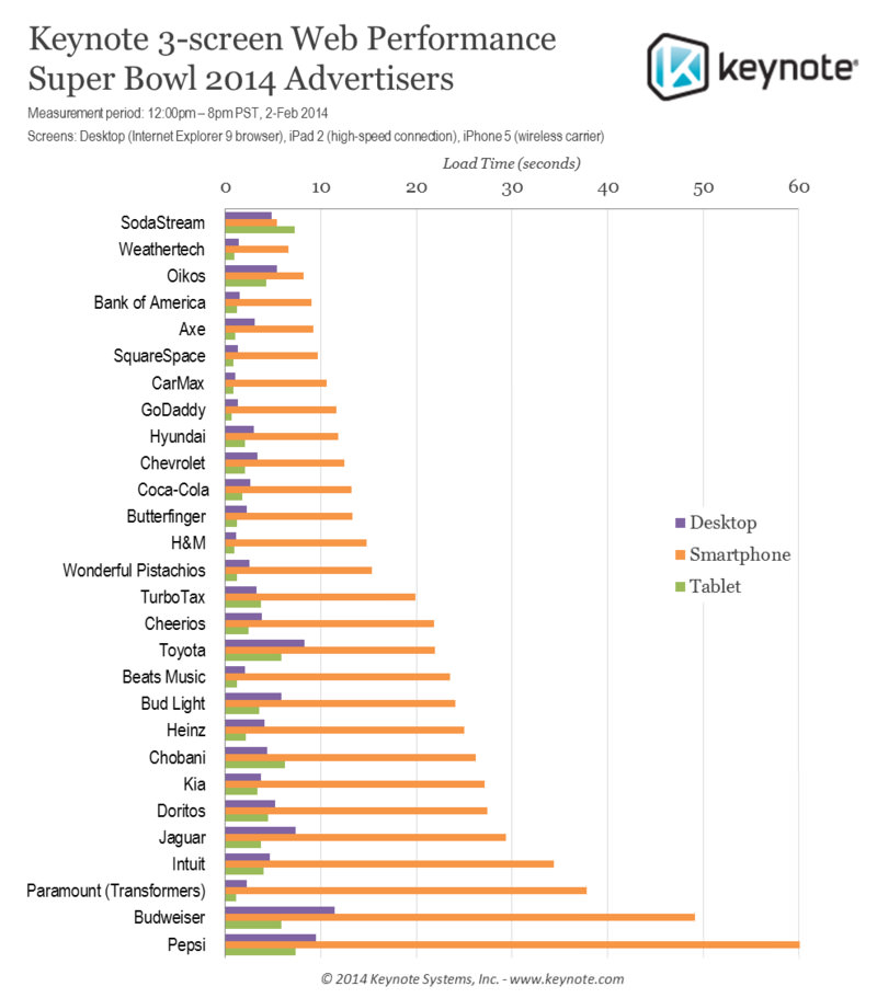
The same report shows that 43% of those websites offer a mobile-specific version, with an average size of 862 KB; 50% deliver a responsive solution, with an average size of 3211 KB (nearly four times larger); and 7% offer only the desktop version to mobile devices. So, by default, responsive websites are larger than mobile-specific websites.
Of course, responsive design can look different, but, unfortunately, the average responsive website out there looks like these ones of Super Bowl advertisers.
Cloud-Based Browsers
If you still doubt that performance is a problem on the mobile web, consider that browser vendors are creating cloud-based browsers to help users — including Opera Mini, the Asia-based UC Browser (which commands 11% of the global market share, according to StatCounter), Amazon Fire’s Silk and now Google Chrome (through a settings option).
These vendors compress every website and resource in the cloud, and then the browser downloads an optimized version to the mobile device. They do it because they know that performance matters a lot to the user’s happiness.
Underestimating The Mobile Web
The web community has always underestimated the importance of mobile browsers. I’m used to hearing people say that the mobile web today is just Safari for iOS and Chrome for Android and that, for responsive design, we need only care about viewports that are 320 pixels wide. It’s far more complex than that.
Today, more than 10 browsers have a market share over 1%. Even if you want to consider only the default browsers on iOS and Android, it’s not so simple. Roughly speaking, 50% of mobile users browse the web on iOS, 38% on Android, 3% on Windows Phone, 5% with Opera Mini (on various operating systems) and 4% on other platforms.
On Android, 64% of users today browse with Android’s stock browser, which is not the same as Google Chrome and which exists in different versions. Moreover, some of Samsung’s latest Galaxy devices have a version of the Android browser with a customized engine.
In terms of viewport size, we are dealing today with pixel widths of 320, 360, 400 and 540 with Android smartphones alone. My suggestion, then, is never to underestimate the mobile web, and to learn its unique characteristics.
Above-The-Fold Content In 1 Second
On a mobile device, we can consider a website to be fast when content above the fold (i.e. the content that is visible without scrolling) is rendered in 1 second or less. I know, 1 second seems awfully fast — especially considering that at least half of that time is taken up by the cellular connection — but it has been proven to be possible. A 1-second response keeps users engaged with the content, thereby increasing the conversion rate and reducing abandonments.
To achieve a 1-second response time, above-the-fold content needs to be received in one round trip over the transmission control protocol (TCP) — remember that the average 3G connection has almost half a second of latency. Because of a TCP feature known as a “slow start,” that first response should be no more than about 14 KB in order to avoid a second package. This means that at least the HTML and CSS for the above-the-fold content should fit in a single 14 KB HTTP response. If we achieve that, then we’ll have achieved the perception of a 1-second loading time.
This rule is not written in stone and will vary based on your content. However, because content that appears above the fold will usually not be the same on a mobile screen as on a desktop screen, achieving this goal of 1 second with a responsive design is very difficult. It’s possible, but combining techniques makes it much easier.
One HTML For All
A typical responsive design delivers a single HTML document to all devices: televisions, desktops, tablets, smartphones and feature phones. It sounds great, but we live in a world that has cellular and other problems. Your responsive HTML might render correctly on mobile devices, but it’s not as fast as it should be, and that is affecting your conversion rate.
If a single display: none appears in any of your CSS, then your website is not as fast as it could be. On a website that has been designed from scratch to be semantic, then the responsive overload would be almost nil; on a website whose HTML includes 40 external scripts, jQuery plugins and fancy libraries, mostly for the benefit of big screens, then the responsive overload would be at the high end. When the same HTML is used, then the same external resources would be declared for all devices.
This isn’t to say that responsive design alone can’t be done, just that the website won’t be optimized by default. If you are sensitive to performance, then your responsive solution might look different than the usual.
Let’s review Starbucks’ website. Its home page is responsive and looks great in the three viewports we tested (see the screenshots below). But upon checking the internals, we see that all versions load the same 33 external JavaScript files and 6 CSS files. Does a mobile device with 3G latency deserve 39 external files just to get the view shown below?
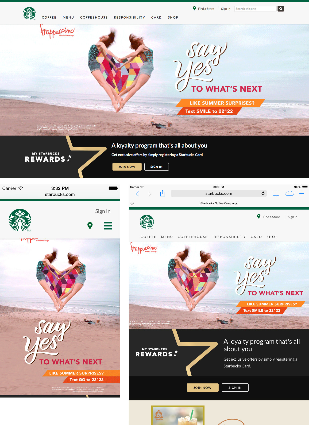
You might be thinking, “Hey, blame the implementation, not the technique.” You’re right. This article is not against responsive web design. It’s against aiming for responsiveness in a way that leads to a weak implementation, and it’s against prioritizing responsiveness over performance, as we see with Starbucks. It looks great when you resize the browser, but that’s not all that is important. Performance also matters a lot to mobile users.
If your responsive website has performance problems, then the fault may lie with how you’ve framed the goal. If you have the budget for responsive design, then you must also have the budget for performance.
Loading Resources
Media queries are implemented in different ways, usually as one of the following:
- a single CSS file with multiple
@mediadeclarations, - multiple CSS files linked to from the main page via media attributes.
In the first case, every device would load the CSS intended for all devices because there would be just one CSS group. Hundreds of selectors that will never be used are transferred and parsed by the browser anyway.
You might think that multiple external files are better because the browser would load the resources based on breakpoints. This is what we’re taught in tutorials in blogs, magazines, books and training courses.
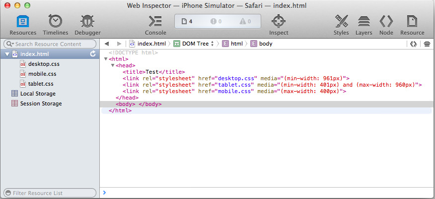
<link rel="stylesheet" href="desktop.css"
  media="(min-width: 801px)">
<link rel="stylesheet" href="tablet.css"
  media="(min-width: 401px) and (max-width: 800px)">
<link rel="stylesheet" href="mobile.css"
  media="(max-width: 400px)">
Well, you’d be wrong. All browsers will load all external CSS, regardless of context. The screenshot below shows an iPhone downloading all of the CSS files excerpted above, even ones not intended for it.
Why do browsers download all CSS files? Suppose you have one CSS file for portrait orientation and another for landscape. We wouldn’t want browsers to load CSS on the fly when the orientation changes, in case a couple of milliseconds go by without any CSS being used. We’d want the browser to preload both files. That’s what happens when you define media queries based on screen dimensions.
Can the dimensions of mobile browsers be changed? Mostly not yet, but vendors are preparing their mobile browsers to be resized like desktop browsers, which is why the browsers usually load all CSS declarations regardless of whether their width matches the media query.
While stretchable viewports don’t exist on mobile devices (yet), some viewports resize in certain situations:
- when the orientation changes in certain browsers,
- when the viewport declaration changes dynamically,
- when offset content is added after
onload, - when external mirroring is supported,
- when more than one app is open at the same time on some Samsung Android devices (in multi-window mode).
Browsers that are optimized for these changes in context will preload all resources that they might need.
While browsers might be smarter about this in the near future, we’re left with a problem now: We are delivering more resources than are needed and, thus, penalizing mobile users for no reason.
The Real Problem: Responsive Design As A Goal
As Lyza Danger Gardner says in “What We Mean When We Say ‘Responsive’,” designers define “responsive” differently, which can lead to communication problems.
Let’s get to the root. The term first appeared in a 2010 post by Ethan Marcotte, followed by a book with the same name. Ethan defines it as providing an optimal viewing experience across a wide range of devices using three techniques: fluid grids, flexible images and media queries.
Nothing is wrong with that definition. The problem is when we set it as the goal of a website without understanding the broader goals that we need to achieve.
When you set responsive design as a goal, it becomes easy to lose perspective. What is the real problem you are trying to solve? Is being responsive really a problem? Probably not. But do you understand “being responsive” to mean “being mobile-compatible”? If so, then you might be making some mistakes.
The ultimate goal for a website should be “happy users,” which will lead to more conversions, whatever a conversion might be, whether it’s getting a visitor to spread the word, providing information or making a sale. Users won’t be happy without a high-performing website.
The direct impact of performance on conversions, particular in mobile, has been proven many times. If this is the first time you are hearing about this, just check any of Steve Souders’ expert books about optimizing web performance.
When you know your goals, you can decide which tools and techniques are best to achieve them. This is when you analyze where and how to use a responsive approach. You use responsive design — you don’t achieve it.
Responsive Vs. Users
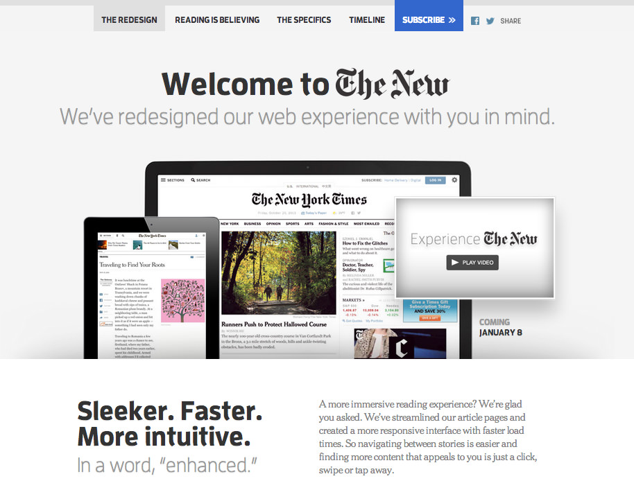
The New York Times redesigned its website a couple of months ago with the goal of keeping “you in mind.” Meanwhile, thousands of other big companies present their new responsive websites with pride.
The New York Times follows responsive design in different ways, but some people complained that it still uses a separate mobile version, instead of adapting the layout based on the same HTML. An article even came out titled “The Latest New York Times Web App Misses the Point of Responsive Design.”
Who said that responsive web design means supporting all possible screen sizes with the same HTML? Sure, this is a common understanding, but that rule isn’t written anywhere. It’s just our need to simplify the problem that has led to it.
In recent months, companies have said things along the lines of, “We’ve applied a new responsive design, and now our mobile conversions have increased by 100%.” But did conversions increase because the website was made to be responsive, or are users realizing that the website is now responsive and so are happier and convert more?
People convert more because their experience on mobile devices is now better and faster than whatever solution was in place before (whether it was a crude mobile version or a crammed-in desktop layout). So, yes, responsiveness is better than nothing and better than an old mobile implementation. But a separate mobile website with the same design or even a smarter solution done with other techniques would achieve the same conversion rate or better.
Conclusion
“Your visitors don’t give a sh*t if your site is responsive,” — Brad Frost
Brad Frost is completely right. Users want something fast and easy to use. They don’t usually resize the browser, and they don’t even understand what “responsive” means.
It’s a bitter truth, and it doesn’t quite apply to all websites. But it’s better than thinking, “We can relax. Our website is responsive. We’ve taken care of mobile.” Sometimes, even when not relevant to the situation, saying that responsive design is “bad for performance” can be good because it helps to spread the word on why performance is so important.
The New York Times is right: The goal is the user. It’s not a tool or a technique or even the designer’s happiness.
Other Resources
- “Responsive Web Design: Missing the Point,” Brad Frost
- “RESS: Responsive Design + Server-Side Components,” Luke Wroblewski
- “What We Mean When We Say ‘Responsive’,” Lyza Danger Gardner, A List Apart
- “You Can Run, But You Can’t Hide From Performance,” Aaron Rudger, Keynote
- “Real-World RWD Performance: Take 2,” Guy Podjarny
- “Blame the Implementation, Not the Technique,” Tim Kadlec
- “‘RWD Is Bad for Performance’ Is Good for Performance,” Tim Kadlec
Further Reading
- Mobile-First Is Just Not Good Enough: Meet Journey-Driven Design
- Help Your Content Go Anywhere With A Mobile Content Strategy
- Picking A Mobile Support Strategy For Your Website
- How To Spark A UX Revolution
 (al, ml, mrn)

