Size Matters: Balancing Line Length And Font Size In Responsive Web Design

Email Newsletter
Weekly tips on front-end & UX.
Trusted by 182,000+ folks.
 Register for Free
 Custom Web Forms for Angular, React, & Vue. Your backend.
 Celebrating 10 million developers


As we refine our methods of responsive web design, we’ve increasingly focused on measure (another word for “line length”) and its relationship to how people read.
The popularization of the “ideal measure” has led to advice such as “Increase font size for large screens and reduce font size for small screens.” While a good measure does improve the reading experience, it’s only one rule for good typography. Another rule is to maintain a comfortable font size.
How People Read
People read online text to serve their own needs: to find the information they seek, to discover new ideas and to confirm their notions about life.
People Read In Three Ways
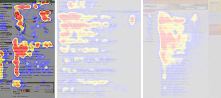
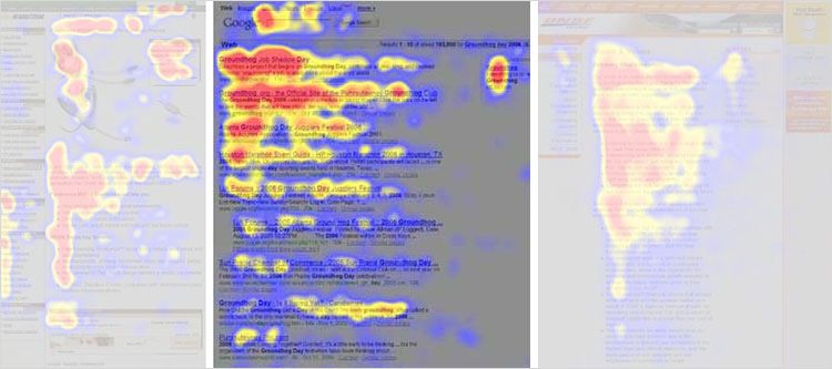
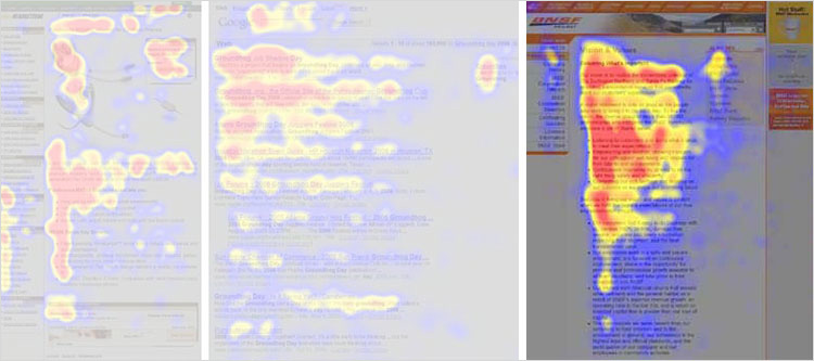
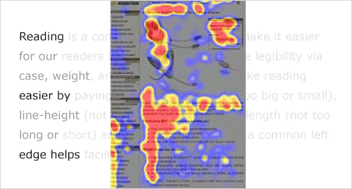
In 2006, the Nielsen Norman group released images of heat maps from eye-tracking studies. The areas where people looked at the most while reading are red, areas with fewer views are yellow, and the least-viewed areas are blue. As you can see below, the red and yellow areas form three variations of an F-shaped pattern. These variations aren’t surprising because people read in three different ways.
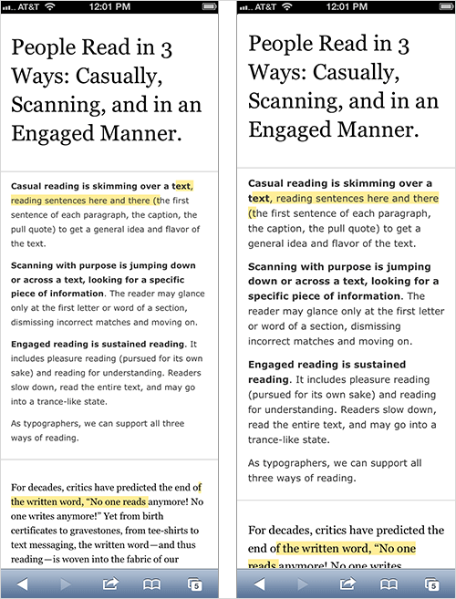
People read casually, skimming over text, reading words and sentences here and there to get a sense of the content. The heat map below shows the eye movements of someone casually reading about a product. The reader spent time looking at the image of the product, reading the first couple of sentences, then scanning through the bulleted list.
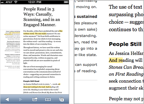
People also scan with purpose, jumping from section to section, looking for a particular piece of information. They might only read a word or the first couple of characters of a word as they scan the screen. The heat map below shows the eye movements of someone scanning the results of a Google search with purpose. The person read the first two results more slowly. Then, their eyes jumped from section to section, looking for the search term. Therefore, we do not see a strong vertical stroke along the left edge of the text.
Finally, people read in an engaged manner. When they find an article or blog post they are interested in, they will slow down and read the whole text, perhaps even going into a trance-like state. The heat map below shows the eye movements of a person reading in an engaged manner. The tone is more continuous. There is more red (meaning more time spent reading) and less jumping around the page. When the intensity of reading dwindled because they lost interest (the corporate “About us” page might not have aligned with their interests), their eyes continued along the left edge of the text.
Reading Is A Complex Process
We know that people read in three different ways, but let’s look more closely at how people read — how the F-shaped patterns are formed.
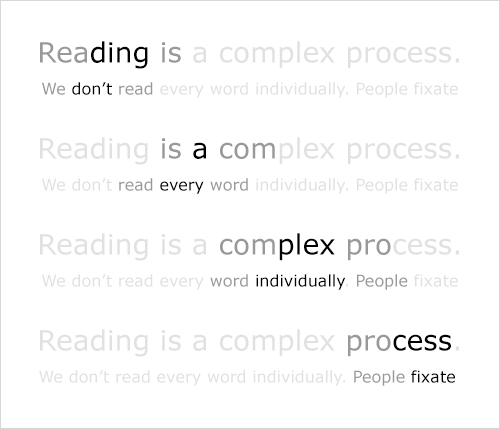
We know that people. Don’t. Read. Each. Individual. Word. Instead, they use their foveal (or central) vision to focus on a word, while using their peripheral vision to find the next spot on which to focus.
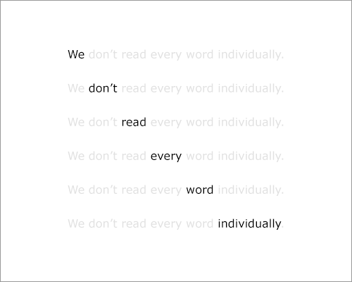
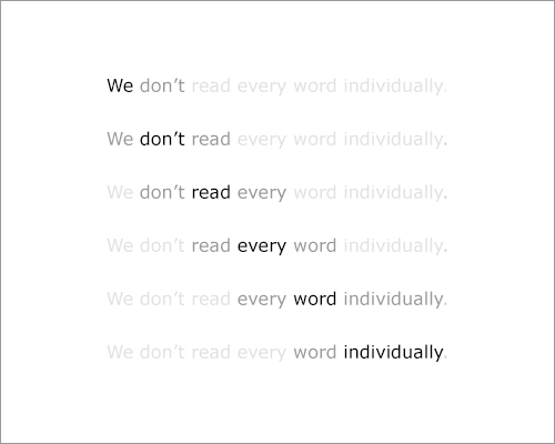
We also know that people don’t fixate on every word, but tend to skip words (their eyes take little leaps, called “saccades”) and fill in the rest. This is especially true of those who read casually or scan with purpose.
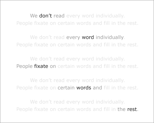
Finally, we know that readers anticipate the next line while moving their eyes horizontally along a line; so, their eyes are drawn down the left edge of the text. This constant struggle between horizontal and vertical motion contributes to the F-shaped reading patterns.
Line Length (Measure) And Reading
Typographers have been writing about the relationship between horizontal and vertical eye motion for almost a century. In 1928, Jan Tschichold dismissed centered text and advocated for left-aligned text. He argued that this would assist readers by providing a consistent left (vertical) edge for the eye to return to after finishing each (horizontal) line.
The Ideal Measure: 45 To 75 Characters
We have multiple “rules” for facilitating a horizontal reading motion, one of which is to set text at a reasonable measure. As James Craig wrote in his book Designing With Type (originally published in 1971, now it its fifth edition):
"Reading a long line of type causes fatigue: the reader must move his head at the end of each line and search for the beginning of the next line.… Too short a line breaks up words or phrases that are generally read as a unit."
If a casual reader gets tired of reading a long horizontal line, then they’re more likely to skim the left edge of the text. If an engaged reader gets tired of reading a long horizontal line, then they’re more likely to accidentally read the same line of text twice (a phenomenon known as “doubling”).
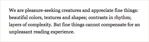
65 characters (2.5 times the Roman alphabet) is often referred to as the perfect measure. Derived from this number is the ideal range that all designers should strive for: 45 to 75 characters (including spaces and punctuation) per line for print. Many web designers (including me) apply that rule directly to the web. I’ve found, however, that we can reliably broaden the range to 45 to 85 characters (including spaces and punctuation) per line for web pages.
Measure And Web Type
Web designers have started to embrace a reasonable measure for text. Resources abound. Early writings include Mark Boulton’s more poetic approach to typography, which he refers to as “knowing your hanging punctuation from your em-dash” (“Five Simple Steps to Better Typography”). Later writings include Harry Roberts’ more technical approach to typography (“Technical Web Typography: Guidelines and Techniques”).
The most recent (and, dare I say, exciting) development in measure? Its role in responsive web design. More designers are using line length to help determine break points in a responsive structure! Chris Coyer recently developed his bookmarklet to test line length in order to help responsive web designers keep an eye on their measure (“Bookmarklet to Colorize Text Between 45 and 75 Characters”).
But a good measure is only one rule for setting readable text.
Font Size And Reading
A good, comfortable font size is also necessary for setting readable text. This rule is old news. But given the number of responsive websites out there that make text too small or too big in order to achieve an ideal measure, the rule bears repeating.
Static Web Pages And Font Size
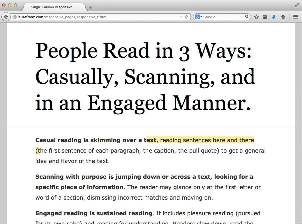
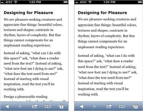
One benefit of a responsive web structure is readable text — text that people on hand-held devices don’t have to pinch and zoom to read. If a structure is static (like the two-column page shown below), then an ideal measure won’t do the trick. The text will simply be way too tiny to read on a small device such as a phone.
Small Devices And Font Size
When designing a responsive website, start with a comfortable font size and an ideal measure to help determine break points. But when the time comes (as it always does), let the ideal measure go.
Text already looks smaller on hand-held devices than on larger devices. This is fine because people tend to hold small devices closer when reading. Current popular wisdom is to preserve the measure by further reducing the font sizes for held-held devices. In practice, retaining a comfortable font size as much as possible better preserves readability. The result will be a less-than-ideal measure but a more comfortable reading experience.
A responsive structure won’t help if small text on a hand-held device encourages readers to pinch and zoom!
Large Devices And Font Size
When designing a responsive website, remember that measure and font size affect not only people using hand-held devices. The majority of people still use larger devices, such as laptops and desktop computers.
Some simple responsive structures keep text in a single column that expands and contracts with the size of the device. This can be an elegant, appropriate solution — except when the font size (instead of the column’s width) is used to preserve the ideal measure.
We’ve learned not to set text too small, but text that’s too big also poses a problem. When type gets too big, the reader’s eyes try to follow their usual pattern. But a font size that’s too large takes up more horizontal space, and it interferes with the horizontal flow that readers have established using their foveal vision and their pattern of skipping words.
We’re used to setting online text larger than printed text. This is fine because people tend to place large devices on their lap or on a desk while reading. But overly large text forces the reader to slow down and adjust how far they skip ahead as they read. Reading horizontally becomes cumbersome, and the reader will start to skip vertically down the left edge of the text.
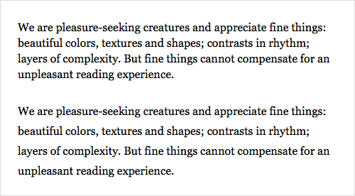
Current popular advice is to preserve the measure by increasing the font size for large devices. For example, the one-column structure below has an ideal measure. But to achieve this ideal measure on large devices, we’ve had to set the text to 19-pixel Verdana, 22-pixel Georgia for the article, and a whopping 26-pixel Georgia for the introduction!
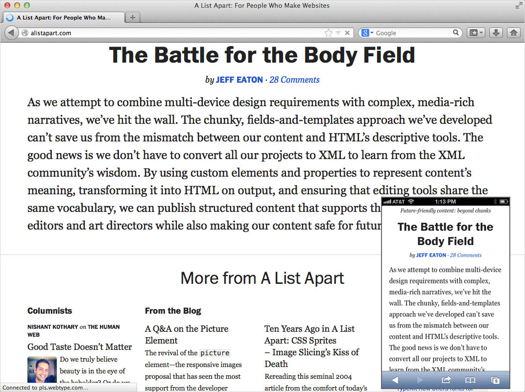
In practice, retaining a comfortable font size as much as possible and simply narrowing the column’s width instead are better. Look at what happens to A List Apart when it’s viewed on a hand-held device and on a laptop.
Bonus Section: Line Height And Reading
So far, our focus has been on the relationship between font size and measure in responsive web structures. But line height also affects how people read.
Line Height Affects Horizontal Motion
Because readers scan content both horizontally and vertically, lines of text should feel like horizontal lines, not like woven fabric.
A line height that is too tight could undermine horizontal eye movement and encourage scanning down the left edge. It could also force people to reread lines of text. On the other hand, a line height that is too loose could make lines of text visually “float away” from each other. The lines will no longer feel like a cohesive unit, and vertical scanning becomes more difficult.
While there is no perfect line height, a good rule of thumb is to set it at approximately 150% of the font size.
Line Height And Font Size
Setting line height is a complex balance of variables (font family, measure, font size, language). The most important variable when creating a responsive web structure is — surprise! — font size.
Smaller type tends to need more line height, not less. A generous line height helps the eye to recognize small word shapes more easily, and it encourages horizontal motion when the eye gets tired of reading small text.
Look Closely, Break Rules
When we design a responsive structure, testing it on a large device is easy; we can change a desktop browser’s size quickly. But designing on a desktop or laptop browser means that we are spending most of our time at an arm’s length from the text, and we don’t spend much time seeing how the text renders on small devices.
If you’re using measure to find break points in your responsive website, then you probably care about type and reading. Keep using measure! It’s a great starting point. But to see whether your type truly works, spend some time looking at it closely, on a smaller device. Balance measure, line height and font size as needed.
Remember that all rules are meant to be broken. Heck, Jan Tschichold broke his own rule and used centered text for much of his career. When the time comes, sacrifice measure for a comfortable font size. A good font size (not too small) is readable. A good font size (not too big) promotes horizontal eye motion. A good font size with the proper line height will help your readers find what they’re looking for.
Further Resources
- “Five Simple Steps to Better Typography,” Mark Boulton
- “Technical Web Typography Guidelines and Techniques,” Harry Roberts, Smashing Magazine
- “Choose a Comfortable Measure,” The Elements of Typographic Style Applied to the Web
- “How We Read,” Jason Santa Maria, A List Apart
- “Bookmarklet to Colorize Text Between 45 and 75 Characters (For Line-Length Testing),” Chris Coyier
- “How I Test Type and Layout,” Jordan Moore
Further Reading
- 16 Pixels: For Body Copy. Anything Less Is A Costly Mistake
- Designing For The Elderly
- 10 Principles For Readable Web Typography
- The Perfect Paragraph
 (il, al, mrn)

