Sci-Fi, Frustrations, Flash And Forms: The Typeform Story

Email Newsletter
Weekly tips on front-end & UX.
Trusted by 182,000+ folks.


 Celebrating 10 million developers
 Custom Web Forms for Angular, React, & Vue. Your backend.
Take any new interface design or display technology, and chances are that someone somewhere has already compared it to Minority Report. The 2002 dystopian film, with its see-through screens and gesture-driven interfaces, is remembered more for its futuristic tech than for the insidiousness of the technology — pre-crime prediction — that was its actual focus. It continues to be the standard by which we judge new interfaces.
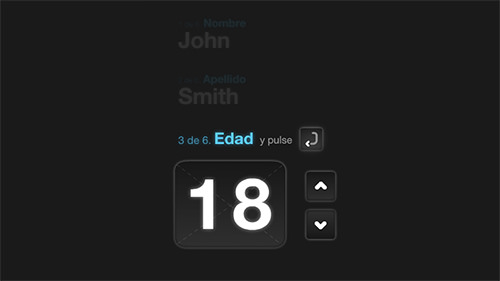
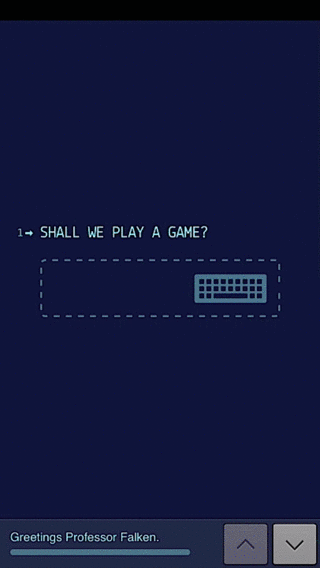
But inspiration doesn’t only come in the form of flashy, futuristic interfaces. At Typeform, we were inspired to simplify online forms by a movie that’s decidedly a blast from the past: the 1983 film WarGames, which centers around a student who remotely logs into a research computer and, through its terminal interface, nearly sparks a nuclear war. Its computers are hardly state of the art, yet the computers’ question-driven interface inspired us to reinvent forms. Instead of a list of questions, how much better would it be if forms presented one easy-to-answer question at a time?
Stripping forms down to their basics and building them back up into something better took four years of work, but that core idea guided us all along: questions are better than lists. Here’s the story of our crazy idea to reimagine how forms could work, and how we turned that idea into a product that’s helped companies of all sizes get a 55% completion rate on their forms.
Dismembering A Form
"Everything should be made as simple as possible, but no simpler." – attributed to Albert Einstein
You’ve filled out plenty of online forms, from the standard surveys that you get in emails to checkout forms and more. Forms have been with us since the earliest days of the Internet, and they largely look the same today as they did in the ’90s. They’re filled with lists of questions and tiny bullet points that are hard enough to fill out on a PC and are an exercise in extreme frustration on mobile.
Forms have turned into one of the most annoying things about the Internet, right along with popup ads and auto-playing audio. They’re a necessary evil — no one would say that they love filling out forms, but we all have to fill them out anyway.
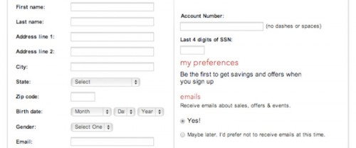
Traditional online forms can be overwhelming.
Crowded with information, forms feel like the on-screen equivalent of questions being screamed at you — something you’d walk away from in real life. If your form makes people feel like they’re completing a tax return in a crowded room, chances are they’ll click away, too.
Questions themselves don’t have to be unpleasant, though. They are the foundation of small talk and are an important and even fun part of life when used in moderation. If that’s all they are, then surely we can make a better form by emulating conversation, with just one question at a time.
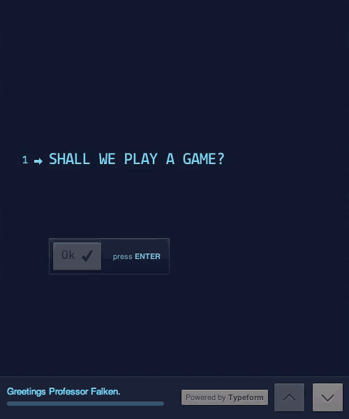
That’s the genius of the console in WarGames. It asks a question, waits for an answer, then follows up with another question. Without any more logic than your average form, it feels more lifelike simply because asking one question at a time feels like a conversation. It’s not overwhelming, and yet it gets the same result as a form would.
That, we knew, had to be the future of a more human form. One question at a time, presented in a way that would make people want to respond.
To Build A More Conversational Form
Simplifying forms, though, took more than just inspiration. It took us on a four-year journey, starting with a showroom Flash application for a client in 2010. That application was built to run full-screen on large monitors at an exhibition, complete with video, animations and a way to collect information from visitors to the booth in a modern (for the time), interactive experience. A typical Web form would have been impossible to use on such a large screen and would have looked terrible alongside the other elements. We quickly saw that it was time to reinvent the form.
There’s ways to make traditional forms better, by including more whitespace, separating forms into sections, and more. There’s standards behind the way forms look and feel, which have kept them far more similar to a paper form than something imagined just for screens. We wanted to experiment and see what a form could be like if it was removed from those linear constraints, redesigned around questions.
It wouldn’t be a traditional form, and it would even break conventions—much in the same way the iPhone’s software keyboard broke the standard real-button keyboard conventions—but the WarGames form had given us the idea that perhaps there was another way to gather info than the traditional form, and perhaps it could be better. We wanted to start out with a clean slate, and reimagine what a form could be with an entirely new product.
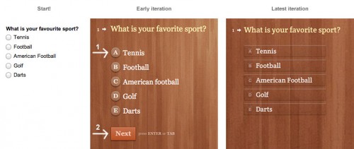
The design has come a long way since those early days. But the principles remain the same.
Our original solution was Quickyform, a Flash-based contact form that ran on an iMac in the exhibition space. It embodied the essence of the WarGames form even as a rough early prototype. Only one question was shown in focus at a time, and once a visitor filled it out and pressed “Enter,” the next question came into focus, ready for them to enter the next answer without having to click anywhere. This, we knew, was the first step in the right direction for the future of forms.
When we built Quickyform, Flash was still prevalent online, and there was lingering hope that Apple and others would adopt it for their mobile platforms. Flash has its uses, but it had quickly become obvious that it wasn’t the best tool for our needs. We quickly shifted to the modern languages of HTML, CSS and JavaScript, and got to work designing a better UI that would work everywhere — ultimately, realizing our dream and even recreating the part of WarGames that had initially inspired us.
Starting With The Basics
Our basic idea was to find the perfect way to display one question at a time, to reflect natural human conversation. To do that, we had to entirely declutter the UI, removing everything that might take the user’s attention away from the one question at hand. At the same time, we still wanted to retain a global view of the entire form to make it easy to navigate and see the remaining questions.
The solution wasn’t apparent at first. For example, an early version opened and closed each question as you went through them. That took care of showing only one question at a time, but the animations were too jarring and made it difficult to navigate the entire form. We took many such detours into the land of strange animations and interactions that just don’t feel natural in our quest to discover what would work best. The final simple solution of putting the active question in the center of the screen while showing the preceding and following questions faded out above and below seems obvious in retrospect but took a lot of experimenting to perfect.
Putting the active question in the center helped out other parts of our UI. It helped our large typography to make sense, which in turn freed us to make use of Web fonts. We use 24-pixel fonts on the desktop, and between 16- and 20-pixel fonts on mobile, depending on the device. Very few Web fonts work well at sizes below 16 pixels, so focusing on one question at a time enabled us to drastically improve the UI’s design.
In turn, the UI influences the UX. Large typography in our form designer forces you to shorten questions because there is less space per line. You have to make every word count in the questions you put in your form, and that precision makes the resulting questions far more likely to be answered by respondents.
Design Is How It Works
After deciding on the basics of our UI, we tackled interaction design as the next challenge. Our focus was a computer without a touchscreen, accelerometer, webcam or even a mouse. All that is needed to interact is a keyboard. After all, if you’re just answering questions, what more should you need?
Traditionally, a typical form forces you to move back and forth between the mouse and keyboard. You’ll click in a text box to type something in, and then reach for your mouse or squint to tap on your smartphone’s screen to fill in a multiple-choice question. If the form doesn’t already look bad enough, then the rows of tiny bullet points should be enough to get respondents screaming for the hills.
As dated as it might sound in the age of smartphones and tablets, we decided that keyboard navigation would be central to our redesigned forms. Users have to use a keyboard for questions that need a typed answer anyway, so we added keyboard shortcuts for all other types of questions. For “Yes” or “No” questions, you would tap “y” for yes and “n” for no. For multiple-choice questions, each answer is assigned a letter. For ratings, respondents would tap the number corresponding to their rating, from 1 to 0 (ten).
Navigation between questions raised a new issue: the “Enter” key or the “Tab” key? How would these two buttons work in the context of Typeforms? At first, we allowed “Tab” and “Enter” to be used interchangeably to move to the next question, but assigning two buttons to do exactly the same thing seemed weird. So, we asked ourselves, what could we learn from what’s been done before?
In every other app or website, the “Tab” key is most commonly used to move between elements. You use it to jump between fields in a traditional form and to move between parts of a Web page. It is a non-committal way to move around. The “Enter” key, on the other hand, is most commonly used to commit to a decision. It’s the button we press to take an action or to submit a traditional form.
So, in learning from those who came before us, we decided to assign “Tab” for jumping between questions without setting off any validation checks. This way, you can move around the form without having to use the mouse. Pressing “Tab” brings the next question into view, ready to be filled out; “Shift” + “Tab,” in the same way, take you back to the previous question; and the arrow keys let you move up and down in the form as you’d expect.
Our next choice in keys was much harder to make: how to use the “Enter” key. It’s widely used in many apps to complete an action, but is also used to add a line break to text. In a form, we feel it’s far more common to need to quickly complete an action than it is to need to write multiple paragraphs of text, so we chose to use the “Enter” key to validate and submit responses. If an answer does not validate, then the user is asked to correct their answer; otherwise, they’ll move onto the next question. Then, we used the common “Shift” + “Enter” shortcut for line breaks when writing multiple paragraphs of text, the same shortcut commonly used in chat apps like Facebook Messenger.
Ideally, though, users shouldn’t have to use “Tab” or manually scroll to navigate forms at all, even though the forms show only one question at a time. That’s why we designed the forms to auto-scroll to the next question as soon as the current question is answered. Most forms require you to scroll through to see all of the questions, or even click to other pages to continue the survey. Our approach keeps respondents focused on the conversation and makes it far quicker to fill in the form.
Iterate, Iterate, Iterate
Even though Typeform’s UX and controls were in place, a lot of wiggle room was left in our UI. When we drafted the style guide for our UI, the world was shifting from skeuomorphic to flat design. We didn’t want to trap our design in a particular trend, so we embraced the best of both worlds.
Multiple-choice questions proved to be the hardest. Our original designs for them still felt like traditional forms, listing possible answers with radio buttons to their left. We wanted to keep the standard parts of forms intact, but that didn’t feel quite right — we hadn’t come this far to leave the most annoying part of forms alone.
So, we decided to turn multiple-choice answers into glass-like elements. Our first try put the standard round radio buttons on the left, albeit with translucency that made them better fit the form’s background. It looked nicer, but the original usability problem was still there because radio buttons are still relatively hard to select, especially on a touchscreen. To solve this, we expanded the size of the button, turning it into a glass panel that overlays the answer. This gives a far larger target to click or tap, perfect for mobile and desktop. We removed the radio buttons entirely because their presence automatically makes you think you’ll need to tap that smaller areas to select the option—we wanted people instead to feel free to tap anywhere on the button.
From fiddly radio buttons, to nice big touch targets.
This “glassification” brought with it another challenge: making sure that the buttons look great on a wide range of background colors. After extended experimentation, we finally landed on the solution of categorizing background colors into five levels of luminosity. We then add different CSS that adjusts the color of the button, shadows, border, highlights and a range of other factors based on the background. LESS turned out to be the perfect solution for getting the right balance of color every time.
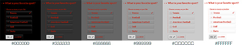
Buttons react to the background they’re on.
You can see the change most obviously with the border. On a black background (#000000), the borders are a light color to offset the button. As the background gets lighter, the borders change to a darker color to give more contrast and better offset the button. We spent a lot of time getting the formula just right, and it paid off with a UI design that looks great no matter how our users want their forms to look.
That left us with one final UX problem: the “Next” button after a multiple-choice question. We needed a way for people to select choices — again, using the keyboard or mouse — and then easily jump to the next question with our auto-scroll. If we auto-scrolled as soon as someone had made a selection, then they’d have no chance to change their mind, but we didn’t want multiple-choice questions to have the friction they do in normal forms.
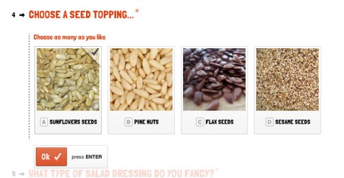
Our solution was to add an “OK” button that’s activated by pressing “Enter.” We assigned standard alphabet keys to each multiple-choice item, and we check mark an item once the user has selected it. A bit of extra text is added to questions that list multiple options, to help people understand. Once the user has made their selection, they just have to tap “Enter” to proceed to the next question.
Leave the mouse at home. Just tap or use your keyboard!
Working Everywhere
We designed Typeform’s UX to work great with just a keyboard, but then tweaked its UI to be perfect on touch screens, too. Designing it as a responsive app from the start would seem obvious, then, using media queries and breakpoints to render the same code on any screen size.
This isn’t how Typeform works, though. We experimented with delivering the same UI to a mobile device and a PC. That would work, but it created two problems:
- The whole form has to be rendered at the same time. This impairs performance on devices with limited RAM, especially if the form includes much multimedia content.
- It’s a poor use of limited screen space, with valuable room taken up by unnecessary elements.
The goal of responsive design is to deliver the same content and experience everywhere, and we still wanted that, even if using the same code wouldn’t achieve that goal for us. Our solution was to move to page- and slide-based navigation. On mobile, each question is rendered on its own, giving the form a small resource footprint and using the smaller screen more efficiently.
To do this, Typeform delivers different code to the browser depending on what device is being used. You’ll notice this if you open the same form on a PC and a smartphone. On a PC, we use the larger display to faintly show the previous and next questions. On a smartphone, we show only the current question in order not to waste any space. Respondents can easily swipe up and down on their phone to navigate questions, just as PC users would press the up and down arrows, but no space is wasted with the previews of previous and next questions. That’s one of the many tweaks we had to make in order to make our forms work perfectly on both desktop and mobile.
We then have a even simpler fallback mode on every form, that’s even faster to load on any device. These options were the ways we balanced between a rich web app on desktops and laptops, an equally polished mobile experience, and a faster option for lower internet speeds.
Test Everything
Typeform is a direct result of our own testing and tweaking of the idea that blossomed from WarGames’ inspiration and our client project in 2010, but we had very little user feedback in the beginning. It was just a side project, worked on in spare moments here and there. Decisions were based on intuition and hunches, and we had no idea what the lean methodology even was.
What we did know is that we had stumbled upon an entirely new way of interacting with online forms, not just an evolution of the interfaces that we’re all used to. If we had asked people what they wanted, we would have designed a normal form builder. Like Henry Ford, we needed to show people what they want. We had to invent the future—to discover the story hidden on the blank page, or uncover Michelangelo’s David in a block of marble as Ed Catmull describes the creative process of inventing the new in “Creativity, Inc.”
So, rather than rapidly release features in the wild and iterate based on feedback from our users, as lean methodology would dictate, we worked with our own controlled test group to find what was and wasn’t working before releasing it. If we had launched a public beta earlier, perhaps we would have thrown out the closing and opening animation between questions earlier on. But then we would have missed the subsequent iterations that guided us to our current solution of fading out the preceding and following questions. By iterating and working on intuition and experience, we were able to greatly improve an experience that might have been thrown out if we had asked users.
This isn’t to say that the lean methodology is bad or that it wouldn’t work for us now, but it couldn’t have worked for testing our initial concepts and finding our ground. Only when we had almost finished building the app and opened our beta program did we start getting a lot of feedback from our user base. The app was finished enough that people understood our vision and were able to help us find the rough edges that needed fixing. Feedback is important, but make sure that your vision is defined and apparent in your app before inviting the opinions of others; otherwise, you might miss the stages in the development of an app when you learn the most.
Never Stand Still
We turned our vision of a new type of form into a product, but we’re not done working. Breaking down forms into their basics opens up a lot of opportunities, because you can do so much with a format that asks one question at a time. We’ve finally realized our dream of recreating WarGames’ terminal in a form that captures the simplicity of the original, and we have found a ton of uses for Typeforms that go far beyond the traditional form. What other format would let you make anything from a Stripe-powered purchase form to an interactive storybook?
Typeform’s simplicity gives us a platform on which to build and do more with the basic elements of a form. Designers can focus on things that make each question better and perhaps more visual and interactive, while still ensuring that all of the questions work together as a form. It’s already ready for large high-resolution screens and can just as easily be scaled down to a watch screen or whatever new displays the future will bring us.
Our core technology platform isn’t standing still, either. Typeform’s current technology stack consists of Symfony 2 and PHP that loads data from Redis and MySQL databases on the back end, and CoffeeScript and Backbone.js on the front end, all running on Amazon’s AWS platform. If that’s not enough, we’re currently refactoring parts of the application, using Node.js and NoSQL databases to improve performance and make it easier to implement new features.
More Human Forms Work
What will stay the same are modern, question-driven forms. We’re not the only ones on this journey of exploring how a redesigned form could work. Stripe has redesigned its checkout forms to be as simple as possible, asking just for the user’s email address, credit-card number, expiration date and CSV number, in a sleek form that would hardly intimidate anyone. PageLanes uses a question-driven form to collect contact information, and CoDrops was inspired by that to make a basic CSS- and Javascript-powered question-driven toolkit that you can use to design your own forms.
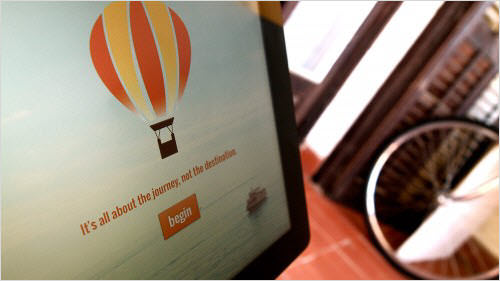
A typeform in its native habitat, ready to be filled in.
Question-driven forms get results. Quartz’s team recently got 940 C-level executives to respond to its executive study. Its careful wording got Quartz a 34% open rate, and over 55% of those who opened its interactive survey (powered by Typeform, incidentally) actually finished it. That number is consistent with the average response rate we see from all of the more than 9 million unique Typeform form visits we’ve seen so far. Those results and the new unique ways you can use forms with Typeform—along with the results those forms bring—have been enough to get industry leaders from Adobe, Uber, MailChimp and more to use our forms to get results. That’s an exciting confirmation of what we’ve believed all along: People will want to fill out forms if the forms are driven by questions and simple enough to answer.
We’ve destroyed the traditional form — literally, in a joke game that we made recently — but much more can be done with forms. That’s what keeps us working on Typeform and what makes us excited to see new developments from others. But forms aren’t the only part of the web that could use some new design ideas. All it takes is breaking things down to their basics, figuring out what’s really important, and then building back up around that. If that approach can change forms this much, imagine how much it could change the things you’re working on.
You may have to break some conventions, and your final product might be fully new instead of just an updated version of the old—the app version of the motor vehicle versus the old horse-and-carriage. It might not even work. But you’ll be sure to discover something new and exciting along the way, something that just might let you make a better product.
Further Reading
- Conversational Interfaces: Where Are We Today?
- How Do You Design Interaction?
- Useful Ideas And Guidelines For Good Web Form Design
- Forms On Mobile Devices: Modern Solutions
 (al, il, mrn)

