A Front-End Developer’s Ode To Specifications

Email Newsletter
Weekly tips on front-end & UX.
Trusted by 182,000+ folks.
 Celebrating 10 million developers


 Custom Web Forms for Angular, React, & Vue. Your backend.
In the physical world, no one builds anything without detailed blueprints, because people’s lives are on the line. In the digital world, the stakes just aren’t as high.
It’s called “software” for a reason: because when it hits you in the face, it doesn’t hurt as much. No one is going to die if your website goes live with the header’s left margin 4 pixels out of alignment with the image below it.
But, while the users’ lives might not be on the line, design blueprints (also called design specifications, or specs) could mean the difference between a correctly implemented design that improves the user experience and satisfies customers and a confusing and inconsistent design that corrupts the user experience and displeases customers.
For those of us who create digital products, design specs could mean the difference between efficient collaboration and a wasteful back-and-forth process with costly implementation mistakes and delivery delays. It could also mean the difference between your business making money and losing money, in which case lives might actually be on the line.
In short, specs can help us to build the right product more quickly and more efficiently.
What Are Blueprints (And Why Are They Blue)?
Why are blueprints blue? To find the answer, let’s go back in time a bit, courtesy of Wikipedia:
"A blueprint is a reproduction of a technical drawing, documenting an architecture or an engineering design, using a contact print process on light-sensitive sheets. Introduced in the 19th century, the process allowed rapid and accurate reproduction of documents used in construction and industry. The blue-print process was characterized by light colored lines on a blue background, a negative of the original."
Architectural blueprints were the photocopier of the 19th century. They were the cheapest, most reliable technology available to copy technical drawings.
Blueprints were created by sending light around an ink drawing on transparent film. The light would shine through everywhere except the ink and hit a paper coated with a light-sensitive material, turning that paper blue. This outlined a white copy of the engineering drawing on a dark-blue background.
These copies were then distributed to builders who were responsible for implementing the designs in those drawings.
Today, many graphic designers also distribute design specs to the front-end developers who are responsible for implementing the designs. Design specs are no longer made with paper and light, and they are no longer blue, but, as before, they ensure that the product gets built correctly.
From Bricks To Bits And Bytes
I learned the value of architectural blueprints in my previous career as a real estate developer. One of my responsibilities was to find great architects to create blueprints so that the construction workers we hired knew exactly what to build. Somewhere along the way, I realized that real estate development was not for me: I wanted to make a greater impact by building the scalable skylines of the virtual, rather than the real, world. I learned HTML, CSS and JavaScript and went in search of startups that were hiring. My understanding of the importance of detailed blueprints went with me.
In the wild west of World Wide Web startups, I had to build single-page JavaScript applications that looked good and performed well, and I had to do it quickly. Designs were often handed down to us one week before the product’s release date, and we were asked to start sprinting. The designs usually consisted of Photoshop files (PSDs) with a lot of layers and zero specs to accompany them.
For a former real estate developer, working with graphic designs without specs was like getting a set of architectural blueprints with all of the drawings and none of the numbers. Without the necessary CSS “measurements,” I was forced to hunt through layers and sublayers of shapes and text elements to figure out the right HEX value for the border around the “Buy” button or the font family used in the “Forgot Password?” field. Such a workflow was very unproductive.
I was starving for specs when my friend Chen Blume approached me with the idea of Specctr, a tool that would bring the familiar benefits of architectural blueprints to the world of graphic design and front-end web development. I immediately recognized the value and potential of this idea, so we started working together right away, and soon after that, the first version of Specctr was released.
Initially, the Specctr plugin was for Adobe Fireworks users only, which at the time — 2012 — seemed to be the best tool for UI and web designers. Later, we expanded the range of supported apps, and today it includes Fireworks, Illustrator, Photoshop and InDesign.
A Picture (And Some Numbers) Are Worth More Than A Thousand Words
They say that a picture is worth a thousand words. Well, a picture and some RGB values could be worth much more!

The phrase “A picture is worth a thousand words” means that a complex idea can be conveyed with just a single still image. It also characterizes well one of the main goals of visualization, which is to make it possible to absorb large amounts of data quickly. However, in the design and development business, a picture or a single PSD is not enough.
Developers need to know a design’s exact attributes to be able to write the HTML and CSS necessary to recreate the text and shape elements via code. If a PSD is not accompanied by detailed specs, then making approximate guesses or hunting through layers could lead either to errors or the loss of precious development time.
Developer Focus
When developing something, I might need several minutes to load the necessary mental models in my head before I can be productive. Any interruption could bring a wrecking ball to the intricate imaginary machinery I’ve struggled to assemble inside my head.
This is why having to look up an RGB value or turn to a teammate to ask which typeface is being used could lead to big gaps in my productivity.
And if you’re a member of a distributed or remote team, then you don’t even have the luxury of immediately getting your questions answered by a colleague — you’re off to an asynchronous communication tool like Skype, Hipchat or, worse, email. As Chris Parnin puts it:
"The costs of interruptions have been studied in office environments. An interrupted task is estimated to take twice as long and contain twice as many errors as uninterrupted tasks. Workers have to work in a fragmented state as 57% of tasks are interrupted. For programmers, there is less evidence of the effects and prevalence of interruptions. Typically, the number that gets tossed around for getting back into the 'zone' is at least 15 minutes after an interruption. Interviews with programmers produce a similar number."
A Carnival Of Errors: Developer Edition
Julia had been at her computer for eight straight hours and was late for dinner with her parents, but she had promised to have this CSS transition between the “product” overlay and “buy” overlay on the master branch by the end of the day. She was almost done, but the type on this “Submit” button didn’t look the same as the one that was live on the website now.
“It’s fine,” she thought. “I’ll change it tomorrow.”
Faced with short deadlines and the prospect of rummaging through Photoshop layers, some developers would take a stab in the dark with what type to use — thus, negating the hours of design research they’ve invested with one stress-fueled decision.

In the end, we’ll have to redo it anyway, but for now we’ll meet the deadline. It’s all about developer convenience.
No one in the history of forever put in extra effort to do the wrong thing. Mistakes are usually the result of following a tempting shortcut.
The record industry’s failed attempt to halt the digital distribution of music is a good example of this. Spotify’s whole business model is based on the fact that “people were willing to do the right thing but only if it was just as rewarding, and much less hassle, than doing the wrong thing.”
Give your front-end engineer a fully spec’ed design and then bask in the rays of gratitude emanating from their face. They’ll get all of your margins and padding exactly right; that subtle gradient will have the precise values you took so long to match; and it will all get done faster. Why would they do anything else? All of the information they need is right there in front of them!
The Triumph Of Tediousness: Designer Edition
Lauren took a second to appreciate her finished design. It was well-balanced and conveyed a sense of calmness, all while guiding attention towards the “Submit” button.
She was tired and ready to go home after a long day of work, but she had promised to deliver the finished design so that Julia could get a head start on developing it for tomorrow’s deadline. She sometimes created specs for the developers she worked with, but she just didn’t have it in her to type and draw out each individual annotation “by hand.”
“Julia will figure it out,” she thought to herself as she hit “Send.”
It’s all about designer convenience.
If design specs (i.e. blueprints) have so much to offer, then why aren’t they a part of every designer’s workflow? The reason I, as a developer, might skip looking up the type is the same reason many designers don’t create specs: It’s easier not to.
This is because designers are not using the right tools. They manually measure and draw each dimension, and they type each pixel value and RGB value “by hand,” using the same general-purpose drawing tools that they used to create the design.
Any time you ask an artist to stop creating and focus on process, you’re fighting an uphill battle. The hill becomes dramatically steeper when the process is slow and tedious.
With the right tools to automate the creation of specs, designers can reduce costs and enable their whole team to reap the benefits of creating and distributing design specs.
Let’s Create (And Use) Design Specs
The two examples above — with Julia and Lauren — are imaginary, but that doesn’t mean they don’t happen constantly in real life. Developers should not have to make any guesses that lead to errors and lose time. On the other hand, creating detailed specs manually is tedious and takes a lot of the designer’s time.
Is there a better way? I believe there is.
We should start using tools that help us to create design specs with a minimum of hassle. Such tools would save time for both designers and developers and would lead to better designer-developer workflows.
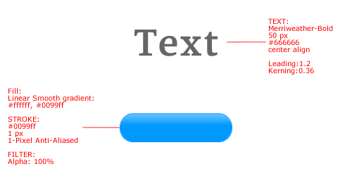
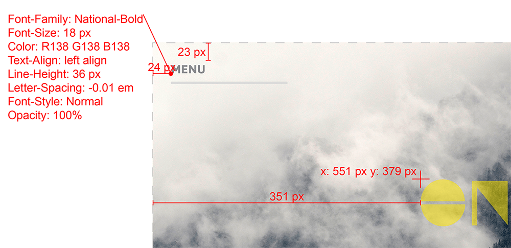
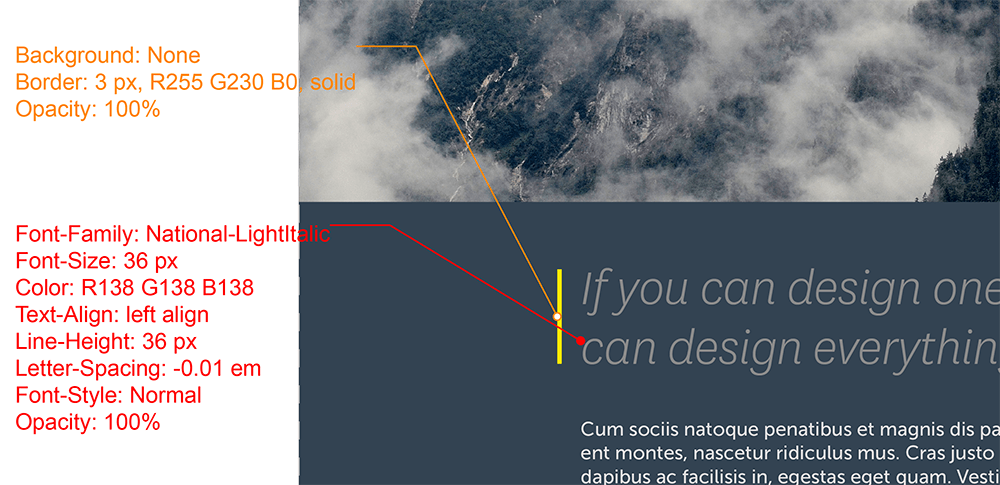
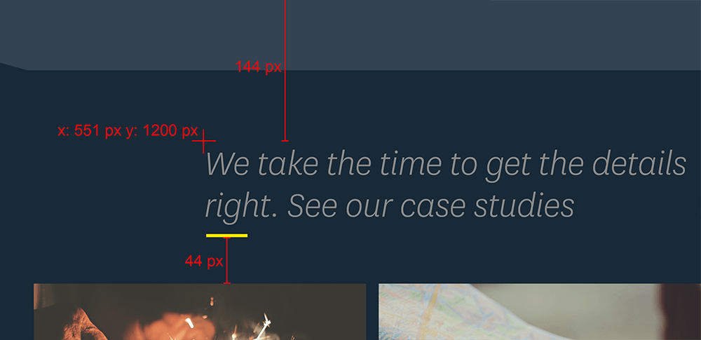
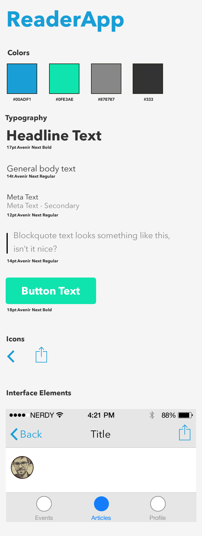
Below are some excerpts from a design document annotated with Specctr. With the help of the Specctr plugin, a designer could quickly provide the color values of any design element, along with the exact width and height, gradient values, type attributes (including font family, weight, kerning, leading, etc.), margins, padding, border properties and more. This would greatly help the developer to implement the design because they would not need to hunt through layers and sublayers or make any guesses.
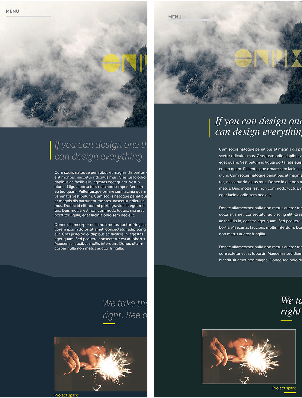
As a bonus side effect, using detailed design specs will help you to avoid errors and inconsistencies in the final version of the design when it’s implemented in real life. Below is an example of the “drift” that can occur when implementation details are not made explicit and are left up to the developer’s guesswork.
Note: Specctr is not the only tool that automatically generates detailed design specs. Plugins such as PNG Express (designed to work with Photoshop) do similar tasks, but I’ve been mentioning Specctr because I developеd it myself and have the most experience with it. If you have tried other spec-generation tools, please, share your experience in the comments below.
Components And Style Guides
Developers have long been familiar with the advantages of breaking a large system down into small components through object-oriented programming, which is currently the dominant programming paradigm, thanks to the adoption of languages such as Java. Breaking a complex project into self-contained parts that make up the whole allows a single part to be reused in multiple places in a project and allows for greater project organization and easier maintenance.
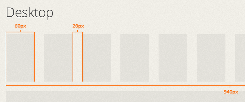
Designers are also finding that breaking down a design into its atomic components allows for greater efficiency because they’re able to combine them to reuse their code and styles. Seeing the components from which a project’s entire design is derived allows for the immediate communication of style choices made across that project. Examples of the components that would be shown are the grid, buttons, forms, tables and lists.
Components combined with design specs make up a style guide. A style guide serves as a reference both to communicate a project’s design aesthetic and to provide details of its implementation to developers. Developers no longer have to rely on designers to spec individual documents, and can instead use this reference to find the information they need. In this way, a style guide is another great tool for more efficient collaboration between designers and developers.
Conclusion
I reached out to a few designers for comments about the process they follow to document designs. One of my favorite responses comes from Jason Csizmadi, senior visual designer at Cooper:
"Developers at all stages of projects expect and demand strong documentation. Although documentation is never the most exciting aspect of design, it’s a critical step in ensuring smooth working relationships, timely delivery and a successful hand-off at the end. Ultimately, design documentation acts as a life-support system, ensuring that your vision is executed properly."
Like any good business process, design specs should support the primary endeavor — in this case, to create beautiful websites and applications. Creating these products requires collaboration between designers and developers, and effective collaboration requires effective communication. Investing in the development of workflows and tooling around to make this communication easier and more efficient will pay off big with the speed and effectiveness with which products are built and, ultimately, with the success of the businesses that depend on those products.
Other Resources
- “Best Practices for Designer-Developer Collaboration,” George Dean A nice summary of the different workflows available to developers and designers
- “How to Improve Designer and Developer Workflow?,” StackExchange A discussion illustrating some of the concerns about designer-developer workflows
- “Blueprint,” Wikipedia A detailed definition (and some history) of the word “blueprint”
- “Programmer Interrupted,” Chris Parnin Some studies and resources on the effects of interruption on programming
- “Creating a Killer Style Guide,” Ben Gremillion, Zurb A tutorial on creating a style guide
- “How to Make an Effective Style Guide With Adobe Fireworks,” Joshua Mauldin, Smashing Magazine An interesting read on making style guides with Fireworks
- “Blueprints for the Web: Specctr Adobe Fireworks Plugin” and “Blueprints for Web and Print: Specctr, a Free Adobe Illustrator Plugin,” Chen Blume, Smashing Magazine Examples of using the Specctr plugins for Fireworks and Illustrator
I’d like to thank Michel Bozgounov, who helped me research this article and made a few useful suggestions to improve it.
Further Reading
- Not An Imposter: Fighting Front-End Fatigue
- Preparing For A Front-End Job Interview
- How To Boost Your Design Workflow With Setapp
- Talks To Help You Become A Better Front-End Engineer In 2013
 (mb, al, il, mrn)

