Icons Of Digital Design - Who Shaped Modern Design?

Email Newsletter
Weekly tips on front-end & UX.
Trusted by 182,000+ folks.
 Register for Free

 Custom Web Forms for Angular, React, & Vue. Your backend.
 Celebrating 10 million developers
Apple launched the Macintosh personal computer in 1984. It was more user-friendly than other PCs at that time — and, with its desktop publishing software, graphical user interface and mouse (all novel at the time), the Mac was uniquely geared to designers. Compared to what we can create on the computer today, the original Macintosh, with only 128 KB of memory, had limited capabilities. At the time, though, it opened up so many new possibilities.
Of course, using a computer didn’t automatically make designers better at their craft. Instead, the new technology gave them more control and sped up their exploration process. As with anything unfamiliar, the Mac sparked debate among designers during this time: While some saw the computer as simply another tool for creating work, like a drawing pen, others saw its potential as a medium in itself.
Emerging digital technology also changed typography, exploding the number of typefaces available and giving designers the tools to create and distribute their own fonts. Some digital typefaces were updated versions of classics, while others were brand new: type that was made for low-resolution screens, and type that was less functional and more illustrative. It was easier to break the rules. There was a refreshing jolt of youthful experimentation as people moved past the limits of the rational and functional.
I wrote my book Graphic Icons: Visionaries Who Shaped Modern Graphic Design to highlight the era’s influential designers, from El Lissitzky in the early 1900s to Stefan Sagmeister today. Each of these designers broke from tradition and changed the world of design in some way. Those who designed not only on the screen, but for the screen, ushered in a new era of digital design, mixing media and incorporating motion, sound and interactivity. Below are a few of those pioneers.
Wim Crouwel
First, though, let’s step back. Twenty years before the Macintosh was released, Dutch designer Wim Crouwel had an uncanny sense of how computers would influence design and vice versa. In the 1960s, developments in printing technology gave designers more control over their work: Instead of relying on a printer to compose type and position images in a layout, designers used rub-down type and photomechanical transfer to do it themselves. This DIY approach gave designers more freedom and flexibility in using, manipulating and creating type.
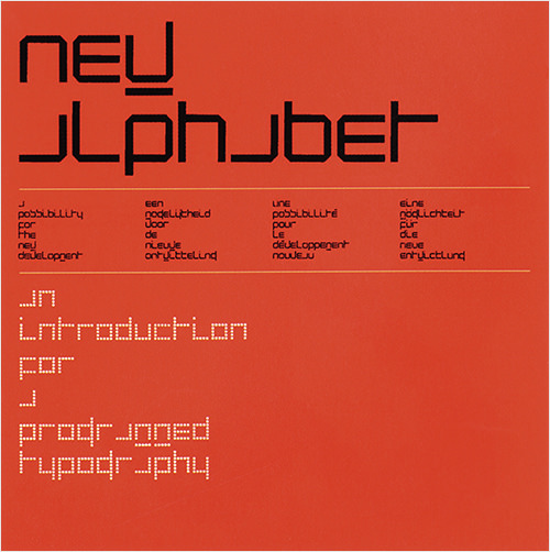
The computer was in its early stages at the time, and Crouwel saw an exhibition in Germany on digital type production. The limitations were clear to him. Dot-matrix printers and computer screens couldn’t reproduce traditional type with curved letterforms. So, he created a groundbreaking typeface to work with this emerging technology.
Starting with the Swiss typographic grid, Crouwel based letters on the rectangle, using only vertical, horizontal and diagonal lines. The result was 1967’s New Alphabet, so radical in appearance that it was almost abstract. It was never meant to be used; it was just an experiment. Crouwel must have been surprised to see the New Alphabet used on the cover that Peter Saville designed for Joy Division’s Substance album 20 years later.
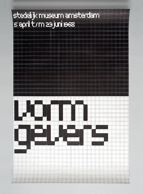
Still, that concept influenced his future work, like his poster for Vormgevers (“Designers”), for which he hand-rendered the lettering based on squares in a visible grid. Crouwel developed a system for Amsterdam’s Stedelijk Museum where each piece — posters, brochures, advertisements — used the same grid. Although these pieces promoted art exhibits, they never depicted the art itself. The type-centric design and common grid unified the museum’s communications, yet the system was flexible enough to remain fresh and interesting.
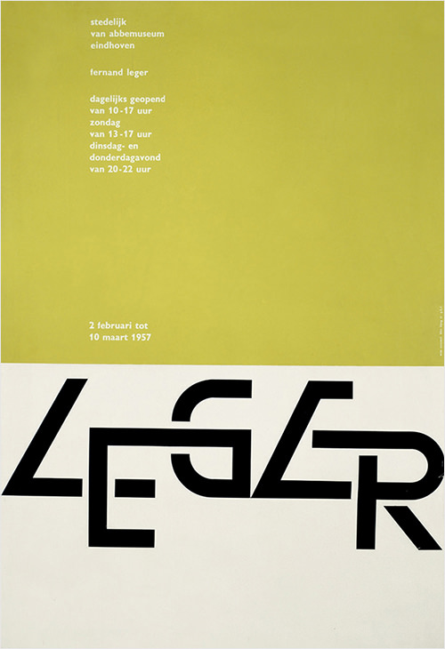
Crouwel also broke new ground in how Dutch designers worked. In the 1960s, Dutch companies with large projects often hired larger firms in cities like London, thinking that the local designers who usually worked solo wouldn’t be able to handle the workload. In order to attract those large projects, Crouwel and four partners, with a range of experience in graphic and industrial design, formed Total Design. It was the country’s first multidisciplinary studio, where teams handled complex two- and three-dimensional projects. It was successful: Private corporations, government agencies and arts organizations hired Total, and their designs for postage stamps, airport signage and museum posters made a distinct mark on the country’s visual culture.
Hans Rudi Erdt, A.M. Cassandre and especially Josef Müller-Brockmann are big influences on Crouwel’s work, and in turn, Crouwel remains a prevalent figure in the design world — in 2013, he was celebrated with a retrospective at London’s Design Museum. Crouwel inspires young designers, including Philippe Apeloig and Spin, who created a series of posters based on the grid he developed for the Stedelijk Museum.
April Greiman
April Greiman uses different words to describe what she does: “hybrid imagery,” “transmedia,” “visual communication.” But not “graphic design.” She feels that term refers exclusively to print, and her work combines elements from different types of media. Greiman thinks in terms of space when she designs, not in terms of a page. This is probably why designing digitally has been such a good fit for her.
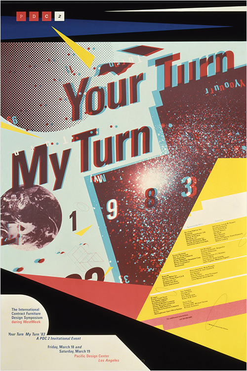
New Wave typographer Wolfgang Weingart encouraged Greiman, while she was in graduate school at Basel in the early 1970s, to break free from a grid-based approach to design — to layer type, and to float it in space. She brought this knowledge to New York; and, after growing frustrated by the rigid limitations imposed by East Coast clients, she moved in 1976 to Los Angeles and opened a studio. The change of location opened her eyes and encouraged her to explore. She began teaching at the California Institute of the Arts (CalArts) in 1982 and gained access to the school’s computers and video equipment.
The new technology opened so many possibilities for Greiman, enabling her to combine print, video and type into multiple layers that were previously impossible to create. She felt strongly that these new tools weren’t just a means to arrive at the same old solutions, but that they should lead us to explore ideas and create something new.
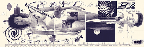
When Greiman designed an issue of Design Quarterly for the Walker Art Center in 1986, she blew up the traditional magazine format, creating a 2 × 6-foot folding collage that combined a nude portrait of the designer overlaid with multiple layers of images and text. While the fact that Greiman used a computer to create the work hardly seems noteworthy today, consider that the computer had one megabyte of RAM and a monochrome 9-inch display.
Greiman built the collage on the computer and outputted letter-sized pages on her dot-matrix machine, then directed the magazine’s printer to assemble the pages and photograph the entire composition. Greiman wasn’t just tinkering with the computer; she was exploring the idea of making sense, touching on philosophy and physics. Like much of Greiman’s work, the project wasn’t just about technology, but was personal.
Greiman’s list of influences is well-rounded: Among them are her former teachers Armin Hofmann and Wolfgang Weingart; singer, songwriter and poet Leonard Cohen; theoretical physicist David Bohm; psychiatrist Carl Jung; and spiritual leader the Dalai Lama.
As the world continues to change, so does Greiman. More recently, she’s been creating web design, branding, signage and public art and has been consulting on color, finishes and textures for architectural projects. She continues to teach and believes in always being open to new ways of doing things.
"Do what you love to do, with a vengeance. It’s not what you do but who you are." – April Greiman
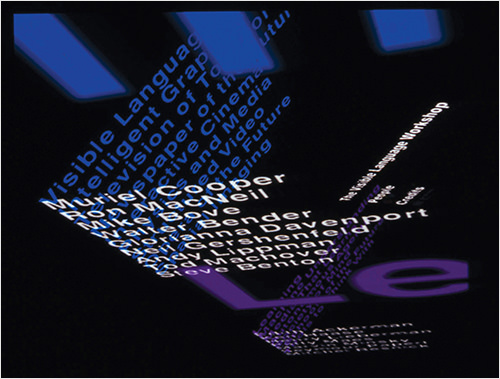
Muriel Cooper
Muriel Cooper had two design careers: first as a print designer and secondly as a groundbreaking digital designer. Both revolved around the Massachusetts Institute of Technology (MIT), and both were based on her quest to make static media more dynamic.
MIT’s Office of Publications hired Cooper in 1952 and continued working with her after she established her own studio. She then became art director for MIT Press, where she designed classic books, such as Hans Wingler’s Bauhaus. She designed the first edition of Learning From Las Vegas; authors Robert Venturi, Denise Scott Brown and Steven Izenour hated what she did, but many graphic designers loved it. She also designed the abstract logo for MIT Press, a modern classic.
Cooper took her first computer class at MIT in 1967, and it bewildered her. However, she could see the computer’s potential in the creative process and soon began the second phase of her career: applying her design skills to computer screens. With Ron MacNeil, Cooper cofounded the research group Visible Language Workshop in 1975, which later became part of MIT’s Media Lab. Cooper didn’t write code; she was the designer and the thinker. She knew what she wanted visually and encouraged her students to use technology to present well-designed information.
Cooper presented the group’s research at the influential TED5 (Technology, Entertainment, Design) conference in 1994. For the first time, computer graphics were shown in three transparent dimensions, which moved, changed sizes and shifted focus, instead of the standard Microsoft Windows interface of opaque panels stacked like cards. She made a big impact: Even Microsoft founder Bill Gates was interested in her work. Unfortunately, she died soon after of a heart attack, but her legacy in interactive design continues.
"Muriel Cooper taught me that design had very little to do with how you make something, and instead why you make something." – John Maeda
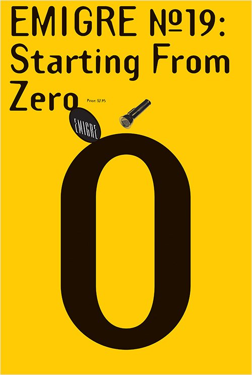
Rudy VanderLans And Zuzana Licko
Apple broke new ground when it introduced the Macintosh computer in 1984. Designers Rudy VanderLans and Zuzana Licko did the same (albeit on a smaller scale) with Emigre magazine that same year.
While many designers initially resisted the computer, VanderLans and Licko embraced it, though in different and complementary ways: VanderLans liked the freedom it gave him in designing layouts, while Licko found a disciplined method for designing type.
VanderLans studied design in The Netherlands and worked at Wim Crouwel’s Total Design. But he was more attracted to the expressive work of Herb Lubalin and Milton Glaser than to the Dutch modernists. He went on to study photography at UC Berkeley, where he met Licko, his future wife and business partner, as she studied graphic communications.
Emigre magazine quickly became a forum for designers, especially those interested in experimentation and technology. It featured in-depth articles and visual essays, in layouts that broke all the rules — with varying type sizes, overlapping layers, text columns crashing into each other and distorted letterforms, all techniques that the Mac made easier. VanderLans and Licko sold their type designs to fund the magazine (which meant they didn’t have to cater to advertisers).
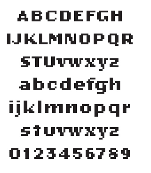
The typefaces were an important part of the magazine’s design as well. After the first two issues, the magazine was set exclusively from the collection of Emigre Fonts. Licko began with rough pixelated typefaces, like Oakland, and progressed to more versatile fonts, like the popular Mrs Eaves. Emigre Fonts also carried select designs by Barry Deck, Jonathan Barnbrook, Elliot Earls, Eric Donelan and Bob Aufuldish and Ed Fella, among others.
The magazine ceased publication in 2005, but Licko continues to design fonts, and VanderLans designs the type specimens. They also sell books, ceramics and collectibles.

John Maeda
John Maeda was a computer science graduate student at MIT in the late 1980s on his way to becoming a user interface designer. Then he read Thoughts on Design, by Paul Rand — an experience that shifted the course of Maeda’s career.
Maeda took a humbling message from Rand’s book: Understanding the computer did not necessarily make one a good designer. Encouraged by his professor Muriel Cooper, Maeda decided to study graphic design in Japan, where he added traditional design skills and concepts to his knowledge of computers.
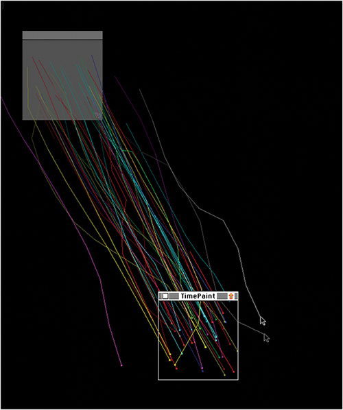
Maeda then returned to MIT to teach, and founded the Aesthetics and Computation Group at the Media Lab. It was there that Maeda, who as a child excelled at both math and art (though his father only bragged about the math part), explored the area where design and technology meet. For Maeda, the computer is a tool and a medium. Through the Media Lab, Maeda created digital experiences like The Reactive Square, in which shapes responded to sound, and Time Paint, a time-based program of flying colors. His Design by Numbers project (no longer active) encouraged designers and artists to learn computer programming.
In his quest to educate, Maeda writes books, too: The Laws of Simplicity outlines his hopes that technology will simplify, rather than complicate, our lives. From 2008 to 2013, Maeda was president of the Rhode Island School of Design. As an educator, he considers creative thinking equally important as technical capability in the development of the leaders of tomorrow. To the emphasis on science, technology, engineering and math — STEM — throughout the country’s educational system, Maeda proposes adding an A for art, to create STEAM. His goal? Not to make the world more high tech, but to make it more humane.
Summary
Of course, digital technology wasn’t the only new development during this era: Design education programs expanded and became more rigorous. Design writing evolved into its own discipline, as practitioners took matters into their own hands by writing articles, books and criticisms that brought new perspectives to the design canon. And designers were — and are — affected and influenced by social, political and cultural changes as they explored new ways to engage their audiences.
Today, people all over the world can communicate with each other like never before. With the rise of the Internet, social media and mobile applications, the user has gained control over how, when and where they access information. The digital revolution continues, and design is sure to play a significant role in shaping the future.
Further Reading
- About Art – What Do We Really Mean
- Beautiful Photoshop Illustrations By Artists Around The World
- Inspiring Illustrator Artworks By Artists Around The World
- Ask the Expert – Design Discussion with James White
Portions of this article are from the book “Graphic Icons: Visionaries Who Shaped Modern Graphic Design” by John Clifford. Copyright © 2014. Used with permission of Pearson Education, Inc. and Peachpit Press.


