Card Sorting Beginner’s Guide: Improving Your Information Architecture

Email Newsletter
Weekly tips on front-end & UX.
Trusted by 182,000+ folks.


 Celebrating 10 million developers
 Custom Web Forms for Angular, React, & Vue. Your backend.

In this article, we’ll discuss card sorting, a tried and true technique for doing just that. We’ll go through some practical tips for running a card-sorting session, and also cover some examples.
Information architecture (IA) is one of those buzzwords you’ve probably heard before. It refers to the organization of the information on your website and how it all fits together. When planning your IA, involve users of your website in the process as soon as you can.
What Is Card Sorting?
Card sorting is a great way to become familiar with information architecture and user-centred design. It’s cheap, reliable and easy to set up.
What Is Information Architecture?
One of the great things about modern web design is the way it considers users’ needs from the start. Successful projects are successful often because the owners commit to understanding users, their backgrounds and their goals as early as possible. Like anything else in this game, though, a successful project takes work and planning.

Good Navigation Starts With Good IA
IA refers to the structure of information on a website, and it is depicted with site maps, diagrams and spreadsheets. Navigation refers to elements of an interface that people use to make their way through that structure — menus, breadcrumbs, links — and it is depicted in wireframes or prototypes. Therefore, improving IA starts with analyzing the website’s content and structure first — navigation comes after.
As with many website improvements, it helps to use techniques that involve users. Card sorting is one such technique that has been used for many years due to its reliability and effectiveness. To start with, we’ll examine the causes of poorly organized information — prevention is always better than a cure! We’ll then cover some practical tips for running your own card-sorting sessions and consider how they can improve the IA in your own projects.
Bad IA Is Everywhere
Bad organization can happen anywhere. When was the last time you spent ages looking for something within a complex system and couldn’t find it? A typical example is trying to find something at a large supermarket. Most people could easily find household staples in the frozen goods, dairy or fresh produce section. But which section would you visit to find more obscure products? Where would you find gluten-free bread, your favorite imported brand of hot sauce or that artisanal handmade bean dip you tried at the party last weekend?
Where’s The Hot Sauce?
I sometimes struggle when looking for products at my supermarket, which increases my frustration. I usually end up asking a store employee where to find the item, assuming I haven’t left the store already. The same is true of the web, except that users are even less patient. If users can’t find what they want in seconds, by either browsing or searching, they’re unlikely to stick around. As a result, websites (and supermarkets) benefit greatly from an intuitive structure and organization. Unfortunately, some fail to address these issues properly, leading to lost sales as customers grow frustrated and leave.
How Bad IA Happens
It’s not difficult to end up with a badly organized website, despite one’s best intentions. But how does a website end up like this in the first place?
One of the most common reasons is that the IA is created from the business structure of the organization, rather than from users’ needs. This is the default option for many clients. More common still is when the information is organized according to the preferences and whims of senior members in the company. This is often due to the influence of the HIPPO (the highest paid person’s opinion), usually made by an assertive individual who often lacks a grasp of what makes a good website.
The Importance Of Content Strategy
For larger websites, the issue is often the lack of a clear content strategy. Managing content is crucial for websites that are large or frequently updated. Content strategy covers processes like:
- who updates the website and how often,
- the system for managing old or out-of-date content,
- maintaining the taxonomies for content on the website (tags, types, categories, labels).
As web professionals, we take pride in our work and planning abilities. Being confronted by an overbearing HIPPO and archaic content strategies is frustrating. However, both of these problems have a common solution. User-centered techniques such as card sorting are powerful because they enable you to be much more scientific in diagnosing and fixing website problems. Later on, we’ll look at how card sorting and content strategy work hand in hand.
How Card Sorting Helps
So, how do we get users involved in organizing the information on our website? Ideally, we want a solution that’s cheap, quick and useful. Thankfully, card sorting is all three of these. The process is much like it sounds. You write down all of the discrete elements that you wish to organize onto cards, and then ask participants to collect them into groups that make sense to them. But is that all there is to it? When can it be used, and what should the outcome be?
When To Use It?
The process of organizing content is fraught with questions. Should it be grouped by type or by subject? Which category does this FAQ question belong to? Card sorting answers these types of questions and is useful in many situations. Some specific examples include:
- classifying the products in an e-commerce store,
- organizing questions in an FAQ section,
- untangling a complex site map.
One of the great things about card sorting is that it needn’t be confined to client projects or even websites. After having used it for clients, we saw its value as a general purpose tool. We have started using it in our own internal meetings to incorporate feedback from our team about how to organize a particular business process or how to structure an upcoming presentation.
Ultimately, the goal of any card sort is to improve the labelling, grouping and organization of information. However, it is best suited to organizing content, and it won’t fix everything on its own. If your website is very task-focused (if it’s an airline-booking website, for example), then card sorting on its own will provide limited benefit. Best to direct your energies towards usability testing, especially if your time or budget is tight.
Open Or Closed?
Card sorting sessions can be classified as one of two types — open or closed. Open card sorting is the more flexible option of the two. Here, users are free to organize the cards you supply into groups that make sense to them, and then come up with their own names for these groups. They are also free to rename cards or make their own suggestions for new cards if they wish.
This type is best when you want to understand how users would group your content. Gathering their ideas and suggestions for names and labels goes a long way to making your website more intuitive.
The alternative method, closed card sorting, is where the categories or labels are fixed. This is useful when you want to understand how users fit content into an existing structure. It’s also used when new content needs to be added to a website.
As an example, consider an e-commerce website and the top-level categories they might have for their products, such as technology, home and garden, and sports and leisure. Now suppose that the store has started stocking a new range of products that have just been launched. Which top-level category on the website should these products be added to? Involving users in a closed card sort could help you to arrive at an answer.
Sometimes you can mix the two techniques. Run an open card sort with one group of users to define the top-level categories. Then run a closed card sort using these new categories, and see how easy it is for users to fit existing content into them.
This Time, It’s Personal
Traditionally, card sorting is as low-tech as it gets, requiring no advanced technology or software. You simply write all of the items on pieces of paper or cards, spread them out on a table, and let your users have their way with them. This method is the most widely used because it’s cheap, quick and intuitive. Being in the same room as your users means you’ll be on hand to guide them through the process.
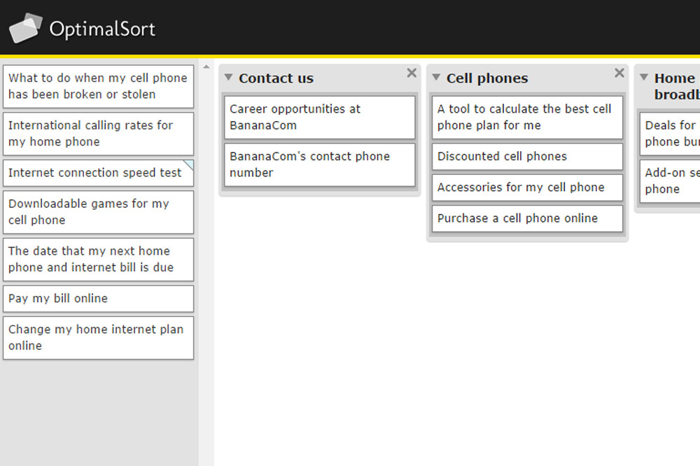
The focus of this article is offline sessions, but online sorting tools, such as OptimalSort and OptimalWorkshop, present some key advantages. Recruiting participants is easier, which makes it easier to scale up. Many feature advanced reporting tools to identify correlations and patterns, which can take a lot of time when done manually. Free tools such as Trello also work well for card sorting, but you lose the ability to generate reports.
The disadvantages of online services are that they are often a lot more expensive and you lose that personal touch. You’ll gain unique insight by observing people’s behavior and body language, which online sessions can’t capture.
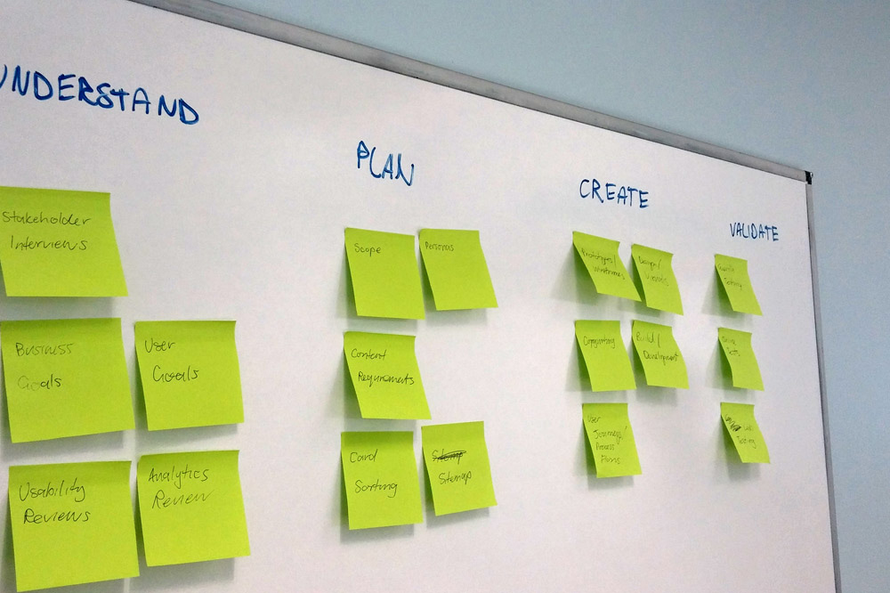
Step By Step
1. Prepare
The first task in running an offline session is to prepare your cards. Create a document that lists all of the items you are testing, and give each one a number — spreadsheets are ideal for this. These items could be pages in a site map, product categories or labels in a taxonomy. Each item in this list then gets written on a single card, with the corresponding number written on the reverse. This numbering will help if you want to run more advanced analysis once the sessions are complete.
For the cards themselves, use actual cards instead of paper, which can get lost, worn out or torn easily. Also, don’t test too many things at once. From experience, I can say that no more than 50 to 70 items per session is about right. If you’re trying to organize a massive system, break it up into chunks, and then run sessions for each chunk.

Choosing what to write on the cards can be challenging. Ideally, the labels should be short enough that they can be read quickly, but long enough to make sense and for participants to understand what is being represented. Short titles usually make sense only in the context of the group they belong to. Therefore, summarizing the content as briefly as possible could help, rather than simply using a title.
For example, a label like “More information about our phones” would be preferable to just “More information.” The second item would make sense within an existing parent group named “Our phones,” but on its own it doesn’t make much sense.
In summary:
- Use a spreadsheet when preparing your cards.
- Get cards that are durable.
- Find a balance for labels between simple and intuitive.
2. Walk Before You Can Run
If this is your first time using this technique, use it in a smaller project if you can. Organizing and analyzing the results will be easier, and it will be an opportunity to fine-tune your technique for next time. One decision you’ll need to make early on is whether to run group or individual sessions. The answer usually depends on the complexity of the system, as well as your time and budget. If you’re just starting out, get your feet wet with individual sessions first — you can always scale up later if you need to.
When you’re organizing a lot of content, groups of three users will reach consensus faster. However, they will need more moderation, and they could cost you more time and money. You also run the risk of dealing with aggressive HIPPOs, which can skew the results.
How many users should you include in a session? For the data to be useful, you will need more users than for a typical usability test. Jakob Nielsen recommends about 15 users to arrive at statistically useful results. Be wary of including more and more users in your tests, however, because the returns diminish as you go higher.
In summary:
- If this is your first go with card sorting, try it on a smaller project first.
- Groups reach consensus faster.
- Individual sessions are easier to moderate.
- Get around 15 participants to achieve useful results.
3. Find Participants
The next step is to find participants. For best results, find actual users of the website, especially if it’s a niche or specialized system. If you’re trying to improve the organization of a student intranet, for example, find students. For something more general, like a large e-commerce website, find users with a broad range of demographic indicators, such as age, income or technical ability.
If possible, involve your client in finding users. The client could even provide them directly — say, if you’re redesigning a staff intranet. Offering a small financial incentive, like a gift voucher, also helps to make sure they turn up.
In summary:
- For niche websites or intranets, find existing users.
- For more general websites, find users from varied demographics.
- Clients are often helpful in finding participants.
4. Put It All Together
The final step in preparation is to get the meeting room ready. Get a large table or notice board — the bigger the better. You’ll also need some kind of recording system in place. This could be anything from a camcorder to a smartphone, as long as it enables you to play back the audio and video from the session. Make sure enough drinks and refreshments are on hand, too.
Once you’ve prepared the cards and your users have arrived, it’s time to run the sessions! Provide clear instructions, and let the users know you will be recording their sessions for later review. Explain that you want them to organize the cards into groups that make sense to them and that there is no right or wrong answer. If you’re running an open card sort, get some blank cards for them to write their own names once the initial organization stage is over.
While you’re running the sessions, you might need to act as a moderator. Be on hand if they get stuck (there will likely be a lot of “ums” and “ahs”), but explain that this isn’t a problem. In fact, knowing where they are getting stuck is useful because it indicates a problem with labelling. If they find some cards difficult to classify at all, then leave them off to one side and note what they are. Also, be aware that the demands on you as a moderator will increase in group settings.
In summary:
- Record each session and take notes.
- There is no right or wrong answer.
- The demands on you as a moderator will increase with more participants.
5. Wrap Up
Once they have gotten as far as they can, feel free to ask some questions if you have time. You could ask them to explain their choices in more detail, what made them hesitate about this particular card, and so on.
Finally, record the arrangement they’ve made. The easiest way to do this is simply by taking a photo, but in a small room it can be hard to make sure that all of the cards are in the shot. Taking a photo isn’t always feasible, so if you have numbered the cards, then you can note which numbers were grouped together. This will also help you when you do a more detailed statistical analysis of the groupings, which is out of scope of this article.
Once that’s done, write the participant’s name on your notes and photos. To reduce any potential bias, shuffle the cards for the next user, and then invite them in.
In summary:
- Taking photos is a quick way to record the arrangements.
- Ask questions if you have time.
- Shuffle the cards before each session to reduce bias.
Further Tips
- Offering a small incentive is a good way to encourage participation.
- When choosing what to sort, try to choose content from similar levels (i.e. category pages or individual help topics). Mixing child and parent categories is confusing.
- Provide clear instructions. Have an idea of what you want to say before you start.
- Provide blank cards and a marker pen for new suggestions — essential for open card sorting.
- Try not to interrupt participants unless they ask for help.
- It’s OK if participants can’t group everything. This is useful information.
- Set a time limit for each session, which will make scheduling much easier.
- In individual sessions, ensure that no one else is present. This would be distracting.
- Always record the sessions, and take notes!
Interpreting The Results
Congratulations! You’ve just run your first card-sorting sessions, and your notebook is full of fresh insights. The next step is to interpret the results. Because this is probably your first card-sorting session, you won’t have mountains of results to sort.
For each participant, document two sets of observations for each session. The first step is to create a new document, and then transfer any notes that you made during that session. These should be qualitative observations, such as any new names that were suggested and whether the person hesitated on a particular card.
Next, note that participant’s groupings. You could simply arrange the groupings in a bulleted list in your document or show the groupings in a spreadsheet. A spreadsheet is ideal if you want to perform some advanced statistical analysis later. Various methods and pieces of software can do this for you, and the specifics of this could fill another article by themselves. The important thing is to depict the hierarchy, the parent-child relationships, that each participant created.
What To Look For
Once this is complete, it’s time for analysis. This is as much art as science. The goal is to identify trends that correlate across different sessions, and to answer some of the following questions:
- Which items appeared together most often?
- Which items did participants struggle to classify?
- What new suggestions or labels were made?
- Were any items put in more than one grouping?
- Were any other items of interest brought up during the sessions?
If many users organized the cards in a similar way, then the job is fairly straightforward. It’s a matter of applying that same organization to your content. If you have time, then follow up with further user testing to confirm that the new structure is superior to the old one.
For IAs that are complex, users often come up with wildly different structures. You might need to involve a larger group until broad trends emerge. This is the hard part, and it might take a couple of passes to sift through the chaff and get to the good stuff. After running a few sessions, you’ll get the hang of it.
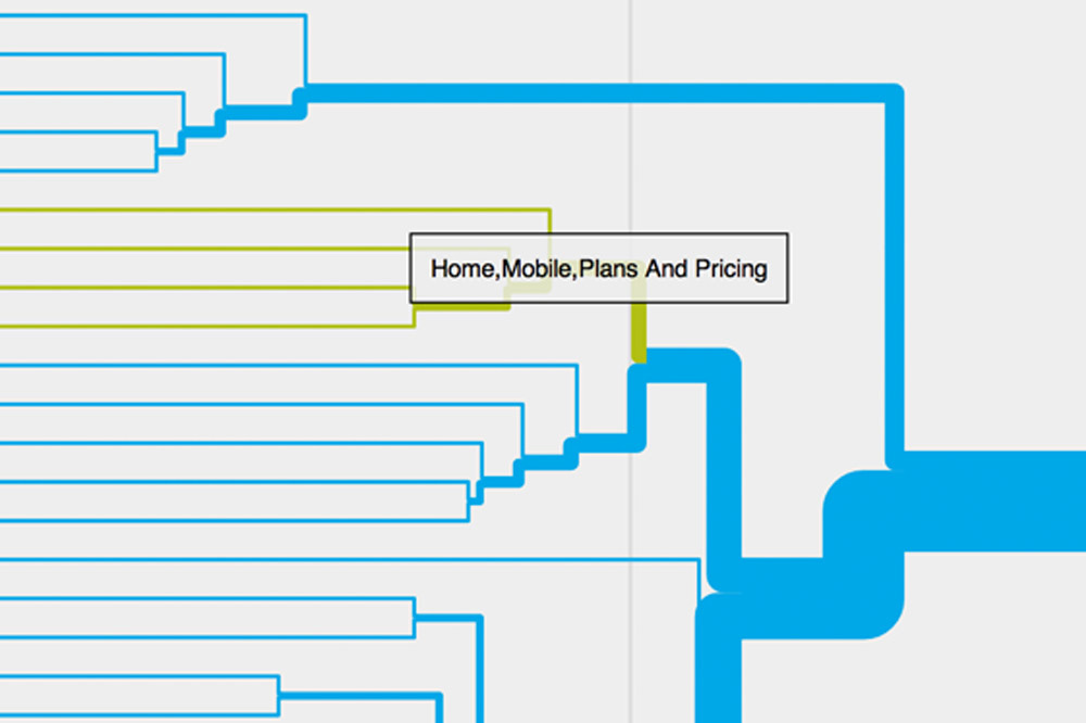
Online tools are a great help in these situations because they make statistical analysis much easier. Advanced techniques of analysis include creating dendrograms. These are tree-like diagrams that show the grouping of information within hierarchies and show how closely items are related. Some online services provide tools for making these, but they’re quite onerous and out of scope for this article.
Example From A Real-World Project
Background
Recently, the team at Decibel Digital worked on the redesign of a major UK animal charity website. The existing website had a section simply named “A–Z,” which contained hundreds of pages. A lot of the pages were genuinely useful and included varied content such as news, help, videos and downloads. The problem was that there was little to no structure. Everything was simply mixed together and then organized alphabetically. It was the largest section of the website by far, so locating what you needed without relying on search was incredibly hard.
Upon speaking with the digital team, we realized that part of the problem was a lack of oversight. Anyone in the company was able to upload new content to this section, and they would often upload duplicate content with a slightly different name. Over many years, the content in this section grew into a chaotic mess, like an asteroid belt — and just as difficult to navigate.
Running A Content Audit
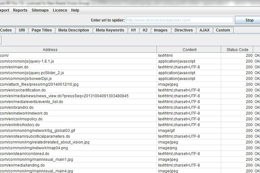
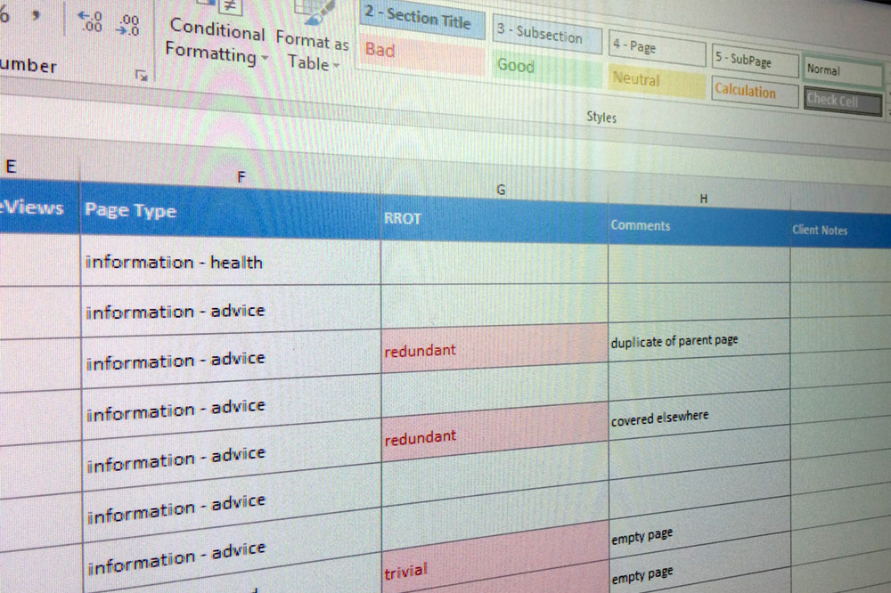
Getting into the habit of auditing content before redesigning a website is a good thing. We gathered all of the website’s pages and their URLs in a spreadsheet, along with a short description of the content — text, images, video, articles and so on. These URLs can be exported from an existing CMS, but we used a Java tool named Screaming Frog.
Once the spreadsheet was prepared, the next step was to evaluate the content. We used a method called a ROT analysis. We checked each piece of content using the following criteria:
- R: Is the content redundant?
- O: Is it outdated?
- T: Is it trivial?
Working through the website’s content like this can seem laborious, but it was actually very therapeutic. The client felt relieved once they started unravelling the content monster that their old website had spawned, which made everyone feel better about the project. Using this ROT analysis made it faster to reach consensus on choosing pages to remove or archive. Pretty soon, the content was whittled down to manageable levels. The next step was to figure out how to organize this content. Enter card sorting!
Running A Card-Sorting Session
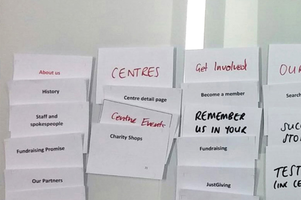
Following on our content audit, we all felt that the existing A–Z section wasn’t really fit for the purpose, despite a lot of the content being useful and valuable. We decided to run a card-sorting session to organize the content in a way that would inform the new website’s navigation. The goal was to develop a structure that made the content browser-friendly and easily findable without the user having to rely on search.
What To Test?
The website still had a lot of pages, so we had to decide which to include in the sessions. Having too many cards to sort becomes laborious and difficult, so we decided to include only first- and second-level pages to keep things manageable. We also didn’t include utility pages, such as “Contact Us,” “Privacy Policy” and the like, which are commonly found on many other websites. Once this was done, we had about 50 pages left, which we felt was ideal to begin the sessions.
Finding Users
The next step was to find users to test, for which we enlisted the help of the client. The users of the website tended to skew to an older female demographic, so having the client’s input here was very useful. Some of the users we tested had already engaged with the client in offline marketing activity and were excited to help!
Open Vs. Closed
We decided to run an open card sort because the content from the existing A–Z section was diverse, comprising news, videos, blog posts, help articles and advice. We wanted to rely on the users’ input to create labels for these content types that made sense to them. As a result, we supplied plenty of blank cards and pens for them to write their own suggestions.
During each session, we took plenty of notes, particularly about the items that users found difficult to sort and any suggestions they made for new labels that we hadn’t considered. We also recorded each session as a backup, so that we could go over the recordings later to observe anything we missed.
What We Found
At the conclusion of the sessions, we took photos of the groupings and updated our spreadsheets. We looked for quantitative data — were there any trends? Did multiple users make similar suggestions for new labels? Did any labels consistently cause users to struggle? We looked at qualitative data, too: specific comments that users made or what they said out loud as they struggled to categorize a particular card.
Being a charity, the client relies a lot on donations and support from the public, so getting the labels for these sections right was important. We found some interesting points:
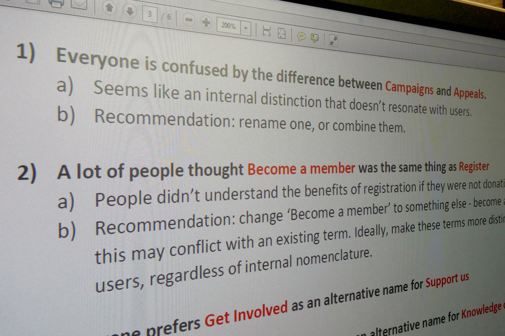
- The website offered annual paid memberships as a means of supporting the charity, as well as the ability to register a free account on the website. These were labelled as “Register an account” and “Become a member”; however, many users were confused by the difference. We ended up changing the wording of the membership call to action to eliminate the confusion.
- We had suggested the name “Knowledge Centre” as a label for the help content, but many users suggested alternatives. We ended up using “Help & Advice” on the website instead.
- The charity ran monthly “Appeals” as another means of getting donations, and it also campaigned on many issues that were listed in “Campaigns.” Lacking any context, though, every user we tested struggled to differentiate these cards. We ended up incorporating the “Campaigns” section into another area of the website.
- To indicate a desire to support, nearly every user suggested the term “Get Involved” as a major category label. We noticed this convention on other charity websites, too.
After all this was done, we presented our findings in a report. We decided not to include masses of quantitative data. While it was useful to us internally, we felt the client would be unfamiliar with the quantitative data and wouldn’t know how to interpret it without sufficient explanation.
Instead, we presented our key findings (like those listed above) in plain English, and we classified our findings as high, medium and low priority. We also included some recommendations on how to resolve the issues we found. This made it much easier for the client to identify “quick wins” with their content’s structure, and it made it easier for us to implement the required improvements.
Final Thoughts
Card sorting is a favored technique because it’s cheap, reliable and easy to set up. It’s a great way to become familiar with concepts such as information architecture and user-centred design. Remember that it’s not a silver bullet, and it won’t fix all of the problems on an existing website. A website might be performing poorly or be hard to use for many reasons, and improving the IA might address only some of them. However, when used in tandem with other user-centered design techniques, it can go a long way to starting off a project or redesign on the right foot.
Hopefully, you have enjoyed learning about card sorting. When implemented well, it results in a product that is intuitive and easy to navigate. If you’ve made it a part of your own process already or you have anything to ask or share, please join the discussion in the comments section.
Other Resources
- OptimalWorkshop Online card-sorting tool
- OptimalSort Another sorting tool, part of a suite of UX products
- The Difference Between Information Architecture and Navigation, Jennifer Cardello, Nielsen Norman Group This article does a great job of explaining what IA is, and what it is not.
- Information Architecture for the World Wide Web, Peter Morville and Louis Rosenfeld The definitive book for those who want an in-depth look at IA
Further Reading
- Website Content Planning The Right Way
- Stop Designing Pages And Start Designing Flows
- Responsive Design Begins With The URL
- 20 (Alternate) Ways to Focus on Users


