A Frank Lloyd Wright Approach To Digital Design

Email Newsletter
Weekly tips on front-end & UX.
Trusted by 182,000+ folks.

 Custom Web Forms for Angular, React, & Vue. Your backend.


 Celebrating 10 million developers
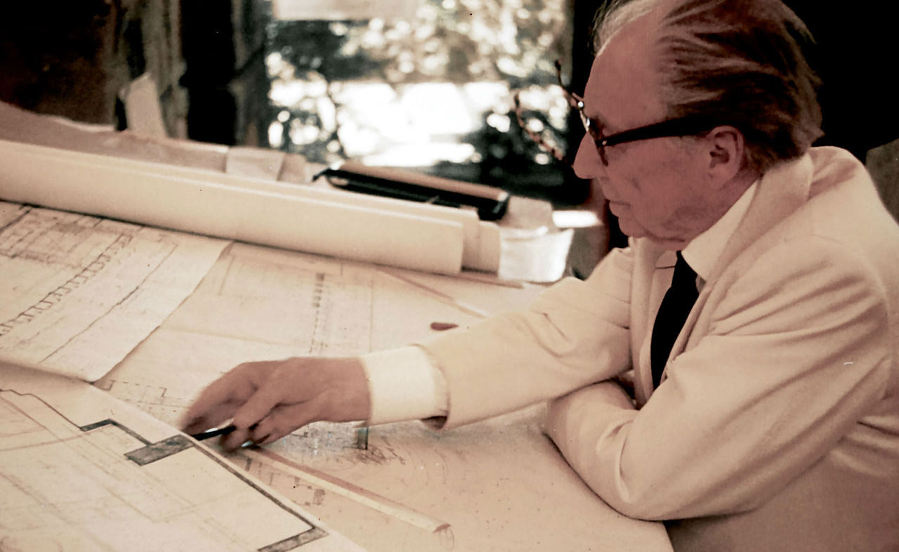
Frank Lloyd Wright was a century ahead of his time. He was a pioneer, an avant-garde architect who broke free of the traditions of his era. His views on materials, form, function, space and environment define his iconic works. These ideals and principles are still used in architecture today, and his buildings have stood the test of time, remaining relevant even in today’s digital age.
I find a lot of inspiration in Wright’s timeless work. As designers, we’re frequently asked to create digital experiences (especially in software) that will have a lifespan of 5 to 10 years. This is an eternity in “digital” time, and it has made me ponder the future. What kind of devices will people be using in the next few decades? What interaction patterns will we be using in 25 years? 50 years?
Throughout his 70-year career, Wright developed a number of principles and ideals that can inspire us to design digital experiences that better stand the test of time. I will cover six main aspects of Wright’s approach that we can apply to digital design. His effort to create a “new” architecture, along with his views on materials, layout, form, function and the relationship between the whole, its parts and the environment can inspire us to rethink the way we approach our digital design work and even push the medium into new and exciting territories.
The Need For A New Architecture
We should never add levels of complexity to our design work for the sake of being new and exciting. In fact, Wright discouraged this practice in his architecture. In his preface to Studies and Executed Buildings, he said:
“I do not believe in adding enrichment merely for the sake of enrichment. Unless it adds clearness to the enunciation of the theme, it is undesirable, for it is very little understood.”
The Victorian Era And Its Frivolous Design
Wright started his career at the height of the Victorian era. Mainstream American architecture embraced the classical academic traditions of Europe. Victorian homes were not only dwellings, but also status symbols — showrooms of personal wealth. These homes were littered with ornamentation and consisted of many small rooms that weren’t designed with function in mind.
In the words of Wright, “The average desire seems to be to build something which will rear on its hind legs and paw the air in order that you may seem more important than your neighbor.” Additionally, Wright’s opinion was that little imagination was being put into this architecture — an architect could pick a pattern out of the stylebook and “place a bay window on it for the lady.”
The Dawn Of A New Architecture
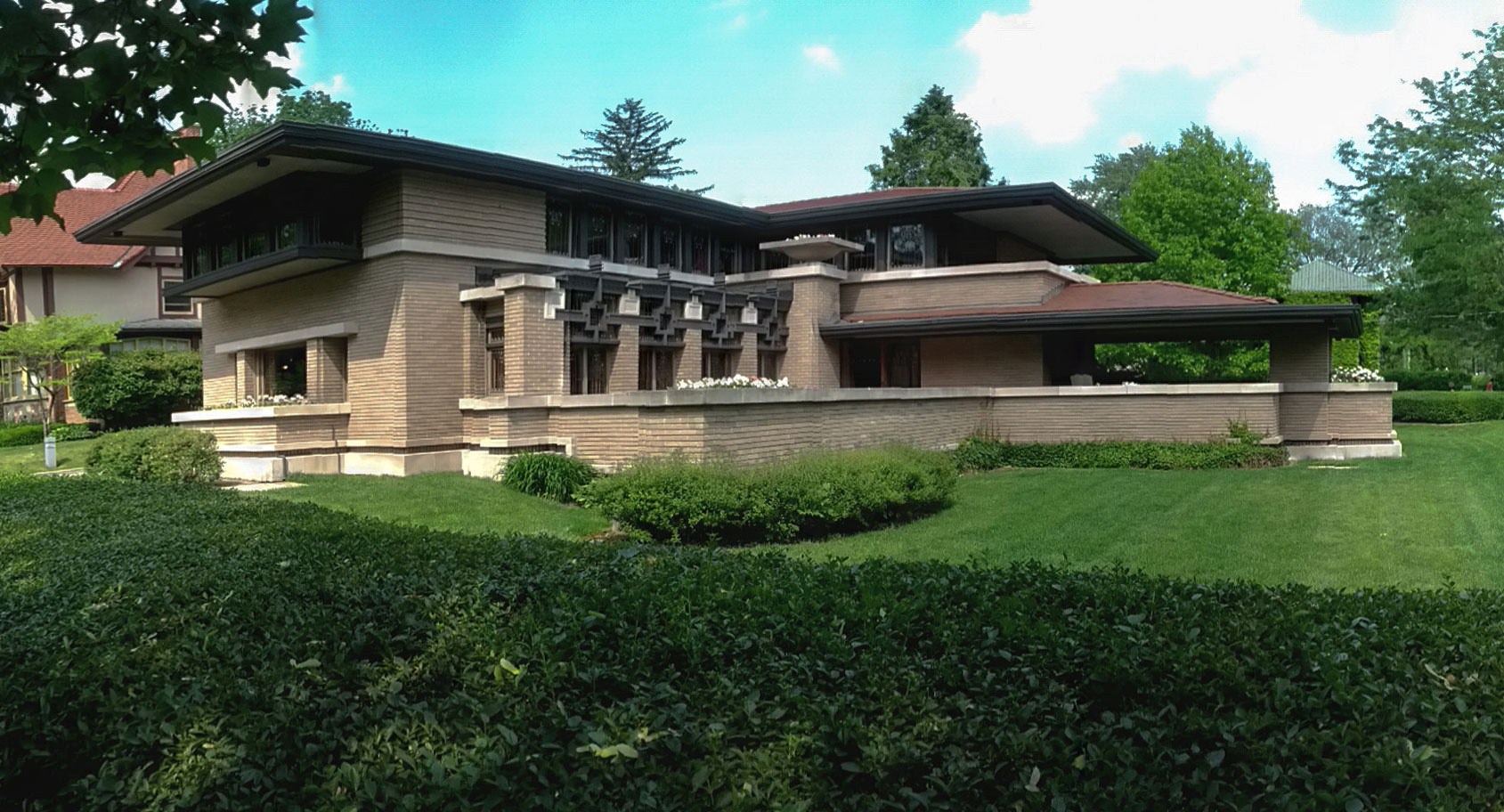
Throughout the 1880s and 1890s, Wright identified the need for a new architecture. By the turn of the century, he had found his voice. He discarded the superficial Victorian traditions of the time and led a new, American architectural movement: The Prairie School. According to this school of thought, every building would serve a purpose, and each detail would be carefully planned so that it supported that purpose. These details would define the structure’s aesthetic style.
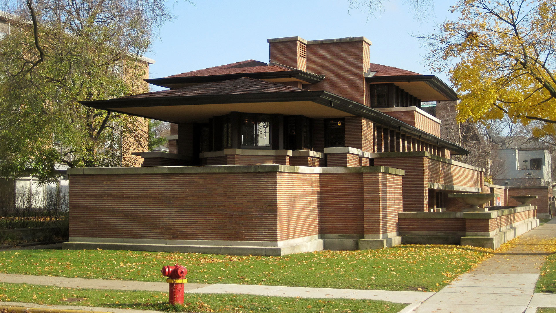
One example of function driving form can be seen in Wright’s Frederick C. Robie House. A defining characteristic of this private home is its exaggerated eves and cantilevered rooflines. While this is a defining part of the building’s aesthetic, its primary purpose is to provide shade to the main areas of the home during hot Midwest summers. It also provides an added sense of shelter during the frequent severe storms and other harsh conditions.
Details With A Purpose
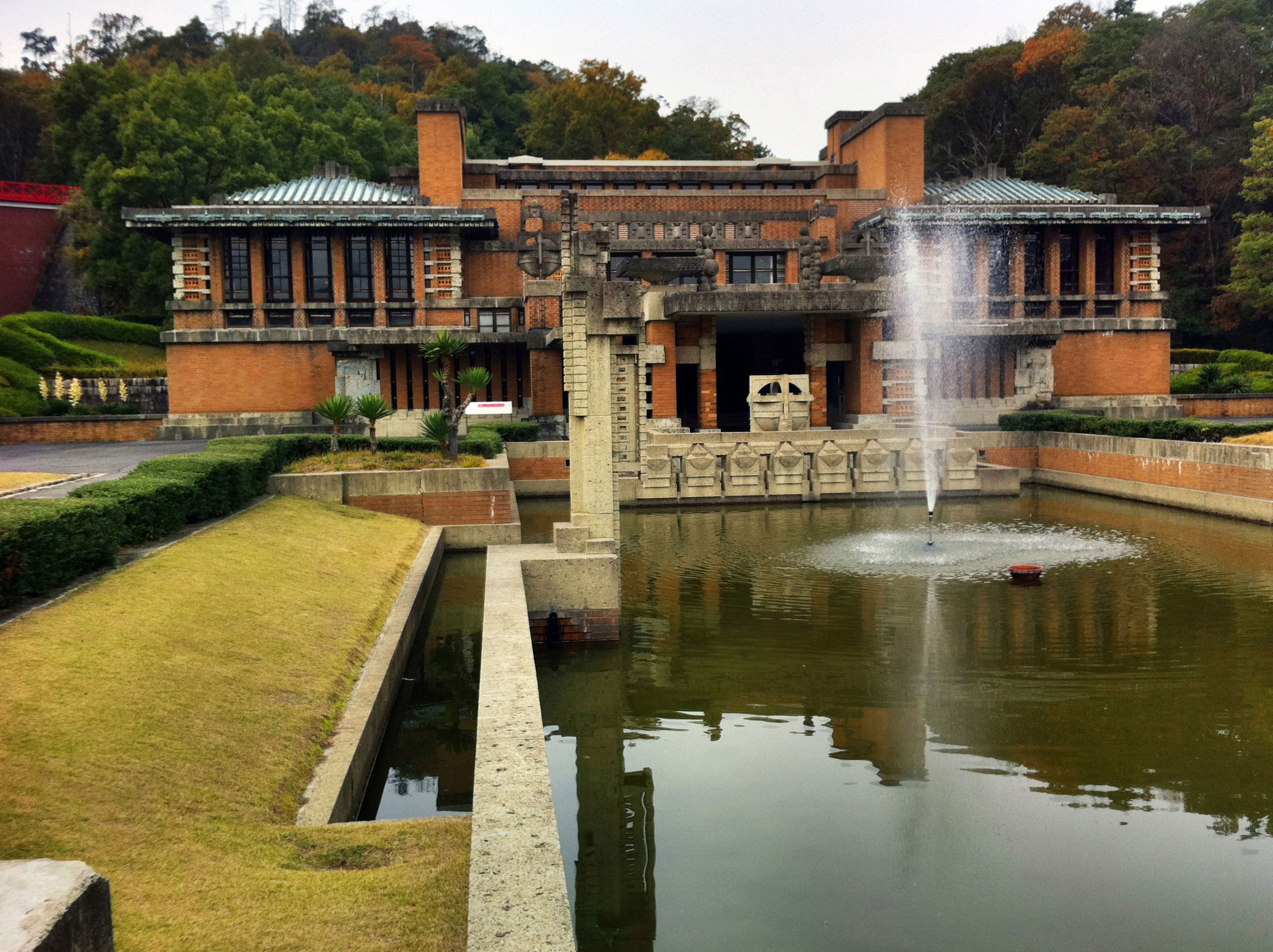
When Wright designed the Imperial Hotel in Tokyo, a city that at the time was prone to fires, he included reflecting pools that could be used as a water source for fighting fires. While these pools were aesthetically beautiful, they served a much more important purpose.
As designers, we’re in the business of providing beautiful, engaging, usable experiences that meet the needs of our users and serve a much greater purpose. We shouldn’t add unnecessary complexity to our designs, nor should we use visual styles for the sake of being fashionable. After all, we aren’t in the business of impressing our design colleagues. Instead, every decision we make should serve a purpose that supports the original UX requirements and business objectives.
Materials
Understanding The Nature Of Materials
Wright gave careful consideration to the materials he used. He chose materials based on their natural strengths and properties. For example, glass allows light to pass through it. Concrete is fluid and can be poured. Both brick and stone are solid. He was dissatisfied in the way other architects treated materials. They had a disregard for the nature of each material and treated all materials as if they were the same. Wright felt it best to allow materials to exist in their natural form, instead of superficially dressing them. For instance, wood has a natural color and grain. It is also strong yet flexible. Painting or carving a piece of wood doesn’t respect its natural, simple qualities and would be considered by Wright an instance of unnecessary design.
Combining Materials
Wright’s deep understanding of materials gave him the freedom to better meet the needs of his clients. He combined materials in innovative ways when he designed the Johnson Wax Administration Building in Racine, Wisconsin. One of the project’s objectives was to increase traffic flow and freedom of movement throughout the building. Wright created a sealed environment with a vast open layout, soaked in natural light and supported by an indoor “pine forest” of columns.
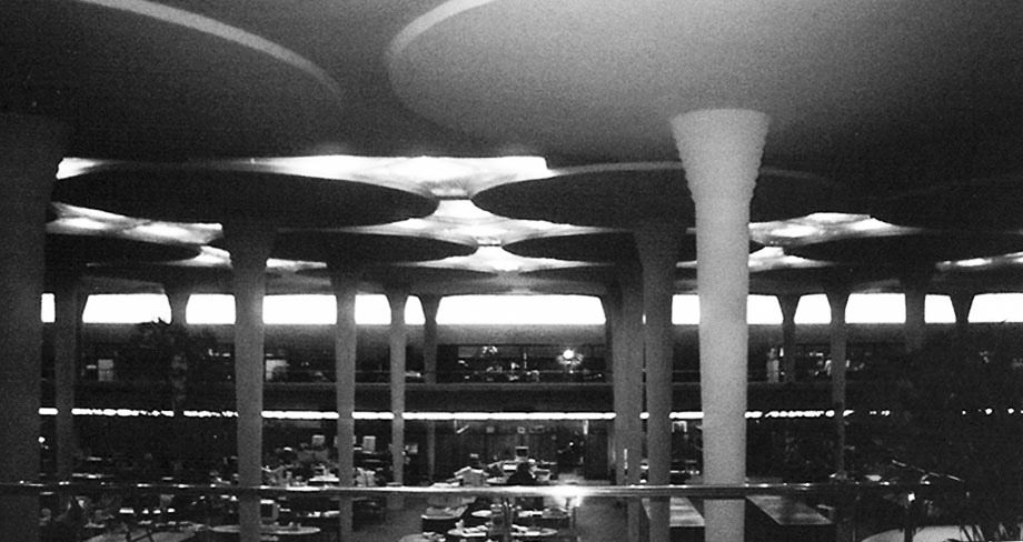
Wright’s dendriform columns consisted of narrow bases and wide tops, and they appeared to defy gravity. Skeptical engineers felt this design would fail. Wright’s deep knowledge of materials and their properties enabled him to design these columns so that they were structurally sound yet didn’t compromise traffic flow or the openness of the layout. The office floor’s revolutionary design led to a 25% boost in employee productivity in the facility.
Technologies: A Designer’s Palette Of Materials
In our digital world, different devices offer varying combinations of technologies and capabilities. We can apply these technologies to our design work in the same way that Wright used materials to create great buildings. Let’s think of a device’s technologies as our bill of architectural materials. For instance, a device might have a screen, an accelerometer, a haptic engine, a camera, NFC and GPS. Like wood has a natural grain and is both strong and flexible, a haptic engine can offer vibrating feedback at varying intervals. An accelerometer detects sudden movement.
In a lot of cases, the screen is a “catch all” and is misused in the same way that Wright’s contemporaries misused architectural materials. If we think beyond the screen, we can use the natural capabilities of these technologies or “materials” to create more engaging, immersive experiences that surpass the initial business objectives and requirements.
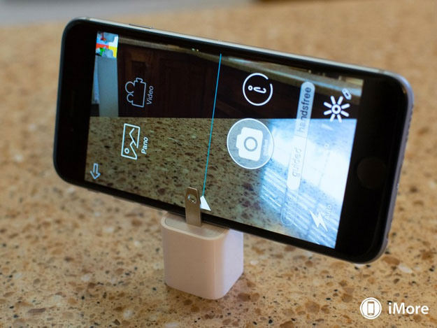
As Wright did with the Johnson Wax building, we can take this further by combining materials in clever, innovative ways. A good example is Cycloramic. This app takes hands-free 360-degree panoramic photos. To do this, the app depends on the iPhone 5’s flat ends to stand up. Vibrations created by the haptic engine rotate the device, while the camera captures the surrounding environment. The result is a perfect panoramic photo.
Even more innovative is Cycloramic’s solution for the round-edged iPhone 6, which cannot stand on its end. The app’s creators use an additional material, the charging plug, as a holder for the phone.
Good apps leverage the technologies made available by the device that they’re designed for. The new Apple Watch could lead to a whole new gold rush in the app market. Like homeowners of the Victorian era, companies will create watch apps just to keep up with the Joneses. These apps might not even serve a defined purpose. The successful and well-designed apps will leverage the watch’s core technologies, such as the taptic engine, NFC reader, heart-rate monitor and input crown. How will you leverage the technologies available on the devices you’re designing for?
Layout And Form
Free And Open Layouts For The People
Unlike their Victorian predecessors, Wright’s prairie homes consisted of open layouts arranged around a central point. Instead of creating traditional rooms, Wright believed in creating flexible, mixed-use spaces. These open spaces, or vistas, were carefully designed to manage the movement of people inside and outside of the home. As a result, areas of the home were more readily accessible to the inhabitants. These spaces were designed so that light and air could permeate the whole structure with a sense of unity. Areas were separated with “screens,” instead of rigid walls. These screens were made up of anything, from furniture (like in the Robie House) to continuous windows.
Wright felt that eliminating boxy rooms enabled him to make all of the space more human, with less space wasted on the structure and more left for living. In an interview with Mike Wallace, he stated that he received letters from his clients indicating that this approach had a life-changing effect on them.
As designers, we can find inspiration in Wright’s layout principles. In addition to (but not excluding) the fundamental layout principles we use, such as hierarchy, contrast and balance and consideration for reading direction (i.e. left to right), we can draw inspiration from Wright’s views on form and layout to push our design work in new directions. The screen is the most popular technology (or, in Wright’s terms, material) at our disposal, and it’s usually not used to its full potential.
Cramming In More Information: What Not To Do
As more information becomes available, users demand access to it through websites and software. Because of this, we tend to cram information into our designs, and we end up adding more modules, panels and even screens. Adding more screens places an artificial burden on information architecture and/or the app’s search capability. This design model is evidenced in the unnecessary levels of navigation in many applications. Some navigation panels even take up more real estate than the actual content (as illustrated below). This is the digital equivalent of a boxy, confined Victorian home layout.

We could make screens taller, but that would just give tacit permission to stakeholders to continue adding content, which was the cause of the original problem. We are not fully leveraging the screen’s natural capabilities. To do this, we need to confirm that any addition meets an identified UX requirement or business objective; then, we would evaluate how it fits in our design on a holistic level.
Applying Wright’s Ideals To Digital Layouts
Our design canvas isn’t confined to the physical real estate of a screen, nor should the form be limited to one flat plane that sits directly beneath a device’s display. The screen can be considered a viewport into a world that’s an extension of our own physical 3-D world. This virtual space is as vast as the prairie landscape that inspired Wright’s early works.
Like rooms in a Wright house, we should arrange content into forms that let it naturally flow and become more immediately accessible. We have multiple axes to work with in this vast virtual space. This opens up new places to put information. The arrangement of the content and the overarching form shouldn’t be arbitrary. The resulting form should be determined by content, simple in its nature and, as stated earlier, not a matter of design for the sake of being cool.
SpaceX created a tool to design rocket components. As you can imagine, rocket engines are packed full of sophisticated components, all of which need to be designed, tuned and tweaked.
Like the earlier example of the sketched layout, this screen could have been cluttered with menus, options and settings. Instead, relevant information appears in context, relative to the engine component in focus. The form, or screen layout, is derived from the very model that the engineer is constructing within the tool. Like the open vistas in the prairie house, the interface, or lack thereof, combined with the tool’s open layout allows the engineer to freely move around the drawing board and edit the engine on the fly. This is a great example of how complex information can be arranged in a simple, intuitive form.
Additionally, the Leap Motion Controller was chosen as the method for input. This technology makes the experience even more natural, enabling the engineer to sculpt the engine with their own hands. Not only can the software’s form be mapped back to Wright’s principles, but it’s a fine example of the usage of materials — and, by the way, nothing about this design is excessive.
Form And Function Are One
Wright’s Architectural Forms
Wright’s mentor, Louis Sullivan, is famous for this quote from his article, “The Tall Office Building Artistically Considered”: “Form ever follows function.” In other words, a building’s form should be determined by its purpose. This idea had been around for a while and actually derives from the ideals of Marcus Vitruvius Pollo, an early Roman architect and engineer who wrote De architectura.
Wright went on to revise this classic idea to “Form and function should be one joined in spiritual union.” This granted him more latitude in his architectural decisions.
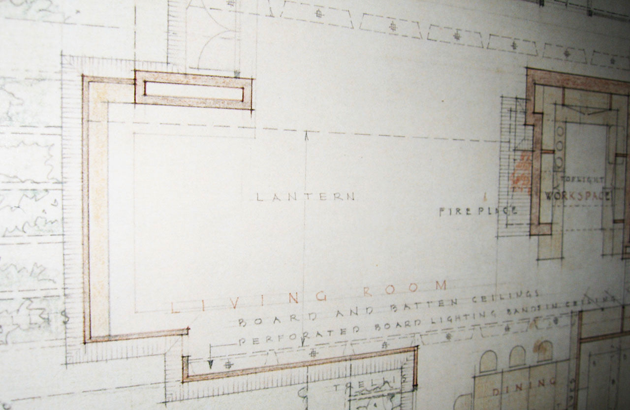
The shape of a prairie house was driven by its purpose: to provide an intimate yet open setting sheltered from the harsh conditions of the Midwestern prairies. To achieve a sense of intimacy and coziness, the structure was brought down to “human” proportions. Ceilings and rooflines were lowered. Primary rooms were situated on a slab, raised off the damp cold prairie ground. As mentioned, rooflines were cantilevered and exaggerated to provide shade, while uniform rows of windows were suspended to maximize natural lighting in the main living quarters. Bedrooms and utility rooms were considered to be less important and, so, were situated on an upper level. Kitchen and utility areas were adjacent to the main areas as needed. The main areas were typically long open vistas. The homes typically took on the shape of an L or a cross.
Content, Form And UI Becoming One
In addition to the form-related principles mentioned above, we can further simplify our design work by tightly combining the content, its form and the UI to become one. Today, content and the UI typically coexist, and sometimes there is tension between the two. Usability doesn’t need to be sacrificed either. The UI should always be obvious. A consistent form will enable users to create a clear cognitive map of the content. Information should always be accessible through a consistent interaction model, making for a more natural experience.
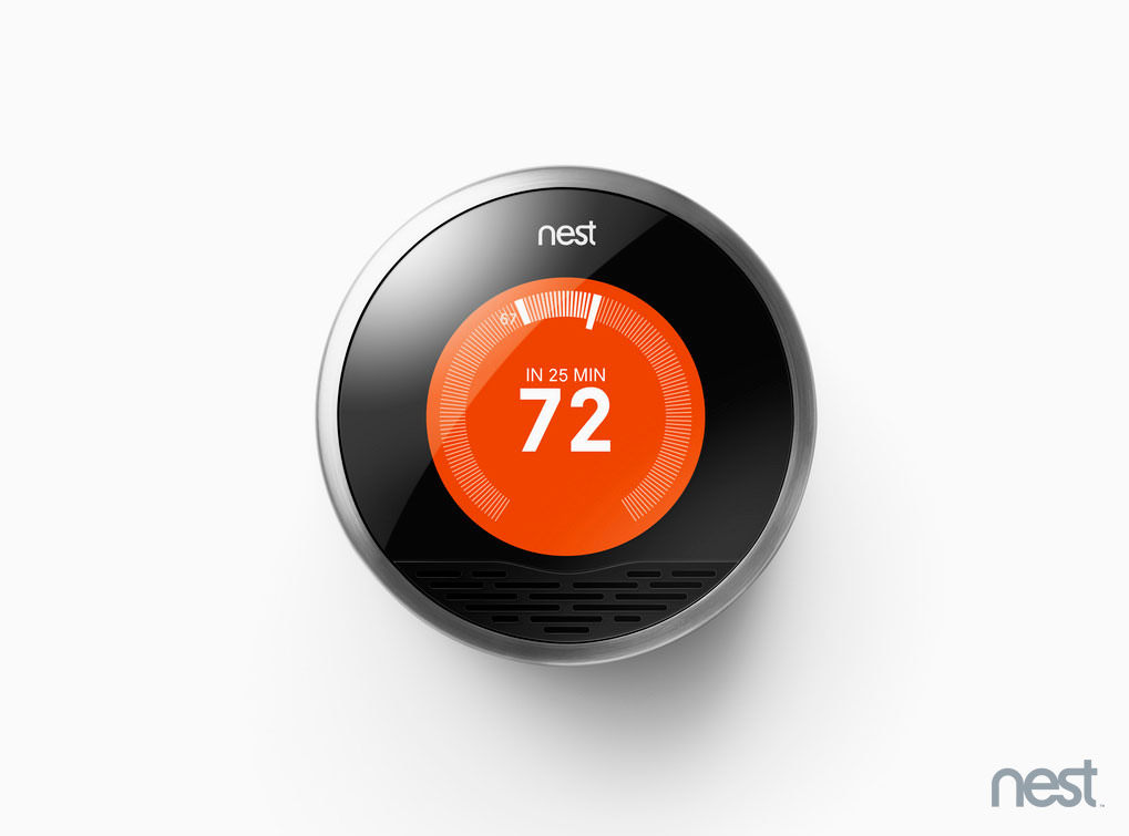
Form and function are elegantly combined in the Nest Learning Thermostat. Rather than cluttering the screen with UI controls and buttons, the designers made the device’s physical form, the cylinder, as the UI itself. It can be rotated to control the temperature and other functions. The thermostat’s sensor array learns the user’s preferences and automatically sets the temperature based on the time of day, occupancy and settings history. The uses of other technologies, or materials, ease the burden on what would have otherwise been a cluttered UI. Contextual information is the focal point of the form, and it is seamlessly integrated in the product’s design and interaction. While the thermostat’s form recalls the analog rotary dial used in the past, it’s a great example of content, form and UI becoming one.
Depending on how our content takes shape, creating physical layers of information might be appropriate. These layers could be accessed through transitions, like animation, zooming and panning, further orienting the user within the greater form. It will give the user a better understanding of where they’ve come from and where they are going. If we’re designing a gestural interface, it could also suggest the interaction required to get back to the starting point.
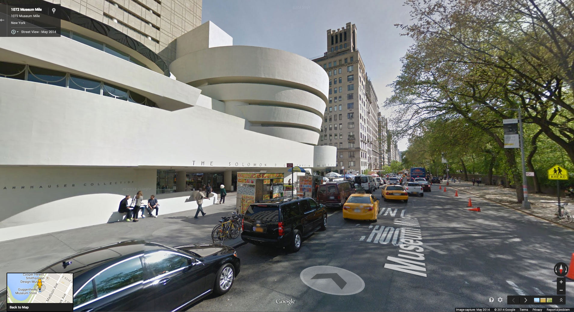
Google Maps’ Street View is another fine combination of form and function. The app allows users to explore cities and maps from a street-level view. Its form takes on the shape of the city you’re exploring. You can click on the roadways and buildings to navigate the map. As a result, the app has little to no navigation chrome — the content is the UI. Animation and zooming further orient us in the larger form.
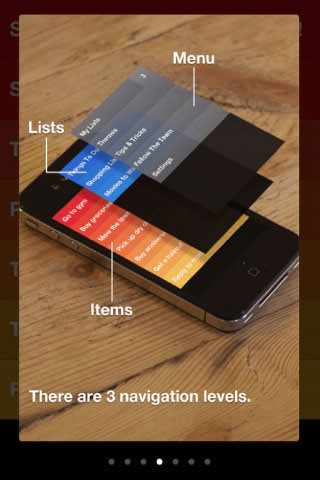
Finally, Clear seamlessly integrates form and function, too. The app’s layered form enables users to easily navigate the content. Color and animation are used to represent the transition from one layer of information to another. Also, it’s another great example of how transition techniques and the integration of content, its form and the UI can be used to create a more natural experience. How will you integrate form and function in your next design project?
The Whole And Its Parts
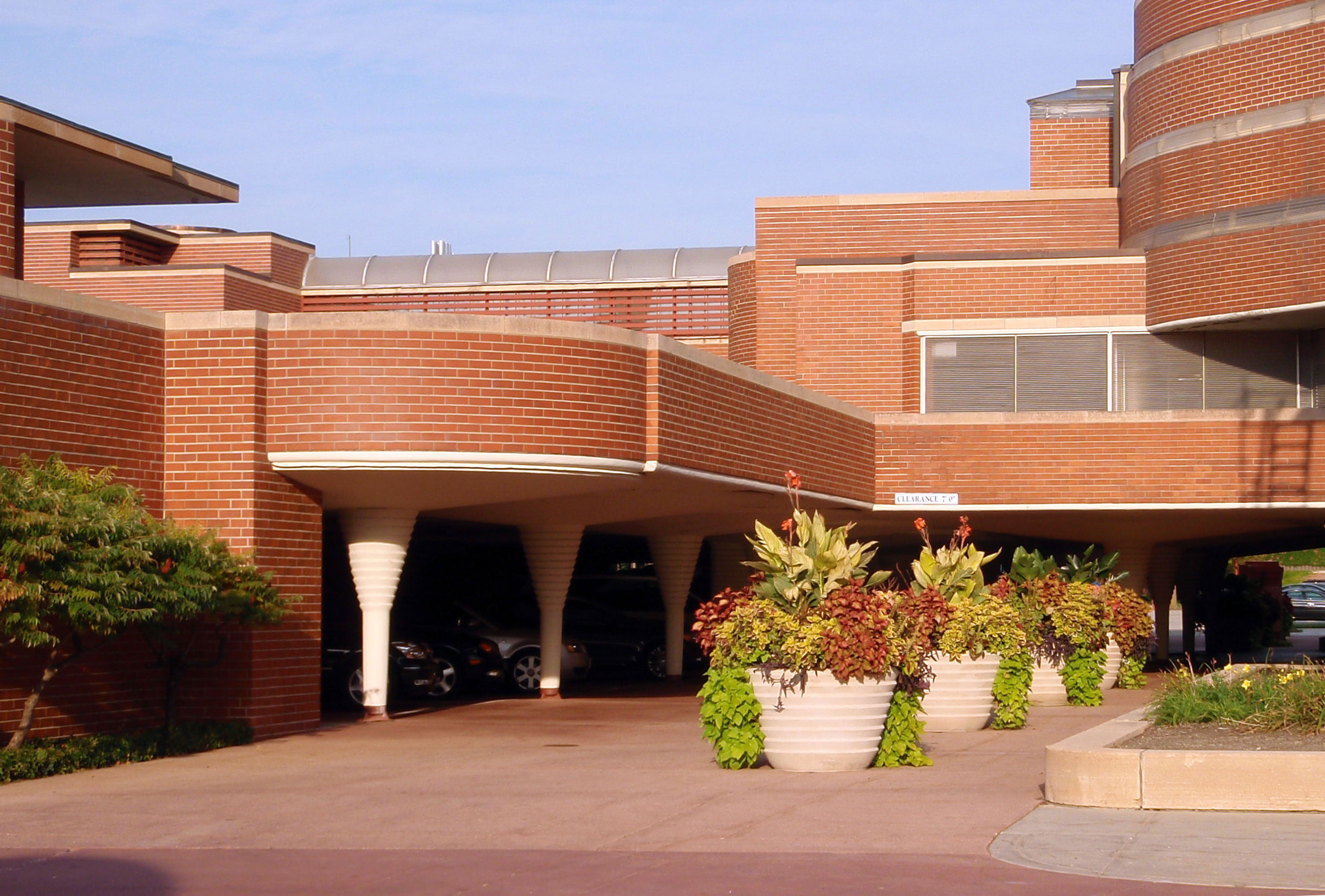
Frank Lloyd Wright felt that all parts (including rooms, areas, indoor and outdoor spaces, and the surrounding environment) are related to the whole and that the whole is related to the parts. There should be a marriage between the structure and its site, materials, time and context. Wright suggested that visitors should admire the entire building (the whole) before entering its parts (indoor areas). As a result, defined entryways were usually hidden or disguised. In the words of Wright, “To approach the building was to be embraced by it long before one reached the entrance.” By the time they entered, visitors had a better understanding of the building. This held true for his homes and larger works. For example, employees of Johnson Wax had to drive around the building and then through the carport to access the main entrance.
Enabling Users To Experience The Whole To Understand Its Parts
Today, we use affinity diagrams and site maps to visually organize information. These tools also enable us to group and view the relationships between the pieces of information. We can take cues from these tools and artifacts when we’re putting form to our information. Just like Wright, we might do well to give users a look at the larger form first (the whole) before drilling into the content (the parts). This initial holistic view could provide additional context and enable users to better understand the connections within the information.
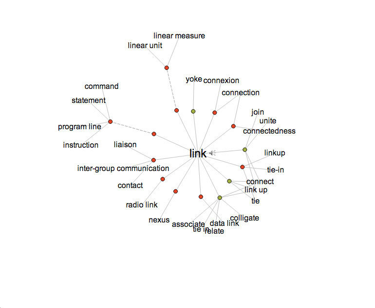
Visual Thesaurus arranges synonyms in clusters around the word in focus. It provides a view of the full form up front. Like in an affinity diagram, related synonyms are arranged in visual clusters around the search term. Color-coding shows the differences between nouns, verbs and adjectives. The synonyms (parts) are part of a visual web (the whole) that helps us to understand how synonyms relate to each other and the term in focus. As a result, we have a deeper understanding of the information and can take action (in this case, choosing the best synonym to use). Just like a Wright building, this website enables you to first experience the full web of synonyms before drilling into the content. Incidentally, Visual Thesaurus also incorporates Wright’s ideas on form and function; the web of synonyms merges the content and the UI.
If you’re following Wright’s principles of form and function, then giving users a moment to take in the larger form before drilling into specific content might not hurt. Depending on what your design is supposed to accomplish, you could consider showing the relationships between pieces of information within the form, helping users to better understand the content.
Environment
Harmony Between The Building And Its Environment
Frank Lloyd Wright was famous for his quote, “No house should ever be on a hill or on anything. It should be of the hill. Belonging to it. Hill and house should live together, each the happier for the other.” Wright carefully designed buildings that were a continuation of their surrounding environment. He applied this philosophy to all of his works. Fallingwater is a textbook example. Its cantilevers mirror the rock formation that creates the waterfall immediately below the structure.
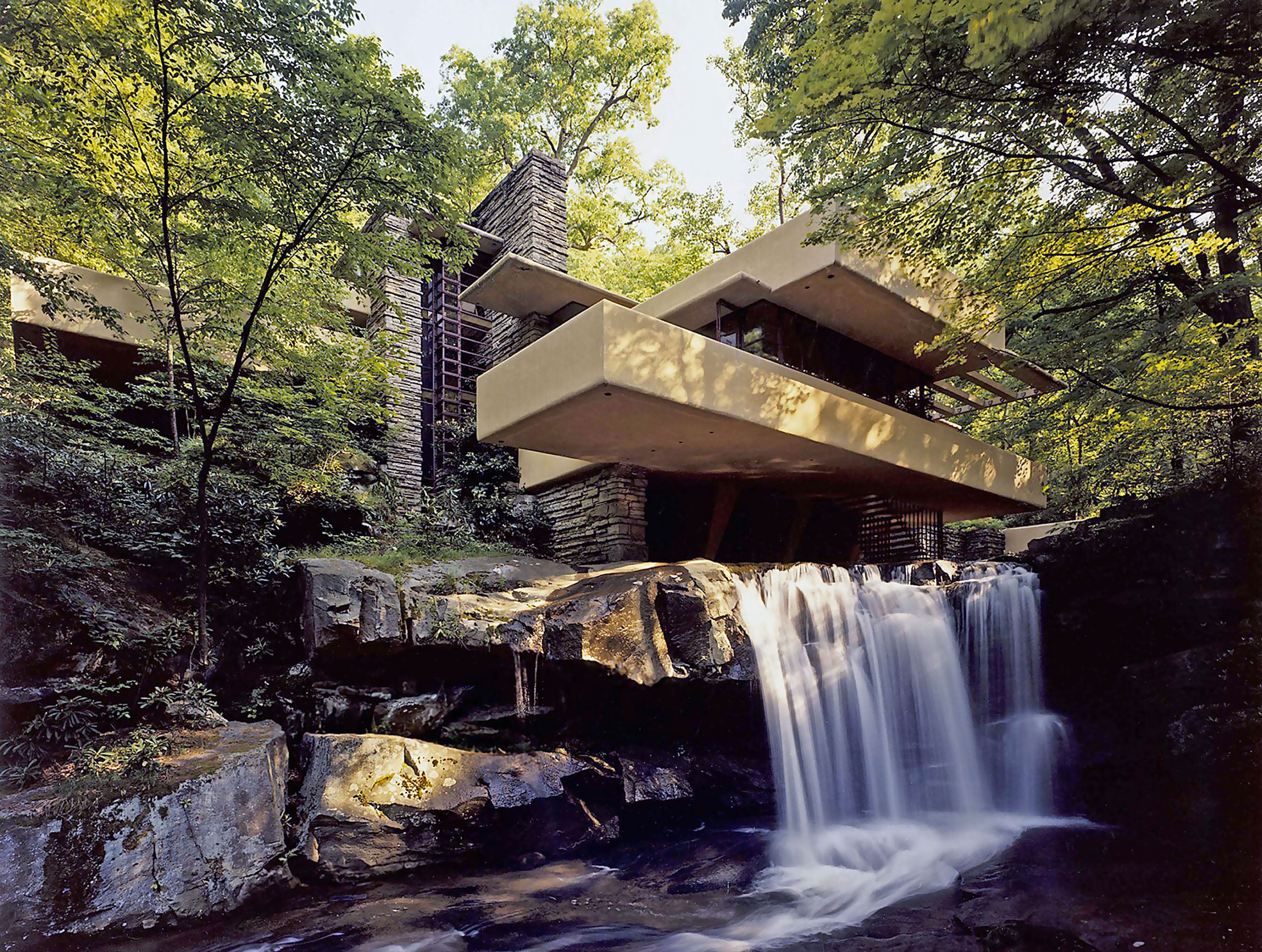
Wright liked to mix indoor and outdoor spaces. The light screens, or glass walls, wrapping the living spaces of Fallingwater bring the outside environment into the house. The protruding overhangs and shaded cantilevers pull the interior spaces into the outside environment. The low profile of his buildings ground them in the earth. The long, low horizontals are meant to suggest a horizon.
The Device Is The Designer’s Construction Site
Carefully consider the devices you’re designing for. In addition to maximizing the technologies they offer, you could also consider their physical makeup, look and feel. Think of the device as the plot of land in which your app resides. If you follow this principle, then they should work together in perfect harmony. The device and app should live together, each the happier for the other.
On a functional level, this can deeply affect interaction models. For instance, a device’s shape and how it’s held will affect how users interact with it. For a phone, you might want to place the navigation controls within thumb’s reach. Consideration of the device could also affect any aesthetic decisions you make. A few years ago, when skeuomorphic design was a popular trend, there was an obvious clash between the sleek, futuristic design of the iPhone and the retro, leather-stitched screen interface.
Once again, Nest is a great example of design that works in perfect harmony with the physical device. It doesn’t hurt that the company designed both the screen’s interface and the hardware. Think about the devices you’re targeting in your next design project. It could influence your design.
Conclusion
Frank Lloyd Wright was a true pioneer. He was an avant-garde architect whose ideals led to architectural masterpieces that are relevant nearly a century later. As designers, we can find inspiration in his architectural philosophies. As with his buildings, every detail in our designs should serve a purpose. We must consider the nature of the materials and technologies we use and figure out how to maximize their native capabilities to achieve our goals.
If we adopt his views on form and function, then we can simplify our interaction models by combining content, form and UI. We should also consider each part of the design and its contribution to the whole. Finally, we might consider creating harmony in the relationship between our digital design and the physical device. In addition to the fundamental design principles we use every day, these ideals could push our work in new and exciting directions.
References
- “Designing Life: Frank Lloyd Wright, Architect,” Keith Gaff, Design Thinking @ Haas
- Drawings and Plans of Frank Lloyd Wright: The Early Period (1893-1909), Frank Lloyd Wright
- “Frank Lloyd Wright: The Prairie Style, From Theory to Practice,” Westcott Center for Architecture + Design
- In the Nature of Materials: The Buildings of Frank Lloyd Wright 1887 – 1941, Henry-Russell Hitchcock
- “Frank Lloyd Wright and the Principles of Organic Architecture,” Kimberly Elman, The Legacy of Frank Lloyd Wright
- Understanding Frank Lloyd Wright’s Architecture, Donald Hoffmann
Further Reading
- Why Won’t Helvetica Go Away?
- Bauhaus: Ninety Years of Inspiration
- Learning From The Past: Design Legacies & Arts
- The Dying Art Of Design


