Accessibility Originates With UX: A BBC iPlayer Case Study

Email Newsletter
Weekly tips on front-end & UX.
Trusted by 182,000+ folks.


 Celebrating 10 million developers

 Custom Web Forms for Angular, React, & Vue. Your backend.
Not long after I started working at the BBC, I fielded a complaint from a screen reader user who was having trouble finding a favorite show via the BBC iPlayer’s home page. The website had recently undergone an independent accessibility audit which indicated that, other than the odd minor issue here and there, it was reasonably accessible.
I called the customer to establish what exactly the problem was, and together we navigated the home page using a screen reader. It was at that point I realized that, while all of the traditional ingredients of an accessible page were in place — headings, WAI ARIA Landmarks, text alternatives and so on — it wasn’t very usable for a screen reader user.
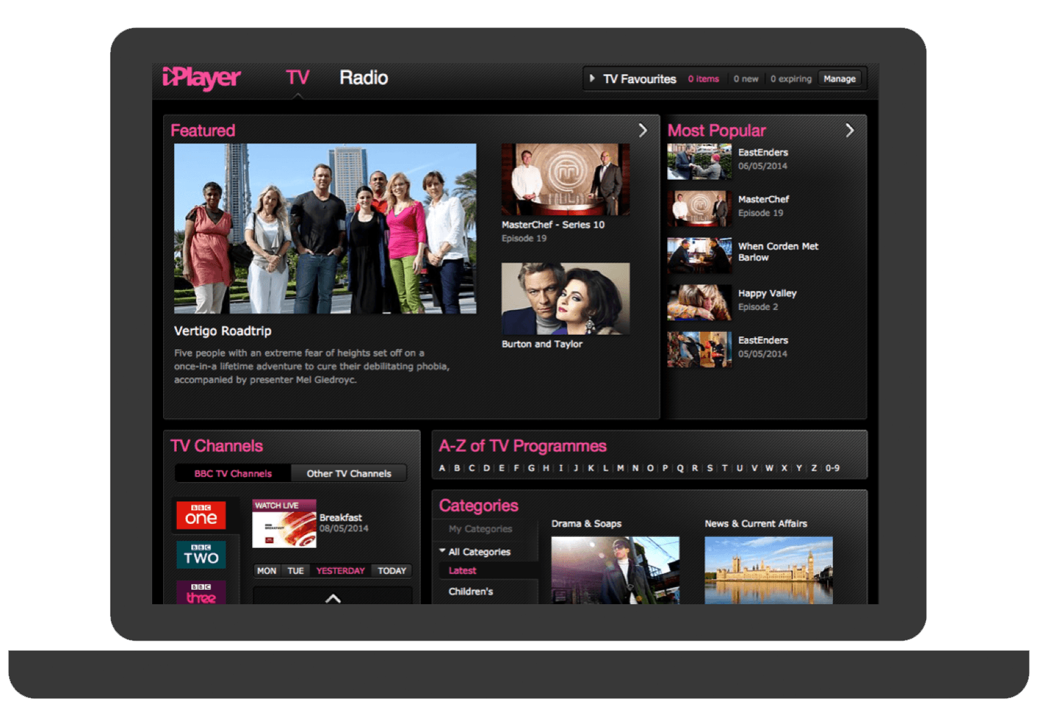
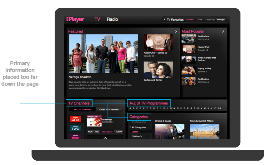
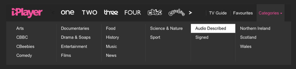
The first issue was that the subnavigation was made up of only two links: “TV” and “Radio,” with links to other key areas such as “Categories,” “Channels” and “A to Z” buried further down the content order of the page, making them harder for the user to find.
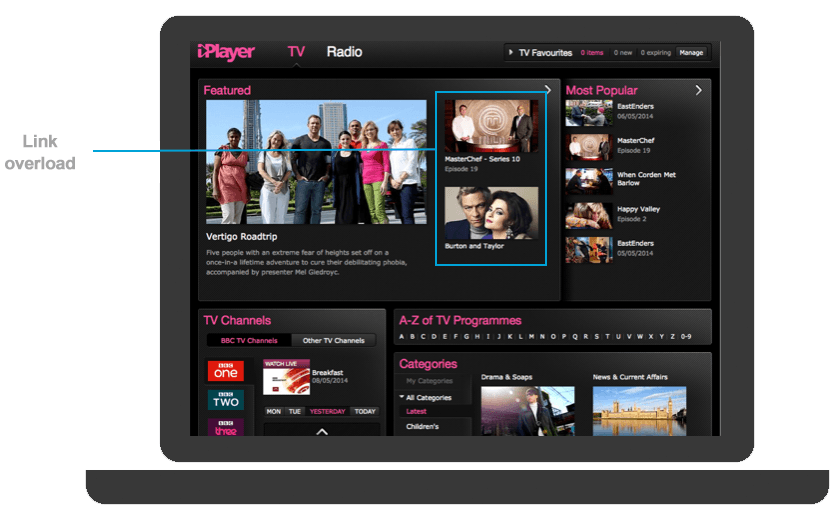
The second issue was how verbose the page was to the screen reader user. Instead of hearing a link to a program once, the program would be announced twice because the thumbnail image and the heading for the program were presented as two separate links.
This made the page longer to listen to and was confusing because links to the same destination were worded differently.
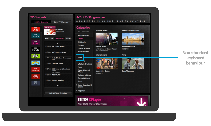
Finally, keyboard access on the page was illogical. In the “Categories” area, for example, a single click on a category would reveal four items in a panel next to it. To access the full list of items in that category, you had to click again on the same link to be taken to a listing page. This was a major hurdle for the user and the place where the customer I was talking to gave up using the application altogether.
It was clear that, while the website had been built with accessibility in mind, it hadn’t been designed with accessibility in mind and this is where the issues originated.
The Challenge
At the BBC, a number of internal standards and guidelines are in place that teams are required to follow when delivering accessible website and mobile applications. Key ones are:
- Accessibility Standards and Guidelines,
- Screen Reader Testing Guidelines,
- Mobile Accessibility Standards and Guidelines.
There is also a strong culture of accessibility; the BBC is a publicly funded organization, and accessibility is considered central to its remit and is a stronger driver than any legal requirement. So, how did this happen?
Part of the issue is that standards and guidelines tend to focus more on code than design, more on output than outcome, more on compliance than experience. As such, technically compliant pages could be built that are not the most usable for disabled users.
It may not seem immediately obvious, but visual design can have a massive impact on users who cannot see the page. I often find that mobile applications and websites that are problematic to make accessible are the ones where the visual design, by dictating structure, does not allow it.
This does not mean that standards and guidelines are redundant — far from it. But what we have found at the BBC is that standards need to sit within, and inform, an accessibility framework that runs through product management, user experience, development and quality assurance. As such, accessibility originates with UX. Most of the thinking and requirements should be considered up front so that poor accessibility isn’t designed in.
While redesigning the BBC iPlayer website, renewed focus was given to inclusive design, which, while adhering to the BBC’s standards and guidelines, is driven by four principles (more on that below). We then distilled our standards and guidelines to create a focused list of requirements for the UX to follow. We also started to train designers to annotate their own designs for accessibility.
UX Principles
Our four main principles are the following:
- Give users choice.
- Put users in control.
- Design with familiarity in mind.
- Prioritize features that add value.
Give Users Choice
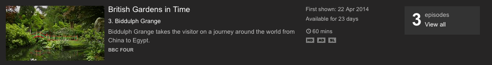
Never assume that just because a user can access content one way that they want to access content in that one way. Because BBC’s iPlayer has “audio described” and “sign language” formats, it was never in any doubt that both of these should have their own dedicated listing pages, accessed via the “Categories” dropdown link. (Note that all on-demand content is subtitled, which is why there is no “Subtitled” category. Subtitles can be switched on in the media player.)
User research and feedback indicated, however, that although people want dedicated categories, they also want to be able to search for and browse content in the same way that any other users would and to select their preferred format from there. I have stayed in touch over the years with the gentleman who complained about the old iPlayer page, and he’s said himself, “Don’t send us into disability silos!”
This means that from the outset the designs need to signpost “Audio Description” and “Signed” content via search results, A to Z, category and other listing pages. Not making any assumptions or not stereotyping users with disabilities is important — for instance, a person with a severe vision impairment might not always use audio descriptions; news, sports, music programs and live events often aren’t supported by audio description because commentators already provide enriched commentary.
On-demand pages also list alternative formats, allowing users to choose what they want. Looking ahead, the option to choose your format could also be included in the Standard Media Player — the BBC media player used for on-demand and live streaming video across all BBC products, including iPlayer.

Put Users In Control
Never taking control away from the user is essential. A key aspect of this in iPlayer, which is responsive, is not suppressing pinch zoom. Time and again in user testing, we have observed users zooming content, even on responsive websites, where text might be intentionally larger.
Due to an iOS bug that was rectified in iOS 6, the ability to pinch zoom was suppressed on many websites due to poor resizing when the orientation is changed from portrait to landscape. Now that this has been fixed, there is no reason to continue suppressing zoom.
Another aspect of control is autoplay. While iPlayer currently has autoplay for live content, this can be a problem because the sound of the video can make it difficult for a screen reader user to hear their reader’s output. However, we do know of screen reader users who request autoplay because it means they don’t have to navigate to the player, find the play button and activate play. The answer is to look at ways to give users control over playback by opting in or out of autoplay, such as by using a popup and saving preferences with cookies.
Design With Familiarity In Mind
There needs to be a balance between the new and the familiar. Users understand how to interact with pages and apps that use familiar design patterns. This is especially important in native apps for iOS and Android, where standard UI components come with accessibility built in.
Equally important is the language used across the BBC’s native iPlayer apps and responsive website. Where the platform allows, consistent labels for headings, links and buttons — not just visually, but also via alternatives for screen reader users — ensure that the experience is familiar and recognizably “BBC iPlayer,” regardless of the platform.
Tied into this, the new designs reinforce a logical heading structure within the code, which in turn supports navigation for screen reader users. Key to this is ensuring that the pattern used for the heading structure is repeated across pages, so that users do not find main headings in different places depending on what page they are on. While structure is typically viewed as a responsibility of developers, it needs to be decided before designs are signed off in order to prevent poor structure getting coded in — more on that later.
Prioritize Features That Add Value
Accessibility at the BBC is not just about meeting code, content and design requirements, but also about incorporating helpful features that add value for all users, including disabled users. A large proportion of feedback we get from our disabled users pertains to usability issues that could be experienced by anyone on some level but that seriously adversely affect disabled users. When we incorporate features to help users with specific disabilities, everyone gains access to a richer and easier experience.
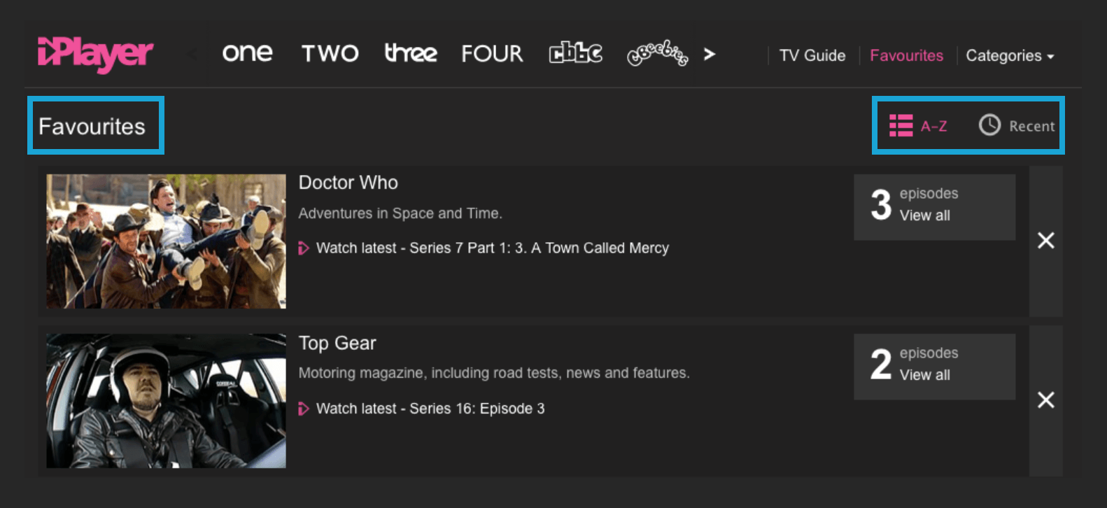
One obstacle that comes up time and again is finding a favorite show. I’ve spoken with many screen reader users who say they save shortcuts to their favorite shows on their desktop but, due to changing URLs, often lose content. A simple way to address this that benefits all users is to ensure that there is a mechanism for saving favorites on the website. Adding in options to sort favorites and list them the way you want further improves this. It may sound unrelated to accessibility, but it was the single most requested feature received from disabled users. Simply accessing the favorites page to watch the latest episode of something, rather than having to search the website, makes all the difference.
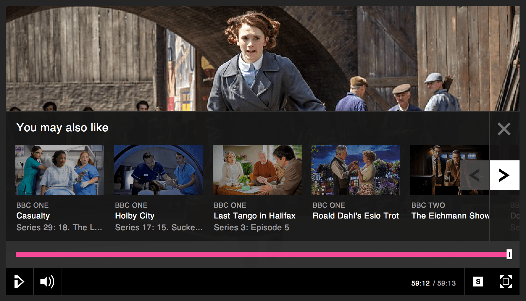
Finding ways to allow people to get to the content they want more quickly has also influenced what is available within the media player itself. Once an episode has finished playing, exiting the media player and navigating back to the website to find the next episode is a massive overhead for some users. Adding a “More” button to the player itself — showing the next episode or programs similar to the current one — cuts down on the amount of effort it takes users to find new content.
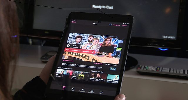
One key feature that has added value to BBC iPlayer’s native iOS and Android apps, as well as the website (when viewed in Chrome), is support for Google Chromecast. Being able to control what content you view on TV without having to use a remote or complex TV user interface is invaluable. Using one’s device of choice, whether it be iOS or Android, is much easier for a disabled user than using a remote control and a potentially inaccessible TV interface.
Guidelines
The principles above exist to create a mindset that helps product owners and UX practitioners alike when shaping and designing inclusive products. In addition to the four principles, a set of guidelines is used to design more accessible interfaces. The following are a subset taken from the “BBC Mobile Accessibility Standards and Guidelines”:
- Color contrast
Ensure that text and backgrounds exceed the WCAG Double A 4.5:1 contrast minimum. - Color and meaning
Information conveyed with color must also be identifiable from context or markup. - Content order
Content order must be logical. - Structure
When supported by the platform, pages must provide a logical and hierarchical heading structure. - Containers and landmarks
When supported by the platform, page containers or landmarks should be used to describe page structure. - Duplicate links
Controls, objects and grouped interface elements must be represented as a single component. - Touch target size
Targets must be large enough to touch accurately (44 pixels). - Spacing
An inactive space must surround all active elements (unless they are large blocks exceeding 44 pixels). - Zoom
Where zoom is supported by the platform, it must not be suppressed. - Actionable elements
Links and other actionable elements must be clearly distinguishable.
The New iPlayer
Keeping in mind this backdrop of principles and guidelines, along with the renewed focus on adding value and features that enhance the experience for disabled users, here are a few of the changes introduced in the BBC’s new iPlayer:
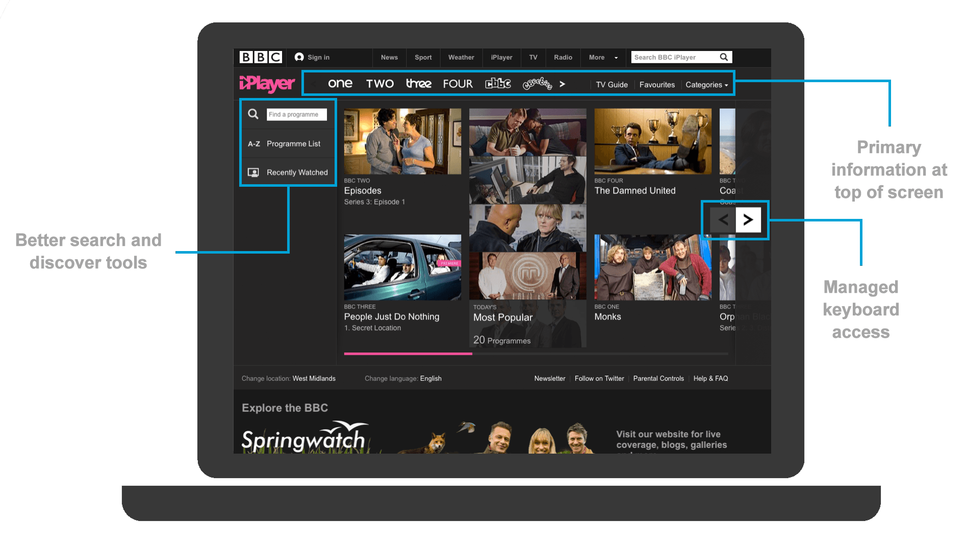
At launch, the iPlayer’s navigation housed the BBC’s channels, a “TV Guide,” “Favourites” and “Categories.” These all sit at the start of the page, high up in the content order. While they are visually easy to see, they are also easily discoverable by screen reader users via a hidden heading and labeled navigation landmark:
<div role="navigation">
<h2>iPlayer navigation</h2>
Where previously the “Categories” were unusable for the screen reader user I spoke with, they are now prominent in the page and fully keyboard navigable. Since launch, the addition of more channels has meant that the channel links have been rehoused in their own dropdown menu.
Search tools have also been added, enabling users to carry out predictive search, browse A to Z or view their most recently watched program. This is all keyboard accessible, it makes use of headings, and it has landmarks where appropriate.
The home page carousel is also fully keyboard accessible. Each program in the stream is presented as one link, with the reading order of text starting with the primary information first: channel attribution, program name, episode information, abstract and program duration.
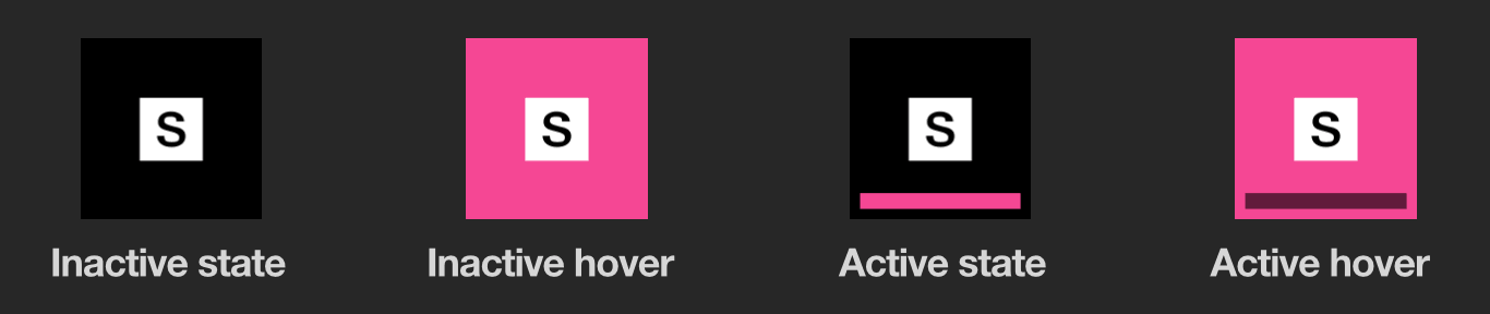
Work has also been carried out to improve visible focus and bring both the iPlayer website and the Standard Media Player in line with the BBC header and footer. The pink underline used for the hover and focus states in the main BBC navigation is now used within the Standard Media Player to indicate when a button is selected — for example, when the subtitles are switched on. This replaces the use of color only to indicate a selected state, which was indistinguishable from the hover and focus states.

You can read more about what steps were taken to make iPlayer web-accessible and to make the Standard Media Player accessible, including creation of an accessible media player in Flash, on the BBC’s Internet Blog.
Annotated UX
All of the thinking around inclusive design that comes from product owners, UX practitioners and designers needs to be captured and communicated to developers and engineers. At the BBC, we are moving to a model where designs need to be annotated for accessibility. This includes:
- headings,
- containers,
- content order,
- color contrast,
- alternatives to color and meaning,
- visible focus,
- keyboard and input interactions.
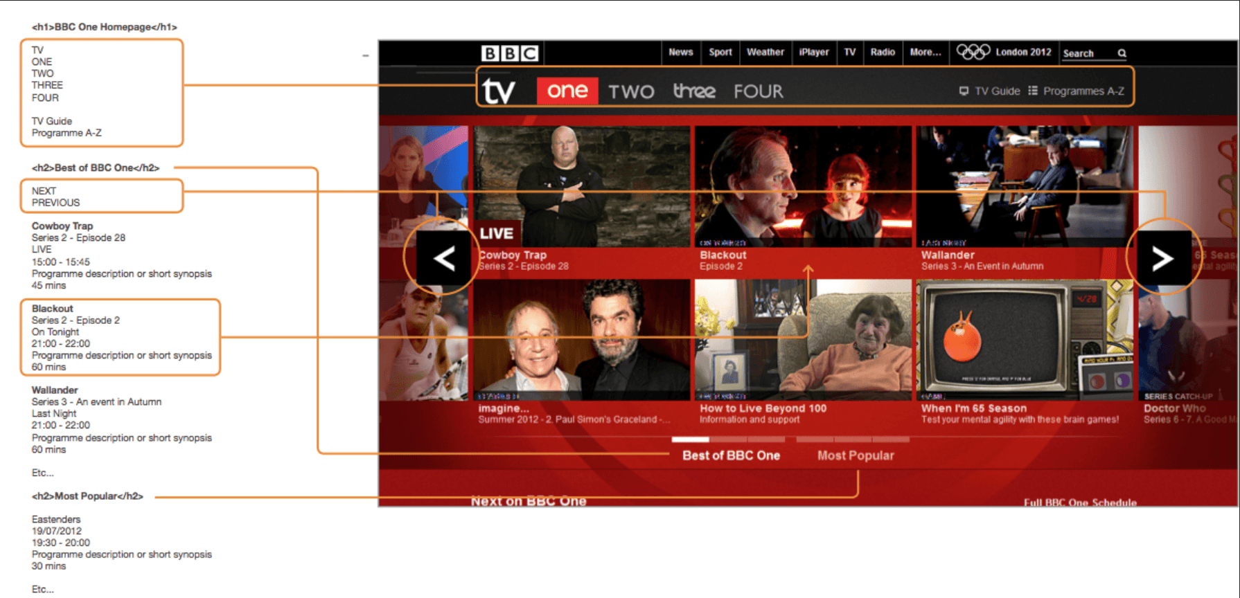
The design above, showing an early version of the BBC One home page in iPlayer, outlines where the <h1> to <h6> headings should be. The UX practitioner doesn’t need an in-depth knowledge of code, but rather an understanding of the hierarchy of data within a page. As such, an equally acceptable approach would be to indicate the “main heading,” “secondary heading,” “third-level heading” and so on. Developers can then take this and translate it into semantic markup.
Equally, indicating the logical order of content helps developers to code content in the right sequence (i.e. source order) — something that is essential to a screen reader or sighted keyboard user’s comprehension of the page.
Annotating the UX in this way is key to identifying designs that don’t allow for a logical page structure, content order or behavior. It is the first step to generating a style guide that documents focus states, colors and so on. Further down the line, these requirements can also be used to generate user acceptance criteria and automated quality assurance tests.
Even if you’re working in an agile way, where designs are iterative and not delivered in a complete form, annotation still works. As long as the basic framework of the page is well defined, the visual design can evolve from that.
Summary
It’s very easy to get bogged down by accessible output and to forget that, ultimately, accessibility is about people. As such, keep the following in mind, whether you are working in product, UX, development or quality assurance:
- Design with choice in mind.
- Always give users control over the page.
- Prioritize features that add value for disabled users.
- Design with familiarity in mind.
- Integrate accessibility into annotated UX and style guides.
- Make no assumptions. Test ideas and concepts.
Fostering these key principles across the entire team will go a long way to ensuring that products are inclusive and usable for disabled people. Listening to users and actively including their feedback, along with adhering to organizational standards and guidelines, are essential.
Further Reading
- Color Contrast And Why You Should Rethink It
- Notes On Client-Rendered Accessibility
- Accessibility APIs: A Key To Web Accessibility
- Making Accessibility Simpler, With Ally.js
- The WAI Forward


