An Exploration Of Carousel Usage On Mobile E-Commerce Websites

Email Newsletter
Weekly tips on front-end & UX.
Trusted by 182,000+ folks.


 Celebrating 10 million developers
 Custom Web Forms for Angular, React, & Vue. Your backend.

Does this title make you skeptical? I would have been too before I saw the research that led to this article. Ask anyone and they’ll tell you that carousels are an anti-pattern. Don’t use them. But maybe it’s not so cut and dry.
Using real data, this article aims for a better understanding of the current argument against carousels and whether they really deserve the reputation they’ve gained. I’ll break down the arguments point by point and see if our data lines up with those expectations. Through all of that, I’ll detail our findings and methods and make some recommendations on how and when you should use carousels in future.

There have been a few contributors to carousels’ bad reputation. The Nielsen Norman Group wrote the piece that got the ball rolling. The real tipping point came when Erik Runyon posted a fantastically detailed breakdown of carousel usage on the University of Notre Dame’s website. On his website Should I Use A Carousel?, Jared Smith firmly states that, given the choice, you should not use a carousel. Brad Frost echoes this sentiment in his article “Carousels.” Luke Wroblewski joined in and suggested that the data available so far is convincing enough to never use a carousel again (Luke later presented some additional data suggesting that he may no longer be convinced).
At Mobify, we develop large-scale e-commerce websites for mobile devices. A lot of the time, those websites have at least one carousel on them. Are we doing something wrong? Are we doing our users a disservice? Could our websites be even better if we stopped using carousels? These were all questions my co-author Peter Maclachlan and I asked each other as we looked through the websites we develop. Instead of being reactionary and following these recommendations to a tee, Peter and I decided to do our own research.
So, we started looking at the data available to us. At first we were just curious — what does our data show? What we found surprised us enough to encourage us to keep looking. We examined several mid-sized to large e-commerce websites over a period of 11 months. When I say mid-sized to large, I’m talking about websites that do at least $20 million in e-commerce sales per year. During this 11-month period, we sampled approximately 7.5 million carousel interaction events. The conclusions drawn through the rest of this article are based on that data.
Why We Use Carousels
Carousels are much more than a method of displaying marketing information on a home page. Because we focus on designing for mobile, one of our biggest concerns is making sure that we’re balancing information density with the limitations of small screens. That means making sure we’re always making the best possible use of horizontal and vertical real estate. We use carousels to maximize that information density and maintain context without forcing the user to scroll further down the page.

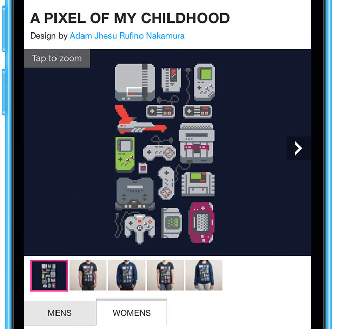
Context is integral for carousels. Our design team avoids carousels that don’t provide context to the user. For the most part, we only use carousels in one place on our websites: as an image gallery on product detail pages. On a product detail page, a user knows that swiping through the carousel will give them more product images. On a home page marketing carousel, the user has little idea of what the next slide will show or why they should care.
The Case Against Carousels
The current argument against carousels centers on a few points:
- People don’t interact with carousels.
- If people interact with carousels, they interact only with the first slide.
- Carousels aren’t accessible.
- Automatic advancement of carousel items is bad for users.
I’ll tackle the first two of these points by comparing the data presented in Erik Runyon’s article with the data we found. The last two points are a little more qualitative, so I’ll just address those on their own.
Hypothesis 1: People Don’t Interact With Carousels
Argument
The argument here usually centers on the data provided by Erik Runyon for the University of Notre Dame’s website. This data shows that only 1.07% of visitors clicked on slides in the featured marketing banner carousel. Viewing a slide was not enough to count as an interaction. Users had to click directly on a slide to be counted.
To dispute the hypothesis, the data would have to show that people interact with carousels at a much higher rate than 1.07%.
Our Results
People interact with product image gallery carousels at a high rate: 72% of users advance the carousel at least once; 23% of users directly interact with the carousel by zooming.
If you look at our unique interaction data — specifically, for the closest comparison, zoom interactions — you can see that 23% of users interacted with the carousel by directly tapping on it for more information. If you consider advancing the carousel in any way to be an interaction, then that data goes up to 72% of total users who interacted with the carousel.
Note: For a complete breakdown of how we arrived at these results, please read the “Findings” section below.
Hypothesis 2: People Interact With Only The First Slide
Argument
Of the 1.07% who clicked Erik’s carousel, 89.1% clicked on the first slide. Again, if we assume that carousels are effective, we’d expect those numbers to follow a reasonable trend downward as we add more slides. Instead, Erik’s data shows that the slide in the second position received only 3.1% of all clicks. To put that in perspective, of the 3,755,297 visitors to Notre Dame’s website, only 1,234 visitors clicked on the second slide. Slides after the second one show the fall-off we would expect.
For us to dispute the hypothesis, the data would have to show that users interact with the second slide at a much higher rate than 3.1%.
Our Results
People directly interact with the second slide of product image gallery carousels at a rate of 15.7%. At least 64% of people advance from the second slide to the third.
The data shows that users advance carousels at a roughly linear rate. Different control schemes had different results for the likelihood of interaction. All showed that users had a high percentage of engaging with the next slide. At least 64% of users who interacted with the first slide interacted with the second.
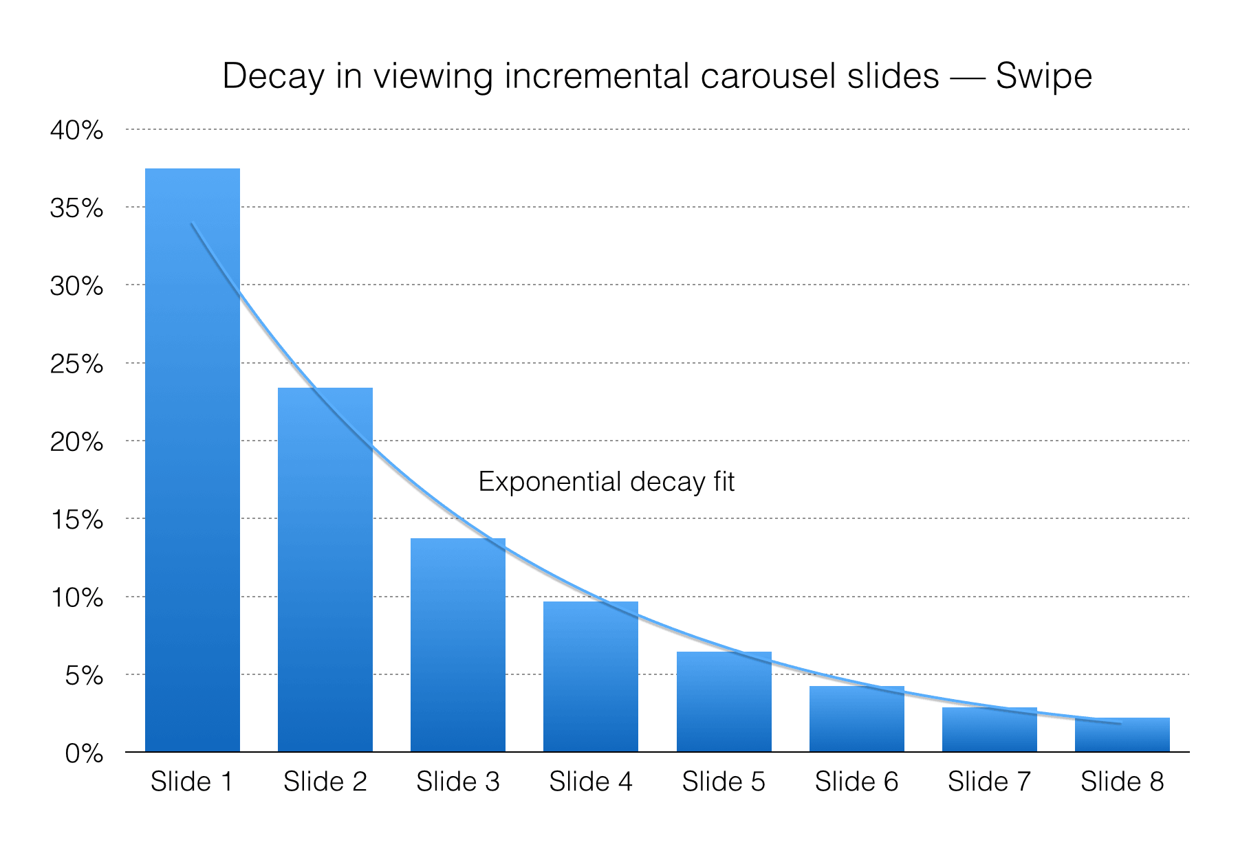
The Notre Dame data looks explicitly at clicks on slides to measure interaction. To ensure that our data maps well, we would also need to look at direct interactions. For our carousels, that would be the zoom interaction. The data shows that, of the 23% of users who zoomed our carousel, 54.1% zoomed on the first slide. The slide in the second position received 15.7% of all zoom interactions.

This looks like Erik’s data: The first slide received the majority of direct interactions. However, the decay in our data is much more reasonable than Notre Dame’s carousel; 45.9% of all direct interactions occur on slides after the first one. This means that nearly half of all direct interactions occur after the first slide.
Note: For a complete breakdown of how we arrived at these results, please read the “Findings” section below.
Hypothesis 3: Carousels Aren’t Accessible
The next issue is bad but much more manageable. This argument is not against using carousels in general, but against using them as they’re currently implemented. It’s not impossible for a carousel to be accessible, but it does seem to be pretty rare. Certainly, our current carousel implementation was not designed with accessibility in mind.
This, I don’t think, is a fault of carousels in general, but it should be a consideration in your decision of whether to use one. Making our carousel plugin accessible is a top-of-the-list feature for our next version. It’s not a part of the argument about the effectiveness of carousels, so we won’t deal with it here.
Carousels, as they stand, are not accessible, but there is no reason they can’t be in future.
Hypothesis 4: Automatic Advancement Of Carousel Items Is Bad For Users.
The argument here is that, by auto-advancing carousel items, users who want to click on a slide are being thwarted by the interface. We agree wholeheartedly with this point. If you’re going to use a carousel, then definitely avoid auto-advancing the slides. If you need further convincing, check out Brad Frost’s tweet on the matter.
For an excellent exploration of this issue, read Jakob Nielsen’s article “Auto-Forwarding Carousels and Accordions Annoy Users and Reduce Visibility.” None of the carousels we design advance automatically.
If you have to use auto-advancement, turn it off the moment the user starts interacting with the carousel. There’s little worse than clicking the wrong slide because the carousel advanced just as you clicked. On the desktop, this means turning off auto-advancement as soon as the mouse hovers over the carousel. On mobile, this means turning off auto-advancement as soon as you register an active touch on the carousel.
Auto advancement is bad. If you have a carousel, do not auto-advance.
Findings
Caution: This part outlines how we conducted our research and goes into way more detail on the data. If that sounds interesting, please read on. If not, you might want to skip to the next section.
Research Methods And Context
The data used in this analysis comes from several mid-sized to large e-commerce websites over a period of 11 months. During this time, we sampled approximately 7.5 million carousel interaction events. Following our privacy policy, we retained no individually identifiable information.
In order to apply to the hypotheses laid out above, the data needs to address two points:
- frequency of interaction with the carousel,
- frequency of interaction with slides after the first one,
Defining Interaction
There are four ways to interact with the carousels that we tracked during this experiment (also shown in the figure below).
- Use the swipe gesture on a smartphone’s touchscreen to swipe left or right.
- Use an in-slide arrow button to advance or reverse the carousel by one image.
- Tap a thumbnail at the bottom of the carousel.
- Tap on the slide to zoom the current image in the carousel into a full-screen view.
To map our data to the Notre Dame data, we will consider the fourth type of interaction — zooming — to be the same as clicking on a feature. In both cases, the user is engaging with the carousel slide and requesting more information.
Another important note is that we considered only deliberate interactions as interactions. Touchstarts or touchmoves didn’t trigger interactions. Accidental swipes that didn’t result in advancement of the carousel also didn’t trigger interactions.
Results
1. Unique Interaction Rates
The first statistic that interested us is how often mobile users interacted with the carousel. We measured that by looking at unique interactions.
A unique interaction is the user’s first interaction of any given type with the carousel’s content or controls. If a user tapped five thumbnails, we would count it as only one unique interaction. We’ll investigate non-unique interactions in more detail below.
The data shows that around 72% of visitors to the page interacted in some way with the carousel. Thumbnails were the clear front-runner for interactions: 55% of visitors clicked at least one thumbnail.
1a. Proportion of Unique Interactions
Our data shows that the thumbnail controls were the most popular way to interact with the carousel. In fact, they were almost twice as popular as each of the other interaction methods and more popular than arrow and swipe interactions combined.
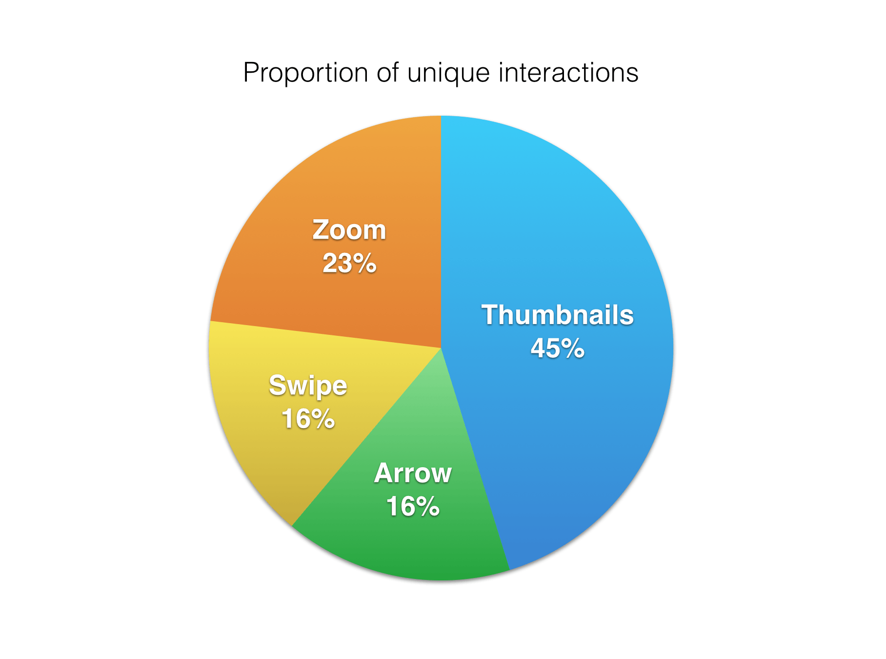
Zooming was the second-most popular interaction type. Zooming is similar to swiping in that it has the largest trigger area of any of the interactions — you can tap anywhere on the carousel to trigger it. We have to assume that some of the zoom interactions we encountered were unintentional mistaps. That being said, the level of engagement with zooming was still high — too high to be accidental. Almost 23% of all visitors interacted with the zoom functionality.
Swiping was the least popular way for users to interact with the carousel. This strongly supports the case for providing an explicitly visible control system for interactions.
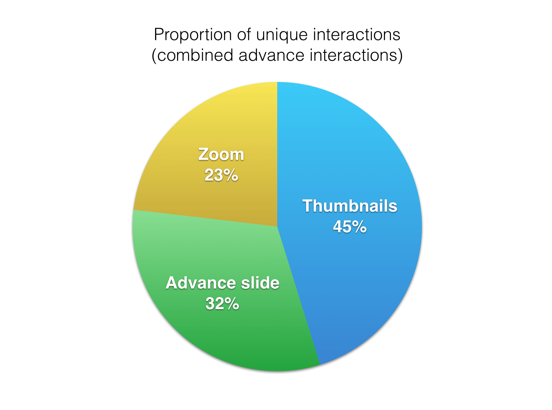
Both arrow and swipe interactions involve the same carousel action: advancing to the next slide. If we combine them, their interaction rate is very similar to that of thumbnails.
2. Total Interaction Rates
In total, there were 2.4 interactions per carousel impression on average. This shows that for the 72% of visitors who did interact with the carousel, interacting with it many times was the norm.
2a. Average Number of Interactions of the Same Type (Non-Unique)
Users who interacted with thumbnails did so way more often than with any other control system on the carousel. On average, a user would interact with 6 thumbnails when they used the carousel. Swiping and arrows both had similar numbers of interactions: 3.5 and 3.9 on average. The low number of zoom interactions shows us that users only zoom on product pictures when they have a high level of interest.
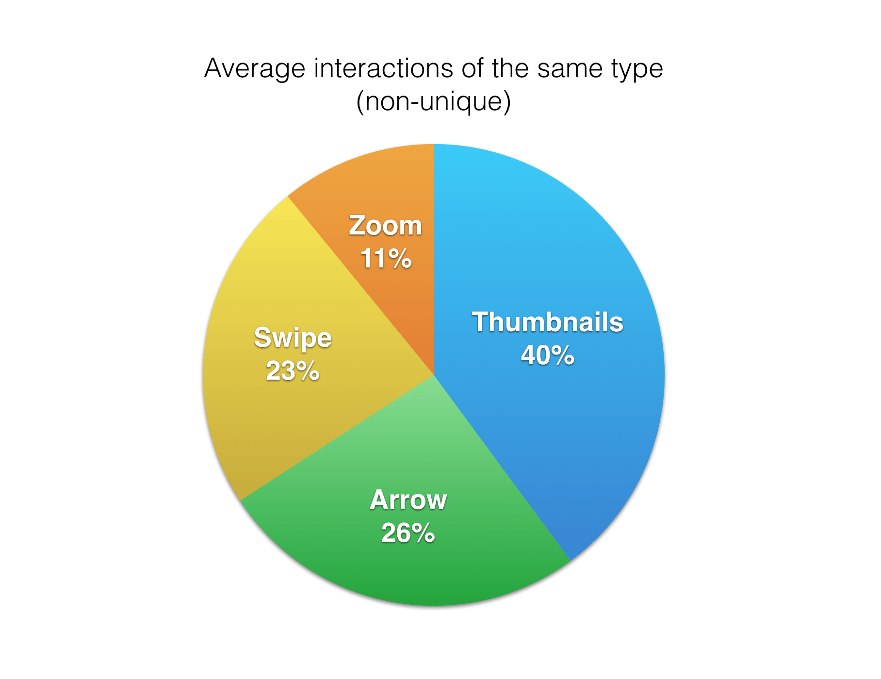
Thumbnail users having the highest average number of interactions shows that they are significantly more engaged than arrow or swiping users. Exploring how this level of engagement results in additional micro-conversions, such as “add to cart,” might be interesting.
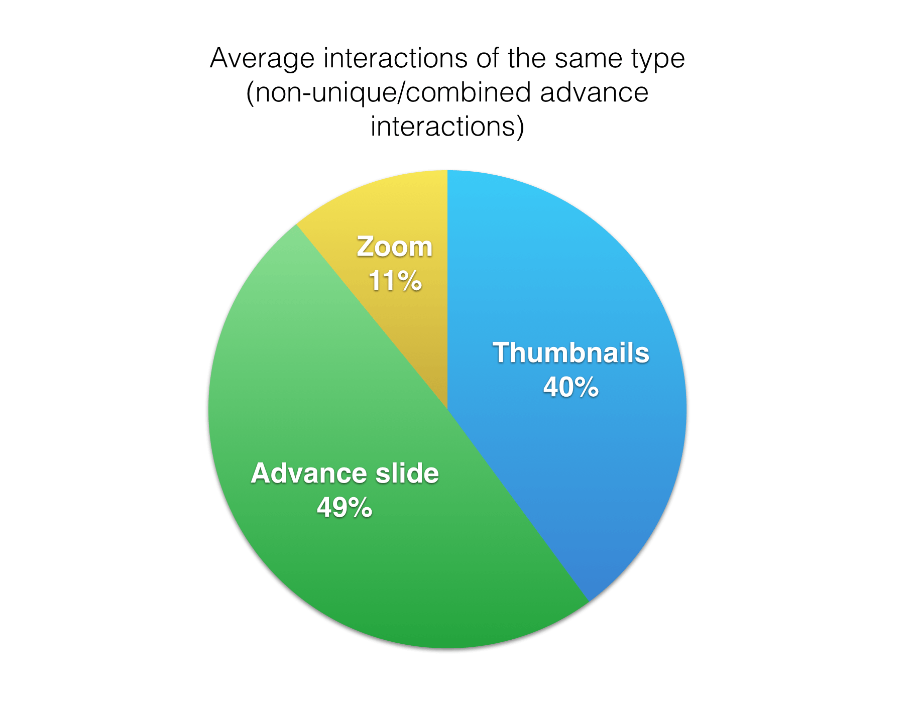
If we combine arrow and swiping interactions, similar to how we analyzed the unique interaction data, then slide advancement emerges as the most popular carousel interaction activity.
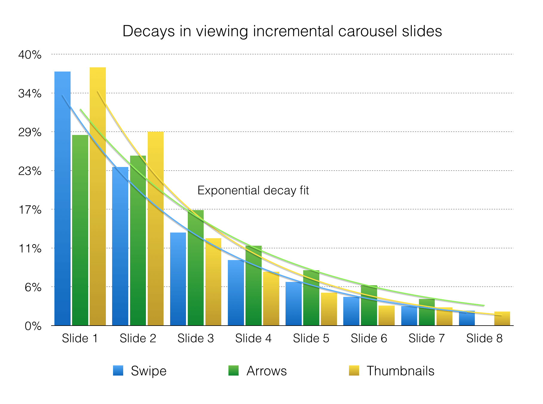
3. Interaction Decay Rates
Using the data we collected, we were able to model the likelihood of a user interacting again after each interaction. In the case of slide advancement, this means advancing from the second to the third image after the user has advanced from the first to the second. In the case of direct interaction, this means tapping on the zoom of each slide after the first image.
We modeled this for each of the different interaction methods: thumbnails, arrows, swiping and zooming.
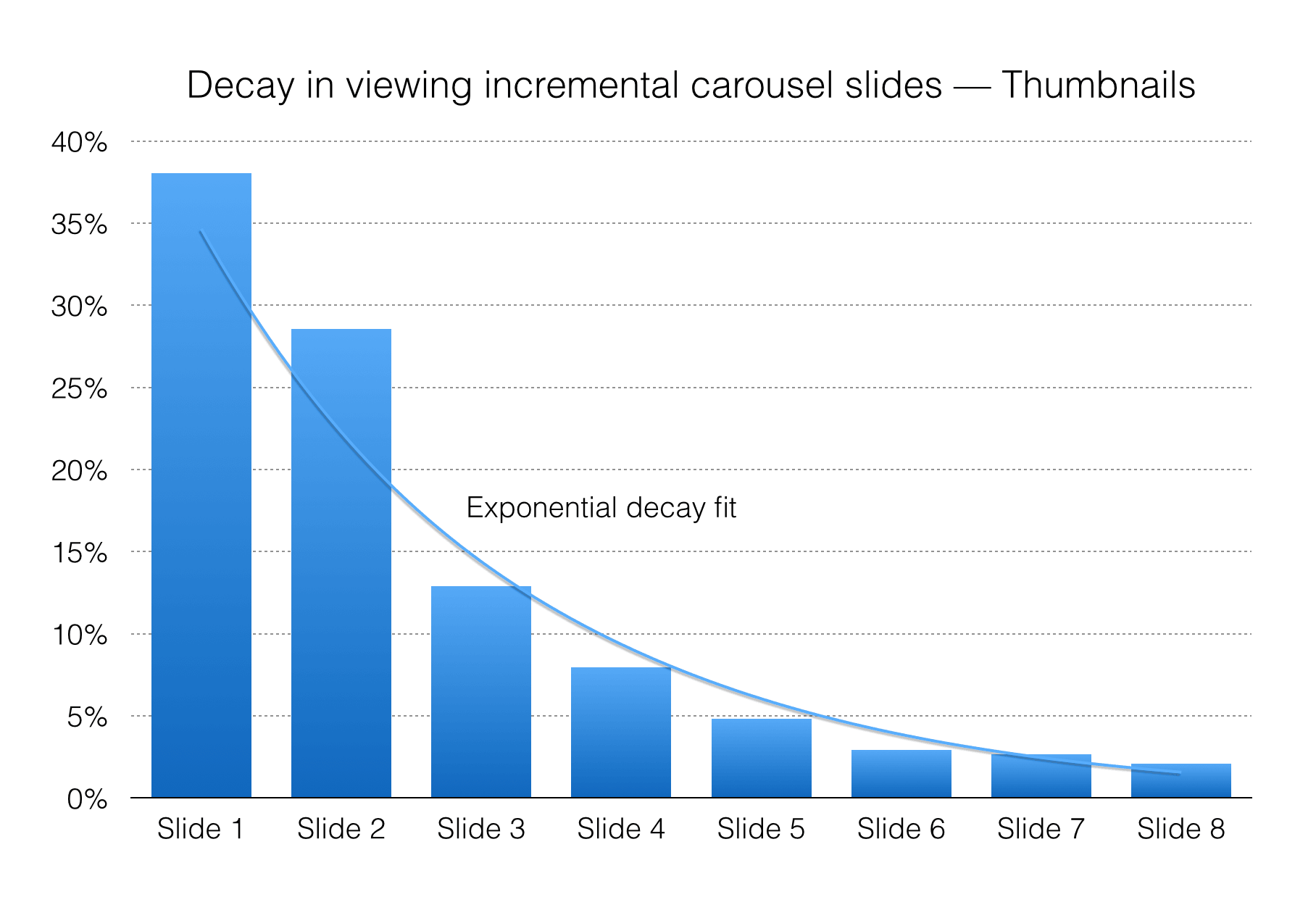
3a. Thumbnails
For each thumbnail viewed, there was roughly a 69% chance of the user viewing the next thumbnail. A more precise fit can be achieved using an exponential decay rate, shown in the figure below. Even though the user could view thumbnails in any order, most thumbnail users viewed the images in the carousel in sequential order.
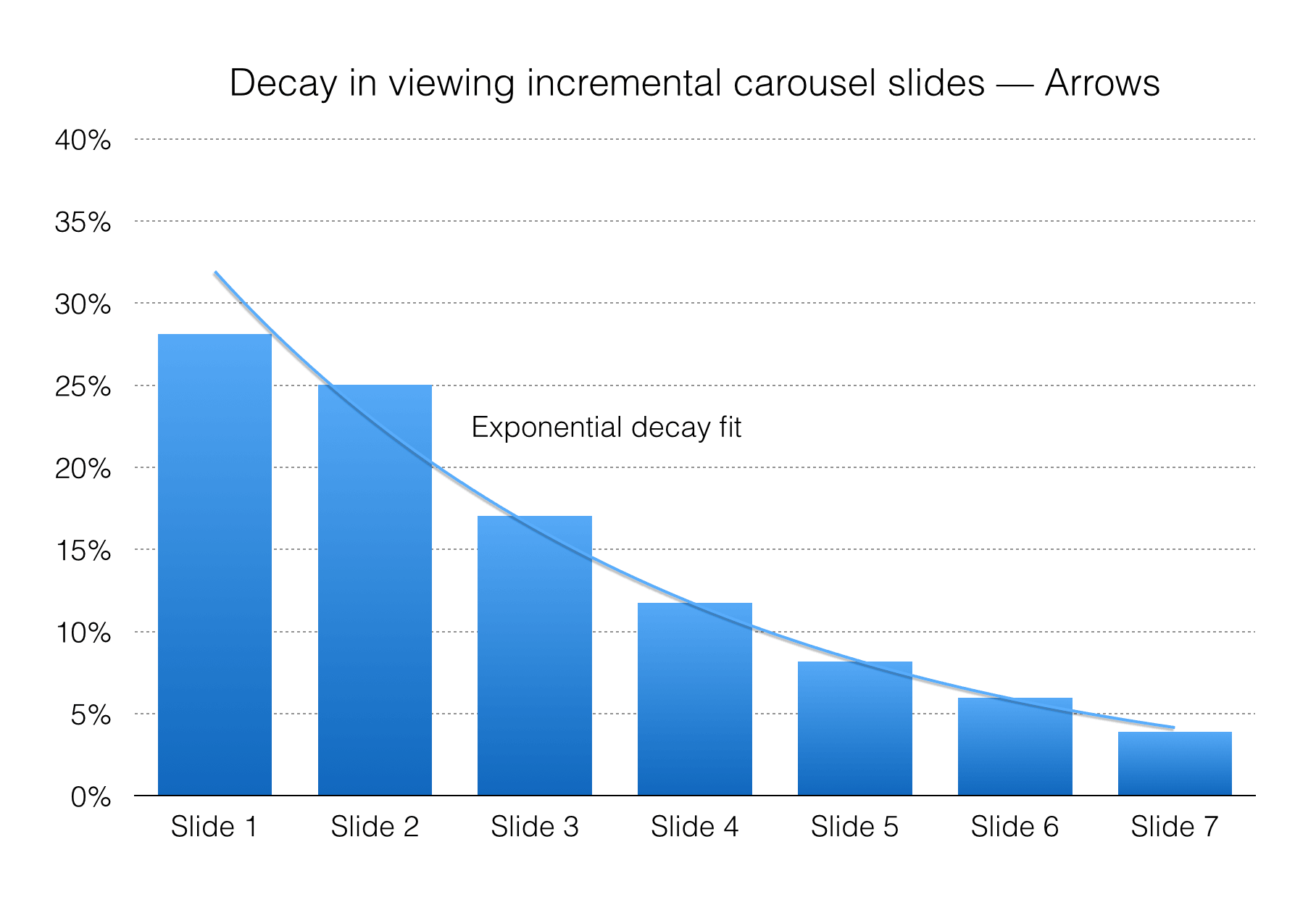
3b. Arrows
For each arrow tapped, we found a roughly linear relationship with a more precise exponential model. In the linear relationship, there was roughly a 76% chance that the user would click the arrow again to view the next slide.
3c. Swiping
The swipe decay can be modeled linearly, with a 64% chance that the user will swipe again. A more accurate exponential model is shown in the figure below.
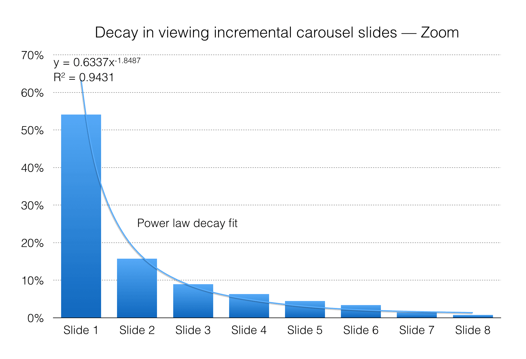
3d. Zooming
The zoom interaction decay rate follow a power law; a linear approach would be a very poor approximation. An r2 of nearly .98 indicates an excellent fit.
Considerations
Marketing Carousels Vs. Image Carousels
There is an issue with comparing our findings to Erik’s data for Notre Dame. The types of carousel we’re using are different. I don’t think this presents much of a problem for our findings. While the two types of carousels may not be visually related, our findings show that the underlying pattern is successful. Our goal with this study was to determine whether the idea of a horizontally scrolling multi-slide content display is flawed. The data suggests it is not. The root problem for Notre Dame seems to be not so much carousels in general, but more likely the design.
Users may be exhibiting banner blindness with marketing carousels. Marketing carousels might also not be providing relevant information to users. There are so many reasons why a marketing banner carousel could be ineffective that it would be unreasonable to suggest that the UI pattern itself is the problem. We do sometimes use marketing carousels on our websites. An interesting follow-up to this article would be a comparison of our and Notre Dame’s data for those.
Luke Wroblewski, in a talk presented to Google, brought up some data from Amazon UX manager PJ McCormick. PJ shows off how Amazon uses marketing banner carousels and some much more optimistic data on its usage. Luke suggests that one of the big problems with marketing banner carousel design right now is that the controls are not obvious. Amazon’s carousel, shown below, definitely sidesteps this issue by providing overt carousel controls.

Mobile Interactions Vs. Desktop Interactions
Our carousels are only on mobile devices. Notre Dame’s carousel is only on desktop devices. There is a chance that mobile users interact with carousels more than desktop users. This could be due to the ease of interaction with swiping or controls relative to the smaller control target sizes with a mouse. It could also be a more natural pattern for mobile devices.
Carousel Success Criteria
The success criteria of the carousels measured here and of the carousels measured by Erik are different. The success criterion for Erik’s carousels is users clicking through to the content offered by the slides. The success criterion for our carousels is users navigating to the next slide and seeing all of the images.
The former criterion (users clicking to navigate to a new page) is at a much higher level. That may be why the interaction rate on Notre Dame’s carousel is much lower than the one we measured here.
University Website Vs E-Commerce Website
Another limitation on comparison of our findings to those of Notre Dame is that the two user contexts may be so different that a comparison is impossible. The goal of a user on an e-commerce website is to discover information about products to make a purchasing decision. The goal of a user on an educational website is to learn more or find specific information about the university.
Steps For The Future
This data opened my eyes to how much research is still needed on carousels. There are some steps I would love to take or see other people take in the future:
- We would like to do similar studies on different types of carousels. It would be interesting to see whether our marketing banner carousels perform at similar rates to Erik Runyon’s data.
- It would be interesting to measure how interaction with a carousel affects a user’s actions further down the line. If they interact with a product image gallery, are they more or less likely to “add to cart”?
- I would love to see whether there is a good way to measure the likelihood of carousel interaction between mobile, tablet and desktop. Unfortunately, we don’t build desktop websites, so that data is less accessible to us. Direct comparison, instead of extrapolation from the data available, would help.
- The data shows that swiping is one of the least used interaction types. I have a theory that swipe interaction gets cannibalized by other interaction types, perhaps because it is still an unexpected method of interaction on the web. By presenting extra controls, users have an obvious way to interact with the carousel, so they are more likely to choose that method. It would be interesting to see if removing other control schemes causes swipe interactions to go up.
Conclusion
We started this article by going over why and how Mobify uses carousels on the websites we build. There are big differences between the different kinds of carousels. We find a compelling use for them by presenting extra contextual information, without forcing the user to scroll.
Most of the data that exists so far on carousels is based on marketing banner carousels. This data supports the argument that interactions with carousel content are quite low — on the order of 1.07%. It also suggests that the chance of users advancing the carousel and interacting with the next slide is extremely low. The data also raises some valid points about carousels in general: They aren’t accessible, and auto-advancement is bad.
Our research found little in common with the data presented by Erik Runyon for Notre Dame. Users interacted with our carousels at a high rate. They also interacted with additional slides at a rate that is much higher than the Notre Dame data suggests. There are some pretty good reasons for these discrepancies, which we discussed in the “Considerations” section. They’re definitely very different carousels with very different goals. For me, that’s the biggest conclusion to take away from this article.
Carousels come in many shapes and sizes. Some can be effective, others less so. We need a lot more data from a lot of different situations before we dismiss the pattern entirely. Based on Erik’s research, arguing against home page marketing carousels is fair. The user doesn’t know what to expect from the slides, and so they won’t likely want to flip through them. If you’re using it in a context that clearly indicates what the next slide holds and why the user should view it, then a carousel might actually be the perfect solution.
So, Should You Use A Carousel?
Don’t use a carousel just to get additional content on the screen. Think of carousels for one particular use case: providing additional content within a specific context. Use a carousel when vertical space is limited — as it is on mobile — and when the content is directly related — especially if the content isn’t useful to the user.
Don’t use a carousel if the content isn’t interesting or useful. The first slide has to sell the next slide to the user. Why would someone advance a slide to get another marketing banner unless something is in it for them? Like the rest of our content, carousels need to be engaging in order to be effective. If people aren’t interacting with your carousel, it might not be your carousel’s fault.
Don’t use a carousel if you need the user to see all of the content. Even if your carousel is effective, remember that most users aren’t going to see every slide. The first slide should always show the most important piece of content, and they should all be ordered by importance. If viewing multiple slides is important but not necessary for your content, I recommend using thumbnails as controls because users are more likely to view multiple slides.
It turns out that there isn’t one answer to this question. In certain situations — as with marketing banners — the answer might be an emphatic no. In others — as with product image galleries — the answer is a definite yes. As with any design pattern, if you find yourself asking, “Should I use a carousel?,” then there’s really only one right answer: if it’s right for your users.
Useful Links
- “Designing Effective Carousels: Create a Fanciful Amusement, Not a House of Horrors,” Kara Pernice, Nielsen Norman Group The Nielsen Norman Group has some additional recommendations on how to design effective carousels.
- “Good carousel use,” Jeffrey Zeldman, Twitter Zeldman suggests to Josh Clark that carousels are best used to display linear content, like image galleries.
- “Why Users Aren’t Clicking Your Home Page Carousel,” UX Movement UX Movement has some suggestions for making your home page carousels more effective.
- “Why You Should Use a Carousel,” Matt Isherwood Isherwood has some thoughts on why the carousel’s bad rap might not be deserved.
- Scooch, Mobify Mobify’s carousel plugin, Scooch, is built with mobile browsers in mind. It’s a good place to start if you’re looking to integrate a carousel on your mobile website.
Further Reading
- Fundamental Guidelines Of E-Commerce Checkout Design
- Reducing Abandoned Shopping Carts In E-Commerce
- Local Storage And How To Use It On Websites
- A Little Journey Through (Small And Big) E-Commerce Websites


