Content First — Design Last

Email Newsletter
Weekly tips on front-end & UX.
Trusted by 182,000+ folks.


 Celebrating 10 million developers
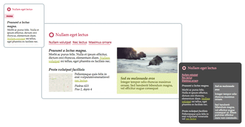
 Custom Web Forms for Angular, React, & Vue. Your backend.
How does one design and develop for the responsive web? A lot of methodologies out there try to tackle this problem, but all of them rely on the same classic website development process. It boils down to the following: design and then develop. Let’s go nuts and flip this outdated methodology on its head.
Before we start flipping things around, let’s take a quick stroll down memory lane, just so we know where we’ve come from and where we are now.
History
It’s 1989, and Tim Berners-Lee, the man with the plan, conjures up HTML while working at CERN. It’s a language to link content across documents.
After four years, the web went public, in 1993. It took a couple of years for someone to create the first columned layout using a table — at which point, something changed. I imagine this as being a turning point in web development. It was the moment when design could be moved to the front of the development process. You could now design a web page, slice it up and present it on the web.
Luckily, we regained our sanity and ditched tables for layout. We proudly moved to semantic HTML, but we held on to our design-first approach. Let’s take a closer look at semantic HTML.
Semantic HTML
Semantic HTML is about picking the right HTML element to describe a given piece of information, rather than using HTML to define the way the information should look. If you’re a front-end developer, you’ve probably been doing this for the past couple of years. Great, keep it up!
In my opinion, writing semantic HTML is one of the key aspects of being a good front-end developer. It’s something I value greatly.
Because of that, it’s been a topic I’ve discussed a lot with colleagues who have valued it less or simply did not understand. To resolve these debates once and for all, I tried to give them a glimpse of the thought process behind my HTML writing.
I searched for a straightforward website online and derived its HTML structure (without looking at the existing HTML, which would have been cheating). Then, I turned my HTML thought process into a step-by-step visualization. For many of my colleagues, this visualization turned out to be a real eye-opener. These couple of visuals created mutual understanding of what a front-end developer does and why semantic HTML is important. Also, interestingly, it revealed that not all front-end developers view semantic HTML in the same light.
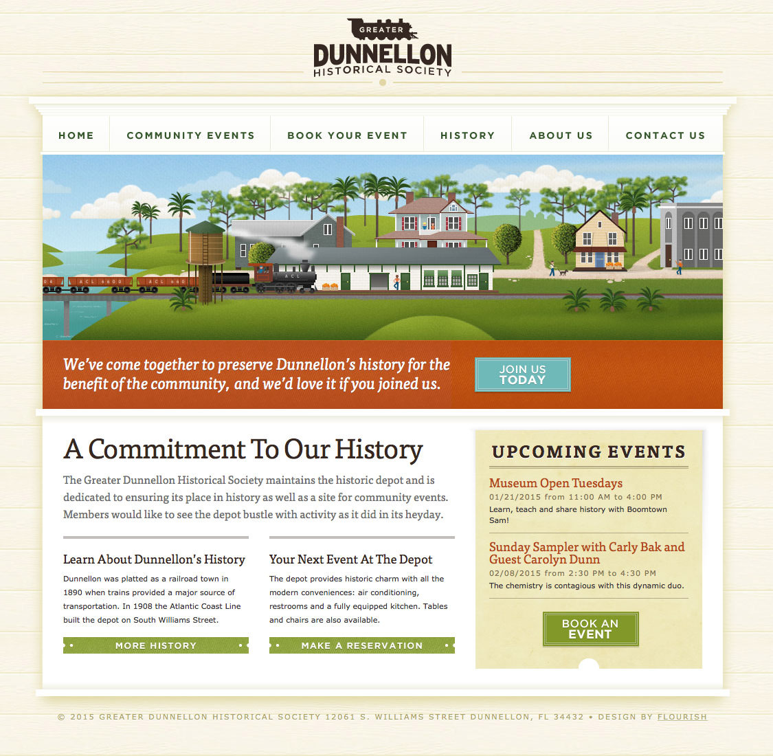
Below is the website I used in the thought process experiment.
I’ve laid out the thought process below. On the left side is my view of the website. On the right is the written HTML as rendered in the browser. OK, let’s do this!
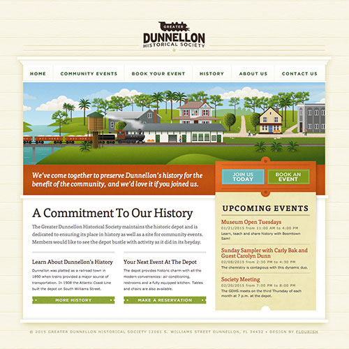
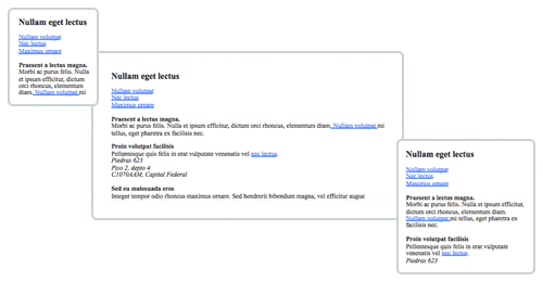
- In my opinion, this landing page serves as an umbrella for all subpages. So, I’ll wrap the logo in an
h1. I’ll add animgtag as well, so that the logo displays when printed.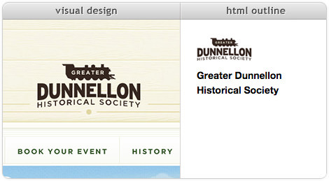
- All right, next up is the menu. I’m putting it at the top because this is a landing page. Also, let’s handle caps with CSS
text-transform. I’ll wrap the menu in anavand add a mandatory header called “Navigation” inside. Also, we’ll add an ordinary unordered list, with anchors as links to the other pages.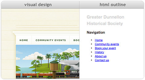
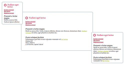
- Is this image showing a train actually content? And should we, therefore, use an
imgtag? Or is it aesthetic, meaning we should handle it in CSS usingbackground-image? I’m going with aesthetic, which means it won’t end up in the HTML outline.
- What type of content is that white text below the image? What should I name it? How about “Introduction” — I’m not 100% sure, though. I’ll add an “Introduction” heading and hide it with CSS later on. This heading might be useful for screenreaders as well.
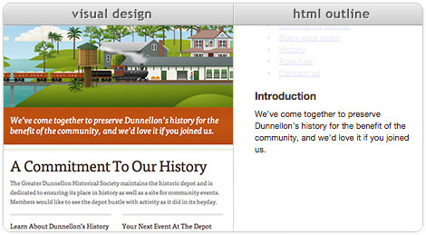
- Wait a minute! That blue “Join us today” button is related to the introductory paragraph (“… if you joined us”). Also, it’s not a button but a link. I’m setting myself up for a CSS positioning nightmare.
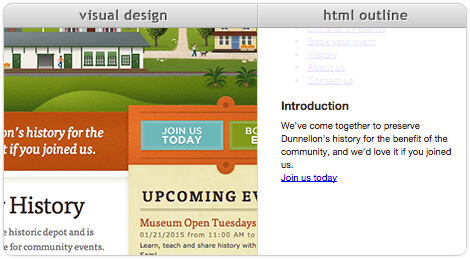
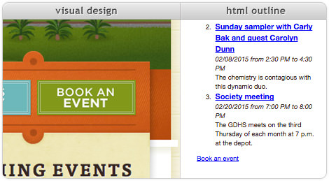
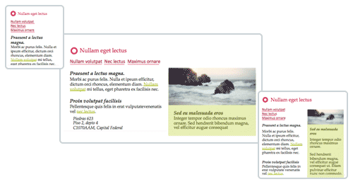
- At this point, I don’t know what to do with the “Book an event” button. It’s not related to “Join us today,” that’s for sure. It’s a button without context. I’ll just skip it for now.
- Finally, some straightforward content: headings, paragraphs and links. To position them, we might need to wrap some of these in a
divlater on.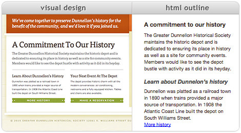
- On to the events! Let’s go for an ordered list because shuffling the dates would be confusing. We’ll use the
timeelement for dates and times. Let’s wrap a link around the subheading.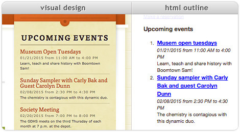
- Now we know where the “Book an event” button should go. People need to know about upcoming events before they can book one — makes sense. So, we’ll put the button with the events making our CSS positioning nightmare even worse.
Below is the resulting HTML.
<h1><img src=""/>Greater Dunnellon Historical Society</h1>
<nav>
   <h2>Navigation</h2>
   <ul>
      <li><a href="/">Home</a></li>
      …
   </ul>
</nav>

<main>
   <h2>Introduction</h2>
   <p>We’ve come together … if you joined us.</p>
   <a href="/">Join us today</a>

   <h2>A commitment to our history</h2>
   <p>The Greater Dunnellon … in its heyday.</p>

   <h3>Learn about Dunnelon's history</h3>
   <p>Dunnellon was platted … South Williams Street.</p>
   <a href="/">More history</a>

   <h3>Your next event at the depot</h3>
   <p>The depot provides … are also available.</p>
   <a href="/">Make a reservation</a>

   <article>
      <h2>Upcoming events</h2>
      <ol>
         <li>
            <h3><a href="/">Museum open Tuesdays</a></h3>
            <time>01/21/2015 from 11:00 am</time> to <time>4:00 pm</time>
            <p>Learn, teach and share history with Boomtown Sam!</p>
         </li>
         …
      </ol>
      <a href="/">Book an event</a>
   </article>
</main>
A lot of attributes have been left out to keep the HTML compact.
You probably noticed that I’ve made a lot of assumptions in order to come up with the HTML structure above. The introductory paragraph heading, the banner image and the call-to-action buttons — these were all places where I assumed something and added to or altered information on the page.
I’ve also made assumptions about where to position things on the page. In deriving semantic meaning from textual data, I’ve assumed that the visual designer intended to give information on the right side a lower priority than information on the left. Based of these assumptions, “Upcoming events” ended up below “A commitment to our history.” I put the navigation above “Introduction,” although it might have been better the other way around.
Assumptions are dangerous, not only because one could assume incorrectly, but also because somebody else will most likely assume differently. In this case, if you and I had independently written an HTML tree based on the design above, it would have been a miracle if they turned out the same.
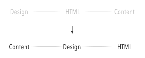
HTML is about giving meaning to information. We should not end up with different descriptions of the same information. It seems that design clouds the meaning of the content and creates room for interpretation and assumption.
Content First
A content-first approach teaches us that visual design should always be based on actual content. Only with real content can we decide how best to present it to users. We’ll get to what “real” means in a minute.
With a content-first approach, we move from designing without content to designing based on content — a very important distinction. Remember the definition of semantic HTML: giving meaning to content.
Semantic HTML has no relation to appearance — that’s what CSS is for. Why put off the HTML until after the design phase if it doesn’t depend on the appearance? Let’s move it to the front and describe our content before designing it.
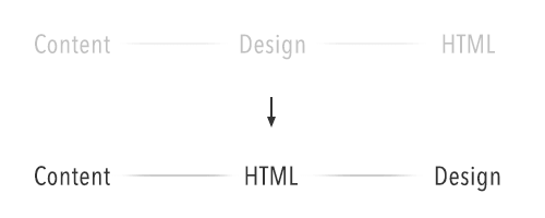
It’s a small change, but it makes a big difference. With this change, all assumption is taken out of the equation. We now know how our content will be structured. And before even drawing a pixel, we’ve got ourselves a website.
Do you hear that? That’s the sound of screenreader users celebrating.
Flipping It
Let’s go back to the slides. This time, we’ll do it the other way around. We’ll use the HTML that we’ve just written and imagine a designer using it for their visual design.
It’s difficult to imagine the call-to-action buttons ending up where they were in the original design. In terms of visuals but also content, this new setup makes a lot more sense.
When we were basing the HTML on the initial visual design, we could use the visuals for one viewport only. By turning things around and basing the design on the HTML, we can use the HTML for all possible viewports and contexts.
Reality Calling
If I’ve piqued your interest, you might be wondering how to implement this approach in an actual project. Depending on the project, your team and your client, it might look something like the following.
Because we’re doing things content-first, we need to get our hands on the client’s content. Mark Boulton rightly points out that content-first is not about waiting for the final content before doing anything. When we talk about content-first, we mean that we want to know the structure of the content that we’re designing for. Having the final content already in hand would be fantastic, but most of the time it simply is not. In “Structure First. Content Always,” Boulton says:
"You can create good experiences without knowing the content. What you can’t do is create good experiences without knowing your content structure."
In my experience, this is true, and making sure everyone knows what “content first” means is important. So, make sure everyone understands that you’re talking about structure and that you don’t mean to pause the project and wait for the client to deliver the final content.
Before we start writing HTML, we need to determine what content to present on the page and how to prioritize it. This is where a priority guide comes in handy. Together with your client, write down all of the content types of your web pages on sticky notes, and then order them chronologically along the y-axis. For example, you could have a “product detail” sticky and a “post a review” sticky, and because someone would need to know about a product before reviewing it, “product detail” should come first. Your client might deem the “post a review” box to be more important, but that importance could be visualized later using color and composition, not by changing the order of content.
I find that clients are pretty good at this exercise, maybe because they are used to writing documents such as quotes and writing papers that must adhere to a certain hierarchy and chronological order to make sense. As I said, this exercise makes them really think about what’s important. Also, if there are multiple stakeholders, it shows how each is motivated and which stakeholders have the most influence.
We’ve set up our content types; let’s talk about content structure. Structuring content is exactly what HTML is good for. Let’s go for it. We’ve got our content types, and we understand semantic HTML, so let’s start adding structure to the various content types. This could be easy or challenging, depending on how high-level your content types are.
A basic “post a review” form could be pretty straightforward:
<form>
   <fieldset>
      <legend>Rating</legend>
      <label><input type="radio"/> 1</label>
      <label><input type="radio"/> 2</label>
      <label><input type="radio"/> 3</label>
      <label><input type="radio"/> 4</label>
      <label><input type="radio"/> 5</label>
   </fieldset>
   <label>Review</label>
   <textarea></textarea>
   <button type="submit">Send</button>
</form>
A lot of attributes have been left out to keep the HTML compact.
The “product detail” sticky might be a bit more challenging. In its most minimal form, it could be just a “title,” “image” and “short paragraph.” But your client might also want things in there like “product specifications,” “ordering options,” “related products,” etc. These other content types require further discussion and prioritization. In the end, you might conclude that “post a review” is actually a part of “product detail” because people will be posting a review of the product described in “product detail.”
<article>
   <h1>MacBook Pro</h1>
   <img src="macbook-pro.jpg"/>
   <p>A groundbreaking Retina display. All-flash architecture. Fourth-generation Intel processors. Remarkably thin and light 13‑inch and 15‑inch designs. Together, these features take the notebook to a place it’s never been. And they’ll do the same for everything you create with it.</p>

   <section>
      <h1>Post a Review</h1>
       <!-- 'post review' module here -->
    </section>
</article>
A lot of attributes have been left out to keep the HTML compact.
These content types don’t stand on their own. They should be contained in an overall content hierarchy, as we saw in the series of images related to semantic HTML earlier. Together with this hierarchy, your content types should create a nice and correct HTML5 sectioning outline. To test this, you can copy your HTML to the HTML5 Outliner.
Below is an example of an initial web page setup.
Now, we could have also done a bit of content choreography to make sure each bit of content receives the right amount of attention from the user. In his excellent book Responsive Design Workflow, Stephan Hay advises us to set up content reference wireframes at this point. In my opinion this would be a bit too early — it’s best to wait a bit longer on the composition, because color, typography and functionality will affect the way attention is distributed across the page.
Let’s continue with our basic HTML web page. Don’t show it to your client yet; mix in their brand identity first. Add their logo, and convert their typography rules and color schemes to CSS. This will make it easier for your client to identify with the content — the content will look less anonymous and more like their own.
While your client would be able to relate to the version shown above, they would probably have a hard time getting enthusiastic about it. In my experience, the client will be impressed with the amount of work done but will feel uncomfortable not knowing what the result will look like. I recently renovated my house, and I have to admit, after totally stripping it, taking down walls and removing old plumbing and electricity, I seriously doubted whether it would come together in the end. That’s when I understood how my clients feel.
You need to manage that feeling or else they’ll panic and fall back to the classic web development pattern, demanding design up front.
The version above is the “minimum viable web page.” It contains, if all has gone according to plan, the core content that your client’s users will be coming to the web page for.
If you’ve been using actual content, then even if all hell breaks loose, you could put this online as is. It wouldn’t be perfect, but the brand would be recognizable, and users would be able to access the information.
For now, hell is not breaking loose. So let’s move to the content choreography. Start resizing the browser window and view the page on some different devices. You’ll notice that on a wider viewport the line lengths will become uncomfortable to read. An ideal line contains between 45 and 75 characters. So, you can regard points where it’s longer or shorter than that as indicators to tweak the layout or font size.
You have two options here: either make the adjustments live in the browser or boot up your favorite design tool. In my experience, designing in the browser is useful for tweaking things such as font size and color, while composition experiments are easier to do in Sketch or Photoshop or using pen and paper.
Tweaking CSS values in the browser might be tempting, but taking a screenshot and making some quick adjustments outside of the browser is usually faster. I find this results in more interesting design choices. When sketching, try to imagine how your solution would scale or break in smaller and bigger viewports and how your design choices relate to the content’s order and importance.
When you’re happy with the sketches, transform the result to CSS.
Now that we have set up the base version of the web page, we can start testing and iterating. Do some quick usability tests, which you can easily do by following the Don’t Make Me Think methodology. Sometimes creating a small prototype for this is easier than using the production version.
While tweaking the web page for each context, we can look into adding functionality and presentation styles based on contextual measurements. For instance, in small viewports, we could move the menu out of view. Or when the user is viewing the web page late at night in a dimly lit environment, we could load a style sheet with inverted colors. If enough real estate is available, we could turn an address into a Google Map.
If you look closely, you’ll notice that all of these enhancements are layered on top of the content. They only change the way the content is presented and interacted with; they never change the content (or priority of content) itself. This fits perfectly with a strategy of progressive enhancement: Start with the content, and work from there.
We’ll finish up this section with a short note about web applications. The methodology explained above is for content-driven web pages — pages that are and should be accessible to everyone in all contexts. Not all web applications fit this description. Many use HTML to describe the interface instead of the content. In these cases, this methodology might not be the best fit.
Advantages Over Design-First Approach
I’ve compiled a list of the challenges overcome and the advantages gained by this approach. Not to say that this approach does not introduce new challenges, but those new challenges mostly have to do with managing client expectations and team communication.
To the list!
- Content — and, therefore, HTML — is the only constant across all devices. How you present your content and how users interact with it will differ between devices, but the content will remain the same. Starting with content means starting with everyone.
- Describing content with HTML is not only about lists, paragraphs and headings. It’s also about choosing between buttons and links, dropdown and radio buttons, tables and definition lists. It’s about outlining all functionality with HTML first.
- With the content nailed down, there’s less confusion about what things actually are. Something could look like a button in a visual design but in reality be a hyperlink. This creates miscommunication in a team, which is easily prevented by writing HTML first.
- Because we’ve layered design on top of HTML, we have created an opportunity for the team to work together. Developers can work on implementing the HTML, while designers can think of compositions for various viewports and contexts. No more deliverable dependencies means no more tiny secret waterfalls.
- This methodology enables designers to work concurrently with their developer buddies, allowing them to quickly test things in the browser. Some design problems might be easier to tackle in CSS. As Paul Boag explains: “Developers might suggest ideas that you might have dismissed as impossible.”
- It’s now clear what content should be generated or be manageable via the CMS. Hidden skip links, headers and labels are no longer hidden — all content is right there in plain sight. Design choices can now make content implicit, but that does not mean the content won’t end up in the HTML, because we’ve already written it. In my experience, none of these implicit content items end up in the CMS because they aren’t visible to everyone. By starting with HTML, this is easily resolved.
- If you and the client have pinned down what content you want to communicate to users, that will very likely not change during the development process. A change would only happen if user research uncovers some previously unknown facts that warrant a change in course.
- Content creates focus. By focusing on content and functionality early on in the process, you’re less likely to end up in a “red or blue?” discussion with the client. Too often clients are tempted to focus on details when they should be thinking of the big picture. With this layered setup, the focus starts with the big picture and then moves to the details during the project.
- Having the HTML early on enables you to build the minimum viable product first. In later stages of the project, you can progressively enhance it to further improve the user experience. If you introduce usability testing in the project (which you should), you can use the results to decide what to enhance first. An asynchronous search filtering system might be cool, but your users might value other functionality more. Harry Roberts reminds us that “good enough” today is better than “perfect” tomorrow.
- As we saw with the call-to-action buttons in the semantic HTML exercise, spotting user experience problems is easier when you’re working with content as the foundation.
- Once you’ve finished the HTML, you can immediately start testing the content with visually impaired users. Most of the additional layering will be for the sighted.
- Starting with content enables you to more easily define your HTML5 sectioning outline, to pick micro-formats or micro-data and to apply WAI-ARIA rules. This results in better accessibility and makes the pages easier to index by search bots.
- This approach entails going from a robust stable base to a very detailed flexible end product. By staying away from highly detailed solutions early on, you decrease the risk of putting a lot of hours into unneeded functionality. For example, you could build synchronous search first, and then later on in the project, if your user base turns out to heavily favor search, you could layer asynchronous search and filtering on top of it.
- A correctly written HTML tree provides natural hooks for JavaScript later on. Content under headings could be made visible in large viewports and then presented in an accordion in smaller ones.
- No longer are you creating pretty pictures of web pages. The focus has moved to quick sketches and tiny prototypes to solve design challenges, and the results are quickly transformed in CSS and moved to the browser. We’re throwing away fewer deliverables, which means we’re working more efficiently.
Talk To Your Client
As with everything, it’s all about communication.
If your client thinks the Web is a 1024 × 768-pixel box — and continues thinking this while you and your team are working on their shiny new website — then you’re going to run into a lot of trouble.
Many clients expect a visual design up front, because that’s what they’re used to getting. They don’t know any better.
Your job — not an easy one — is to explain to them why this is impossible. Enlighten them about the millions of different viewports, interaction methods and feature sets out there, and help them understand that you cannot capture all of that in a static design.
If your client understands the Web, you’ve won half the battle.
Further Reading
- How To Convince The Client That Your Design Is Perfect
- How To Explain To Clients That They Are Wrong
- How To Sell Your UX Design Solution To Clients
- How To Sell Responsive Web Design To Clients
 (vf, il, al, ml, mrn)

