How To Keep Framework Development Simple And Bug-Free

Email Newsletter
Weekly tips on front-end & UX.
Trusted by 200,000+ folks.


 Flexible CMS. Headless & API 1st
 Register!
It’s just like that for your product, too: people rely on our products to work. Bugs erode trust, which in turn loses customers. So when we began updating Foundation, a responsive CSS framework, we wanted to ensure everything worked. Thoroughly. We know that many people rely on our software for their work, and maintaining that trust is paramount.
In this article you’ll learn our methodology for testing responsively, not just on a case by case, page-from-PSD comp. See, we’ve developed a certain system to make sure that nothing’s broken at launch on different devices.
Firstly, how do we define “broken”? There are degrees of problems. Parse errors are clearly bugs. But other issues were more difficult to classify. For example, we once had a download button on a busy page that no one seemed to find. We defined this as “broken user feedback,” and treated it as a bug, even though the button worked fine.
It’s not enough to look for blatant bugs. You have to be thorough: in execution, in accountability, and in direction.
Test Ideas From The Start — Even Before Code
Long before we reach a more organized review process, we work closely with our customers to test ideas before coding them out. They’re involved from day one in a project, contributing ideas and feedback as we decide how best to solve a problem.
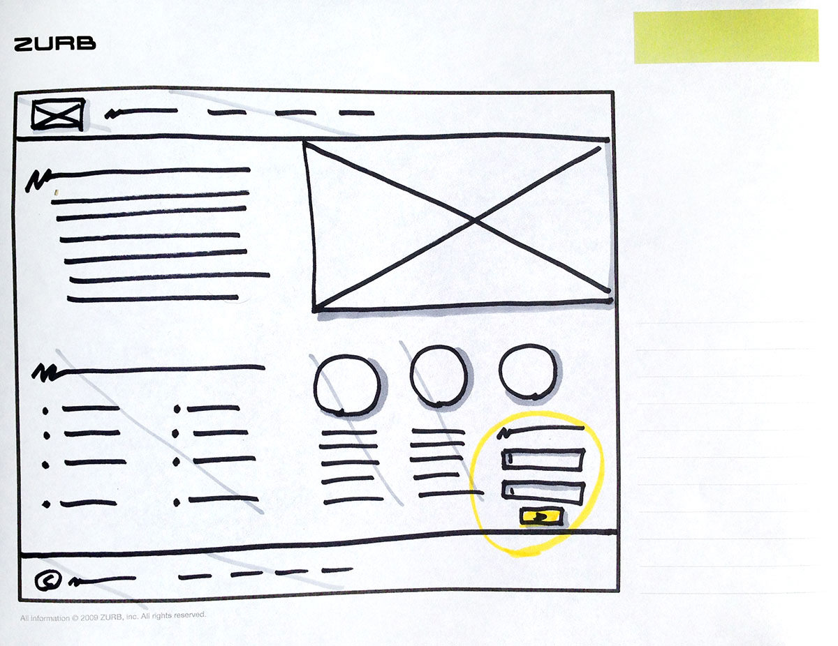
Remember that “broken” isn’t just about parse errors. Bad ideas and broken user flows kill a project just as much as users reporting error messages. So we start with our favorite tools: Sharpie markers and Copic shaders.
We love sketching. It’s not unusual for a designer to sketch a few hundred ideas for each user flow or view, and visit a client with 30–50 pages in hand. They’re both easy to make and to throw away. Five minutes with a marker on an idea that doesn’t work is preferable to an hour on that same idea in Photoshop.
Sharpie sketches are surprisingly useful to help us prevent problems at a high level. Especially with responsive web design, each page must have different configurations for various screen sizes, device capabilities, or other factors. A few quick drawings show:
- What appears (or doesn’t) on each page per configuration
- How those elements are arranged
- Our favorite hero pic will get sized down how small on mobile devices…?
Sketching the same site at different sizes gives us a rundown of design problems before they happen, at least in the broad strokes.
Use A Visual Checklist
As designers, we’re visual people. Our engineers are also known to sketch their ideas to communicate with others. And when we create responsive designs, we tend to sketch desktop-first — it’s visual, clients get a better grasp of the structure and style, and we’ve been designing for wide screens for much longer than mobile devices. We just feel more comfortable with the process this way.
Yet mobile matters, so we found a visual way you can stay accountable to yourself: with a visual checklist. Here’s how it works.
- If you’re working digitally, print your work. Nothing beats a hard copy for quick, disposable edits.
- Circle the point of the page: A call to action, a _____, or a _____.
- Cross out every element — except those that paint a direct path to that circled element. For example, on a marketing site we might keep a hero image, a paragraph of descriptive text, and… that’s about it. Kill the sidebar, zap the footer, and even the navigation bar. Show no mercy. It’s only a bit of paper.
Everything that’s left are the essential elements. The core of the page.
- Sketch out — yes, we recommend going analog with detail-defeating Sharpie and paper — a mobile version of the page with only the essential elements you defined earlier. Lay it out with the same considerations you’d use with any design.
- Once you have those elements roughed out, add back the elements you previously eliminated — but support the entire site. Navigation, for example, or the link-laden footer.
The visual checklist approach is tricky to learn, and worth the effort when paring down a website for mobile devices. But it’s just the beginning. After you code up your work, it’s time to test.
Test The Execution In Real-World Conditions… Or Else
In terms of responsive web design, simply resizing your browser window doesn’t cut it beyond a quick check. To be fair, it’s a rare day when we don’t play with our browsers’ window sizes for brief glances into responsive design. But we also we test on real devices. Our design thinking process involves quick iterations with lots of feedback. Soon after we begin to code, we begin to test.
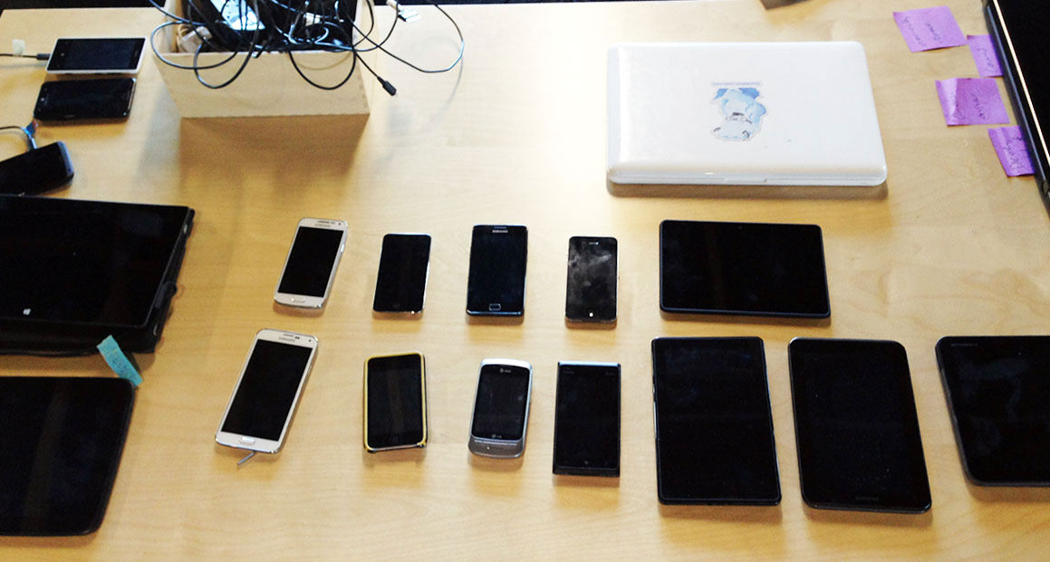
This is especially true as we work on new versions of the framework. We know that we need to support about a dozen different devices to catch the majority of use cases. While we don’t have a full-on device lab, we do test upcoming versions on about 16 devices, both iOS and Android, plus the major modern desktop browsers. Services like Litmus also play a role in our testing, though they don’t always provide that necessary hands-on experience. Pun intended.
Speaking of hardware, we also learned to test servers the hard way. Another framework we developed, Foundation for Apps, uses a command line tool for installation and updates. During development, the code worked fine in every test — well, maybe not every test, but that’s the development cycle for you.
Still, it improved. And with refinement, installing the framework became so reliable that we didn’t question it. The code just worked. Which is why, on the eve of launching it, we were shocked to discover it failed to load on our production server.
A minor difference between our development system and the live one would have spelled disaster at the last minute… except that we applied our test methodology to our products even as they move to different servers. Since then our best practice includes testing our work on live servers, but before deploying it — and certainly before announcing it.
Use A Spreadsheet Tracking System
Solving technical and design problems is hard enough without overhead, so we rely on a plain ol’ shared Google spreadsheet to keep track of what works and what doesn’t. Specifically, we track everything that can be clicked per page or view. The rules are deceptively simple.
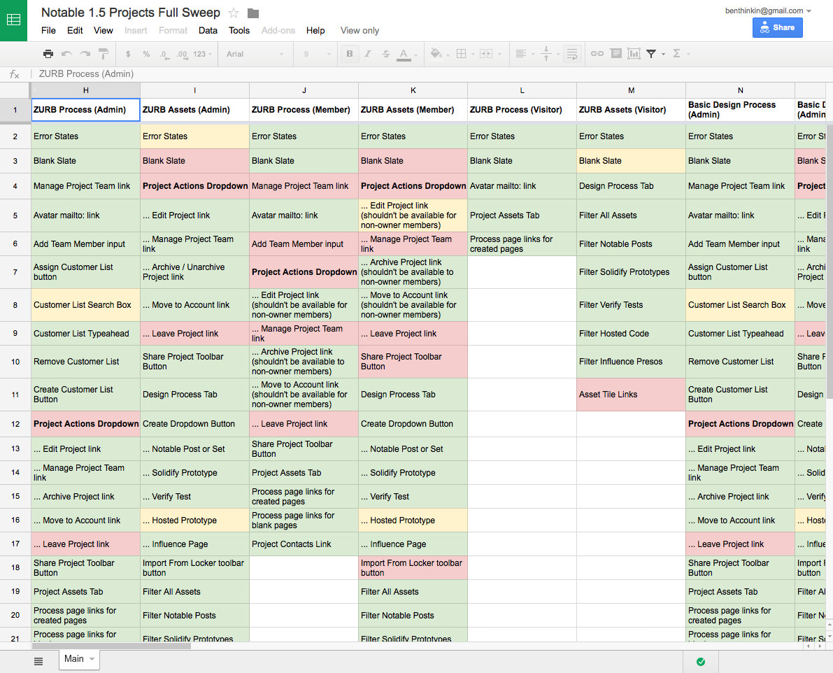
Colored backgrounds indicate:
- What works
- What fails
- What partially works
- And what hasn’t been tested.
Every cell in the spreadsheet starts out default white. Then we color green every function that passes muster or — we admit — often red and yellow, which mean broken and questionable, respectively.
Each column describes a page or view per state — or circumstances under which each page is loaded. For example, administrators and users may see the same dashboard, but with different controls. Those are two different columns.
The spreadsheet is a great overview, but our developers use GitHub to track issues and report success. So we include GitHub issue numbers in the spreadsheet’s comments: every cell that indicates a code problem also links to the issue in GitHub. Thus our engineers, who refer to the same spreadsheet as our designers, can stay on top of issues and mark items green as they’re solved.
Over time, the spreadsheet steadily loses its red and yellow boxes in favor of green as we fix bugs. Of course, we also discover new problems, and sometimes invent new things that must be tested. Everything gets added to the spreadsheet.
Not only do we use this for client projects, but we also test upcoming Foundation versions this way. Each component and their functions have expected behavior. Each gets a column in the spreadsheet. Does it work under Internet Explorer for Windows 7? How about Chrome for Mac OS X 10.10? And so on.
For example, we provide many free starter templates to use with the framework. Every one of them failed in Firefox — a long red streak along our troubleshooting spreadsheet. We had accidentally pushed out code without first running its CSS through the Autoprefixer. The issue was easily resolved, but underscored to everyone here the importance of testing, testing… and testing again.
Going Forward (And Sliding Sideways)
When we released our off-canvas navigation component to make sliding menus a snap on any modern browser, we ran into a number of unexpected issues. Obviously when it comes to complex components, you wouldn’t just list Internet Explorer, but you would list all the versions supported in the spreadsheet. That’s what we did, too.
It was a good thing, too, because to our surprise the initial off-canvas animations didn’t work in IE9. Instead, the panel just sat on top of the page, obscuring a good chunk of the layout and refusing to get out of the way. We had to rethink certain CSS techniques and — after ensuring it worked in our supported versions of Internet Explorer — ran it through the QA gamut again to be certain that solving for one browser didn’t break another.
Half of developing a tool isn’t the creative work — it’s the time taken to make sure the creative work works. We address different degrees of “broken,” from ill-considered ideas to implementing the good ones; testing under a variety of circumstances; and ensuring that we cover as many bases as we can. It doesn’t take complex tools to stay accountable. Our spreadsheet approach works because it’s simple and accessible.
Is it perfect? No. But when problems arise, our hands-on system makes solving problems relatively quick. The result is a solid foundation that many designers have come to rely on.
Further Reading
- Which Responsive Design Framework Is Best?
- Frameworks: Just Because You Can, Should You?
- Creating A Complete Web App In Foundation For Apps
- Responsive Web Design: What It Is And How To Use It
 (da, og, ml, mrn)

