A Few Different Ways To Use SVG Sprites In Animation

Email Newsletter
Weekly tips on front-end & UX.
Trusted by 182,000+ folks.


 Celebrating 10 million developers
 Custom Web Forms for Angular, React, & Vue. Your backend.
There are some things we know and like about SVGs. First, SVGs have smooth, clean edges on any display, so using SVGs can reduce the number of HTTP requests for image replacement. Second, it’s easy to make an SVG scalable to its container for responsive development.
In this article we’ll cover a few ways of using SVG sprites to describe motion on the web. I’ll show some techniques for using SVG sprites in complex animation that takes advantage of these factors. All examples shown will assume the use of an auto-prefixer and some basic knowledge of CSS animations.
Technique 1: Complex Responsive Animation With An SVG Sprite
Most of us have been using sprites for development for a long time now: using SVG in a sprite is not new business. This article by Ilya Pukhalski breaks down Joe Harrison’s responsive icons technique in a very impressive way. In this first example we’ll take it one step further and use SVG sprites not just for iconography, but for complex, fluid animation as well.
Animation has soared in popularity this year due to increased browser support for animations and user experience benefits of movement that supports content. But until now, we have not thought about this medium in the same way we have about so many other design concepts that shift for different screen sizes. Even if the animation is complex, we can still get the most bang for our performance buck while still catering to our users’ needs.
Responsive web development adapts content for different displays for so many elements of UI interfaces. Animation can modify with the same considerations as the typography and layout, adjusting to the viewport and clarifying the design.
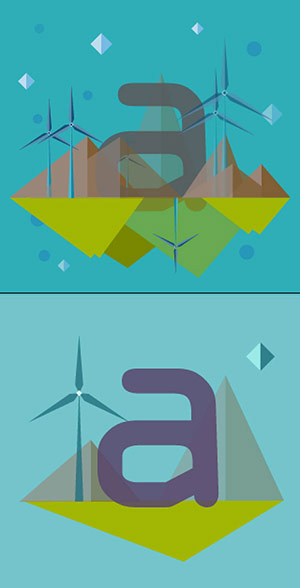
This is what we’ll be making:
See the Pen Responsive SVG Sprite Animation that Adjusts Based on Viewport by Sarah Drasner (@sdras) on CodePen.
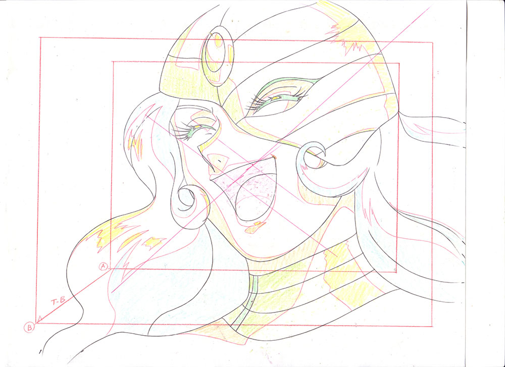
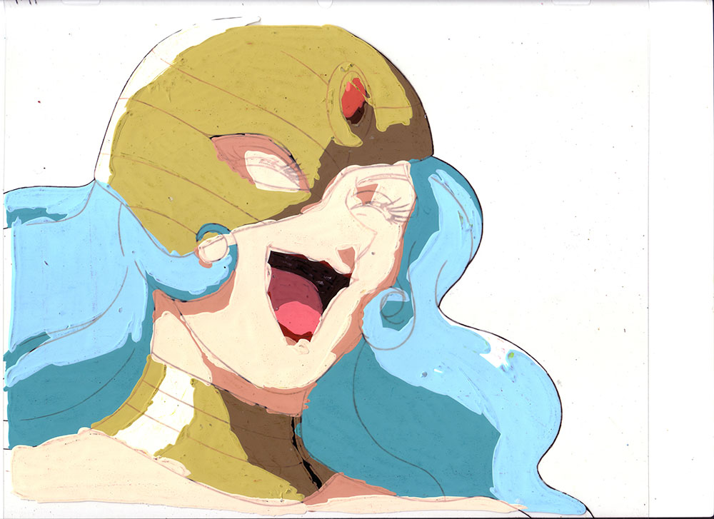
In this example, I’ve made a modern day Book of Kells initial illustration to show a complex animation in the context of page content. First, I’ve made three different designs based on small, medium and large viewports.
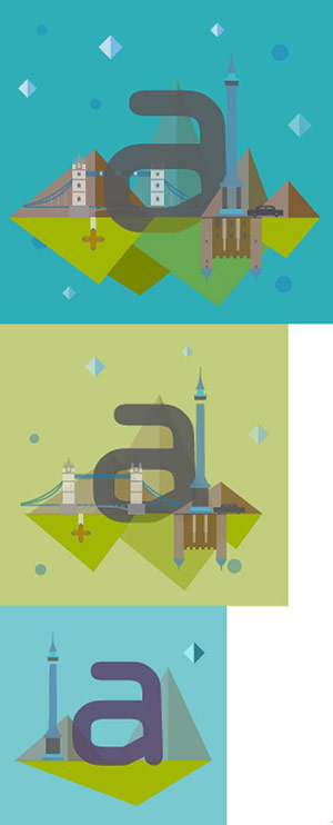
I use this as my map for the rest of the project and refer to it often. Other people plan differently, working in the browser or making sketches. Choose the method that makes you most productive.
Grouping And Drying It Out
Now that we have a map, we can start reducing the repetition of elements. We identify the shapes that the first and second versions have in common so we can reuse them. A class can be assigned to the rect in the background and so that we can change the fill using a media query. All the objects are named and grouped for easy reference, such as “mountains”, “bridge” or “tower”.
We’ll also put a class on all detailed shapes, such as building windows or bridge ropes that will be removed in the medium screen size. Any group that’s too different to modify, we put together in a larger group that we can then hide or display. If the first illustration is kells_1, the group particular to the second illustration is kells_2, and the last is kells_3. In order to make the whole SVG similarly scalable to the same container values, the last illustration becomes the same size as the first.
What we’re left with are two sprites in the sprite sheet, and three SVG groups. The first appears slightly complex:
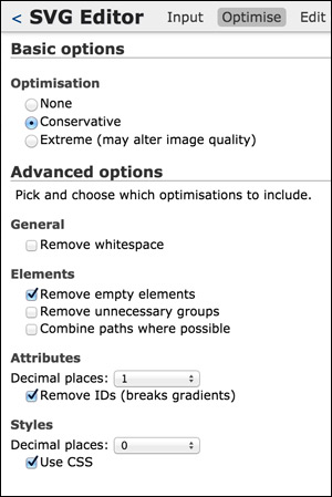
We now export it to Peter Collingridge’s SVG Editor — or any preferred method of SVG optimization — keeping the groups, which brings the file size down to 18KB! Note: SVGO is also great for terminal-based optimization, though I prefer to use the online editor because not only is there is a preview of how the SVG will appear when you’re done, there is also now an experimental editing section to work with.
To use this tool, you simply cut and paste all the SVG code into the textarea, hit load, and you will be directed to the optimize view. I usually try the “Extreme” selection option just to see if I can get away with it, but tend to end up using “Conservative”, not removing whitespace (because of readability while I’m working), and making sure that I preserve the groups. Here is a screenshot of the settings I normally work with. Please note that this varies from project to project and everyone has different preferences.
The optimized SVG is placed inline in the HTML (rather than a source URL background image) so that it’s easier to animate. By taking the time to label the classes properly, we can now add the CSS that will alter the details between large and medium sizes:
@media screen and ( max-width: 700px ) {
  .kells3 {
    display: block;
  }
  .background {
    fill: #93A600;
    opacity: 0.57;
  }
  .mid-hide { display: none; }
  .bridge { transform: translateX(15px); }
}
Making It Fluid
At this point the width and height are removed from the SVG and we can add in preserveAspectRatio=“xMidYMid meet” (though that is the default, so it’s not strictly necessary) to make the SVG fluid. With these alterations, it will adjust to the container size instead, which we set based on percentages. Flex or any other responsive container would work here too.
.initial {
  width: 50%;
  float: left;
  margin: 0 7% 0 0;
}
The Viewbox Trick
There is one catch and you might have already guessed it. Even if we assign the bottom layer a class and hide it, there will be an empty gap where the viewbox still accounts for that space. We can change the viewbox in the SVG to show only the top portion:
viewBox="0 0 490 474"
and that will do the trick… for the two larger versions. The smallest version is now obscured, as the viewbox is providing something of a window into another portion of the SVG sprite sheet, so we will need to adjust it. To change the viewbox based on a shifting viewport, we’ll use a little JavaScript:
var shape = document.getElementById("svg");

// media query event handler
if (matchMedia) {
        var mq = window.matchMedia("(min-width: 500px)");
        mq.addListener(WidthChange);
        WidthChange(mq);
}
// media query change
function WidthChange(mq) {
        if (mq.matches) {
    shape.setAttribute("viewBox", "0 0 490 474");
    shape.setAttribute("enable-background", "0 0 490 474");
        }
        else {
    shape.setAttribute("viewBox", "0 490 500 500");
    shape.setAttribute("enable-background", "0 490 500 500");
        }
};
Now, when we scroll the browser window horizontally, the viewport will shift to display only the part of the SVG we want to expose. Our code is now primed and ready to animate.
Time To Animate
If you’re exporting from Illustrator as I am, it will account for the fact that you have many “mountain” classes, “dot” classes, etc., and number them for you: “mountain”, “mountain_2_” and so forth. The nice thing about naming all of these groups properly is that we can consistently reuse the same animation across an array of sprites. To target all of the “mountain” classes, we can use a CSS attributeStartsWith selector (I’ve changed the default Illustrator IDs to classes):
[class^="mountain"], [class^="grass"] {
  animation: slant 9s ease-in-out infinite both;
  transform: skew(2deg);
}
You’ll see here that we begin with a transform set on that element: this keeps the keyframe animation concise. The animation will assume that the 0% keyframe corresponds to the initial state of the element; all that needs to be defined to create a very succinct loop are the changes halfway through the animation sequence.
@keyframes slant {
  50% { transform: skew(-2deg); }
}
For the dots and stars that share a common animation, we declare that once in @keyframes, but then change the timing of the animation for each of the different effects with as little code as possible:
@keyframes blink {
  50% { opacity: 0; }
}

[class^="star"] {
  animation: blink 2s ease-in-out infinite both;
}

[class^="dot"] {
  animation: blink 5s -3s ease-in-out infinite both;
}
We don’t want both the stars and dots to animate at the same time, so the animations are staggered with a delay. However, doing so with a positive integer will cause a gap in continuity at the start of the animation when the viewer arrives. This is solved here by specifying a negative delay.
Of course, we also need to add the most common viewport meta tag:
<meta name="viewport" content="width=device-width">
To get the best possible performance and to offload work to the GPU (particularly in Firefox), we also need to hardware-accelerate any element that we’re animating. SCSS is great for this as I can use a mixin:
@mixin accelerate {
  transform: translateZ(0);
  backface-visibility: hidden;
  perspective: 1000;
}
and add this to all of the elements with animation:
@include accelerate;
Backwards Compatibility
If SVG or animation is not available, we can provide backwards compatibility by adding a fallback. In this case I’ve used a simple PNG, but you can also make something more complex if you wish.
<div class="fallback">
  <img src="fallback.png">
</div>
We add in Modernizr — a slim, custom build to check for SVG — and use the class hooks provided to hide and display it depending on the support level:
.svg .fallback {
  display: none;
}

.no-svg .fallback {
  width: 50%;
  float: left;
  margin: 0 7% 0 0;
  img { width: 100%; }
}
By nesting the image in a div set to display:none, the fallback asset isn’t accessed unless SVG or animation support is disabled. More information about what content is downloaded in different media queries can be found in Tim Kadlec’s blog post “Media Query & Asset Downloading Results”. For a more detailed analysis on how to provide multiple fallbacks for SVG using the picture element and a polyfill, Sara Soueidan created a great resource.
And there you have it: a complex animation with concise code that shifts based on the viewport.
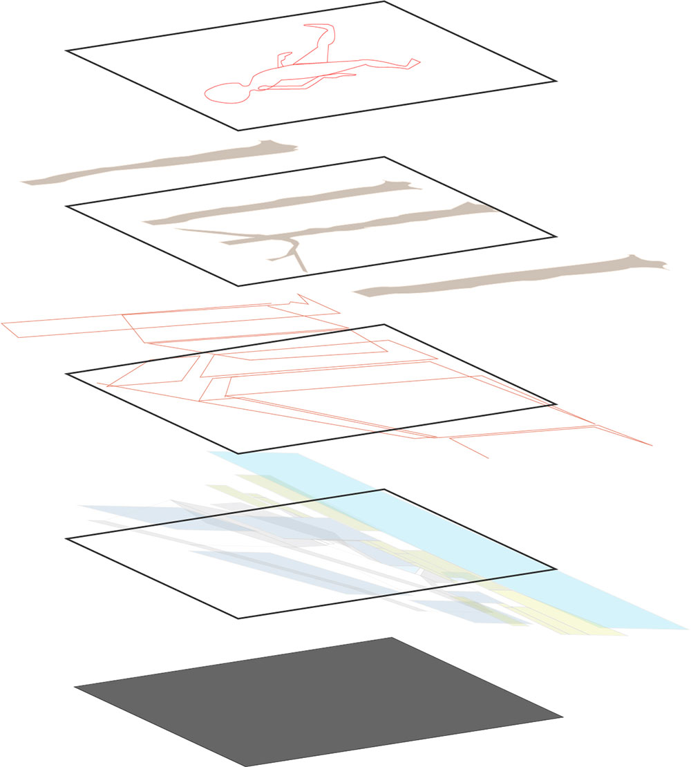
Techniques 2 And 3: Keyframe Animation With Steps() And SVG Sprites
Techniques 2 and 3 are shorter and related to each other. In these examples, we’ll use the SVG sprite to make a step animation. Of all web-based animation techniques, step animation most closely resembles old hand-drawn cel animation. Cel is short for “celluloid” which is a type of transparent sheet. This material was used by animators like Disney or the original Looney Tunes to draw on top of their previous drawings, thereby defining a sequence and creating the illusion of movement.
The images were shot on film, frame by frame. Each frame was composed of several different layers. There was typically a stationary painted background, used statically throughout a scene. The character’s body and corresponding moving body parts were then painted on separate layers of celluloid to reduce repetition.
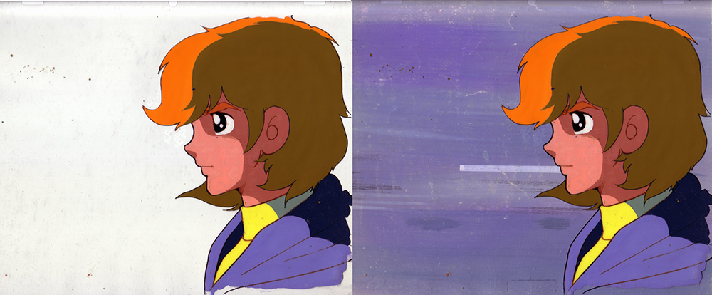

Here, we mimic this analog process by using a single motionless background, then quickly showing a series of images on top. This gives the illusion of movement without any real interpolation. Instead of a series of images though, we will simultaneously reduce HTTP requests and simplify our keyframes by using a single SVG sprite sheet. This technique is better for more complex shapes and expressive movement than what simple transforms can offer.
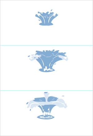
Here is the final animation for Technique #2:
See the Pen Step Keyframe Animation with SVG sprite by Sarah Drasner (@sdras) on CodePen.
The drawing in this animation has 21 parts. That might sound like a lot, but it is vital that the ratio of drawing per second stay high so that the animation appears smooth. Considering that there are 21 drawings over 1.8s seconds, we are pretty close to our goal of the standard 12fps. This number is not arbitrary - old film was shot at 24fps, and animators largely considered “shooting on twos” (meaning one drawing over two frames, or 12fps) the standard for an illusion of movement. Anything much lower than this, and the animation appears slightly choppy.
In order to appropriately place each drawing in each frame we could move guides around precisely with rulers, but it’s more efficient to automate that task. I’ll demonstrate two different options for preparing your designs: drawing in Illustrator with a template; and drawing in an SVG editor, or on paper frame by frame and using Grunt to sprite.
Drawing In Illustrator With A Template
First, we decide how big the animation is and multiply that number by 21 in one direction: that’s our artboard size. We drag a box around that area and choose Object → Path → Split Into Grid. Then we enter the rows we want (or columns, if you wish to make a horizontal sprite sheet) and click OK. Then choose View → Guides → Make Guides and our template is all set.
If you’re drawing directly in Illustrator, your best bet is to place your first drawing within the first box, copy it into the next box using the alignment line, or shift and drag to keep it steady. Then slowly pull and reshape parts of the drawing from frame to frame. With each drawing, copy the last version, move it and redraw it slightly.
You can also do a screencast of something and place each image in the Illustrator doc and trace it, either through Illustrator’s native trace functionality, or with the pen tool for a hand-drawn feel, and more concise paths.
Obviously, this approach can also be done in Sketch or any other SVG editor: use the tool of your preference.
Once we have a long sprite sheet, we export and compress the SVG, and also save a copy as PNG that we’ll use as a fallback, and in this case, the fallback will still animate.
Drawing In An SVG Editor, Or On Paper Frame By Frame And Using Grunticon To Sprite
If you like a hand-drawn look, you can draw it all by hand on paper and scan it. Old animation studios used lightboxes and celluloid sheets so animators could trace their previous drawings incrementally. You don’t necessarily need these materials to try this technique, though. By placing a lamp underneath a glass table, you can easily make a poor man’s lightbox. This set-up shines enough light so that you can see through even regular opaque copy paper. To create each new frame, place a piece of paper or vellum over your last drawing and change the drawing slightly until you have a series. You can then scan this set of drawings and vectorize them.
Alternatively, you can draw each piece frame by frame, shifting the image slightly each time, and saving every new version to a folder. Just be sure that what you’re initially saving is indeed an SVG and not an .ai (or any other) file type. You can then use Grunticon to compress and sprite them automatically. Here’s a great article explaining how to do so. Notably, Grunticon also generates a fallback PNG automatically.
Personally, I think if you draw each frame by hand, it makes the most sense to just make sure the placement on each artboard is consistent and use Grunticon; but the Illustrator template technique has the benefit of allowing you to see all of your work at once.
Keeping It Simple
For this animation, I didn’t make the SVG fluid because I purposely designed it to take up the whole screen on mobile. Note that there is no need for a lot of complicated math and keyframe percentages. All we need to do is take the image height, and specify the background-position with that number as a negative integer on the 100% keyframe value:
@keyframes splashit {
        100% { background-position: 0 -3046px; }
}
Then on the splash div, we animate using steps() for the number of frames we had in the SVG:
.splash {
  background: url(‘splash-sprite2.svg’);
 ...
  animation: splashit 1.8s steps(21) infinite;
}
Using an SVG rather than a PNG gives us the advantage of a crisp image on all displays, but of course we will still provide a fallback. We use Modernizr to create a class hook on the <html> element and can then provide a fallback, and still animate it with the PNG we created:
/* fallback */
.no-svg .splash {
  background: url(‘splash-sprite2.png’);
}
Technique 3
If you take the steps() value out of the last animation, you might see something interesting. Instead of creating a seamless moving drawing, it just rolls through the background. We’re going to use that to our advantage in the next Pen.
See the Pen SVG Sprite Animation #2 by Sarah Drasner (@sdras) on CodePen.
First, we make a walk cycle using the cel/steps drawing technique. For fun, I shifted the color in each frame by slightly adjusting the hue incrementally to do a little easy manual color animation. Again, it’s important that the steps() and animation-duration ratio still fall around the 12fps range.
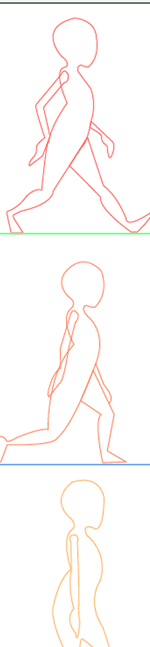
Then we will scroll through the rest of the images by animating the background position of the SVG sprite sheet. In order to keep everything consistent, we’ve made all of the background images the same size.
To create the impression of fluid linear infinite movement, the three background images must be able to repeat seamlessly on the x-axis so that when they scroll through there are no hiccups. This can be achieved by making each end identical, or, in this case, using an image that is sparse enough that it can completely flow through.
There are three parallaxed background images that don’t include the figure. All three share a few things in common: they all have the same width and height dimensions for consistency, and they share a common keyframe value.
With SCSS, we can @extend the similar pixel region designation:
/*--extend--*/
.area {
  width: 600px;
  height: 348px;
}

.fore, .mid, .bk, .container { @extend .area; }
Each element uses the same keyframe values, but we set apart their animations with an incremental decrease in seconds the further back their z-index. This yields a nice parallax effect.
.fore {
  background: url(‘fore.svg’);
  animation: bk 7s -5s linear infinite;
}

.mid {
  background: url(‘mid.svg’);
  animation: bk 15s -5s linear infinite;
}

.bk {
  background: url(‘bkwalk2.svg’);
  animation: bk 20s -5s linear infinite;
}

@keyframes bk {
  100% { background-position: 200% 0; }
}
I’ve seen people write multiple intervals for this kind of animation, but remember, the keyframes will interpolate values for us. We can even avoid having to designate precise pixel amounts on the scrolling backgrounds (just in case that amount changes in one of the sprite sheets in the future) by setting a percentage.
Again, we’ve added null Z transforms, perspective:1000;, and backface-visibility:hidden; on all of the selectors with animation to enable a bit of hardware acceleration where possible, which helps remove jank and keep our animations fluid. And again, the use of negative delays ensures that the animation is running from the start. All of the SVGs are optimized and have a PNG fallback.
And there you have it! A full, parallaxed animation with SVG sprites and very little code.
Further Reading
- Adventures In The Third Dimension: CSS 3D Transforms
- Animating Clipped Elements In SVG
- Designing an Interactive Exhibition With CSS Clip Paths
- The Illusion Of Life: An SVG Animation Case Study
 (ds, il, og, mrn)

