An Interview With Type Designer Akira Kobayashi

Email Newsletter
Weekly tips on front-end & UX.
Trusted by 182,000+ folks.
 Try ProtoPie AI free →
 Celebrating 10 million developers
 SurveyJS: White-Label Survey Solution for Your JS App

 Register Free Now
Customers and clients cannot physically touch the products that online designers create, nor can they smell, hear or taste them. One of the important factors in a customer’s decision of whether to use a product is usually the brand’s visual presence, which can help a product stand out from the rest of what the market has to offer. Upon taking a closer look, it doesn’t take long to see that good typography is involved.
Like all type designers, Akira Kobayashi believes that good typography reinforces the meaning of the text. He has a background in art and calligraphy and has been a freelance type designer for 18 years. Originally from Japan, Akira is a frequent speaker at type conferences and workshops in Europe, the Americas and Asia, and he has served as a judge in prestigious international type design competitions.
Q: Tell us when your love of typography began.
 Kobayashi: I think it was in the early 1970s, when I was twelve or thirteen. I was already fascinated with drawing pictures with pencil and watercolors and was also eager to design posters for in-school campaigns and events. One day when I was able to draw a poster with good lettering on it; I found it far better than the previous versions I made. Then I realized that a poster is different from a piece of artwork. Posters have information written in words to convey messages. Drawing nice elaborate illustrations may make posters attractive, but what makes them really work is the written information appearing on them.
Then later I started to teach myself lettering. At that time, I didn’t even know the word “lettering,” nor did I know that lettering handbooks were available in bookshops. What I did was use kanji characters in newspaper headlines as models to practice lettering.
Q: So when did you decide to try to design your very own Latin typeface?
Kobayashi: My first Latin typeface was the FF Clifford design, which I started in 1994 and finished in 1997. However, the ITC Woodland design was developed as my second Latin typeface but was actually launched before Clifford. In 1997, I created Woodland based on a suggestion from Hermann Zapf. Earlier that year I had sent him a set of type specimens of Clifford to ask his advice on it. He gave me high praise for my work, but at the same time pointed out that it was not the right time to launch Clifford as a new serif typeface. He recommended that I keep the Clifford design in my drawer until the time was ripe and that I create something different that would attract more attention of major type foundries. That made me come up with an idea of a very humanist sans, which would later become the Woodland family.
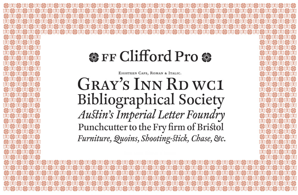
After completing the design of Woodland, one day I received a copy of U&lc magazine, which I had subscribed to. There I found an announcement of an international type competition, and I decided to submit Clifford. So Woodland, the second typeface I designed, was actually my first commercial type released by a Western foundry.
The Clifford type was actually my proposal for the desktop publishing environment in the 1990s. Back then, a number of classic typefaces developed in the hot-metal era had been available in digital form, but they lacked the quality that they used to possess in the letterpress-printing environment. To my eye, the three classic types I fell in love with during my year-and-a-half stay in London — the Bembo, Garamond and Bodoni designs — looked too weak and feeble in digital. This is the reason behind my decision to design a robust serif type with size-specific variations.
Q: You designed 55 font families by the year 2014. How was the design process different back then from the process you are following today?
Kobayashi: When I first started off as a type designer, I was involved in several Japanese font projects from 1983 to 1989 in Japan at Sha-Ken Co., Ltd., and producing fonts back then was much different compared to today’s methods. In the 1990s, standard text types that were originally designed for hot metal often looked too light and feeble. I even purchased a digital rendering of a famous foundry type, but it did not quite satisfy me. I began thinking about the need for a new digital text typeface suitable for offset-litho printing. The idea was still vague, but it had to be conventional or classical in design, and robust, such as the Monotype Plantin typeface.
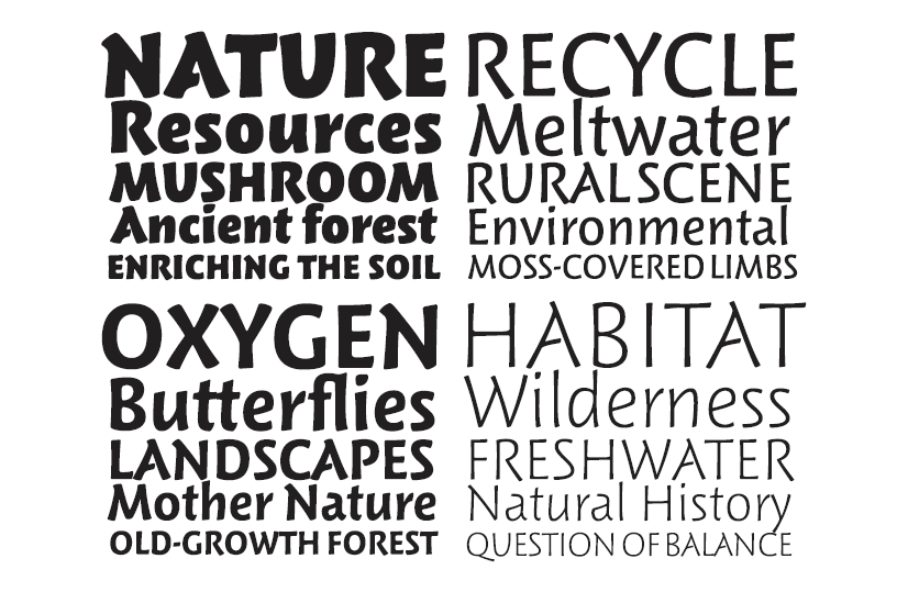
Today I usually start the design process by drawing sketches on paper. Several characters are done by hand, and the rest are designed on screen. Very often, people ask me questions like, “When you create a new type, which letter do you draw first?” But my earlier sketches of different typefaces suggest that I have no preferred letter to start with. I am not particularly interested in the form of certain glyphs, but rather in how words set in my type would look like. This is the reason why I prefer to draw groups of letters that appear to be words, even though they actually have no meaning at all.
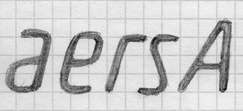
Once I am more or less satisfied with the letters drawn, I start to reproduce them on screen with a mouse. Usually, I do it without scanned images in the background. I put my sketches alongside me and draw the outline of letters directly on the screen. After several letters are done, I compose sample words to see if they are close enough to my original idea, not to the sketches. It’s important to remember that letters do not stand by themselves; they have to work together to form words. When they do not satisfy me, I change letterforms rather freely. As there is no scanned image in the background, nothing distracts me from drawing a new form from scratch.
After creating all the necessary glyphs, the letter spacing and kerning process begins. It is the most stimulating part of the type design process. Many hours will be devoted to checking words and texts in several languages. While I am doing all that, I keep standing — in my office in Germany, I have a special working desk without a chair. I think standing while working makes it easier for me to concentrate. My friends and colleagues tell me it is also good for my back, and I agree with them. I have had no back problems from working so far. The only problem I had was in 2001, right after packing my things — mainly books — in my flat in Tokyo to ship them to Germany for relocation.

Q: Would you say that designing Latin letters as a Japanese type designer can be quite a challenge?
Kobayashi: There is no doubt that the Japanese have a complicated system of writing. There are basically three scripts available, and the biggest challenge is perhaps understanding how punctuation and diacritics are used in different languages. If you take a closer look at the Japanese language, a set of proper Japanese fonts requires approximately 7,000 characters and takes a couple of years to complete by an entire team of skilled designers. Also, the Japanese read both from right to left as well as from left to right, depending on whether the text is set horizontally or vertically.
Q: Is that why you decided to design Latin typefaces instead?
Kobayashi: Well, Latin alphabets are actually quite a crucial part of the Japanese writing system. We use them in our text in Japanese, often to describe a name of an organization such as IOC and OPEC. I occasionally designed Latin characters and Arabic numerals, but I felt that I needed to learn more about Latin alphabets. Then I realized that I had to have a better handle on the English language: first, because the books available to me on the Latin alphabet were almost always written in English, and secondly, because I knew that if I was not very familiar with the Western alphabet, I could not know whether the characters I drew would be acceptable to a Western reader.
Still, the Japanese language is expanding; we have already included the Latin alphabet and Arabic numerals in our characters, and that has been standard for decades. Not only have we included the Latin alphabet in our language, but we also have a special set of Latin alphabets in order to avoid collision in vertical typesetting. I must emphasize that they are not designed for setting words, but rather for the contractions that require letter-by-letter recognition.
Q: In your opinion, what makes for a great typeface?
Kobayashi: I believe that the success or failure of a typeface is a question of achieving a good balance of white space inside and outside the letters. This is why I spend so much time on letter spacing and kerning. When I design a typeface, especially a text type, what I’m actually doing is shaping the right and well-balanced forms of words. “Well-balanced” means that a word or words have a good balance of black and white. When I draw black letters on a white background, I carefully examine the white shapes inside the letters, as well as the spaces between the letters. If you look at words and think the white parts are balanced, then you are looking at a well-crafted typeface. All in all, letter drawings are only one part of my design process.
Q: You recently designed the new typeface SST for Sony. What were Sony’s special requirements for this typeface?
Kobayashi: Printing on products tends to be smaller now, as devices are becoming more compact, and on the screens of smartphones, tablets and other devices, the display experience is increasingly important. Usability and enjoyable content depend on clear, legible printing and on-screen text. Typefaces are also key elements of design that shape our impression of products and the user experience itself.
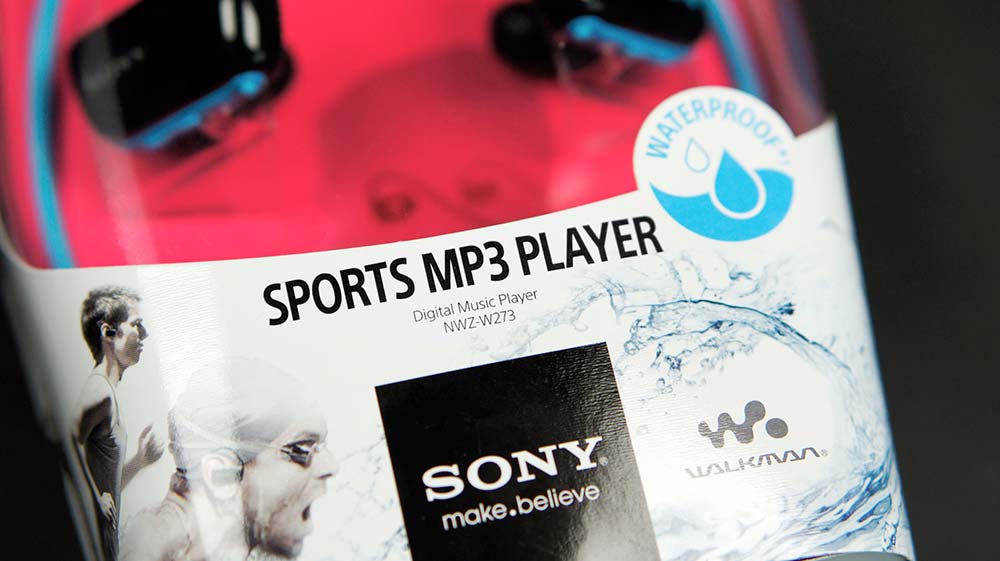
To enhance product value and user experiences, Sony thought it was time for a closer look at typeface design. The original typeface would be seen by people in a variety of touchpoints — in products and services, not to mention in ads, in stores, online and in manuals — which would help us provide a consistent, distinctive and engaging user experience. Knowing this, Sony and Monotype set to work developing a corporate typeface to be used across the company.
Q: Can you tell us a bit about the SST?
Kobayashi: The SST typeface family offers an ideal combination of Helvetica’s neutral design with the humanistic style of Frutiger. In spite of the fact that certain stylistic elements were adopted from some of our company’s other design icons, we found a way to give the SST a distinctive touch with a high level of reconcilability. The various type weights are very well graduated, so the user on the customer side has a wide range of design freedom. One very important feature of SST is the good legibility both in print and on screens, since Sony is using the typeface across the board.
Q: In which media is the typeface already being used, and which are to follow?
Kobayashi: SST has now been introduced worldwide. In Europe it is used on product packaging, in operating instructions, on websites, in TV menus and in Playstation 4, as well as in apps on the Xperia smartphones.
Q: I can well imagine that this was not one of the easiest projects. What would you say was your biggest challenge in the entire design process?
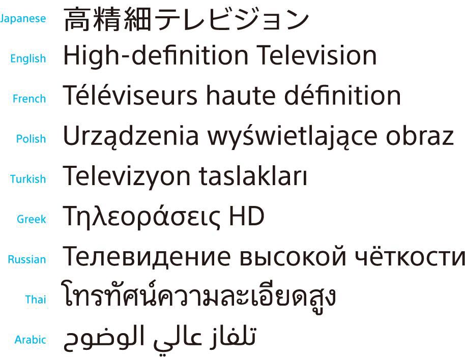
Kobayashi: For me, it was particularly challenging to design appropriate Japanese type weights. The sheer volume of more than 15,400 characters per type weight gives you some idea of the task facing us. We were able to tackle this only with the help of an excellent Japanese design partner. For example, in addition to the thousands of Chinese characters (called kanji in Japanese), more than 2,000 variants of Roman characters (in circles, squares, etc.) were required. These are things Western Europeans might not immediately be aware of, but they are integral components of Asian character sets.
In addition to the common Greek and Cyrillic scripts, we also created matching type weights in Thai, Hebrew and Japanese. We took great care to incorporate the same design features so as to obtain an overall match.
In general, I have gone through more than several difficult projects, but the biggest problem has always been the deadline. The solution to this is simple and easy — just work hard and keep standing!
Q: What did you decide to design first, the desktop or web font?
Kobayashi: Since we knew that the intention was to use the typeface on screens, care was taken from the very start of the design and development process to ensure that the design and the fonts were not just ideal for print. This has now become standard for all newly developed typefaces. Our workflow always starts with the development of desktop fonts so that later on special formats can be developed from these, such as those required for use on the web. This also allowed us to respond to the customer’s request for us to start by applying the typeface on tradefair standards and in business stationery used by top management.
Q: Could you tell us what key phrases or type templates or specimens you use to preview how a typeface works??
Kobayashi: I have a favorite text string for checking the quality of a typeface, but it is too long to quote here since it would take more space than this whole interview. Among the key phrases and words, the toughest one to work on is “little.” See how difficult it is to balance the spaces between the verticals and to keep a good rhythm.
It is useful to choose words or texts that have difficult letter combinations. You are not checking it to satisfy yourself; you need to be the severest critic of your own type.
Q: What takes the most time in a typeface design, and what takes the least?
Kobayashi: If it is a headline font with no weight variations, it would be possible to finish it in a couple of months. However, the typical projects I have been involved in recently have required more than three variations. Then I would need more time, say six months to one year.
As I said in my answer to the question about how I design today, the letter-spacing and kerning process takes much more time than a non-designer might think. Of course, it is not always easy to separate the glyph design and spacing/kerning processes — like, “Now I’m finished with glyph design, so let’s move on to spacing” — because in the middle of the spacing process I often find awkward letter combinations that sometimes make it necessary to change the outlines to get better results. So I go back and forth, designing glyphs and then letter spacing and kerning, and I feel that I spend almost the same amount of time for both stages. In other words, if I spend one month designing the glyphs of a new typeface, I would devote another month to spacing and kerning. Indeed, sometimes I worry much more about letter spacing than letterforms.
Q: As a type designer, what is your proudest achievement?
Kobayashi: I’ve been proud of many projects, but some that stand out are my collaborations with Hermann Zapf and Adrian Frutiger. To name just a few, these include Hermann Zapf’s Optima, Zapfino and Palatino typefaces, and Adrian Frutiger’s Avenir, Meridian (the reworked version is called Frutiger Serif) and Frutiger designs.
Being a fan of Hermann and Adrian, these collaborations have meant a great deal. Before working with each man, I knew they were not entirely happy with the digital rendering of their classic fonts, many of them first released during the hot-metal type era. Since I was familiar with the metal versions, I was able to provide suggestions for improvements to bring their typefaces to a higher level.
Hermann knows exactly how a glyph should be rendered. He loves to draw sketches to visualize his ideas. I have a collection of his sketches and even doodles! Adrian takes a different approach. He uses scissors and takes a good look at proofs on paper before cutting them out and reconstructing letters. Hermann sometimes uses scissors, and Adrian draws sketches as well, but what I mentioned above is more or less my personal impression of them.
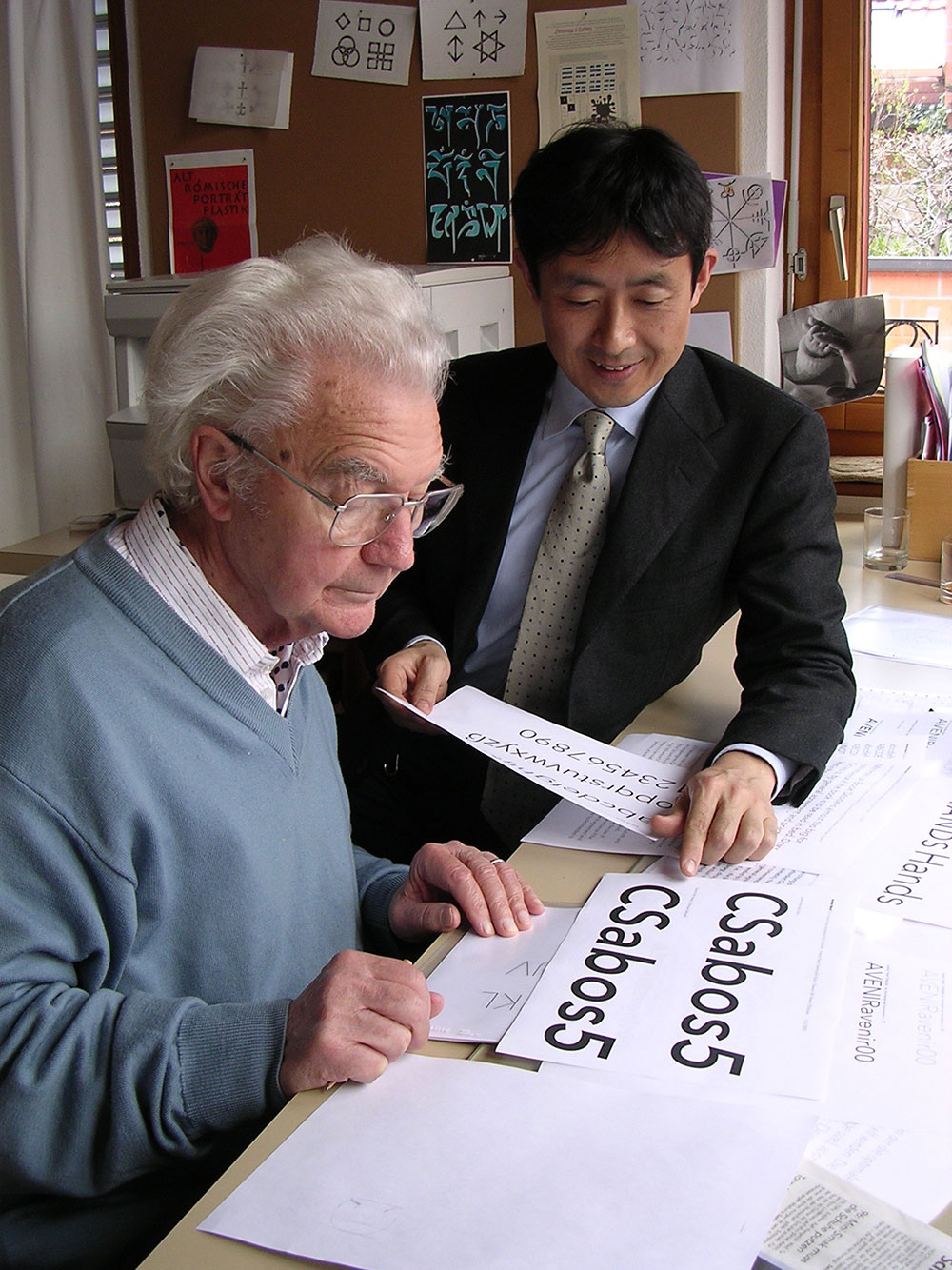
It is also amazing that they have very sharp eyes (Hermann is now nearly 96, and Adrian is 86.) At the end of the Neue Frutiger project, I sat with Adrian with my laptop between us. Adrian looked at a text proof on paper, which I think was set in 24 points. He said, “Akira, I do not think the lowercase ‘o’ is centered.” He was right. Its left sidebearing value was 61, and its right sidebearing 60. Or was it the other way round? Anyway, he saw the 1/1000th difference at the age of 81. It was clearly my mistake. It was the moment that proved I was working with a living legend.
Also, both Hermann and Adrian are very open-minded. They would always be happy to listen to my suggestions and would be eager to take new ideas into their classics. To name a few, the Neue Frutiger family has matching arrows and the Optima Nova family a titling version. Both were drawn from scratch.
Q: Where does your creative inspiration come from when designing typefaces?
I’m inspired by most everything I see in everyday life, no matter if the image contains a letter or not. I often take pictures of road signs and notices in public spaces. Naturally they contain letters, but I rarely use them as direct sources of my inspiration. In other words, I do not start drawing an “a” just because I saw an attractive handdrawn “a” the day before. It does not happen like that. What fascinates me are not only letters but also the shapes of things — things in nature, such as pebbles and tree leaves, as well as manufactured things, like airplanes and cars.
Q: Any other clever tips and tricks for the workflow to distinguish a good typeface from a bad one? What do you look at first when comparing typefaces and how they work??
Graphic designers and students sometimes seek my advice or opinion on their type specimens. I look at their text samples first if available, because a nice showcase of A–Z with very wide tracking does not give me any useful clue. It often looks too bland, anyway.
I want to see the type in action. I need to know what it was made for. I would suggest that young type designers set an attractive set of specimens first, even before the type is completed! Choose words carefully so that your specimen starts to speak itself. If the type is designed for a certain automobile, a novel or a legendary person of the past, choose appropriate words so that the text in your specimen brings the viewer into your world.
The words you select will also help you to polish your design. Even if you’ve found that an s-t combination in your sample text looks terrible in 72 point, do not try to change the text itself. You are going to use it somewhere else in the future. Let’s fix the type instead — you can still do it before anyone else sees it. Repeat trial and error over and again. This will enable you to improve the appearance of your type intensively and to bring your storyboard closer to perfection.
Q: Be honest, do you have a favorite typeface?
Kobayashi: While I have thousands of favorites, if I’m forced to pick, I would have to say Cooper Black. It stands out to me because of its organic and friendly appearance. When I was about seventeen, I drew a large poster with Cooper Black for an in-school advertisement. I remember very clearly how I was fascinated by the design’s soft proportions as I drew outlines with a brush.

Q: And what is your favorite part about designing type? Do you also have a least favorite part?
Kobayashi: Every single step, designing every single glyph is my favorite!
Q: Do you have any advice you’d like to share with our readers who may be interested in becoming type designers?
Kobayashi: Type design is a slow process. One day you may come up with a nice letter “a,” but that is only the first step. In the next step, you will notice that your “a” should work with other letters, because each letter of the Latin alphabet is made to form words. Once you know the complexity of the process and understand how you can handle it, you’ll be fascinated!
Thank you for sharing all of these inspiring insights into your work, dear Akira! We sincerely appreciate it.
Further Reading
- The Art Of Hand Lettering
- Beautiful Hand Drawn Typography
- Beautiful Handwriting, Lettering and Calligraphy
- A Reference Guide For Typography In Mobile Web Design


