How To Think Like An App Designer

Email Newsletter
Weekly tips on front-end & UX.
Trusted by 182,000+ folks.


 Custom Web Forms for Angular, React, & Vue. Your backend.
 Celebrating 10 million developers
There’s more to designing mobile apps than meets the eye. The task requires a deep knowledge of devices, and it often means changing the way we think — even if that means leaving behind much of what we’ve learned from designing for the web.

I started my career like many designers: working on print design projects. Shortly thereafter, I discovered the world of websites, which fascinated me and became the focus of my work for some time. Along the way I learned concepts related to interaction design and user experience, which I hardly knew existed until then.
At some point I felt stuck in a kind of repetitive work cycle: I had found a formula, an almost surefire way of designing, that enabled me to deliver each new project more easily and quickly than ever before, but in some way or another, all of the designs looked similar. It was then that the first versions of iOS and Android were released.
Thereafter, looking for a breath of fresh air, my life took an unexpected turn, focusing me on something that seemed completely different: mobile app design. That was what I needed, a real challenge. I not only had to learn new things, but somehow had to forget part of that magical recipe for designing websites that I had been using till then.
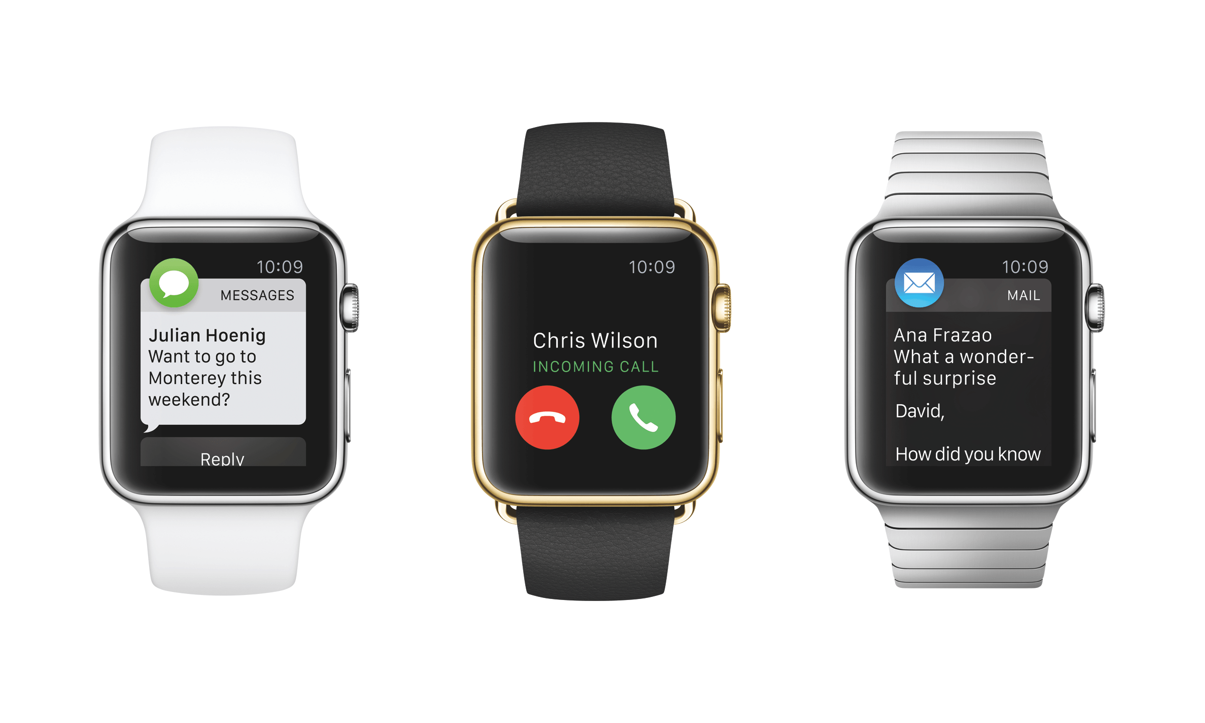
A few years after that aha moment, just days ago in fact, the design community met the launch of new apps for Apple’s smartwatch with mixed emotions. On the one hand, seeing a device that offers a world of new design possibilities is exciting. On the other, the challenge of understanding a medium with unprecedented interactions and use cases is daunting.
It’s not the first time we’ve seen a device like this on the market. But as new technologies that require new design approaches appear more and more frequently, we will have to adapt at an increasingly quicker rate.
Of course, the first big push came nearly 20 years ago, with ubiquitous Internet access, which ushered in the first websites. Before then, most designers, like me, focused on print, and the arrival of the Internet required us to learn how to design for an interactive medium. The user had become much more than just a spectator.
The transition was harder for some than for others, and that’s why so many websites of the time looked like signs with buttons on them — designers didn’t immediately understand the characteristics of this new medium.
The same thing is happening today with apps. One often comes across applications that look like mini-websites: They’re constructed as web pages “translated” for smartphones, and in turn, they fail with contrast, font size, touch targets and gestures. They also miss the mark with who will be using the app, where and on what devices.
When designing for mobile, escaping from a web structure is imperative because it can work against us. We have to face projects with a different mentality and fully comprehend the mobile devices in order to take full advantage of them and deliver delightful experiences.
So, what do you need in order to be an app designer? Beyond knowledge and tools, you need to change the way you think. Below are a few recommendations for adapting to the world of app design.
Change The Way You Work
Hundreds of apps are entering the market at this very moment — you’ve got no time to lose.
As professionals, we can no longer afford to spend weeks or months on detailed fancy designs before launching a product, only then to realize that other apps have already solved the problem (and most likely solved it in a similar way).
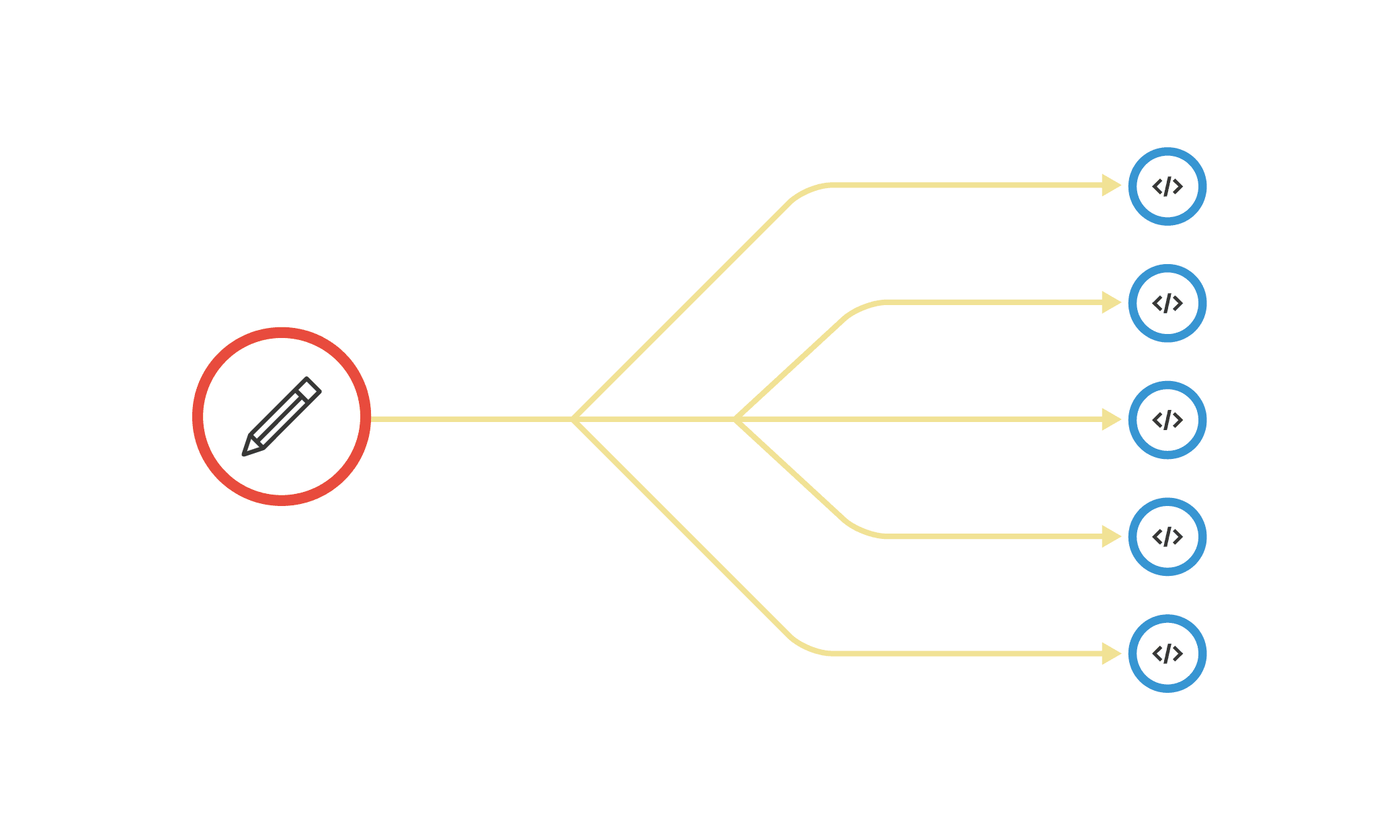
This is where lean UX comes in, a way of working in short quick cycles. The approach entails continual iteration on design and development, keeping one single focus in mind: that nothing is certain until users try it out.
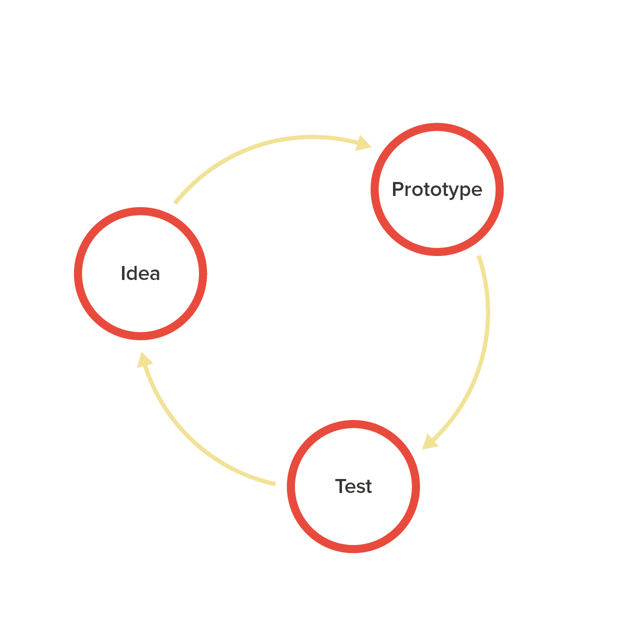
Thus, app design can’t begin with interface design in Photoshop or Illustrator. It has to start before that, with wireframe-based prototypes and basic designs. That way, if change is necessary, it will take moments — not months — to apply.
Beginning with the visual design is a normal tendency for designers: That’s the stage that is usually most interesting to us. In some way, we also got used to working in this way because it was the only way possible.
Recently, in speaking with many designers, most look at me with surprise when I recommend that they start working on projects without even using the computer, but instead by simply drawing on paper. It sounds so natural that we often forget it’s even a possibility. Designing like this has proven to be very useful in preventing us from thinking in terms of variables (such as the size of the design document, colors and fonts used, etc.) — variables and details that can actually block our creativity when we are starting a project.
Personally, I find sketching on paper to be much more useful because we focus only on the idea and the problem to be solved, without falling into the trap of considering design details, or at least not in that first stage.
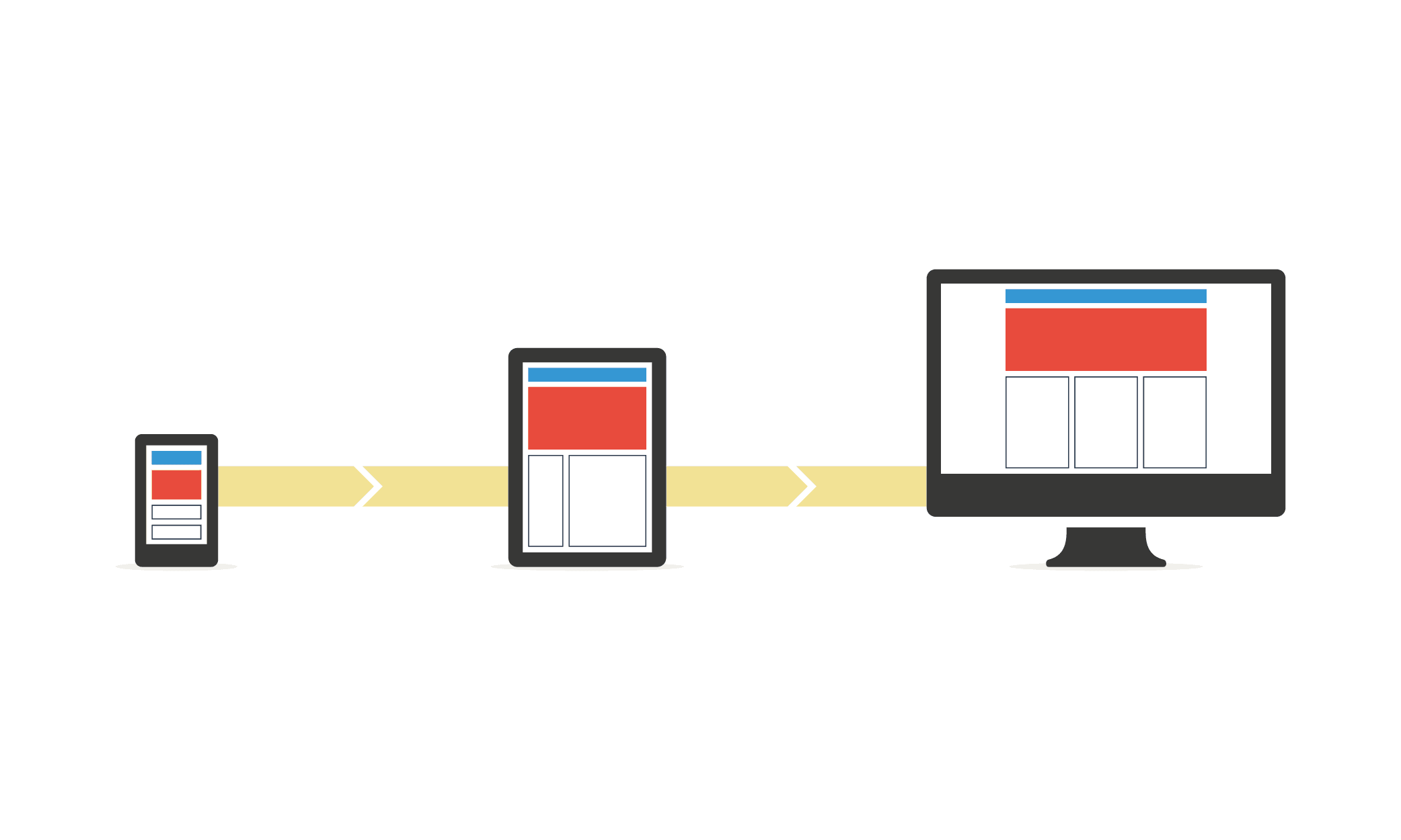
“Mobile first,” or starting with the small screen, is also a good strategy to employ. Even if your app will run on both smartphones and tablets, beginning by designing for the smaller phone is more effective. Starting the design process from a mobile standpoint forces us to prioritize, choose and above all alter our mental structure, which is accustomed to the larger screen of a desktop computer as a general point of departure.
The first time I started a project this way, I almost ended up with a headache. Perhaps it’s a similar situation when you go to the gym for the first time; muscles that you haven’t used for a while start to hurt, due to the effort of working differently. If you haven’t done it yet, try it some day. You’ll notice how your priorities change, and you will sooner realize what are the truly important things in your app, the things that are indispensable.
You could also draw a parallel with travelling with luggage. If you have a small suitcase, what should you bring? You’d bring the most important things, of course, the things you are sure to need during the trip, and leave everything else behind. Believe it or not, this ordinary example is similar to what happens when we design for a smartphone.
Learn From The Other Half
The success of an app depends on both the designer and the developer, who must work together to innovate and achieve the highest level of quality. To accomplish this while working efficiently, you can shorten iterations by working in parallel. For this to work, you must both be conscious of the complexities of the design as well as of the actual implementation.
One way to do this is to learn to use development tools, not necessarily to develop apps from start to finish, but at least to build screens that can be transferred quickly and faithfully, while accurately communicating the design’s intent.
Shortly after arriving in Barcelona, I started working at a tech startup. I was surprised to find that I was the sole designer there — I was literally surrounded by developers, and at first there were a lot of bottlenecks because everybody was waiting for me to finish my design work in order to continue their own.
With time, I learned how to use tools such as Xcode and some basic programming languages. These enabled me to make more complex proposals and to work at certain moments at the same pace as the rest of the team.
After a while, once I had been with the company for months, developers learned the way I work, too. They would now open my design documents directly and would know how to export design assets without my help.
Finally, I would like to teach you a little trick: Learn to use the same terminology as the rest of the team. Doing so, you will feel that everybody in the office speaks the same language. Designers and developers often refer to the same thing but in different words, which makes understanding between parties more difficult.
Recognize The Value Of Teamwork
Going back a bit to the previous topic, teamwork goes far beyond sharing office space. It entails collaboration between roles and constant communication. Lean app design entails putting an end to cascading processes, where the work of one individual begins where another one’s ends.
But in practice, most teams have settled into an efficient hybrid process, with developers following an agile methodology (working with a goal to accomplish by a specific deadline) and designers following a lean one (rapid iteration, usually without a specific deadline).
While there is still a vestige of a “cascade” (or waterfall) here, with designers usually working just a bit ahead of the rest of the team, developers can certainly start without waiting for every design to be ready.
That’s why an app designer must recognize that their coworkers — especially programmers — are allies, not enemies. Understanding one another and growing accustomed to working together will lead to a better, more synergetic result.
We are often afraid to share our work. We tend to be somewhat defensive of the reviews and comments that may arise, especially coming from fellow designers. The truth is that many of the things that others say are vital to improving our proposals, including feedback from those who do not have a design background, such as programmers. Their vision, generally more pragmatic than ours, can provide a good balance.
People in a company I visited a while ago told me that designers and developers work on separate floors, communicating through various systems of instant messaging. I suggested that they try something else: Designers and developers who work on the same projects should try sitting all mixed together. A few months after that, they told me that the quality of their products had dramatically improved, as did even the relationships between team members.
Use Various Operating Systems
When you’re designing a mobile app, you can’t just use your own phone for reference. If your target is the global mobile market, you’ve got to have access to at least Android, iOS and Windows Phone devices and grow accustomed to using them constantly in order to fully understand how to resolve different design scenarios on each platform.
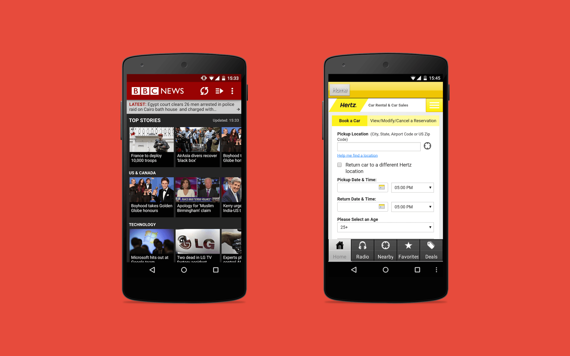
The truth is that the world doesn’t begin and end with the iPhone. So many designers limit themselves to iOS, and when the time comes to design for Android, they just translate — often almost literally — the original app.
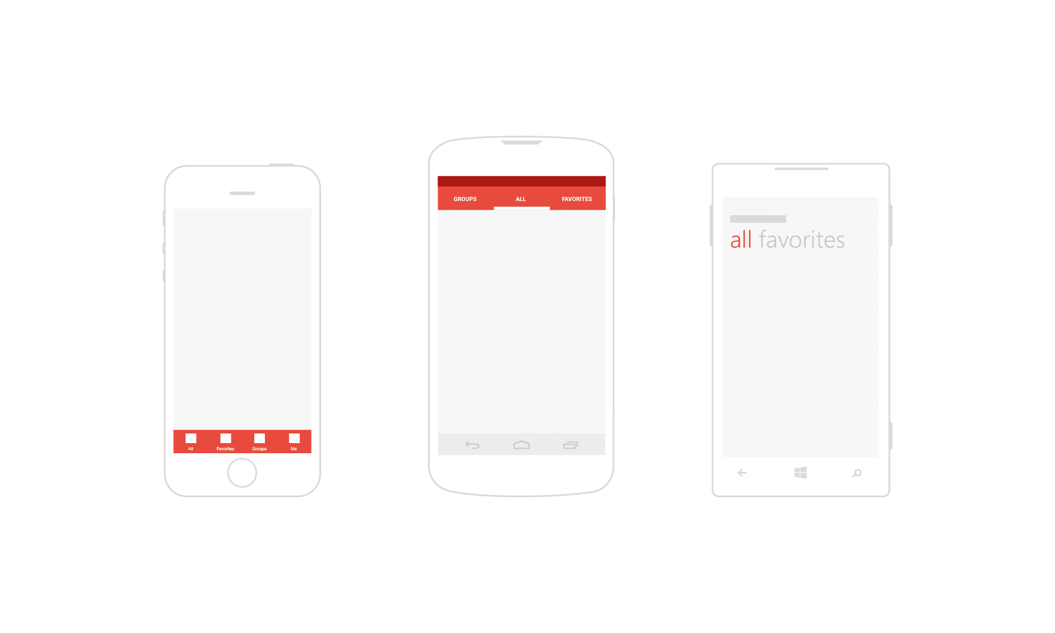
Interaction patterns (i.e. established solutions to problems of design) are different on each operating system. As such, designers must alternate frequently in order to assimilate them and use them correctly.
To name just a few examples, the location of tabs, how to show menus, and when and how to display primary and secondary actions vary on each of these mobile operating systems.
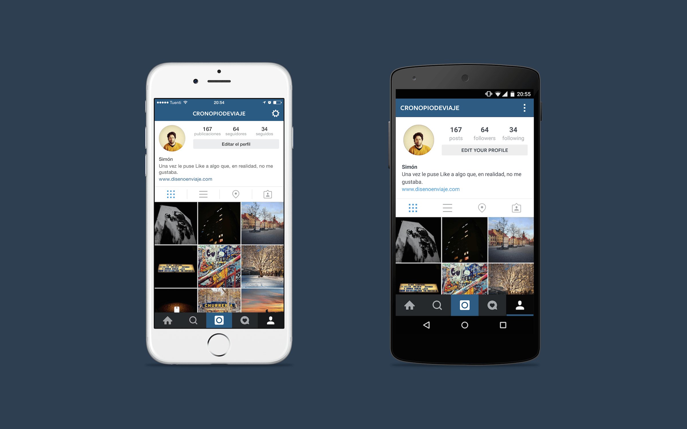
To learn the different patterns on each mobile OS, here’s a practical exercise you can follow: Download and install the same app on various operating systems, and analyze their distinctions and similarities critically; the patterns should be different. So, if you find that an app looks and works practically the same on iOS and Android, it’s possible that something has not been done correctly on one of them.
Moreover, continually looking at and trying out other applications is a great way to discover how to solve your own interface problems. For example, many times when I feel some sort of a creative block and don’t know how to fix a problem, I’ll start playing with my phone, carefully analyzing the apps to see their approach to the problem I’m facing.
If you don’t have a phone near you, you could check websites such as Pttrns (for iPhone), Android App Patterns and Windows Phone UI Design Patterns, which have plenty of examples that might be useful to you.
Prototype Everything
An agile methodology requires understanding how something will look and function prior to implementation. Likewise, prototypes help us to evaluate (via user testing) an app’s usability. Ideally, we would not have to wait long before building our first prototype.
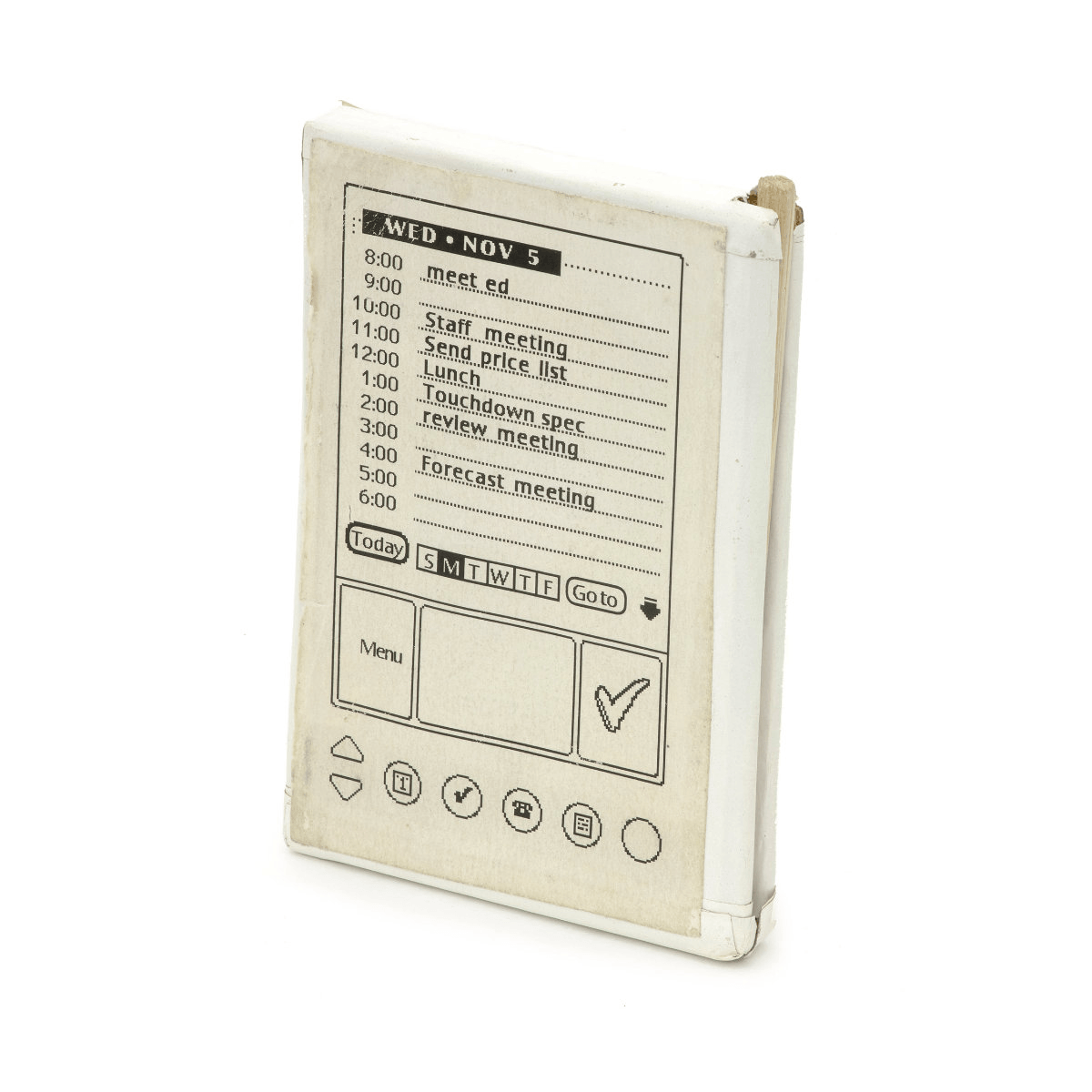
Few of us probably remember the Palm Pilot: One of the first prototypes was a simple piece of wood with a sheet of paper on it with the printed design of the interface. Employees would carry the prototype in their pockets as if it were a real device.
For what it was intended to test — size, weight and comfort of use — that prototype was more than enough. The point is to determine the extent to which it’s necessary to design in order to test what you have in mind, and then get down to work!
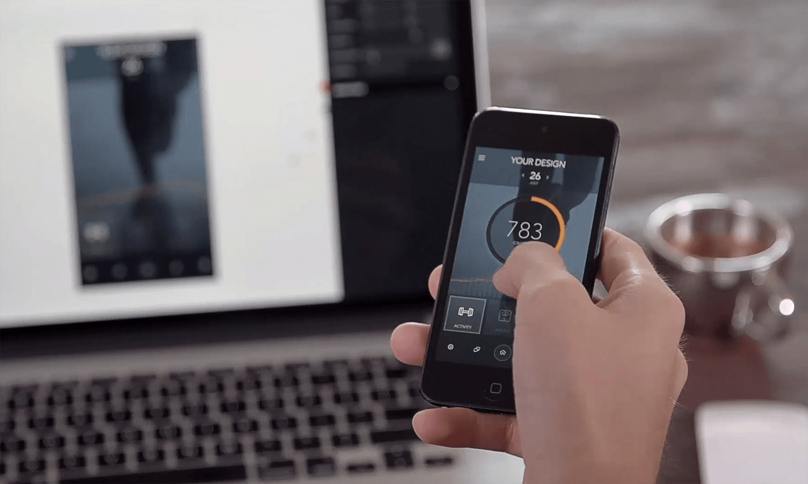
Numerous tools exist for prototyping and even viewing a design on smartphones as though it were a finished product. That being said, a prototype has to do more than just show a static design; it must also include images, transitions and gestures.
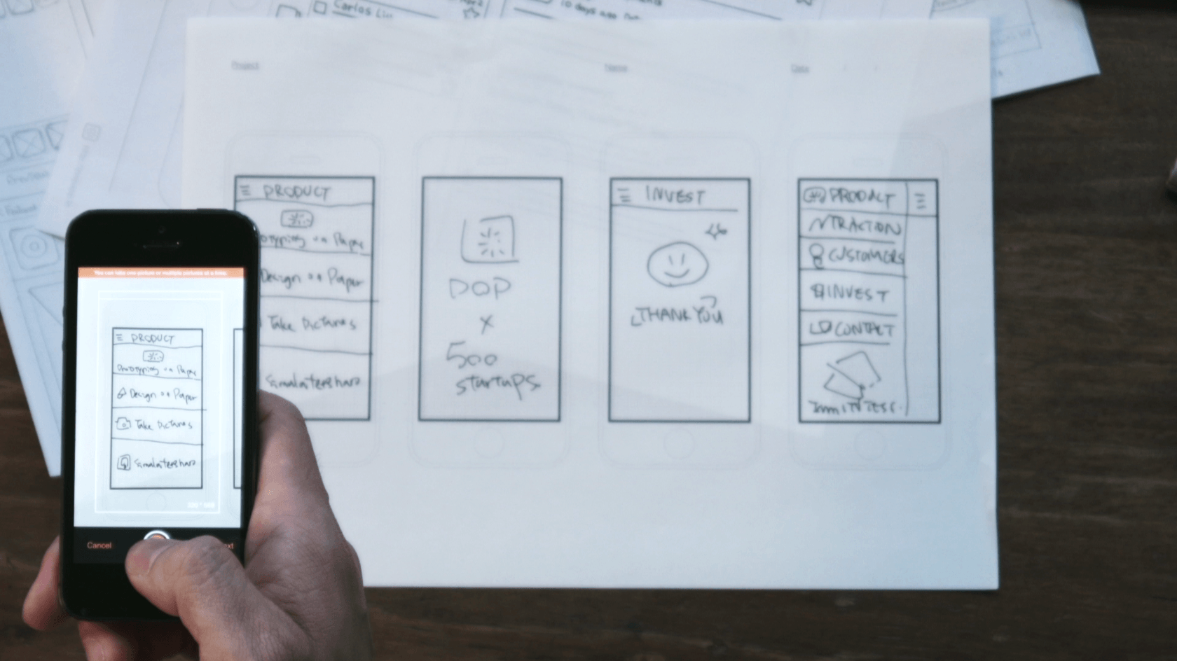
Choosing the most appropriate tool will depend a lot on your workflow, what you want to achieve and the result you are expecting. For example, I often use POP when I have no more than simple wireframes drawn on paper. With this app, I can take pictures of designs, then add gestures and transitions — quickly and easily!
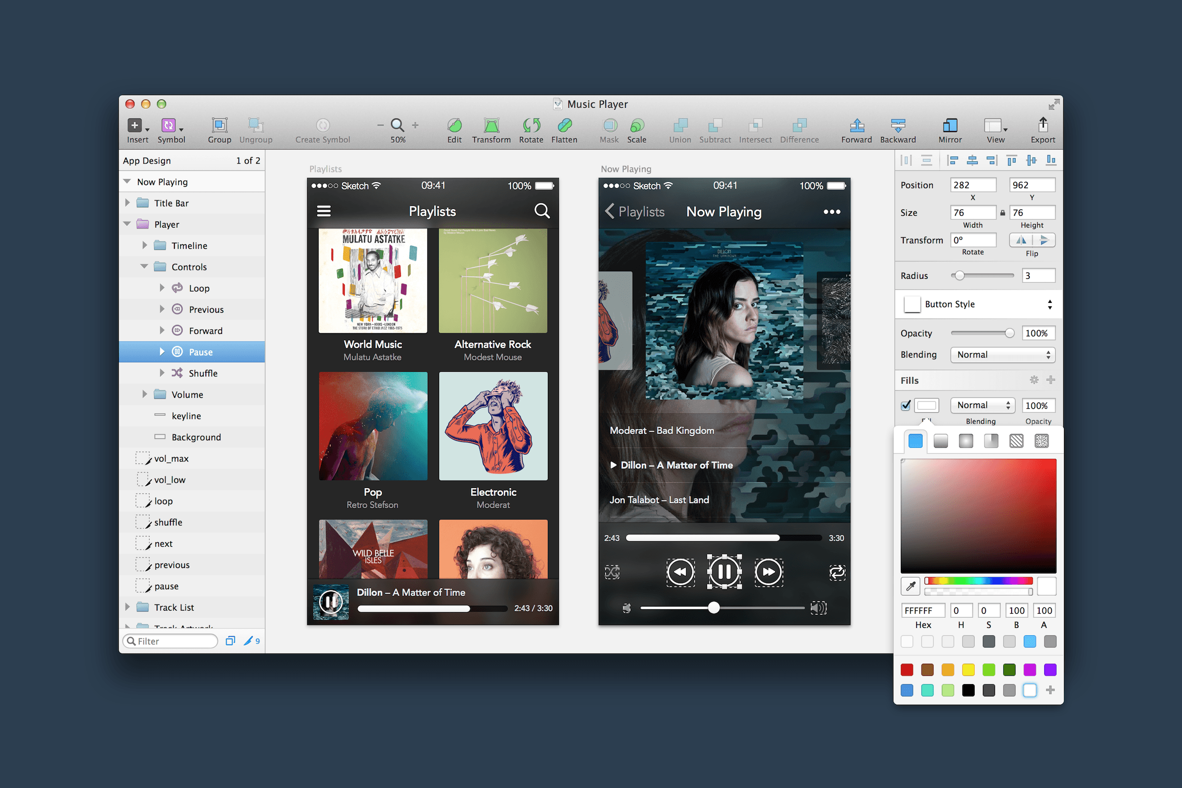
But when a concept is more advanced, I find it more convenient to work in design-specific software, such as Sketch, and then build a prototype using Marvel, Flinto or InVision, making for a more polished prototype. (Note that sometimes one tool is not necessarily better than another. Choosing among them will partly depend on which you feel most comfortable with. However, if you’d like to learn more about prototyping with Sketch and InVision specifically, Smashing Magazine has you covered!)
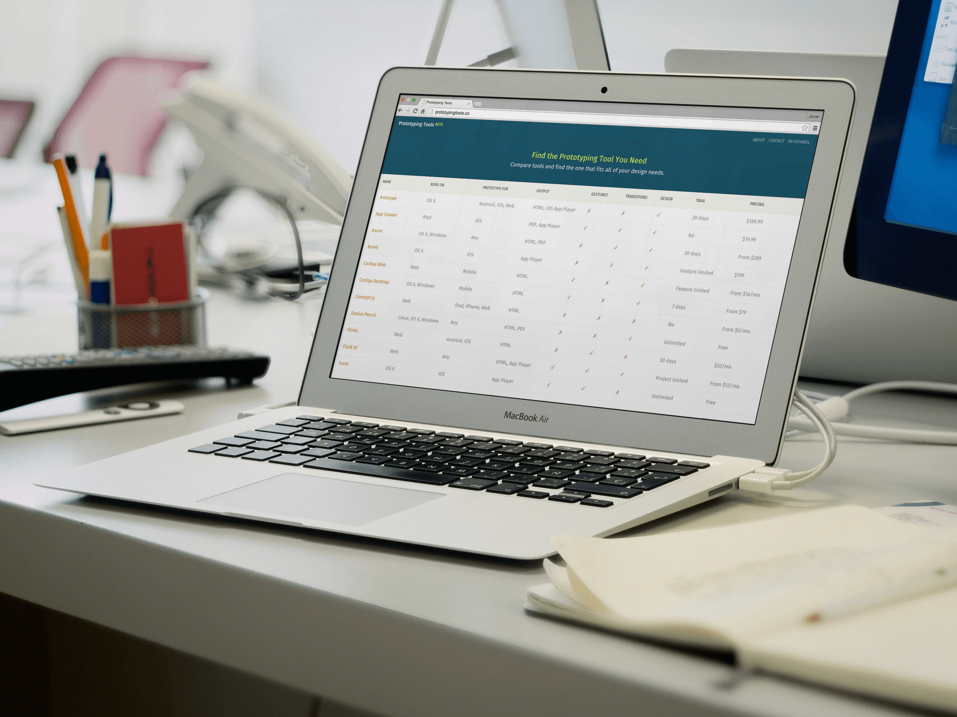
As mentioned, a ton of prototyping apps are out there, so many that I decided a few months ago to create a small website, Prototyping Tools, that lists all of them that I am aware of. The website provides an overview of which features each tool provides and so should help you choose one.
On the other hand, be aware that operating systems like Android — with its “material design” — are bringing more focus to micro-interactions. Prototyping micro-interactions is the responsibility of many designers today. (A tool like Keynote enables you to prototype these kinds of details with relative ease. Keynote’s Magic Move option comes in handy here.)
Don’t Trust What You See
When designing for the web, it’s possible to watch a design come to life as you work. But with apps, you have to test on a mobile device in order to see how an interface will look (and function). Above all, such testing is imperative for choosing contrast and sizes.
Tools for both Android and iOS will help designers view their work on mobile screens with varying resolutions and densities. For iOS, one of the most well-known options is LiveView. Another, the one I use most, is Skala (available for both iOS and Android), which comes with a desktop version that you can use on a Mac. If you use Sketch, you could also try Sketch Mirror.
Unfortunately, a tool of this kind is not available for Windows and Windows Phone (at least not that I’m aware of).
In my workflow, I always preview a design on my phone to be sure of how it will look before taking the next step. Likewise, I usually start designing for one operating system at a time, and always with the phone close to me most of the time. That way, I can frequently review how my work will appear on that screen, and from the moment the first wireframes are ready, I can be sure that the sizes (of graphics, text and touch targets), contrast and colors will be the ones I’m expecting. If you don’t do this, you might notice it later, when making changes and corrections would require much more time.
Also important, start working with a design document that is the same size (in width and height) as the phone on which you are previewing your work. (Note: If you are designing for different screen sizes, then keep in mind that pixels are no longer the best way to measure sizes, because they change from one OS to another — for example, see the difference between points on iOS and density-independent pixels on Android. This forces you in some way to fully understand the differences in how to design and how to treat images in the current mobile landscape.)
Once your designs have been implemented by the developers, check how the app looks and performs on different phones and OS versions, and not only in the best phone you have next to you.
Design Humbly
App designers must abandon the concept of creating something final. An app is never finished, because it’s a digital product that evolves over time. For this very reason, we can’t approach interface design with a definitive stance. The truth is discovered through usability testing and deciphering what problems users encounter.
Sometimes we designers tend to think that when a user makes a mistake using an app, they are at fault, thus freeing us from all liability. The truth is that we more likely have done something wrong.
Detecting problems (and discovering our mistakes) isn’t a bad thing. Rather, it is an opportunity to learn and correct our work, thereby improving it and building something that’s easier to use. We must approach design with an attitude of humility.
In one company where I worked, every time I told my boss that I had finished a design, he would ask me, “Have you tested it with users already?” I hadn’t always tested it yet, but in the end I incorporated it as a habit, and each time I tested, I went in ready with an open mind, willing to see what problems I would find.
This can only be done if you are mature enough to accept your mistakes and learn from them. It’s difficult, but if you succeed it’s really worth it.
Stay At The Forefront
The amount of information out there makes it nearly impossible to stay current on everything when designing for tomorrow. Nevertheless, as app designers, we must stay engaged and curious about what’s new and what’s to come.
This includes trends in app design, as well as new versions of operating systems. Like it or not, we have to install new operating systems and stay ahead of the curve in order to see where app design is headed.
One good way to get valuable design information is by reading official design guides for the latest OS versions. You can also learn from industry leaders, like Josh Clark and Luke Wroblewski, to name just a couple.
Staying on top of things also means trying tools that simplify design and make our work more efficient as they come onto the market. We can’t be afraid of getting out of our comfort zone and abandoning our old ways of working and designing.
Along these lines, a while ago I finally dared to use Sketch. It was a bit hard at first, because it meant learning something new from scratch, when — I have to admit — I was already comfortable (sort of) using the tools I already knew.
A few months later, I now realize that this software has quite a gentle learning curve. It saves me time and enables me to work in a very agile manner — and all of that has been a reward for being willing to learn something new.
Conclusion
At the end of the day, changing one’s mindset to adapt to apps comes from the inside. No one will force you to do it. If you don’t adjust, you run the risk of becoming little more than an icon factory, just a small step in a larger process of design.
Above all, designing apps requires a new way of thinking. It’s time to leave our web design boxes and to understand smartphones, tablets and even watches as separate and distinct devices. It’s the only way to truly design complete, comprehensive mobile experiences.
Additional Resources
- “7 Lessons Learned From Interviewing 100+ App Developers,” Steve P. Young
- Lean UX: Applying Lean Principles to Improve User Experience, Jeff Gothelf with Josh Seiden
- “Motion UI Design Principles,” Grant Liddall, BeyondKinetic
- Prototyping Tools, Javier Cuello This is my personal project where I maintain a list of modern prototyping tools.
- “Three Stages of Making Wireframes,” Alexander Mescheryakov
- “Prototyping iOS and Android Apps With Sketch,” Joshua Mauldin, Smashing Magazine
- “iOS Prototyping With TAP and Adobe Fireworks,” Shlomo Goltz, Smashing Magazine
- “Designing for Smartwatches and Wearables to Enhance Real-Life Experience,” Jonathan Kohl, Smashing Magazine
- “Designing Navigation on Mobile: Prototyping With Keynote,” Patrick Marsceill, Smashing Magazine
- “Designer’s Guide to DPI,” Sebastien Gabriel
- “Mobile Behavior and Design Trends,” User Interface Engineering A podcast episode featuring Luke Wroblewski
Further Reading
- What Everyone Should Know About The Process Behind App Design
- How We Designed And Built Our First Apple Watch App
- Getting Started With VR Interface Design
- How To Create A Flat Vector Illustration In Affinity Designer
 (mb, al, ml, mrn)

