Creating Responsive Shapes With Clip-Path And Breaking Out Of The Box

Email Newsletter
Weekly tips on front-end & UX.
Trusted by 182,000+ folks.
 Claim Your Free Spot!
 SurveyJS: White-Label Survey Solution for Your JS App

 Register Free Now
 Celebrating 10 million developers
clip-path property you will begin to think outside the box, literally, and hexagons, stars and octagons will begin to take form on your web pages. Once you get your hands dirty with clip-path, there’s no end to the shapes you can generate, simply by tweaking a few values. In this article, Karen Menezes will provide demos referenced to an inline SVG, in order to gain additional support on Firefox. Generating a responsive SVG clipped shape is trivial once you have created a responsive shape with CSS’ clip-path. We’ll look at this in detail later.CSS’ clip-path property is your ticket to shape-shifting the monotonous, boxy layouts traditionally associated with flat, responsive design. You will begin to think outside the box, literally, and hexagons, stars and octagons will begin to take form on your web pages. Once you get your hands dirty with clip-path, there’s no end to the shapes you can generate, simply by tweaking a few values.
While the focus of this article is on clip-path using polygons with CSS, all of the demos provide a reference to an inline SVG, in order to gain additional support on Firefox. Generating a responsive SVG clipped shape is trivial once you have created a responsive shape with CSS’ clip-path. We’ll look at this in detail later.
Clip-Path, In A Nutshell
Clipping, with the clip-path property, is akin to cutting a shape (like a circle or a pentagon) from a rectangular piece of paper. The property belongs to the “CSS Masking Module Level 1” specification. The spec states, “CSS masking provides two means for partially or fully hiding portions of visual elements: masking and clipping”.
The first part, i.e. masking, has to do with using a graphical element, such as a PNG image, CSS gradient or SVG element, as a mask to conceal sections of another element.
The second part, i.e. clip-path, involves a closed vector path, which could be a basic shape defined in CSS or an SVG using the clipPath tag. The region inside this path is displayed, and everything beyond or outside it is clipped out.
Note: Masking is beyond the scope of this article, but CSS-Tricks and HTML5 Rocks have more information.
Below is a simple visualization of how clip-path works:
See the Pen Visualizing clip-path by Karen Menezes (@imohkay) on CodePen.
Note: The demos in this article, including the one above, will work in Firefox and in WebKit and Blink browsers, including Chrome, Safari and Opera.
Clip-Path Is Not Clip
There is an older CSS 2.1 clip property, which is rather restrictive, notably because it supports only rectangular shapes. It has been deprecated in favor of clip-path.
Articles about clipping that use the deprecated syntax feature code that looks like this:
.element {
  clip: rect(30px, 30px, 20px, 20px);
}
Support For Clip-Path
In August 2014, the “CSS Masking Module” was published as a “Candidate Recommendation,” which is a step up from the earlier “Last Call Working Draft” stage. Before we look at browser support, it’s important to consider the multiple ways in which clip-path can be applied to an element, because browser support varies for each method.
There are two ways to use clip-path:
- with CSS Basic shapes from the “CSS Shapes Module” provide a convenient way to use
clip-path. The different shapes available arepolygon,circle,ellipseandinset;insetis for rectangular shapes. - with SVG One can, alternatively, create a shape using SVG and then clip an element to this shape via the URL syntax. There are two ways to do this:
- with a reference to an inline SVG (i.e. the SVG markup exists on the page itself),
- with a reference to an external SVG document.In both cases, the
clipPathelement within the SVG is used to wrap the element that determines the clipping path, be it a circle, polygon, path or other element. Compare the demo below in Firefox and in a WebKit or Blink browser such as Chrome to spot the differences. Square images imply a lack of browser support. Note: The third image does not show up in Safari. Despite extensive debugging, I’m unable to resolve the issue. I’d appreciate a note in the comments section if you come across the solution.
See the Pen Clip-path: Browser support by Karen Menezes (@imohkay) on CodePen.
As you may have gathered from observing the demo above in different browsers, support for clipping paths is quirky and currently depends on the means by which you choose to clip an element:
- with CSS: Chrome 24+, Safari 7+, Opera 15+, iOS 7.1+, Android 4.4+, Opera Mobile 24+ (Note that all supported browsers currently require the
-webkitvendor prefix.) - with SVG: all of the browsers listed above and Firefox 3.5+
The clip-path property is not yet supported in Internet Explorer but is currently under consideration as part of the “Masking Module.”
Note: There is a caveat with support for SVG clipping path. Modern WebKit and Blink browsers support clipping paths with SVGs only if they are declared inline (i.e. within the document). References to external SVGs are supported only in Firefox, as evidenced in the demo above. The Chromium project is tracking this bug.
Let’s examine the advantages of CSS versus SVG with clip-path.
Advantages Of CSS
- The lucid syntax is easy to grasp due to the relative simplicity of basic shapes.
- Responsiveness is easily achieved with relative units, such as percentages.
Advantages Of SVG
- Browser support is better, with the addition of Firefox.
- You can clip with complex shapes, multiple shapes and text.
While CSS offers a background-clip property that provides us with some options (including a non-standard way to clip text), neither background-clip nor CSS’ clip-path match what SVG clipping can achieve in modern browsers. Getting acquainted with clip-path via CSS, however, is less intimidating (especially if you aren’t familiar with manipulating SVGs) and will prepare you for the intricacies of clipping paths with SVG, as well as the “CSS Shapes Module,” where content aligns itself to the shape of an element.
Note: If you can’t wait to delve into the matrix of clipping with SVG, Sara Soueidan’s overview is a good starting point.
Let’s look at the pros and cons of using clip-path to progressively enhance our designs.
Pros
- Browsers that don’t support the
clip-pathproperty will ignore it. If you use it with care, users on non-supporting browsers won’t suspect a thing! - Once a clipping-path shape is generated, the specification states that pointer events must not be dispatched outside the clipping area (which is ideal). So, the click event is restricted to the shape and its outer boundary. We will look at this in the demos below.
- You can use percentages or any length unit, such as pixels or ems, to define your coordinates with basic shapes using CSS. Fluid units such as percentages can be used to create responsive shapes, perfect for adaptive layouts.
Cons
- All borders, shadows and outlines outside the clipping region will be clipped. You can’t add a border and expect it to be honored. We’ll look at some alternatives below.
- The specification has not yet reached the “Recommendation” stage, so there’s always a chance that the syntax will change in the interim.
- A few bugs have been reported with
clip-pathand 3D transforms, transitions and opacity, which are covered in the demos below. Be aware of these, and avoid combining properties that replicate these bugs.
Clip-Path With Polygons: Usage And Syntax
The demos below focus on using different kinds of polygons in a design. The syntax for the other basic shapes (i.e. inset, circle and ellipse) is quite simple, and you can go only so far with them. Polygons, however, open the door to a practically infinite numbers of shapes.
The syntax for a basic polygon shape is this:
.element { clip-path: polygon(x1 y1, x2 y2, x3 y3, ...); }
Each argument pair in the list represents the x-axis and y-axis coordinates of that particular vertex of the polygon.
Here’s how we’d write it in the real world (minus the currently supported WebKit-prefixed version):
.element { clip-path: polygon(0 100%, 0 0, 100% 0, 80% 100%); }
Let’s add support for Firefox with a reference to an inline SVG:
.element { clip-path: url("#clip-shape"); }
Here’s how our selector will finally look, with cross-browser support:
.element {
  -webkit-clip-path: polygon(0 100%, 0 0, 100% 0, 80% 100%);
  clip-path: polygon(0 100%, 0 0, 100% 0, 80% 100%);
  -webkit-clip-path: url("#clip-shape"); /* required for Webkit/Blink browsers if you're using only inline SVG clipping paths, but not CSS clip-path */
  clip-path: url("#clip-shape");
}
Below is the code for the inline SVG, which we will need to insert anywhere in the markup.
<svg width="0" height="0">
  <defs>
    <clipPath id="clip-shape" clipPathUnits="objectBoundingBox">
      <polygon points="0 1, 0 0, 1 0, 0.8 1" />
    </clipPath>
  </defs>
</svg>
Here is the final demo.
See the Pen Clip-path: Demo by Karen Menezes (@imohkay) on CodePen.
You can create a responsive SVG clipping path in the following manner:
- Set the width and height of the SVG to
0. - Set an ID on the
clipPathelement inside the SVG, which can then be referenced with CSS. You can use inline or external SVG, keeping in mind the browser support mentioned above. - Reuse the percentage coordinate values of the polygon defined with CSS
clip-path. Just divide them by 100 and add as unitless polygon points to the SVG. - Set the value of the
clipPathUnitsattribute toobjectBoundingBox, so that the clipping path honors the boundaries of the HTML element that references it.
Dudley Storey has more on this process.
Let’s look at a demo to understand how to plot coordinates for a polygon.
Below we have an image that is clipped. The background color represents the dimensions of the original image. The black boxes with the coordinates are simply absolutely positioned divs whose locations match the polygon’s vertices in percentages. You will see that they maintain their positions, even if you resize your browser window to a narrow width (for example, 400 pixels or greater).
See the Pen Clip-path: Polygon coordinates by Karen Menezes (@imohkay) on CodePen.
Real-World Examples With Clip-Path
Note: Every demo in this article uses clip-path with CSS but also has inline SVG in the markup with a class of clip-svg, which simply resets the width and height of the SVG to 0. You could, alternatively, remove the class and set the width and height attributes directly in the SVG markup.
Example 1: Clip An Image To Various Polygon Shapes
In case you need a quick definition of a polygon, it’s a 2D shape that’s closed and consists of straight lines.
Therefore, a shape cannot be a polygon if it has curves, is open or has fewer than three lines. Some famous polygons in history are triangles, quadrilaterals, pentagons and hexagons. Even star shapes are polygons, since the boundaries of a polygon can cross each other.
Note: The images in the demo are responsive. By using the good ol’ responsive image solution of img { max-width: 100%; height: auto; } and adaptive clipping paths via CSS and SVG, we make our polygons blissfully scale up and down.
This demo is the result of an exercise to understand plotting coordinates to make polygon shapes. I’ve added several shapes that you can use for your designs in the demo below. On hovering over each image, you will see the aspect ratio of the original image.
Nothing beats the exceptional Clippy, a GUI tool by Bennett Feely to visualize shapes. All coordinates for all of the existing shapes are provided in percentages, and there’s also a custom polygon option. This one’s a game-changer. You can use Clippy to generate clipped shapes and create SVGs for yourself based on them, for better browser support.
See the Pen Clip-path: Polygon shapes by Karen Menezes (@imohkay) on CodePen.
Example 2: Animate A Basic Shape With CSS Transition
Hover over the purple hexagon. It transforms to an octagon. However, the CSS transition specified has not taken effect.
See the Pen Clip-path: shape transition: Part 1 by Karen Menezes (@imohkay) on CodePen.
The reason for this is explained in Sara Soueidan’s article on animating CSS shapes: “The number of points defining the final shape must be the same as the number of points defining the initial shape.” Makes perfect sense!
Because a hexagon has six pairs of coordinate points, let’s add two pairs through duplication to make them eight, to match the number of pairs for an octagon. These duplicated pairs won’t affect the shape of the hexagon.
This is the declaration for a hexagon in the form of a default polygon with six pairs of coordinate points:
clip-path: polygon(50% 0%, 100% 25%, 100% 75%, 50% 100%, 0% 75%, 0% 25%);
And this is the declaration for a hexagon in the form of a polygon with eight pairs of coordinates, the first two of which have been duplicated:
clip-path: polygon(50% 0%, 50% 0%, 100% 25%, 100% 25%, 100% 75%, 50% 100%, 0% 75%, 0% 25%);
Now the transition will be smooth as the shapes transform, as seen in the demo below.
Note: For browsers that support clipping paths only with SVG (currently Firefox), we need to add a SMIL animation to obtain a seamless transition on hover. According to the SMIL specification, declarative animations can be used to animate paths and polygon points in SVG, which is currently impossible with CSS.
Keep in mind that some people are discussing deprecating SMIL in Chrome and Chromium and focusing on implementing the Web Animations API, which is unfortunately at the early draft stage.
In the demo below (background image courtesy of morgueFile), you can see that we have animated the polygon points between the mouseover and mouseout events over a duration of 0.2 seconds. Look for the <animate> tag in the SVG markup.
See the Pen Clip-path: shape transition: Part 2 by Karen Menezes (@imohkay) on CodePen.
Example 3: Add A Border To A Clipped Object
To make a long story short, borders, outlines and box-shadows that lie outside the clipping region are removed.
I was a little saddened by this, and I pinged the W3C members on the working group for CSS. However, the conclusion is that there’s no way to do this when you’re using basic shapes. Dirk Schulze responded to my query: “Yes, all drawing operations belonging to the element get clipped. This includes outlines and borders.”
See the demo below. Hover over the rhomboid with a partial border to see the original, unclipped version with the entire border.
See the Pen Clip-path: Borders by Karen Menezes (@imohkay) on CodePen.
Of course, we can always use a CSS hack to get a border, which is what I finally resorted to — good ol’ generated content.
The demo below creates a copy of the element via a pseudo-element (content:after) and absolutely positions it. This creates the illusion of a border, enabling us to simulate interesting effects, such as the gradient border seen in the second octagon and the inset box-shadow via a CSS filter on the third one (not very pretty, but functional). Note that CSS filters currently work only in Firefox and in WebKit and Blink browsers.
See the Pen Clip-path: Border simulation by Karen Menezes (@imohkay) on CodePen.
Example 4: Use clip-path To Create A Diamond Grid Over A Rhombus
Below is the image we will use.

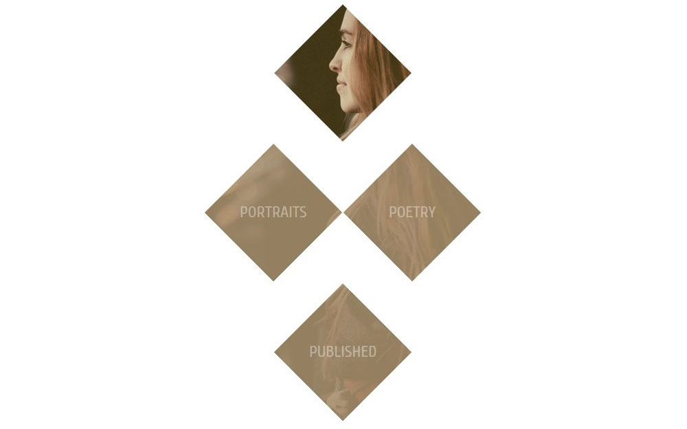
This is the effect we’re aiming for. Upon hovering over the bottom three boxes, you’ll see the background color fade to reveal the background.
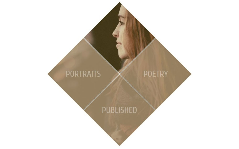
The actual size of the image is 600 × 600 pixels. Thus, let’s start with four empty divs of 300 pixels each and apply the same background image to them. Let’s add a parent wrapper of 604 pixels and lay out the images with the inline-block property.

Let’s now change the value of the background-position property for each image to top, left, right and bottom, respectively.
Let’s clip each box into the shape of a rhombus. We will overlay an absolutely positioned layer on each of the bottom three images, with some text.
Now we will move the images into rows — the second and third image into one row, and the first and fourth into their own individual rows.

Finally, we will use negative margins to push up the second and third rows, so that they are laid out as in the final demo below. We can remove the width value of 604 pixels on the parent wrapper, and we can structure our media query so that the four diamond boxes move from a stacked layout on small screens to inline blocks on larger ones.
See the Pen Clip-path: Diamond grid by Karen Menezes (@imohkay) on CodePen.
While working on this demo, I noticed a bug in Chrome with pointer events being dispatched outside the clipped region, which violates the specification: “By default, pointer events must not be dispatched on the clipped-out (non-visible) regions of a shape.” I have filed the bug. The issue with this demo was solved by using the pointer-events property with a value of none on the overlay. Alternatively, you could apply the same clip-path value to the overlay to resolve the issue.
Due to the negative margins applied, this demo would look odd in browsers that don’t support clip-path. You would have to use some sort of feature detection to apply the margins (although I haven’t experimented with this) or the @supports CSS feature query, although I wouldn’t recommend the latter in production code.
Example 5: Create A Dummy Profile Page With Hexagons
Our final page should look like this:
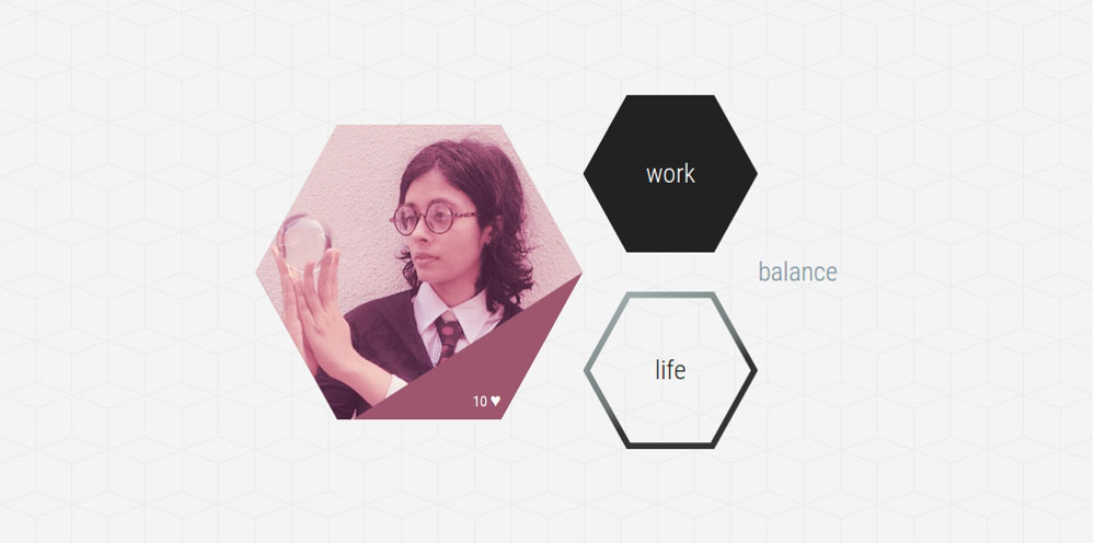
We’ll start by adding a background image of hexagon tiles to the body (the image courtesy of Subtle Patterns).
The hexagon clip-path values can be obtained from one of the demos above or with the Clippy tool.
The first hexagon uses a background image (because we’re blending a dull maroon into the background using the background-blend-mode property). Using generated content, an absolutely positioned overlay is clipped to a maroon triangle shape, which you can see on the bottom. It disappears on hover.
The second hexagon, with the word “work,” simply has a dark grey background that changes on hover.
The third hexagon has a gradient border, similar to the one in the demo on creating borders with clip-path.
The hexagons stack on small screens and are vertically centered on larger ones. I’ve used a combination of display: table and the absolute centering transforms hack — of course, you could use flexbox, floats or whatever else floats your layouting boat.
Here’s the final demo.
See the Pen Clip-path: Hexagon shapes for dummy profile page by Karen Menezes (@imohkay) on CodePen.
I discovered a bug with clip-path while creating this demo. Altering the value of opacity in combination with the CSS transition causes a flicker and artifacts on the page. Be aware of this if you’re using clip-path to progressively enhance a design.
There is also a bug with clip-path and the backface-visibility property when set to hidden. This bug is documented in Chromium’s issue tracker and I have been able to replicate it using the basic shape syntax in Chrome on Linux. Keep this in mind if you’re using a clip-path shape to do a cool 3D flip or anything that uses CSS 3D transforms.
While clipping with SVG wins hands down for its flexibility and options, nothing beats the ease with which elements can be clipped with CSS. In fact, the same polygon coordinates can be effortlessly recycled to create responsive SVG for even better browser support. With clip-path, you can dramatically alter the look and feel of a page, without having to worry much about non-supporting browsers, where it will gracefully degrade. If you choose to use clip-path for design enhancements, keep an eye on the specification as it advances towards “Recommendation” status.
Resources, Tools And Inspiration
- “CSS Masking Module Level 1,” W3C This is the ultimate source of truth and the best reference, when in doubt.
- “Clipping in CSS and SVG: The
clip-pathProperty and<clipPath>Element,” Sara Soueidan Soueidan has the definitive guide to clipping paths. While the focus is largely on SVG, this article is a fantastic introduction, with plenty of information for both intermediate and advanced readers. - “clip-path,” Sara Soueidan, Codrops Soueidan’s well-researched and comprehensive article over on Codrops breaks down a fairly complicated module into something that is easy to understand and assimilate.
- “Clipping and Masking in CSS,” Chris Coyier, CSS-Tricks Coyier’s article, peppered with several helpful demos, explains both clipping and masking.
- Clippy Bennett Feely’s fab clip-path maker can generate a plethora of predefined and custom polygon shapes, circles and ellipses for CSS’
clip-path. All values are in percentages and, hence, useful for responsive layouts. - Clip Path Generator CSS Plant offers a rather comprehensive graphical interface to clip or mask an element. Cross-browser support is provided for Firefox, Chrome, Safari and old iOS. Clips are in pixels, not percentages.
- Species in Pieces So breathtaking it borders on the spiritual, this showcase of 30 endangered species was crafted entirely with CSS’
clip-path, without a hint of canvas or WebGL. View it in a WebKit or Blink browser until the other ones catch up.
Further Reading
- Adventures In The Third Dimension: CSS 3D Transforms
- Animating Clipped Elements In SVG
- Designing an Interactive Exhibition With CSS Clip Paths
- The Illusion Of Life: An SVG Animation Case Study
 (ds, il, al, mrn)

