Benton Modern, A Case Study On Art-Directed Responsive Web Typography

Email Newsletter
Weekly tips on front-end & UX.
Trusted by 182,000+ folks.

 Custom Web Forms for Angular, React, & Vue. Your backend.
 Celebrating 10 million developers


Having the ability to set legible body copy is an absolute must, and we’ve come a long way with web typography since the dawn of web design. However, I feel like we have allowed the lack of variety prior to the rise of web fonts to dampen our creativity now that thousands of web fonts are at our disposal. Have usability conventions and the web’s universality steered us away from proper art direction? Have we forgotten about art direction altogether? I believe so.
As designers, we can achieve much more with type, and with just a little more thought and creativity, we can finally start to take full advantage of the type systems available. Let’s look at ways we can push typographic design on the web further, beyond the status quo of today.
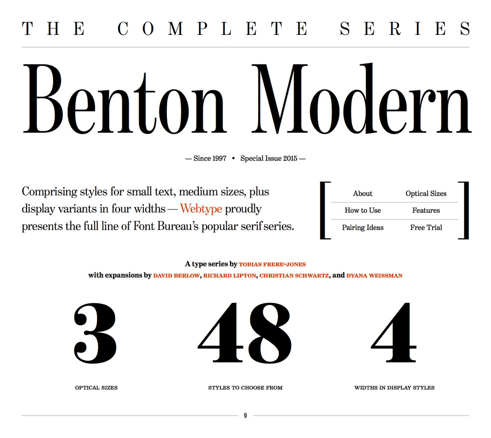
The Benton Modern brochure website (a project I was involved in) is a perfect example for showcasing how a large type family can be utilized to improve legibility and readability across breakpoints, while at the same time evoking emotion and providing a pleasant experience. We shall explore the ideas introduced to push the boundaries of typographic design on the web and get practical, too, with a key focus on responsive web typography.
First, The Basics Of Responsive Web Typography
You’re probably aware of responsive web typography by now and how it can solve challenges outside of core responsive web design. However, as the focus of this article isn’t on the ins and outs of responsive web typography, we shall not be exploring it in any great detail.
If you’re interested in learning more about general typesetting for the web and how to approach certain issues, many resources exist to help you.
Furthermore, my “Responsive Typography” talk and chapter in Smashing Book 4, in which I propose reusing “traditional” typography rules and translating them to the language of CSS, should help kickstart any aspiring web typographer to improve their typography game.
To also help you on your way, here’s a quick rundown of some of the methods I’ve been advocating in recent years, methods that were applied to the Benton project, too:
- Provide different font sizes for different reading distances, currently achievable by detecting a device’s form factor using @media queries. Long term, this is probably not ideal — that is, until reading distance-detection techniques become more feasible. In the meantime, use Size Calculator by Nick Sherman and Chris Lewis to calculate the physical or perceived font size when factoring in reading distance.
- Maintain perfect proportions in a paragraph with letter spacing, word spacing and line height properties for each breakpoint. Universal Typography’s demo by Tim Brown of Nice Web Type is a very useful tool that can help you experiment with and adjust your paragraph proportions accordingly.
- Establish hierarchy using either a typographic scale (Modular Scale is a useful tool by Tim Brown and Scott Kellum) or different styles at the same font size — for instance, uppercase for
h2, small caps forh3and italics forh4subheads. For more options and ideas on styling subheads, may I suggest you read “Setting Subheads With CSS” and explore examples of subheads set with CSS. - For small screens, indent paragraphs and separate page sections with white space. For large screens, use block paragraphs and separate page sections with graphical elements (lines, shapes, color).
- Use graded fonts to normalize rendering across different pixel densities. Font grades are very subtle font weights used to compensate for different ink and paper qualities, as well as for different pixel densities on screen. This method is explained in detail in iA’s article “New Site With Responsive Typography.” In short, lighter grades are used for low-DPI screens and heavier grades for high-DPI screens, while graded fonts will also compensate for different sub-pixels’ direction between portrait and landscape mode on mobile and tablet devices.
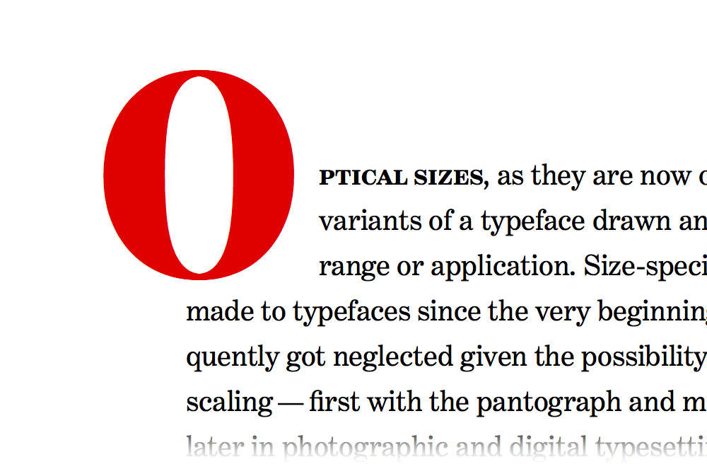
- Look for type families that have multiple optical sizes, and use appropriate styles for body copy, tiny text and display sizes. For instance, Font Bureau, the company behind the Benton Modern family, makes many families like this with a wide stylistic palette.
- Use different font widths according to the width of the screen (see what happens with the subheads on the Benton website when you resize the browser window). For instance, use a condensed font for small screens and a wider font for larger desktop screens, just like on the brochure website for Input (again, resize the window). In the case of the Benton project, we set different font widths manually for each breakpoint, but there’s also a solution for automatic swapping using Font-To-Width (by Sherman and Lewis) that takes advantage of multiple-width type families to fit pieces of text snugly within their containers.
- Here’s another tip: If you intend to use Georgia or Verdana on large screens, replace them with Georgia Pro Condensed or Verdana Pro Condensed on mobile screens. The reason why Georgia Pro and Verdana Pro’s condensed widths work well at small sizes is because they aren’t extremely condensed and, hence, can still be read comfortably.
- First, we tested all of the styles at large and small sizes, stretching and squeezing every which way possible. We used Reading Edge optical sizes (designed for 9- to 14-pixel font sizes) as subheads, and display optical sizes (designed for headlines) for body copy. We wanted to see what could go wrong and challenge the intended use for each style. However, the solution that we settled on was still pretty much in line with the intended use for each optical size.
- Next, we tested how different styles behave in narrow columns versus wider blocks of text. Hyphenated and justified verus left-aligned. Tightly spaced versus loosely spaced.
- Lastly, we analyzed all of the glyphs one by one, searching for little hidden gems. Apart from the ampersand — which is always an obvious choice — another good candidate was the uppercase R.
With this basic primer on responsive web typography out of the way, let me walk you through the process of designing a web page that is meant not only to inform, but to amaze!
Show, Don’t Tell
Webtype commissioned us to build a brochure website for Benton Modern soon after Indra Kupferschmid had seen my talk on responsive web typography at Smashing Conference in Oxford. The brief was to showcase what could be achieved typographically with a versatile type family coupled with responsive web typography using as many responsive techniques as possible, essentially putting into practice the elements presented and demonstrated in my talk. With Indra Kupferschmid as the chief type savant and Nick Sherman as the onboard quality assurance director, there was certainly to be no trouble with experimenting and pushing the boundaries.
From the very start, we wanted the user to experience the type family through the design and not just through a full page of body copy. That being said, in searching for the right metaphor to use, we eventually settled on creating two distinctive designs — the formal and the expressive. Both are fully responsive, utilizing the same HTML, and for all intents and purposes showcase the benefits of separating structure from presentation, so don’t forget to resize your browser and inspect the HTML and CSS.
Learning About The Typeface
Indra’s elaborate copy was a good starting point to get to know the typeface. When you receive content up front, as was the case in this project, it’s so much easier to create semantic HTML and to explore different styles. Here’s how we started our investigative testing, bearing in mind that Benton Modern comprises 48 styles in total:
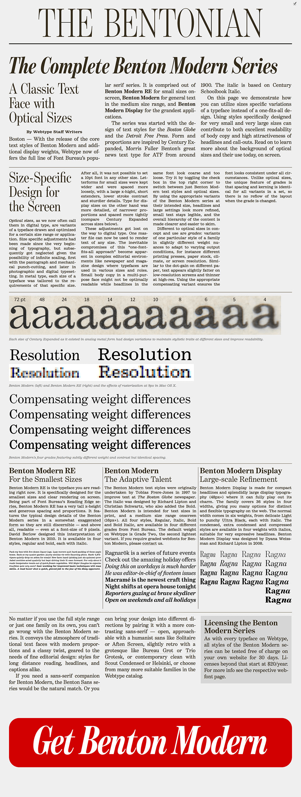
From there, the next step was to apply some basic styles to the page. One of the early ideas was to adopt a traditional newspaper column layout, which we tried. With the exception of this high-level concept, we still didn’t have a definitive layout concept by this point.
Indented paragraphs in columns were too narrow to be justified and hyphenated properly, so we just kept the hyphenation to improve the texture a little bit.
.columns p {
   -webkit-hyphens: auto;
   -moz-hyphens: auto;
   hyphens: auto;
}
.columns p + p {
   text-indent: 1.5rem;
}
We used columns only when there was enough horizontal space. But we also wanted to avoid columns bleeding out of the screen vertically, because that would require scrolling up and down during reading when moving from column to column. That’s why we introduced another @media query to test the height of the screen before applying columns.
@media only screen and (min-height: 25em) {

   @media only screen and (min-width: 40em) and (max-width: 59.9375em) {
      -webkit-columns: 2;
      -moz-columns: 2;
      columns: 2;
      -webkit-column-gap: 2.7em;
      -moz-column-gap: 2.7em;
      column-gap: 2.7em;
   }

   @media only screen and (min-width: 60em) {
      -webkit-columns: 3;
      -moz-columns: 3;
      columns: 3;
      -webkit-column-gap: 2.7em;
      -moz-column-gap: 2.7em;
      column-gap: 2.7em;
   }
}
Designing Content
The next step was to analyze the content in more detail. That way, we were able to establish what the different sections were and adjust the details as we went along.
The formal version was the first to be developed. We created a huge headline to reflect newspaper headlines and added the year that the series started. The deck was the obvious element to style next. We experimented with a condensed version, and to our surprise it worked immediately. At that stage, the page navigation still didn’t exist and was only included much later on to improve overall usability, as well as to demonstrate the use of brackets as graphic elements.
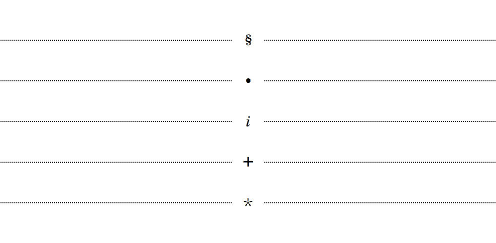
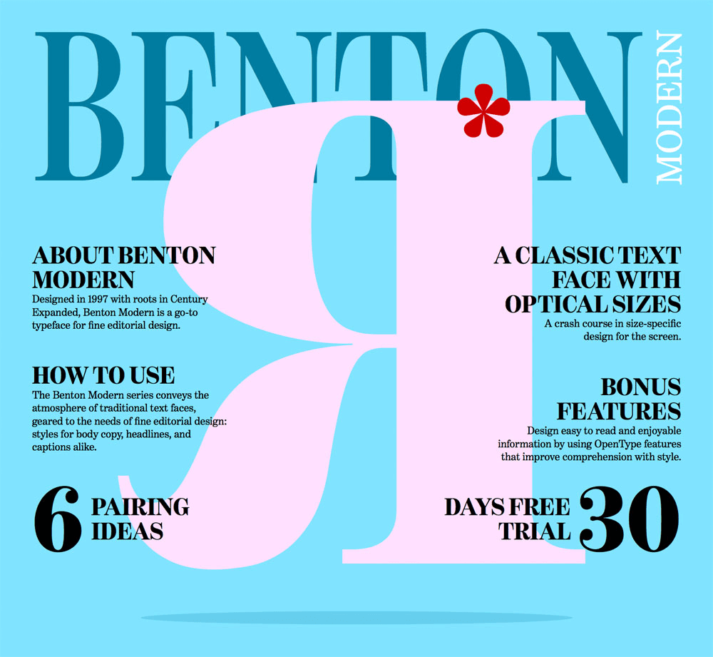
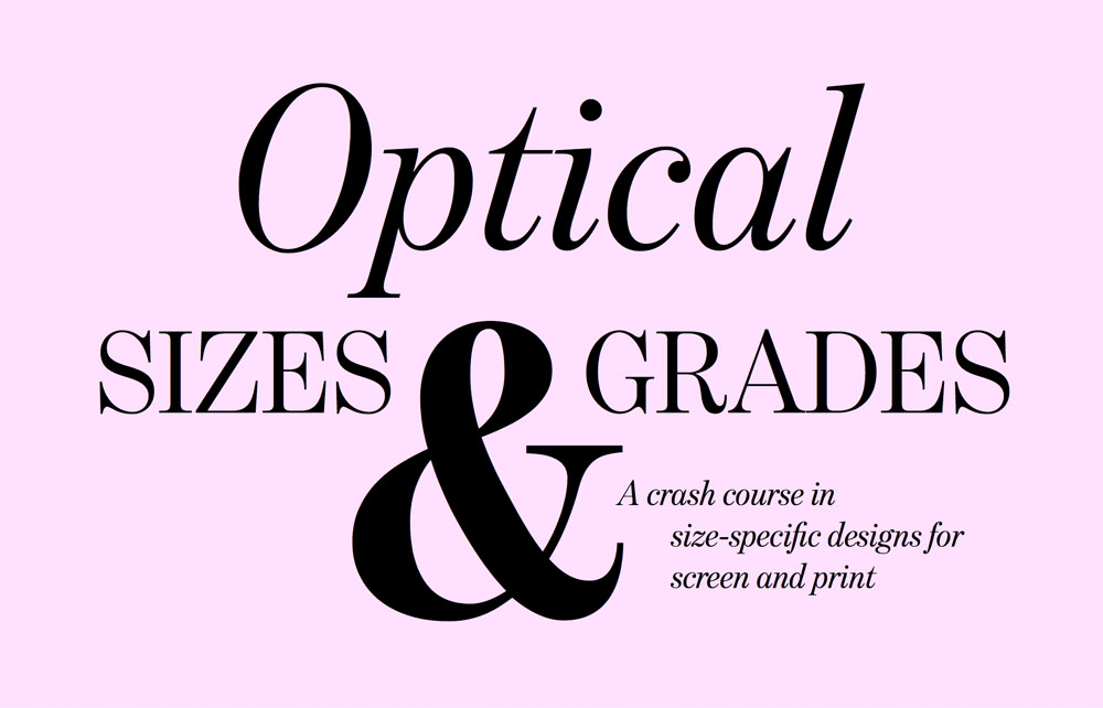
The sections were a little dull, though. The hierarchy and arrangement of subhead, intro paragraph and columns were quickly established using the rules explained previously, but something was still missing. After some trial and error, we decided to separate the different sections with dotted borders to further emphasize the fine detail in the design of the Benton Modern series, and we introduced the section sign § (Alt + 6 on a Mac) to mark the sections. However, that still wasn’t good enough, so we again previewed numerous glyphs to find suitable candidates for other sections. We ended up using § for “About,” • for “Optical Sizes,” an italic i for “How to Use,” + for “Bonus Features” and * for “Pairings.” Some of these characters are rarely used in web design, so introducing them as decorations felt natural.
At this point the design was pretty solid, but we still needed to highlight the most impressive facts to showcase to the reader the inherent versatility of the family. So we established a no-nonsense look and feel by enlarging the important numbers: 3 optical sizes, 48 styles to choose from, and 4 widths in display styles.
The first version of pairing swatches was set in Pinterest-inspired columns, as with the rest of the sections. Yet we had a need to change it — at least slightly — because this section was not about Benton Modern, but about its companions. Benton Modern RE fonts are really great at small sizes, so introducing the pairs as contrasting large headlines made sense. Indra’s selection of pairings worked very well without many additional adjustments. The only areas that required special attention were the custom sizes for each headline, especially if we wanted the headlines to resize with the screen.
Viewport Width For Smooth Type Scaling
The only CSS units that support smooth scaling are vw (1% of the viewport’s width), vh (1% of the viewport’s height), vmax (1% of the longest side) and vmin (1% of the shortest side). The resulting CSS for one headline is composed of three font-size declarations — values in pixels, root ems (rems) and viewport widths — one for each flexible breakpoint (small to medium screens) that covers older browsers, too:
#swatch-benton-sans h1 {
   @include rem(font-size, #{208/16});
}
@media only screen and (max-width: 29.9375em) {
   #swatch-benton-sans h1 {
      @include rem(font-size, #{57/16});
      font-size: 18.75vw;
   }
}
@media only screen and (min-width: 30em) and (max-width: 61.9375em) {
   #swatch-benton-sans h1 {
      @include rem(font-size, #{86/16});
      font-size: 20vw;
   }
}
As you can see, we’re using a Sass mixin here. It returns the given property with values in pixels, as well as in root em units.
@mixin rem($property, $values) {
   $max: length($values);
   $pxValues: ’;
   $remValues: ’;

   @for $i from 1 through $max {
      $value: strip-unit(nth($values, $i));
      $pxValues: #{$pxValues + $value*16}px;
      @if $i < $max {
         $pxValues: #{$pxValues + " "};
      }
   }

   @for $i from 1 through $max {
      $value: strip-unit(nth($values, $i));
      $remValues: #{$remValues + $value}rem;
      @if $i < $max {
         $remValues: #{$remValues + " "};
      }
   }

   #{$property}: $pxValues;
   #{$property}: $remValues;
}
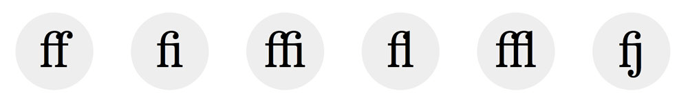
OpenType Features
Whenever you need to showcase important details within the content — in this case, OpenType features such as the alternate R, the ligatures and the small caps — it’s always good to highlight these features in an interesting way. We didn’t want to use CSS images for graphic details, so we simply enlarged the type and brought the details to focus. The difference between ligatures and default glyphs is clear, and comparing small caps with uppercase and lowercase counterparts is easy.
If you were wondering how to enable OpenType features in CSS, here are a couple of examples with vendor prefixes:
/* Alternate characters */
-webkit-font-feature-settings: "ss01";
-moz-font-feature-settings: "ss01" 1;
font-feature-settings: "ss01";

/* Common ligatures (ff, fi, ffi, fl, ffl, fj, …) */
-webkit-font-feature-settings: "liga";
-moz-font-feature-settings: "liga" 1;
font-feature-settings: "liga";

/* Small caps */
-webkit-font-feature-settings: "smcp";
-moz-font-feature-settings: "smcp" 1;
font-feature-settings: "smcp";
You can test all of the OpenType features available with CSS in Richard Rutter’s CSS3 Font-Feature-Settings OpenType Demo. Consult Bram Stein’s excellent The State of Web Type to check which features are supported in which browsers and to what extent.
OpenType Features In Safari Are… A Drag
There’s one piece of bad news. Safari on both Mac and iOS support OpenType features but ignores any assigned value. The safest way to use alternate characters or small caps in Safari is by loading subset fonts (subset fonts contain only a subset of glyphs from the full font file). For the Benton Modern project, we decided to test browser capabilities with @support before applying small caps, and we provided a fallback for browsers that don’t support font-feature-settings:
@supports ((font-feature-settings: "smcp") or
   (-webkit-font-feature-settings: "smcp") or
   (-moz-font-feature-settings: "smcp" 1)) {
   .small-caps {
      text-transform: lowercase;
      -webkit-font-feature-settings: "smcp";
      -moz-font-feature-settings: "smcp" 1;
      font-feature-settings: "smcp";
   }
}
Expressive Details
The Formal newspaper-inspired style looked really great. It was well organized, with plenty of small details. But we wanted to push the design a little further. How about creating a magazine-inspired design? We retained the same emphasis on elements as in the formal version but fed the opening section and all section subheads with steroids using pseudo-elements (for example, the R and the asterisk on the “cover” page), and we created a specific arrangement for each subhead by repositioning each word in a subhead in a Lubalinesque manner.
3D Effects
The 3D effect on “The Complete Series” was achieved with multiple text shadows, as explained in Tim Brown’s Typekit Practice lesson “Using Shades for Eye-Catching Emphasis.”

Drop Caps
Drop caps can be achieved simply by floating the first character. But vertical metrics complexities as well as cross-browser inconsistency make it virtually impossible to get drop caps right. Luckily, Adobe engineers wrote dropcap.js, a small script that solves that problem. The setup is very straightforward, and it’s easy to adjust positioning by specifying the number of lines the drop cap should span, as well as the height of the drop cap itself. There’s a bonus: The script doesn’t require any external JavaScript libraries.
var dropcaps = document.querySelectorAll('.drop-cap');

if (window.innerWidth < 600) {
   window.Dropcap.layout(dropcaps, 3);
} else {
   window.Dropcap.layout(dropcaps, 5, 3);
}
Flipped And Rotated Type
All elements that needed special treatment were wrapped in their respective spans and given dedicated class names. This meant adding non-semantic markup, but there was no other way around it, especially if we wanted to take full control over the presentation.

We flipped parts of the pairings section subhead with the transform: scale rule. The great thing is that if the transform property is not supported by the browser, nothing will happen.
.flip {
   display: block;
   -webkit-transform: scale(-1, -1);
   -moz-transform: scale(-1, -1);
   transform: scale(-1, -1);
}
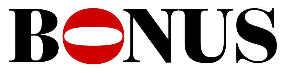
The same applies to the O in the “Bonus Features,” which we rotated with the transform: rotate rule. When rotating letters, you might want to readjust the positioning after rotation (watch out for the aforementioned vertical metrics issues). The values will vary from typeface to typeface and glyph to glyph, so there’s no generic rule.
.o {
   -webkit-transform: rotate(90deg);
   -moz-transform: rotate(90deg);
   transform: rotate(90deg);
   /* Glyph-specific adjustments */
}
Setting Expressive Subheads
Setting responsive expressive subheads is a piece of cake when you grasp the underlying concept. We need to do only two things:
- set the font size of a container in viewport width units,
- size everything that’s inside the container in em units.
<div class="container">
   <h1>
      <span class="s1">You</span>
      <span class="s2">&</span>
      <span class="s3">Me</span>
   </h1>
</div>
Elements inside the container can be repositioned either absolutely or using negative margins. If you’re using absolute positioning, then it’s best to fix the aspect ratio of the h1, thus retaining proportions. If you’re fixing the aspect ratio, you can also use percentages instead of ems, because now you have a height reference for vertical properties in place.
Example of positioning with margins:
.container {
   font-size: 10vw;
}
.container h1 {
   font-size: 1em;
   line-height: 1;
   width: 100%;
}
.s1 {
   margin-left: 1em;
   margin-top: 1em;
}
Example of absolute positioning:
.container {
   font-size: 10vw;
}
.container h1 {
   font-size: 1em;
   line-height: 1;
   position: relative;
   width: 100%;
   height: 0;
   padding-top: 75%; /* 4:3 aspect ratio */
   padding-top: 50%; /* 2:1 aspect ratio */
}
.s1 {
   position: absolute;
   left: 10%;
   top: 10%;
}
Voila! Compare all three positioning variants in the Expressive Web Typography demo.
Steal Ideas!
Now you hopefully see how far we can take typography on the web. To take full advantage of the methods discussed in this article, look for type families with multiple font styles and optical sizes. The only reason we were able to make all of these responsive adjustments is that the Benton Modern is such a versatile typeface family with so many variants.
View the HTML and CSS source on Benton Modern, use those techniques to improve typography in your own projects, and let us know if you come up with something different. Setting type on the web still involves a lot of manual labor, especially for the smaller, more delicate details, but typographic tools are emerging to speed up the process. Until then, don’t be intimidated because there is always a solution to a given problem. The next time you are offered a challenging project, bite the bullet, test like crazy, and do whatever it takes.
Further Reading
- Truly Fluid Typography With vh And vw Units
- Introducing Responsive Web Typography With FlowType.JS
- 10 Principles For Readable Web Typography
- The Perfect Paragraph
 (al, ml, mrn)

