Notes On Client-Rendered Accessibility

Email Newsletter
Weekly tips on front-end & UX.
Trusted by 182,000+ folks.


 Custom Web Forms for Angular, React, & Vue. Your backend.
 Celebrating 10 million developers
As creators of the web, we bring innovative, well-designed interfaces to life. We find satisfaction in improving our craft with each design or line of code. But this push to elevate our skills can be self-serving: Does a new CSS framework or JavaScript abstraction pattern serve our users or us as developers?
If a framework encourages best practices in development while also improving our workflow, it might serve both our users’ needs and ours as developers. If it encourages best practices in accessibility alongside other areas, like performance, then it has potential to improve the state of the web.
Despite our pursuit to do a better job every day, sometimes we forget about accessibility, the practice of designing and developing in a way that’s inclusive of people with disabilities. We have the power to improve lives through technology — we should use our passion for the craft to build a more accessible web.
These days, we build a lot of client-rendered web applications, also known as single-page apps, JavaScript MVCs and MV-whatever. AngularJS, React, Ember, Backbone.js, Spine: You may have used or seen one of these JavaScript frameworks in a recent project. Common user experience-related characteristics include asynchronous postbacks, animated page transitions, and dynamic UI filtering. With frameworks like these, creating a poor user experience for people with disabilities is, sadly, pretty easy. Fortunately, we can employ best practices to make things better.
In this article, we will explore techniques for building accessible client-rendered web applications, making our jobs as web creators even more worthwhile.

Semantics
Front-end JavaScript frameworks make it easy for us to create and consume custom HTML tags like <pizza-button>, which you’ll see in an example later on. React, AngularJS and Ember enable us to attach behavior to made-up tags with no default semantics, using JavaScript and CSS. We can even use Web Components now, a set of new standards holding both the promise of extensibility and a challenge to us as developers. With this much flexibility, it’s critical for users of assistive technologies such as screen readers that we use semantics to communicate what’s happening without relying on a visual experience.
Consider a common form control: A checkbox opting you out of marketing email is pretty significant to the user experience. If it isn’t announced as “Subscribe checked check box” in a screen reader, you might have no idea you’d need to uncheck it to opt out of the subscription. In client-side web apps, it’s possible to construct a form model from user input and post JSON to a server regardless of how we mark it up — possibly even without a <form> tag. With this freedom, knowing how to create accessible forms is important.
To keep our friends with screen readers from opting in to unwanted email, we should:
- use native inputs to easily announce their role (purpose) and state (checked or unchecked);
- provide an accessible name using a
<label>, withidandforattribute pairing —aria-labelon the input oraria-labelledbypointing to another element’sid.
<form>
  <label for="subscribe">
    Subscribe
  </label>
  <input type="checkbox" id="subscribe" checked>
</form>
Native Checkbox With Label
If native inputs can’t be used (with good reason), create custom checkboxes with role=checkbox, aria-checked, aria-disabled and aria-required, and wire up keyboard events. See the W3C’s “Using WAI-ARIA in HTML.”
Custom Checkbox With ARIA
<form>
  <some-checkbox role="checkbox" tabindex="0" aria-labelledby="subscribe" aria-checked="true">
  </some-checkbox>
  <some-label id="subscribe">Subscribe</some-label>
</form>
Form inputs are just one example of the use of semantic HTML and ARIA attributes to communicate the purpose of something — other important considerations include headings and page structure, buttons, anchors, lists and more. ARIA, or Accessible Rich Internet Applications, exists to fill in gaps where accessibility support for HTML falls short (in theory, it can also be used for XML or SVG). As you can see from the checkbox example, ARIA requirements quickly pile up when you start writing custom elements. Native inputs, buttons and other semantic elements provide keyboard and accessibility support for free. The moment you create a custom element and bolt ARIA attributes onto it, you become responsible for managing the role and state of that element.
Although ARIA is great and capable of many things, understanding and using it is a lot of work. It also doesn’t have the broadest support. Take Dragon NaturallySpeaking — this assistive technology, which people use all the time to make their life easier, is just starting to gain ARIA support. Were I a browser implementer, I’d focus on native element support first, too — so it makes sense that ARIA might be added later. For this reason, use native elements, and you won’t often need to use ARIA roles or states (aria-checked, aria-disabled, aria-required, etc.). If you must create custom controls, read up on ARIA to learn the expected keyboard behavior and how to use attributes correctly.
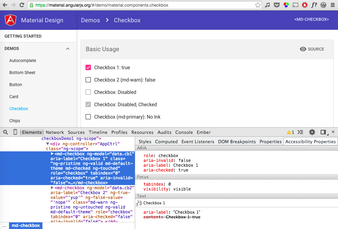
Tip: Use Chrome’s Accessibility Developer Tools to audit your code for errors, and you’ll get the bonus “Accessibility Properties” inspector.
Web Components And Accessibility
An important topic in a discussion on accessibility and semantics is Web Components, a set of new standards landing in browsers that enable us to natively create reusable HTML widgets. Because Web Components are still so new, the syntax is majorly in flux. In December 2014, Mozilla said it wouldn’t support HTML imports, a seemingly obvious way to distribute new components; so, for now that technology is natively available in Chrome and Opera only. Additionally, up for debate is the syntax for extending native elements (see the discussion about is="" syntax), along with how rigid the shadow DOM boundary should be. Despite these changes, here are some tips for writing semantic Web Components:
- Small components are more reusable and easier to manage for any necessary semantics.
- Use native elements within Web Components to gain behavior for free.
- Element IDs within the shadow DOM do not have the same scope as the host document.
- The same non-Web Component accessibility guidelines apply.
For more information on Web Components and accessibility, have a look at these articles:
- “Polymer and Web Component Accessibility: Best Practices,” Dylan Barrell
- “Web Components Punch List,” Steve Faulkner
- “Accessible Web Components,” Addy Osmani and Alice Boxhall, Polymer
Interactivity
Native elements such as buttons and inputs come prepackaged with events and properties that work easily with keyboards and assistive technologies. Leveraging these features means less work for us. However, given how easy JavaScript frameworks and CSS make it to create custom elements, such as <pizza-button>, we might have to do more work to deliver pizza from the keyboard if we choose to mark it up as a new element. For keyboard support, custom HTML tags need:
tabindex, preferably0so that you don’t have to manage the entire page’s tab order (WebAIM discusses this);- a keyboard event such as
keypressorkeydownto trigger callback functions.
Focus Management
Closely related to interactivity but serving a slightly different purpose is focus management. The term “client-rendered” refers partly to a single-page browsing experience where routing is handled with JavaScript and there is no server-side page refresh. Portions of views could update the URL and replace part or all of the DOM, including where the user’s keyboard is currently focused. When this happens, focus is easily lost, creating a pretty unusable experience for people who rely on a keyboard or screen reader.
Imagine sorting a list with your keyboard’s arrow keys. If the sorting action rebuilds the DOM, then the element that you’re using will be rerendered, losing focus in the process. Unless focus is deliberately sent back to the element that was in use, you’d lose your place and have to tab all the way down to the list from the top of the page again. You might just leave the website at that point. Was it an app you needed to use for work or to find an apartment? That could be a problem.
In client-rendered frameworks, we are responsible for ensuring that focus is not lost when rerendering the DOM. The easy way to test this is to use your keyboard. If you’re focused on an item and it gets rerendered, do you bang your keyboard against the desk and start over at the top of the page or gracefully continue on your way? Here is one focus-management technique from Distiller using Spine, where focus is sent back into relevant content after rendering:
class App.FocusManager
constructor:
$(‘body’).on ‘focusin’, (e) =>
@oldFocus = e.target
App.bind 'rendered', (e) =>
return unless @oldFocus

if @oldFocus.getAttribute('data-focus-id')
@_focusById()
else
@_focusByNodeEquality()

_focusById: ->
focusId = @oldFocus.getAttribute('data-focus-id')
newFocus = document.querySelector("##{focusId}")
App.focus(newFocus) if newFocus

_focusByNodeEquality: ->
allNodes = $('body *:visible').get()
for node in allNodes
if App.equalNodes(node, @oldFocus)
App.focus(node)
In this helper class, JavaScript (implemented in CoffeeScript) binds a focusin listener to document.body that checks anytime an element is focused, using event delegation, and it stores a reference to that focused element. The helper class also subscribes to a Spine rendered event, tapping into client-side rendering so that it can gracefully handle focus. If an element was focused before the rendering happened, it can focus an element in one of two ways. If the old node is identical to a new one somewhere in the DOM, then focus is automatically sent to it. If the node isn’t identical but has a data-focus-id attribute on it, then it looks up that id’s value and sends focus to it instead. This second method is useful for when elements aren’t identical anymore because their text has changed (for example, “item 1 of 5” becoming labeled off screen as “item 2 of 5”).
Each JavaScript MV-whatever framework will require a slightly different approach to focus management. Unfortunately, most of them won’t handle focus for you, because it’s hard for a framework to know what should be focused upon rerendering. By testing rendering transitions with your keyboard and making sure focus is not dropped, you’ll be empowered to add support to your application. If this sounds daunting, inquire in your framework’s support community about how focus management is typically handled (see React’s GitHub repo for an example). There are people who can help!

Notifying The User
There is a debate about whether client-side frameworks are actually good for users, and plenty of people have an opinion on them. Clearly, most client-rendered app frameworks could improve the user experience by providing easy asynchronous UI filtering, form validation and live content updates. To make these dynamic updates more inclusive, developers should also update users of assistive technologies when something is happening away from their keyboard focus.
Imagine a scenario: You’re typing in an autocomplete widget and a list pops up, filtering options as you type. Pressing the down arrow key cycles through the available options, one by one. One technique to announce these selections would be to append messages to an ARIA live region, a mechanism that screen readers can use to subscribe to changes in the DOM. As long as the live region exists when the element is rendered, any text appended to it with JavaScript will be announced (meaning you can’t add bind aria-live and add the first message at the same time). This is essentially how Angular Material’s autocomplete handles dynamic screen-reader updates:
<md-autocomplete md-selected-item="ctrl.selectedItem" aria-disabled="false">
<md-autocomplete-wrap role="listbox">
  <input type="text" aria-label="{{ariaLabel}}" aria-owns="ul_001">
</md-autocomplete-wrap>
<ul role="presentation" id="ul_001">
  <li ng-repeat="(index, item) in $mdAutocompleteCtrl.matches" role="option" tabIndex="0">
</ul>
<aria-status class="visually-hidden" role="alert">
  <p ng-repeat="message in messages">{{message}}</p>
</aria-status>
</md-autocomplete>
In the simplified code above (the full directive and related controller source are on GitHub), when a user types in the md-autocomplete text input, list items for results are added to a neighboring unordered list. Another neighboring element, aria-status, gets its aria-live functionality from the alert role. When results appear, a message is appended to aria-status announcing the number of items, “There is one match” or “There are four matches,” depending on the number of options. When a user arrows through the list, that item’s text is also appended to aria-status, announcing the currently highlighted item without the user having to move focus from the input. By curating the list of messages sent to an ARIA live region, we can implement an inclusive design that goes far beyond the visual. Similar regions can be used to validate forms.
For more information on accessible client-side validation, read Marco Zehe’s “Easy ARIA Tip #3: aria-invalid and Role alert” or Deque’s post on accessible forms.
Conclusion
So far, we’ve talked about accessibility with screen readers and keyboards. Also consider readability: This includes color contrast, readable fonts and obvious interactions. In client-rendered applications, all of the typical web accessibility principles apply, in addition to the specific ones outlined above. The resources listed below will help you incorporate accessibility in your current or next project.
It is up to us as developers and designers to ensure that everyone can use our web applications. By knowing what makes an accessible user experience, we can serve a lot more people, and possibly even make their lives better. We need to remember that client-rendered frameworks aren’t always the right tool for the job. There are plenty of legitimate use cases for them, hence their popularity. There are definitely drawbacks to rendering everything on the client. However, even as solutions for seamless server- and client-side rendering improve over time, these same accessibility principles of focus management, semantics and alerting the user will remain true, and they will enable more people to use your apps. Isn’t it cool that we can use our craft to help people through technology?
Resources
- “Design Accessibly, See Differently: Color Contrast Tips and Tools,” Cathy O’Connor, Smashing Magazine
- ”Web Accessibility for Designers,” WebAIM
- ”Accessibility Developer Tools,” Chrome plugin
- “Using WAI-ARIA in HTML,” W3C
- “How I Audit a Website for Accessibility,” Marcy Sutton, Substantial
- “Using ngAria,” Marcy Sutton
- “Protractor Accessibility Plugin,” Marcy Sutton
Protractor is AngularJS’ end-to-end testing framework.
Thanks to Heydon Pickering for reviewing this article.
Further Reading
- How To Scale React Applications
- Why You Should Consider React Native For Your Mobile App
- Test Automation For Apps, Games And The Mobile Web
- Server-Side Rendering With React, Node And Express
 (hp, al, ml, mrn)

