Design Principles: Compositional, Symmetrical And Asymmetrical Balance

Email Newsletter
Weekly tips on front-end & UX.
Trusted by 182,000+ folks.


 Custom Web Forms for Angular, React, & Vue. Your backend.
 Celebrating 10 million developers

A balanced composition feels right. It feels stable and aesthetically pleasing. While some of its elements might be focal points and attract your eye, no one area of the composition draws your eye so much that you can’t see the other areas.
Balancing a composition involves arranging both positive elements and negative space in such a way that no one area of the design overpowers other areas. Everything works together and fits together in a seamless whole. The individual parts contribute to their sum but don’t try to become the sum.
An unbalanced composition can lead to tension. When a design is unbalanced, the individual elements dominate the whole and the composition becomes less than the sum of its parts. In some projects, unbalanced might be right for the message you’re trying to communicate, but generally you want balanced compositions.
Note: This is the seventh and final post in a series on design principles. You can find the first six posts here:
- Design Principles: Visual Perception and the Principles of Gestalt
- Design Principles: Space and the Figure-Ground Relationship
- Design Principles: Connecting and Separating
- Design Principles: Visual Weight and Visual Direction
- Design Principles: Dominance, Focal Points and Hierarchy
- Design Principles: Compositional Flow and Rhythm
"Happiness is not a matter of intensity but of balance, order, rhythm and harmony." – Thomas Merton
Physical And Visual Balance
Balance is easy to understand in the physical world, because we experience it all the time. When something is unbalanced, it tends to fall over. You’ve probably been on a seesaw or a teeter-totter at some time in your life — you on one side and a friend on the other.
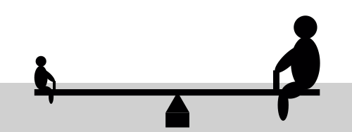
Assuming you were both about the same size, you were able to easily balance on the seesaw. The following image appears to be in balance, with two equally sized people equally distant from the fulcrum on which the seesaw balances.

The person on the left makes the seesaw rotate counterclockwise, and the person on the right makes it rotate clockwise by an equal amount. The force of each person acts in a different direction, and their sum is zero.
If one of the people was much bigger, though, the balance would be thrown off.
This image doesn’t feel right because we know the person on the left isn’t big enough to balance the person on the right. The clockwise force should be much greater, and the seesaw should be touching the ground on the right.
However, if the larger person slid in toward the center, then the seesaw would be balanced again.
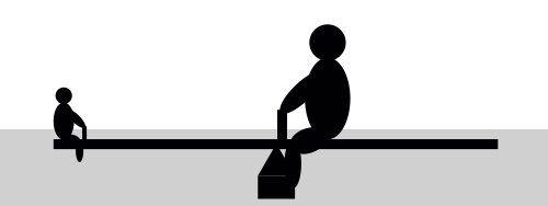
Here, the force of the larger person is reduced by being closer to the fulcrum on which the seesaw balances. I’ll trust you’ve been on a seesaw before or at least watched others play on one and that you have a pretty good sense of what’s going on.
Visual balance is similar. Physical weight is replaced by visual weight. The direction in which the physical weight acts is replaced by visual direction.
As a reminder, below are definitions for visual weight and visual direction, although I’ll refer you back to the fourth post in this series for more details.
- visual weight. This is the perceived weight of a visual element. It’s a measure of how much anything on the page attracts the eye of the viewer.
- visual direction. This is the perceived direction of a visual force. It’s the direction in which we think an element should be moving if it were given a chance to move according to the forces acting on it.
You don’t use instruments to measure the forces. You don’t use formulas to calculate whether everything is in balance. Rather, you use your eye to determine whether a composition is balanced.
Why Visual Balance Is Important
Just as in the physical world, visual balance is a good thing. It’s desirable in and of itself. An unbalanced composition can feel uncomfortable for the viewer. Look back at the second of the three seesaw images — it looks wrong because we can tell that the seesaw shouldn’t be in balance.
Visual weight is a measure of the visual interest of an element or area in a design. When a composition is visually balanced, every part of it holds some interest. The visual interest is balanced, which keeps viewers engaged with the design.
Without visual balance, viewers might not see all areas of the design. They probably won’t spend any time in areas with less visual weight or interest. Any information in those areas could easily go unnoticed.
You would balance a design visually because you want to balance the points of interest in your composition, so that viewers spend time with all of the information you want to convey.
Four Types Of Balance
There’s more than one way to balance a composition. The images in the previous section show two of them. The first image is an example of symmetrical balance, and the second is an example of asymmetrical balance. Two other types of balance are radial and mosaic.
Symmetrical balance occurs when equal weights are on equal sides of a composition, balanced around a fulcrum or axis in the center. Symmetrical balance evokes feelings of formality (it’s sometimes called formal balance) and elegance. A wedding invitation is a good example of a composition that you’d likely want to be symmetrically balanced.
The downside of symmetrical balance is that it’s static and sometimes regarded as boring. Because half of the composition mirrors the other half, at least half of the composition will be rather predictable.
Asymmetrical balance results from unequal visual weight on each side of the composition. One side of the composition might contain a dominant element, which could be balanced by a couple or more lesser focal points on the other side. One visually heavy element on one side might be balanced by a handful of lighter elements on the other.
Asymmetrical balance is more dynamic and interesting. It evokes feelings of modernism, movement, energy and vitality. Asymmetrical balance offers more visual variety, although it can be more difficult to achieve because the relationships between elements are more complex.
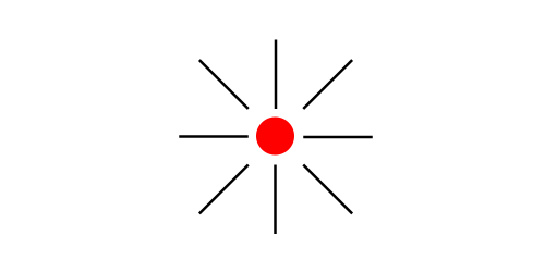
Radial balance occurs when elements radiate from a common center. Rays of sunlight and ripples in a pond after a stone is tossed in are examples of radial balance. Maintaining a focal point (fulcrum) is easy because it’s always the center.
Because everything radiates from a common center, everything also leads to that center, making it a strong point of attraction.
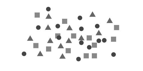
Mosaic balance (or crystallographic balance) results from balanced chaos. Think Jackson Pollack paintings. The composition lacks distinct focal points, and the elements share a uniform emphasis. The lack of hierarchy leads to visual noise at first glance. Somehow, though, it all works together.
Symmetry And Asymmetry
Both symmetry and asymmetry can be used throughout a composition, independent of, yet while contributing to, the final balance. You can have symmetrical forms in an asymmetrically balanced composition and vice versa.
Symmetry is usually seen as beautiful and harmonized; however, it can also be seen as static and dull. Asymmetry tends to be more interesting and dynamic, despite not being regarded as intrinsically beautiful.
Symmetry
There are three primary types of symmetry.
Reflection symmetry (or bilateral symmetry) occurs when everything is mirrored around a central axis. It’s probably the first thing you think of when you hear the word “symmetry.” The axis can be in any direction or orientation, although it’s often vertical or horizontal.
Everything on one side of the axis is mirrored on the other side. Natural forms that grow or move across earth’s surface develop reflection symmetry. A human face and a butterfly are examples.
When the reflection is a perfect mirror image, the symmetry is said to be pure. Much of the time it won’t be perfect and each side will have slight variations. This is near symmetry, and it’s more common than pure symmetry.
The symmetry can even occur over multiple axes at the same time. For example, the left and right half of a composition could mirror each other, while the top and bottom also mirror each other. Snowflakes show reflection symmetry over more than two axes.
Rotational symmetry (or radial symmetry) occurs when everything rotates around a common center. It can occur at any angle or frequency, as long as there’s a common center. Natural forms that grow or move perpendicular to the earth’s surface develop rotational symmetry. The petals of a sunflower are an example. Rotation without reflection can be used to show motion, speed or dynamic action. Think of the spinning wheels of a moving car.
Translational symmetry (or crystallographic symmetry) occurs when elements are repeated over different locations in space. Repeating fence posts are an example. The repetition creates translation symmetry. It can occur in any direction or at any distance, as long as the basic orientation is the same. Natural forms develop translational symmetry through reproduction. You can create rhythm, motion, speed and dynamic action through translation symmetry.

Symmetrical forms are commonly seen as the figure, as opposed to the ground. A symmetrical form will carry more weight than a similarly sized and shaped asymmetrical form.
Symmetrical forms convey balance in and of themselves, but they could appear too stable and too balanced, leading to a lack of interest. Symmetrical forms also lead to passive space because the negative space is equal all around the form.
Asymmetry
Asymmetrical forms lack the balance of symmetrical forms, although you can asymmetrically balance an entire composition. Asymmetry is rather common in natural forms: you’re probably right- or left-handed; fiddler crabs have different sized claws; trees branches grow in different directions; clouds have random shapes.
Asymmetry creates more complex relationships between elements, and so it tends to be more interesting than symmetry. Because it’s more interesting, asymmetry can be used to draw attention.
Space around asymmetrical forms is more active. Unpredictable patterns are created, and overall you have more freedom of expression with asymmetry than with symmetry. The tradeoff is that it’s harder to achieve.
Much in the same way that similarity and contrast work together, you can combine symmetry and asymmetry to good effect. Balance symmetrical forms in an asymmetrical way, or balance asymmetrical forms symmetrically. Break up symmetrical forms with a random mark to add interest. Contrast symmetry and asymmetry in your composition to make elements get more attention.
Gestalt Principles
Throughout this series I’ve tried to point out how many design principles arise from gestalt principles. I also hope that as you’ve followed along you’ve seen how different design principles build on each other.
One of the gestalt principles specifically addresses symmetry and order and certainly applies to compositional balance. It’s hardly the only principle that applies, though.
The simplicity of symmetrical forms is predicted by the Law of Prägnanz. Gestalt principles such as focal points and similarity contribute to visual weight. Principles such as continuation, common fate and parallelism impart visual direction. I also mentioned that symmetrical forms are more likely to be seen as figure rather than ground.
I hope this idea that the principles of gestalt lead to many of the design principles that guide us has become clearer as you’ve read through this series. The design principles we follow didn’t arise out of thin air; they emerged from the psychology of the way we perceive our visual environment.
Examples
It’s time for screenshots. I have a few more websites than usual for this last article in the series, and I’ve grouped them according to the four types of balance.
As I’ve reiterated throughout the series, what follows is my opinion. This is how I see the balance in these designs. You might see it differently, which is fine. Thinking critically about the designs is more important than our agreeing about what we think.
Examples Of Symmetrical Balance
The design of Helen & Hard’s entire website is symmetrically balanced. The screenshot here is from the “About” page, but the other pages of the website are similarly balanced.
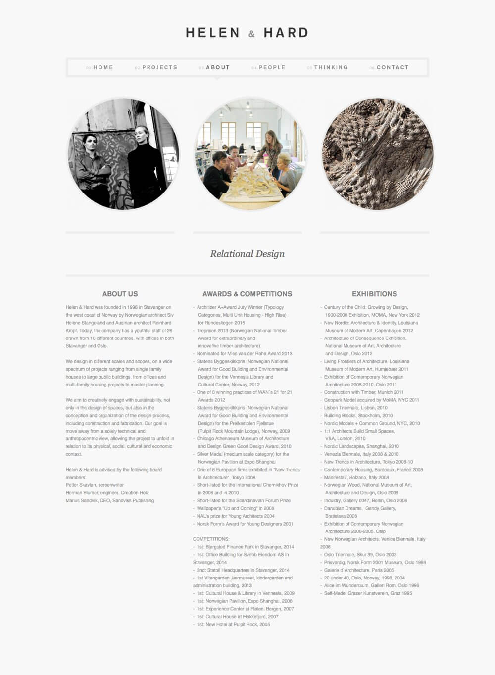
Everything reflects around a vertical axis down the center of the page. The logo is centered, the navigation bar is centered, the circular images are centered, the heading is centered, and the three columns of text are centered.
The balance isn’t perfectly symmetrically. The columns have different amounts of text, for example.
However, notice the top of the page. Both the logo and navigation bar are centered, but they don’t appear to be visually centered. My eye wants the logo to be centered on the ampersand, or at least closer to it. The three menu items on the right side of the navigation bar have more letters than those on the left. My eye wants them to be the same and wants the center to be in between the “About” and “People” links.
I think moving these two elements out of center to make them look like they’re visually centered would balance the composition a little better.
The home page of Tilde is another design that’s symmetrically balanced. Like Helen & Hard, everything here revolves around a vertical axis running down the center of the page: the navigation, the text, the people in the image. It’s the same as you scroll down the page.
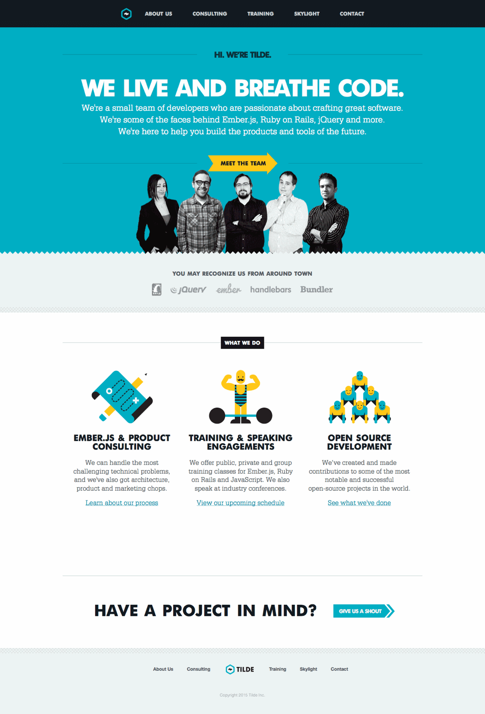
As with Helen & Hard, the symmetry isn’t pure. Centered lines of text aren’t mirror images, for one thing. Also, a couple of elements are off: the “Meet the Team” arrow pointing right and the text at the bottom of the page ending in another arrow pointing right.
Both are calls to action and both break the symmetry, calling extra attention to themselves. Notice how both arrows use colors that contrast with their background, further increasing the attraction of these elements.
Examples Of Asymmetrical Balance
The home page of Carrie Voldengen’s portfolio exhibits an overall asymmetrical balance around a dominant symmetrical form. Looking at the overall composition, I see several discrete shapes.
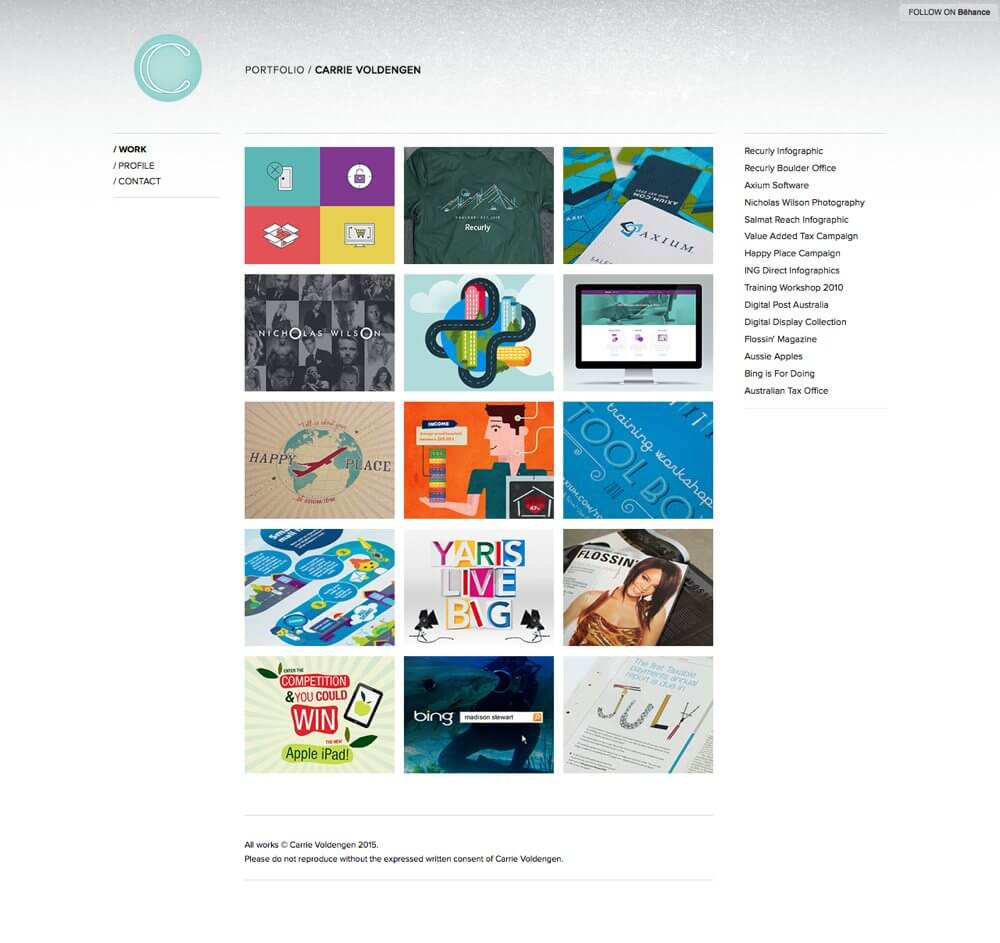
The mass of the page is a large rectangle that’s composed of a grid of smaller rectangular images. On its own, this grid is symmetrical around both the vertical and horizontal axes. It feels very strong and stable. On its own, it’s very balanced and looks like it’s not going anywhere.
To the right, a block of text pulls down on the shape. It’s counterbalanced by text and the circular logo in the upper left. Both provide a relatively equal amount of visual weight acting on the grid in opposite directions.
The distance to an imagined fulcrum is about the same as the weights. The text on the right is larger and darker overall, but the blue circular logo gives more weight to its general area. The circle even connects to the top-left corner of the grid through a single color.
The text below the grid seems to hang from it, and it’s light enough on its own not to throw the composition out of balance.
Notice that the space also feels balanced. The areas down the left, along the top right and down the right, including a bit of the bottom right, all balance each other. The area on the left is larger than the area on the right, but the right has additional space on the top and bottom.
The images at the top of Hirondelle USA’s home page rotate. I grabbed a screenshot of this one specifically to talk about the asymmetrical balance established at the top of the page.
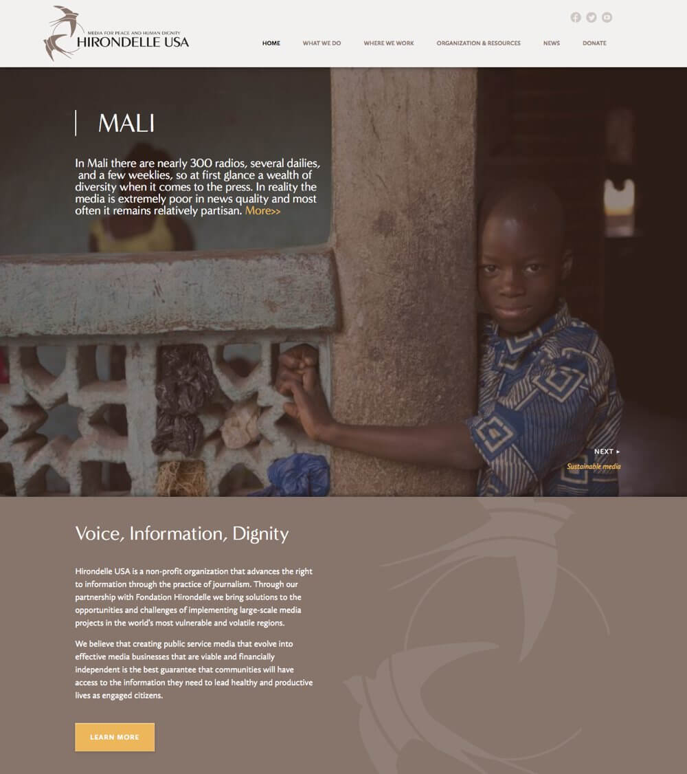
The column in the image is slightly off center, and it anchors the composition with a strong vertical line — it’s an object we know weighs a lot. The railing on the left provides a strong connection with the left edge of the screen. It, too, feels anchored. It’s hard to imagine any design element on the page throwing either out of balance.
The text above the railing feels supported by the railing; however, it’s also visually balanced by the image of the boy on the right. You might view the railing as hanging off the left side of the pole, pulling it out of balance, but I think the intrinsic interest of the boy as well as the darker values in the background behind him counterbalance both the rail and the text on the left and keep things in balance.
There’s a sense of translation symmetry as the gold lines of text repeat in the upper left and lower right of the image, as well as in the button further down the page. The white text is repeated as well.
Examples Of Radial Balance
The home page of Vlog.it exhibits radial balance, which I hope is clear from the screenshot. Other than the shape in the top-right corner, everything revolves around the center of the page, as the three rings of images rotate around the center circle.
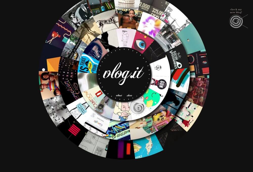
What you can’t see in the screenshot is how the page loads. A line is drawn from the lower-left corner to the center of the page. From that point on, just about everything that appears on the page does so by revolving around the center or radiating from it, like ripples in a pond.
The smaller circle in the upper right adds a little translation symmetry and some asymmetry, increasing visual interest in the composition.
Opera’s Shiny Demos home page isn’t circular, but the text links all seem to emanate from a common or near common center. It’s easy to imagine the whole shape spinning around one of the squares in the middle or maybe one of the corners where four squares meet.
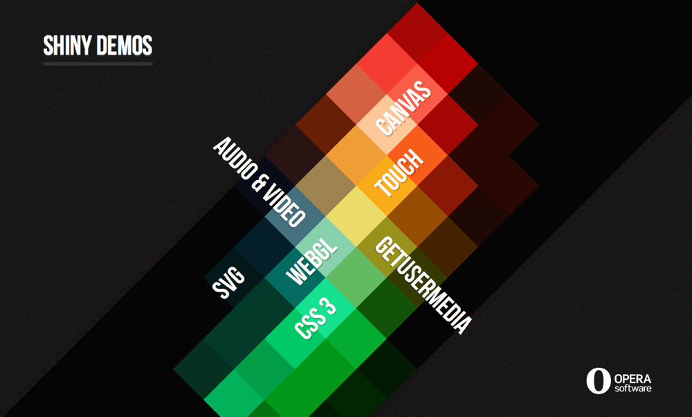
The Shiny Demos heading in the upper left and the Opera logo in the lower right counterbalance each other and also appear to radiate from the same center as the text links.
It’s a good example of how radial balance doesn’t necessarily require the use of circles.
Examples Of Mosaic Balance
You might expect mosaic balance to be the least used online, especially after I offered Jackson Pollack paintings as an example of mosaic balance. Many more examples are online than you might realize.
The home page of Rabbit’s Tale was a good example. There was certainly a random and chaotic feel with the letters strewn about, but the balance in the composition works.
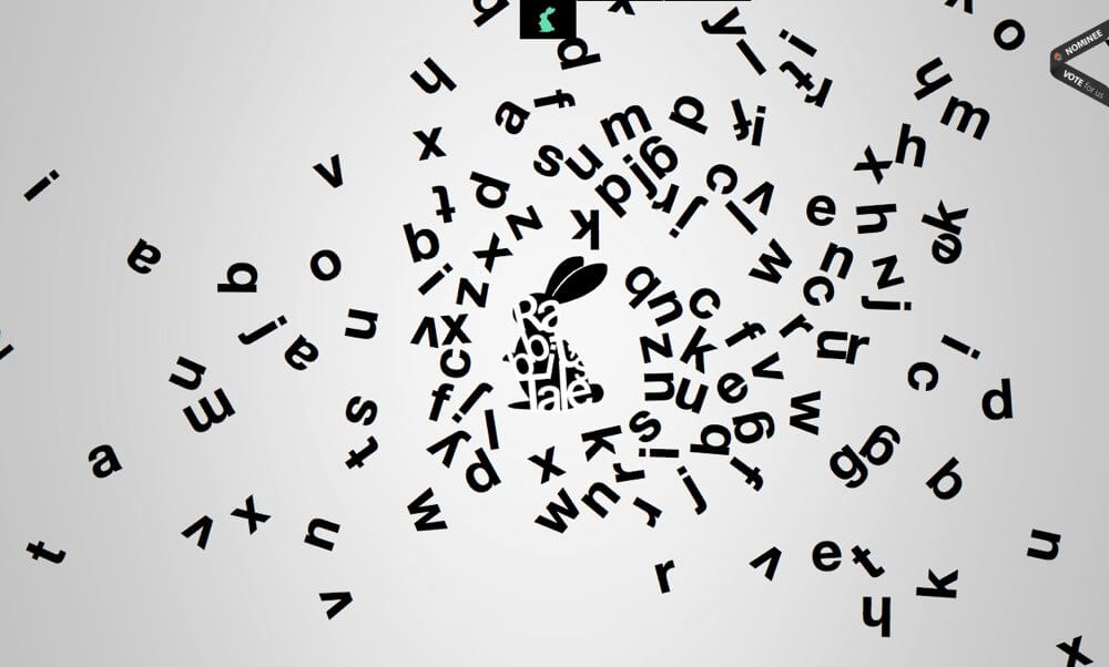
There are close to equal areas of color and space on both sides (right and left) to balance each other. The rabbit in the middle even serves as a fulcrum. It might also stand out a little after you’ve seen it, but overall the elements don’t call attention to themselves individually.
I’m not going to try to figure out which elements counterbalance each other, one element at a time, but hopefully you agree that there’s an overall balance. If anything, the chaos is weightier on the right, but not to the point of throwing off the balance.
Content-heavy websites such as news and magazine websites exhibit mosaic balance as well. You might recognize the home page of The Onion. In the screenshot, I’ve removed the background image behind the top of the page.
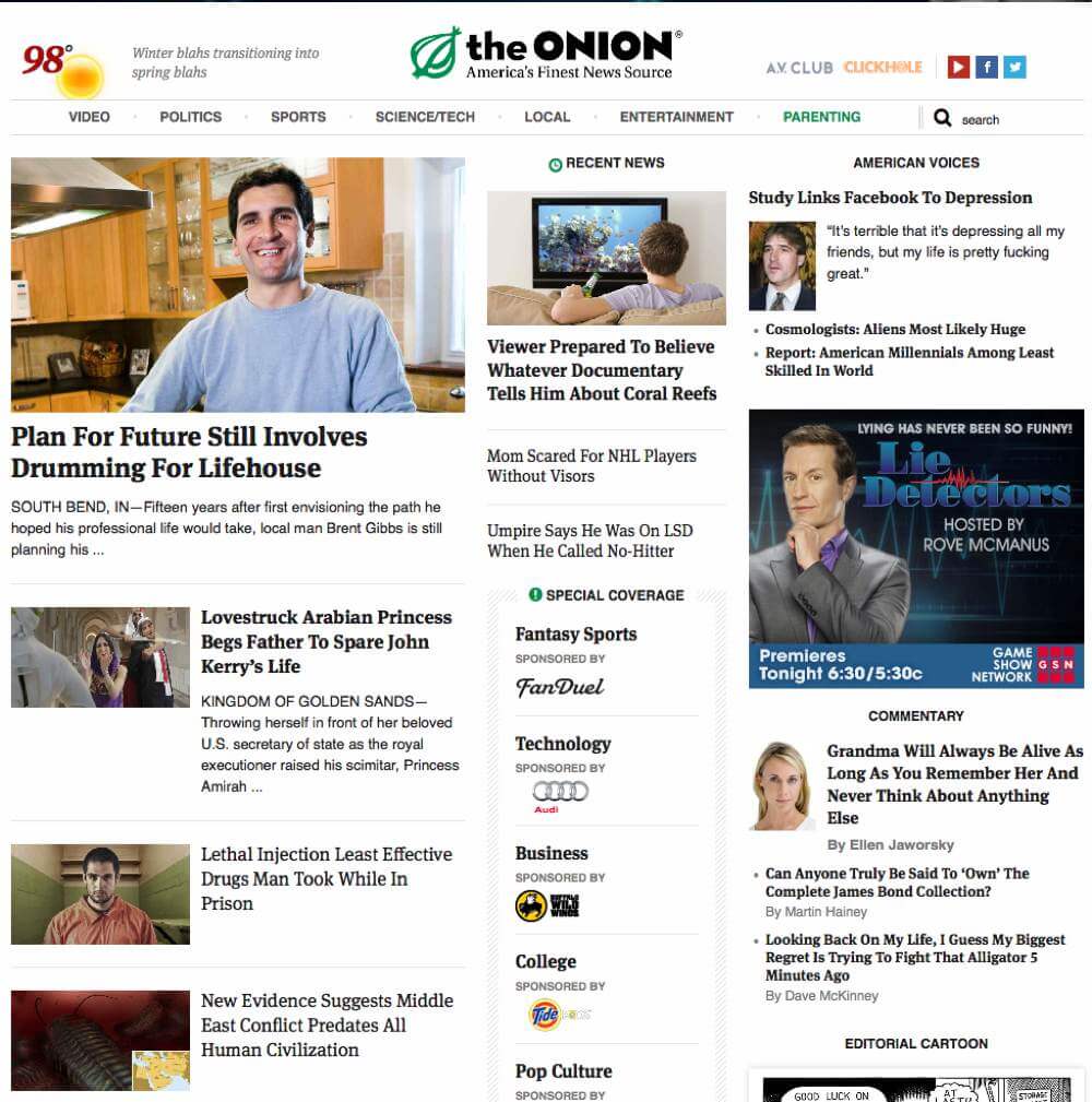
There’s a lot to look at. The layout isn’t symmetrical. The columns aren’t equal in size. It’s hard to identify what counterbalances what. The blocks of content have different amounts of content inside and, consequently, are different sizes. Nothing radiates from a common center.
There’s a bit of chaos and randomness in the different-sized blocks, some denser than others. Because the stories on the website change daily, a different chaos will appear each day. Overall, it works.
Perhaps it’s a stretch to say that it’s a mosaic balance, but again I would argue that it is and that many websites exhibit this sort of chaotic balance, although something tells me that much of the chaos we see online wasn’t planned.
Summary
It’s taken a while to get here, but that concludes our series on design principles. I hope you’ve enjoyed it, learned something new or found the series to be a good review of fundamental design principles.
As you can guess, I think the fundamentals are important. I started this series to show how all of these principles arise out of human perception and gestalt theory. I didn’t make them up. The principles are based on how we all perceive and interpret our visual environment.
For example, one reason we notice focal points is because they contrast with the elements around them. They stand out as different. That’s important when you need to quickly determine friend from foe. That ability was important for our survival as a species, and so our eyes developed to make the determination quickly.
However, design principles aren’t hard and fast rules. They’re guidelines. There’s no one right way to communicate that two elements are similar or different, for example. You don’t need to follow any of these principles, although you should understand them and have a reason for breaking them.
Again, I hope you’ve enjoyed this series, and I hope even more that something in the series has given you more control over the visual communication in your designs.
Additional Resources
- “Is Your Web Design Balanced?,” Steven Bradley
- “A Study of Symmetry: When, Where, and Why to Use It,” James George
- “Visual Balance,” Cheryl Qian
- “Balance — Symmetry,” James T. Saw
- “Understanding the Importance of Balance in Graphic Design,” Mark Masters
- “Photography Rules of Composition: Visual Weight,” Julie Waterhouse
- “Principles of Design: Balance,” Charlotte Jirousek
- “A Fine Balance,” Erik Spiekermann
- “Art and Visual Perception by Rudolph Arnheim: Notes by Frederic F. Leymarie” (PDF) Leymarie’s notes of Arnheim’s book.
- “Map Design”, from Cartography: Thematic Map Design, Borden Dent and Jeff Torguson This book chapter deals with the design principles discussed in this series.
Further Reading
- Rediscovering The Joy Of Design
- Using Friction As A Feature In Machine Learning Algorithms
- Creativity In A World Of Technology: Does It Exist?
- The Principles Of Visual Communication


