Logo Design Theory, Part 1: Symbols, Metaphors And The Power Of Intuition

Email Newsletter
Weekly tips on front-end & UX.
Trusted by 182,000+ folks.

 Celebrating 10 million developers

 Custom Web Forms for Angular, React, & Vue. Your backend.
No designer creates wow work 100% of the time. There’s no question that creating good design takes significant exertion, but generating the wow factor in your work can also be fairly effortless. Many designers follow their intuition during the creative process and incorporate universal symbols and metaphors simply because it “feels right.” Intuition — accessible to all people and most especially useful to those engaged in creative pursuits — guides designers towards solutions that align with a universal knowing.
“There are three responses to a piece of design — yes, no and WOW! Wow is the one to aim for.” – Milton Glaser
Adding a universal quality to a logo provides the broadest communicative reach, what almost all identities are intended to accomplish. The intellectual exercise of connecting the dots of “thinking” is not irrelevant in design, of course — particularly when it comes to branding — but by combining the intuitive immediacy of symbols and metaphors with strategic thinking, you integrate essential information that helps your logo stand out and be remembered.
This three-part series explores fundamental creative strategies for designing effective logos. The first part shows how to use symbols, metaphors and the power of intuition.
Design’s Intuitive Process
“Intuition (is) perception via the unconscious.” – Carl Jung
There will always be those who dismiss the non-quantifiable, but many of history’s most important thinkers have given intuition its due, including Albert Einstein, Buckminster Fuller, Carl Jung, Ray Bradbury and Steve Jobs — even Alan Turing, the infamous WWII logician and cryptanalyst, understood mathematical reasoning to be based in “intuition and ingenuity.” Great thinkers and futurists from all walks regard intuition as having a key role in the problem-solving process. Fortunately for the many designers who rely on wisps of inspiration to help materialize creative solutions, intuition is not some foreign object lodged in our process. It’s as natural as breathing. Intuition is the medium many creatives swim in, while intellect provides a formula to execute and deliver on the finished product.
As a medium, intuition is readily accessible to anyone, although it is best honed with use (try the exercise at the end of this article). As an inherent ability, it doesn’t typically get the same validation as an “educated” intellect. Culturally, we are trained to accept that only through the process of formal education (and a lot of it at significant expense) are we able to arrive at viable solutions. While I’m not here to debase a good education or strong intellectual skills (they are fundamental to anything human beings do or create), I do want to make a compelling case for the useful and reliable qualities of intuition in good design. Balancing the two can help you create a logo that appeals to a wider audience. And that’s important in a globally connected world.
Our worldwide, interconnected technology affords any business, large or small, access to a global audience. On the flipside, this access produces an inordinate amount of background noise that has to be constantly managed. Complicating things further, today’s stressed economy demands smaller budgets with smarter thinking. Experience has taught me that the addition of a sensual experience to a logo — the integration of feeling with thinking — provides an immediate and intuitive connection. This sidesteps the need for the brain to do interpretative somersaults. Or to throw a lot of money at the logo to make it stick via redundancy. Small-budget logos that use this method get a relationship-driven response from their audience that any big-budget client would envy. By engaging the subconscious, symbols and metaphors are an optimal way to reach and hold the audience’s attention longer, and that results in better recall later.
Symbolic communication adds an immersive aspect to design. Symbols came long before written language was invented. Symbols and metaphors both expand information into meaning, but each is distinct in how it works. Symbolic communication is succinct, immediate and tightly packed, while metaphoric communication links specific elements within the design to more precisely define who the client is — sometimes unexpectedly (and even delightfully!) so.
The Symbolic Principle In Logo Design Theory
Describing a symbol with words is like trying to capture a star in a jar, but I’ll do my best here. Symbols are whole and complete entities, while words are made up of fragmentary letterforms. Symbols are processed intuitively and immediately, while a word must be understood first in its particular language, and then be related to a visual (and words expanded into sentences must also be strung together in sequence for meaning). We process the two concepts very differently.
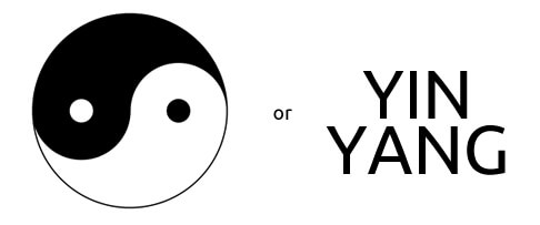
Symbols are immediate, while words must be associated with an image to be understood. The yin yang symbol is instantly understood as two opposites contained within a whole, but words require the additional step of visualizing the symbol before it becomes meaningful.
Symbols reference patterns and imagery common to all human beings. You could describe a symbol as a seed or egg that expands into meaning with the viewer’s participation — in the same way that seeds and eggs expand into new organisms once fertilized by an outside source. Although a tree looks quite different than the seed from which it originally grew, it has the seed’s “container” shape at its core. Human beings have a bellybutton at our center — our essential birthmark — linking us to the circular egg from which we developed.
Circles and spheres tend to manifest as original source: Molecules, cells, eggs, seeds and planets all carry this archaic shape (more on this and other geometric shapes upcoming in “Effective Logo Design, Part 3: How Geometry Influences Logo Design”). Symbols are the archetypes of human communication. The etymology of the word “archetype” is arche-, original, and type, kind, coined by Swiss psychoanalyst and symbolism master, Carl Jung. As original kinds, archetypes — in their pristine state — are limited in number but universal in function and meaning. Archetypal symbols are the foundation of the human systems we invent and the structures we build.
“The soul never thinks without an image.” – Aristotle
Abstract archetypal symbols — such as the shape of a circle — contain knowledge that resides in the collective unconscious (another Jungian term) of all humans. Snakes and apples are examples of more complex symbols that are layered with cultural meaning. The basis of the symbol is existential (for example, a spiral rather than a coiled snake) but it becomes significantly more complex with the addition of cultural context. Because different cultures have varying distinctions, it is important to research the interpretation of your chosen symbol to ensure it supports the meaning you want to convey within the culture(s) in which it will be used.
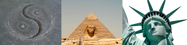
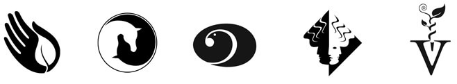
Examples of symbolic integration in human systems and structures include the yin yang symbol where opposites complete the whole, the stable base of the pyramid that points to the unknowable and infinite universe, and the sacred number seven incorporated into Lady Liberty’s feminine principles of abundance and inclusion. The seven-sided heptagon is the only polygon of the first ten geometric shapes that cannot be precisely created with geometry tools, setting it apart.
Symbolic Versus Letterform Logos
Symbols are perceived sensuously and unconsciously (and, therefore, immediately) while words are actively thought about before the subject makes the connection to an image of a thing or idea. Symbols remove the thinking step by being directly perceived, one of the reasons why symbolic logos are more effective than wordmarks. Symbols also communicate universally, while wordmarks are constrained by the limits of language. However, words and symbols can be effectively used together to expand meaning and impact.
Symbol Use In A Logo Design
Symbolism was the primary communication tool for a logo I designed in the mid-’80s for an Arabian horse farm. In the first exploratory sketch, I focused on the relationship between mare and stallion, the intimacy of which was implied by touching faces. The second sketch shows this concept progressed into the relationship between mare and foal, with the foal protected under the mare’s shoulder.
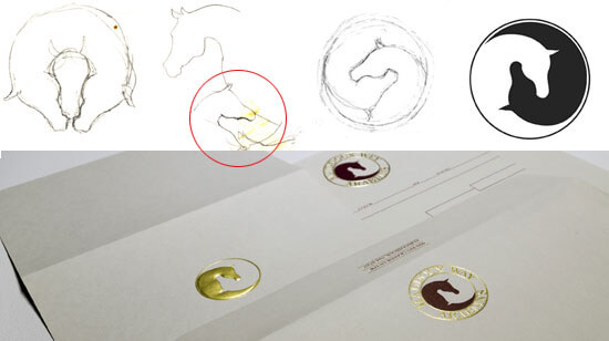
The original sketches for Maddoux-Wey Arabian Horse Farm show the process for the final design. Symbolism condenses and simplifies a logo’s communication and provides universal relevance. The visual simplicity of a symbol also supports the flexibility that a logo needs in order to work in multiple future applications.
I scrapped my first attempt as unworkable, but had I not gone through that first step, I don’t know that I would have recognized the opportunity to rotate the design 180° in the second sketch. (Future opportunities are an important reason to preserve and refer back to your process.)
Because of the Arabian’s delicate bone structure, I was able to create a perfect fit between face and shoulder. This relationship was further emphasized when I enclosed the design in a circle, creating a symbolic yin yang effect (which references my first sketch of the opposites contained within the whole in the mare and stallion relationship).
The simplicity of this logo categorizes it more closely as a symbol, or a universally recognized image that expands into a personal relationship with the viewer. Another benefit of the symbolic logo is its inherent timelessness, remaining relatively unaffected as styles change. The simplicity of a symbolic design has clearly defined negative and positive space, making for broad flexibility, which is essential for many future applications. Symbols are optimal choices for long-term branding, and they help a logo retain its relevance (and, therefore, value) over the long haul.
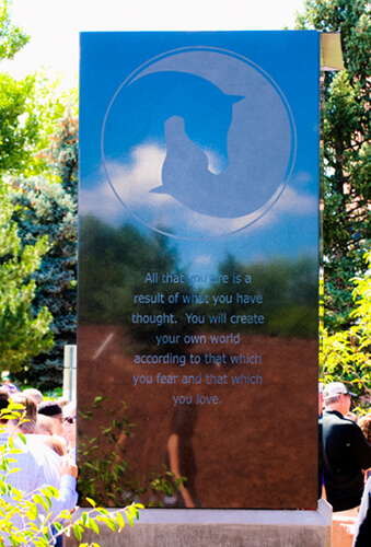
The Arabian logo has been printed, foil and blind embossed, used as jewelry design, applied to signage and, most recently, engraved on a granite memorial to commemorate the life of Claire Davis, an equestrian teen killed in a tragic high-school shooting in 2013.
Using Metaphors In Logo Design
Metaphoric logos expand information just like symbolic ones do, but they go one step further by making connections between distinct concepts. This helps to further distinguish specifics about the client and adds interest to the design by creating relationships that are unexpected or unusual. They are memorable because they contain the aha! component.
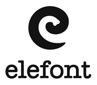
One example is the Elefont logo, where every possible opportunity was taken to create a simple but powerful logo that grabs your attention on multiple levels: symbolic, metaphoric and semantic.
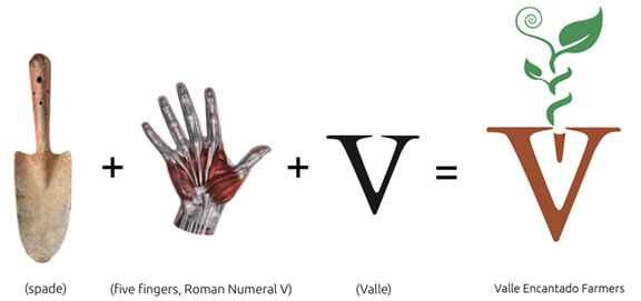
Valle Encantado is a farming and traditional craft-making partnership in the South Valley of Albuquerque, New Mexico. There were several opportunities to create metaphoric links between the client’s name and purpose in their logo. The primary one was to use the “V” letterform as a reinforcement of the name and to reference farming in the character’s negative space. Activating both filled and empty space (a principle of the “closure gestalt”) maximizes the logo’s communication.
The “V” also represents the Roman numeral five, one of those happy accidents you want to look for to leverage a logo’s communication. This helps connect the design to the hands-on work of farming and community endeavors. In branding the organization, the logo was further reinforced with the slogan “Cultivating Community” to tie it together. (The spiral and helix also played an important role in this logo’s communication, and a discussion of how they were used is coming up in “Effective Logo Design, Part 2: Using Nature’s Patterns In Logo Design”).
Metaphoric logos can be tricky to create, but if you really delve into your client’s purpose and name and the potential ways in which they can be visually related and expanded upon, multiple aspects can be resolved into one coherent, tightly packed concept. I’ve used this method to create distinct and recognizable logos for over 30 years because it works for my clients and works for me: Logos designed decades ago continue to bring new clients (and many have been plagiarized and settled out of court — protecting your original work is also important). Logos that communicate simply and deeply benefit everyone: the client, the audience and the designer who created them.
Some Final Thoughts On Creating A Good Logo
Use Symbols And/Or Metaphors As The Core Communication Of Your Logo
Symbols and metaphors help establish a relationship between the client and logo, and logo and audience. If you design a wordmark, augment its communication with a relevant visual component. Secondary design considerations — color combinations, stylistic textures or typographical applications — might need updating over time, but if the logo is symbolic at its essence, secondary revisions can be made to the logo without negatively affecting the brand. Symbols help the brand hold up as styles and trends change.
Archive And Refer Back To Your Conceptual Process
I have often referred back to sketches later in the design process and discovered something I hadn’t seen previously. Sometimes different thought tracks can be merged to create a more sophisticated or complete concept. Concepts you scrapped for one client might work for a future client. Respect your creative process and save it for later review. Train yourself to be a conduit between the past and future to maximize your creativity.
Design In Black And White
On the practical side, if your logo works in black and white, it will work in any future medium or application — from full color to blind emboss. From a symbolic perspective, the more simply you define the meaningfulness of your logo between the negative and positive space, the more distinct and defined the symbolism of your concept will tend to be. Whenever possible, optimize the communication of your logo by utilizing the empty space as well as the filled (the closure or completion gestalt, which leads the eye without completed lines or forms).
Make Sure The Logo Scales
Create your logo as a vector so that it has the flexibility to scale without issue. Because logos are the core component of an identity system, they have to be ready for any extreme. Logos need to scale from minuscule sizes on a website all the way up to a gigantic billboard and still retain legibility. If it doesn’t hold up at small sizes, remove superfluous information. If anything is lost, make sure it isn’t critical to the communication of the design. If it looks bulky or awkward at large sizes, review how you might alter the drawing of the logo for better flow and form.
Balance The logo
Look at your logo upside down, reflected and rotated. Optimally, it should appear balanced in any configuration. This process reveals imperfections that aren’t noticeable when the logo is right-reading, and it might help you discover ways to extend the logo into branding applications, such as a repeating background pattern.
Detect Subtlety
Your job as a designer is to find solutions no one else can. Develop your instincts for subtle communication on all levels: visual, symbolic, metaphoric, word play and intuition. The following exercise will help with that.
Exercise: Intuition And Synchronistic Design
Problems aren’t negative occurrences. They’re opportunities to flex your creativity and problem-solving skills and to connect with the deepest parts of yourself. This exercise will bring more awareness to how you source information through and beyond yourself to come up with a solution that has the most possibility. The most important part of this exercise is to pay attention to how the inside relates to the outside.
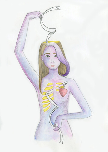
This drawing by student Evaluz Luna shows her quandary of connecting head with heart in design. The top of the head and ribcage were cut out by hand and the ribbon threaded through, creating a dimensional work that further enhances her intention of connecting the subconscious aspect of creativity to real-world design practice.
- Think of a design problem you’re working on or a personal issue.
- Sketch an image that helps to represent the problem for you. (This is not about drawing skill!) Whether your sketch is abstract or realistic, it should have a relationship with the problem that is meaningful to you.
- Tell yourself that you want help in finding a resolution or relationship with this issue or project and that you are open to any ideas that might lead to a viable solution.
- Over the next few days, be conscious of what is around you, what comes up in dreams or what happens in other situations when you are not actively thinking about the issue (in the shower, for example). External manifestations will arise spontaneously if you take care to notice them. In particular, pay attention to anything that comes up more than once, even if it doesn’t seem to be related to the problem at hand.
- If a common image, number or other instance of a tangible “thing” recurs in separate and unrelated events, delve into what the relationship is between it and your issue. Consider your emotions as you explore (they give clues, too). Are you anxious? Comforted? What is the relationship between the problem, you and the recurring event or object? Is the relationship related to a past experience?
- Understand that sometimes an unrelated issue blocks resolution to the current problem. It is particularly important that you respect whatever your subconscious reveals and try to interpret the relationship to the current problem as honestly as you can.
Conclusion
Logo design is a challenging yet satisfying balancing act. Good logos are smart but not condescending. They’re accessible and simple but have enough depth to be interesting. They’re immediate and intuitive but memorable when out of sight. And they’re both timely and timeless.
Designing a good logo is the utmost in creative problem-solving. The process makes you really think succinctly about how relationships work. The practice of logo design develops your skills of intuition to recognize obscure but effective solutions and teaches you to discover connections that aren’t apparent on the surface. These are basic tenets for any problem-solving endeavor — not just logo design — and these methods can be extended into personal issues as well. As nature artist Andy Goldsworthy says, “Everything has the energy of its making inside it.” As I tell my students, learn to design a good logo and you’ll learn to design a good life.
Coming up next: “Effective Logo Design, Part 2: Using Nature’s Patterns In Logo Design.” Our life experience is fundamentally based in nature. We often forget this as we develop and grow through our pervasive human-made systems, but nature is the ubiquitous experience of us all. Because human beings are natural life forms at our essence — not machines and not technology — nature is an inherent part of our creative process. By leveraging the forms and processes of natural patterns in logo design, you enhance the communication of your logo by enhancing its connection to our inherent source.
Further Reading
- Effective Logo Design, Part 2: Using Nature’s Patterns In Logo Design
- Effective Logo Design, Part 3: How Geometry Influences Logo Design
- How To Get A Logo Accepted: 8 Steps To A Better Design Workflow
- Logo Design For Responsive Websites


