Responsive Upscaling: Large-Screen E-Commerce Design

Email Newsletter
Weekly tips on front-end & UX.
Trusted by 182,000+ folks.
 Register for Free


 Celebrating 10 million developers
 Custom Web Forms for Angular, React, & Vue. Your backend.
The responsive design revolution is truly upon us (if it hasn’t already happened!), and even though e-commerce websites haven’t picked up responsive design quite as aggressively as in other industries, it’s becoming increasingly popular.
So far, most of the responsive design thinking has revolved around covering the range of experiences from mobile to desktop. Yet little attention has been paid to the opportunities for expanding that range beyond the standard desktop screen, to create an experience optimized for modern large-scale displays. Consider this:
- Only 18% of the 50 leading US e-commerce websites that we benchmarked earlier this year optimize their design for large monitors (yet 94% of those websites have a design optimized for mobile devices).
- Approximately three-quarters of e-commerce sales still happen on PCs, not mobile devices (see here, here and here).
- About one third of those users visit on screens wider than 1350 pixels (see here, here and here). (Note: There is, of course, a difference between screen and browser width — the actual number of users with a browser this wide will be lower. We recommend that you track browser sizes in your web statistics for the most accurate picture of how significant this segment is on your website.)
Based on these statistics, crafting an optimized experience for users with large screens should seem well worth the effort. In fact, designing for big screens might turn out to be the next frontier of responsive e-commerce design.
In this article, we’ll explore how e-commerce designers could use responsive upscaling to craft a tailored experience for users with big screens. We’ll cover one core principle, along with 11 ideas for upscaling different parts of the e-commerce experience to deal with the various usability challenges observed during our e-commerce usability studies. This article was originally published by the Baymard Institute.
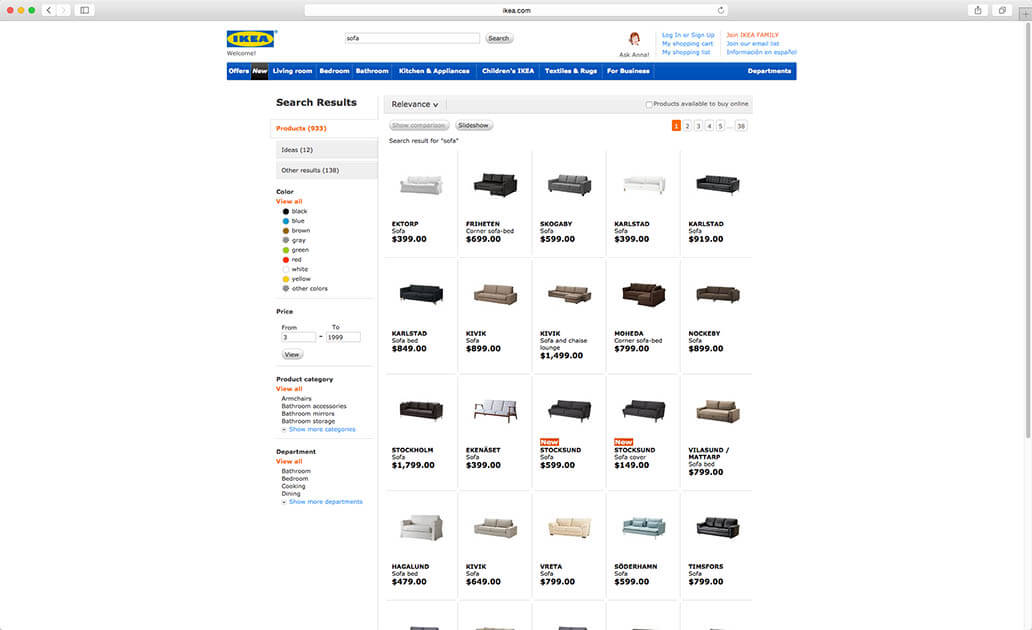
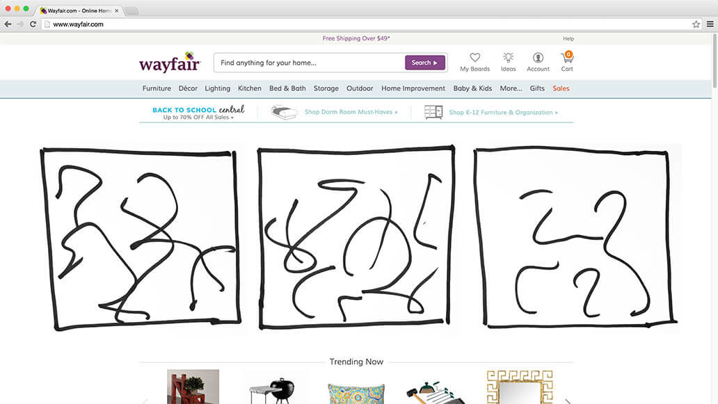
Notice all of the white space surrounding IKEA’s rather crammed search results page. During our e-commerce product list study, it became clear that in aesthetically driven product verticals, such as home decor, users need large thumbnails to accurately evaluate products. Utilizing the extra screen space to provide that is one of many “responsive upscaling” ideas for e-commerce websites to consider.
The extra screen real estate afforded by large screens is typically left unused as vast seas of white, while the actual page content is crammed into a tight design optimized to fit a laptop screen. At a very minimum, content could be given a little more breathing room, with some additional white space between elements on large-sized monitors.
Yet “responsive upscaling” can be taken much further, to provide a superior experience for users on large monitors by using the extra space to provide larger images, additional product columns, better page context and easier access to relevant website actions (filtering and sorting, “Add to Cart” buttons, etc.).
Core Principle Of Responsive Upscaling: Same Content, Different Packaging
There are fundamentally two ways to utilize the extra space: insert additional content on the page (i.e. content that’s only available at the large-scale resolutions), and present existing page content in a different way (i.e. reposition elements, change their layout, scale up, etc.).
You’ll notice that all of the examples in this article illustrate how existing page content can be presented differently (sometimes dramatically so). This is because inserting entirely new page content that’s available only at the large-scale resolutions generally isn’t a good idea. There are exceptions, of course, but generally speaking, if content isn’t important enough to show in the “regular” desktop view, then it most likely isn’t important enough to be shown on bigger screens either.
A bigger screen doesn’t mean that the user suddenly wants a cramped layout which is difficult to scan, nor does a smaller screen mean that the user would never request any kind of information that they’ve seen on the site before. Therefore, show the same content, but “package” it differently so that it is optimized for the screen it is being displayed on.
Unimportant content should never be added to the page just because there’s room for it on the page. Likewise, important content should never be left out just because screen real estate is limited (see our test findings in “How Should Your Mobile and Desktop Sites Differ?,” which documents this principle). The only time new page content should be inserted at large-scale resolutions is when that content somehow makes sense only on larger displays but not on regular screens.
So, as a general rule, a warning bell should ring when new page content is being added at large-scale resolutions. A few times it will be justified, but most often the content either will be too unimportant to show at regular screens sizes and therefore ought to be excluded from the large-scale versions too or will be actually important and therefore should be included on the page regardless of screen size. Obviously, important content might need to be presented very differently depending on the available space, but it should be available in some shape or form in all versions of the design.
Ideas For Responsive Upscaling On An E-Commerce Website
Keeping with this principle of avoiding new content and instead presenting existing content differently, let’s look at some of the many ways responsive upscaling might work on an e-commerce website.
All of the following examples have been illustrated by layering drawings onto screenshots of Wayfair.com. Now, Wayfair’s desktop design currently isn’t responsive at all (i.e. the page doesn’t scale and the layout doesn’t rearrange based on browser size), neither “up” nor “down” — the page’s width stays fixed regardless of the user’s viewport. It is, therefore, a good case for illustrating how the different types of pages on an e-commerce website could be optimized for users with large screens.
In a real implementation of these examples, other page elements would likely realign and possibly scale, too (especially page elements such as the header and footer), but for the purpose of these basic illustrations, the elements are simply shifted around a little. The examples should be seen as inspiration, and some will obviously be more appropriate to you than others, depending on your website’s product verticals and objectives.
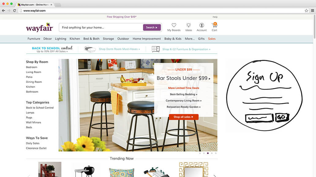
Inlining Sign-Up Overlay
Sign-up overlays can be made less obtrusive on large screens by ditching the overlay and instead permanently placing the dialog alongside other “above-the-fold” content. This will make the sign-up dialog less intrusive because it won’t block out the whole page, yet it will still keep the dialog highly visible because it will still be shown immediately upon page load (because it’s placed above the fold).
Now, users uninterested in the sign-up will obviously find this dialog easier to ignore because they won’t have to actively dismiss it anymore. However, during our usability studies, most of the test subjects simply closed traditional overlay dialogs without ever reading their content, often referring to these overlays as “popups” (see “Avoid These 5 Types of E-Commerce Graphics”). It’s a kind of overlay blindness. Those users might actually be more likely to read the sign-up dialog when it is placed inline above the page fold instead, because on seeing the element, they won’t spend all of their attention trying to find a way to dismiss it.
Header And Footer Shortcuts
The most popular links from the header (for example, account and ordering links for signed-in users) and footer (customer service and FAQ links) could be displayed in a box on the home page when there’s room for them. Obviously, the links should still be accessible in their original positions within the header menus and footer sections. On large screens, these shortcuts would simply also be available directly on the home page.
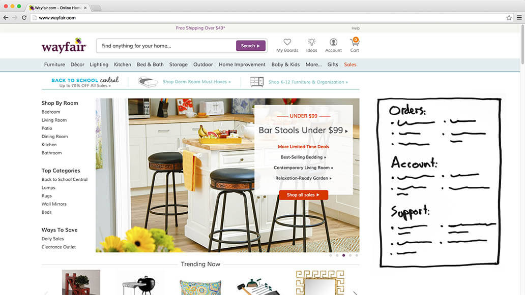
This is a good example of content remaining available on the page but being displayed differently. It’s not new content, but rather existing content being displayed differently, to optimize the experience for users on large screens. In this particular case, the color of the link shortcuts box should probably be lightly faded to make it appear secondary to other content.
Inlining Carousel Slides
Home page carousels are fraught with usability issues and must be implemented very carefully to work at all (see the eight carousel requirements observed in our test studies). On larger screens, the carousel could, of course, simply scale up, making the shown slide all that much bigger. However, if the slides are square or even just reasonably tall, then scaling up the carousel slide could actually end up pushing the rest of the page’s content outside of the viewport on large monitors — decreasing the home page overview despite the increased viewport! A solution to this is turning the carousel slide into a multi-column view, with two or three slides being shown at once.
If the total number of slides matches the number of columns, then the problematic interactive features of the carousel could even be hidden away in favor of a static multi-column layout of the slides. If there are more slides than columns, then they will, of course, still need slide rotation features or a grid representation with rows.
Inlining Filled Cart
Most e-commerce vendors hope for one of two actions to follow when a user adds an item to their cart: The user goes looking for more items to add to their cart, or they buy the item in their cart. Continuing to browse for other products is obviously great for revenue, but it also means that buyer’s remorse is more likely to set in — especially if the user has a hard time navigating the website while searching for additional products.
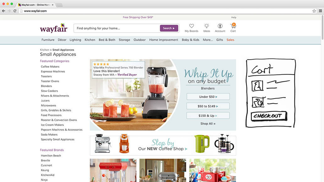
By inlining the regular drop-down cart (available from the page header), the vendor gives the user an overview of the items already in their cart — reminding them of the great products they have already found (which, of course, they should most definitely purchase before leaving!). This gives the user easy access to the checkout process and thus helps to close the sale.
Furthermore, during our study of home page and category navigation, users were frequently observed to reopen their cart simply to glance at the names of previously added items. For instance, they might reopen the cart to see the model name of the camera they just added in order to find a matching camera case. Permanently displaying the cart will make it easier for users to find matching items, because it enables direct comparison between the product list currently being browsed and the items in the cart.
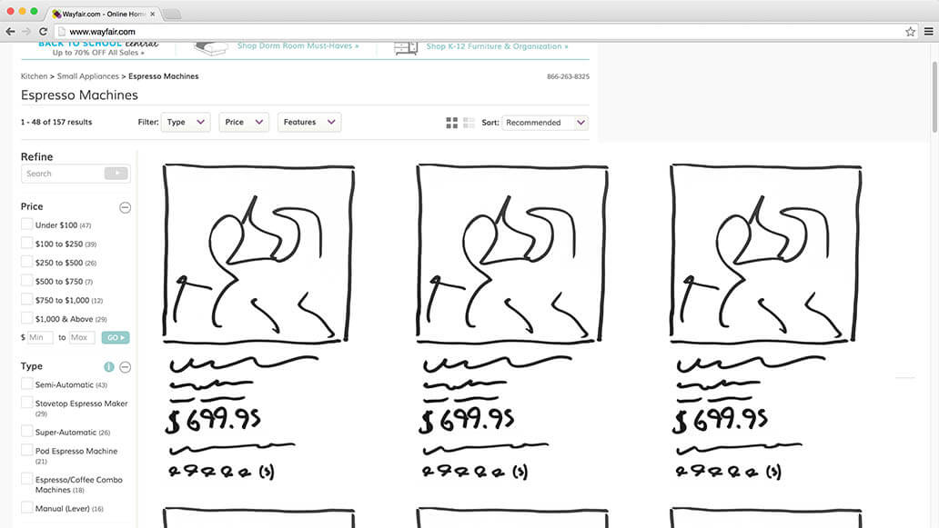
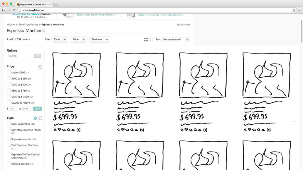
Additional Product Columns
One of the most obvious ways of utilizing the extra screen real estate in grid-based product lists is to rearrange the products so that they appear across additional columns. This can greatly increase the number of products visible on the screen. In the example above, the user goes from being able to see six products in their viewport to seeing ten.
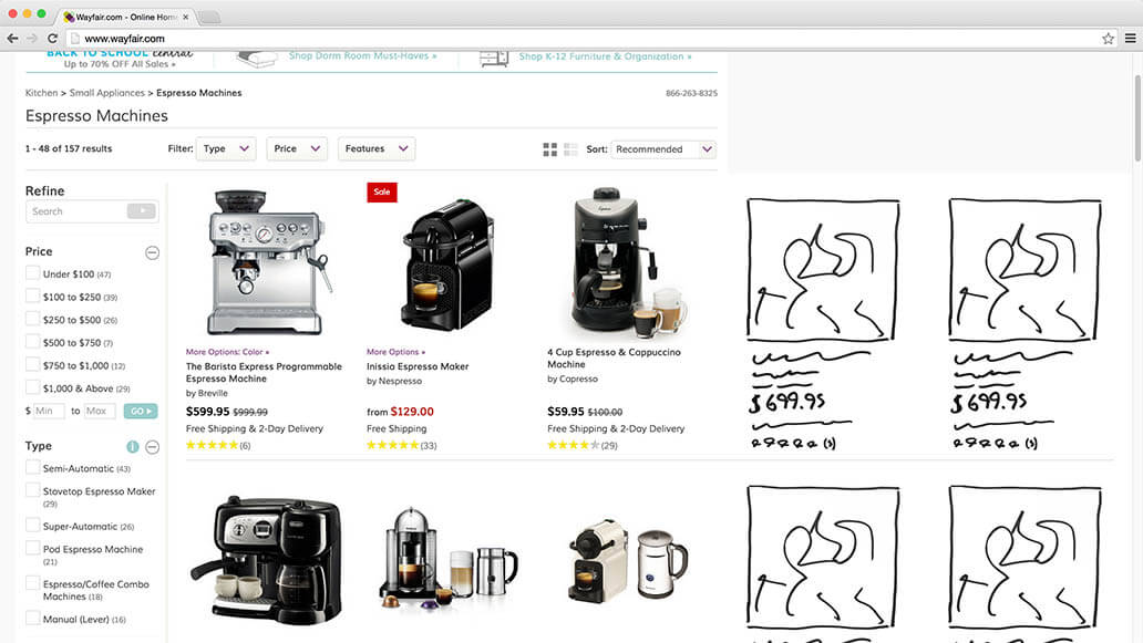
This approach can significantly optimize the product list view on large screens, but do it with care. If the number of product columns is excessive, then the grid will ultimately become more difficult to scan because users will drown in information and their eyes will have trouble travelling from one line to the next (there’s a reason text has an optimal line length).
Therefore, restrict your products to five to eight columns (depending on size of list items and product vertical) to keep users from getting lost in a sea of information.
Larger Product List Images
The other obvious way to take advantage of extra viewport space in product lists is to scale up each list item to fit the user’s screen. For example, you could significantly increase the size of product thumbnails, allowing users to inspect the aesthetics of each product in much greater detail. This has palpable benefits in visually driven product verticals because it maximizes the amount of visual information conveyed, making it much easier for users to identify products to their liking.
However, discretion is once again advised, because simply scaling up images will often result in a vast increase in list item height (assuming that aspect ratios are maintained), which can actually greatly reduce the number of products on screen. Notice in the illustration above how the second row of columns has been pushed almost entirely out of view.
The tradeoff when scaling images up in product lists, therefore, is an increase in the level of visual detail available about each product, at the cost of limiting the user’s overview of available products due to the lower number of products that can fit in the viewport.
Scaling And Rearranging Product Lists
By combining the two previous approaches as the user’s screen widens — that is, by both adding columns and increasing the size of each list item — we get the best of both worlds. Visual information about each product is increased, yet the overview is maintained because the product grid rearranges to show an additional column whenever the list items reach a height threshold.
This way, list items can grow to show additional visual information about each product, without ever growing so tall as to compromise the total number of products that fit on the screen. Indeed, because of the additional columns, the number of products in the viewport will increase. Thus, both the total number of shown products and their individual resolution improves.
Sticky Filters
Another way to utilize extra screen space is to permanently attach filtering and sorting tools to the user’s viewport via a “sticky” element. This will give the user additional context about the products they’re currently viewing and easy access to manipulate the criteria for the product list.
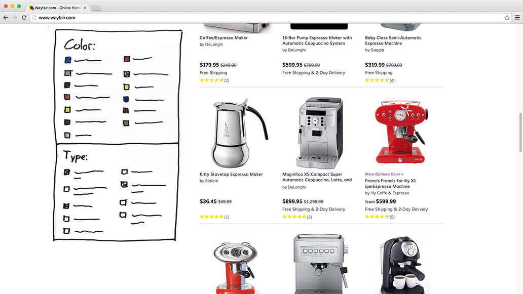
Fixed content effectively makes the space available for the main content smaller. Therefore, whenever fixing content to the edges of the viewport, do so only on a screen axis that has enough space to keep the fixed content from consuming too much room across that axis. For instance, don’t fix content to the top or bottom of the screen without applying a viewport height rule (for example, a height-based @media query) that checks that sufficient space is available.
However, with appropriate checks in place, the sticky filtering sidebar could even be rearranged to occupy multiple columns, with the tools distributed across two or three columns. If the filtering toolbar is horizontal, you could attach it to the top of the screen if the viewport is sufficiently high, or if the horizontal space is plentiful, you could reposition it into a sidebar upon scroll. Browser height can similarly be used to dynamically adjust truncation thresholds for filtering values, increasing the number of filtering values displayed before truncation sets in as the screen height goes up.
Recently Viewed Items
During testing, when the subjects landed on a product page and decided the product wasn’t for them after all, they would either continue browsing or leave the website. Making it easy for the user to do the former is obviously in the vendor’s interests. By displaying suggestions for alternative and supplementary products or a list of recently viewed items in the sidebar above the page fold, you instantly show users an escape route should they decide that the product they’re currently looking at isn’t for them.
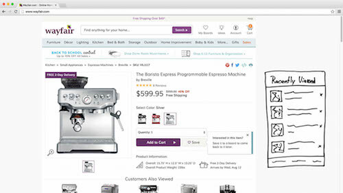
Making it easy for users to navigate from one product to the next can be essential to their product-finding abilities. Of course, product categories could similarly be promoted, although be mindful of the user flow — is the user being sent back and forth between product lists and product pages, or can they go from one product to the next?
Sometimes the former is attractive because it gives the user a more coherent overview of the website’s offerings, but obviously the back-and-forth flow also introduces a lot more friction. Therefore, make sure the paths you suggest in promoted elements strike a sensible balance between category and product page destinations.
Sticky Product Page Summary
Product pages can be long. They can contain images, descriptions, specifications, customer reviews, suggestions for alternative and supplementary products, FAQs, etc.
All of our usability studies have shown that more information is almost always better (so long as the content is of good quality — that is, useful, trustworthy and reasonably accurate). Yet it also means that the user can sometimes end up very far away from the core context of the product (i.e. the name, price, any possible variations and the “Buy” button). To provide a permanent context and always keep the “Buy” button within reach, put a sticky product summary in the extra space on large screens, attaching it to the edge of the viewport as the user scrolls down the page.
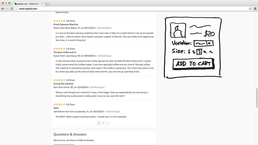
This sticky product summary can basically be a slightly modified version of the product’s list item design; or, if it’s attached to the horizontal axis of the user’s screen, it can take on a more slender aesthetic. Either way, the intent is to give the user a permanent product context, enabling them to see the name, price and any variations, even if they’re deep down in customer reviews. And, of course, always keep that “Add to Cart” button within easy reach when the user is reading that rave review from a happy customer.
Sticky Order Summary And Customer Support
During checkout, plenty of horizontal space will be unused because the pages tend to be very focused and because multi-column forms can cause major usability issues during checkout. On large screens, this vast sea of white space can be appropriated by an order summary and customer support details. The order summary would be a constant element throughout the checkout experience and serve as a constant reminder of the products the user is only moments away from owning.
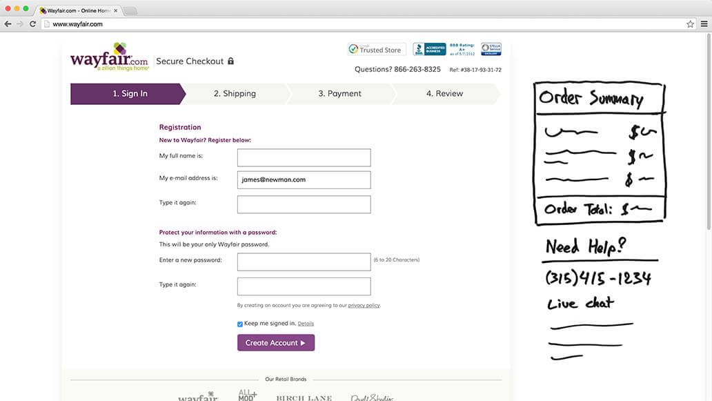
Meanwhile, customer support features can be moved up from their common footer position to make them readily available should the user run into trouble during the checkout process. If you’re worried about being overrun in customer support, then you can more selectively promote details based on the cart’s order value and how far into the checkout process the user is and whether they have run into validation errors.
Responsive Upscaling For E-Commerce
It’s striking how few e-commerce vendors currently optimize their website’s design for large screens. Even the 18% of leading e-commerce vendors that do offer an optimized large-screen experience have really only taken the first small steps in that direction. Given the large segment of users with big screens, responsive upscaling is an area ripe with potential.
When implementing responsive upscaling, keep in mind the core principle of “same content, different packaging.” Either a piece of content will be important to all users, or it won’t be important enough to bother users on large monitors with either; just because a user has more space on their screen doesn’t mean they want a barrage of low-quality content. Instead, explore ways to present existing page content differently in order to create a better experience for users with big screens.
The 11 ideas covered in this article are all based on this principle of same content, different packaging — taking existing page content and scaling or repositioning it, sometimes significantly, other times subtly:
- inlining sign-up overlay
- header and footer shortcuts
- inlining carousel slides
- inlining filled cart
- additional product columns
- larger product list images
- scaling and rearranging product lists
- sticky filters
- recently viewed items
- sticky product page summary
- sticky order summary and customer support
Do you have other ideas for optimizing e-commerce websites for larger monitors? Share them in the comments section. It’s time to optimize the e-commerce experience for big-screen users, too.
Further Reading
- Fundamental Guidelines Of E-Commerce Checkout Design
- The Current State Of E-Commerce Filtering
- UI Patterns For Mobile Apps: Search, Sort And Filter
- Reducing Abandoned Shopping Carts In E-Commerce
- A Little Journey Through (Small And Big) E-Commerce Websites
 (vf, al, ml, mrn)

