Creating Cel Animations With SVG

Email Newsletter
Weekly tips on front-end & UX.
Trusted by 182,000+ folks.


 Celebrating 10 million developers
 Custom Web Forms for Angular, React, & Vue. Your backend.

What if I told you there was an image format like GIF, but it worked with vectors? What if I said it was possible to reverse the direction of its animation? What if you could take one base image and animate different parts of it separately, at different speeds? Well, the image format, SVG, already exists. It just needs a little gentle encouragement.
Animations, Old-School-Style
I’m not an animation expert, but I know what I like: things that move around. This is just as well, because I design for the web and web animation is in its ascendancy. In fact, the support for animation technology is so strong now that we’ve had the luxury to shift our focus onto what the purpose and the meaning of our animations might be.
Expressive and flexible though the CSS animation spec is, there is one thing that it isn’t terribly good at. Since the mode of animation I’m referring to has had a primacy since long before I was born, this is a bit disappointing.
An Enduring Charm
“Do everything by hand, even when using the computer.”
— Hayao Miyazaki
Hayao Miyazaki’s Studio Ghibli, which has produced a slew of wonderful features including Spirited Away, Howl’s Moving Castle and Princess Mononoke, is loyal to the traditional animation technique of hand-drawing individual animation “cels”. Unlike CGI or the keyframe animations we’re used to using with CSS, these animations are inherently time-consuming. Miyazaki is famous for cooking vats of ramen for his animators as they work late into the night, for countless nights in succession.
But their commitment to this way of working isn’t a mere fetishization of the past. The reason paintings have an enduring appeal after the advent of the camera is that you see life in the brush strokes: the deliberation of the artist is intrinsic and evident. The same applies to animation. Where each frame is drawn by the artist rather than being merely the artifact of a plotting vector, the product is inevitably richer. There is a tacit realism, superior to technical accuracy, when every frame is informed by observation and created by hand.
An Unpleasant SMIL
It would be untrue to say the ability to create cel-based animations is entirely absent from the web. The clunkily named synchronized multimedia integration language (SMIL) can do just that. In fact, Jonathan Ingram has a nice tutorial on using SMIL to create a cel-based, looped animation of a Mortal Kombat character.
<animate
  id="frame2"
  attributeName="display"
  values="none;inline;none;none"
  keyTimes="0;0.33;0.66;1"
  dur="1s"
  begin="0s"
  repeatCount="indefinite" />
animate element used to define the animation state of its parent path.But there are grave concerns. Despite being a rather old specification, SMIL is not supported in Internet Explorer. Not only that, but there are no plans for it to be supported in IE12, 15 or even 38. Meanwhile, it is in the process of being deprecated in Blink, meaning Chrome support is diminishing. Google’s Paul Kinlan tells me that the Chrome 45 beta actually throws related warnings.
Support holes aside, I find the idea of using XML markup to define animations more than a little odd. I’m used to animation being a separate concern, defined in my style sheets, and I feel this is where it belongs. After all, animating the visual position of something doesn’t actually change where it appears in the document. Only JavaScript can do that.
Unfortunately, there is no explicit or terse way to create cel-based animations using CSS but, as I shall describe, it is possible to exploit a rarely used feature of CSS keyframe animation.
Taking Steps
The @keyframe animations you’re no doubt familiar with support a number of timing functions expressed via the animation-timing-function property. For example, the ease-in value will slow the animation rate as it reaches completion.
The little used steps() timing function is of interest to us because it staggers the animation, giving a simulated jerky — or “janky”, to quote the vernacular — motion which looks like distinct cels being played in sequence. For example, steps(5) would execute an otherwise smooth animation in five discrete steps.
All the steps() value does is put a twist on a keyframe animation; it doesn’t magically switch to a frame-by-frame idiom. However, by applying steps(1) I effectively suppress animation in order to simply switch between the keyframes. By animating the opacity property from 1 to 0 using steps(1) we can show and hide the animated element in a single step: it’s there and then it isn’t. This is vital to showing and hiding the hand-drawn cels I am going to create.
Elements As Cels
So far, I’ve concerned myself with just one element, or cel, which by itself does not make for a body of animation work deserving of Miyazaki’s homemade ramen. It’s just a picture that appears and disappears.
There’s only one thing for it, and that is to create more pictures: a set of cels that will constitute my animation. This part is inevitably quite arduous, but I won’t make any apologies for that: drawing the individual cels is what makes these animations special. What I will be able to help with later is generating the animation logic to string the drawings together.
The Markup
I’m going to be working with SVG for this. There’s no reason why the same animations can’t, technically, be applied to any set of sibling markup elements, but in SVG we can easily define complex paths and overlay them. In the example below, I’ve created a container for the animation using an SVG <g> (group) element, inside which are our cels. These cel elements should be included in the order you wish them to appear as the animation proceeds.
<g class="animation-name">
<path d="[path coords for first cel]"></path>
<path d="[path coords for second cel]"></path>
<path d="[path coords for third cel]"></path>
</g>
Making The Cels
There are a number of visual editors that can handle SVG, but Inkscape is designed for SVG, and includes an inbuilt XML editing pane. This will make our lives easier. Oh, and it’s free to download.
I’m going to keep this quick run-through simple, just to demonstrate the mechanics. Open up a new Inkscape document and draw three shapes of a similar size. They don’t have to look exactly like the ones in my screenshots.
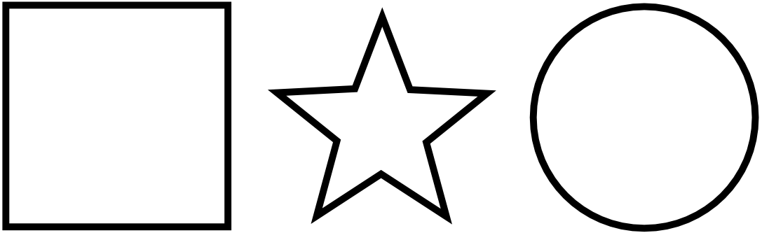
Next, place the shapes on top of one another and adjust the document size to fit. The easiest way to do this is to choose File → Document Properties and select Resize page to drawing or selection. Make sure no individual shape is selected first, or the document will fit that shape alone.

Now select all the shapes at once and hit Object → Group. This will create the containing <g> element. Then, with the new group still selected, open up Edit &→ XML Editor and give your group the .shapes class.
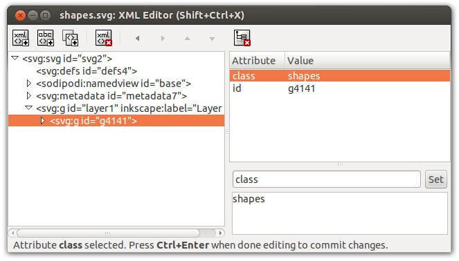
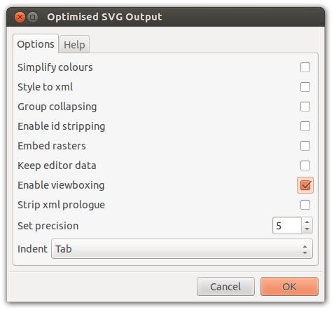
.shapes class on the group container element. (View large version)Excellent. Now you just need to save your SVG. Choose Optimized SVG from the drop-down and make sure the Enable viewboxing option is checked. Now your SVG is ready for animation.
A Note On Optimization
Dealing with simple shapes like these keeps the SVG data to a minimum. In this case, the file size of the animated SVG (including the CSS we are about to write) is just 2.3KB. Generally speaking, the simpler the path data for each cel, the greater the number of cels you can afford to include. Animating more complex drawings, like the wobbly scribbles included throughout this article, I recommend using Jake Archibald’s stellar visual optimization tool, SVGOMG.
Layering Animations
As I explored earlier, using steps(1) I can switch the visibility of an element on and off using opacity. This is not possible using the visibility and display properties because they do not take ordinal values (there’s nothing to animate between). To begin, I should set all of the cels within our container to opacity: 0, hiding them by default.
.shapes > * {
  opacity: 0;
  animation-duration: 0.75s;
  animation-iteration-count: infinite;
  animation-timing-function: steps(1);
}
As well as setting the step-based timing function, I’ve also chosen an infinite number of iterations and set the duration of the animation to 0.75s. Since each cel will appear for an equal duration and there are three cels in total, this will give me a simulated frame rate of 0.25s, or 4 frames per second.
So, how do I make each cel appear and disappear one after another? The answer is to give each element its own 0.75s animation, then run those animations concurrently, layering them up. Having three cels, each should be visible for successive thirds of the animation. I express these proportions in percentages (as expected in @keyframe syntax) and apply each named animation to the corresponding nth-child.
@keyframes shape-1 {
  0% {
    opacity: 1;
  }
  33.33333% {
    opacity: 0;
  }
}

.shapes > :nth-child(1) {
  animation-name: shapes-1;
}

@keyframes shapes-2 {
  33.33333% {
    opacity: 1;
  }
  66.66667% {
    opacity: 0;
  }
}

.shapes > :nth-child(2) {
  animation-name: shapes-2;
}

@keyframes shapes-3 {
  66.66667% {
    opacity: 1;
  }
  100% {
    opacity: 0;
  }
}

.shapes > :nth-child(3) {
  animation-name: shapes-3;
}

Embedding And Including
Now that I have my CSS, I can embed it in the head of my SVG file, finalizing the creation of my simple, scalable “GIF”. Since I had no task runner set up, I prefixed my animations with an online version of autoprefixer.
<svg viewBox="0 0 100 100">
<style>
<!-- CSS here -->
</style>
<g class="animation-name">
<path d="[path coords for first cel]"></path>
<path d="[path coords for second cel]"></path>
<path d="[path coords for third cel]"></path>
</g>
</svg>
Some browsers will preserve the animation of your SVG when including the file via an <img/> tag, but not all. A more consistent and reliable method is to use an <object> as specified below.
<object type="image/svg+xml" data="path_to/shapes.svg" role="img" aria-label="shapes animation">
  <div role="img" class="shapes-fallback" aria-label="shapes animation"></div>
</object>
Note the use of a WAI-ARIA img role and an aria-label on both the object and its fallback <div>, to provide appropriate semantics to assistive technology users. I have avoided using an <img /> fallback because some browsers will load this resource in addition to a supported SVG. You will, of course, have to provide the static image via the CSS background-image property on .shapes-fallback.
One Image, Multiple Animations
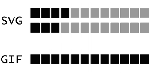
Aside from the scalability of SVG, perhaps the biggest improvement on the traditional GIF format is the ability to animate different parts of the same image, at — if so desired — different rates and overall durations. In my shark example, the tail and eyes are animated at slightly different rates, using differing numbers of cels.
Mathematically speaking, something rather nice is happening here: if you consider the two independent animations as one composite animation, then the overall duration is much longer. That is, if I have one animation that is three frames long and one that is four, the composite animation length is twelve frames — three times longer than the longest of the two constituent animations.
Using a GIF, where each frame is mapped directly to a cel, this would only be possible by including several more pictures. Importantly, the file size would increase accordingly.
Alternating Animations
In my shark.svg example, both the wagging tail and the blinking eyes use alternating, symmetrical animations, wherein the cels are shown in forward, then in reverse order ad infinitum. Fortuitously, each constituent cel animation starts simultaneously, making the effect possible by simply adding animation-direction: alternate to each of the cels:
.tail > * {
  animation-direction: alternate;
}
This is a further economy. To achieve the same effect with GIF, I would have to include the same pictures twice, first laid out in one direction, then in reverse.
True Cel-Based Animation
I began this article by conceding that traditional cel animation is inherently arduous compared with modern, keyframe animation. However, the innovation of animation cels was itself one of labor reduction. Before the advent of cel animations, each and every frame in an animation was drawn in its entirety — not just the animated parts. By drawing animated figures on transparent cels, static backgrounds could be reused. Aside from saving time, this also increased consistency.
SVG is a text-based image format divisible into as many “subtrees” of markup as you wish, making it ideal for combining static and animated imagery in the same context.
Automation With Sass
As my animations increased in ambition, creating individual, named animations for each cel became more than a little tedious. At this point, I employed Sass to do some of the grunt work. By harnessing a @for directive and some arithmetic, I was able to generate animations automatically, like so:
$cels: 6;
$fraction: 100 / $cels;

@for $i from 1 through $cels {
  $name: shapes;
  $start: ($fraction * $i) - $fraction;

  @keyframes #{$name}-#{$i} {
    #{$start * 1%} {
      opacity: 1;
    }
    #{($start + $fraction) * 1%} {
      opacity: 0;
    }
  }

  > :nth-child(#{$i}) {
    animation-name: #{$name}-#{$i};
  }
}
Note that I have used the “shapes” string and appended the iteration count to create each named animation, for example: @keyframes shapes-1 {}. I later included this logic within a mixin and created the name dynamically by producing a unique identifier with unique-id().
$name: unique-id();
In the following example, where the 3 parameter represents the number of cels, a unique string is used to dynamically create the named animations, cel-u358d90ae, cel-uebf9a21c and cel-u05cf8ffe.
.shapes {
  @include cel-animation(3);
}
Finer Control
It became increasingly apparent as I worked with this setup that just defining the number of cels was too simplistic. I was bound to show each cell for an equal duration. In cases like the eyes in my shark animation, I wanted to show the eyes in an open state for proportionately longer than the sequence of cels that made up the blinking motion.
To begin with, I simply duplicated the open eye cel and included six identical versions to emulate a pause in the animation, but I wasn’t happy with this: It was unwieldy and produced redundant path data, increasing the file size. Ultimately, I wanted an interface that would let me define the number of cels and their durations simultaneously: a two-dimensional parameter. The answer was a Sass list.
.eyes {
  @include frame-animation((6 1 1 1), 0.15);
}
In this example, used to generate my shark’s animated eyes, the first parameter, $cels, defines a list of cels where the first cel will appear for a duration six times longer than each of the following three. The number of cels can be expressed as length($cels), and the number of frames by adding up the integer values of each cel in the list. As the second parameter, the frame rate, is 0.15, the duration of the animation will be (6 + 1 + 1 + 1) * 0.15 * 1s.
This more mature version of the mixin is available as a handy partial on GitHub. Enjoy, and please send me your creations so I can start putting together a little showcase. You will be credited of course!
Conclusion
As a designer, I’m not fond of code for its own sake. I can’t get excited about a technology unless I can see how it might solve a bigger problem. The reason I conceived the technique and wrote the necessary code for this article is because I really wanted to make cel animations of my drawings. There was already a goal. Though there are a few conspicuous features missing from the web (and some things feel like they should just be easier to achieve), there’s usually a way of making this generous array of technologies do our bidding. The design part is in determining what we want to make in the first place, for whom, and whether it’s really such a good idea.
Many thanks to Kitty Giraudel for his help sanitizing and commenting the cel animation Sass mixin and Sara Soueidan for her suggestion of using <object> elements to include the animations reliably in their parent page. Using inline SVG is always an option, too.
Further Reading
- SVG and CSS animations with clip-path
- The new Web Animation API
- Practical Animation Techniques
- The Math Behind JavaScript Animations
- UI Animation Guidelines and Examples
- Designing Animations In Photoshop
- Fast Prototyping UI Animations In Keynote
 (ml, og, il, mrn)

