How To Run A Side Project: Screenings Case Study

Email Newsletter
Weekly tips on front-end & UX.
Trusted by 182,000+ folks.
 Register for Free


 Custom Web Forms for Angular, React, & Vue. Your backend.
 Celebrating 10 million developers
Did you know you have a superpower? No, I’m not talking about super-strength, sticking to walls or pushing metal claws out of your forearms (although you might have those as well, for all I know). If you work on the web — which I assume you do if you’re reading this — your superpower is side projects.
Unlike your regular job, where you have to listen to your boss or please your client, a side project lets you take on an alternate identity, one of which you are in charge and no one can stop you. And the best part: If your impact is big enough, the whole world will soon know your name (or at least your Twitter handle).
So, today, my goal is to give you a play-by-play account of the process of building and launching one such side project. But first, let me tell you a little more about myself.
My Side Project Track Record
The reason I feel like bringing up this topic in the first place is because I have a lot of experience launching various side projects.
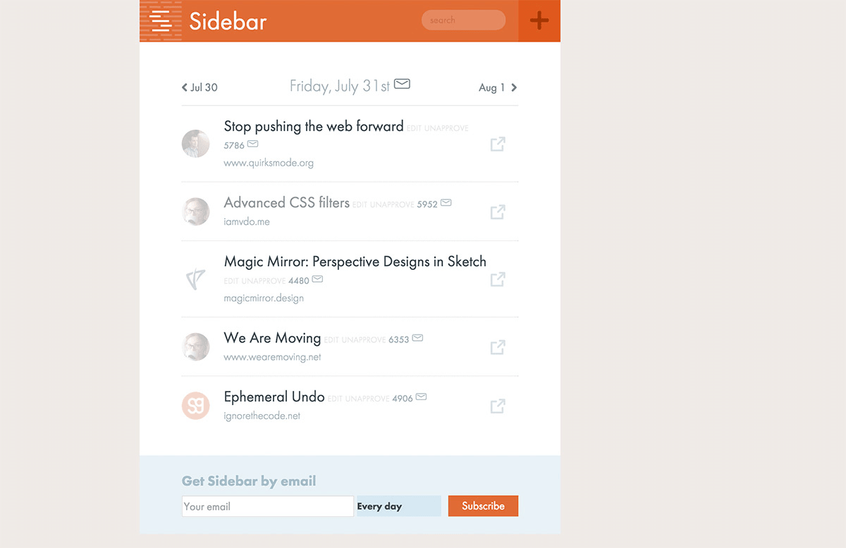
Back in the day, I launched a simple pattern-generation tool, called Patternify. A couple years ago, I took a couple weeks off from freelancing to write a short eBook about UI design. More recently, I launched Sidebar, a daily newsletter of design links.
Every project was a chance to learn new things, make new connections and have fun while doing it. Most importantly, it was also a chance to craft something that simply didn’t exist before, something I could truly call my own.
The Three S’
So, what makes a good side project idea? I believe it boils down to the three S’: simple, specific and special.
Simple means keeping the scope small and getting rid of as many features as you can. For example, do you really need user accounts? Could you maybe build the same thing entirely client-side, without the need for a back end?
Specific means solving a well-defined need and targeting a well-defined audience. QuantityQueries focuses on a tiny aspect of CSS, but it’s probably the best tool around for this particular problem. It does one thing but does it very well.
Finally, special means having something that makes you stand out from the crowd. This could be the idea itself or something else, like your brand or design. “Form element autosizing” sounds like the most boring thing ever, but Stretchy makes it fun with a funky color scheme, script fonts and even a cat.
The 10-Hour Rule
Remember when I said that side projects are your superpower? Well, any superhero needs a nemesis, and yours is Chronotron, the Lord of Time.
Chronotron uses all kinds of dirty tricks (such as meetings, deadlines and time with your family) to rob you of the time you need to make use of your superpower. Fortunately, you can fight back using a simple principle: the 10-hour rule.
This rule states that your project should be ready to launch after 10 hours of work.
Stick to this rule and you’ll take care of your two biggest roadblocks: never starting and never finishing.
If you’ve been procrastinating about starting your side project, it’s probably because you haven’t been able to free up your schedule. By setting a hard 10-hour limit, finding time will suddenly become much easier. Just set aside three hours a day on the weekend, then two hours twice during the week, and you’re there!
Or maybe you did start your project but never finished it. Once again, the 10-hour rule helps, forcing you to avoid feature bloat and scope creep.
Does that mean you should never go over 10 hours, no matter what? Of course not. In some cases, you’ll be forced to go over the limit, and in fact I ended up breaking my own rule, as you’ll soon see. Still, it’s a good starting point, and especially if this happens to be your first side project, I do suggest sticking to the rule!
Screenings: A Case Study
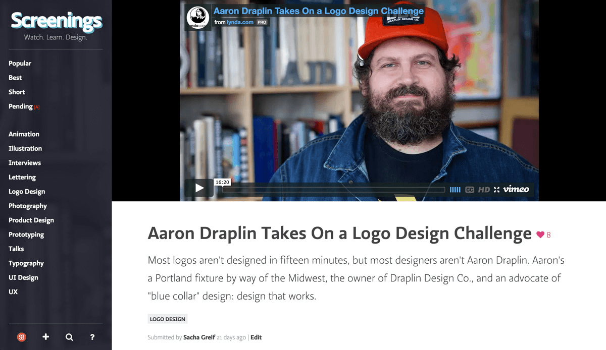
But rather than keep theorizing, let me give you a concrete example in the form of my own latest side project: Screenings, a website to help you discover new and inspiring design videos.
I got the idea for Screenings from running Sidebar. People would often submit video links to Sidebar, but I wasn’t quite sure what to do with them. Sidebar readers often check the newsletter as part of their morning routine to get their quick fix of design news and links, which isn’t the best time to take a break and spend 10 to 15 minutes watching a video.
So, in the back of my mind, I always had this idea that a Sidebar just for videos could be pretty neat.
And it even met my own three S’ rule:
- It was simple, because I knew I could rely on Telescope (the open-source app that also powers Sidebar and a few other projects) to do most of the heavy lifting.
- It was specific, because I wasn’t trying to build the next YouTube; instead, I would focus on the narrow niche of design videos.
- It was special because, as far as I knew, nothing quite like it was out there yet.
A Solid Foundation
Telescope is an app I’ve been working on for the past few years to make it easier to build just this kind of project. It basically started off as a Hacker News or Product Hunt clone but has since evolved into a free, open-source platform that supports any kind of social app or community. Think WordPress but for communities instead of blogs.
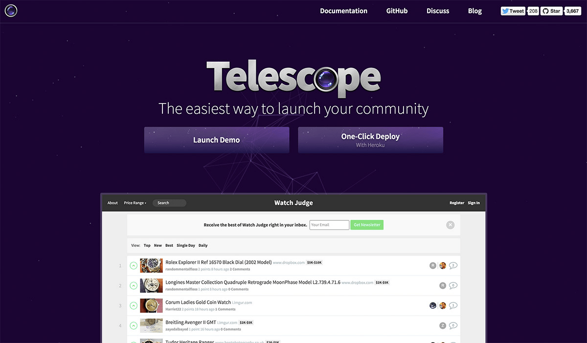
Most of the features I needed (posts, comments, media previews, sorting, etc.) were already built into Telescope, so I knew my work would mainly focus on theming and customizing the app’s look and feel.
So, I cloned Telescope, created a new theme package and got to work.
Customizing Telescope
I started by repurposing a few of Telescope’s features to better suit videos.
For example, out of the box, Telescope lets you upvote or downvote any post. For Screenings, I transformed the upvote icon into a like heart, while keeping the back-end logic identical.
I also added a new “short” sorting view that would filter out all videos longer than three minutes, for when you need a quick shot of inspiration during your coffee break. And I had some fun with flexbox in trying to come up with a dynamic grid layout that would automatically resize for small screens.
Finally, I added a scrolling hover effect with CSS animations, to emulate the old marquee tag:
.marquee-outer {
   position: relative;
}

.marquee-inner {
   position: absolute;
   span {
      position: relative;
      animation: marquee 5s linear infinite;
      &:after {
         content: attr(data-content);
         margin: 0 10px;
      }
   }
}

@keyframes marquee {
   0% { left: 0; }
   100% { left: -50%; }
}
Look And Feel
When you work on your own project without a client breathing down your neck and telling you to “Make it pop more” and ”Avoid green because my niece doesn’t like that color,” settling on a look and feel can be surprisingly hard.
Should you go serif or sans-serif? Light or dark? Solid color or gradient? You can do literally anything you want every step of the way, and that can drastically slow you down (or lead to some pretty grievous crimes against good taste, as you’ll soon see).
I started with a serious, classical style, trying to evoke the look and feel of respected print magazines, such as Monocle.
But maybe because I didn’t have the brand and history to go along with it, my design ended up looking boring and uninspired.
I then went a bit too far in the other direction. I tried so hard to be fresh and edgy that I ended up copying the iTunes icon’s colors without even realizing it. Sure, my design would appeal to 15-year-olds, but the neon gradient was taking focus away from the content.
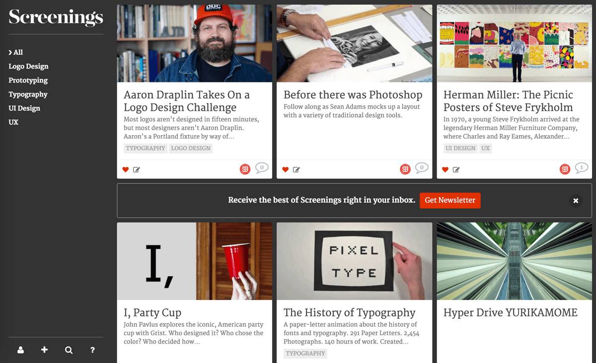
Refocusing on content turned out to be the key. I decided to keep things low key with a dark-blue background, but using a translucent overlay of the video thumbnail on individual video pages.
As for the logo, I tried out various serif and script fonts but couldn’t decide on something I liked. I eventually decided to keep things simple and go with a text-only logo, highlighting with a CSS text-shadow effect for now.
Prioritizing The Design
As it turns out, the 80⁄20 rule still holds true. Getting 80% of the way to a finished product was easy; the remaining 20% wasn’t going to be as smooth.
The big problem I ran into was how to display grid items. Here’s all of the meta data associated with a single video:
- title
- description
- author
- number of comments
- commenters
- number of likes
- timestamp
- duration
- thumbnail
Add to this the like and share buttons, the edit icon and, for administrators, the approve/unapprove link (because videos require moderation before appearing publicly on the website), and you can understand my problem: How could I fit all of this in a single grid item without ending up with a complete mess?
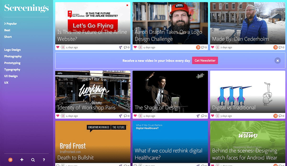
After pondering the question for a good while, I decided to get rid of the share buttons, commenter avatars and video duration. Things were already starting to look a bit saner!
Displaying the title and summary would also prove tricky. I knew I wanted to stick them on top of the video thumbnail, but some kind of overlay would be needed to make it work, even when the thumbnail was white or light.
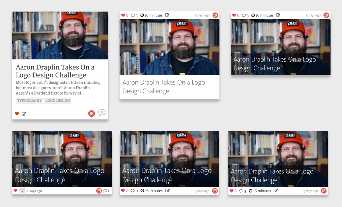
I tried a black-to-transparent gradient, but, while this looked great on dark images, it made light images look dirty and grimy. In the end, I resorted to a solid translucent overlay instead.
Another consideration was how much text to display: too little and the video might fail to trigger a user’s interest, too much and the items would look more like blog posts and less like videos.
After many iterations, I finally had something that more or less worked. It wasn’t perfect by any means, but it would do for now. It was time for the big launch.
The Launch
Launching a project is always a delicate operation. It’s the only part of the process where you can’t iterate. You get one shot, and if you blow it, then that’s it.
Big companies can rely on their press contacts and PR teams to set up a successful launch, but you’re on your own with a side project. Thankfully, the rise of websites like Hacker News, Reddit and Product Hunt has helped to even up the scales.
This is particularly true of Product Hunt: It gets a lot fewer link submissions per day, meaning that each one is more likely to get a fair shot. And its focus on products, instead of general news or discussion, makes it the perfect place to launch any kind of project.
So, for Screenings, I decided to focus all of my initial effort on Product Hunt. I got in touch with Product Hunt’s administrators to show them a preview of the website, asking them if they thought it was a good fit for the website. They said it was and even suggested a good time for the launch.
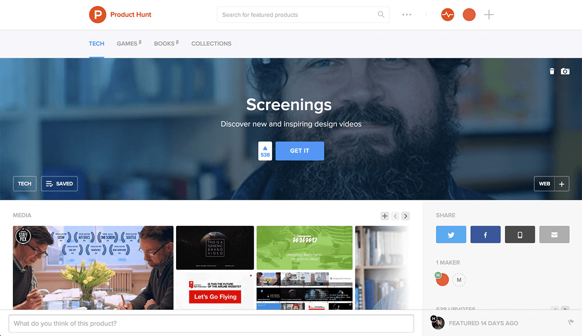
All of this preparation paid off: Screenings reached second place on the day I submitted it (behind Product Hunt’s own new “Books” category).
Scaling Issues
It was not all smooth sailing (or should I say, smooth scaling).
The website held up fine under traffic throughout the day, even while being featured on Product Hunt. But I then made the mistake of emailing an announcement to the entire Sidebar mailing list, and this pushed my poor overworked server over the edge.
Of course, I should also mention that I did this at 11:00 pm, at the end of the big launch day. Faced with an increasingly unresponsive server, I knew I had a few hours of development work ahead of me if I wanted to accomodate this influx of traffic.
Yet, I then did something that might surprise you: I decided to go to bed.
I knew the traffic spike would die down eventually. Fiddling with servers while tired, possibly making things worse, just wasn’t worth it. And I knew that the traffic spike on launch day has little to do with a project’s long-term success.
Sure enough, when I woke up the next day, the spike was over, and my server was back to chugging along just fine. If you want to hear more, I’ve written about the whole episode in more detail on the Telescope blog.
A Few Stats
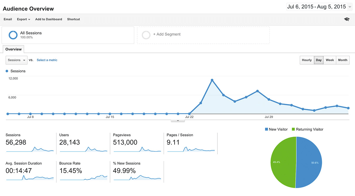
Here’s a few statistics for the two weeks since the initial launch:
- total page views: 513,000
- total unique users: 28,143
- newsletter registrations: 946
- user registrations: 322
- videos posted: 94
- tweets: 452
Overall, a pretty good result for about 16 hours of work!
I know: I broke my own 10-hour rule. In my defence, a big chunk of that time was spent fidgeting over fonts!
The Aftermath
This brings me to the last part of my journey: the aftermath. After a launch, I always get this weird, disoriented feeling: “So, what now?”
Up to launch day, you have this clear, well-defined goal with a tangible payoff attached to it. But once your website is out there and the initial interest has died down, you’re faced with a very different challenge.
Compared to the all-out, take-no-prisoners war of the pre-launch period, you now face a long, slow battle of attrition, in which the aim is to make a tiny bit of progress every day.
This is where a lot of side projects fade out. And nothing is wrong with that: You’ve had fun, you’ve learned a ton, and now’s the time to go back to your day job (or maybe to think about your next side project).
But there’s also something to be said for embracing the grind and trying to make your side project into, well, a project.
This is what I’m trying to do with Screenings. It’s now up to me to slowly improve the website, get more people to sign up and get the word out.
And guess what? This article is the first step in that long process!
Conclusion
I really believe that side projects are underused by the vast majority of designers and developers out there. We create school projects as students, and they’re almost always a great learning experience, but somehow, once we enter the “real world,” work gets in the way, and we forget that side projects are even a possibility.
So, with this article, I want to awaken your latent side-project powers. First, remember the three S’ (simple, specific and special) when coming up with an idea.
Then, stick to the 10-hour rule while working on the project.
Finally, once you’re ready to launch, press that big red button. And then start thinking about your next side project!
One final note: I decided to open-source the Screenings theme, so that anyone can easily build their own video website!
Further Reading
- A Guide To Personal Side Projects
- Work, Life And Side Projects
- How And Why To Make Side Projects Work At A Digital Agency
- Take The Initiative and Create Your Own Projects


