Intimate And Interruptive: Designing For The Power Of Apple Watch

Email Newsletter
Weekly tips on front-end & UX.
Trusted by 182,000+ folks.

 Custom Web Forms for Angular, React, & Vue. Your backend.

 Celebrating 10 million developers
“We’re all back at square one again.” That was the overwhelming lesson we learned while designing our first major Apple Watch app for launch.
To be successful in designing for this device, the entire way we think about app design will need an overhaul. The patterns and processes that became standard for other devices are of little help here and, in many cases, can actively hinder efforts to create a beautiful, functional and user-centric watch experience.
Because of its form factor and intimate interface, Apple Watch is likely to function more as a personal concierge that screens and sorts incoming communication than as an additional “portal” to the web as we know it.
To help recalibrate our thinking as we all take on the new device, I would like to share a few of the big realizations that our team encountered on this project and will be taking with us into future apps, including:
- the differences between designing phone apps and designing Apple Watch apps;
- why the home screen is not the key screen in the watch’s interface;
- the importance of restricting notifications to urgent, essential and personal content;
- how to use custom design to establish yourself as an early leader in Apple Watch app design;
- why starting over can sometimes be the fastest way forward.
Watch Apps Should Not Be Simplified Versions Of Phone Apps
Because we’ve done this transition once before from desktop to mobile, we should be able to avoid making the same mistakes as we begin building for wearables. In the same way that simply “translating” desktop content to a mobile screen didn’t work, we can’t simply translate our mobile information architecture to our watch apps. Apple Watch is an entirely different breed.
The watch’s “pre-phone” role as a discreet personal assistant means it will never be our primary media consumption or communication device. Instead, it will function as our go-to device for quick personal checking in, screening communication and keeping up with timely alerts and notifications.
To design effectively for these use cases, we quickly realized that we needed to forget what we knew about mobile app design and re-evaluate our assumptions. Inspired by Benedikt Lehnert and the Wunderlist team (among others), we used the following questions to make sure we were organizing content in a way that made sense for Apple Watch and not based on existing design patterns:
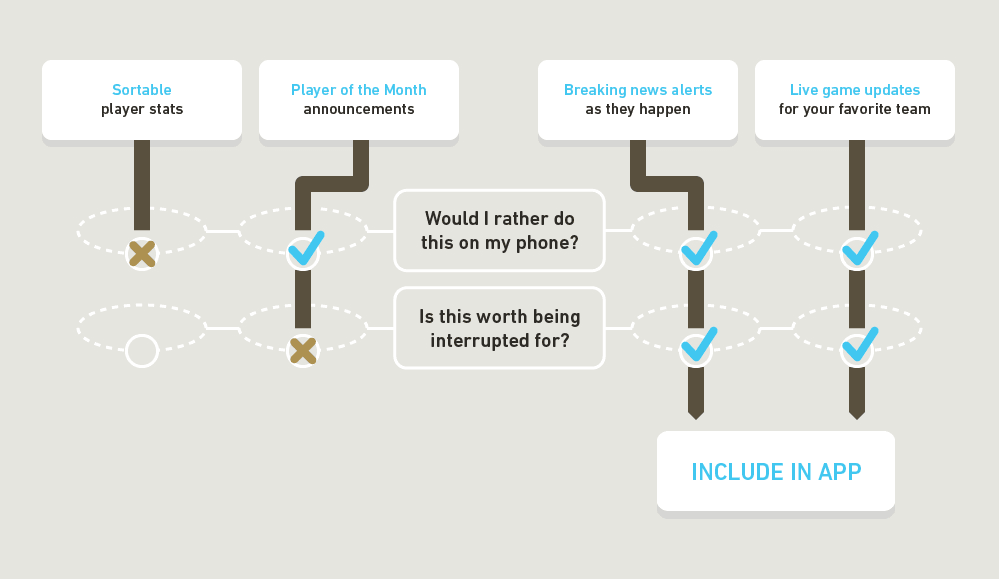
- Would I rather do this on my phone?
- Is this worth being interrupted for?
Surprisingly, these two simple tests turned out to be extremely useful in breaking us out of existing design patterns such as home screens and hierarchical navigation. In our project, for a real-time sports app, the tests looked something like this:
The combination of watch and mobile device will indeed be a powerful one, but likely with the watch functioning more as a heads-up display for daily life than as a wearable replacement for our ever-present phones.
Don’t Overemphasize The “Front Door”
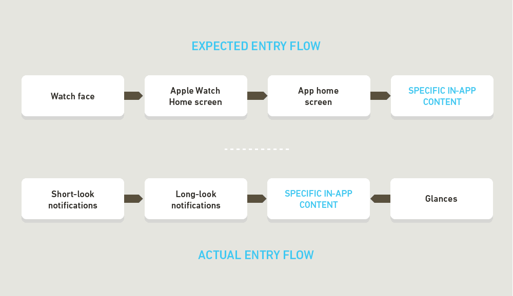
The home screen will not be the primary way people enter your watch app. In fact, they may almost never experience your app that way.
Upon seeing the app’s screen and its radial candy-colored interface on promotional materials for more than six months, one might easily assume that this is the key screen in the interface — the home screen we’ve grown so accustomed to on our phones.
In reality, the “home” screen of the watch is — wait for it — a watch display. Perhaps we shouldn’t be so surprised, but the sheer out-of-the-wayness and marginal utility of Apple Watch’s app screen caught us off guard. And if initial reviews are anything to go by, we were not the only ones to be surprised by this discovery.
Once we started studying user behavior, it was impossible not to notice that the likelihood of someone navigating to the app screen and clicking on an icon was far lower than we imagined.
We also found that app navigation isn’t nearly as important on this device as on others. A nice home screen might seem like a necessary starting point, but in reality Apple Watch users will often access information outside of the app proper — through “glances” or “complications” — or enter through a side door via different levels of notifications.
Have A Smart, Respectful Plan For Notifications
Apple Watch is equal parts intimate and interruptive, meaning that every interaction has the potential to be extremely powerful for brands. This power could work both ways, however, and if used without the proper respect for the user and their needs, it could result in an extremely irritating experience — something that could quickly and significantly harm a brand’s equity.
Apple Watch notifications require a deeply empathetic strategy, with full attention to the user’s needs and contexts. Designers must focus on delivering the kind of information worth getting tapped on the wrist for or worth interrupting a conversation for. Compared to the notifications we receive all day on our other devices, that’s an extremely high bar.
We found that restricting notifications to urgent, essential and personal content delivered right when the user needs it felt like the ideal target. For us, that meant relevant breaking news, inner-circle social updates and timely reminders, but we imagine that will vary for different applications, as long as the principles stay the same. Because of this, we see an easier transition for apps that focus on proactive, bite-sized or geo-targeted content — like flight status alerts, instant messaging or proximity-triggered experiences — than for long-form or search-centric apps.
Staying focused can feel like you’re missing out on opportunities to communicate with your users, but according to our experience, they will appreciate it. In the end, allowing the app to screen everything else out by default will feel like just another benefit.
Stand Out While You Can
Here’s the good news: It’s still early. Now, while everyone is feeling out the landscape and Apple Watch is still looking for its killer app, is the perfect time to make a big impression.
Many people are reporting that the biggest issue with this edition of Apple Watch is performance. Between the first-generation hardware and a limiting phone tether, we see every reason to keep the first release simple. Having a beautiful app that puts users’ main need front and center will immediately give you a leg up on many early entries in the space.
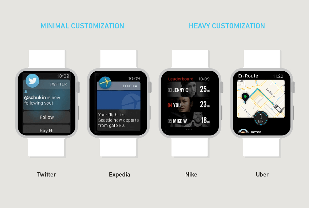
Additionally, now is the time to push custom design. As mainstay brands launch apps designed to match the formulaic “Apple Watch Human Interface Guidelines,” challengers like Uber and Yahoo are embracing the seamless black canvas with beautiful, simple layouts that elevate the overall experience. Look past the Apple-provided templates and select your own custom fonts to express your brand. You’ll stand out better this way.
Don’t Be Afraid To Start From Scratch
The best of the first batch of Apple Watch apps are extremely simple and focus on doing one thing well. This will remain true for some time as the watch’s technology and operating system continue to mature.
In our process, we ended up scrapping two full designs before settling on a simplified approach. In each case, the reboot resulted in a much more focused, functional product. Once we were willing to start over, we found ourselves far more likely to explore design solutions that broke out of our existing patterns. In the end, these from-scratch views felt most at home in the watch’s context and resonated most with our users.
If your team ends up in a circular conversation about prioritizing features or editing the information architecture, we recommend stepping back to try again from a clean slate. It could be that your brand should be doing something completely different on Apple Watch than it does on any other device, and you might not realize it until you take the time to start over with a blank slate.
Far from being inefficient or wasteful, this freedom to reset is often the fastest way forward when designing for the simplicity-first context of Apple Watch.
Conclusion
Designing apps for the Apple Watch requires thinking in a way that’s unlike the way we design for any other device. As we get familiar with these new patterns of interaction, there is a huge opportunity for designers and brands that harness the power of this device and deliver on its promise — a seamless user experience that carefully balances information, intimacy and interruption.
Further Reading
- How We Designed And Built Our First Apple Watch App
- Developing For Apple Watch Without The Device
- How To Think Like An App Designer
- Designing For Smartwatches And Wearables
- Getting Started With Wearables


