A Responsive Material Design App With Polymer Starter Kit

Email Newsletter
Weekly tips on front-end & UX.
Trusted by 182,000+ folks.


 Celebrating 10 million developers
 Custom Web Forms for Angular, React, & Vue. Your backend.

One upcoming technology that represents a big leap forward in making the web a mature application platform is web components. From a high-level perspective, web components will enable better composability, reusability and interoperability of front-end web application elements by providing a common way to write components in HTML.
The goal of this article is to show you why this will be such an important step, by showing off what can be accomplished right now using Polymer. Polymer is currently the most advanced and (self-proclaimed) production-ready library based on web components.
What Is Polymer?
Let’s get this out of the way: “Polymer is not a framework.” The team behind it strongly emphasized this at this year’s Google I/O talk about the 1.0 release. Polymer was announced at Google I/O 2013. Its purpose is to enable developers to work with web components and the four underlying low-level APIs — HTML imports, shadow DOM, HTML templates and custom elements — before the standards are finalized and implemented by all browser vendors.
This is accomplished by providing a set of polyfills that, well, “fake” the new API behavior where it is not yet implemented for the last two versions of all major browsers. Beyond these polyfills, Polymer also provides some syntactic sugar that makes working with web components a bit easier.
One year later, the project got a big boost at Google I/O 2014, as the team announced its ambitions to drive Polymer forward by providing an extensive library of prebuilt elements for developers, based on the material design guidelines. Now, one year later, the “production-ready” 1.0 version of Polymer was officially announced in the I/O 2015 keynote.
So, let’s take a closer look at what all the fuss is about and what working with web components and Polymer feels like.
The Polymer Components
With version 1.0, the Polymer team announced different sets of element product lines. These reusable building blocks are prebuilt for developers and show how web components will enable an ecosystem of modular building blocks.
- Iron elements These are utility elements that handle basic layouting and core functionality, without applying any complex visual styles.
- Paper elements These are a web component implementation of material design based on the iron element.
- Google web components These web components are wrappers for Google APIs and services. For example, there is an element for Google Maps, YouTube and Google Calendar.
- Gold elements These are special elements that can be used for e-commerce, such as credit-card input elements.
- Neon elements All fancy special effects fall under this label. Currently, only a web animations element is in there, which has some pretty cool demos.
- Platinum elements This category is for components that enable complex web app functionality, such as push notifications.
- Molecules These elements are wrappers for other JavaScript libraries.
Beyond this official Polymer repository, you should check out Custom Elements, a repository of even more elements. These elements are not necessarily based on Polymer but are still compatible thanks to the web component magic.
Example Application
Create Boilerplate Using Starter Kit
Enough with the high-level talk and overviews. How do we start developing with Polymer? Thankfully, the guys at Google have released a neat starter kit with version 1.0.
If you have Node.js, npm, Bower and Gulp installed, you can run the following command in the project directory to install all dependencies:
npm install -g gulp bower && npm install && bower installFor additional information on modern JavaScript tooling, check out the respective pages on npm, Bower and Gulp.
After installing the dependencies, you can run the kit with Gulp:
gulp serveThis command will build and serve the starter kit.
A Look At The Starter Kit
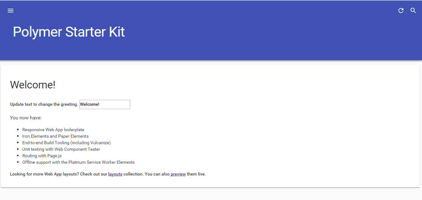
What we have here with the starter kit is a very basic application skeleton, with responsive layout, material design, routing functionality and offline caching via the service worker API.
Let’s take a closer look at what an application like this looks like under the hood in web component land. Look at the app/index.html file. In the head you can see that the script is included in the page:
<script src="bower_components/webcomponentsjs/webcomponents-lite.js"></script>This is the web component polyfill part of Polymer, which will become obsolete over time; Can I Use lists its current state. At the time of writing, web components are supported natively 100% in Chrome and Opera and are currently behind a flag in Firefox.
A bit further down the line, you will find this part:
<link rel="import" href="elements/elements.html">This is HTML imports in action. When you go further and open the elements/elements.html file, you will see that all of the elements used in the body of index.html are imported here. You could also directly import them into index.html, but the source file is a bit cleaner if you put them into their own .html file.
Now, let’s have a look at the actual markup of the application.
Structure An App With Web Components
Most importantly when looking at index.html, you will see a lot of custom elements, which are used to mark up the app. Here, you will see mostly elements from the iron-* and paper-* element libraries. Custom elements need to be prefixed with this - notation to avoid collision with potential future base HTML elements.
You can see that the complete layout of the page is made up of paper and iron elements from the Polymer library:
<paper-drawer-panel>
   <!--Responsive sidebar drawer -->
   <paper-header-panel>
      <!-- Header of the drawer -->
      <paper-toolbar>
      </paper-toolbar>
      <!--Menu in the drawer -->
      <paper-menu>
      </paper-menu>
   </paper-header-panel>
   <!--Main content area -->
      <paper-header-panel>
         <!--Header of the main content -->
         <paper-toolbar>
         </paper-toolbar>
         <!--Main content -->
      <iron-pages>
      </iron-pages>
   </paper-header-panel>
</paper-drawer-panel>
This shows the very declarative and semantic way of structuring an app with web components. Imagine looking at the markup of such an application in a traditional web application; it would have hundreds of divs all over the place.
Web Components As APIs
Additionally, you have an example of the platinum-* elements that provide more complex functionality, such as facilitating the new service worker API. Service workers are another new standard API that enables you to create a background service in the browser that can handle caching, an offline experience for your web app and much more. It is not directly related to web components, so check out HTML5 Rocks’ article if you want to learn more about it. Similarly, the paper-toast element adds a notification toast functionality to the application. This shows the way web components can be used to capture more complex functionality and APIs.
Overall, the markup of the application shows the very declarative way of marking up an application by combining reusable elements. Notice that there is not a lot of additional JavaScript or CSS throughout the starter kit app. Most of the complex code is nicely encapsulated in the elements that were pulled in as dependencies.
Data Binding And Routing
You probably noticed that the application is wrapped in an HTML template tag:
<template is="dom-bind" id="app">
   …
</template>
This is done because Polymer uses HTML templates as context (as AngularJS does with the $scope, for example) for data binding. The is=“dom-bind” shows the is attribute, which is a way to declare that some element is a custom element of the type provided as a value, while still inheriting from the tag it is placed on. So, this template tag gets treated as a dom-bind element, which is a custom element provided by Polymer that now inherits from the template element it was placed on. The dom-bind element here turns on Polymer’s binding capabilities in the template tag it was placed on.
AngularJS developers will probably spot this on first sight: The app is held together via data binding with the Mustache syntax. The connection between the paper-menu element and the iron-pages element is a great example of what can be done with this in a web component world.
The paper-menu element, which contains several anchor elements, is responsible for the state of the menu. The selected attribute is bound to the {{route}} variable.
<paper-menu class="list" attr-for-selected="data-route" selected="{{route}}" on-iron-select="onMenuSelect">
   …
</paper-menu>
The iron-pages element is responsible for filling the main content area with one of its child elements, depending on the state of the selected attribute. Here you can see that the {{route}} variable is being used to connect it with the menu state.
<iron-pages attr-for-selected="data-route" selected="{{route}}">
   …
</iron-pages>
This data-binding functionality is part of Polymer’s syntactic sugar and is not part of the basic web components standard.
Additionally, to bind the route correctly to a URL, a lightweight router is inside the elements/routing.html file.
page('/', function () {
   app.route = 'home';
});

page('/users', function () {
   app.route = 'users';
});

page('/users/:name', function (data) {
   app.route = 'user-info';
   app.params = data.params;
});

page('/contact', function () {
   app.route = 'contact';
});

// add #! before urls
page({
   hashbang: true
});
Here you can see how the route variable is accessed programmatically via app.route. Notice that the template element, used for data binding, has an ID of app. Inside the routing JavaScript code, the data inside the custom element is now available via its ID attribute value; that is why it can be accessed via app.*.
Creating Your Own Custom Elements
If you are interested in creating your own custom elements with Polymer, you will find the app/elements/my-greeting and app/elements/my-list elements that are defined and used in the starter kit application.
We won’t go in depth into how to create your own reusable elements, though, because that would probably require a whole article of its own.
Adding An Existing Custom Element
Let’s go beyond the boilerplate project and add another custom element. How about a Google Map?
Thankfully, there is already an element for that in Google’s product line. Adding it to your project is just one bower install away:
bower install --save GoogleWebComponents/google-map#^1.0.0Now, you can include it with the imported elements in the app/elements/elements.html file:
<link rel="import" href="../bower_components/google-map/google-map.html">
Now that the element is imported, include it in your application — for example, on the “Contact“ screen:
(…)
<section data-route="contact">
   <paper-material elevation="1">
      <h2 class="paper-font-display2">Contact</h2>
      <p>This is the contact section</p>
   </paper-material>
   <paper-material elevation="1">
      <google-map latitude="37.77493" longitude="-122.41942"></google-map>
   </paper-material>
</section>
(…)
Some additional CSS is still needed in the app/styles/main.css file to set the display height of the map.
(…)
google-map {
   height: 600px;
}
(…)
Voila! You’ve just added a Google Map to your application, without tinkering with any iframe or initializing a JavaScript library.
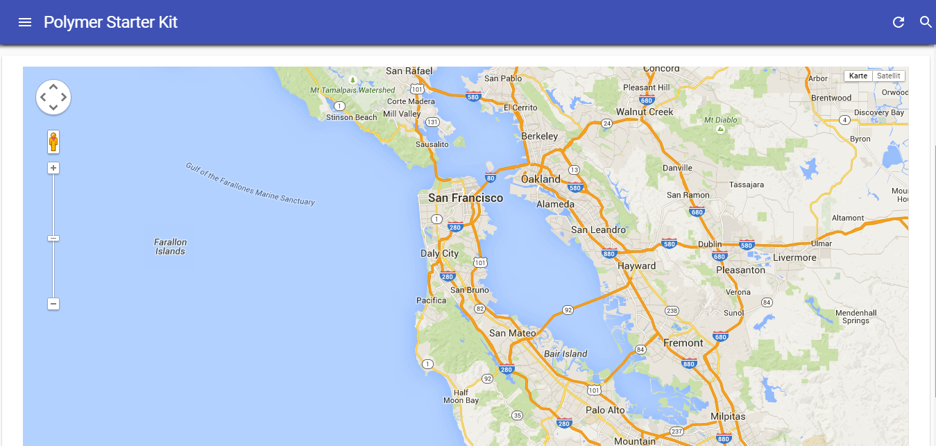
This neatly showcases how developers can take advantage of web components to reuse elements without having to create the same boilerplate or reinvent the wheel. The standard method of adding a Google Map to an app without web components is cumbersome by contrast.
Adding A Non-Polymer Custom Element
Another thing we might want on the web page is an animated GIF. Go to Custom Elements and find the x-gif element, which promises smooth GIF playback. Unfortunately, it is not based on Polymer. But no problem! It can be added like any other web component.
Again, let’s do a quick bower install to fetch the x-gif component:
bower install --save x-gifAdd it to your app/elements/elements.html imports list:
<link rel="import" href="../bower_components/google-map/google-map.html">
<link rel="import" href="../bower_components/x-gif/dist/x-gif.html">
Put your favorite GIF in app/images/epic.gif, and add it to the home screen using the x-gif tag:
<section data-route="home">
   <paper-material elevation="1">
      <my-greeting></my-greeting>

      <p class="paper-font-subhead">You now have:</p>
      <my-list></my-list>

      <x-gif src="images/epic.gif"></x-gif>

      <p class="paper-font-body2">Looking for more web app layouts? Check out our <a href="https://github.com/PolymerElements/app-layout-templates">layouts</a> collection. You can also <a href="https://polymerelements.github.io/app-layout-templates/">preview</a> them live.</p>
   </paper-material>
</section>
Mind-blowing:
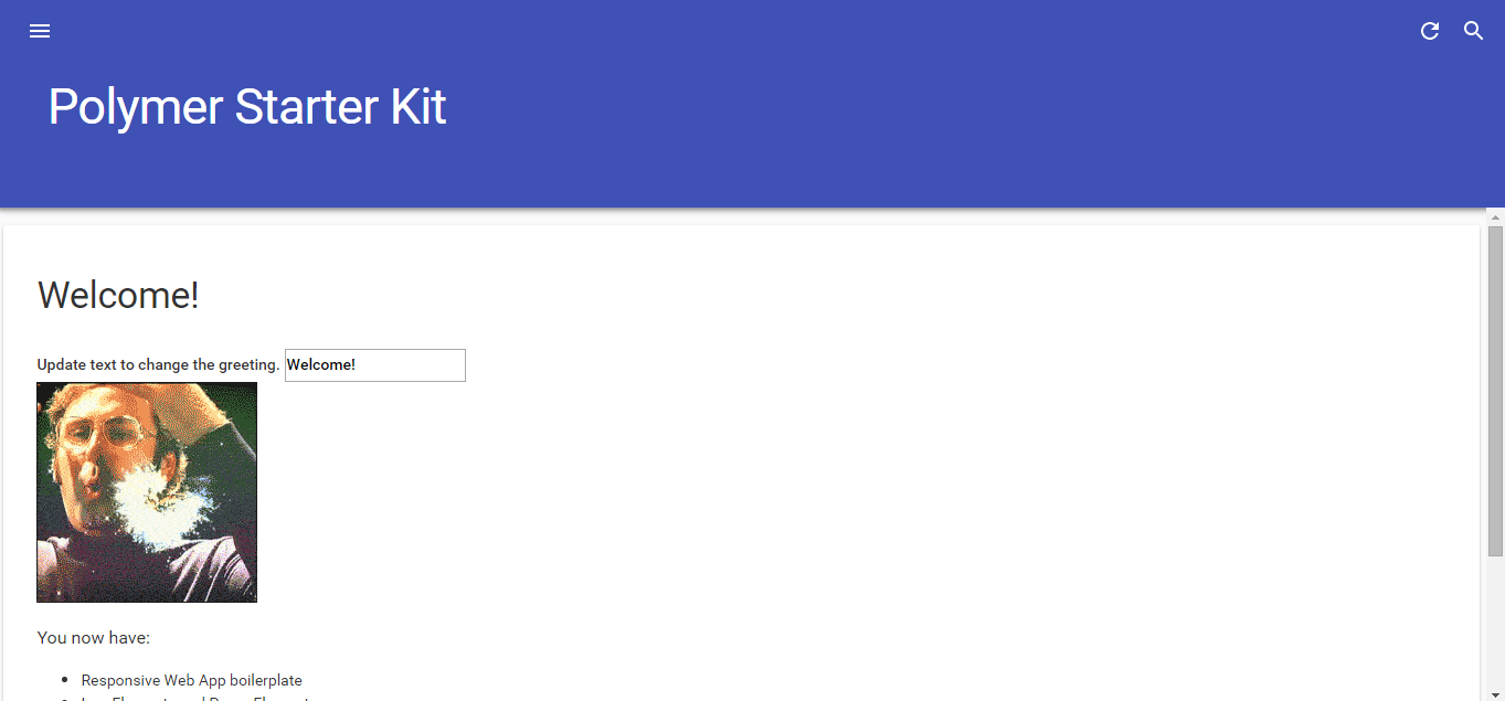
Just remember that the x-gif web component has nothing to do with the Polymer library; it is built using the vanilla web components APIs. This really shows the interoperability of web component-based elements. Now, think about how popular frameworks like AngularJS 2.0 and Google Web Toolkit 3.0 will be based on web components in future versions and how much more interoperable frameworks will be in future. By the way, Mozilla is also working on a web component-based library, Bricks, which is pretty far along in development.
Conclusion
We’ve seen now what working with web components in Polymer 1.0 looks like, using the starter kit as a foundation. And we’ve seen the declarative and boilerplate-free way to combine reusable elements, elements that interoperate without necessarily having been developed with the same libraries or frameworks.
I am really excited about web components because they mark a huge step in the advancement of the web and its transformation into a fully capable application distribution platform, without the quirky hacks and framework silos of the past.
Resources
Elements
Videos
- “Polymer and Modern Web APIs: In Production at Google Scale,” Google I/O 2015
Further Reading
- Material Design Icons, Goodies And Starter Kits
- Sketch With Material Design
- Styling Web Components Using A Shared Style Sheet
- How To Design Better Buttons
 (al, ml, rb, jb, mrn)

