Flexbox For Interfaces All The Way: Tracks Case Study

Email Newsletter
Weekly tips on front-end & UX.
Trusted by 182,000+ folks.
 Register for Free
 Celebrating 10 million developers
 Custom Web Forms for Angular, React, & Vue. Your backend.


The days of floats and margin trickery are finally behind us, as CSS furnishes developers with new and improved properties perfect for those delicate layouts. Layout features such as vertical alignment, evenly distributed spacing, source-order control and other patterns such as “sticky” footers are quite effortless to achieve with flexbox.
In this article, we’ll discuss layout patterns well suited to flexbox, using the interface from the Tracks application, which also takes advantage of atomic design principles. I’ll share how flexbox proved useful and note the pitfalls of pairing it with particular layout patterns. We’ll look at those patterns that caused concern, provide suggestions for fallbacks and share additional tactics to start using this CSS property immediately.
Flexy Atomic Components
The approach to Tracks’ interface started with each piece being investigated as an isolated case, using the principles outlined by Brad Frost. There are also documented bits of development and integration on Dribbble for an insider’s view.
The philosophy of atomic design can be thought of as small LEGO-like pieces constructed together to form a larger distinctive part of an interface. Scientific terms such as organism, atom and molecule are used to enable developers to categorize pieces of the interface in order to gain a deeper understanding of each part of the whole. This type of categorization creates an opportunity for the identification of these patterns and prevents outside influences such as grids, colors, and spacing from disrupting the goal, which is to identify patterns. Building from a microscopic level allows for a wider distribution of these parts throughout the interface.
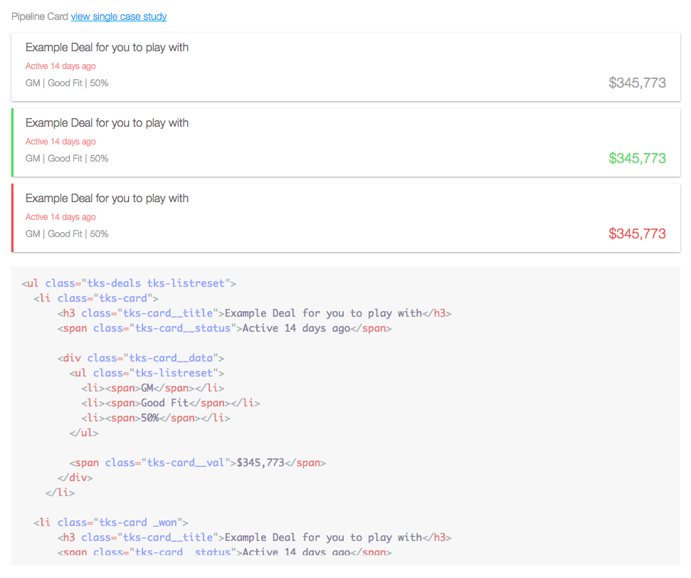 Figure 1. These application cards used to display data were constructed using atomic design principles. Can you guess which parts use flexbox? (View large version)
If you’d like to dive deeper into the theory of atomic design, read Brad’s post, which discusses his philosophy in more detail. I also suggest checking out his book on the subject.
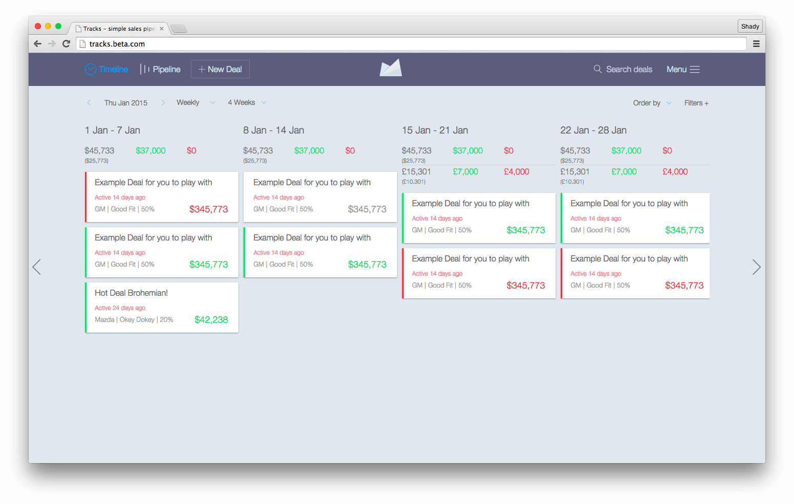 Figure 2. The primary interface of the Tracks application, which takes full advantage of flexbox and atomic design. (View large version)
The interface designs were conveyed as a set of InVision comps, documenting the flow and UI. During the initial audit of the interface, I began determining regions where flexbox would be beneficial. I also elected to use flexbox for page layouts using patterns such as the well-known “sidebar to the left, main content to the right” pattern, which is most often implemented with floats.
One welcome aspect of the Tracks redesign was that the project’s scope required Internet Explorer (IE) 10+, Android 4.1+ and iOS 7+. This was good news because they have great support for flexbox, with the appropriate prefixes. Even though support is far more stable these days, operating systems prior to, say, Android 4.1 require fallbacks. What would a fallback look like in a case where support doesn’t exist? Developers using Modernizr can target those browsers using the .no-flexbox class and serve a more stable supported layout system (alternatively you could use CSS feature queries with @supports which is well supported, too. —Ed.). For example:
<ul class="flexbox-target">
  <li>…</li>
  <li>…</li>
  <li>…</li>
</ul>
html.flexbox ul.flexbox-target,
html.no-js ul.flexbox-target {
  display: flex;
  flex-direction: row;
}

html.no-flexbox ul.flexbox-target li,
html.no-js ul.flexbox-target li {
  display: inline-block; /* Could also use a float-positioned-layout system instead */
}
Where flexbox support isn’t quite right, we’ll go ahead and use display: inline-block for the layout fallback. We’ll also add a no-js to the declaration should JavaScript fail. The cascading nature of CSS will be in place if flexbox isn’t supported, even with JavaScript off or loading failures. Flexbox can co-exist with float and display: table and relative positioning, and browsers supporting flexbox will prioritize flexbox over other definitions, while browsers not supporting flexbox will ignore flexbox properties and gracefully fall back to good ol’ CSS layout mechanisms.
As with everything, the tough choices will depend on the project’s scope, analytics and budget. My golden rule is to always make the choice that makes the most sense for the project.
Inline Patterns
Navigational components proved to be extremely valuable with flexbox, not only for easing implementation, but also for shortening development sessions. Inline patterns that were known to consume a great deal of developers’ time can now happen in minutes with flexbox. If you’ve had the pleasure of developing with this kind of pattern prior to IE 9, then you’ll know the frustration.
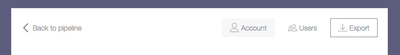 Figure 3. This admin navigation uses an inline layout pattern, with navigational items centered vertically. (View large version)
The markup pattern for the admin navigation consists of a nav tag wrapping a series of anchors. Here’s an example of this pattern in HTML:
<header role="banner">
  <nav role="navigation">
    <a href="pipeline.html">Back to pipeline</a>
    <a href="account.html">Account</a>
    <a href="users.html">Users</a>
    <a href="export.html">Export</a>
  </nav>
</header>
And here are the related styles:
nav[role="navigation"] {
  display: flex;
  align-items: center; /* Center navigation items vertically */
}

nav[role="navigation"] a {
  display: inline-block; /* To avoid layout issues for inline elements with the order property in IE 10 */
}

nav[role="navigation"] a[href="pipeline.html"] {
  flex: 1;
}
The CSS required is just as minimal as the markup. Note the inline-block value given to anchors. This declaration solves any future headaches in IE 10 if you were to change the sequence of elements with the order property. It was also discovered that any padding or margin given to direct children of a flex container defined with the flex property causes layout issues in IE 10. A good idea is to ABC (always be checking) across browsers and platforms.
 Figure 4. This header navigation pattern with a centered logo is often seen on the web and is flexbox-approved. (View large version)
The common inline pattern above is typically implemented with non-semantic markup. It no longer requires this kind of hackery now that flexbox is an option.
The layout consists of a collection of menu items to the left, a centrally positioned logo and additional items to the right. The markup for this pattern is as follows:
<header class="pipeline-header" role="banner">
  <a href="pipeline.html" class="pipeline-logo">… </a>

  <nav class="pipeline-nav" role="navigation">…</nav>

  <form class="pipeline-search" role="form">…</form>

  <a href="#menu">…</a>
</header>
Flexbox can alleviate the need for HTML hackery and can maintain semantics, as the markup demonstrates. Maintaining semantics is important because the HTML will have a higher chance of being reusable in the future, among many other reasons beyond the scope of this discussion.
Before flexbox existed, developers applied approaches such as display: inline-block and even float: left to achieve inline layouts. Now that flexbox is a viable option, developers are no longer forced to follow bad practices for the sake of aesthetics. The CSS required is not as brief as the admin navigation pattern in figure 3, but it’s still faster to implement than the methods mentioned earlier.
.pipeline-header {
  display: flex;
  align-items: center;
  justify-content: space-between;
}

.pipeline-header > a {
  display: inline-block; /* IE 10 doesn't recognize order, so we do this to avoid odd layouts there. */
}

.pipeline-logo {
  flex: 1;
  order: 2;
  text-align: center;
}

.pipeline-nav {
  flex: 1.25;
  order: 1;
}

.pipeline-search {
  flex: 1;
  order: 3;
}

a[href="#menu"] {
  order: 4;
}
When using flexbox with the pattern in figure 3, remember that the source’s sequence can be changed. If the header’s logo requires a shift in position, doing so is painless with the order property. Be mindful that source order is always important for accessibility and somewhat controversial when it comes to flexbox; especially with varying accessibility implementations across browsers. All browsers and screen readers use the source code’s order, not the visual order determined by CSS, for keyboard navigation.
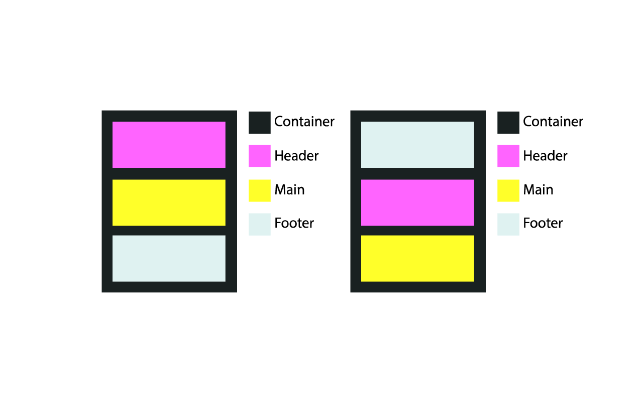 Figure 5. The normal written flow in the markup and rendered in the browser (left), and the sequence changed with flexbox without adjusting the markup (right). (View large version)
The code below is for the layout above. The markup is never altered to change the order of appearance.
<div class="container">
  <header role="banner"></header>
  <main role="main"></main>
  <footer role="contentinfo"></footer>
</div>
Here is the CSS used to change the order for the diagram on the right in figure 5.
.container {
  display: flex;
  flex-direction: columns; /* row is the default value */
}

header {
  order: 2;
}

main {
  order: 3;
}

footer {
  order: 1;
}
This type of layout isn’t just for navigation either. You might have seen the pattern in footers as well.
 Figure 6. The same pattern we’ve seen used time and again for navigation is used here for the footer. (View large version)
When using this pattern, consider how the content might fill the container and consume space. Should the content grow from the center out? What if the content pushed downward? How would that affect other items in the layout? Ask these questions in every project before proceeding with implementation. Consideration for keyboard navigation order, as mentioned, is just as important to end users.
Inline Form Inputs
Forms can be a nightmare for developers, especially when they’re tightly coupled to an intricate grid structure made in Photoshop. The “inline label” pattern, as I’ll refer to it, is as much a staple in our industry as the Fender Stratocaster is to rock music.
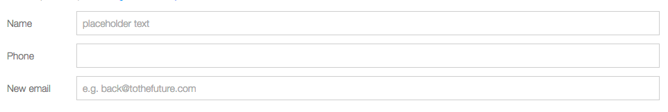 Figure 7. Inline labels and inputs are another great place to use flexbox. But be careful with how the label text wraps or pushes according to the text’s length. (View large version)
As mentioned in the previous section, decide how your content will flow and occupy the space of its container when the browser resizes or when dynamic content is inserted.
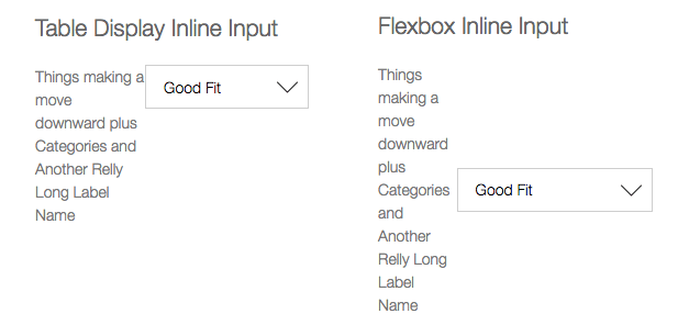 Figure 8. Decide how the content will expand. On the left, a table display is vertically aligned to the middle. On the right, flexbox aligns items to the center. (View large version)
These screenshots clearly indicate the faults flexbox can present with dynamic or lengthy content. The effect in the image on the right is what I call a “center push,” meaning the content pushes from the center outwards along the x and y axis.
Here’s the markup for the inline label pattern in figure 8.
<div class="form-group">
  <label>…</label>
  <select>…</select>
</div>
The solution to the problem in this case is to use a table display to better control long text. This allow content to flow downwards, instead of push from the center out.
.form-group {
  display: flex;
}

.form-group label {
  display: table;
  vertical-align: middle;
}

.form-group input {
  flex: 1;
}
Mixing and matching flexbox with table is a great technique and one that I encourage further exploration with. When mixing and matching, always check across testing environments to catch layout bugs early.
 Figure 9. With inline inputs with buttons, the equal heights of the inputs give balance to the design. (View large version)
I’ve seen many search inputs with this type of pattern. It’s an extremely flexible pattern that can be reused across a plethora of templates. Of course, CSS that could interfere, such as context-specific properties unrelated to the overall pattern, would be kept separate.
The HTML required is typical and includes a surrounding div to define the flexbox structure.
Here is our HTML:
<div class="form-group">
  <input type="text" placeholder="Add a note…">
  <button>Add</button>
</div>
And the CSS:
.form-group {
  display: flex;
}

.form-group input {
  flex: 1;
}
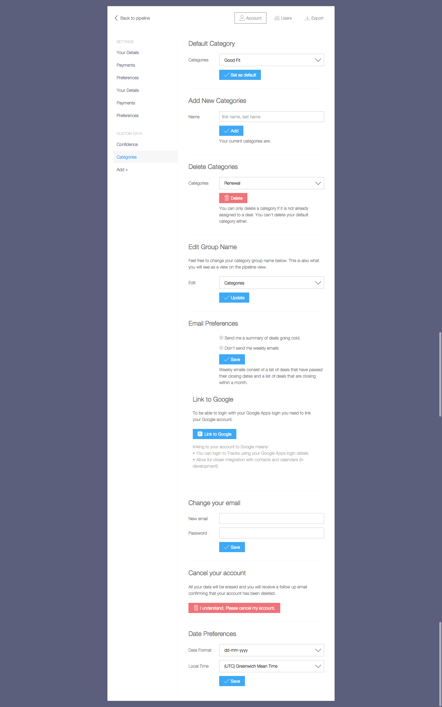
Dropdown Menu
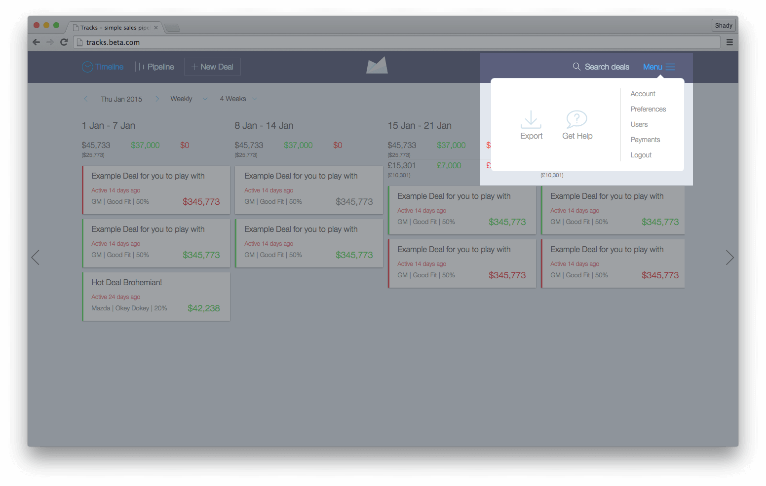 Figure 10. The dropdown menu’s region is highlighted using some quick flexbox tactics for effortless positioning. (View large version)
The dropdown menu’s layout consists of a column on the left, containing vertically centered items positioned inline, and a list of items on the right, where each list item lies on its own line.
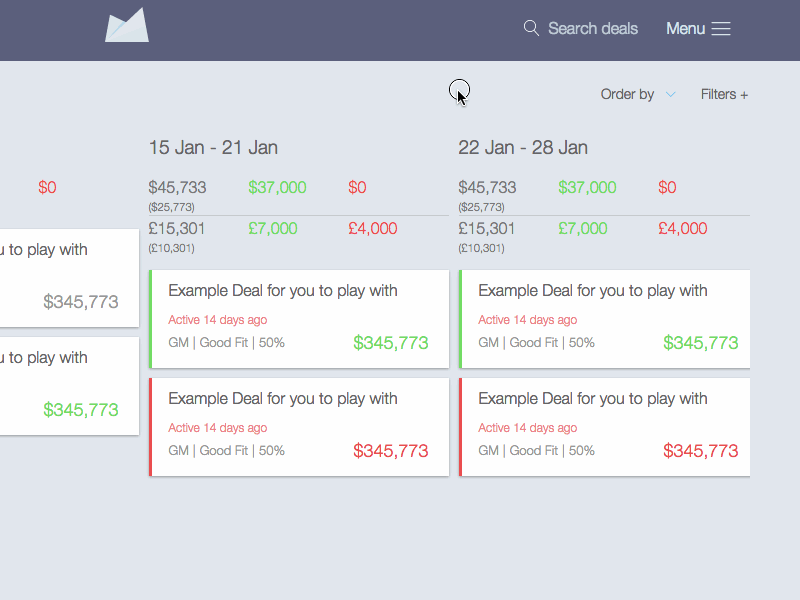 Figure 11. The menu for this primary interface was built using only flexbox for the layout. (View large version)
The markup for this navigation menu uses the following HTML as its structural foundation.
<nav class="menu">
  <div class="menu__options">
    <a href="export-data.html">Export</a>
    <a href="help.html">Get Help</a>
  </div>

  <div class="menu__items">
    <a href="account.html">Account</a>
    <a href="preferences.html">Preferences</a>
    <a href="users.html">Users</a>
    <a href="payment.html">Payments</a>
    <a href="logout.html">Logout</a>
  </div>
</nav>
The CSS required is lean and easy to read, too, just the way developers like it.
.menu {
  display: flex;
}

.menu__options {
  display: flex;
  align-items: center;
}

.menu__items {
  display: flex;
  flex-direction: column;
}
In just a few lines of code, layout bliss is achieved. Plus, it is decoupled from any grid structure, and the HTML and CSS are full of semantic meaning. It’s just another example of the power of flexbox to quickly avoid complicated positioning tactics and verbose markup.
Media Objects
 Figure 12. In the media-object pattern, using flexbox, a fixed-width SVG sits to the left, with flex content sitting adjacent. (View large version)
In this universal pattern, known to some as the “media object” pattern, an element such as an image or video floats to one side, with content sitting adjacent.
<div class="media-obj">
  <div class="media-obj__fig">…</div>
  <div class="media-obj__body">…</div>
</div>
Here is the CSS:
.medi-obj {
  display: flex;
  align-items: flex-start;
}

.media-obj__body {
  flex: 1;
}
Philip Walton shares a great approach on his website Solved by Flexbox, which I encourage everyone to explore. Philip gives some helpful reminders and tips on using certain patterns with flexbox, and he maintains an up-to-date repository of all of the patterns he demonstrates.
Flexbox works great for this type of pattern, but be careful how content reacts to adjacent content, as shown above. In the GIF above, you can see how the graphic’s space seems to collapse while text pushes over the top. This might seem like a silly example because who would make their browser that narrow, right? The point, though, is that we need to understand how content relates to its surroundings before we use flexbox.
A suggestion for this pattern is to always set images to max-width: 100% when inline inside a flex parent or to define images with a fixed width and then use media queries to adjust as needed.
Flexy Calendar
 Calendar. (View large version)
What kind of world would it be if we didn’t consider a context such as a calendar? You might ask here, “Why not use a table?” In this case, the calendar is being used as a date-picker, so I opted to go with buttons for the day, month and year calendar and to confine these buttons to rows (each row of the weekly calendar is wrapped in a div). Using this approach made for less markup and an easier layout. (Huge thanks to Shane Hudson for building the killer logic and providing insight.)
The markup is straightforward and even works well for the calendar’s pagination controls in the header.
<div class="datepicker">
  <header class="datepicker__header flex-container">
    <button>Left Arrow</button>
    <span>2015</span>
    <button>Right Arrow</button>
  </header>

  <div class="datepicker__view flex-container">
    <button>Jan</button>
    <button>Feb</button>
  </div>
</div>
The CSS couldn’t be any shorter. It’s meaningful to anyone reading the code and brief enough to write.
.flex-container {
  display: flex;
}

.datepicker__header {
  justify-content: space-between;
}

.datepicker__view {
  align-items: center;
  justify-content: flex-start;
}
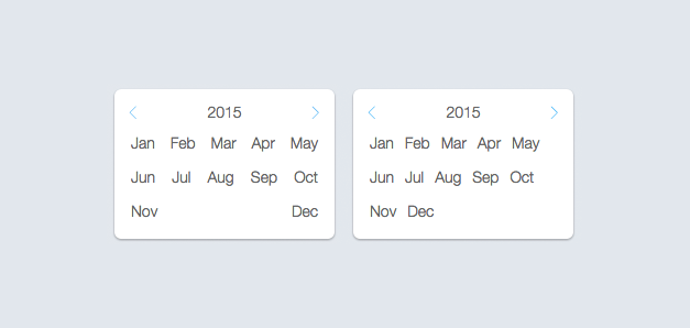 Figure 14. For this calendar month-picker,
 justify-content: space-between is used on the left, and justify-content: flex-start on the right. Both wrap content very differently. (View large version)These two examples clearly show why one must plan ahead. How will the content wrap? How will it react as the viewport is resized? Does the content need to be wrapped? These are important questions to ask to arrive at the right strategy for the context.
Layout
Flexbox is ideal for interface elements, but it also plays well with certain layout patterns. A typical pattern is a primary container (typically for the main content) floating entirely to one side and a complementary container floating to the other.
The code required for this pattern is heavenly to implement, and the extra required for a fallback is minimal.
The markup for the admin layout uses a series of divs to wrap each container, as seen above.
<div class="admin-ui">
  <div class="admin-ui__nav">…</div>

  <div class="admin-ui__body">
    <nav>…</nav>
    <main>…</main>
  </div>
</div>
.admin-ui__body {
  display: flex;
}

.admin-ui__body nav {
  flex: 30%;
}

.admin-ui__body main {
  flex: 70%;
}
Here’s a great fallback for the layout pattern discussed in figure 14. The pattern doesn’t involve a complicated grid structure. Plus, our old friend display: table is ready to provide a hand when needed.
See the Pen Display: table-cell by Dennis Gaebel (@dennisgaebel) on CodePen.
The display: table-cell is a powerhouse CSS declaration that dates back to CSS 2 and is a perfectly reliable fallback for this context. The value causes the element to behave like a table element, which is exactly the kind of behavior we need in order to replicate the flexbox version. You could also swap the order using some table trickery, with such declarations as display: table-header-group and display: table-footer-group.
Sticky Footers
Sticky footers are one of those rites of passage for aspiring web developers, where the footer is positioned at the bottom of the viewport. If content is added, it will push the footer down, but the footer would appear at the bottom of the viewport in any other case.
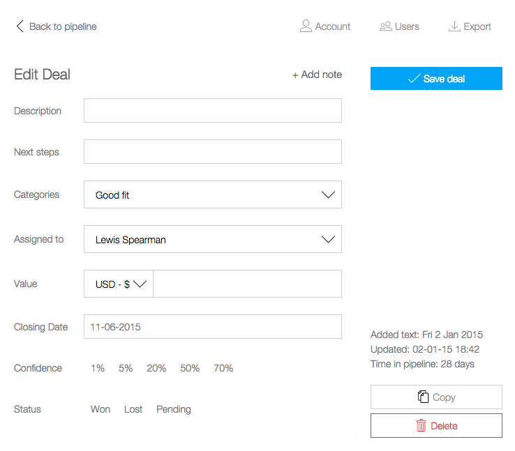 Figure 16. Sticky footer in the right sidebar. (View large version)
Here is the markup for the right sidebar:
<div class="admin-edit">
  <button class="admin-edit__save">Save Deal</button>

  <div class="admin-edit__footer">
      <p>…</p>
      <button>Copy</button>
      <button>Delete</button>
  </div>
</div>
And here is the CSS:
.admin-edit {
  display: flex;
  flex-direction: column;
  justify-content: space-between;
}
Here’s a great fallback for flexbox sticky footers that also maintains the layout all the way back to IE 6.
See the Pen Sticky footer on steroids by Dennis Gaebel (@dennisgaebel) on CodePen.
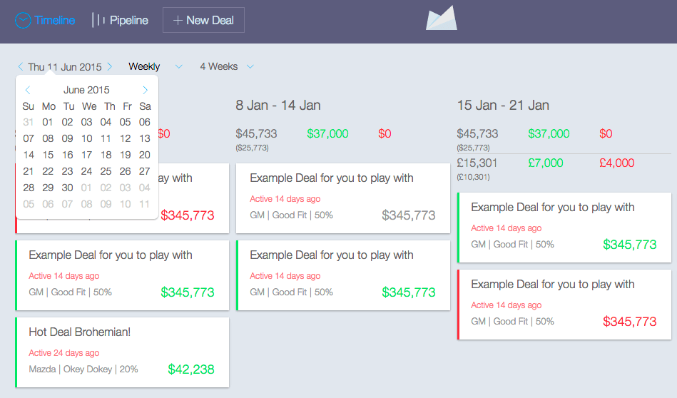
Another part of the layout where I took a chance with flexbox was the main application view, or what was termed the “pipeline” of the application. Each card has a defined width and takes advantage of the flex property. This gives each card a consistent and defined proportion.
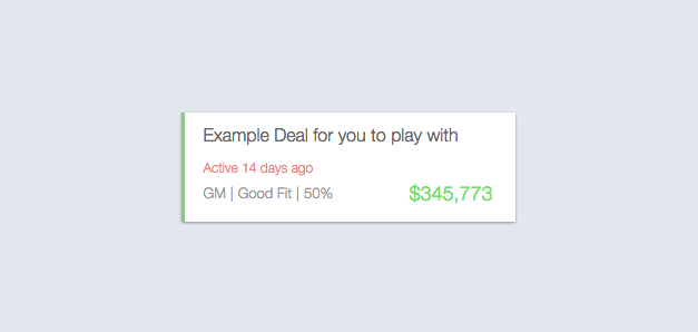 Pipeline. (View large version)
Flexbox helps to position the content of each card beautifully. The entire application is one big layout version of the movie Inception, where flexbox contains flexbox, which contains even tinier atoms and molecules using flexbox. It’s mind-boggling when you consider how hard developers used to fight to center an item, but today we accomplish this in only a few lines of code.
Be Careful
During browser testing, we discovered that combining the flex property with other spacing properties, such as margin and padding, resulted in a broken layout when viewed in IE 10 (see figure 18).
.parent {
  display: flex;
}
.parent .child {
  flex: 1;
  padding: 20px; /* Breaks layout in IE 10 */
}
When a module’s parent wrapper, defined with display: flex, has children that use the flex property along with padding or margin, the layout breaks in IE 10.
The feature query @supports (display: flex) {} is supposed to be something like Modernizr but implemented with native CSS. Unfortunately, support for @supports is very poor at this time and should be avoided. Instead, here are some tips for fallback solutions:
- Use Modernizr’s
no-flexboxclass to detect features. - Use transforms or a table display for centering.
- Use a table display.
- Control the order with table-display tactics, such as
table-caption,table-header-groupandtable-footer-group. - Use floats as a fallback for entire layout structures.
- Use inline or inline-block as a display fallback for inline patterns.
- Use conditional comments for IE 9 and below to deliver non-flexbox styling.
Ian Devlin has a great article explaining stacking techniques. He gives a great overview of how to control stacking order using table-caption, table-header-group and table-footer-group.
Conclusion
Flexbox today is very, very real. After many years of development, the specification has become much more stable, making it easier to achieve those CSS layout dreams. I also suggest going through Wes Bos’ What the Flexbox?! The simple 20-video crash course will help you master flexbox, all for free! The first 13 videos cover the fundamentals of flexbox; the last 7 are code-alongs in which Wes builds everything from navigation to a mobile app layout, entirely with flexbox! There is truly no time like the present to start using it in your work.
Further Reading
- Flexbox Is As Easy As Pie – Designing CSS Layouts
- CSS Grid, Flexbox And Box Alignment
- The Flexbox Reading List: Techniques And Tools
- Harnessing Flexbox For Today’s Web Apps
 (ds, ml, al, jb, mrn)

