Using UI System Fonts In Web Design: A Quick Practical Guide

Email Newsletter
Weekly tips on front-end & UX.
Trusted by 182,000+ folks.

 Custom Web Forms for Angular, React, & Vue. Your backend.


 Celebrating 10 million developers
For perhaps the first time since the original Macintosh, we can get excited about using system UI fonts. They’re an interesting, fresh alternative to web typography — and one that doesn’t require a web-font delivery service or font files stored on your server. How do we use system UI fonts on a website, and what are the caveats?
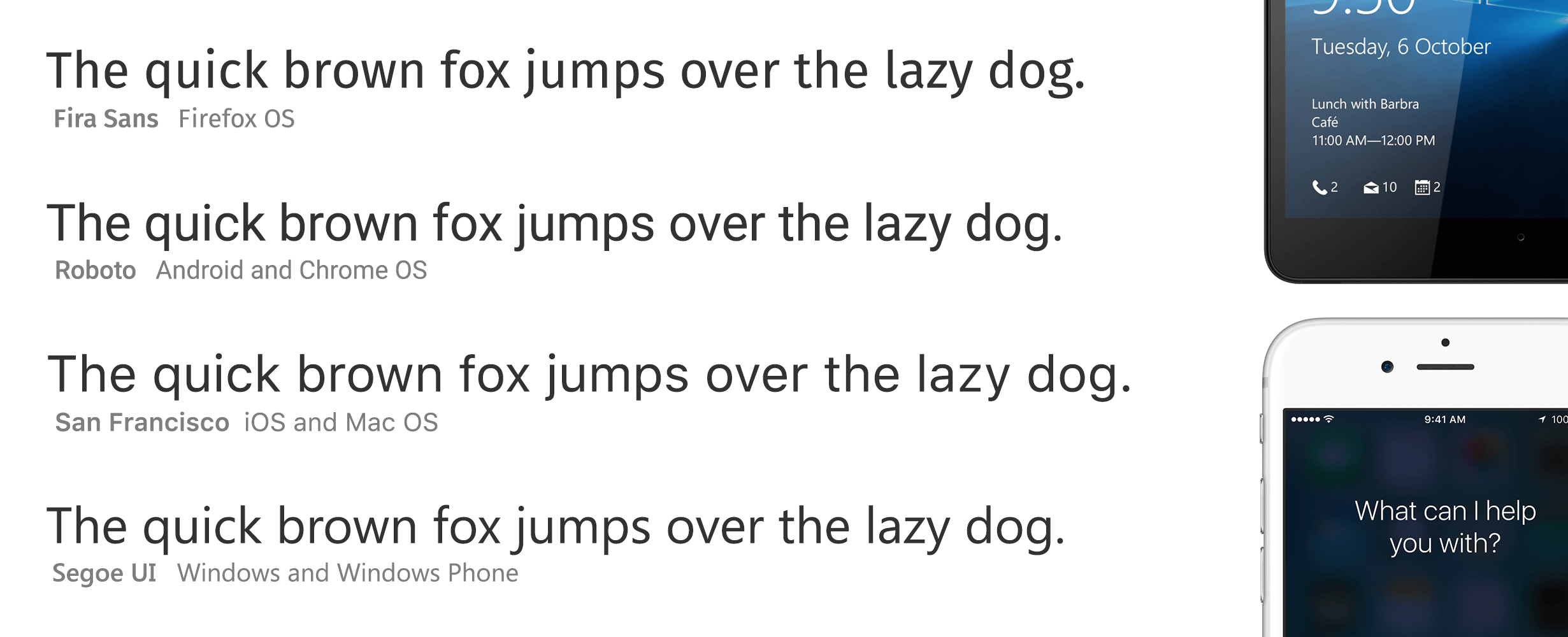
System UI fonts being amazing kind of snuck up on us. Google has been toiling away at Roboto with great success (including regular updates), Apple made a splash with San Francisco, and Mozilla asked renowned type designer Erik Spiekermann to create Fira Sans. Last but not least, let us not forget about Microsoft. It was Microsoft that restarted conversations about system UI fonts with its original Windows Phone design language (née Metro), which relied heavily on typography in general, and on a font named Segoe in particular.
No wonder that the idea of using those fonts is spreading through the web world as well. Whether you want your website to feel more like an app, to draw clearer lines between the content and user interface, or to use modern, beautiful fonts with zero latency, you might be interested in using system UI fonts on your website.
But it’s not as easy as it could be. That’s because the CSS support is curiously schizophrenic.
(Nomenclature note: I am using “system UI font” here to refer to the font that the user interface of the operating system is rendered in — distinct from a “system font,” a traditional name for any local or platform font that is already present on the user’s system and that doesn’t need to be included in the website’s payload.)
Two Approaches To System Fonts
Currently, there are two approaches to making your website use the system UI font for its typography.
Approach A
Approach A is to use the “magical” shorthand CSS property:
font: menu;
A few of these shorthand properties have existed for the longest time (caption, icon, menu, message-box, small-caption, status-bar), yet I have never seen them being commonly used.
Approach A has its drawbacks:
- It doesn’t return a correct font on iOS, nor in many Android browsers.
- It’s a shorthand, which means it overrides the font size (although that can be reset), and it cannot be combined with and does not fall back to anything else.
- Until December 2015 in Firefox on Mac OS X, it doesn’t use the “smart” properties of San Francisco (which switches from San Francisco Text to San Francisco Display automatically for text over 20 pixels and adjusts letter spacing).
Approach B
Approach B is to list fonts by name:
font-family: -apple-system, BlinkMacSystemFont,
    "Segoe UI", "Roboto", "Oxygen",
    "Ubuntu", "Cantarell", "Fira Sans",
    "Droid Sans", "Helvetica Neue", sans-serif;
This, too, has its drawbacks:
- You’ll have to maintain the list (and its order). Perhaps system UI fonts won’t change as often as they did in the last few years — but in any case, this is not future-proof.
- The list targets the most popular browsers and operating systems, but it doesn’t target all of them.
- It doesn’t yet work in Firefox on Mac OS X El Capitan, resulting in Neue Helvetica being shown, rather than San Francisco. (This is slated to be fixed in December 2015.)
- This solution is prone to naming conflicts, which led to a very interesting bug with the system font on Medium. Also, for example, Oxygen (KDE’s UI font) is the name of another font that people can install, which can lead to surprises. Also, if you are a developer and happen to have installed Roboto or Fira Sans on your machine, then this font declaration might use one of those instead of the system’s actual UI font.
- Mac OS 10.0 to 10.9 uses Lucida Grande as the system UI font. Mac OS 10.10 uses Neue Helvetica. However, all versions of Mac OS X have both of these fonts installed. Because the
font-familydeclaration works by sequentially going through the list of fonts to find the first one installed, choosing Lucida Grande on some platforms and Neue Helvetica on others is impossible. The first available one listed in the declaration will always be chosen.
Other Approaches
You might be inclined to combine approach A with approach B to get the best of both worlds. Unfortunately, this is not easy because the font and font-family properties are mutually exclusive — one will just override the other. Perhaps media queries can come to the rescue, but that’s hacky.
You might also imagine sending different CSS values from the server, depending on the user agent (for example, sending only font-family: “Fira Sans”, sans-serif; if we know the browser is running on Firefox OS), or doing it via JavaScript. But this seems cumbersome and hard to maintain, and it still doesn’t solve all of our problems.
What To Do Today?
I work at Medium, and currently we use approach B:
font-family: -apple-system, BlinkMacSystemFont,
    "Segoe UI", "Roboto", "Oxygen", "Ubuntu", "Cantarell",
    "Fira Sans", "Droid Sans", "Helvetica Neue",
    sans-serif;
We chose this approach because it seems to have fewer major problems. (Approach A fails in mobile browsers in ways that are unacceptable. Approach B fails, too, but less often and with fewer consequences. Your mileage may vary.)
You and I can make this even better together. The box below uses the declaration above and should render in your system’s UI font. If it doesn’t or if you have any thoughts, please leave a comment!
This should be rendered in your system’s UI font. The quick brown fox jumps over the lazy dog.
Details Of Approach B
If you are interested in the details, let’s work through how this list got to look the way it does:
font-family:
/* 1 */ -apple-system, BlinkMacSystemFont,
/* 2 */ "Segoe UI", "Roboto", "Oxygen", "Ubuntu", "Cantarell", "Fira Sans", "Droid Sans",
/* 3 */ "Helvetica Neue", sans-serif;
The first grouping is CSS properties that map to the system’s UI font. That covers a lot of ground, and there is no chance that these fonts will be mistaken for something else:
-apple-systemtargets San Francisco in Safari on Mac OS X and iOS, and it targets Neue Helvetica and Lucida Grande on older versions of Mac OS X. It properly selects between San Francisco Text and San Francisco Display depending on the text’s size.BlinkMacSystemFontis the equivalent for Chrome on Mac OS X.
The second grouping is for known system UI fonts:
Segoe UItargets Windows and Windows Phone.Robototargets Android and newer Chrome OS’. It is deliberately listed after Segoe UI so that if you’re an Android developer on Windows and have Roboto installed, Segoe UI will be used instead.Oxygentargets KDE,Ubuntutargets… well, you can guess, andCantarelltargets GNOME. This is beginning to feel futile because some Linux distributions have many of these fonts.Fira Sanstargets Firefox OS.Droid Sanstargets older versions of Android.- Note that we don’t specify San Francisco by name. On both iOS and Mac OS X, San Francisco isn’t obviously accessible, but rather exists as a “hidden” font.
- We also don’t specify San Francisco using
.SFNSText-Regular, the internal PostScript name for San Francisco on Mac OS X. It only works in Chrome and is less versatile thanBlinkMacSystemFont.
The third grouping is our fallback fonts:
Helvetica Neuetargets pre-El Capitan versions of Mac OS X. It is listed close to the end because it’s a popular font on other non-El Capitan computers.sans-serifis the default sans-serif fallback font.
Here are the currently known problems with this approach:
- In Firefox on Mac OS X, San Francisco has tighter letter spacing than on Safari and Chrome.
- It doesn’t render Lucida Grande on pre-Yosemite versions of Mac OS X, falling back to Neue Helvetica. And it might not match the correct font on less popular operating systems or more complicated configurations.
The Future
There’s still work to do. Everything we’ve covered works only for Western typography. Also, if you want to adjust the padding or line height according to the UI font that your website is using, then you’ll have to use the hybrid approach above or else detect the font after rendering.
Still, the early results are already good enough. Hopefully, in the future, all of this will become less complicated. If any of this is important to you, please tell browser vendors!
Other Resources
- “I Left My System Fonts in San Francisco,” Craig Hockenberry
- System Shock: A Story of a 25-Year-Old Font Coming Back With a Vengeance,” Marcin Wichary, Medium
Thanks to John Daggett, Michael Duggan, Kenneth Ormandy and Emil Eklund for their help with this article.
Further Reading
- Tools And Resources For A More Meaningful Web Typography
- Guide to CSS Font Stacks: Techniques and Resources
- Whitespace Characters in Unicode & HTML
- Balancing Line Length And Font Size In RWD


