Animating Clipped Elements In SVG

Email Newsletter
Weekly tips on front-end & UX.
Trusted by 182,000+ folks.


 Celebrating 10 million developers
 Custom Web Forms for Angular, React, & Vue. Your backend.
clipPath and a CSS clip-path, including examples to guide and inform you through this journey. Finally, he’ll share a few demos both personal and in the wild to help you better understand clipPath animation and inspire your visions.Scalable Vector Graphics (or SVG) lend developers an incredible ability to display crisp, beautiful graphics at any size or resolution. SVG can also be animated using various techniques. In combination with clipping paths, interesting effects can be achieved.
This article explains the difference between an SVG clipPath and a CSS clip-path, including examples to guide and inform you through this journey. Finally, I’ll share a few demos both personal and in the wild to help you better understand clipPath animation and inspire your visions.
Clipping Facts
When only a portion of an object is visible through a bounding area, we call that a clipping mask. In other words, we get a clipping mask when a portion of a selected surface is “cut out,” making any objects that sit within the bounded region visible to the viewer. Any parts that lie outside of the region are invisible.
Think of a clipping path — CSS or SVG — as a custom viewport, like the porthole of a submarine. Clipping paths can also be considered a special type of mask, according to the W3C’s “Clipping, Masking and Compositing” specification:
“The clipping path restricts the region to which paint can be applied. Conceptually, any parts of the drawing that lie outside of the region bounded by the currently active clipping path are not drawn. A clipping path can be thought of as a mask wherein those pixels outside the clipping path are black with an alpha value of zero and those pixels inside the clipping path are white with an alpha value of one (with the possible exception of anti-aliasing along the edge of the silhouette).”
If you’re curious how events transpire in an SVG with a clipPath, the following diagram depicts how an SVG clipPath is structured:
Clipped content requiring interaction, such as event-driven data, operates according to the “Clipping Paths, Geometry, and Pointer Events” section of the specification:
"By default, pointer-events must not be dispatched on the clipped (non-visible) regions of a shape. For example, a circle with a radius of 10 which is clipped to a circle with a radius of 5 will not receive “click” events outside the smaller radius."
CSS Clip Path
The difference between an SVG clipPath and a CSS clip-path is important. The latter defines a specific region of an element to display. This is all done within a style sheet.
.target-element {
  clip-path: inset(10px 20px 30px 40px);
}
The values in the bounding parentheses are read as “from top, from right, from bottom, from left.” These values define the clipping shape of the corresponding element.
Of course, we could implement far more intricate clipping patterns using a variety of shapes as our template. For instance, we could clip using an external SVG clipPath, referred to by a unique identifier (ID) or a polygon specified as a series of points.
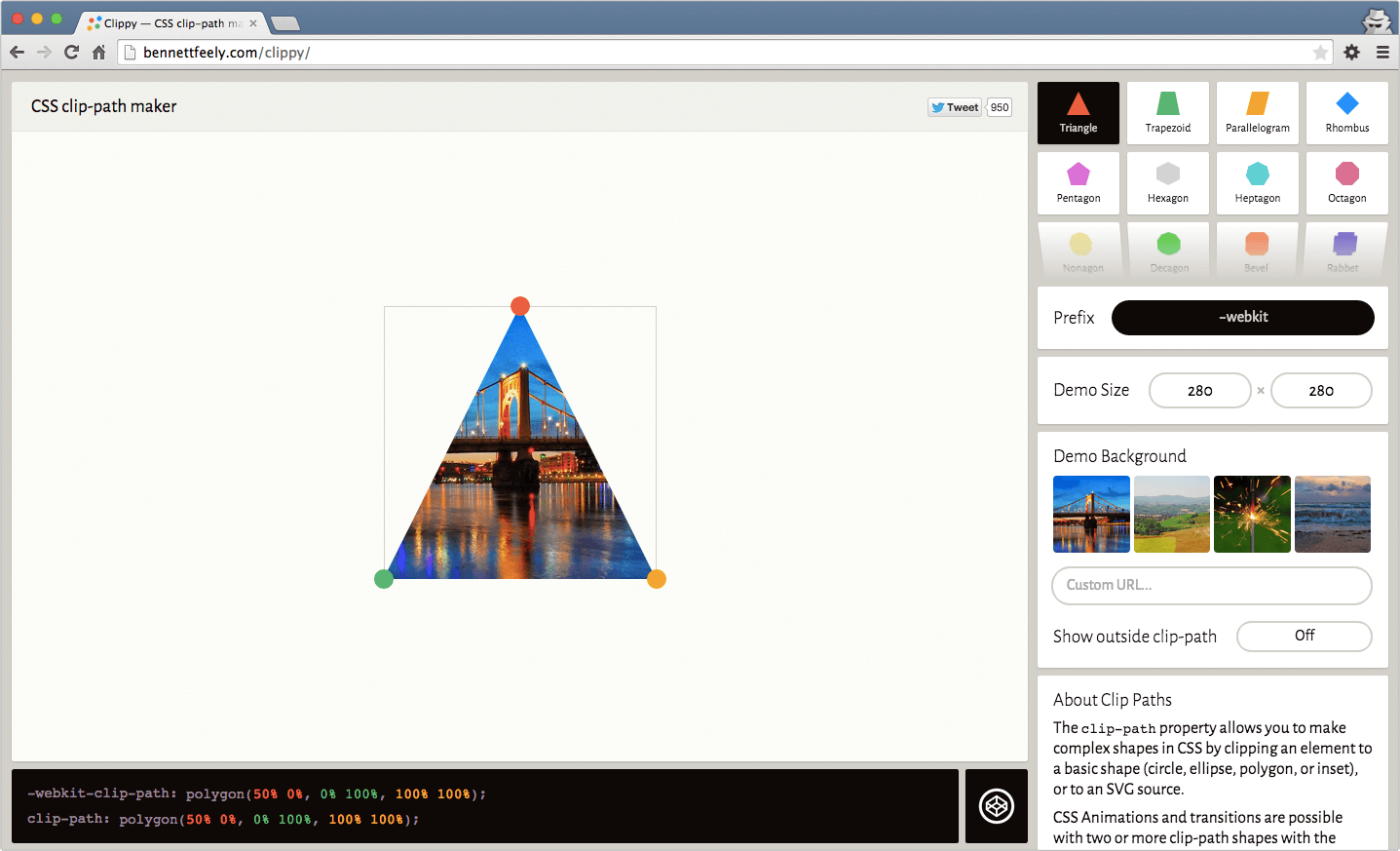
If you want a visual guide, Bennett Feely has made a highly educational and interactive tool, called Clippy, that allows developers to explore different clipping shapes in the browser.
<!DOCTYPE html>
<html>
  <body>
  <svg xmlns="https://www.w3.org/2000/svg" xmlns:xlink="https://www.w3.org/1999/xlink" version="1.1">
    <clipPath id="#inline-svg-clipPath">
      <circle cx="150" cy="150" r="50" />
    </clipPath>
  </svg>

  <div class="clipped-element"></div>
 </body>
</html>
Below is a list of possible variations using the clip-path property in CSS. The first code block represents an SVG located inline with the markup and referred to via an external style sheet. Uncomment each variation to view the result of that approach.
.clipped-element {
  width: 100px;
  height: 100px;
  background: black;

  /* Refers to the inline SVG clipPath element above */
  clip-path: url(#inline-svg-clipPath);

  /* Refers to an external SVG using the same contents of the inline SVG above. */
  /*clip-path: url(path/to/image.svg#inline-svg-clipPath);*/

  /* CSS polygon clip-path */
  /*clip-path: polygon(45% 15%, 100% 0%, 100% 75%, 75% 75%, 75% 100%, 50% 75%, 0% 75%); */

  /* CSS circle clip-path */
  /* clip-path: circle(30px at 35px 35px); */

  /* CSS ellipse clip-path */
  /*clip-path: ellipse(65px 30px at 125px 40px);*/
 }
SVG Mask Vs. SVG clipPath
See the Pen SVG Mask by Dennis Gaebel (@dennisgaebel) on CodePen.
Just so we don’t confuse an SVG mask with an SVG clipPath, let’s examine what an SVG mask is and how it differs from a clipPath. I like to think of masks as a way to accept the visible region already defined by an object’s shape — as if you were to cover an object with a blanket and define the visible region by the object’s shape pressed into this blanket — whereas a clipping path defines the shape, not the object. In the latter case, the object would be covered with a blanket, with the visible region already defined, instead of the visible region being inherited from the object. An SVG mask is defined in the specification as follows:
"A “mask” can contain any graphical elements or container elements such as a “g." […]
"Any graphical object which uses/references the given “mask” element will be painted onto the background through the mask, thus completely or partially masking out parts of the graphical object."
If you’re still pondering what a mask looks like and the mechanics thereof, let’s start with the XML tag:
<mask></mask>
The mask element accepts quite a few attributes that take some getting used to, such as maskUnits. If you’re curious about the attributes, refer to the specification.
Much like a clipPath, a mask may be reused multiple times, as long as it has been defined in the definitions, defs.
<defs>
  <mask id="mask">
    <rect width="800" height="300" fill="url(#gradient)"/>
  </mask>
 </defs>
As the specification states, “A mask can accept a graphical object.” In this case, a rectangle meets this requirement. The mask’s rectangle has also been filled with a linear gradient.
<use xlink:href="#txt" mask="url(#mask)"/>
The final steps are to reference this mask using the mask attribute and to pass the ID of mask within defs to the attribute’s url() method, which retrieves this mask with the corresponding ID. The use element allows for portability, which might be familiar to those of you who use SVG icon sprites.
<defs>
  <linearGradient gradientTransform="translate(10)">…</linearGradient>
</defs>
There are some really crafty ways to animate linear gradients in SVG using the gradientTransform attribute. This attribute accepts many transform values, including translate(), scale(), rotate() and matrix(). If you’d like to dive deeper, the specification lists all of the accepted values.
The gradientTransform example shows how values can be passed using the transform syntax that you are familiar with.
The gradient’s motion is accomplished through the use of the GreenSock Animation Platform, which manipulates the attribute. The entire discussion surrounding how to animate the gradient is best left for another time, but the demo provides plenty of clues, should you be curious.
Spinning Globe
See the Pen Animated SVG clipPath by Dennis Gaebel (@dennisgaebel) on CodePen.
clipPath lending motion to the globe.A clipping path placed strategically over the globe creates the illusion of a sphere spinning 360 degrees when, in fact, it’s two identical paths. These paths (i.e. the map) are moved along the x axis in tandem. Finally, the entire sequence is repeated. An inline SVG clip path — the ellipse — is used to hide the parts of the map that lie outside the view of the globe.

Resting in the defs of the SVG is the clipping shape (i.e. ellipse). Directly beneath it is the reference that turns this ellipse into a reusable clipping path. You can also think of it as a reusable symbol.
The defs element allows graphical objects to be defined for reuse. When possible, define referenced elements inside this element. Defining graphic visuals such as linear gradients and animations inside these elements promotes both understanding of the SVG content and accessibility.
Because the clipping path defined in defs has an ID, it can be referred to with the use element to render these graphical effects anywhere. A clipping path is referred to using the clip-path attribute, as follows:
<svg version="1.1" xmlns:xlink="https://www.w3.org/1999/xlink" viewBox="0 0 484.4 261.7">
    <defs>
    <ellipse id="ellipseClip" cx="239.7" cy="139.2" rx="65" ry="62.5"/>
        <clipPath id="clipPathId">
      <use xlink:href="#ellipseClip" overflow="visible"/>
    </clipPath>
    </defs>

  <g id="globe">
    <use xlink:href="#ellipseClip" fill="#A4CAE1" overflow="visible"/>
      <g id="middle" clip-path="url(#clipPathId)">…</g>
    <g id="left" clip-path="url(#clipPath)">…</g>
  </g>
</svg>
In this case, the use element is used multiple times, making this technique one of the best parts about SVG. Any graphical elements defined inside defs are not directly rendered and can be saved for reuse at another time. The use element takes nodes from within the SVG document and duplicates them elsewhere.
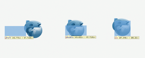
I’ve highlighted each part of the SVG where the clipping path occurs. The clip path is an ellipse where the content (in this case, the map of the continents) is clipped into the ellipse shape (the globe). I’ve also included a duplicate map off to the left of the initially visible map, to make this spinning sequence appear as if it is rotating seamlessly.
To see this effect for yourself, follow the steps detailed in the video above:
- Open Chrome.
- Load the Codepen page.
- Right-click on the globe, then select “Inspect Element.”
- In the “Elements” tab of the Developer Tools, find the element
id="continents"and expand it. - For each of the elements
id="middle"andid="left", double-click on the codeclip-path="url(#clipPath)", select it completely, backspace, then enter. - Now, on the page, watch the two sets of continents move.
Using the GreenSock Animation Platform to control the motion and some minor timing adjustments, we can make the globe appear to spin 360 degrees seamlessly.
If you’ve never heard of it, the GreenSock Animation Platform (called GSAP by avid users) is a suite of tools for scripted animation written in JavaScript. Sarah Drasner and Dennis Gaebel each offer a great series on it for the eager beginner.
If you’re curious how to create a clipPath in Illustrator, follow these steps:
- Make a shape with the Marquee or Pen tool.
- Place an object below the shape.
- Right-click the object, and select “Make clipping mask.”
Folding Fan
See the Pen Folding Fan by Dennis Gaebel (@dennisgaebel) on CodePen.
To better understand clipPath, let’s examine this SVG fan by Thoughtbot, who has thoroughly cleaned and customized it by hand and strategically placed clipPath to identify and animate the visible region.
The diagram helps us to understand the clipPath shape by revealing what remains visible and invisible to the viewer as the folding action takes place. The individual blades don’t fold because the motion is fast enough to fool the eye — the entire section of blades is moved outside the clipping path through the power of rotation. The clipPath is nothing more than a simple polygon shape. Anything that resides within the bounding area is visible to the viewer, and anything outside of this region is invisible.
<svg version="1.1" xmlns="https://www.w3.org/2000/svg" xmlns:xlink="https://www.w3.org/1999/xlink" viewBox="0 0 92 92.1">
  <defs>
    <polyline id="fan-clipShape" points="12.5,79.5 89.2,86.6 89.2,2.5 12.5,2.5    "/>

   <clipPath id="fan-clipPath">
  <use xlink:href="#fan-clipShape"/>
    </clipPath>
  </defs>

  <g id="fan" clip-path="url(#fan-clipPath)">…</g>
  <g id="handles">…</g>
</svg>
The SVG uses a polyline element to create the defining shape. A clipPath is then created around it, defining the bounding region, a square. Finally, the shape is laid over the portion of the artwork where the clipping effect is desired — that is, directly over the fan blades, designated with an ID of fan and referred to by the clip-path attribute.
Clips And Paths To Create The Illusion Of A Morph
See the Pen SVG Paper Shredder by Chris Gannon (@chrisgannon) on CodePen.
In this demo, Chris Gannon animates clipping paths to make paper appear as though it’s being shredded or morphed into another form, although the strips themselves are not created with clip paths. Investigating the HTML panel of this demo, you’ll see that the individual parts of this SVG reside in a single vector file.
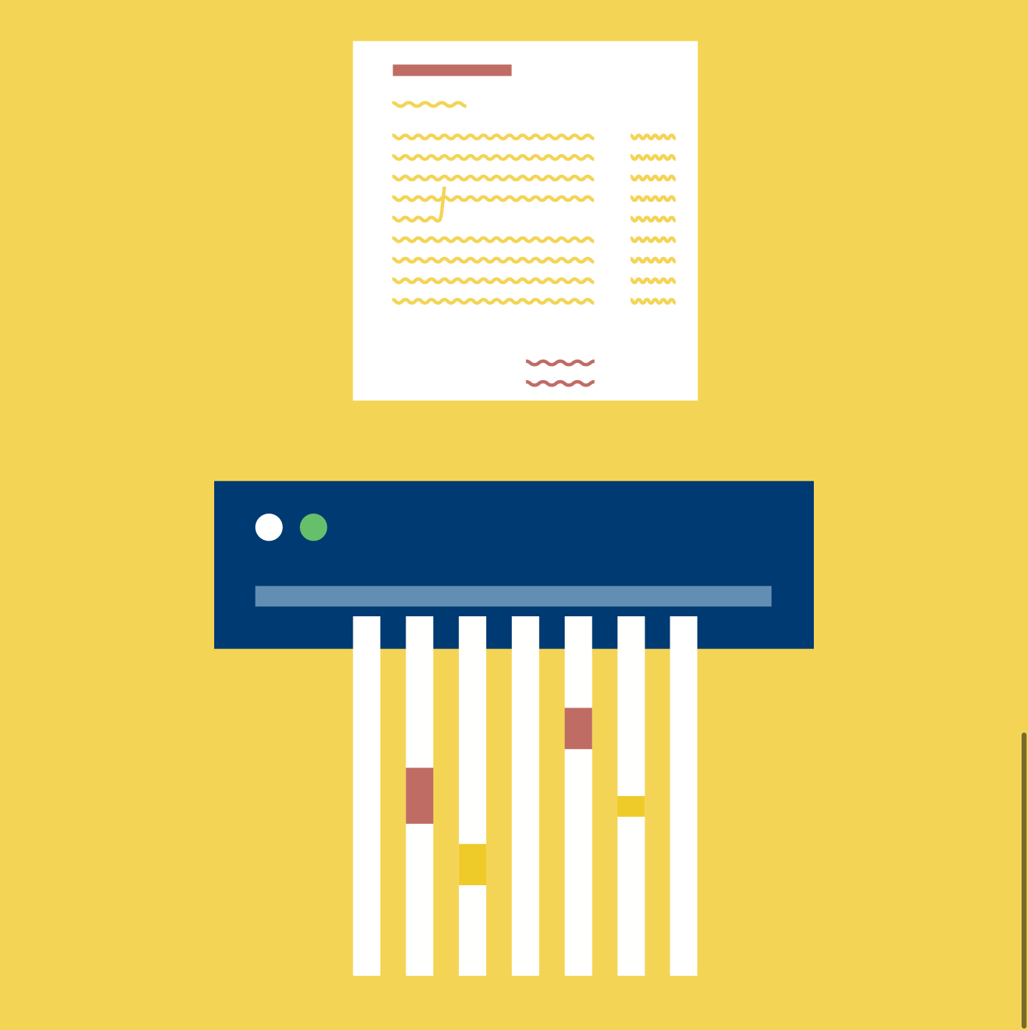
If you’re still asking yourself how this trick is done, the following image illustrates the effect:
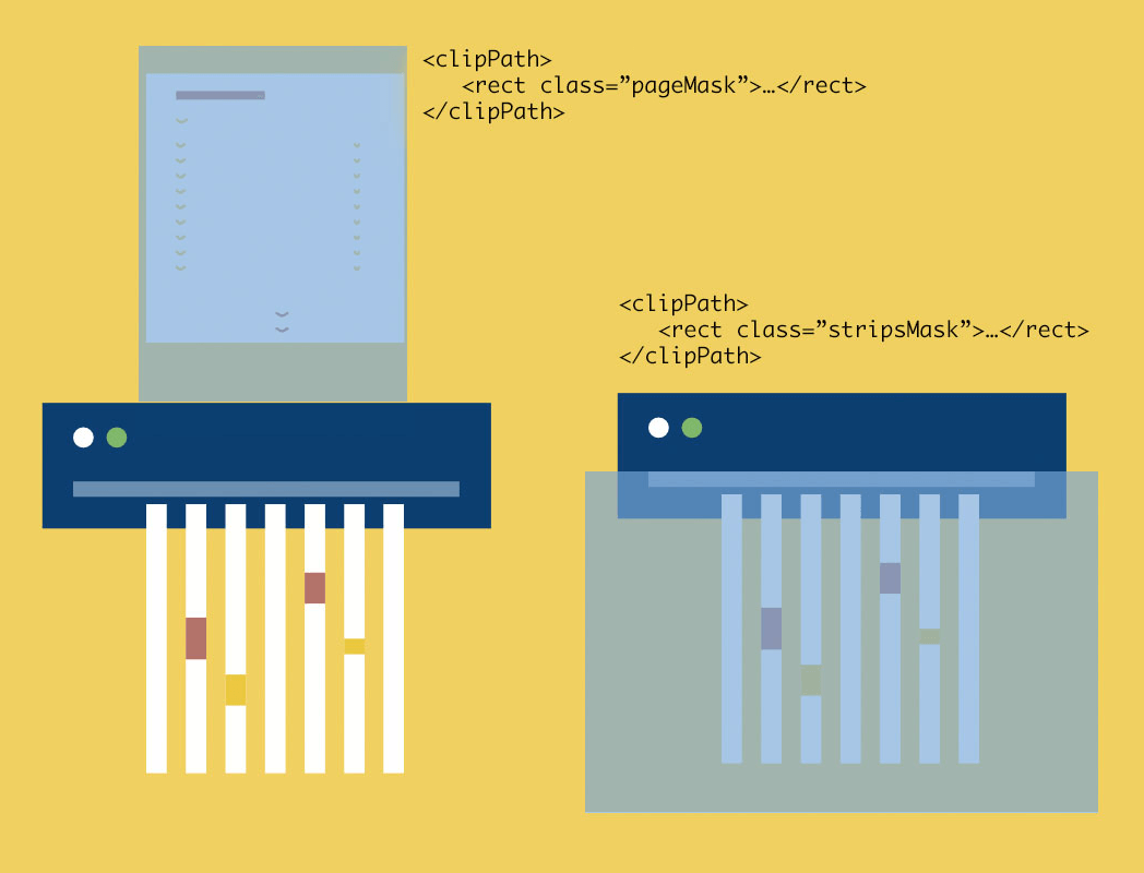
clipPath, which creates the paper-shredding effect. (View large version)The clipping paths are simply SVG rectangles, nothing more! This means that anything within the boundaries of the defined rectangle will be visible to the viewer, and anything that lies outside of this space will be invisible.
All that’s left to do is move the bits within these clipping regions along the y axis from top to bottom. Just before the full sheet of paper reaches the end of its sequence, a call is made to the next sequence of the animation, whereupon the paper is chopped up and ejected from the shredder.
Clipping Animations With Mouse Events
See the Pen X-ray me (SVG Experiment) by Noel Delgado (@noeldelgado) on CodePen.
This demo was posted quite a while back, but it’s worth sharing because it shows another great use of the clip path. It’s also a pretty fun way to combine SVG clips with user interaction. Move your mouse over the girl to see the effect.
See the Pen SVG Space Rocket! by Chris Gannon (@chrisgannon) on CodePen.
Here is the same concept that we previously saw, but combined with a bit of animation to enhance the effect.
Conclusion
Clip paths open up a wide array of exciting possibilities. Understanding the simple mechanics and how everything moves relative to each other can help you create some powerful and captivating interactions for your users. Try this out with text, imagery, scrolling and more! Have fun, and don’t be scared to take chances.
(ds, ml, al); Smashing Magazine would like to thank Sarah Drasner for her expert assistance with code examples in this article.
Further Reading
- Rethinking Responsive SVG
- A Few Different Ways To Use SVG Sprites In Animation
- Creating Cel Animations With SVG
- The Guide To CSS Animation: Principles and Examples
 (mrn)
(mrn)

