Getting Back Into The (Right) Deliverables Business

Email Newsletter
Weekly tips on front-end & UX.
Trusted by 182,000+ folks.


 Custom Web Forms for Angular, React, & Vue. Your backend.
 Celebrating 10 million developers
“Get out of the deliverables business” has become quite a mantra in the lean startup and UX movements. There’s much to love in that sentiment — after all, for every wireframe you make, you’re not shipping code to customers.
But I’m worried that, just like with the concept of a minimum viable product, we’ve taken this sound advice to an extreme that’s actually hurtful to the creation of good products. What follows is an account of my own journey in navigating these stormy design seas together with the community.
Below is a photo of what many believe to be the first wireframe ever created. It’s attributed to Paolo di Dono (or Paolo Uccello), sometime in the mid-1400s.
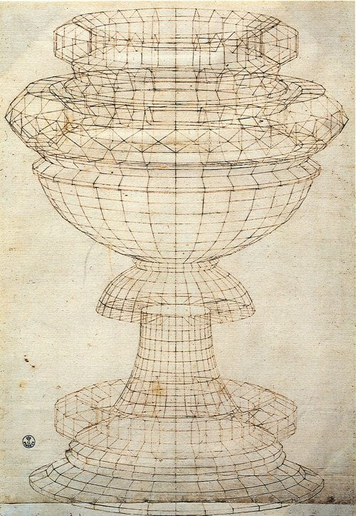
Back then, wireframes were used to accomplish very specific goals in the design of everyday objects:
- view the model from any desired point,
- produce standard and auxiliary views,
- create perspective views more easily,
- analyze distances within the structure,
- check tolerances and interference,
- decrease the number of prototypes required,
- edit the model.
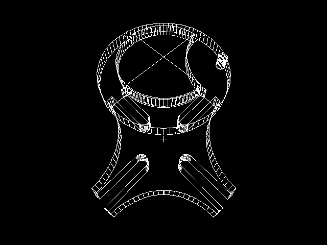
Wireframe models are particularly useful in the world of architecture, so it’s no surprise that they are integral to software for creating CAD models:
To clarify a bit, wireframes were originally used to accomplish two product design goals: reduce reworking and speed up delivery. Those words will make any designer or developer’s ears perk up. Who doesn’t want that?
However, somewhere along the way, we watered down wireframes to something completely different. At worst, they’re reverse-engineered artefacts based on completed Photoshop files, created once the agency’s account manager remembers that they’re supposed to “do UX” as part of the project they sold. At best, they’re hailed as good communication tools — nothing more, nothing less. We’ve managed to reduce a highly useful design tool to something we fight over on Twitter. And the humble wireframe is not the only thing in the crosshairs. Personas. PSDs. Debriefing presentations. They’re all looked on with the same disdain.
The reality is that there is a lot of truth to the criticism we heap on “deliverables.” The lean movement is right about the main reason for getting out of the deliverables business: Whatever time we spend documenting stuff is time spent not making stuff, and that’s a problem. It’s much better to create hypotheses, build them quickly and test them with users to get feedback and iterate. I’m in complete agreement on that approach.
That being said, there is a problem with this approach, which bothered me more and more in my own journey to stop making deliverables. The problem is that design is path-dependent. The choices we make early on in a design constrain the choices we can make later on. Ryan Singer sums this up really well in his answer on the Quora thread “Should I focus on a good user experience, or push something out quickly?”
“On the very first iteration the design possibilities are wide open. The designer defines some screens and workflows and then the programmer builds those. On the next iteration, it’s not wide open anymore. The new design has to fit into the existing design, and the new code needs to fit into the existing code. Old code can be changed, but you don’t want to scrap everything. There is a pressure to keep moving with what is already there. Our early design decisions are like bets whose outcome we will have to live with iteration after iteration. Since that’s the case, there is a strong incentive to be sure about our early bets. In other words, we want to reduce uncertainty on the first iterations.”
So, the main question I kept running into as I stripped deliverables out of my design process is this: How do I know where to start? How do I make sure I start in a place that isn’t going to limit me so much that I’ll have to start over completely at some point? And not just that, but what about that thing we all want to pretend doesn’t exist but we have to deal with every single day? You know, the S word. Stakeholders, those people who need to know what’s going on and why, all the time. Without deliverables, we’re kind of exposed to the elements on that, with nothing to lean on.
Something’s gotta give, and I think that something is the deliverables that we make part of our design and development process. So, I started thinking.
I started thinking about Jared Spool’s excellent piece from earlier this year, “A Bias for Making” in which he wrote the following:
“A bias for making doesn’t mean the team never plans. On the contrary, plans happen fluidly throughout the entire design process. The difference is they are evolving as the team learns from the process of making.”
And then I started thinking about Giff Constable’s words in “You Are Spending 3x – 5x More Than You Should”:
“Agile/lean has helped people debunk the “big upfront design” phase, but far too many replace it with nothing.”
And, as I kept thinking about all this stuff, I started to realize that there are some things that the right deliverables could actually be good at. For example:
- Deliverables could provide a better baseline to start designing wireframes and prototypes from, particularly when it comes to device-agnostic design and development.
- Deliverables could help teams run along smoothly by anchoring everyone in the same vision and serving as a communication tool to help executive teams understand the execution plan.
- Deliverables could help with building up organizational memory, so that when the inevitable leadership changes happen, not everything gets scrapped and everyone has to start over.
Of course, the next obvious question is, “What are these right deliverables you speak of?” If we’re all agreed that lorem ipsum-based wireframes and hundreds of PSDs are against the spirit of lean, what’s the alternative? How do we solve the problems that “no deliverables” present and come up with something that helps us create better products (which is the end goal we all have in common)?
There are two kinds of deliverables I’ve been working on as possible (work-in-progress) solutions to these issues: expanded customer journey maps and content slice diagrams. Let’s look at each in turn.
Expanded Customer Journey Maps
Journey maps are visual representations that help summarize research, highlight and prioritize user needs and opportunities, and give teams a common goal to work towards. (See Adaptive Path’s excellent introduction, “The Anatomy of an Experience Map.”) A product’s journey map is important for several reasons:
- It confirms a common understanding of the users’ needs and goals and the strategy you intend to follow to attend to those needs and goals.
- It is an excellent prioritization tool, because it enables companies to focus on the most important parts of an experience first, without losing sight of the overall picture.
- It is a guiding light for design once you move to wireframing and prototyping. Every time a design idea comes along, a quick glance at the journey map helps you figure out whether it’s a good idea that will accomplish the chosen strategy.
- It is an excellent conduit for content-first design, which fits in perfectly with responsive design approaches.
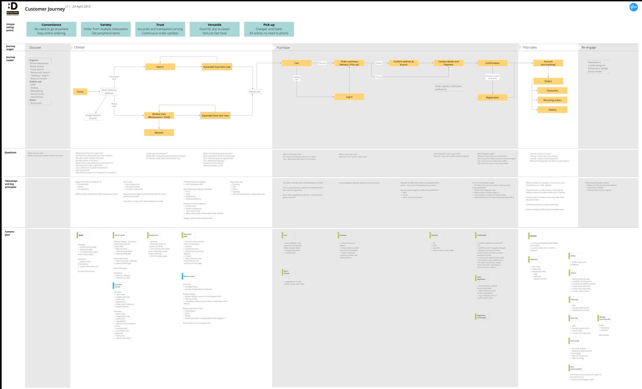
Customer journey maps can be created in many different ways, but they all have some common elements, such as a visual representation of customer touchpoints and emotions, as well as key takeaways throughout the customer’s experience with a product. But that’s only useful up to a point, so we’ve started to expand on the concept. In addition to the usual elements, this document also becomes a representation of the information architecture and the product’s content plan, with personas (needs, goals, scenarios) serving as the starting point for everything — the glue that ties it all together.
This new document is a summary of everything we need to know to design the best possible product for users. It has the following elements:
- Unique selling points keep us focused on what the website needs to communicate at all times. This comes straight from the persona’s needs and goals.
- Journey stages and model remind us of how the product fits into people’s lives, and what the primary calls to action need to be throughout the website. This section is a visual representation of a customer’s journey, from realizing they might need the product until long after they’ve used it. This helps product managers keep a holistic view of the entire product and how it fits into users’ daily lives.
- Questions, which our target personas will likely ask in each phase of the journey, focus the type of content we serve on each page. In an e-commerce context, these are questions like, “Can I trust this retailer?” or “When will my stuff arrive?”
- Takeaways and key principles summarize the unique selling points, journey model and user questions, and they document how these translate into the design decisions and solutions to keep in mind throughout the design process.
- A content plan maps each phase of the journey with the questions that our personas will ask during that phase and a summary of what that means for the specific content that needs to go on each page. We get very specific here — nothing goes on the page unless it’s in the content plan. And if we can’t identify a persona that would find the content useful, it doesn’t go on the list.
We found that this kind of expanded customer journey map does a few things really well:
- It is completely device-agnostic. It starts with personas and content, and the entire design remains anchored in that.
- Once you get going with designing interactions and creating prototypes, design cycles happen faster because everyone is aligned on the vision and direction.
- During user testing, we tend to find fewer usability issues because we’ve already thought through the most common problems that might occur.
- As a team, we tend to have better arguments about our designs — meaning we don’t fight about whether a button should be blue or yellow, but rather about whether the design accomplishes the goals we’ve agreed on.
It’s not a perfect solution, of course. Everything has drawbacks. In the case of expanded journeys, we’ve found that we still need to work through the following challenges:
- There’s no denying it, the lead time before a design starts is longer. That’s just the way it is, because thinking about a problem takes time. Once the design phase starts, we make up that time in spades, as mentioned above, but it can still be awkward with clients and internal stakeholders if they can’t see “pictures” as quickly as they want.
- It’s easy to get distracted if you’re a UX nerd. This stuff is so exciting for some people (OK, me) that it’s possible to stand in front of that whiteboard for days if you don’t check yourself. This isn’t about making a nice document, but about making a better product. Give it your best shot and then move on. Don’t get lost in analysis paralysis.
Content Slice Diagrams
Expanded customer journey maps are great, but they’re only half the story. These journey maps force us to plan what content will be needed before we move to laying out the page. That provides a great starting point, but crossing the chasm between knowing what content should go on a page and how to design the best layout for that content can still be quite difficult.
What we need is an effective way to make content hierarchy decisions across all pages without losing sight of the overall consistency of the website. Enter content slice diagrams, which accomplish three fundamental tasks:
- Get an overview of the content across a website to make sure nothing is missing and the layout is consistent where appropriate.
- Design the right size and hierarchy of each of the content chunks on a page, and see how it affects the page as a whole, as well as related pages.
- Provide any guidelines that writers might need to keep in mind as they create the content for the website.
Once the content slice diagrams are completed, designers and writers should have the following information:
- a clear understanding of the hierarchy of each page, which will lead seamlessly into mobile-first layout design;
- what the structure and nature of the content in each chunk will be.
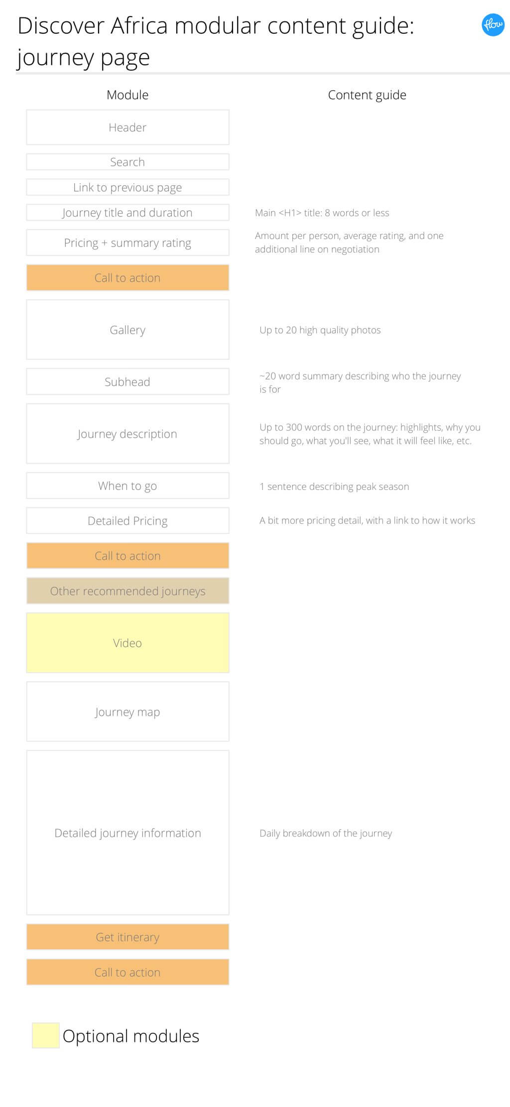
That’s everything you need to start working on the layout. As an example, let’s say you’ve worked on the content plan as part of an expanded customer journey map, so you know what type of content needs to be on a given page — but you’re not sure how to lay it out. A content slice diagram can help. Here’s one we made for a redesign of Discover Africa:
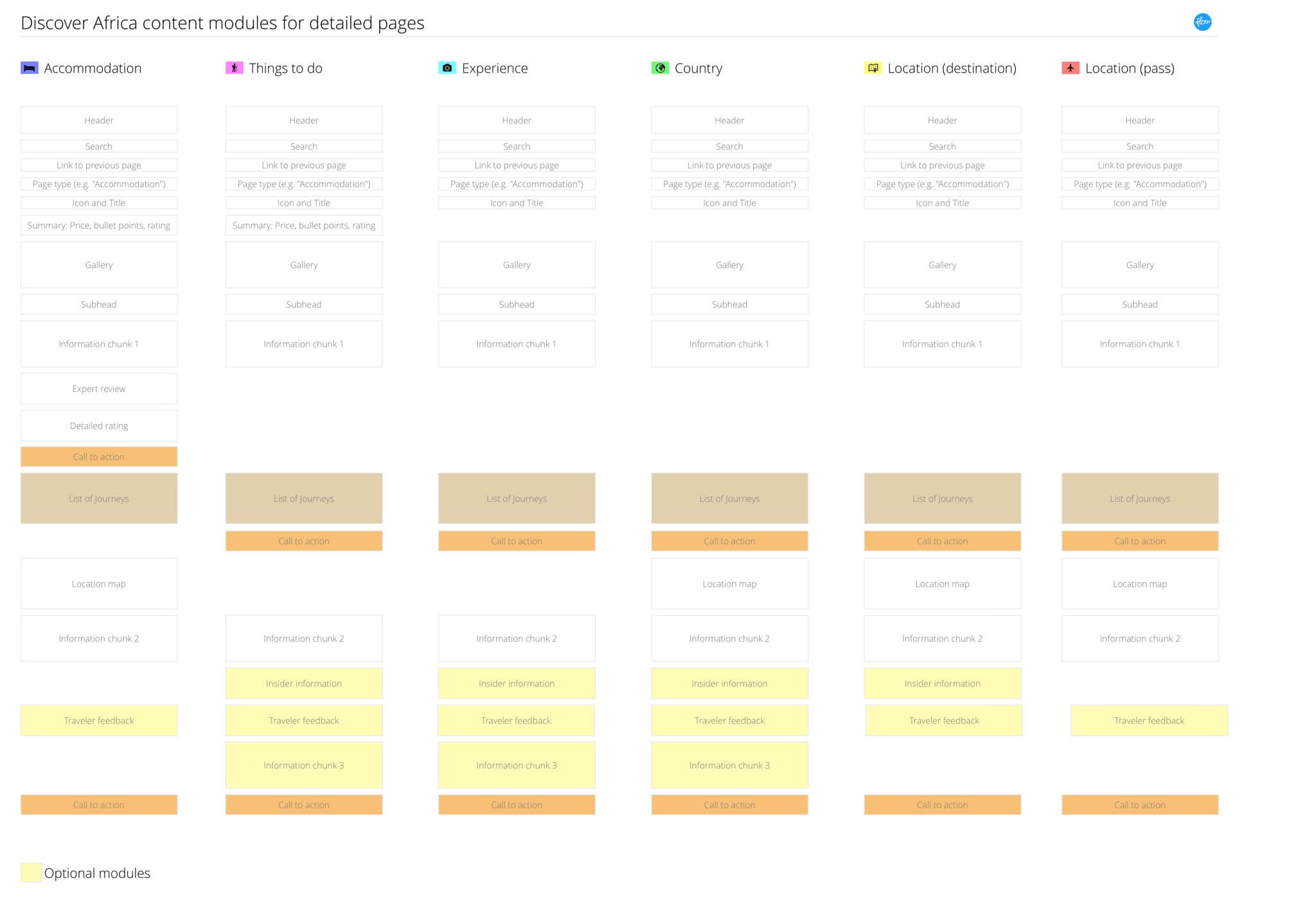
What we have in the image above is a list of pages going from left to right, with rectangles representing content chunks on the page. Calls to action and optional modules are given a different color so that they’re easy to differentiate. When we did this for the travel website, we realized that the call to action was sometimes in a different spot, so we were able to establish consistency across pages. We also moved the content chunks around until we arrived at a hierarchy that makes sense.
You’ll notice that this looks suspiciously like the layout for a mobile screen. That wasn’t the original intent, but it ends up being a welcome side effect of doing content slice diagrams: It’s a great blueprint for mobile-first design.
Once the hierarchy is set, you can create content guides to give writers the structural information they need to start writing:
As mentioned, I hate needless deliverables as much as the next person, but I really like deliverables that help us design better products. And I think content slice diagrams are a great addition to the tools at our disposal for designing device-agnostic, content-first experiences.
And The Point Is?
So, where does this leave us? Yes, deliverables can slow us down and result in documentation that no one reads. But the right deliverables anchor teams in a united product vision, provide early validation for product ideas and speed up (the right) making activities. Those are worth the drawbacks for me.
Remember, deliverables aren’t bad. Bad deliverables are bad.
Further Reading
- The Lean UX Manifesto: Principle-Driven Design
- Effectively Planning UX Design Projects
- Incorporating More Quiet Into The UX Design Process
- A Collaborative Lean UX Research Tool


