Website Layout Tools Compared: Flexbox Vs. Susy

Email Newsletter
Weekly tips on front-end & UX.
Trusted by 182,000+ folks.


 Custom Web Forms for Angular, React, & Vue. Your backend.
 Celebrating 10 million developers
Flexbox has become one of the most popular tools for creating website layouts. Susy is another layout tool that has gained popularity with the Sass community over the last few years.
Many developers I’ve spoken with are unsure which tool is best for creating layouts for their websites. Some feel that Flexbox is powerful enough to handle all of their layout problems. However, they are unsure whether to learn it because of its confusing syntax. Others feel that Susy is much simpler and prefer its simplicity to Flexbox.
Some even ask whether combining Susy and Flexbox is possible so that they can make layouts much more easily. So, these are the two questions that this article seeks to answer:
- Which is more powerful, Flexbox or Susy?
- Is it possible to use both Flexbox and Susy at the same time?
Let’s get the ball rolling by looking at how we’re going to compare Flexbox and Susy.
How We Are Comparing Flexbox And Susy
Strictly speaking, it’s impossible to compare Flexbox and Susy directly because they are two completely different tools. It would be more appropriate to compare Flexbox with a float-based layout.
However, because both Susy and Flexbox are used to build layouts, we can try to build different layouts to serve as a proxy for comparison. In this article, we’ll compare five layouts:
- content and sidebar layout
- content and sidebar on a proportional grid
- content and sidebar on a fixed-gutter grid
- gallery layout on a proportional grid
- gallery layout on a fixed-gutter grid
Don’t worry if you’re unsure what a proportional or fixed-gutter grid is. We’ll get to that when we cover the second layout.
For now, let’s start the comparison with layout 1.
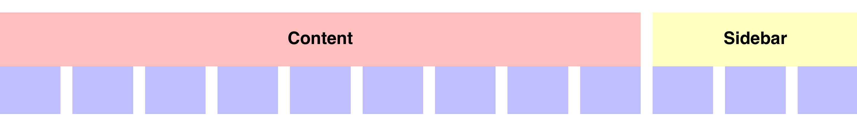
Layout 1: Content And Sidebar Layout
In this first layout, we want to keep things simple so that you start getting used to creating grids with both Flexbox and Susy.
Here, we’re going to create a blog-like layout similar to Smashing Magazine’s, where the content takes up 75% of the total width, while the sidebar takes up 25% of the total width:

Here’s the markup we’re using for both Flexbox and Susy for this layout. We have a containing element plus two divs for each tool.
<!-- Flexbox markup -->
<div class="flexbox">
  <div class="content"> <h4> Content </h4> </div>
  <div class="sidebar"> <h4> Sidebar </h4> </div>
</div>

<!-- Susy markup -->
<div class="susy">
  <div class="content"> <h4> Content </h4> </div>
  <div class="sidebar"> <h4> Sidebar </h4> </div>
</div>
As you can see, we’re keeping things consistent by using the same markup.
Now, let’s start styling.
Flexbox
With Flexbox, we first need to give the parent container (.flexbox) a display property of flex.
Note: We’re skipping the vendor prefixes to simplify the code.
.flexbox {
  display: flex;
}
Then, we add flex-basis, which is similar to the width property, to .content and .sidebar.
.flexbox {
  display: flex;
  .content { flex-basis: 75%; }
  .sidebar { flex-basis: 25%; }
}
See the Pen YywXoj by Zell Liew (@zellwk) on CodePen.
Susy
Susy comes with a default gutter setting on the grids. We first have to disable it by setting gutters to 0 in the $susy map:
// Importing Susy
@import "susy";

// Removing default gutters
$susy: (
  gutters: 0
);
The most common way of using susy so far is with the span() mixin. Here, we can use percentages in the span() mixin for both .content and .sidebar to achieve a similar result:
.susy {
  .content { @include span(75%); }
  .sidebar { @include span(25%); }
}
Because Susy defaults to a float-based layout, we need to force the parent element (.susy) to clear its child elements to prevent the parent element from collapsing:
@mixin clearfix {
  &:after {
    content: ' ';
    display: table;
    clear: both;
  }
}

.susy {
  // Adds clearfix
  @include clearfix;
  .content { @include span(75%); }
  .sidebar { @include span(25%); }
}
See the Pen meevdq by Zell Liew (@zellwk) on CodePen.
As you can see, the code for both Susy and Flexbox are incredibly similar at this stage. The only difference we can point out right now is that Flexbox works purely with CSS, whereas Susy requires the Sass preprocessor.
Let’s move on and compare the next layout. It’ll make things much more interesting.
Layout 2: Content And Sidebar On A Proportional Grid
We’re going to compare a layout with a grid because grids are a basic building block on the web for both designers and developers.
When we think of building a grid for the web, we immediately have to think about how the grid will respond to different screen widths.
Should the columns and gutters expand proportionally when the grid scales upward (a proportional grid)?

Or, should the gutters remain at a fixed size as the columns expand (a fixed-gutter grid)?
The question is important to consider because it will affect how the layout responds on a fluid medium like the web. It will also affect how the layout is coded.
Let’s explore proportional grids first.
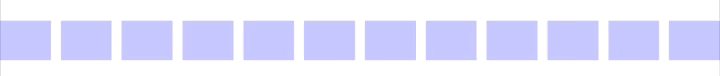
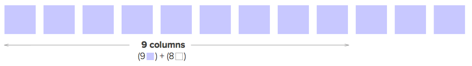
Before moving on, let’s use Susy to help us create a background for the grid so that we can easily see whether we’re on the right track. For this example, we’re going to use a twelve-column grid, and the width of each column will be four times the width of each gutter.
$susy: (
  columns: 12,
  gutters: 0.25,
  debug: (image: show-columns)
);
Then, we’ll show the grid on both .flexbox and .susy with the show-grid() mixin that Susy provides. This show-grid() mixin only creates a background image on the selector and doesn’t affect the code in any way.
.flexbox,
.susy {
  @include show-grid(8);
}
All right, let’s move on. For this layout, let’s try making .content take up nine columns of the grid, while making .sidebar take up the remaining three columns.
Because we’re working on a proportional grid, we need to use percentage widths for both the columns and gutters. Let’s try creating this layout with Flexbox first.
Flexbox
We need to do some math because we’re using percentages.
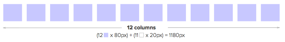
For this layout, let’s assume that each gutter is 20 pixels wide. The columns are four times the gutter width — hence, 80 pixels wide.
The total width of the 12-column layout would then be (12 * 80px) + (11 * 20px) = 1180px.
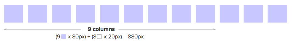
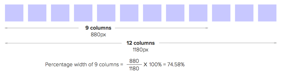
Because .content takes up nine columns, its width should be (9 * 80px) + (8 * 20px) = 880px.
Lastly, we can calculate the percentage width by dividing the width of the content by the grid’s total width. That’s 880px ÷ 1180px * 100% = 74.58%.
Then, we can do the same painful math to get the width of .sidebar:
.flexbox {
  display: flex;

  .content { flex-basis: 74.5762712%; }
  .sidebar { flex-basis: 23.7288136%; }
}
Thankfully, we don’t have to do the math again for the gutters because we can set justify-content to space-between in the flex container. This is because the leftover space, which is one gutter wide, will be distributed between .content and .sidebar.
.flexbox {
  display: flex;
  justify-content: space-between;

  .content { flex-basis: 74.5762712%; }
  .sidebar { flex-basis: 23.7288136%; }
}
See the Pen jbWbPW by Zell Liew (@zellwk) on CodePen.
Now, let’s look at how to create the same layout with Susy.
Susy
With Susy, we insert the number of columns directly into the span() mixin, and it will calculate the percentage width for us. Here, .content would be span(9) because the content takes up nine columns.
Susy also automatically calculates one gutter width and adds it as margin-right to the span() mixin. Hence, when adding span() to sidebar, we have to add an extra last keyword to tell Susy to remove the margin-right property.
In short, the code to create the same layout with Susy is this:
.susy {
  @include clearfix;

  .content { @include span(9); }
  .sidebar { @include span(3 last); }
}
See the Pen avvMyK by Zell Liew (@zellwk) on CodePen.
Right here you might be thinking that this code is so much more elegant, with no painful math. Does this mean that Susy is better than Flexbox?
Well, no. We mentioned earlier that we cannot compare Flexbox and Susy directly because they are different tools. It would be more appropriate to compare Flexbox with the float-based layout for which we had to calculate the painful math back in the day.
This is also where most people misunderstand Susy. It is not a framework. It’s a powerful grid calculator that’s built to handle grid math.
Because it’s just a calculator, we can also use Susy with Flexbox to remove the painful math. The trick lies in a little-known feature in Susy.
This feature is the span() function. It’s what the span() mixin uses under the hood to create the width property.
So, we can also say that the flex-basis of .content is span(9) and that the flex-basis of .sidebar is span(3) to get the same result:
.flexbox {
  display: flex;
  justify-content: space-between;

  // Susy span function with flexbox
  .content { flex-basis: span(9); }
  .sidebar { flex-basis: span(3); }
}
See the Pen LppazX by Zell Liew (@zellwk) on CodePen.
As you can see by now, Flexbox and Susy cannot be compared directly because they are different tools. However, Susy can be used to complement Flexbox for areas for which it is built: grid math.
That being said, let’s continue our “comparison” of how to build layouts with Flexbox and Susy so that you can see the nitty-gritty details that many people miss out on.
Let’s move on to the third layout, where we tackle a fixed-gutter grid.
Layout 3: Content And Sidebar On A Fixed-Gutter Grid
Before continuing, let’s create a grid overlay so that we know whether we’re aligning the grids properly. In this case, we have to roll our own grid for comparison because the one provided by Susy isn’t able to work on a fixed-gutter grid.
The markup for this grid is this:
<div class="fixed-gutter-grid">
  <!-- 12 columns in total -->
  <div class="column"></div>
  <div class="column"></div>
  <div class="column"></div>
  <div class="column"></div>
  <div class="column"></div>
  <div class="column"></div>
  <div class="column"></div>
  <div class="column"></div>
  <div class="column"></div>
  <div class="column"></div>
  <div class="column"></div>
  <div class="column"></div>
</div>
Next, let’s find out how to create the CSS for this grid overlay.
First, gutters must be written with a fixed unit because only columns expand in size. Let’s use 20 pixels as the gutter width of this grid, according to our previous example.
There are 11 gutters in total, which means the remaining columns must make up a total width of 100% - (11 * 20px). The width of each column is, thus, (100% - (11 * 20px)) ÷ 12.
We can’t mix percentages and pixels under normal circumstances, so we need to use the calc() function to help us with that.
Here’s the full CSS for this grid:
.fixed-gutter-grid {
  @include clearfix;

  .column {
    width: calc((100% - (11 * 20px)) / 12);
    margin-right: 20px;
    float: left;
    height: 80px;
    background: rgba(blue, 0.25);

    &:last-child {
      margin-right: 0;
    }
  }
}
See the Pen Maadxe by Zell Liew (@zellwk) on CodePen.
Because we have the grid set up, let’s move on and try to style both .content and .sidebar. We’re striving for this:
Flexbox
On first thought, creating such a grid with Flexbox should be easy. You’d probably think that we can add 20 pixels worth of margin between .content and .sidebar and that Flexbox would magically divide the space between .content and .sidebar equally.
.flexbox {
  display: flex;
  justify-content: space-between;

  .content {
    flex-basis: 75%;
    margin-right: 20px;
  }
  .sidebar {
    flex-basis: 25%;
  }
}
Unfortunately, it’s not as easy as that. This is what you’d get:

It doesn’t matter if you add the margin to .content or .sidebar or split the margin between the two. The result will be the same.
This is because when we take gutters into account, .content and .sidebar are no longer at the exact ratio of 3:1. It’s impossible, then, to calculate the exact ratio between .content and .sidebar because it’s constantly changing.
There is, however, one way to circumvent this flex-basis issue. It requires three steps:
- Add a negative
margin(left and right) to the Flexbox container equal to half of the gutters. - Add
padding(left and right) to all flex items equal to half of the gutters. - Set the
border-boxproperty for all flex items.
.flexbox {
  /* Other properties */
  margin-left: -10px;
  margin-right: -10px;

  > div {
    box-sizing: border-box;
    padding: 0 10px;
  }

  .content { flex-basis: 75%; }
  .sidebar { flex-basis: 25%; }
Well, because we’re using padding and the box-sizing property is set to border-box, we won’t be able to see any visual changes with our current CSS.
We need to give the inner content of each flex item another background color to see that it aligns to the grid:
h4 {
  background: turquoise;
}
See the Pen wKMarR by Zell Liew (@zellwk) on CodePen.
Here’s a problem. What if we wanted to add background-color to the flex item?
One way to solve this problem is to add extra markup, but that’s not the best way to handle it.
An alternative is to use margin instead of padding for each flex item. When we use margin, we must augment the flex-basis calculation with calc() so that it is the original flex-basis minus a full gutter width.
So, the flex-basis for the content should be calc(75% - 20px). The rest of the properties are as follows:
.flexbox {
  /* Other flexbox properties */
  margin-left: -10px;
  margin-right: -10px;

  > div {
    /* Switching to margins */
    margin: 0 10px;
  }

  /* flex-basis = percentage - gutters on each side */
  .content { flex-basis: calc(75% - 20px); }
  .sidebar { flex-basis: calc(25% - 20px); }
}
Here’s an additional tip: You can use the percentage function in Sass if you don’t like to calculate math like 75% or 25%.
.content { flex-basis: calc(#{percentage(3/4)} - 20px); }
.sidebar { flex-basis: calc(#{percentage(1/4)} - 20px); }
See the Pen BojNVM by Zell Liew (@zellwk) on CodePen.
One more thing. Try scrolling the Codepen above to the right and you’ll see a 10-pixel gap. This gap is created when we added margin-right: -10px to .flexbox.
This is a slight nuance with Flexbox on a responsive website. If you do use negative margins on a flex container, make sure to remove the extra space created by adding overflow-x:hidden to the parent element.
In this case, our parent element is body.
body {
  overflow-x: hidden;
}
See the Pen EVPVZo by Zell Liew (@zellwk) on CodePen.
Let’s see how Susy handles something like this.
Susy
Susy doesn’t have an answer for this grid because it is made to calculate percentage widths. What we can do instead is compare it with a float-based layout in which we roll our own calculations with calc().
So far, we know this:
- The width of one gutter is 20 pixels.
- The width of one column is
calc(100% -(11 * 20px) ÷ 12).
From the calculations above (in layout 2), we know that the total width of nine columns is equal to (9 x column-width) plus (8 x gutter-width), which is equal to calc((100% - (11 * 20px)) * 9 ÷ 12 + 8 * 20px)
We can follow the same math to get the width of .sidebar:
.self-made-grid {
  @include clearfix;

  .content {
    float: left;
    width: calc((100% - (11 * 20px)) * 9 / 12 + 8 * 20px);
    margin-right: 20px;
  }

  .sidebar {
    float: left;
    width: calc((100% - (11 * 20px)) * 3 / 12 + 2 * 20px);
  }
}
See the Pen bVVyQP by Zell Liew (@zellwk) on CodePen.
As you can see, it gets complicated quickly if we have to do this math over and over again. One thing we can do to simplify the process is to create a grid calculator mixin:
$columns: 12;
$gutter: 20px;

@mixin custom-span($span) {
  float: left;
  width: calc((100% - (#{($columns - 1)} * 20px)) * #{$span} / 12 + #{($span - 1)} * 20px);
  margin-right: $gutter;
}

.self-made-grid {
  @include clearfix;

  .content {
    @include custom-span(9);
  }
  .sidebar {
    @include custom-span(3);
    margin-right: 0;
  }
}
See the Pen bVVyQP by Zell Liew (@zellwk) on CodePen.
Not too difficult to roll our own math calculator, is it?
Anyway, let’s get back on topic.
As you can see, we need to do some weird tweaking with Flexbox to get it to work properly with a fixed-gutter grid. Once you get the basics down, creating any kind of layout with this type of grids should be simple.
Note that this method is incredibly important (and you’ll see why in layouts 4 and 5).
Layout 4: Gallery Layout On A Proportional Grid
In addition to normal content-and-sidebar layouts, the other layout we normally find ourselves creating is a gallery.
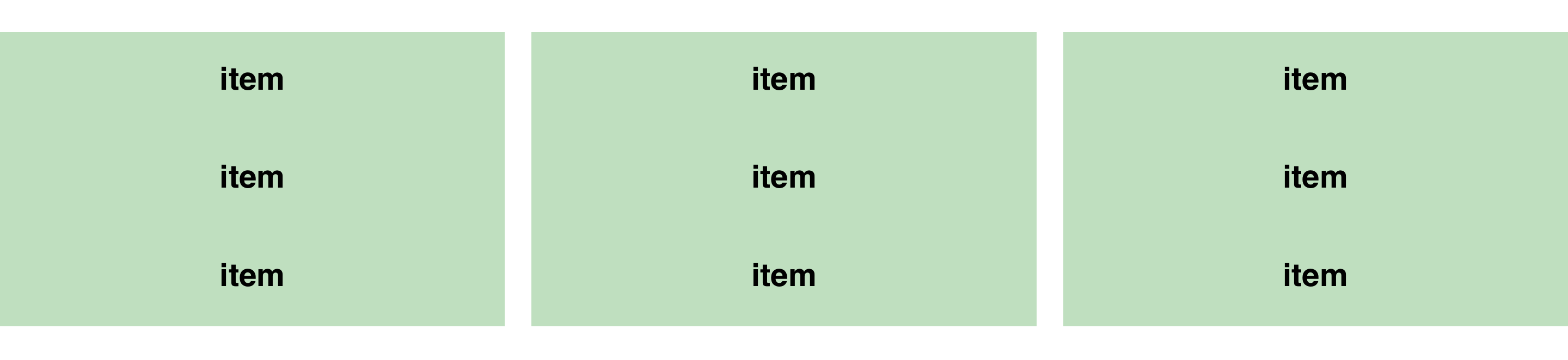
Let’s try to make a three-by-three gallery.
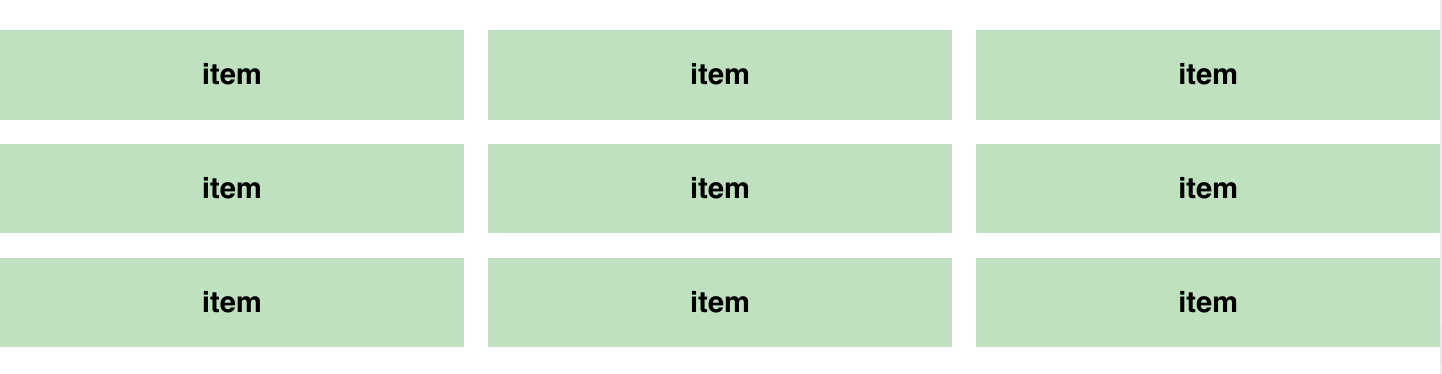
Because we’re creating a gallery, our markup must change slightly.
<div class="flexbox">
  <!-- 9 gallery__items -->
  <div class="gallery__item">item</div>
  <div class="gallery__item">item</div>
  <div class="gallery__item">item</div>
  <div class="gallery__item">item</div>
  <div class="gallery__item">item</div>
  <div class="gallery__item">item</div>
  <div class="gallery__item">item</div>
  <div class="gallery__item">item</div>
  <div class="gallery__item">item</div>
</div>
Likewise, we have to consider both types of grids. Let’s find out how to create a gallery on a proportional grid first.
Flexbox
The first thing you’ll notice is that there is more than one row of items. When this happens, we need to give .flexbox a flex-wrap property of .wrap to allow the flex items to flow to the next row.
.flexbox {
  display: flex;
  flex-wrap: wrap;
  justify-content: space-between;
}
Next, we need to calculate the flex-basis so that each gallery item takes up four columns exactly. We know from the math above that it should be ((4 * 80px) + (3 * 20px)) ÷ 1180px * 100% = 32.20339%.
.gallery__item {
  flex-basis: 32.20339%;
}
We also learned above that we can switch this math out with a Susy span() function:
.gallery__item {
  flex-basis: span(4);
}
What we have now is this:
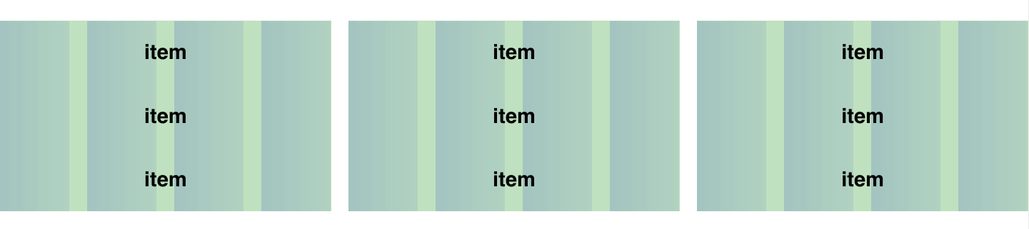
When we create a gallery, we usually add vertical margins so that the vertical and horizontal spaces between gallery items are equal.
The first thought that will probably come to your mind is that we can add a percentage-based margin-top property to each gallery item. This margin-top should be equal to the width of one gutter.
This width would be 20 ÷ 1180 * 100% = 1.694915254%. Alternatively, we can get it with Susy’s gutter() function:
 .gallery__item {
    flex-basis: span(4);
    margin-top: gutter();
  }
If you remove the background grid, you’ll have an equal-spaced gallery:
See the Pen Gppabz by Zell Liew (@zellwk) on CodePen.
… That is, until you use Firefox to view this layout:
This margin-top trick fails because the flex item’s margin and padding percentages are supposed to resolve against the flex container’s explicit size, according to the Flexbox specification.
This means that percentage values for margin-top will be calculated only if we state a height value for the flex container. Because we didn’t do so, margin-top would be equal to zero instead.
This method fails in Firefox because only Firefox has implemented the part of the specification we just mentioned. Neither WebKit nor Internet Explorer have implemented it yet.
This brings us to an unfortunate conclusion: Creating a percentage-based gallery with Flexbox is impossible if we want to ensure that the vertical and horizontal spaces are equal. We can, however, still use absolute units (like px and em) for vertical spaces if we’re not going for a perfectly equal-spaced grid.
Let’s look at how we’d tackle a gallery layout with Susy next.
Susy
Susy provides us with a gallery() mixin that can be used to create a gallery. All we need to do is add the number of columns each gallery item would take up in the gallery() mixin.
.susy {
  @include clearfix;

  .gallery__item {
    @include gallery(4);
  }
}
Because Susy uses a float-based layout, we can stick to using a percentage-based margin to create an equal-spaced gallery without any problem:
.susy {
  @include clearfix;

  .gallery__item {
    @include gallery(4);
    margin-top: gutter();
  }
}
See the Pen VveZKz by Zell Liew (@zellwk) on CodePen.
As you can see, the only way to produce a gallery with percentage-based widths is through a float-based layout.
However, if we stick to a float-based layout, we won’t be able to handle gallery items of unequal heights:
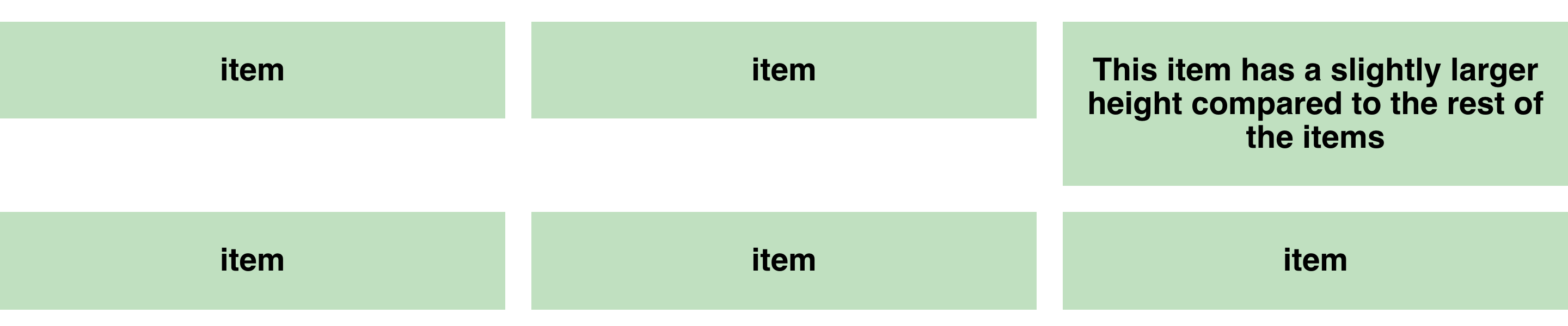
We need to switch to the fixed-width grid to create such a gallery because we need to use the align-stretch property that Flexbox provides.
So, let’s move on to layout 5, where we’ll find out how to create this gallery with Flexbox.
Layout 5: Gallery Layout On A Fixed-Gutter Grid
For this final layout, let’s cut the chatter and jump right to creating the gallery with Flexbox.
Flexbox
We can use the same principles in layout 3 (content and sidebar on a fixed-gutter grid) to create a gallery.
Once again, we need to do the following:
- Add a negative
margin(left and right) to the Flexbox container equal to half of the gutters. - Add
marginto all flex items equal to half of the gutters. - Use
calc()on allflex-basisitems. - Set
overflow-xtohiddenon Flexbox’s parent container.
body {
  overflow-x: hidden;
}

.flexbox {
  display: flex;
  flex-wrap: wrap;
  justify-content: space-between;
  margin-left: -10px;
  margin-right: -10px;

  > div {
    margin: 0 10px;
  }

  .gallery__item {
    flex-basis: calc(#{percentage(1/3)} - 20px);
    margin: 10px;
  }
}
The good thing about this gallery is that it takes care of items with unequal heights, freeing you from having to worry about it:
See the Pen YywrGQ by Zell Liew (@zellwk) on CodePen.
We’re not going to talk about Susy with the fixed-gutter layout because we know we’re just going to roll our own solution again.
For the next part, because we’re on the topic of galleries, let’s talk about how to deal with two scenarios that always happen with galleries:
- gallery items of unequal width,
- leftover items in a gallery.
Let’s tackle these questions with both Flexbox and Susy. The difference, though, is that we’re going to compare Flexbox for layout 5 with Susy for layout 4 to show how to deal with these situations.
Dealing With Items Of Unequal Width In Flexbox
Let’s say we want the first item in a gallery to be twice the size of other gallery items.
Flexbox
We just have to make a simple adjustment to Flexbox, increasing the flex-basis percentage so that it’s twice the width of the rest of the items:
.gallery__item:first-child {
  flex-basis: calc( #{percentage(2/3)} - 20px);
}
See the Pen YywrNx by Zell Liew (@zellwk) on CodePen.
Susy
It’s not as easy with Susy because it uses the isolate technique to create galleries. You’ll get an overlapping element if you tried the method we used with Flexbox (i.e. increasing the width of the first item).

What we have to do is create our own gallery by understanding how nth-child and the isolate technique work. If you’re interested, check out my guest post on CSS-Tricks to understand how the isolate technique works.
.susy {
  @include clearfix;
  .gallery__item {
    float: left;
    width: span(4);
    margin-right: -100%;
    margin-top: gutter();
  }

  .gallery__item:first-child {
    width: span(8);
  }

  .gallery__item:nth-child(3n-1) {
    margin-left: span( 8 wide);
  }

  .gallery__item:nth-child(3n) {
    clear: left;
  }

  .gallery__item:nth-child(3n+4) {
    margin-left: span(4 wide);
  }
}
See the Pen jbWGwR by Zell Liew (@zellwk) on CodePen.
As you can see, changing the default size of gallery items with Susy is not easy. However, if you understand how Susy works, you can switch the way it handles gutters to inside or split, and you can achieve the same simplicity by using the span() mixin:
$susy: (
  // Other properties
  gutter-position: split,
);

.susy {
  @include clearfix;
  .gallery__item {
    @include span(4);
    margin-top: gutter() * 2;
  }

  .gallery__item:first-child {
    width: span(8);
  }
}
See the Pen ZbQXXY by Zell Liew (@zellwk) on CodePen.
In the end, both methods work out to be about the same.
Let’s talk about dealing with leftover items next.
Dealing With Leftover Items
We saw how Flexbox and Susy handle the one leftover item by dangling it to the left. What happens if more than one item is left over?
Flexbox
It’s pretty bad with Flexbox because we’re using the space-between property.
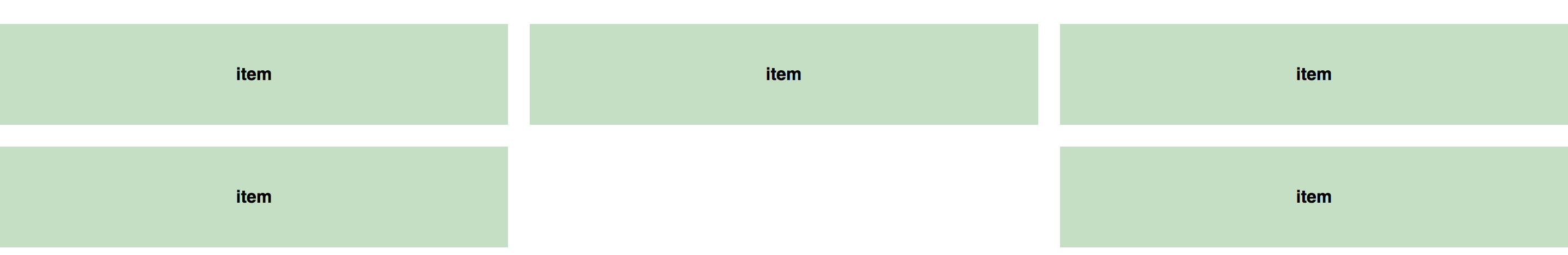
However, we can fix it easily by setting the flex-grow property of each item to 1:
.gallery__item {
  // Other properties
  flex-grow: 1;
}
See the Pen WQrZpL by Zell Liew (@zellwk) on CodePen.
This, however, will make the first item stretch the full width, so you might want to note how many items you leave dangling.
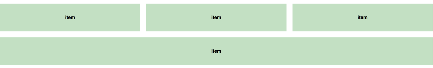
Susy
Susy leaves all elements hanging to the left by default, which is what most float-based layouts do.

I’d recommend leaving it this way if you don’t want to mess around with a lot of code.
But just for your information, it’s possible to create a layout with a Susy gallery that has the same result as setting flex-grow: 1.
I’m not going to explain how it works because it’s rather in depth. Instead, I’ll leave you with a Codepen if you’re interested in figuring this one out yourself:
See the Pen qObPLX by Zell Liew (@zellwk) on CodePen.
A Final Note On Flexbox
We’ve only managed to discuss the flex-basis property in Flexbox for this article. Flexbox provides additional properties, such as flex-grow and flex-shrink, which enable us to make interesting layouts that were impossible to do with a grid previously.
These types of layouts are beyond the scope of this article, so I highly encourage you to check out one of the Flexbox courses mentioned in the next section.
Wrapping Up
We’ve covered a lot of things about building layouts with Flexbox and Susy. By this point, you’ll understand that we can’t compare Flexbox and Susy directly because they are two different tools. In addition, you’ll understand how to create different layouts with Susy and Flexbox, and you’ll be able to solve most challenges that people face with both tools.
Of course, that’s not everything to know about Flexbox nor Susy. There’s a whole lot more. Here are some resources I recommend:
- What The Flexbox?!, Wes Bos
- Unraveling Flexbox, Landon Schropp
- Learning Susy, Zell Liew
Grab seven chapters for free.
That’s it for the article. Let me know in the comments below how you feel having read it! Oh, and feel free to contact me if you have any questions about Flexbox or Susy. I’d be happy to reply!
Further Reading
- Flexbox Is As Easy As Pie – Designing CSS Layouts
- The Flexbox Reading List: Techniques And Tools
- CSS Grid, Flexbox And Box Alignment
- Laying Out A Flexible Future For Web Design With Flexbox
 (rb, ml, al, il, mrn)

