Designing For Kids Is Not Child’s Play
Chances are you’ve seen it: a child glued to a tablet or smartphone, swiping fearlessly with small, sticky fingers. From airports and restaurants, to homes and even schools, mobile devices are a ubiquitous part of childhood today. Apple already launched a curated ‘Kids’ category in the App Store that already has more than 80,000 apps.
With so many apps for kids out there, you may have considered designing one yourself. “How hard could designing for kids be?” you might think. Well, don’t let appearances deceive you. Despite their simple storylines and silly soundtracks, designing for kids is serious business.
It’s not just taking grown–up content and dumbing it down. In fact, there are many reasons why designing for kids is actually more difficult than designing for adults.
In this article, I’ll try to point out how you could avoid common pitfalls through the following UX considerations:
- How observing play can translate into digital insights;
- When and how to use non–digital prototyping;
- The variety of ways you can usability test with children;
- What affordances to provide young users;
- How to set up a user–friendly menu;
- When to incorporate audio/visual feedback;
- Why you shouldn’t forget about adults.
User Research To The Rescue
At Mutual Mobile, user research is a key part of our design process. We’ve found that from initial brainstorming stages to polishing the final product, involving users throughout the entire design process is invaluable, especially when your users are kids.
So why is designing for kids so difficult? The main reason is simple: designers aren’t kids. They’re adults, filled with adult life experiences, adult technology preferences, and loads of adult bias about what they liked growing up. We all know how important it is to have empathy for your users. This is especially true when your users are toddlers. Imagine the repercussions of spending hours and hours creating an app that’s too difficult or boring for your intended user to use. So before jumping to pixels and code, step into the small, light–up shoes of your users, through firsthand user research.
In the earliest stages of designing, your research doesn’t even have to involve technology. By simply observing children’s play with toys, we can learn a lot about how children interact, what captures their attention, and what bores them. All of these insights can be transferred to digital play within apps.
Determine Target Age Range
Before breaking out the crayons and G.I. Joes, it’s important to take a step back and determine the target age range for your app. Kids grow and change much more quickly than adults, so usually a two–year range is the max. Think about the huge developmental differences between a four–year–old and a six–year–old, or a six–year–old and an eight–year–old. For example, some ages prefer to jump in and figure out apps as they go, while other ages need up–front instructions to feel confident and proceed. (For more in–depth details between each age, check out “Designing for Kids” by Debra Gelman.)
Observation
Once you determine your target age range, zero in. Gather a group of children in this age range, absorb their behaviors, and take notes. If you can, try to observe various grouping types (i.e kids who know each other, kids who don’t; only boys, only girls; indoors, outdoors, etc.) As silly as the kids’ actions may seem to adults, they are very telling of how these young users would interact with your app. For example:
- Do kids in this age range enjoy sticking to the rules or do they prefer inventing their own games?
- Are they trying very hard, or are they just trying to ‘out–silly’ each other?
- Are there differences between the ways boys and girls approach play?
Once you have a handle on kids this age, take your observations to the next level by setting up a scenario related to your product idea. For example, if your app involves fairy tales, have children play prince and princess. You can also incorporate low–tech physical prototypes and see how kids react.
Toca Boca Tea Party began as a paper prototype, with cutouts of teapots, cups and saucers sitting on top of an iPad. Cyberchase Shape Quest, an augmented reality game where you manipulate blocks, used cardboard puzzle–like cutouts to assess if the levels would be too difficult for children. Kids are inherently creative — you’ll most likely walk away with a ton of ideas about how to make your app more engaging and exciting.
Participatory Design
Participatory design, also called co–design, is a fantastic and fun method for understanding how children see the world. This involves gathering groups of children together (usually ages 6 to 12), giving them craft supplies, and having them come up with their own design ideas for your product.
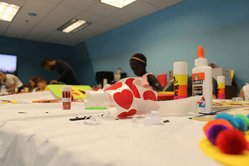
While final design solutions are rarely taken directly from the children’s ideas, this exercise can help designers understand the feelings children have towards the subject matter. For example, kids may design a robot to help them with their homework, but what kind of personality does it have? Is it a nice, encouraging robot, or an authoritarian one? What features do groups think of, and for what purpose?
Understanding these nuances will help designers gain empathy for their users as they start to shape the product. Kids can also create collages, storyboards, or complete take–home workbooks for a similar result.
Usability Testing
As you start to design and develop your product, iterative usability testing should be a key part of your development cycle. Prototyping tools like Marvel and Pixate will allow you to test complex tasks like swiping and pinching/zooming without writing any code. Gestures like these are especially important to test early and often, as smaller children without fully developed motor skills can’t use their hands the way adults can.
When usability testing with older children, you can use traditional think–aloud protocol, but being more creative may be more exciting for your participants. Ask the child to ‘teach you’ how to play a game, or observe one child teaching another child how to play. These usability testing sessions will be invaluable, so observe everything you can. Is your app easy to use? Fun? Boring? Confusing? If it’s a game, are the different levels, time limits and bonuses clear? You may learn something totally unexpected. One team of designers found that when children lost a game, the noise and animation of a ‘sad cat’ was so funny to kids that they would lose on purpose, inciting unstoppable giggles.

Design Tips For A Head Start
While user research will ensure that what you’re building is engaging, enjoyable and usable for children, there are a few design best practices you can keep in mind to give you a head start. In general, most of these tips have to do with making your app easy for younger users to understand. While most kids aren’t afraid to tap and swipe all over new apps, they can easily become frustrated if an app doesn’t conform to their mental models.
Affordances
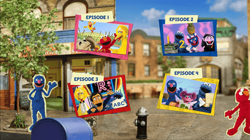
First, it’s no secret that kids love color. Kids expect their apps to be bright and engaging. Don’t be afraid of color, but make it explicitly clear which elements are interactive. With the advent of flat design, everything’s become tappable. Text alone (in the right context) can be tappable. Adults know this, but most kids don’t.
The solution is simple: provide affordances. Design interactive elements with a clear characteristic that indicates they are tappable. For example, buttons could have a simple white outline or drop shadow; interactive background items should wiggle, sparkle, or draw the user’s attention somehow. For younger kids, make this even more obvious by using muting colors in non–interactive backgrounds. The Sesame Street app (see below) makes it quite clear which items its young users can interact with.
Menus And Icons
Most children’s apps use full screen menus to help kids navigate to different app sections (1–player game, 2–player game, High Scores, etc.). These can be especially tricky for kids to navigate, and it’s vital to make them simple and outright explicit. Making the call to action (CTA) the most compelling and physically largest button will help ensure kids don’t get lost.
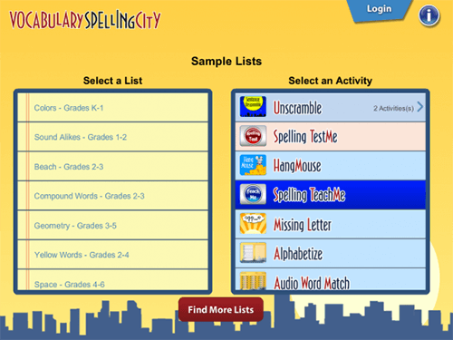
As part of my research, I observed children playing the popular teaching app, VocabularySpellingCity. Despite the app’s widespread adoption with teachers, many of the children didn’t understand the two–step menu process, which forces children to select a grade level, then a game. Kids gravitated towards the right–hand side of the screen where the names of the games were in fun fonts. They would select a game, then wait. And wait. One kid even went into the iPad’s Wi–Fi settings to check it was working. Think about that: he could check the iPad’s Wi–Fi, yet the layout of the screen was too confusing. This could have easily been avoided by splitting this two–step process into two screens, or disabling the second step until step one was selected.
With menus — and throughout your entire app — don’t fall victim to relying on words. Your users may not be able to read complex words, and many associate reading with school work (aka not fun). Incorporating simple icons throughout your app is a good safeguard. Just make sure and usability test the icons, as children aren’t familiar with as many real–world items as adults are.
Feedback, Context And Sound
Feedback is vital in your app. Adults want feedback when something goes wrong. Kids want feedback whenever anything happens. Implement feedback in the form of pages changing, items moving, or sounds. For example, in Yuby — an app we created for Union Bank that teaches children how to save money and track spending — whenever money is added to an account, children hear the sound of coins jingling and see bills falling from the top of the screen.
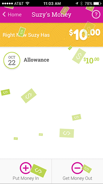
Feedback is especially important in educational apps. If kids get a question wrong, don’t just show a red X and move on. Give them another chance, show them the right answer, or explain the way to arrive at the right solution. This may seem simple, but unfortunately so many educational apps today don’t use these moments as teaching opportunities.
With games, provide contextual feedback and display hints showing users how to succeed. Angry Birds does a great job at this (and without using a single word to my earlier point).
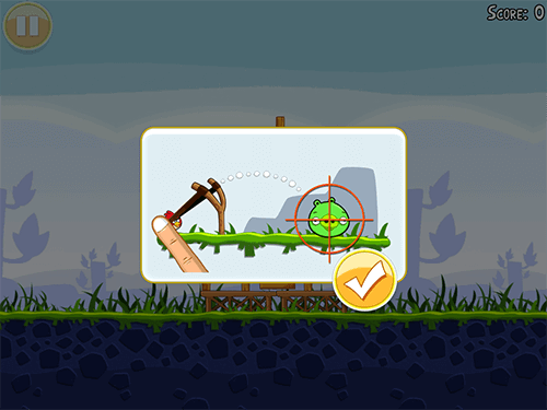
Context should also be considered as you design. Where will children be using your app? At home, at school, or somewhere in between? If your app is being used in schools, tablets are often shared. You’ll need to account for multiple users, at multiple levels. Incorporate features like user profiles for each kid, with photos or avatars to easily identify each user. And be sure to include a way to save progress, so kids who are further along aren’t repeating easier levels and getting bored.
Also, consider context as you think about sound. Sound is a fun way to give feedback and provide instruction, but kids aren’t always in a quiet environment. If a child is using your app in a noisy classroom or a noisy airport — or their parents just want some peace and quiet — how essential is sound? Most apps should be just as usable when they’re silent.
Don’t Forget About Adults
Finally, while you should be focusing on children users, don’t forget about adults! I’m talking about parents, guardians, teachers, and anyone who may interact with the app. What role do adults play in the app? Are they an equal play partner, playing alongside children? Are they assisting or supervising play? Can they troubleshoot when something goes wrong? Or maybe they are a separate type of user to consider altogether. For example, teachers may need to log in to a separate section of the app to check each student’s progress.
As you can surely tell by now, kids’ apps require at least as much care and consideration as the ones we adults use on a daily basis, and they deserve an equal amount of respect. In addition to being potentially huge sources of revenue, young users hold the future of the software industry squarely on their shoulders. If we want the development community to continue progressing, we have to captivate the next generation today. The best way to do that is with well–designed apps.
Further Reading
- “Designing Web Interfaces For Kids,” Trine Falbe
- “A Dad’s Plea To Developers Of iPad Apps For Children,” Rian van der Merwe
- “Connecting Children With Nature Through Smart Toy Design,” Jes Koepfler, Nidhi Jalwal and Meghan Plank
- “How To Design Global Applications For Children,” Catalina Naranjo-Bock


 See the full picture →
 Celebrating 10 million developers
 SurveyJS: White-Label Survey Solution for Your JS App


