Is The Internet Killing Creativity?

Email Newsletter
Weekly tips on front-end & UX.
Trusted by 182,000+ folks.
 Register for Free


 Custom Web Forms for Angular, React, & Vue. Your backend.
 Celebrating 10 million developers
The internet is a wonderful place (mostly). An unprecedented revolution in communication, it continues to empower more people to publish and share their knowledge than any other phenomenon in history. It is a limitless playground of ideas and unbridled creativity.
Or is it?
It All Looks The Same
In 2014, Elliot Jay Stocks declared that designers have stopped dreaming. That we’ve stopped being creative. That every site looks the same. A crazy notion considering the magnitude of tools and resources we have at our disposal. But Elliot’s been right, and he’s not alone either.
In 2015, Noah Stokes chimed in, telling us web design is losing its soul, no less. According to Noah, RWD patterns have become habitual, we’ve become stuck in them, and we’re struggling to break out and be different. Subsequently, at the height of summer last year, Sergio Nouvel declared web design dead, triggering a minor uproar among the people who cared.
Web design is dead. In the ground. Finished. “Frameworks and templates have us covered”, Sergio said. Our patterns are mature, and “trying to get creative at this point will probably be pointless or even harmful.” He mentions The Grid as a pioneer in automation and artificial intelligence, essentially taking over the role of web designers.
“The Grid analyzes your content to detect the best layouts, colors, fonts, and extra imagery for your site.”
— Sergio Nouvel
Take that in for a moment. The Grid — a piece of software — analyzes your content and makes a website out of it. Boom. No designer needed, no fiddling around in SquareSpace, no agency fees. Websites at the push of a button.
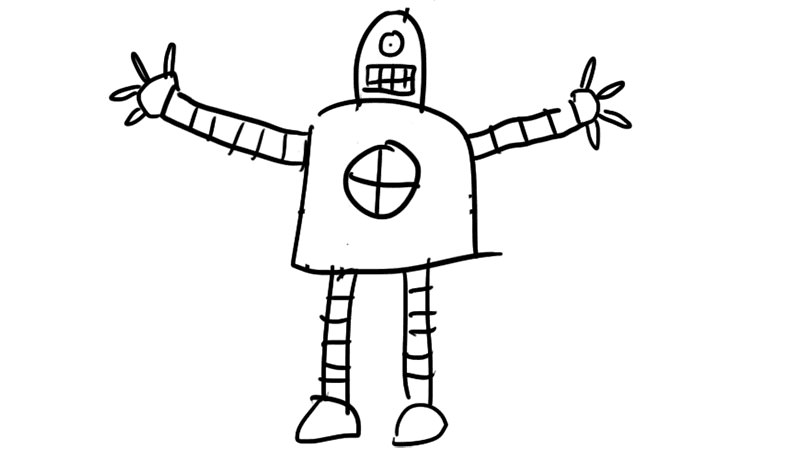
Judgement Day is upon us. The robots are coming. The very tools we’ve built to make our jobs easier are turning on us. And why wouldn’t they?
Think about it. We’ve focused all our efforts on making sure we get the tech right. That we follow the right UI patterns. That our sites perform well. For the best part of our short history, we’ve focused on creating a recipe for making websites. So let me ask you this: what’s the point of web designers if there’s a recipe?
Our future is bleak, people. We’ve laid the foundation for our own extinction. In a few years time we’re out of a job.
Unless we do something about it.
A History Lesson
Whatever you call yourself — whether you’re a web designer, a visual designer, a UX guru or a ‘creative’ (shudder) — we’re all part of a grand movement, a discipline that spans centuries. We all share a common ancestor: the graphic designer.
Our medium is different, of course. We communicate with pixels and bandwidth, not ink and paper. But we can’t ignore our past. Web design is just an extension of graphic design — they are the same thing. We share the same history. And in that history lies the key to our survival.
For the sake of argument, let’s say modern graphic design was born in the 15th century, with the invention of the printing press. At this early stage, layouts were straightforward, largely consisting of justified columns and drop caps.
This pattern largely persisted, although towards the 20th century, under the influence of art nouveau, designs became more ornamental and flourishes were added across the board.
Both these styles were challenged in the early 20th century by the modernist movement, which advocated asymmetrical layouts, simplicity and more complex grid structures.
A little later, we got mavericks like David Carson, who literally threw out all the rules and transformed the page into a playground for creativity.
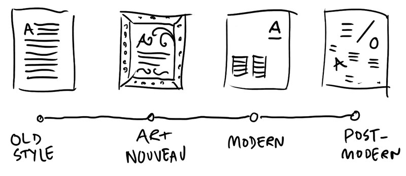
I hope you can excuse the imprecise nature of this summary of events, the details of which have little to do with my point, which is that graphic design has come of age. The discipline has arrived at a place where rules have been defined, but we also have the maturity to know how — and when — to break them.
Web design, on the other hand, is infantile.
We’ve almost moved past centre alignment as the default and we’ve swapped ornamental skeuomorphism and shiny buttons for what we annoyingly call flat design. (Even more annoyingly, we keep referring to it as a trend. For the record, the absence of embellishment is not a trend, it is simply graphic design without the bullshit. But I’m digressing.)
We’ve started playing with different layouts, asymmetrical grids and making the most of different viewports. We’ve finally got a good handle on typography, we have blend modes and animation, we have Retina screens. We’re ready to experiment.
Right now is easily the most exciting time ever to be a web designer.
So why do all websites look the same? Have we simply stopped caring? Are web designers incapable of being creative? No. I don’t think so. But I do think we’re facing formidable obstacles to new ideas. And the first of these obstacles is the C–word.
The C–Word: How Content Changed Design
Around 10 years ago, I started my career in a small publishing agency called White Light Media. I was a magazine designer.
And in the world of magazines, content is taken seriously. Half my colleagues were editors. Not only did this mean that all the content was written before I designed the final layouts, I could also work with the editors to mold headlines and paragraphs to fit.
Our process looked pretty much like this:
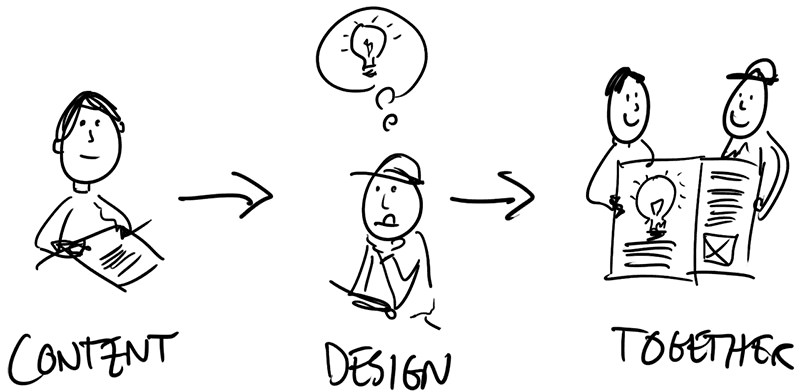
We were a team: content and design, together.
On the web, of course, content is an entirely different beast. The invention of the CMS has changed everything. On the one hand, it allows clients around the world to edit their own content and continuously update their sites without external intervention. That is a great thing.
On the other hand, however, the CMS has, in many, many cases, moved content from the start of the process to the end of the process.
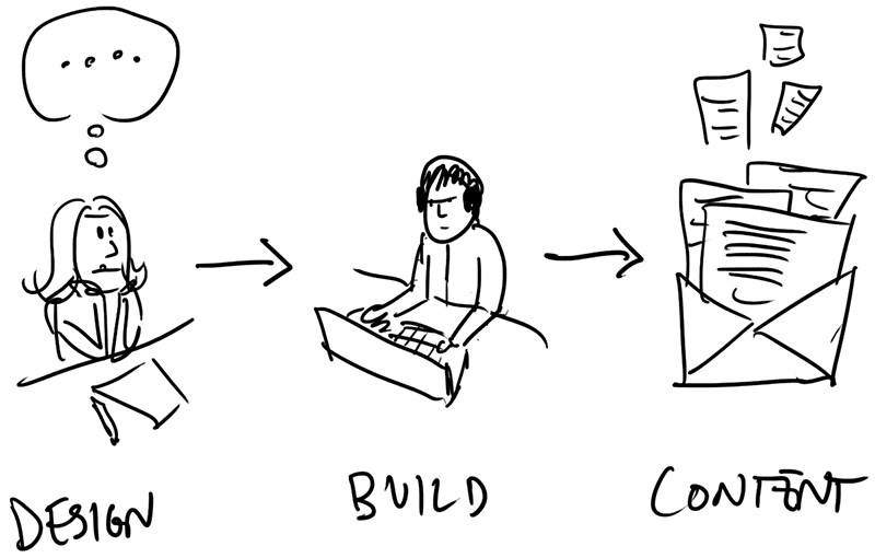
What happens when we remove ourselves from content?
Well, first of all, editorial design is no longer bespoke. We no longer match meaningful headlines with complimentary images. We no longer tailor layouts to suit a particular feature.
Instead we design systems, empty templates waiting for content to fill them. We break sites down into component parts and create style guides. We worship atomic design. We focus on the organization of our design assets, not the meaning of them.
We start our processes, not by coming up with ideas and concepts, but by creating element collages: collections of buttons and paragraphs and feature boxes. We design them so that our clients can sign off on the look and feel. We obsess over style, ignoring the substance in the process. We fall in love with sexy.
Why? Because we no longer know the context of our designs. And when there is no context (read: content), all that’s left is visual effects and polish. We’ve created a new paradigm. And that paradigm is based on the fallacy that graphic design equals the sum of its parts. That as long as we neatly organize, theme and polish each element of a website, we’re doing it right.
Wrong.
Reclaiming Content
If we are to raise our collective creative bar, we need to reclaim content as part of our process. And I don’t simply mean sending an email to the clients and asking them to pass on a Word document. I mean integrate it. Make it ours.
We need to do content and design at the same time. Because the basis of graphic design is image plus text. Not just text. Not just images. Both together.
Of course, lots of graphic design is text only – that in itself is a design decision – but in most cases, photography or illustration improves the experience. Likewise, images can speak for themselves, but in most cases text improves the meaning.
Imagine you’re designing a site for a legal firm. They want something that says that they’re different from the rest, that they are honest, and that they have courage where others lack it. At the kickoff meeting, the CEO hands you this picture for the home page:
Now, if your text is Lorem ipsum, you’re pretty screwed. Using Lorem ipsum is the same as not having text at all. And if you don’t have text, you don’t really have graphic design.
This is where we should unleash our inner copywriter. You may think you can’t write, or “I’m dyslexic.” That’s fine. We’re not writing an essay here; we’re just using words to sketch out an idea. And we all have ideas. By writing an idea into the picture, we can change the context:
Immediately, the meaning has changed. You’ve just made the user think. (Take that, Steve Krug!) The most boring image on earth is suddenly intriguing.
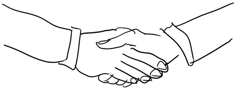
Conversely, changing images has a profound effect on the same piece of text. So if your starting point is “synergy” (the text equivalent of the handshake picture), you can enhance – or change – the meaning of it by choosing the right image. Of course, the bigger the disparity between the picture and the text, the more memorable it gets.
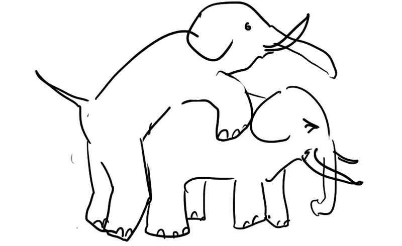
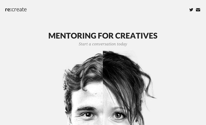
Let’s look at some real–life examples. The first example is the work and passion of my colleague Steve Brown. His core idea is the fusion of two minds, the coming together of a mentor and a mentee. It’s not quite the above two elephants, but it makes so much more sense than your generic stock image.
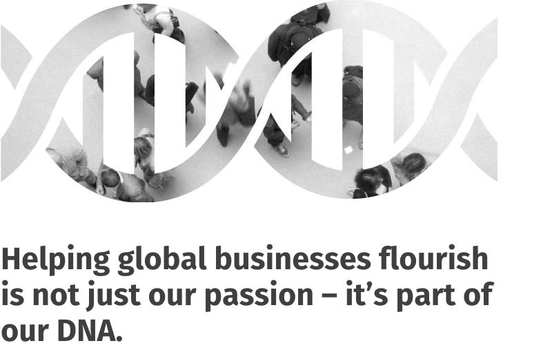
Another example is from an about page we did for activpayroll, a global payroll company based in Aberdeen. Instead of simply writing “About us” and waiting for the client to choose a stock photo, we create synergy (cue mental image of elephants procreating) by linking the image with the content, which talks about the DNA of the organization.
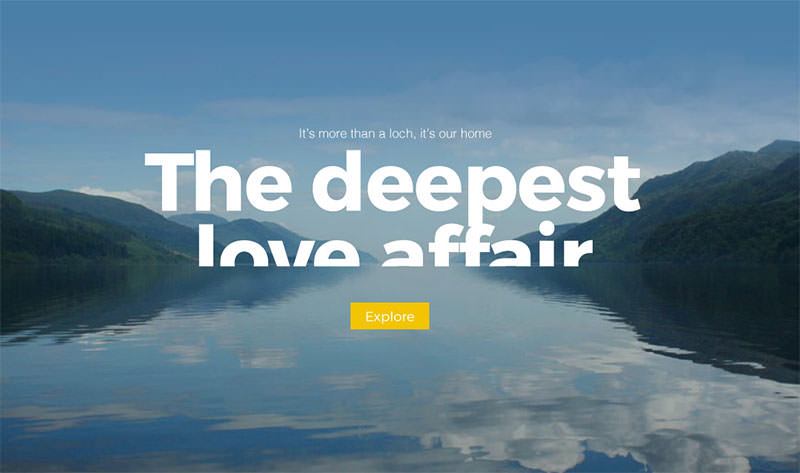
Last, but not least, the history page for Cruise Loch Ness (yup, they do cruises on Loch Ness). This piece of text was written by a copywriter, and Steve had the great idea of letting the typography sink into the loch. Isn’t it beautiful?
Creating empty carousels and sexy hero images is easy. Adding meaning through design is more difficult. But that’s exactly what people should be paying us for. To put it bluntly, if your job is to re–skin Drupal themes, you’re not a graphic designer.
Does Everything Need A CMS?
Content management systems often force your hand when you do a layout; for example, by requiring content areas to be variable height, or using overlays over images because you don’t know when the client will change the background. With a CMS, we have to be generic.
Without a CMS, we can be much more bespoke, making use of creative typography, fixed positioning, animation, unique illustration, and so on. And chances are you might not need to CMS everything. So before you start limiting your ideas, ask yourself two questions: how rare is the content I’m designing for, and how likely is it to change?
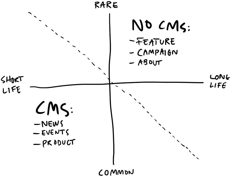
Rare content types — that is, content that isn’t replicated throughout the site — usually don’t need a CMS. And the longer the lifespan, the more you can invest in it. Common content, like a news article or a product listing, is likely to need a CMS, because they tend to have relatively short lifespans, and their content type is used across multiple entries on the the site.
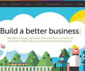
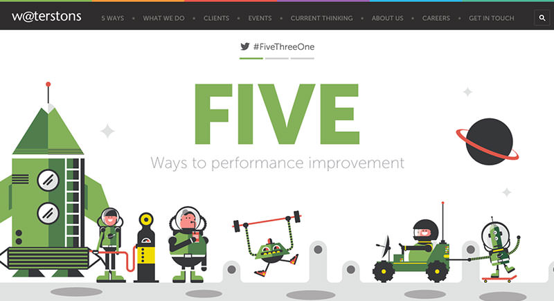
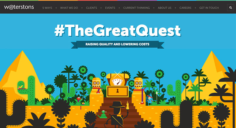
The feature (above) we did for Waterstons is a good example. This whole feature area is hard–coded. We wrote it. We commissioned an illustrator for it. We animated it. And the client can’t change it. This doesn’t mean it can never change. Here’s their first campaign after the launch of the site. New copy. New illustration. New animation.
And here’s what we launched at the end of last year:
Is this more expensive than a standard hero image with a text editor? Well, yes. Is it more inspiring? We certainly think so. Is it worth it?
“The best money we ever spent”
— Michael Stirrup, Financial Director at Waterstons
Right. Moving on.
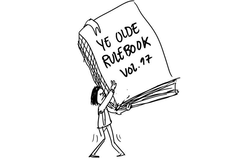
The Holy Book Of Don’t–Do–This–But–Do–That
As a community of designers, researchers, and developers, we love to share our expertise, and that’s one of the best things about this industry. Ironically, it is also one of the main obstacles to creativity.
We’re simply too good at telling each other what to do and what not to do. Everywhere you look there are helpful guides, tips, and hints. The problem is, the more guides there are, and the more we repeat them, the more they start to sound like commandments.
- Thou shalt not define thy line–height in pixels.
- Thou shalt not base thy breakpoints on devices.
- Thou shalt not take the name of the lord Performance in vain.
- Thou shalt begin with mobile.
- Thou shalt not put important shit below the fold.
- Thou shalt not worship the carousel of false idols.
Et cetera.
Our rulebook is problematic for two reasons. The first is arrogance. We start to think we’ve solved it. That we’re finished. That, if everyone just follows best practice, we’ll create the perfect web.
Now, there will always be best practice and best practice is usually good practice. We absolutely need a standards movement. We absolutely need to consider performance, and usability, and all the other things that make web design difficult. The danger is that when too many people walk the same path, it becomes very uncomfortable to create an alternative, particularly as Twitter is full of firebrand preachers who take it on themselves to sniff out blasphemy.
The second problem is this: with so much focus how to do stuff, how to implement stuff, we forget our most valuable assets: meaningful ideas. By creating so many rules for ourselves, we miss out on those ideas. We put blinkers on, and we fail to explore concepts that don’t fit in with the current dogma.
Breaking The Rules
I have a confession to make. I use parallax. And carousels. Even hamburgers. Shocked yet? I doubt it. But I can sense your judgement. As our industry matures, we see the rise (and sometimes fall) of contentious issues that polarize our community. Yesterday it was hamburger menus, today it is page bloat. Tomorrow? Who knows.
Are carousels inherently bad? Of course not. Should parallax be banned? Don’t be daft. Do hamburger menus work? Well, I guess the jury is out on that one.
When I was designing magazines, no one ever talked about click rates, or conversion funnels or usability patterns. We simply had to trust that our readers knew how to open the magazine, how to find the contents page and how to read page numbers. And most people did. I think. (We had no accurate way of checking.)
On the web, things are not that easy. There are so many things that can go wrong when you can’t give everyone the exact same experience. Does this behave the same way on a slightly older version of Firefox? Do people know what the hamburger icon means? Do they even scroll? Luckily, we can measure things!
We desperately love metrics, and we lap it up when someone publishes their results. If you’re into your hamburgers, you’ve probably seen James Foster’s A/B tests, which proved that putting the hamburger inside a box, so it looks like a button, increases use by 22.4%. It also proved that switching the lines for the word ‘Menu’ makes 20% more people click.
I’m using the word ‘proved’ quite generously here. What I actually mean is that Foster’s tests showed us particular results from a particular period of time on a particular site, using a particular set of hamburger icons. In other words, as far as everyone else is concerned, the tests prove nothing.
Why? First of all, because A/B testing excludes the rest of the alphabet. We cannot know what would happen if the button was in a different color, a different size, or in a different context altogether. What if the home screen only consisted of a hamburger menu and nothing else?
Second, there are simply way too many factors at play, making us unable to pinpoint exactly what determines the results. It could be differences in the technical background of the audience. It could be affected by what mobile phone they were using. They could be influenced by the apps they are already used to. By their emotional state. By the temperature outside, or whether they were in a rush, or in a meeting, or on the toilet.
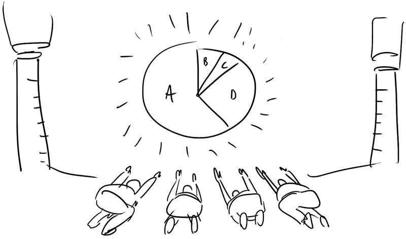
Or, as this simple A/A test shows, it could be coincidence.
I’m not knocking A/B testing (or James Foster, for that matter). By all means, test your stuff and see what works best for you. My point is that someone else’s A/B test rarely has takeaways for your own project. Despite our best efforts or intentions, we simply don’t have the tools, or data, to say how well something works across all contexts.
Despite our best efforts, the answer to most design related questions is still “It depends.” Throwing pseudo–scientific stats around Twitter doesn’t change that.
Think about this: if carousels are inherently bad, how come practically all smartphones use them as the main means of navigating? Most of us use a carousel every single day. Which means that as long as people a) know how to operate the carousel, and b) actually want to see what’s on the next slide, carousels may actually be all right.
It means that at least in some contexts, carousels work. And the same goes for hamburgers, or parallax, or even pages weighing a ton: it depends.
So I say fuck the rules (responsibly). Rules are stifling.
Sure, we’ll make mistakes. Lot’s of them. We’ll make horrible things, bloated things, painful things. But every now and then, we’ll make something extraordinary. Something wonderful.
And I’d much rather have the web be a mix of horrible and wonderful than an ocean of beige.
Pattern Fatigue
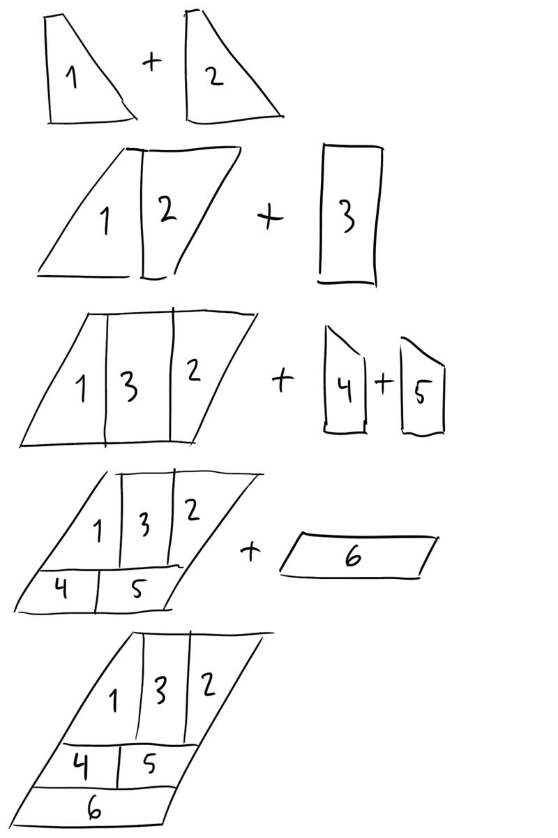
The term ‘lateral thinking’ was coined by Edward de Bono in 1967 and made famous by his 1970 book by the same name. In this book, he talks a lot about patterns and how difficult it is to move beyond patterns that have already been established. As an example, he provides the reader with a puzzle that involves combining an increasing number of shapes to create a larger, simple shape (such as a rectangle).
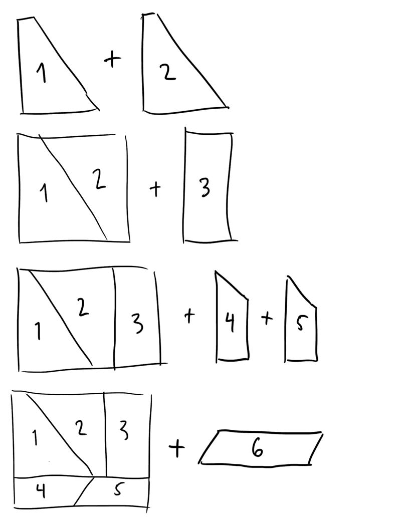
Adding each new piece to the existing shape is easy. Until you hit the last piece. What then? Most people really struggle at this point, but as de Bono points out, the solution is to reevaluate the whole pattern — not just the final piece.
I wonder if we’re stuck right now. We’ve got all these patterns, and they fit so well together that it’s almost impossible to imagine anything else. It feels like our patterns are complete.
There are many examples of so–called completed patterns online. Hamburgers. Horizontal navigation. Pagination. We even have patterns that dictate our page layouts, like the F pattern.
“F for fast. That’s how users read your precious content. In a few seconds, their eyes move at amazing speeds across your website’s words in a pattern that’s very different from what you learned in school.”
— Norman Nielsen Group
People read differently on the web, we’re told. In fact, they don’t actually read our pages, they scan them. They start at the top, going across. Then they move down the page a bit and go across again, before they scan the content’s left side, in a vertical movement.
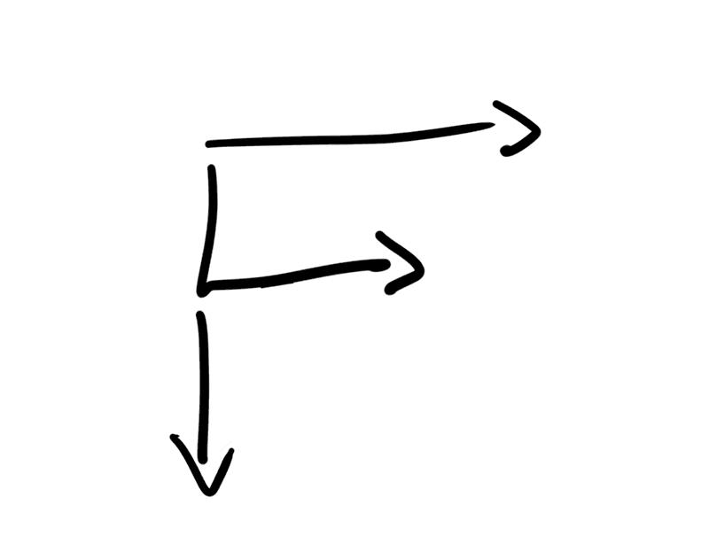
It’s no surprise we design to this pattern. We put our navigation at the top, our content directly below it, and our sidebar on the left–hand side. It makes sense because that’s how users read websites.
But this is a chicken and egg situation. What comes first, the F reading pattern, or the F design pattern? I think people read our sites like they do because we design them that way. I think that if we changed our design patterns, the reading patterns would change too.
“We need creativity in order to break free from the temporary structures that have been set up by a particular sequence of experience.”
— Edward de Bono
In order to become more creative, we must think more like children. We must dare to doubt the obvious, to be curious about the mundane, and to ask the silly questions. Questions like, “Why do we always put the logo in the top–left corner?” or “Why do we always put the navigation at the top of the screen?”
We don’t have to. There are tons of places we could put the logo, and there is no reason other than expectation not to put the navigation at the bottom of the screen. Why not ditch the navigation altogether?
Why are we so obsessed with having every page accessible from anywhere, instantly? Without the navigation as a primary means of moving around the site, perhaps the content can do the job instead. Perhaps every website could have a contents page, leaving all the other pages free of clutter. Perhaps that means we’d discover a whole lot of content we wouldn’t necessarily seek out. Perhaps we’d consume content in a different way. Maybe getting lost is a good idea sometimes?
What if we designed for landscape instead of portrait?
Screens aren’t just getting smaller, they’re also getting bigger. And most of our non–mobile viewports are landscape. Why do we think a long, vertically scrolling wall of content is the best experience for a landscape device? What if we broke our layout into sections, spanning the full width of the viewport?
What if websites read like magazines?
You may think I’m an idiot. That I’m going too far. That challenging patterns that have taken years to develop is unnecessary and dangerous. Well, you wouldn’t be alone in thinking that.
“One of the biggest problems in modern web design is that everyone keeps reinventing things that don’t need reinventing.”
— Matt Hill
For the record, I have since spoken to Matt, and he pointed out that he’s not advocating a lack of creativity, rather “lamenting the constant re–engineering of solved problems at the expense of being creative. IE, designers tweaking pointless things and ignoring the big picture.”
A fair point. Looking at the bigger picture, I believe Matt — and many more — would agree that we’re not done inventing yet. We’re not actually finished. In fact, as far as I’m concerned, we’ve barely scratched the surface.
So, Is The Internet Killing Creativity?
I have discussed content, rules and pattern fatigue as major obstacles to creativity online. So where do we stand? Is web design dead yet?
In a word, no. The internet hasn’t killed creativity, and web design isn’t dead. But generic solutions are. And the robots really are coming. There are so many tools, there are so many frameworks. There’s SquareSpace. There’s the Grid. And others will follow.
Soon, it will be virtually free to create a nice looking website. There will be super sexy templates. There will be themes. There will be payment plans and production lines. If it can be done with an algorithm, it will. Maybe it even should.
But remember this: machines have no imagination. Robots work to a specific set of rules. They follow the recipe. They can’t create something that’s original and meaningful. They have no imagination. If we want to survive the Matrix (my robotic dystopian metaphor of choice), we need to maintain ours.
So we’re left with a choice. We can take the blue pill: we carry on as we are. We perfect the recipe. We choose the familiar. And eventually we hand our jobs over to robots.
Or we take the red pill: we go beyond the obvious and enter Wonderland. We fail. We fail again. And in the process, we offer what the machines can’t: memorable, original and creative experiences.
Note: this is a write–up of my talk delivered at SmashingConf Barcelona 2015.
Further Reading
- “The Process of Creativity,” Jason Gross
- “Web Design Is Dead. No, It Isn’t.,” Vitaly Friedman
- “It’s Not All Doom And Gloom On The Web,” Christian Heilmann
- “Design Or Get Undesigned,” C Y Gopinath
 (og, nl, mrn)

