Leaner Responsive Images With Client Hints

Email Newsletter
Weekly tips on front-end & UX.
Trusted by 182,000+ folks.


 Custom Web Forms for Angular, React, & Vue. Your backend.
 Celebrating 10 million developers
Responsive images have been around long enough for most of us to have taken them for a spin, or at least to have learned from the experiences of those who have. Beyond doubt, the responsive images specification is a great win for the web. However, quite a few reports from the front lines suggest that responsive images can become pretty ugly.
The good news is that there is a fix! No, not throwing JavaScript at the challenge, but by asking the web server for a helping hand. Enter Client Hints, an initiative spearheaded by Google that is already available in browsers (Chrome and Opera) and that is super–simple to use. Let’s see how Client Hints can reduce both image size and verbosity of the responsive images markup.
This article will not demonstrate the challenges of responsive images. Several other sources have already done that. Instead, we’ll focus on how to address the issues, with a little help from the web server and a new way for the browser, or client, to request images with specific properties. Even if this is called “Client *Hints*”, it is pretty specific. Let’s dive in!

What Are Client Hints?
Client Hints is a new feature already available with Chrome 46 and Opera 33. More browser vendors are following. It is an initiative by Google (spearheaded by Ilya Grigorik), and, as its progress indicates, it is likely to be “a thing”. The initiative was also recently adopted by the HTTP Working Group.
You can think of Client Hints as the missing link between the browser and the server when it comes to layout information. Instead of specifying every possible image breakpoint, pixel density and format in your responsive images markup, Client Hints append the current setting to the HTTP request, allowing the web server to pick the perfect fit — also known as content negotiation.
The current way of dealing with responsive images is typically to specify different image sources based on the receiving device’s pixel density, preferred image format and viewport size. If you go through the process of picking breakpoints and formats, your markup might end up something like this:
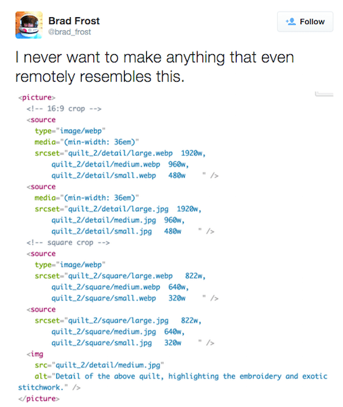
I think many of us agree with Brad on this.
To be fair, the example above include different crops of the image too. Which is something Client Hints alone can’t help you with. Still, crafting markup like this is not something a developer or designer should be spending their time on. We need an automated process. Even if the server can generate dynamic markup automatically, client hints decouples the markup from the image which makes it easier to perform operations on the image without having to worry too much about the markup.
Let The Web Server Know
Imagine if the web server knew the pixel density, the viewport size and also the actual size and format of an image. This is what Client Hints does! Browsers that support Client Hints add a few HTTP headers to requests. The latest draft mentions these hints:
DPRThis stands for “device pixel ratio,” the ratio of physical pixels on the screen to CSS pixels.Viewport-WidthThis is the width of the viewport in CSS pixels. (CSS pixels means the units used in CSS to describe a layout. A CSS width of 100 pixels would be 200 device pixels (DP) if the device pixel ratio (DPR) was 2.)WidthThis is the actual width of an image in real physical pixels (similar to thewdescriptor made famous by responsive images).DownlinkThis is the client’s maximum download speed.Save-DataThis boolean indicates whether extra measures should be taken to reduce the payload.
Downlink and Save-Data are not available in Chrome just yet, but you can imagine their purpose. Let’s focus on the currently available hints. First, we have to tell the browser to send the hints.
Enabling Client Hints In Your HTML
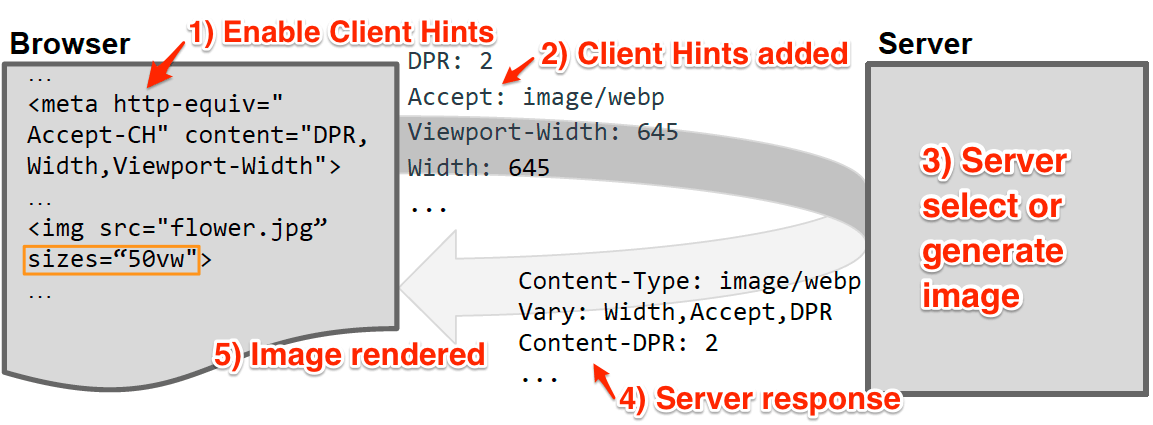
You’ll have to opt in to enable Client Hints. The reason for this is that additional data shouldn’t be added to a request unless it is used for something. If it’s not used, it would work against the very purpose by adding data to the payload. Web servers can also advertise their support by adding an HTTP header to the HTML response which lists the hints accepted by the server:
Accept-CH: DPR, Width, Viewport-Width
If adding an HTTP header is not an option, you can also add this meta tag inside the <head> element in your markup:
<meta http-equiv="Accept-CH" content="DPR,Width,Viewport-Width">
That’s all we need. The browser will now append the DPR, Width and Viewport-Width headers to all subsequent requests generated from the HTML, including CSS, JavaScript and so on (with exception of Width, which, in practice, applies only to images).
Aside from images, Client Hints might be useful if the CSS file contains breakpoints based on the viewport size or device pixel ratio. Knowing the viewport size before the CSS is returned to the browser, the server can strip unqualified blocks from the CSS file before sending the response. That is another story. For now, let’s look at an example with images.
Our Old Friend, <img>
Imagine we have a page with the image tag below. Let’s display the flower.jpg image at a width of 200 CSS pixels.
<img src="flower.jpg" width="200">
With Client Hints enabled, the browser will send the following request to the server:
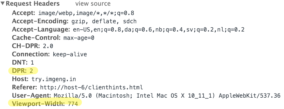
The browser “hints” to the server that the requesting device has a pixel ratio of 2. As a bonus, we get the size of the viewport, too, since this is known by the browser at the time when the request is being made. Because the DPR is 2 and our page’s design need this image to be 200 pixels wide, we would like to serve an image that is 400 actual pixels wide (200 pixels × 2).
But we’re missing information about the intended display size, even if the img tag says width="200". The specification explains that the sizes attribute has to be set in order for the Width header to be sent. In the near future, the width attribute on the image element is likely to be included in the algorithm too, but for now, we’ll have to stick with sizes. The sizes attribute describes the layout and display size of the image. In the beginning, it might be less intimidating to think of it like the good old width attribute or like a CSS property:
<img src="flower.jpg" sizes="200px">
Using pixels might make it easier to “retrofit” existing markup, but using relative units such as vw is recommended to make the page more “responsive”:
<img src="flower.jpg" sizes="25vw">
Now, the request for flowers.jpg will look like this:
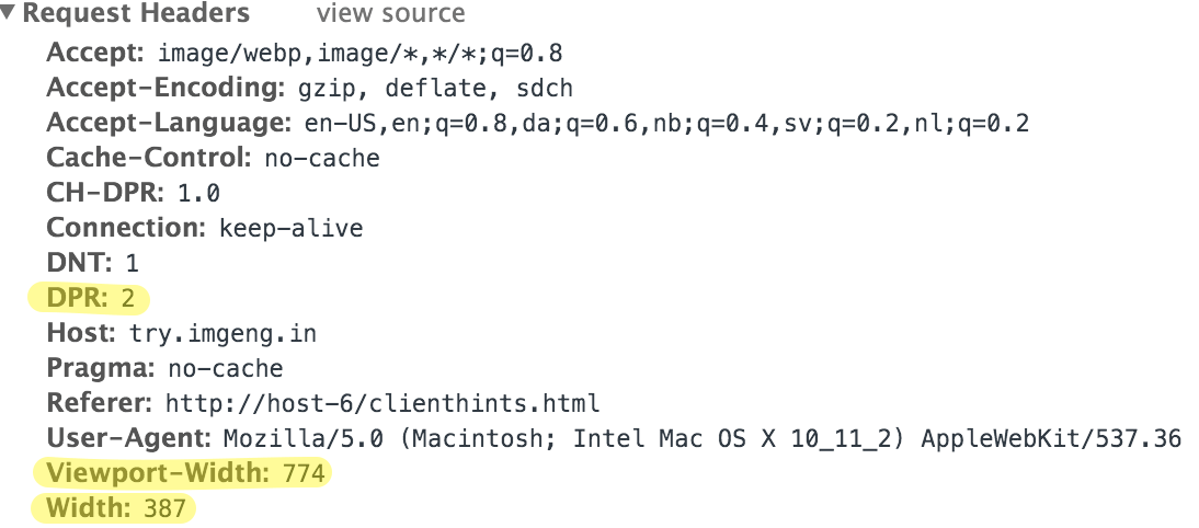
The browser calculates the intended display size of the image based on the current size of the viewport and the device pixel ratio of the device in time for the preloader to fetch it. In the example above, the viewport (Viewport-Width) is 774 pixels wide . The <img> tag specifies that the image should cover 25% of the viewport size: 193.5 CSS pixels.
Because it’s a high density display, with a pixel ratio (DPR) of two, we multiply the CSS pixels by the pixel ratio and arrive at 387 actual pixels (Width). You might recognize this from how the selection process work with “regular” markup for responsive images with multiple image sources listed. The difference here is that the information is appended to the HTTP request, rather than an image source being picked from the srcset attribute.
Mind. Blown.
What just happened? Basically, we boiled our verbose responsive images tag down to something that looks very familiar, but with the same responsive functionality. With the pixel ratio and width information, the server can now pick, or generate, the appropriate size of the requested image.
- The
DPRheader takes care of resolution switching. We don’t needsrcsetwithxdescriptors in our markup. - The
Widthheader tells the server the exact width of the image (relative to the viewport) that the browser need to fit in the layout.
Actually, we don’t need srcset at all. The sizes attribute is our new hero! Based on the relative value of sizes, the browser translates this into the actual size in physical pixels. Also, remember that media conditions can be applied if you want the image to have different sizes as the width of the viewport changes:
<img src="flower.jpg" sizes="(min-width: 30em) 100vw, 50vw">
The Width header will, of course, reflect this, too. For a deeper dive, Jason Grigsby has written a great introduction to sizes over on Cloud Four
But what about type? Responsive images allows you to define different formats, or mime types, of an image by using the type attribute: type="image/webp"
Client Hints does not cover this, but its older brother, the Accept header, may contain valuable information.
Accept: image/webp,image/*,*/*;q=0.8
This example is from Chrome, which is nice enough to tell us that WebP is preferred. Other browsers might just say */* which basically means, “Send me anything.” In those cases, you could apply your own rules, or, even better, the server could implement more advanced device intelligence solutions to decide the best image format to return to the client.
The Server Side Of Client Hints
We could say that, with Client Hints, we’re moving the responsibility of selecting an image source from the browser to the server. This means, of course, that we need to implement some logic to act on the Client Hints server–side.
The bonus of involving the server is that, rather than just selecting the best match from a list of pre–generated image files like the browser does, the server can generate the perfect fit on the fly! On a small scale, this is quite achievable because we have all the information we need in the HTTP header.
However, if this task is a bit daunting and if performance is a priority, a few web services — image proxies, if you will — already support Client Hints. One of them is the free ImageEngine. Using ImageEngine, for example, we first have to “prefix” our images with the URL of the service.
If your image src’s URL is https://example.com/image.jpg, then we’d have to change the src to https://[key].lite.imgeng.in/https://example.com/image.jpg. [key] is the personal token you get when you sign up. As long as the meta tag is present and that sizes attribute is present in the image tags, we’re good to go. Looking at the response with cURL, we can see how the server responds:
$ curl -I https://try.imgeng.in/https://web.wurfl.io/assets/sunsetbeach.jpg -H "DPR: 2" -H "Width: 150" -H "Viewport-Width: 800"

HTTP/1.1 200 OK Content-Type: image/jpeg Vary: Width Content-DPR: 2 …
The request has a DPR of 2, a Width of 150 pixels and a Viewport-Width of 800. The server then responds with the Content-DPR header, whose purpose is to confirm to the browser what the pixel ratio is of the returned image, so that the browser can fit it on the page correctly.
In the example above, the Content-DPR will always be the same as the DPR request header, because ImageEngine is scaling the inputted image to the exact value of Width. As a bonus, even if Width is not set, ImageEngine will fall back to Viewport-Width and then to screen size data from WURFL, a database of devices.
If you implement the server yourself, and you chose to mimic browser behavior by selecting the closest match from a set of pre-generated image sources, then the Content-DPR header might be a different number than the DPR hint from the client. The browser will make use of Content-DPR to scale the image to its display dimensions.
Also worth noting is the Vary header. The purpose of this header is to tell the client (the browser or proxy) that the response from this URI will vary according to the value of the Width header. This enables web proxies and content delivery networks to cache the image better — at least compared to caching based on the User-Agent.
Non-Supporting Browsers
Before you run off and start implementing support for Client Hints, you should know that not all browsers support them. The last <img> tag above will likely mess up a page viewed in a browser that does not support Client Hints. So, what are our options?
Maybe a JavaScript polyfill? In this case, we’d have to rely on cookies, not separate HTTP headers. Cookies would create problems for content delivery networks and cache proxies because the cookie value must be included in the cache key, which would likely lead to cache pollution. Further, and more importantly, the browser’s preloader would not have any knowledge of the cookie’s value.
Until support for Client Hints has reached critical mass, the safest approach is to combine hints with explicit — but relative — widths and heights to make sure the layout doesn’t break. If the browser doesn’t send Client Hints, but the image server expects it, you need the layout to handle an oversized image if that is the default behavior of the image server. Moreover, to reduce the risk of serving too big an image to a non–supporting browser, an image optimization service is recommended, as described above. ImageEngine is useful because it handles mobile devices fairly well (although I’m biased here!). If a mobile device does not support Client Hints, then ImageEngine will never serve an image wider than that particular device’s screen.
Performance
Aside from automation, the motivation for implementing Client Hints is, of course, image performance. It’s difficult to compose a fair test case, but to give an idea of how a Client Hints–based image request performs differently than a “regular” responsive images request, I’ve put together a little demo with the two scenarios. Below is a table showing the bytes transferred and the actual size of the image put on the wire at different viewports. The selected image breakpoints and viewport sizes in the demo are arbitrary.
Responsive images w/srcsetClient Hints with server scaling
| Viewport width | KBytes (w/srcset) | Actual width (pixels, w/srcset) | KBytes (w/client hints) | Actual width (pixels, w/client hints) |
|---|---|---|---|---|
| 320 | 39.6 | 480 | 16.1 | 288 |
| 480 | 39.6 | 480 | 28.6 | 432 |
| 800 | 81.7 | 768 | 63 | 720 |
| 1100 | 138 | 1024 | 113 | 990 |
| 1400 | 138 | 1024 | 186 | 1260 |
While the preselected image breakpoints span portions of the viewport’s size, Client Hints, along with an image server capable of resizing images, addresses the continuum of viewport sizes. With Client Hints, we have surgical precision. On average, the Client Hints approach serves 19% less data. If we exclude the 1400–pixel viewport, to which the responsive images approach serves too small an image (1024 pixels), then the data served is 32% less with Client Hints, which is substantial.

The data sample in the chart above is too small to draw any conclusions, but it illustrates the purpose of Client Hints well. No surprises there. Worth noting, though, is the use of DNS prefetching for the external host name try.imgeng.in. Referring to the table above, the time it takes to download the bytes is as expected. Client Hints works as advertised.
(Almost) Ready For Prime Time
While responsive images (<img>) element with srcset and sizes) implemented in markup only allows the browser to pick the closest match from a list of image resources, Client Hints enable the web server to serve an image tailored to the browser’s needs, which in most cases mean less data and better image quality. It does require some programming if you’re implementing server–side support by yourself; luckily, some content delivery networks and web services already support it.
The future of Client Hints looks promising. Adding hints about the user’s connection and instructions to reduce data traffic are on the way. With this information, the server can increase image compression, avoid serving high–density images or reduce the byte size of images in other ways.
As developers, we have no reason not to start exploring Client Hints right now. The key benefits are less verbose and more maintainable responsive image tags, fewer image bytes transferred and, ultimately, happier end users. Only a few steps are needed from you:
- add the meta tag to the
headelement, - put the
sizesattribute in your image tags.
Then make, or pick, your image server. I’ve mentioned the free ImageEngine optimization service above, which supports Client Hints. The best way to find other services that support Client Hints is to stay tuned and search on Google (duh!), because this is a new thing and more providers are announcing support as we speak.
If you want to implement support for Client Hints yourself, the article “Efficient Image Resizing With ImageMagick” is a great start. Also, the open–source imaging service Thumbor is also considering Client Hints.
Further Reading
- “Preload: What Is It Good For?,” Yoav Weiss
- “Responsive Images Done Right: A Guide To
<picture>Andsrcset,” Eric Portis - “Introducing The Responsive Image Breakpoints Generator,” Nadav Soferman
- “Why Perceived Performance Matters,” Denys Mishunov
 (al, nl, mrn)

