Nobody Wants To Use Your Product

Email Newsletter
Weekly tips on front-end & UX.
Trusted by 182,000+ folks.

 Custom Web Forms for Angular, React, & Vue. Your backend.

 Celebrating 10 million developers
Every morning, designers wake up to happily work on their products, be they digital or physical, with an inner belief that people will want to use their products and will have a blast doing so.
Perhaps that is a slight generalization; however, as designers, we tend to have a natural desire for each project we work on to be the best it can be, to be innovative and, most importantly, to make a difference.
"Oh man, my product will be amazing! It will be full of features, options and settings. People will use it every day and love using it!"
— A designer
Here is a little revelation. People are not really into using products. Any time spent by a user operating an interface, twisting knobs, pulling levers or tapping buttons is time wasted. Rather, people are more interested in the end result and in obtaining that result in the quickest, least intrusive and most efficient manner possible. And these are two fundamentally different concepts — usage versus results — which, at the very least, differentiate good product design from poor product design or, on a smaller scale, a good feature from a bad one.
I still find a lot of products today, be they digital or physical, to be too complex and feature–driven. Shouldn’t we as designers instead be looking to remove complexity for users as much as possible or as much as allowed for by current technology, by making our products fit more seamlessly into their daily lives and routines? I feel that we simply don’t and, more worryingly, that we still haven’t learned lessons from the past.
The Beginnings Of Web Design
If we go back some 15 to 20 years ago, web design was all about visual design. Older readers will recall the days of 2advanced Studios and other similar blockbuster websites. They were gorgeous, with amazing Flash animation and carefully crafted images and pixels. If we were to look back at these websites today through the filter of modern UX design, though, we could say for certain that the experience at that time was less than desirable.
Would anyone today be willing to stare at a loader for five minutes before entering a website? Perhaps, if they were desperately trying to buy concert tickets — otherwise, the answer is always certainly “no.” There were even preloaders for loaders, because loaders were so intricate! These websites were essentially crafted to be admired; they were pieces of art, and the actual benefit to the user, the result, was secondary, if that.
Perhaps in those early days we didn’t know any better because we humans rarely learn from other fields, and we are terrible at translating knowledge learned in one field to another. No studies or best practices for the web were available, but over time, as digital design has grown (encompassing interaction, visual, interface and motion design), we have come to the realization that the less time a user spends on a website — especially a tool or service — the better.
Who would have thought in the early days of Google Search that Google would want to shave milliseconds from the search process so that users could get away from Google as quickly as possible. Google was among the first digital companies to realize, or simply to inherit knowledge from other industries at the time, that time spent with the product itself was wasted time and that the quickest route to the result is the best way to design.
Streamlining The Result
When you think about it, do you really want to work on heating up your food, or do you just want your food to be hot? This is why microwave ovens can be found in basically every modern kitchen; it removes as much work as possible from the process of heating food. Of course, quite a lot of manufacturers still do not realize this and make their microwave ovens overly complicated with too many buttons and settings.
A typical manufacturer still thinks that users stand in front of their microwave and ponder for a few minutes which precise setting to use and then press a bunch of buttons to execute their carefully crafted heating plan. In reality, one needs only two settings: power and time. Honestly, in a lot of cases people need just the time setting. The usual scenario is that you toss the plate of food into the microwave, set the timer and that’s it.
August Smart Lock is on the same path. August realizes that users do not want to manually lock and unlock their doors. What users actually want is to have their house locked when they are away and automatically unlock as they approach the door. (A digression: Actually, that is not all what users want. Users want security, which could potentially be solved through means other than a locked door, but let’s not get into that.)
While we are on the issue of security, do people really want to have to type a password into their phone to unlock it, or do they simply want their phone to be accessible only to them (and other “whitelisted” people), remaining locked for anyone else? That is why Apple’s introduction of Touch ID was such a big deal; it finally brought about a reliable and user-friendly method of locking a phone, while removing all of the complexity of unlocking it. Using Touch ID feels as if the phone is actually not locked at all — as soon as you press the home button to wake up the phone, the phone just unlocks.
Great Design Decisions
This difference in approach — building for features versus building for result — can be seen in numerous products today, both digital and physical. The main reason why some products are great is that they take the load off of users and assist them in making decisions. If you observed these products from the outside, you’d think that their manufacturers do not want people to use them; on closer inspection, people do use them but in a seamless manner, still reaping all of their benefits.
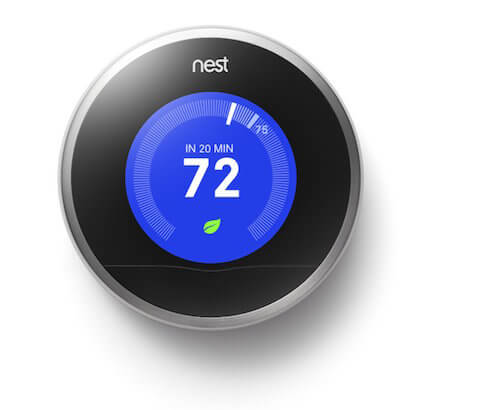
Nest Thermostat
You are probably familiar with Nest Thermostat. What makes it great is that it actively learns about the behavioural habits and patterns of the people living in the home — and so unintrusively that users become totally unaware of it. Sooner or later, they forget that the thermostat is even around, because their home is always at the optimal temperature.
Dropbox
We all love Dropbox. But do we really “use” it? Dropbox figured out a long time ago that people really do not want to sync files across multiple devices, but rather want to manage and sync from one accessible source. Even before Dropbox existed, we could do all of that syncing ourselves: FTP files to a server, go to a second computer, download files from the server, and so forth. But why go to such effort to keep files in sync? The majority of users do not want that; they just want their files to be kept in sync.
Google’s Search Form
In the early days of Google Search, the flow was this: click the search field, start typing, hit enter, and only then would search results be displayed. Furthermore, the ordering of search results had barely any logic behind them, resulting in all sorts of weird suggestions on the first page. Many will recall having to go to page two or three of the search results. Gasp!
However, as soon as technology and design allowed for it, Google began to remove all unnecessary components. Today, the cursor auto–focuses on the input field, and search results are displayed instantly upon the very first character being typed, with results sorted by Google’s all–powerful machine brain, which returns the most relevant results at the very top. Keyboard shortcuts also activate links quickly. Hitting “Tab” triggers a small arrow that can be controlled with the keyboard arrows, and of course hitting “Enter” launches the highlighted link.
Google’s Search Results
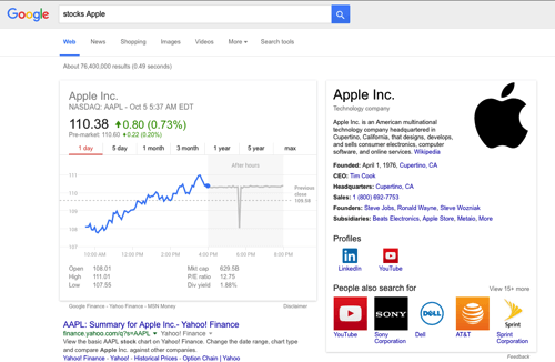
Google Search provides answers to a lot of questions right on the search results page. It is already common knowledge that it is an excellent calculator; with time, it has evolved to provide even more useful data and answers.
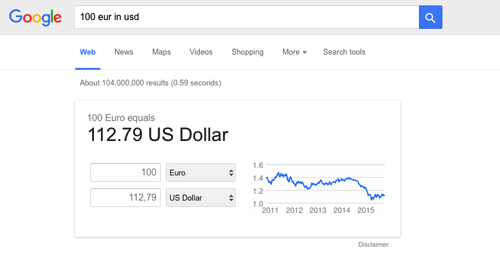
For instance, you’ll find company addresses, hours of operation, currency rate calculations, stock information and more. As a result, there is often no need to proceed to another page, unless more detailed analysis or information is required.
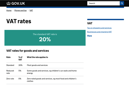
GOV.UK Info Pages
A good example of a government website, GOV.UK, presents key information for each major item at the very top of the page, freeing visitors from having to find key information in large blocks of text. The website goes a step further by placing key information in the description meta tag, making it immediately visible right on the search results page.
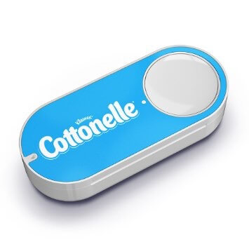
Amazon’s Dash Button
Amazon is also working wonders with Dash. Dash has a simple yet brilliant design, freeing the user from having to interact directly with Amazon’s website at all. The button, purchased from Amazon’s website, is hardcoded with a single brand product.
During the rather simple set–up process, done via a phone over a Bluetooth connection, the user specifies a particular brand’s item to be baked into the button and selects a size, flavor, color and so on, depending on the available options for that particular item. Once Dash is set up, pressing the button automatically executes a chain of commands, resulting in that product being delivered to the owner. All of the magic takes place behind the scenes.
Furthermore, when Amazon Prime Air’s drone–delivery service finally kicks in, an ordered product will likely be able to be delivered to its destination within minutes.
And I know you’re thinking about it: Amazon Sense paired with Amazon Teleport — a detector in the house that identifies when there is no toilet paper left, resulting in the paper being instantly restocked. People do not want to have to drive to a store, walk the aisles, wait in line, interact with a cashier, drive back, and then run up to the toilet all red–faced. All users want is for toilet paper to be stocked in their house at all times.
App Store Updates
Apple realized that most users do not want to go to the effort of always checking whether their applications are up to date. So, it now pushes updates automatically, while the computer is in sleep mode or not in use, meaning that users will come back to find new versions up and running, with little or no effort on their part.
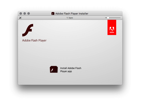
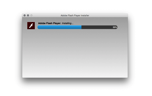
At this point, I might be beating a dead horse, but in stark contrast to Apple, consider how Adobe handles updates to its Flash player. For each update, a Mac user is required to download a new DMG file, manually start the installer and restart the browser. It is a painful process that makes the user work. Is it too much to ask these days for the latest version to be automatically installed at all times?
User Authentication Such As Facebook Connect
You probably know where I’m going with this one. As mentioned, it’s such an obvious roadblock. Users do not always want to have to create accounts; they just want go in and explore a website. Nobody wants to go through the annoying process of typing in an email address or, worse, a username (“Sorry username is taken… Sorry, username2 is taken as well.”), a password (“Sorry, your password needs to contain one uppercase letter, one lowercase letter and one number.”), their blood type, their mother’s maiden name, and then still have to verify their email address. Nobody wants to use a registration form. Users just want to get stuff done without messing around with the interface.
Reducing And Removing The Interface
Removing as much as possible from an interface is a rather old concept. Books have been written about it, talks given, too, and hard–hitting designers such as Oliver Reichenstein have been quoted over and over again. People such as Luke Wroblewski are suggesting that we may have taken this paradigm a step too far, as demonstrated by the no–interface approach of the Apple Watch as well as newer versions of smartphone operating systems, which force users to memorize intricate ways to navigate an interface with various gestures.
Yes, designers sometimes take things too far, sacrificing usability for aesthetics and slickness. However, when design (as in “how things work”) is done properly, the reduction ultimately benefits the user.
Some people still don’t seem to really understand this concept of reduction and removal of every aspect of a design. This has brought us to the point where production people (not so much users, but rather people who work on the web) are beginning to feel that all websites are starting to look the same.
Headers have been made to look the same. The look works because users instantly understand what is going on: logo on the left, log–in form on the right, perhaps search as well. It’s standardized because it causes the least amount of friction, the least amount of having to “use” the website, and it gets users to the results they need.
All websites of a type are the same — all online stores are the same, all blogs are the same, all news websites, all portfolios. Users recognize patterns, which is a good thing because they are able to complete their tasks more quickly. They do not have to worry about where things are. They simply ingest the content, instead of trying to decipher mysterious patterns, unreadable fonts or tricky interactions.
We’ve made registration forms the same because they work: email address, password, and then click the button. Or, for even greater simplicity, just click a single button to log in via Facebook, Google or Twitter.
We’ve made imagery all the same because it works: big clean photos, with full–screen zooming for details. We show smiling happy people because psychology tells us that people relate to this. We show high–quality photos of vacation destinations because travelers are attracted to these views. They convert better.
We’ve made big call to actions with ultra–readable text because users do not want to look for these buttons; they just want to complete their task. We obsess over typography, painstakingly setting font sizes and pairing typefaces, for the sole purpose of minimizing reading time and maximizing a brand’s visual impact. We do this because users do not want to read; they just want to experience the content.
What Does The Future Hold?
We know what the past looked like and what the present looks like, so what’s in store for designers? I think that interfaces will be further reduced, and stuff will just happen and information will surface on its own, not unlike Nest Thermostat and Google Now. Fresh milk will be delivered to your door just as the last bottle runs out. Applications will be updated on their own, rather than have to be updated manually. Phones will be magically charged all the time, instead of having to be charged manually.
Maps will give driving directions, automatically bypassing heavy traffic. Information will be made available according to the environment of the user. Registration forms will not pester people. Hopefully, passwords will be removed altogether, replaced with either reliable fingerprint reading or something even better. (Another prediction: Apple will integrate Touch ID into the trackpads of its laptops. Not this year, not next year, but sometime soon, Apple will finally take the password behind the shed and put it out of its misery.)
- We will design processes, not screens.
- We will design systems, not individual pieces.
- We will design less “using,” and more getting results.
What You Can Do
Know That Your Product Is A Nuisance
Understand that your product is a necessary evil. Realize that, for the user, it would be best if your product did not exist at all and yet the results of the product somehow magically did exist.
Use Known Patterns
Expand on and modify known patterns only when absolutely necessary and only if it really makes it simpler for the user to reach their goal. Reinventing hot water, just for the sake of reinvention, makes no sense. (I know it’s just a saying, but we actually do need to reinvent the wheel. If we didn’t reinvent the wheel, we would still have the stone wheel. Hot water does not need reinvention.)
Do Not Fall In Love With Your Product
The time will soon come when either you or the competition will come up with a better version of your product, and that product will have a smaller footprint in the user’s life, offering greater benefits.
Work Backwards
We have to add as little complexity as is technically possible to get the user to the result. Suppose we are tasked with redesigning the commuting process. Guided by our core principle, we would start with the premise that people do not want to commute; they just want to be where they need to be.
- Working backwards, the ideal method to solve the time and effort wasted on commuting would be teleportation. Because teleportation has some “minor” technical limitations at the moment, we need to add some complexity for the user.
- Let’s introduce the complexity of a car. But note that we have introduced just the vessel itself — an empty shell, so to speak — without any other complexity for the user. The complexity lies on our side, and we (the designers and engineers) have to automate the car’s movement and create a solution for ordering the car and telling it where to take the user. The law of conservation of complexity states that complexity, much like energy, cannot be destroyed; it can just be moved and shuffled around. (In the meantime, Tesla has updated its cars with a self–driving function.)
- At the time of writing, fully automated driverless cars are still not available to the general public, unfortunately. The issues are largely legal, less technical. Thus, we have to introduce a piece of complexity called the “driver”. Note that the driver here is not the user. The complexity of driving is delegated away from the user, and the solution accounts for the process of ordering the car, communicating the destination and handling all of the other logistics that go with it, such as payment.
- If we remove the framework that allows other people to act as drivers (the “taxi” framework), then we shift the complexity of driving to the user. This introduces huge complexity because it requires the user to have various licenses and a lot of knowledge. But at least maintenance of the car will be taken care of, for the most part.
- Introducing the last layer of complexity, the user not only has to know how to drive and operate the car, but has to be a knowledgeable mechanic, too. Furthermore, the car itself is not really user–friendly and requires constant care in order to keep running. Hello, Mr. Ford, nice to meet you.
Figure out a way to remove such complexities. Figure out how to remove entire pieces of your product or interface, while keeping the user on the path to the desired result. Replace those evil elements with cleverly coded software, automation, sensors, data–crunching, prediction and better hardware. If something is not technically possible, that’s a great opportunity to create new value! Invent stuff!
There’s Still Room For Creativity In Information Design
So far, we’ve been talking about task–based interfaces, but what about information design? Even though nobody wants to use your product or website, that doesn’t mean there’s no room for creativity in information design. We can still add style, as long as it contributes to the overall experience. As you will see in the following examples, that translates into better comprehension of information:
- Infographics can explain a lot by visually breaking down large sets of data. Get inspired by Francesco Franchi’s Flickr stream of work he did for IL magazine.
- Illustration, photography and animation contribute to the story. Good examples are the New York Times’ “Russia Left Behind” and “Tomato Can Blues.”
- Color palettes and typography set the mood and evoke emotional response.
- Proper art direction sets off the color scheme, typography, composition and concept.
Conclusion
It’s up to us to remove complexity for the user and to minimize the footprint of our product in the user’s life. Any amount of time users spend operating your product is time wasted, and time is the one resource they cannot get back. Remember Larry Tesler’s law of conservation of complexity, and start offloading complexity from the user onto yourself.
Yes, this requires a lot of work, but that is how you will differentiate your product from the competition’s. Guide the user to the same (or better!) result through fewer steps, less friction and less work.
Theoretically, the ultimate goal for any product is to be completely removed from the user’s perspective. Work towards that goal because nobody wants to use your product.
People just want the benefit of using it.
Further Reading
- “Giving Your Product A Soul,” Joshua Mauldin
- “The Art Of Content Marketing,” Craig Anderson
- “Better Product Pages Turn Visitors Into Customers,” Sabina Idler
- “Quick Course On Effective Website Copywriting,” Peep Laja


