Responsive Image Breakpoints Generator, A New Open Source Tool

Email Newsletter
Weekly tips on front-end & UX.
Trusted by 182,000+ folks.
 Register for Free

 Celebrating 10 million developers
 Custom Web Forms for Angular, React, & Vue. Your backend.
Responsive websites, even the most modern ones, often struggle with selecting image resolutions that best match the various user devices. They compromise on either the image dimensions or the number of images. We can solve these issues and start calculating image breakpoints more mathematically, rather than haphazardly.

The lives of web developers aren’t getting any simpler as the number of different devices and potential screen resolutions increase. The high–resolution arms race seems to be never–ending as vendors try to top one another with innovations in laptop and mobile device screens. New devices such as TVs and smartwatches are entering the market, making the race even more complex.
To support the wide range of resolutions and devices, a website’s markup must adapt itself to look perfect on all the different devices and in various resolutions, pixel densities and orientations. Managing, manipulating and delivering media — specifically images — is one of the main challenges developers face when building responsive websites.
Implementing a responsive design means building your website where slightly different variants of images will be displayed at various dimensions to save bandwidth and optimize image deliery. While there are several responsive frameworks and responsive image solutions available, they often lack a response to the common need of deciding which image resolutions to select and how many different image versions — responsive image breakpoints — to include in your responsive website.
In this article I want to further describe the responsive breakpoints challenge, analyze the mistakes currently being made, and suggest a solution to intelligently find optimal breakpoints for each specific image. This article introduces a new free open source web tool that will allow you to generate breakpoints for your images interactively: the Responsive Breakpoints Generator.
Common Mistakes
Many modern websites are responsive. This means that an image adjusts itself to be displayed in various dimensions. Usually there are different image width limits for each display resolution and each device pixel density — a large widescreen image isn’t very helpful on a small screen, and a small image will not look crisp on widescreen displays. In addition, many responsive layouts involve art direction, which means that images are not only scaled down, but are also cropped or styled differently for each device, based on its resolution or the browser’s window size.
It seems that most websites still solve this issue in a non–optimal way, either delivering the same high–resolution image to all devices or creating too many different versions for each original image.
Mistake 1: Delivering The Highest Image Resolution To All Users
Website owners want their site to look perfect on modern high–resolution devices. Often developers deliver the same hi–res version of each image to everyone: all device resolutions, browser window dimensions and device pixel ratios (DPR). Using this approach, the websites depend on browser–side scaling to fit the images in their responsive layouts.
The websites look great, especially on hi–res displays with high pixel density. However, the same large image files are delivered to devices with much smaller resolutions, resulting in the unnecessary delivery of huge files, which means slower page load times, a negative impact on the user’s experience, and a waste of money on image delivery bandwidth.
For example, take a look at the website for Mango, a popular fashion brand. The following screenshots show a page displayed in a regular laptop’s browser and in standard smartphone resolution.

While the responsive site looks fine both on desktop and mobile, there’s a significant bandwidth waste behind the scenes that also affects the website visitor by slowing down the image load time.
The web page image above is delivered in its highest resolution of 1,934×2,048 pixels to all devices. The actual dimensions available in the desktop view above are 700×442, while the mobile view allows dimensions of 200×213 pixels only. This means that a huge 1,934px–wide image is delivered to much smaller displays. This hi–res image weighs 766KB. If you scale it down to exactly 700px wide for the desktop (DPR 1.0), this image would only weigh 119KB, an 84% saving in file size.
If you scale the image down even further to exactly 200px wide (required by the smaller mobile device resolution), the same image weighs only 14KB, reducing file size by 98%, significantly speeding page load time and dramatically saving bandwidth, especially when there are multiple images on each web page.
Another example is, well, Smashing Magazine. Take a look at the two screenshots below of a responsive web page on Smashing’s website, first in a laptop display and second in a mobile device:
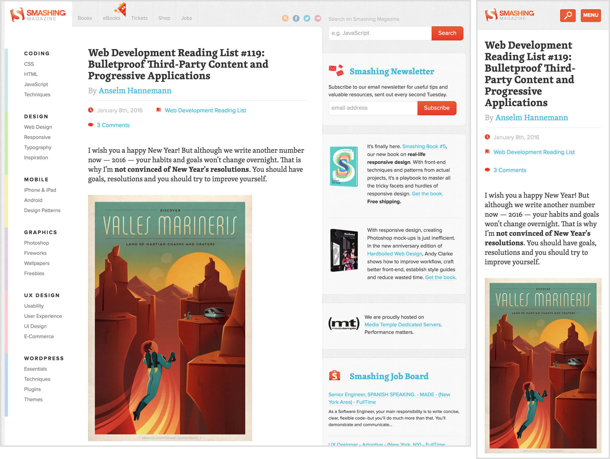
The same original image of 500×750 is delivered to all the different device resolutions and browser dimensions. The original image weighs 92.4KB. We can easily decrease file size by reducing the JPEG quality to 80% and further optimizing the image to get a file size of only 66.8KB. But even then, the same image is delivered when the available dimensions are only 356×534 pixels. For the smaller dimensions we could have scaled down the image to exactly 356px wide, to get an optimized JPEG file of 36.2KB, saving 46% of the file size, reducing the bandwidth involved and improving user experience.
Mistake 2: — Creating Too Many Different Image Versions
Web developers who want to better match the available display resolutions with the delivered images may create multiple versions for each image. There are frameworks and cloud services (shameless plug: such as Cloudinary) that simplify this process by dynamically scaling down images for all the different resolutions. This approach ensures that the correct images are delivered to the different devices and displays. The visual quality is great, the user experience is better and no bandwidth waste is involved.
However, matching image dimensions to display resolutions means that developers might need to create dozens, or even hundreds, of different versions for each image. Furthermore, if the responsive design of the website involves art direction aspects, images are displayed in different aspect ratios and styles, and you need to create many different scaled down versions for each one.
Creating so many different images is quite costly: increased image processing CPU time, larger storage space required, and greater image management complexity and costs.
In addition, having too many different image versions significantly reduces the chances of a CDN cache hit. If a user gets tailored image dimensions from your servers, they might be the first user to request this specific image from your CDN layer. An increase in cache misses might mean a negative impact on user experience and an increase in traffic to your origin image servers.
The Breakpoints Selection Challenge
To avoid making these mistakes, we’ll need to understand the trade–off between the number of different images, the visual quality and the bandwidth involved. The challenge is to find the best breakpoints for your images.
If scaling down images by a certain level doesn’t significantly save enough bandwidth, you can deliver bigger images to your users and let the browser handle resizing. On the other hand, if a small dimension reduction significantly reduces the file size of the image, you should definitely create another scaled down image version.
The file size reduction when scaling down images varies for different images. It depends on the specific content of your images, which has a different sensitivity to the compression algorithms of JPEG, opt–png, WebP and other image formats. For some images, a small scale–down saves significant file size, while for other images even a more prominent scale–down will not significantly affect it. Therefore, you want to define the file size step where it is worth creating another scaled down image version. Jason Grigsby of Cloud Four called this file size step performance budget in his article about image breakpoints.
What Jason showed, and what was verified by Cloudinary’s analysis, was that different images require a different number of versions to balance the bandwidth reduction trade–off, according to your performance budget.
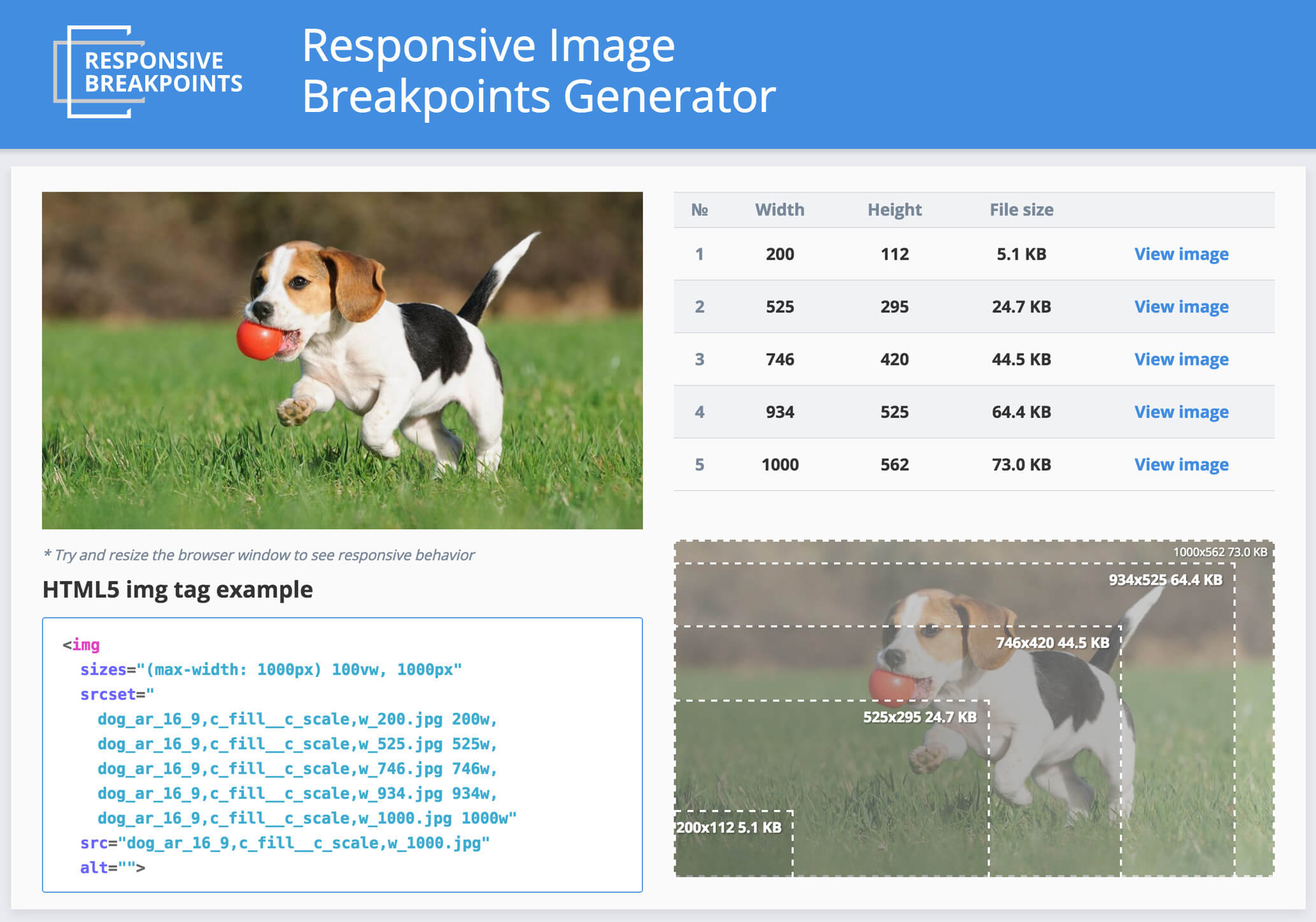
Consider the following JPEG image:

Assume you need to display this image in your responsive website at various width dimensions between 200 and 1,000 pixels. Define the file size step (performance budget) to be about 20KB. As the table below shows, you only need to create and deliver five different versions of this image to all the different devices and browsers.
| No. | Width | Height | File size | Image |
|---|---|---|---|---|
| 1 | 200 | 133 | 6.9 KB | View image |
| 2 | 477 | 318 | 27.2 KB | View image |
| 3 | 681 | 454 | 48.0 KB | View image |
| 4 | 847 | 565 | 67.6 KB | View image |
| 5 | 1,000 | 667 | 86.9 KB | View image |
Now let’s take another JPEG photo:

Trying to find the best breakpoints for this image using the same settings of 200 to 1,000 pixels wide and about 20KB file size steps, results in this image needing nine different versions as the table below shows.
| No. | Width | Height | File size | Image |
|---|---|---|---|---|
| 1 | 200 | 133 | 8.7 KB | View image |
| 2 | 380 | 253 | 27.8 KB | View image |
| 3 | 514 | 343 | 48.5 KB | View image |
| 4 | 619 | 413 | 68.3 KB | View image |
| 5 | 711 | 474 | 87.7 KB | View image |
| 6 | 804 | 536 | 108.5 KB | View image |
| 7 | 883 | 589 | 129.3 KB | View image |
| 8 | 957 | 638 | 148.2 KB | View image |
| 9 | 1,000 | 667 | 160.7 KB | View image |
As shown above, the number of versions required for one image is almost half of the number required for another one. The difference might be even more dramatic for other kinds of photos. If you multiply this difference by millions of user uploaded images, the result is huge savings in storage, image processing costs and image management complexity, while still delivering the best–looking images and preserving the user experience.
A Solution: The Responsive Breakpoints Generator
To perfectly balance the number of image versions for your responsive website, we need to find the correct breakpoints according to the file size step (performance budget) that you define. How can you do that? You can generate images for all possible width values and select only the ones that reflect a significant enough file size reduction. However, this is inefficient and can be expensive.
We’ve come up with a new solution for generating responsive image breakpoints. Analyzing the behavior of the compression mechanisms for various image formats (mainly JPEG, opt–png and WebP), we created algorithms to efficiently and intelligently find image breakpoints that match dimensions and file size saving requirements.
This solution is a new free public web tool called the Responsive Image Breakpoints Generator. I believe you will enjoy trying it out (duh!).
The tool allows you to upload your images and define settings to find matching image dimensions and breakpoints that fit your design requirements. As you can see in the screenshot below, you can define the required image width range, the file size step in kilobytes and a safety limit of the maximum number of images you allow. In addition, you can request that the results include double resolution images for DPR 2.0 displays (e.g. Retina display).
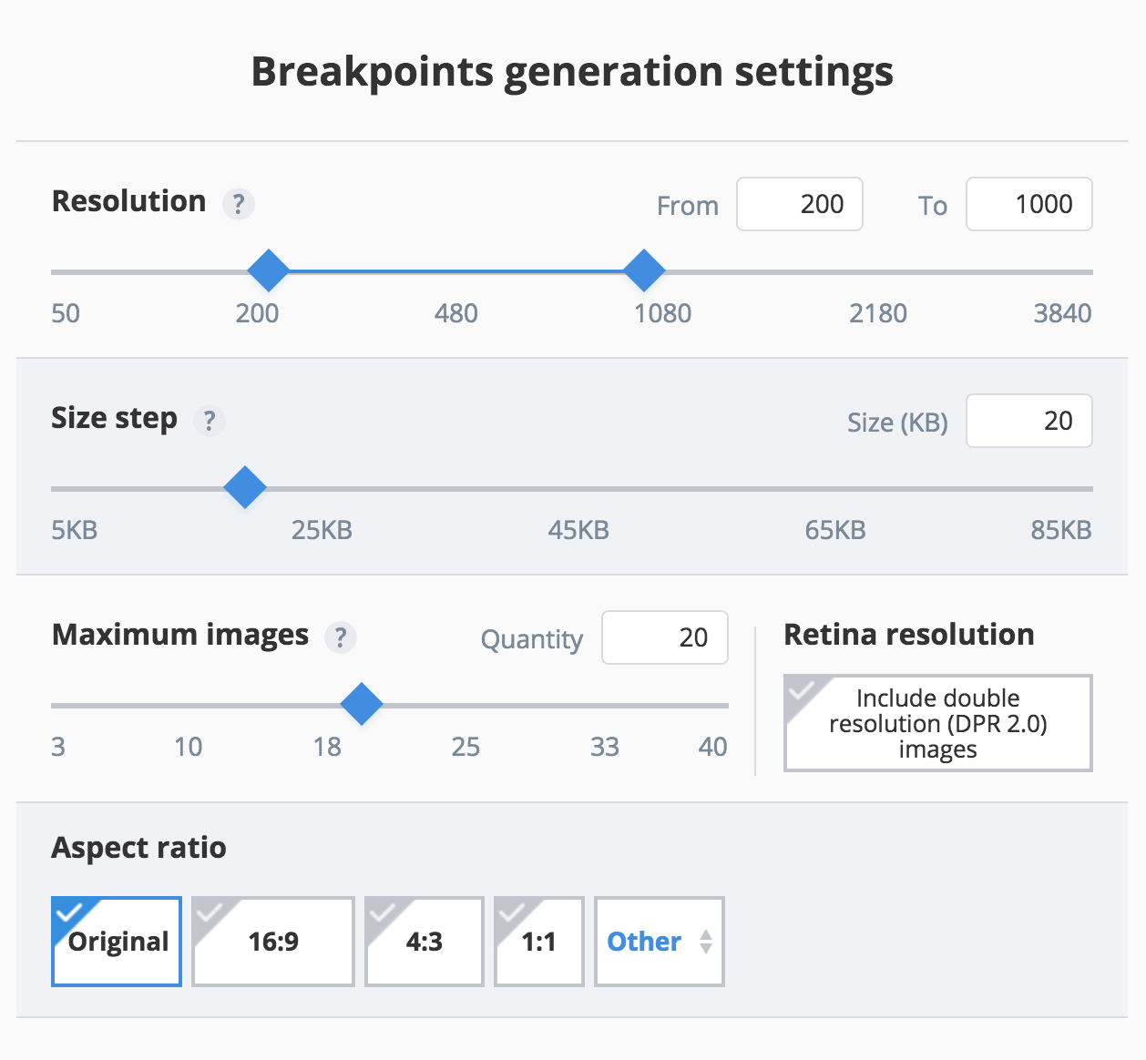
When you upload an image, the breakpoints are generated according to your settings and are performed automatically in the cloud. The generated breakpoints are displayed in a summary table and are also illustrated on your uploaded image. You can also download all scaled down and optimized images that match the generated breakpoints.
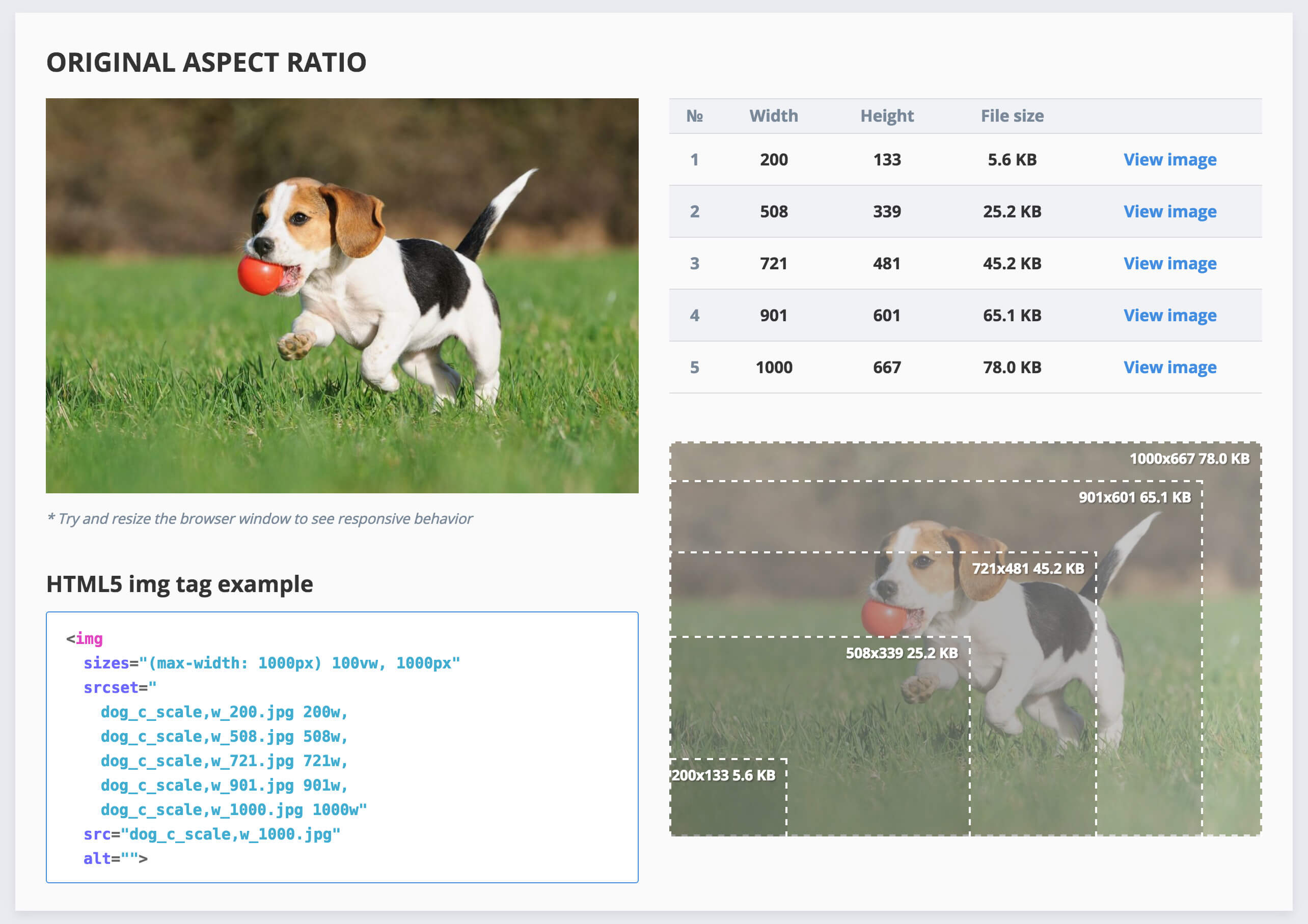
The generator tool generates HTML markup that you can copy and paste into your code. The srcset attribute of the img tag is set to list the image versions and width values according to the smartly selected breakpoints. Modern browsers that process img tag will then know how to select the correct image version according to the available space of the image in your responsive web layout. You can also use the tool to create and download a ZIP file of all image files specified in the source set.
 <img sizes="(max-width: 1000px) 100vw, 1000px"
      srcset="dog_c_scale,w_200-opt.jpg 200w,
              dog_c_scale,w_508-opt.jpg 508w,
              dog_c_scale,w_721-opt.jpg 721w,
              dog_c_scale,w_901-opt.jpg 901w,
              dog_c_scale,w_1000-opt.jpg 1000w"
      src="dog_c_scale,w_1000-opt.jpg" alt="A nice dog">
As mentioned earlier, responsive layouts involve art direction as well. The original images may need to be cropped to match a different aspect ratio required by the graphic design, for a mobile device for example. The breakpoints generator tool enables you to select multiple aspect ratios. Breakpoints will be generated for each aspect ratio separately, while the original image is cropped to match the required aspect ratio.
You can download all the images of all the aspect ratios together. In addition, the tool generates a HTML5 picture sample code that combines the different aspect ratios and their breakpoints into a single responsive HTML solution. Modern browsers, such as Chrome and Firefox, already support the picture element, while Microsoft’s Edge and Apple’s Safari have recently added support to their new official or beta versions. If you want to support older browsers as well, you can use the Picturefill polyfill JavaScript library.
<picture>
  <source media="(max-width: 480px)"
    sizes="(max-width: 1000px) 100vw, 1000px"
    srcset="dog_ar_3_4,c_fill__c_scale,w_200-opt.jpg 200w,
            dog_ar_3_4,c_fill__c_scale,w_386-opt.jpg 386w,
            dog_ar_3_4,c_fill__c_scale,w_522-opt.jpg 522w,
            dog_ar_3_4,c_fill__c_scale,w_632-opt.jpg 632w,
            dog_ar_3_4,c_fill__c_scale,w_739-opt.jpg 739w,
            dog_ar_3_4,c_fill__c_scale,w_834-opt.jpg 834w,
            dog_ar_3_4,c_fill__c_scale,w_920-opt.jpg 920w,
            dog_ar_3_4,c_fill__c_scale,w_1000-opt.jpg 1000w">
  <source media="(max-width: 768px)"
    sizes="(max-width: 1000px) 100vw, 1000px"
    srcset="dog_ar_16_9,c_fill__c_scale,w_200-opt.jpg 200w,
            dog_ar_16_9,c_fill__c_scale,w_525-opt.jpg 525w,
            dog_ar_16_9,c_fill__c_scale,w_746-opt.jpg 746w,
            dog_ar_16_9,c_fill__c_scale,w_934-opt.jpg 934w,
            dog_ar_16_9,c_fill__c_scale,w_1000-opt.jpg 1000w">
  <img
    sizes="(max-width: 1000px) 100vw, 1000px"
    srcset="dog_c_scale,w_200-opt.jpg 200w,
            dog_c_scale,w_508-opt.jpg 508w,
            dog_c_scale,w_721-opt.jpg 721w,
            dog_c_scale,w_901-opt.jpg 901w,
            dog_c_scale,w_1000-opt.jpg 1000w"
    src="dog_c_scale,w_1000-opt.jpg" alt="A nice dog">
</picture>
The tool is freely available. It’s open sourced under the MIT license and is hosted on GitHub, while the actual breakpoints generation algorithms and the image resizing and cropping transformations run in the cloud.
Automate Breakpoints Generation
The tool allows you to process your images, which is useful if you have a reasonable amount of statically uploaded images. However, what if your web application involves user–generated content of dynamically uploaded images?
To generate breakpoints for images uploaded by users, you need to programmatically generate them from your code. For each uploaded image, you probably need to call an API to generate the breakpoints, store or cache them on your side and then build your HTML5 or CSS snippets according to these breakpoints.
You may want to try out Cloudinary’s API to programmatically request the breakpoints for newly uploaded images or existing ones. You can specify settings such as the width range, file size step, maximum number of images and request one or more image transformations to apply on the original image. Such transformations include aspect ratio–based cropping, face detection–based cropping and applying various image effects, filters and optimizations.
You can call the cloud–based API from your development framework code using open source SDKs. For example, the following Node.js code can be used to generate the breakpoints and the matching images for an uploaded image:
cloudinary.uploader.v2.upload("sample-opt.jpg",
  { responsive_breakpoints:
      {
        create_derived: true,
        bytes_step: 20000,
        min_width: 200,
        max_width: 1000,
        transformation: { crop: 'fill', aspect_ratio: '16:9', gravity: 'face' },
      } },
  function(error, result) { console.log(result); });
A quite generous free tier (for 75,000 images and 7,500 monthly transformations) is included for running it on your dynamically uploaded images.
Summary
I hope the tool will help you address some of the challenges related to responsive images. This complexity is the driving force for new solutions that keep arising, such as the HTML5 picture element and srcset image attribute, the Client-Hints specification, and plenty of other client-side and server-side solutions.
Whichever responsive design solution or framework you choose, you still need to generate and deliver multiple versions of each image. The challenge of finding the best fitting resolutions, which are the responsive breakpoints for each specific image, is common for all approaches and frameworks.
Depending on the content of images and as a result of the nature of image compression algorithms, you may have to generate more versions for certain images and fewer for others.
Breakpoint generation should be streamlined in your web application when user–uploaded media is involved. Web pages should be rendered dynamically according to the generated breakpoints that allow browsers to download and show images of the best visual quality with optimized file sizes for any device and resolution. These actions will result in reduced bandwidth and processing costs, an improved user experience and an increase in user engagement and conversion rate.
Further Reading
- “Automating Art Direction With The Responsive Image Breakpoints Generator,” Eric Portis
- “Responsive Images Done Right: A Guide To
And srcset ,” Eric Portis - “WordPress Responsive Images With Art Direction,” Laurie Laforest
- “Responsive Images Now Landed In WordPress Core,” Tim Evko
 (og, nl, mrn)

