Automatically Art-Directed Responsive Images? Here You Go.

Email Newsletter
Weekly tips on front-end & UX.
Trusted by 182,000+ folks.

 Custom Web Forms for Angular, React, & Vue. Your backend.
 Celebrating 10 million developers


In many projects, responsive images aren’t a technical issue but a strategic concern. Delivering different images to different screens is technically possible with srcset and sizes and
On top of that, responsive images markup has to be generated and added into HTML as well, and if a new image variant comes into play at some point (e.g. a file format like WebP or a large landscape/portrait variant), the markup has to be updated. The amount of extra work required often causes trouble — so if you have a perfect product shot, you need to either manually create variants for mobile and portrait and landscape and larger views, or build plugins and extensions to somehow automate the process.
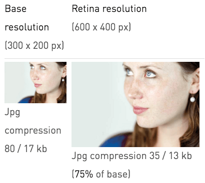
Sometimes workarounds work just well, too. One of them is compressive images, a clever technique which suggests that the level of compression makes more of a difference than its physical dimensions. So, in Scott Jehl’s words, “given two identical images that are displayed at the same size on a website, one can be dramatically smaller than the other in file size if it is both highly compressed and dramatically larger in dimensions than it is displayed.”
So basically we could enlarge a given image, save it in the worst possible quality in Photoshop, and let the browser do the rescaling — on average, the actual image sent down the network would be larger in dimensions but approximately 50–65% smaller in file size. Now, that’s quite a difference. And it works in real projects.
The downside: we offload the work to the client and if the user chooses to save the image, they’ll get a pretty suboptimal version of it. And it doesn’t help us with art-directed images either. That’s not quite a clean solution that we are looking for.
The Devil Is In The… Back-End!
A common scenario would be to integrate some sort of a back-end logic in the CMS, allowing content managers to upload images, define focal points for every given image and generate all of those cropped variants of each image on the fly.
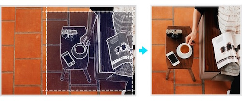
crop=entropy parameter for intelligent automated cropping.The “cropping” bit is a tricky one, and if you’re perfectly fine with resizing the images without art direction and allowing the browser to select an image that it feels would fit best, it won’t be a big hassle — you could use ImageMagick or any other image editing tool for rescaling, or CMS plugins could take care of it for you: e.g. Mobify.js API, Responsive Images in WordPress core and there is a solution for Drupal, too.
However, if art direction does matter — e.g. if you want to send very specific product shots to different kinds of screens — you’ll have to look into more advanced options. A wide landscape photo scaled down for the narrow viewport won’t be particularly helpful, and neither would a narrow image scaled up to fill the entire viewport on a wide screen. That’s where we need better, smarter solutions.
So What Are The Options?
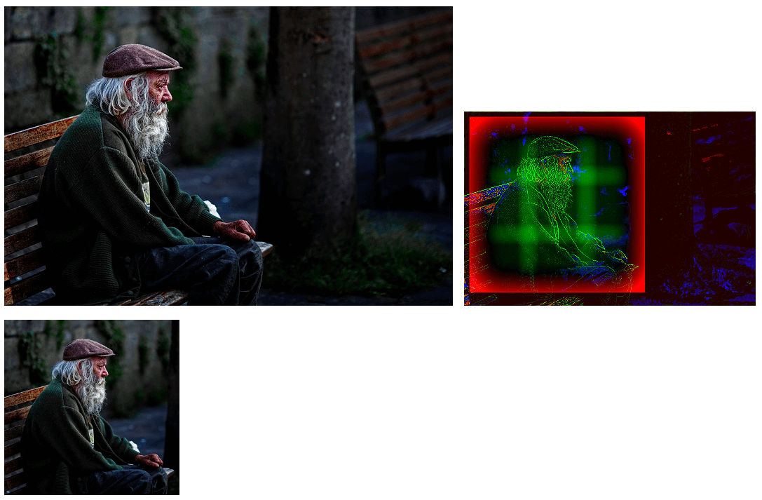
Well, we could run batch processing through the content aware fill in Photoshop, or use tools like Smartcrop.js, which is a fairly simple implementation of content aware image cropping with JavaScript. Potentially we could even integrate the smartcrop-cli (along with ImageOptim-CLI) into our Grunt- and Gulp-building processes and crop images on the fly. You could also use imgix with its automatic point-of-interest cropping. That’s already a great start, but we’d need to write the markup for all those variants manually.
Good news: there is a new kid around the block. Just a few days ago we’ve written about the Responsive Image Breakpoints Generator, a little open source tool that allows you to calculate breakpoints for your images interactively. Basically, you can upload an image, and the tool will detect appropriate breakpoints, rescale images and generate responsive images markup that you can then copy/paste into your HTML. You can go even further and automatically art direct responsive images using the tool’s API.
As Eric Portis explains in his article, when using Cloudinary API, you can specify a crop_mode which allows you to mimic background-size: cover in CSS. In addition to providing heights and widths, you can also specify the focal point using the gravity parameter, zooming factor and supply aspect ratios, which can make URLs a bit easier to read. In fact, the API supports face detection, so if your images contain human faces, art direction can be automated with a higher probability of pretty decent cropping.
If you want to be able to define focal points for images explicitly, you might want to look into Sizzlepig (not free), an in-browser image batch processing tool that can be integrated with Google Drive and Dropbox, and allows you to change cropping and scaling for each image.
Summary
Ideally, we’d love to have one tool that would either generate “smart enough” crops and plug in the responsive images markup in the build automatically, or provide one interface to visually adjust the focal point of images and output “ready-to-go” markup. We aren’t quite there yet, but we might be soon.
In the meantime, the tools listed above could be good enough options to consider when tackling a quite daunting task of producing art-directed variants of images — either manually or by building custom CMS plugins.
Further Reading
- Simple Responsive Images With CSS Background Images
- Automate Your Responsive Images With Mobify.js
- How To Solve Adaptive Images In Responsive Web Design
- Responsive Images In WordPress With Art Direction
 (vf, mrn)

