Creating Content Wireframes For Responsive Design

Email Newsletter
Weekly tips on front-end & UX.
Trusted by 182,000+ folks.
 Register for Free


 Celebrating 10 million developers
 Custom Web Forms for Angular, React, & Vue. Your backend.
As I was leading my course in responsive web design between 2011 and 2012, I kept stumbling over the process of wireframing. My students tended to focus on the wireframe as being the end game in the planning process. They didn’t understand that responsive design focuses on how users will access the content.
You can only imagine my relief when I happened to come across a video by Stephen Hay speaking at the Beyond the Desktop conference in 2012. There, in his talk on responsive design, he presented the concept of the content wireframe. This was a huge relief to me.
I just knew there was a step before the process got real, but I couldn’t articulate it. In this post, I’ll describe the methods I use to get from content to responsive wireframe — and how you can, too.
Introducing The Content Wireframe
The concept of a content wireframe is rather simple to understand because it is an offshoot of the most basic design philosophy: Fall in love with the user, not the technology.

Content wireframes do just that. They block out general content categories and force you, as Stephen so beautifully puts it, to design from the content outwards.
It really isn’t complicated. In fact, it involves two steps:
- create a content inventory,
- create a visual hierarchy of the survivors of that list.
Do that and you have a potential deliverable for your client. What it tends to do is shift the client’s attention away from what “thing” goes where and towards what is important: the flow of information.
Not Rocket Science
The key issue with wireframes, for my students and other designers, is that they tend to take on unwarranted importance. It is almost like the end of a renovation show on TV, when everyone “Oohs” and “Ahhs” when the client gets to walk through the home.
Not for me. I prefer the kitchen renovation scene, when the contractor pulls out a piece of paper and a carpenter’s pencil and sits down with the client at the kitchen table. Then, they draw a simple outline of the room and say, “How about we pull out this wall, put an island here and move the counter over there?”
The carpenter is laying out the “intent” of their approach to the project, and the client is focusing on the important parts of the project, rather than on tiles, fixtures, paint and lighting.
In his book Responsive Design Workflow, Hay uses the term “content reference wireframe” because, “it describes how the wireframes deal with content: they simply refer to it as opposed to depicting it.”
A content wireframe, like our contractor’s sketch, depicts placement — a wall, a counter, a header, a footer — and establishes an information hierarchy and flow. Because the process is iterative, starting the conversation with a simple “How about…” rather than “Here’s how…” keeps it away from the realm of rocket science and puts it where it originally started: old-school boxes and arrows.
Once that is established, we can move into the low-fidelity and high-fidelity wireframe development process. Let’s see how how a content wireframe can focus the conversation by deconstructing a simple page.
Deconstructing Made By Hand

I visit Made by Hand regularly. As the name suggests, the website celebrates artisans who make things by hand. The home page features a series of videos, and when you first visit, it appears to be rather stark, with few flourishes. This makes sense because the films themselves are what’s important, not any other content.
The content inventory for the home page is, understandably, rather basic, consisting of:
- a header and navigation,
- five videos (which we’ll refer to here as the main one and videos 1 to 4),
- a footer.
Still, we can see a definite information hierarchy at play. The list of main content is a bit vague, but once you understand that the intent is to present a series of videos that highlight individual artisans, the priority of each piece of content becomes clear:
- main video,
- videos 1 to 4,
- the footer,
- the header and navigation.
Seeing the header and navigation at the bottom of the stack might strike you as odd. However, the whole purpose of the page is to get you to watch the videos and, if you like them, to subscribe for regular notifications of new content. The header and navigation are simply there to facilitate navigation of the website.
In many respects, the old adage “Content is king” — generally attributed to Bill Gates — drives this website. The focus is the collection of videos and nothing else. This raises an important point: A content reference wireframe establishes content precedence, not page flow.
With that list in hand, you can move on to actually creating the content reference wireframes.
Creating Content Reference Wireframes
Though Stephen Hay is a big proponent of creating these content reference wireframes with a code editor such as Coda or Adobe’s Brackets, for those of us who are, shall we say, code-challenged, a visual editor such as UXPin or Adobe’s Illustrator or a responsive editor such as Macaw or Webflow would be a solid choice. Each has its uses, although a responsive editor has the advantage of giving the designer more than one perspective on their work — specifically, how their work responds to different screen sizes. That’s crucial, given today’s wide range of screens.
There’s no one best tool; pick the one that fits you best. In this tutorial, we’ll walk through Illustrator. Here’s why:
- Although Illustrator is not a truly responsive tool, its artboards enable you to start with a mobile-first approach and, using preset or customizable breakpoints, to quickly build out to a desktop version.
- Its customizable grids allow for consistency of design.
- It lets you create precisely sized boxes for wireframes by clicking and setting the dimensions.
- If you prefer Photoshop for higher-fidelity mockups, you can copy and paste your content wireframe from Illustrator to set the foundation.
Note: If you prefer to work in code when wireframing or prototyping responsively, feel free to skip to the “Next Steps” section at the bottom for other useful resources.
A Mobile-First Approach To Content Wireframes
For this short tutorial, we’ll use Illustrator as part of a mobile-first approach, to focus us on the most important content. We’ll create five viewports to lay out the foundation for a responsive content wireframe.
1. Create The Documents
In Illustrator, create five new documents with the following widths and heights (in pixels):
- 320 × 800
- 768 × 1200
- 992 × 1400
- 1224 × 1600
- 1440 × 1800
(Depending on which version of Illustrator you use, you can also create different artboards in the same document.)

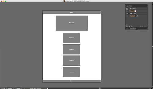
2. Create The Containers
In the 320 pixel-wide document, make seven unlined boxes filled with neutral gray.

3. Create The Labels
Place text over each box — in descending order: Header, Main video, Video 02, Video 03, Video 04, Video 05 and Footer. I’ve used white text to contrast against the relatively dark boxes.

4. Resize The Boxes
Make the main video box a little bigger than the others to indicate its priority. If necessary, scale down the header and footer — but keep them full width.

5. Copy The Boxes
Now that you have their relative sizes and labels, copy the boxes to the other documents or artboards.
Resize them as needed, and remember that these boxes are approximate. They represent the existence of content, not the content’s precise sizing or spacing.

Next Steps
There is no big reveal or other excitement with the creation of content reference wireframes.
They fit into the workflow between the content inventory and the low-fidelity wireframes. This is because their purpose is simply to establish an information hierarchy and, if the client is involved, to get them to think more about the concept of content and information flow, rather than the actual content itself.
The entire process is more of a “How about…” conversation than a “Here’s how…” Once everyone agrees, the next iteration of the project will involve pouring actual low-fidelity content into the boxes that make up the content reference wireframes.
As we’ve seen, you can practice content wireframing by deconstructing popular websites into their basic building blocks. Start with rough containers of information, add in the real content, and then start chiseling them into more finalized forms. In doing so, you’ll be better able to design around what users really care about: the content.
- UXPin This collaborative design tool is useful for laying out a rough wireframe, then adding interactions to create a rapid prototype.
- “Responsive Design Workflow” (slides), Stephen Hay, Mobilism 2012 These slides concisely summarize how to design efficiently for responsive layouts. Hay offers some great advice on auditing content, prioritizing content, wireframing content and using development frameworks.
- “Content Reference Wireframes (PDF), Neil Hao This is a nice overview of a code-based approach to content wireframing, described through a realistic design scenario.
- “Mobile First,” ZURB University ZURB, a design agency, offers this helpful resource portal, which provides context for content wireframing.
- “Dive Into Responsive Prototyping With Foundation,” Jonathan Smiley, A List Apart Smiley’s useful tutorial shows how to wireframe and prototype responsive designs in code. While it’s not totally mobile-first, Smiley does a good job of explaining how to display content consistently across devices.
- “Design Last,” Rik Schennink, Smashing Magazine This interesting article goes over how to design responsively with content and HTML first. In doing so, you’ll pair content with structure right from the beginning.
Further Reading
- The Skeptic’s Guide To Low-Fidelity Prototyping
- How Creating A Design Language Can Streamline Your UX Design
- Beyond Wireframing: The Real-Life UX Design Process
- Better Context Menus With Safe Triangles
 (da, ml, jb, al, mrn)

