The Flexbox Reading List: Techniques And Tools

Email Newsletter
Weekly tips on front-end & UX.
Trusted by 182,000+ folks.
 Register for Free
 Custom Web Forms for Angular, React, & Vue. Your backend.
 Celebrating 10 million developers


Flexbox gives us a new kind of control over our layouts, making coding challenges that were hard or impossible to solve with CSS alone straightforward and intuitive. It provides us with the means to build grids that are flexible and aware of dynamic content, and thus, give us the freedom to focus on the creation process instead of hacking our way towards a layout.
To give you a head start into Flexbox and provide you with ideas on how to use it to master common coding challenges, we have collected tips, tricks, and tools that help you get the most out of its power already today. The list is by no means complete but includes the resources which we found helpful and useful.
Getting Started
Using Flexbox Today
A great primer on the power of Flexbox and how to make use of it, is Chris Wright’s article “Using Flexbox Today.” As Chris points out, there is a distinct gap between what we build today and how we’ll approach tomorrow. So to get more people to use Flexbox today, he outlines a strategy for adding its value to your projects and provides examples of how to enhance current layouts with Flexbox, among them card layouts, split screen layouts, pinned layouts, newspaper and ad units, multi-column layouts as well as dashboards.
Learn Flexbox The Fun Way
Honestly, despite (or because of?) its grand potential, Flexbox can be quite daunting if you are just about to get started. A fun way to grasp its properties and elements is Flexbox Froggy, a browser game that teaches you the Flexbox basics by using it to guide a little frog to its lilypad.
Practical Tips And Tricks
You’ve wrapped your head around the Flexbox basics and are ready to dive deeper? The following resources provide practical solutions for common coding challenges.
Solved By Flexbox
Think of all those things that CSS hackers have tried to solve for years: the Holy Grail Layout, full-width fluid input pairs, media objects that get by without any overflow, clearfixing or block formatting hacks, footers that stick to the bottom even of sparsely contented pages, vertical centering — well, Flexbox solves all of these, for good and without any hacks. Philipp Walton has compiled a showcase of these challenges and their Flexbox solutions. Great to keep on hand for your next project.
Creating Finessed Grids
At the heart of Flexbox is its ability to produce wrappable grids that are tolerant of dynamic content. You can use basic wrapping techniques to distribute children automatically in a grid, and thus, cater for a decent layout no matter the number of children. Element queries help make your grids entirely responsive with children expanding to hit a minimal width, and the possibility to reshuffle the elements in the grid guarantees that a grid never ends with a single element row.
Flexbox And Quantity Queries
Aaron Gustafson experimented with Flexbox and quantity queries to come up with a flexible grid layout with visual enhancements. In Aaron’s case, the grid layout flexes to highlight one to two of his upcoming speaking appearances and allows others to flow in at the default grid size. Also a nice idea for a portfolio page or recent blog posts, for example.

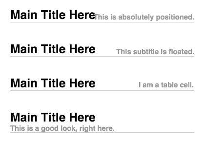
Alignment Shifting Wrapping
Imagine the following problem: You have a main title and a subtitle sitting on the same line. You want the main title to be left-, the subtitle right-aligned, and the subtitle should wrap under the main title when there is not enough space.
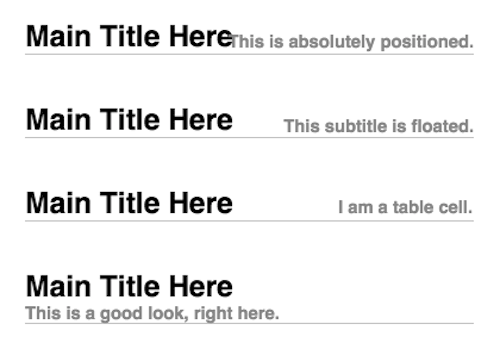
That’s the situation Chris Coyier ran into. His alignment shifting wrapping technique solves the problem by giving the title a flex-container with display:flex; and the title itself flex-grow: 1;, so the subtitle is pushed to the right. And since flex-containers can wrap, it only takes a flex-wrap: wrap; to make the subtitle behave as intended on small screens. One of those moments where Flexbox excels at making something hard incredibly simple. Also applicable to other responsive design challenges.
Overriding justify-content
One of Flexbox’s best-kept secrets is probably how to override justify-content to position a flex-item independently along the main axis. The solution: auto margins! They aren’t new to CSS, of course, but in combination with Flexbox they unveil an entirely new power. When applied to a flex item, the item will automatically extend its specified margin to occupy the extra space in the flex container depending on the direction in which the auto-margin is applied.
Re-Imagining UI Patterns With Flexbox
That the power of Flexbox goes beyond common layouting tasks, shows an experiment by Zell Liew. He used Flexbox to re-imagine a UI pattern which you’ll find everywhere: the star rating element. His Flexbox version gets by with only 50 lines of code and five stars in SVG and was brought to life using a combination of the sibling selector ~, the flex-flow property and row-reverse. Nifty!
Flexbox Patterns by CJ Cenizal also shows ways of using the power of Flexbox to build UI components. It provides interactive examples and the source code you’ll need to get started with stepper inputs, tabs, form footers, centered prompts, sidebars and more.
Tools And Other Resources
Calculating The Width Of Flex Items
If calculating the width of flex items gives you headaches, then Flexbox Tester is for you. Just enter values for flex-grow, flex-shrink and flex-basis for three flex items to see how they behave.
Dealing With Bugs And Workarounds
Like any technique, Flexbox isn’t free of bugs, of course. For those moments when you run into one, Flexbugs is bound to cater for a fix. The community-curated list of Flexbox issues is regularly updated to provide solutions and browser workarounds. If you discover a bug that’s not listed yet, you can report it via GitHub. Speaking of browser workarounds: The Flexibility polyfill provides a fix for older versions of Internet Explorer that don’t support Flexbox. It detects flex-affected elements on the page and restyles them accordingly in IE 8 and 9.
You have something to add to the list? Let us know about your favorite Flexbox resources in the comments section below.
Further Reading
- Designing Layouts with Flexbox
- Horizontal And Vertical Centering with CSS and Flexbox
- Quantity Queries wit CSS and Flexbox
- User Interface Modules (Dropdowns, Sticky Footers etc.)
- Flexbox Modules for Web Apps
 (cm, mrn)

