Google’s Mobilegeddon Aftermath: Eight Months Into A Better Mobile Web
When Google announced the launch of its new mobile ranking system, dubbed Mobilegeddon by the press, everybody agreed that the impact would be devastating on those businesses that didn’t have a mobile web presence. At that time, we conducted a study of the top 10,000 sites from Alexa and showed that four out of ten sites would be affected by Google’s update.
Eight months into the apocalyptic event, we repeated the study because we wanted to measure and understand the real proportions of such an important development. We crunched the data and discovered some interesting findings — this article details the most significant ones.
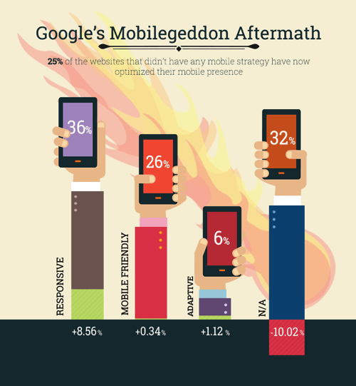
25% Of Websites Without Any Previous Mobile Strategy Have Made The Switch
An unprecedented demand has been unleashed on the web for a swift solution to Google’s move and, as anticipated, site owners have responded with urgency and approached the situation in various ways.
25% of the websites surveyed that didn’t appear as mobile-optimized in April 2015 have since gone on to implement some kind of mobile optimization strategy. Of these, the majority — 85% — have used responsive web design to go mobile.
Another 11% chose adaptive (using the same URL regardless of device, but generating HTML code dynamically by detecting the browser’s user agent), while only 4% went for a separate web address for their mobile version.

E-Commerce Site Owners Focused On Embracing A Mobile Strategy As Fast As Possible
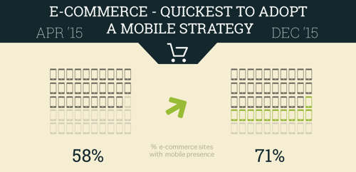
Our study included websites from five key categories: news, e-commerce, tech, business, and sports. As expected, the e-commerce site owners were the quickest to adapt. 31% of e-commerce websites that didn’t have any mobile footprint have turned their attention toward optimizing the experience for their on-the-go users.
This makes perfect sense if we take into account the conversions from natural search in 2015. Whether we’re talking about online purchases, creating accounts or filling out contact forms, conversions were up 27% compared to 2013. Growth was especially strong for e-commerce websites, with an average natural conversion growth rate above 40% according to Search Engine Watch.

While SEO is an important aspect for any type of website, these numbers show that e-commerce website owners take mobile SEO seriously and consider it their top priority. They understand that not being present in results for people searching on their mobile device translates into missing out on a huge slice of the business opportunity.
Publishers Are Thinking Beyond Responsive For Their Mobile Strategy
Websites from the news category revealed an exciting particularity. To begin with, only three out of ten websites were not optimized for their mobile audience; eight months later, however, we identified that publishers adopted a rather bold direction: the number of apps for those publications that already had a responsive website saw a 530% increase.

One plausible explanation for this particular trend is the publishers’ interest in distribution and their belief that a native app will bring more visibility to their content.
Earlier in 2015, Forrester showed that on mobile, consumers spend over 85% of their time using just five apps they’ve installed from the App Store. That being said, it’s probably best for businesses to design their apps only for their best and most loyal or frequent customers – because they are the only ones who will bother to download, configure and use the application regularly.
This certainly applies to publishers, since keeping their loyal readers engaged is critical for their businesses.
3 Out Of 10 Websites Still Oblivious To Google’s Mobile Ranking Signal
The trend is pretty clear and it is to be expected that the number of non-mobile optimized websites will drastically decrease in 2016.
As a general rule, regardless of the category, if a site doesn’t have a mobile web strategy, chances are it won’t go for an application either. You’d expect it to be the other way around, but if site owners ignored all previous mobile web strategies at their disposal, would they really be open to a more laborious and expensive approach (apps)? Not really.
No Visible Positive Trend In Alexa’s Popularity Ranks
Our assumption was that websites that didn’t have a mobile strategy and have chosen to adopt one would see a visible rank increase, as opposed to those websites still not optimized. However, crunching the data revealed no visible positive trend in Alexa’s popularity ranks. One possible explanation for this is that Alexa’s popularity rank is calculated relative to other sites and doesn’t differentiate between desktop and mobile traffic.
However, this doesn’t mean that a website without a mobile strategy is not losing traffic and a website’s overall ranking is highly irrelevant for this aspect. The famous PageRank algorithm from Google hasn’t been updated since December 2013 and it now appears to be dead. It is safe to say that you can stop looking at your website’s ranking and focus on improving its performance. A look at your analytics data will reveal how well your website is doing on mobile devices and provide a good starting point for future improvements.
Is The Mobile Web Heading In The Right Direction?
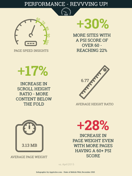
Quantitatively speaking, the answer is a resounding yes, since Google’s announcement on April 21, 2015 triggered a 25% increase in mobile web adoption. If we take into consideration the effort for a better, more efficient web, it is worth mentioning that the average PageSpeed Insights score increased by 3%, meaning websites are now better optimized.
This number alone is not enough to conclude that mobile websites nowadays are faster. However, before Mobilegeddon, only 17% of websites had a PSI score greater than 60; afterwards this percentage grew to 22%. It was also interesting to see how the scroll height ratio increased by 17% in the last eight months, which means that mobile websites are nowadays a bit taller (almost seven screens) than they were in April 2015.
It seems clear that the main priority for businesses at this point is to have a mobile web presence, regardless of its configuration. Efficiency falls back to second place and perhaps another Google cataclysm of equal magnitude might rebound in focus things like page speed and load time. And we’re not that far off!
There are rumors that the big G is planning further changes to how its search results are displayed. The possible addition of a red slow tag (or “Slow to Load” message as reportedly being tested in mid-2015) to name and shame sites that are heavy and slow to load would certainly qualify as the second stage of Mobilegeddon – which I think was the grand plan all along!
Since browsing on mobile devices has already surpassed desktop browsing, it is now definitely the time to start thinking in terms of mobile first if you don’t do it yet. RWD, which without a doubt is now mainstream, is all about adapting a desktop website to fit on smaller screens. But, from a business perspective, mobile users shouldn’t be punished with heavy websites and features that don’t belong on smaller screens just for the sake of keeping mobile and desktop under the same umbrella. Specific targeting through dynamically serving content by taking into consideration the user’s device can certainly create a better user experience and an increase in conversation rates.

WordPress Has The Power To Influence The Mobile Web
When trying to understand why responsive web design is by far the biggest winner of the go-mobile race, we can assume that WordPress in particular had a huge influence on the outcome. We all know that WordPress has the biggest coverage when it comes to content management systems, almost 60% according to W3Techs. Naturally, WordPress has incredible leverage on how we understand and optimize the web for mobile devices and the WordPressers’ appetite for responsive themes is a well-known fact.
I will be extremely watchful of their next moves. One of them was to integrate a new REST API into the WordPress core (to be fully released with version 4.5). Soon after that, Matt Mullenweg introduced Calypso to the world – a new approach to WordPress, completely API-powered and written purely in JavaScript, taking advantage of libraries like Node.js and React.
By integrating a powerful REST JSON API in its core, WordPress opens the door to a whole new way of writing plugins and, especially, WordPress themes. Theme creators will be able to include advanced components in their designs or even build single-page themes, without worrying about maintaining an API as well.
If you’re a WordPress developer, you should start experimenting with the REST API, Calypso and other JavaScript frameworks as soon as possible. Since the vast majority of WordPress themes have a classic, PHP-based structure, taking advantage of these new developments can certainly place you on top of this new wave.
In addition, WordPress has unleashed new opportunities for its huge developer base out there: mobile apps!
Google has already proved it can greatly influence the way we think and act on the mobile web. In February 2015, the company purchased exclusive rights to the .app top-level web domain for $25 million, the highest price ever paid for a TLD. It is easy to see how .app domain names will be appealing for both native applications and web applications, so we can imagine the demand will be quite high. If you haven’t already pre-registered your .app domain name, now is the time to do so.
Where To Go From Here?
It is encouraging to see a big increase in mobile web adoption and Google has definitely proved it has the last word when it comes to SEO. Responsive web design is the big winner of the go-mobile race and will most likely continue to gather the spoils.
However, the websites’ owners willingness to go for the easiest solution shows that the majority of them are still not taking advantage of specific mobile web opportunities, but rather trying to avoid losing business. Old habits die hard and although a mobile-first strategy is not a novelty (after all, mobile games have been doing it for years), other industries are still slow to adapt.
The mobile web has a lot of room for growth when it comes to strategies, user experience or conversions. The new .app top-level web domain together with WordPress’s REST API and the emerging JavaScript frameworks could definitely push things in the right direction. This year we might see a new development on the mobile web, a wave that will take us beyond responsiveness and into the promised land of web apps.
Further Reading
- Everything You Need To Know About Google’s AMPs
- The 3 Fundamental Principles Of Technical SEO
- A Beginner’s Guide To Progressive Web Apps
- Why Perceived Performance Matters


