Diverse And Engaging Instances Of Interactive Infographic Design

Email Newsletter
Weekly tips on front-end & UX.
Trusted by 182,000+ folks.
 Register for Free

 Celebrating 10 million developers
 Custom Web Forms for Angular, React, & Vue. Your backend.

In the last few years, the way we design infographics has changed significantly. Infographics have evolved from static graphics to rich, interactive experiences with animation and video elements, all tailored to the uniqueness of the content, instead of pressing it into a precast mold. For this round-up, I have collected some of the better infographics to see what engaging and informative experiences can look like today.

Most of the infographics on this list were chosen to showcase different ways that designers have approached data visualization. However, there are also a few hybrids here that illustrate the disappearing boundaries between infographics and richer multimedia experiences in creating engaging content and compelling stories. Deviating from the traditional infographic form means that we tread into more complex media territory, but such experimentation with technology and narrative will be crucial in shaping the future of infographic design.
In compiling this list, I received some great recommendations from friends and peers in the design world, and picking just 23 was not easy. Check out the list below to see if your favorite infographic made the list, and let us know about any others that should have been included!
Wind Map
Though you are not advised to “fly a plane, sail a boat or fight wildfires” based on the information in this infographic, “Wind Map” is still an engrossing piece of design that shows the direction and speed of winds over the United States. It’s more artistic than utilitarian, and that’s perfectly fine with us because it’s quite nice to just sit and watch these delicate, wispy threads make their way all over the country. A simple but well-designed example of how an infographic showing movement patterns benefits from animation and moving images.

In Flight
The Guardian lands the third one on this list with “In Flight,” an infographic that uses live data (at least it did when launched in 2014) to show commercial flights currently in the air and to also provide a lesson in the history of aviation. The muffled conversations between aviation crews at the start of the interactive make for a nice atmospheric touch. Are infographics gradually turning into cinematic experiences? “In Flight” certainly hints at that direction!

Dial A Moon
“Dial a Moon” isn’t much to see (if you catch it at the ungodly hour, as in the screenshot below) but it serves its purpose pretty well. Thanks to NASA, this is an infographic on moon phase and liberation for 2015 that updates by the hour. Now you don’t have to Google for this arcane information anymore (you’re welcome!).

24 Hours Of Pluto
Nature magazine publishes a lot of interesting infographics for its scientifically-minded audience. Included here is its most recent one on the much-talked-about Pluto fly-by. There is a lot of text-based information here, but considering all of the jargon-laden information on the web, the visuals here provide easy access to the information you want most — whether it’s the composition of the dwarf planet or the formation of its moons.
Check out more infographics by Nature on its Tumblr page.
Decades Of American Homes
Take a road trip through the great big American dream (as reflected in evolving home styles). This nicely illustrated infographic lets you get behind the wheel of a car (which aptly transforms to keep up with the times as you scroll down) and work your way from the 1900s all the way to the 2000s as you drive by all of the homes that were popular over the decades. There are plenty of nuggets of useful information along the way (including the sociopolitical conditions of the time, as well as the art movement in fashion), and it all ends with a question prompting you to envision the future of the American home. The infographic is a great example of incorporating user scrolling because the concept lends itself well to it.

Evolution Of Insight
Vision Critical’s “Evolution of Insight” traces developments in market research from all the way back in the 1890s to today. It functions similar to the “Decades of American Homes” infographic above, and it’s interesting to compare the effectiveness of the interactive timeline methods of the two very different stories. The “Decades of American Homes” infographic has an advantage because looking at homes as you “drive” by them is much more intuitive than taking a road trip through great American marketing insight. The best infographics are designed for the content, not around it.

LGBT Rights Around The World
The Guardian snags another position on this list with this elegant infographic explaining the legal situation for LGBT people on a variety of issues (marriage, workplace discrimination, hate crime, etc.) in every country in the world. Moving along the semi-circle provides a fast and easy way to compare statistics between different countries, and the overall composition keeps the global status front and center at all times. The infographic also comes with a strong call to action to bridge the gap between awareness and activism.

Inequality Is Fixable
Another great example of an interactive infographic, “Inequality Is Fixable” invites its audience into the issue at hand by making it personal: You are not going to lose interest quickly when the infographic tells you exactly how much you are being underpaid and why. By keeping the user a part of the story throughout (and supplementing it with all of the relevant information that needs to be communicated), the designers are able to maintain interest and guide the user through the requisite steps of information all the way to the call to action at the end.

You Draw It: How Family Income Predicts Children’s College Chances
Many of the infographics in this list use animation and interaction to provide a rich experience. Visually, this New York Times infographic sticks to a classic chart format but uses behavioral insights to expand into a new area of infographic design: anticipatory and participatory visualization. By asking readers to draw their own line first, the infographic leverages the reader’s personal engagement and knowledge to deliver its, therefore, valid packets of information.

How Americans Die
Apart from its Seurat-like title image, this one sticks to good old charts for its visualizations, but it cleverly lets users navigate the data themselves by moving their cursor along the data lines. This makes it much easier to compare, for instance, how many suicide-related deaths occurred in the ’70s compared to now (hint: it’s on the rise) than a static chart would allow for.

The Russia Left Behind
Ever since “Snowfall” debuted to widespread attention and praise, the New York Times has been developing quite a reputation for its cutting-edge multimedia journalism, using a combination of infographic design and in-depth narrative to create rich and engaging experiences. There are more flashier examples of such work, but the one on this list is a strikingly resonant piece on Russia that works like an interactive road trip (complete with a map that you work your way through as you progress) and is all the better for it. For the publication’s earlier pieces that lean more towards data visualization, check out the color-based analysis of movie trailers and a map of the different paths presidential candidates can take to the White House.

Bond Cars
If you have ever wanted an easy and fun way to explore James Bond’s history via his wheels, UK-based car dealer Evans Halshaw has just the thing for you. His interactive infographic lets you nail down the model and design for each one of Bond’s cars and also provides some trivia on each one. Using the ubiquitous slider tactic, you can also “reveal” the car in its full metal glory, rather than the default sketch. It is a creative workaround for including photography that does not gel well with your aesthetic.

The Colors Of Motion
“The Colors of Motion” is an infographic series that analyzes movies only regarding their color palette, frame by frame. If you’ve ever wondered what your favorite movie looks like as a color palette, you have your answer. Can’t find a title in the database? Just send the designers a message; they are accepting requests.

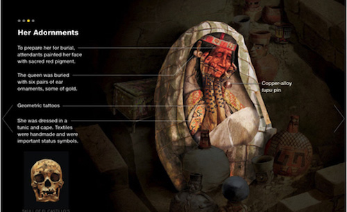
Peru’s Royal Wari Tomb
National Geographic has a pretty impressive collection of what it calls “interactive graphics” (most of which are accompanied by an in-depth story, such as its piece on Trajan’s Column) but I chose this relatively simple one to highlight what’s really effective about interactive infographics. “Peru’s Royal Wari Tomb” systematically uncovers the burial of a noblewoman, layer by layer. The focus shifts from her bundle to her adornments and provisions (in that order). By dividing information into digestible chunks and letting the user navigate them, such interactive graphics avoid the biggest pitfall of most involved infographics: an onslaught of data and visuals. Moreover, each subsequent interaction adds richness to the experience, which is much more rewarding than being presented with everything at once. Our minds have a way of turning out overwhelming stimulus, so interaction provides a great solution for the user to explore information at ease.
You can check out other great infographics by National Geographic on its Pinterest board.
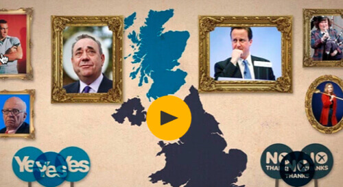
Scottish Referendum Explained For Non-Brits
The Guardian, much like the New York Times, has been pushing the envelope in multimedia journalism, and its video piece on the Scottish referendum does what infographics do best: make unwieldy information palatable. For a lot of us outside the UK, there was a lot of confusion about the whole referendum business; thankfully, this video helps you become knowledgeable about the essential aspects of the topic quickly without requiring a deep history dive.
Population Health
For a 3-part article series commissioned by The Atlantic about “Population Health”, a concept to improve the health of communities, Truth Labs created a rich digital narrative. Its core goal was to preserve the natural document scroll and reading flow while creating an experience that is different from a visual perspective. To bring it to life, they borrowed tools and strategies from filmmaking, but also established a set of design principles to support reading as the key tenet.
Joho’s Bean
The Austrian coffee roaster Joho’s has created an impressive multimedia experience to tell the story of the origin of their coffee beans. The narrative harmoniously blends audio, video and photo material to create an experience for (almost) all senses. You’ll hear the birds chirping as you follow the farmer around the coffee plantation, the sound of the roasted coffee beans getting bagged, as well as the busy streets and the traffic noise in the city.

The Wild Path
The Wild Path is an interactive storytelling experiment made with Canvas. It’s core element is a map that will animate a path on the map as you scroll the page. That way, the story being told is beautifully connected to the path itself. The project is highly experimental, though, and might not work in all browsers. If you want to dive deeper into the tech behind it, there’s an accompanying article which explains how it was done.
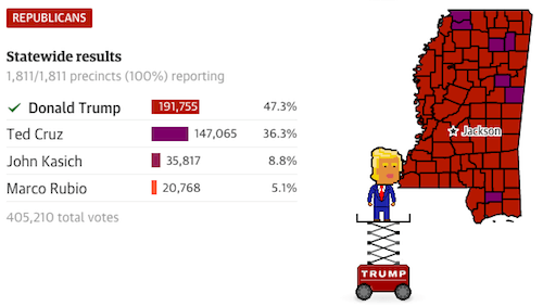
Live Election Results
The Guardian’s coverage of the US 2016 presidential election brings some fun into the serious business of percentages and precincts. An interactive infographic tracks the caucus votes in four states. By default, the graphic shows the statewide results, and as a user hovers over a precinct on the accompanying map, the results show how the candidates performed there. The fun twist: The presidential candidates are represented as little pixel avatars, and as the infographic is updating live, the pixel people color in the precincts in which they won. Every now and then there’s also a speech bubble appearing next to the candidate with a quote he/she has (or could have) said.
Have we missed some of your favorite infographics? Let us know in the comments!
Additional Resources
- “What Makes the Best Infographics So Convincing,” Andrea Ovans Explore the reasons behind the persuasive power of infographic design.
- “The Do’s and Don’ts of Infographic Design,” Amy Balliett A handy list for creators
- “Data Visualization and Infographics Resources,” Cameron Chapman Starting a new project? You will find this useful.
Further Reading
- The Do’s And Don’ts Of Infographic Design
- A Common Misconception About Designing With Data
- Fun With Physics In Data Visualization
- Rediscovering The Joy Of Design


