Monday Morning Design Inspiration

Email Newsletter
Weekly tips on front-end & UX.
Trusted by 200,000+ folks.


 Flexible CMS. Headless & API 1st
 Register!
Some people seem to have a magic touch when it comes to digging up design goodness. Veerle Pieters is one of them. As she explores print and web design, photography, art and type, she uncovers a lot of brilliant gems. And because they are too good not to share, she has compiled a selection of inspirational examples for you in this showcase. The plan is to bring out a new one every month, so let us know in the comments if you like what you see. But for now, please lean back and enjoy!
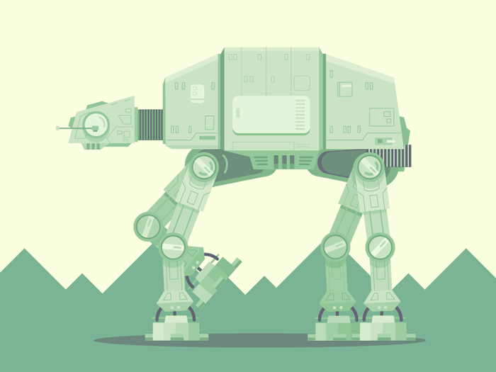
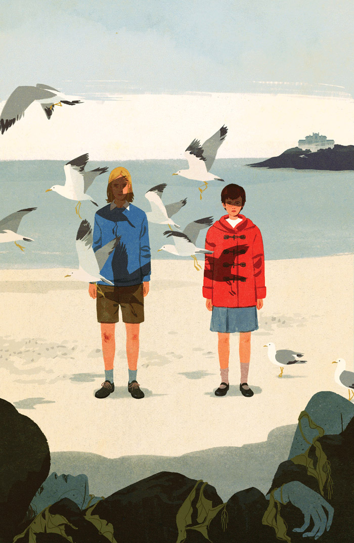
AT-AT
Lovely illustration, especially if you are a Star Wars fan. It’s one of those illustrations that shows its true beauty in the details.
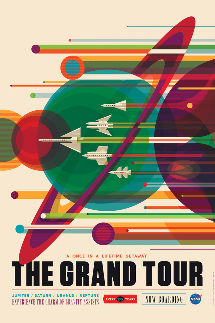
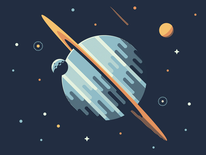
Golden Age Of Space Tourism
Gorgeous space travel posters with a retro feel. This Grand Tour example below is a flashback to the Voyager missions of the 1970s and 80s. The great composition of overlaying lines and circles is what I love most, and the perfect color palette is the icing on the cake.
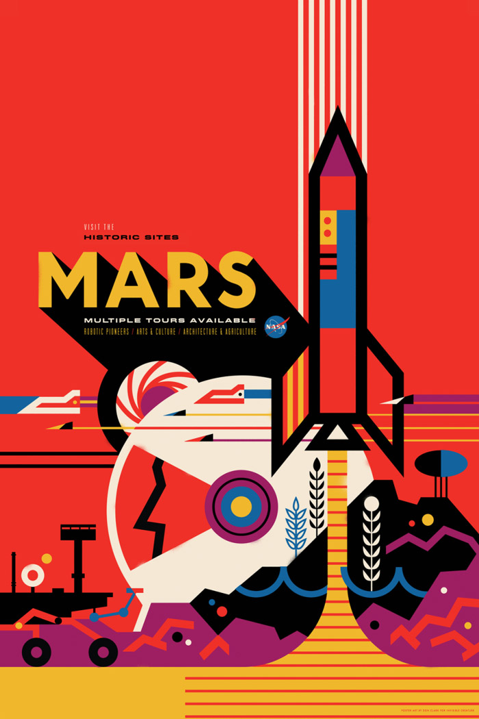
Historic Sites: Mars
This poster depicts a future in which humans settled the red planet long ago, and are now running historic tours. I am a sucker for illustrations that show the essence of their themes using only basic lines and shapes.
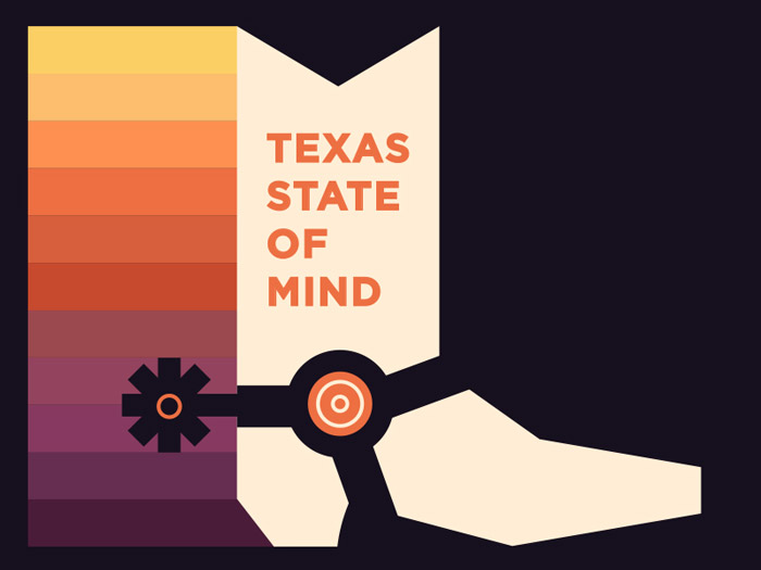
Texas State Of Mind
Pretty stoked about this color palette – what a perfect array of colors! Easy on the eye.
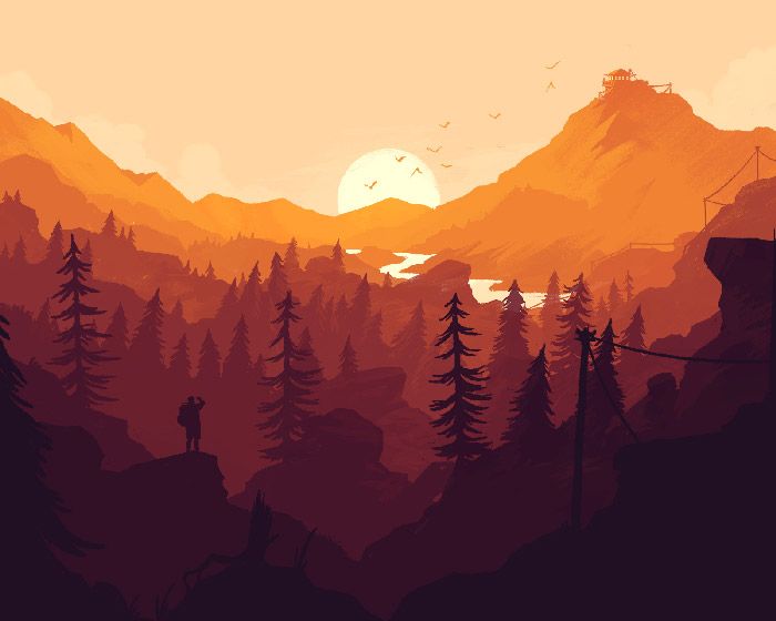
Firewatch
Great illustration with the classic Firewatch game palette. Available as a wallpaper for multiple devices. The colors are so perfectly applied you can almost feel the warmth.
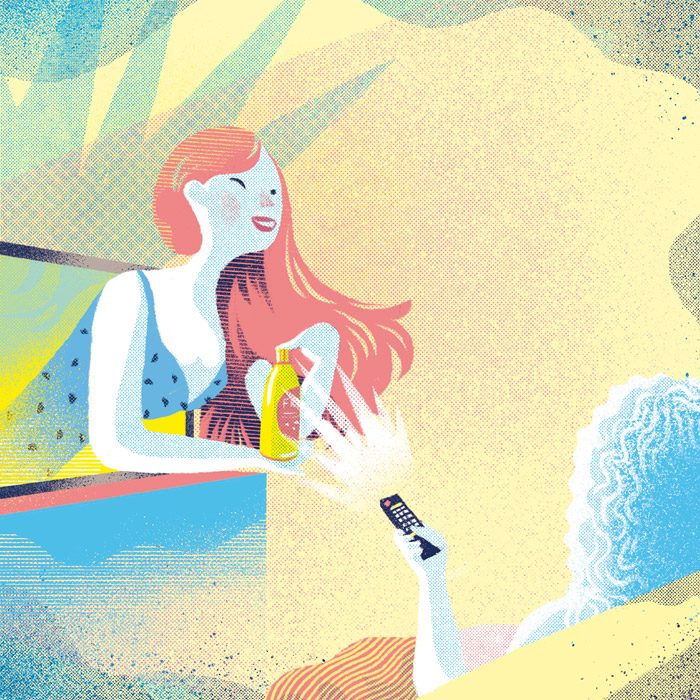
Ultimate Summer
A poster depicting the “ultimate summer.” Vibrant and bold work from illustrator Marylou Faure. This is a perfect eye-catcher. It sticks.

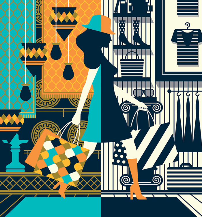
Shop Magazine
Cover for Shop Magazine. I love the many patterns that are used in here.
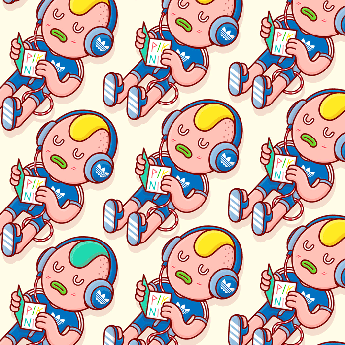
Adidas/Piknic Electronik
Love the fantasy that these Spanish brothers put in every job they illustrate, and there is always a touch of humor. So good!
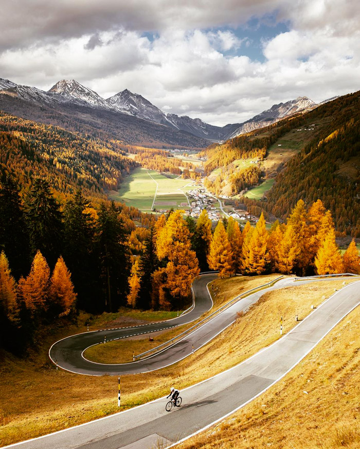
Umbrail Pass
Lower slopes of the Umbrail Pass in late fall – just a few days before it closed. Amazing scene to ride your bike! Beautiful autumn colors.
Young Adults (YM ‘16)
The noise is a nice touch. Combined with the dotted pattern and the geometrical approach, it sets the style of the illustration.

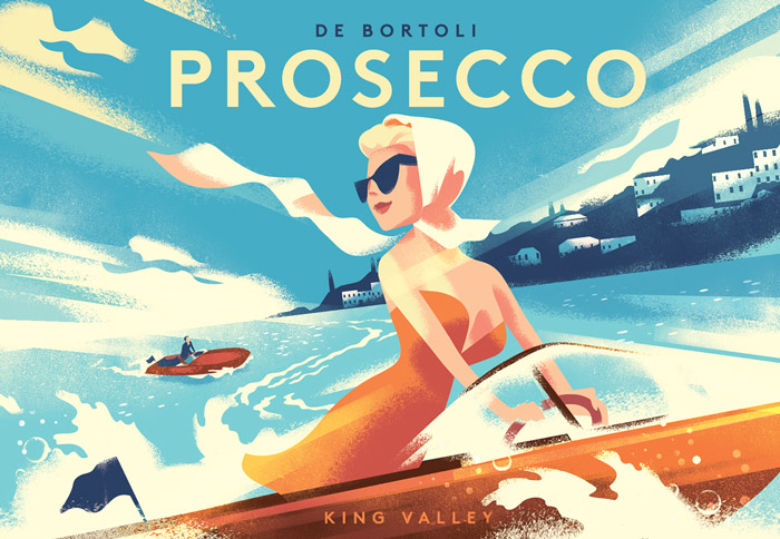
De Bortoli Prosecco
Gorgeous label for De Bortoli Prosecco. Mads Berg has such a cool style, very modernist, and a rather limited color palette. His illustration style is so strong you can recognize it from afar.
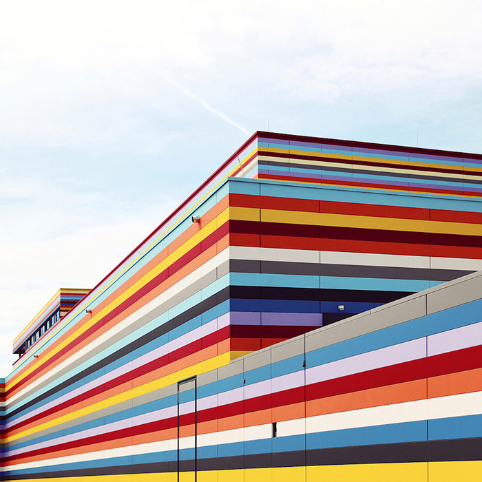
After The Rain
Love this colorful Meininger hotel at Berlin Airport. Colourful stripes are my thing, especially if they’re executed in such perfection. I could look at this all day.
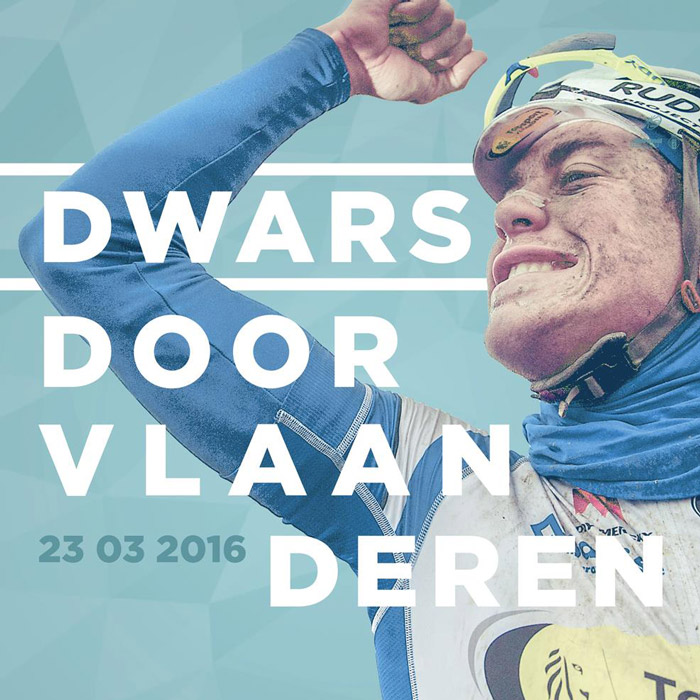
Dwars Door Vlaanderen
Official race poster for Dwars door Vlaanderen with the photography of Kristof Ramon. This design expresses the cycling race perfectly. Lovely typography and vintage look. Really cool idea to interweave the photo with the horizontal lines.
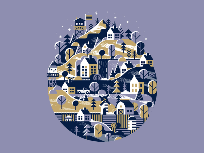
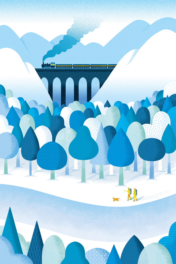
Snowy Mountain Town
Beautiful composition and great use of an unusual color palette.
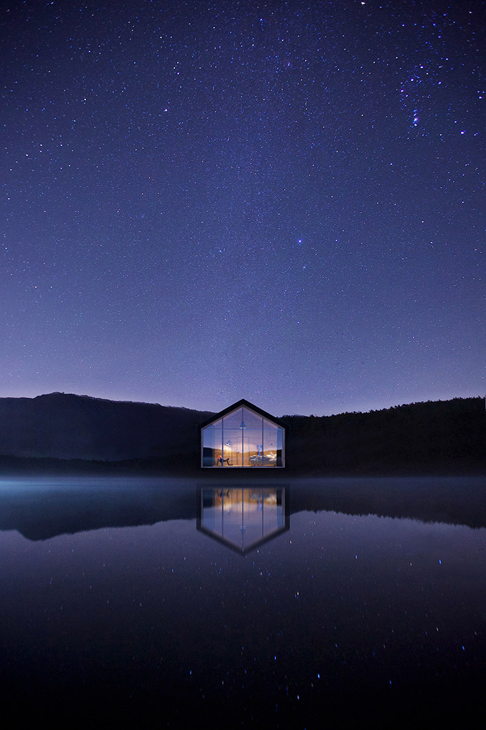
BW House
Beautiful place to live and lovely architecture. The composition, colors and setting are just perfect in this photo.
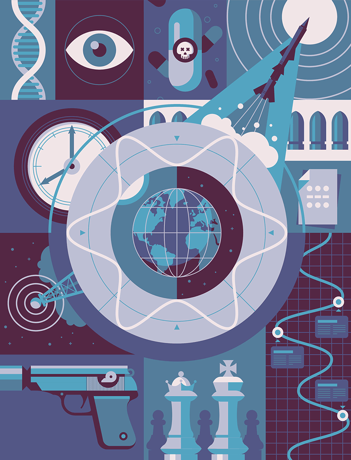
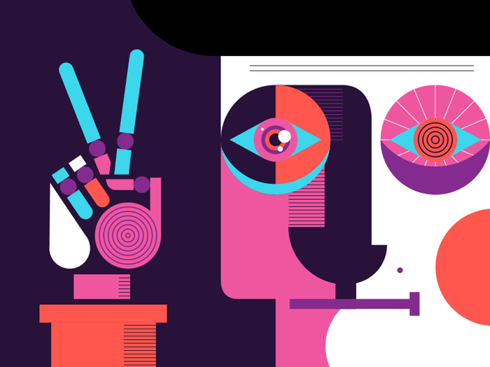
Omega - Spy Gadgets
Illustration for an article about historical spy gadgets. Having only a couple of colors at your disposal and still keeping the design rich is a challenge. This illustration shows how strong the result can be when perfectly executed.
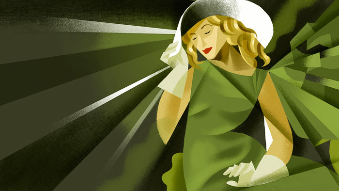
Femeie În Verde
Illustration for the Italian television broadcaster RAI. Such elegance! The shadow and light via this overlay effect is so perfect. The lines suck you into the illustration.
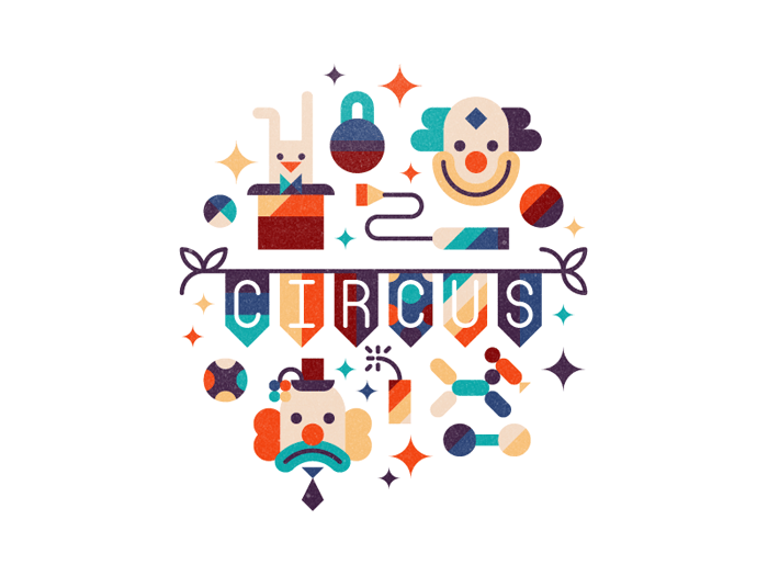
Circus
Inspiring color palette and use of textures. Fantastic composition as well.
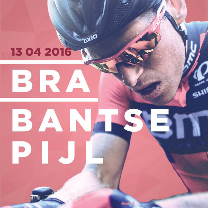
Brabantse Pijl
Official race poster for the Brabantse Pijl cycling race with the photography of Kristof Ramon. Beautiful composition, colors and typography.
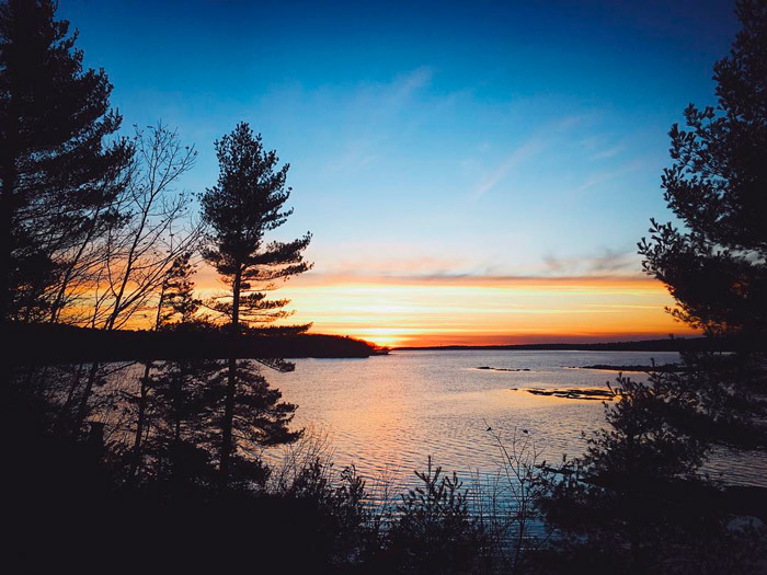
Maine Winter Sunset
That moment that Mother Nature pulls out all the stops. A photo that evokes a strong emotion has my approval.
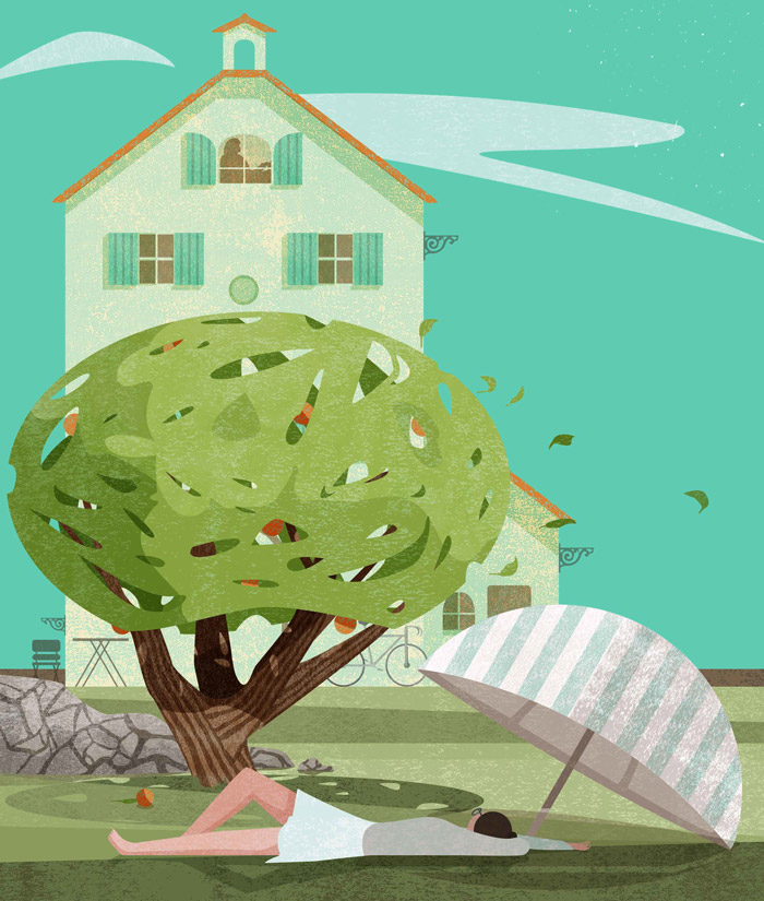
Guardian Weekend Fiction Special
Illustration for the short story ‘Her Share of Sorrow’ written by Tessa Hadley. Love how the tree is done. Shadow and light can play a very important role in illustrations. This illustration is a perfect example.
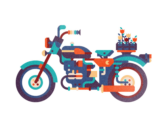
Ural
Very inspiring how all those colourful shapes make up the motorcycle.
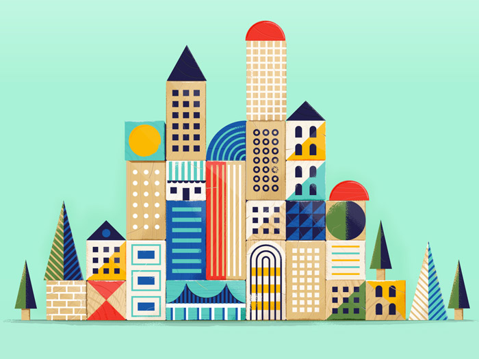
Block City
Super solid work! The wood structure is very well executed. Excellent use of colors too. It’s like a construction made of squares, lines, triangles… It’s a lot all together and yet it’s not too busy, because the colors are well applied and everything is perfectly positioned. It makes it very inviting to look at… and to play with if these blocks were real.
Peace
Such an excellent combination of shapes. This illustration is pure geometry on its own. The limited palette using only flat color creates perfect contrasts.
Opinion On Advertisement
Smart use of halftones and overlapping colors. It creates a special atmosphere which sets it apart.
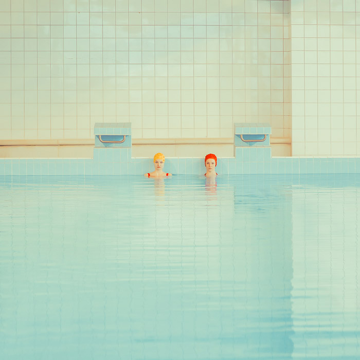
Swimming Pool
Totally in love with the tones in this picture. The cherry on the cake is the two women with just a tad of color.
Landscape With Calm
Original trees and textures. Simplicity is key, but details matter in a good illustration. The challenge is to know where to add these small details and accents. This illustration shows it well, both in color and in texture.
Mint
One of the cooler isometric-style illustrations I’ve seen.

MyCheffy Illustration
An original approach to faces. This one is just so fun to look at, and you keep on looking at the small details which are so well executed.

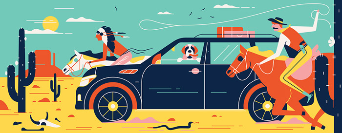
Wild West
I like native American Indians and horses, especially if they’re illustrated in such a beautiful color palette and style. This is an editorial piece on motoring for GQ France.
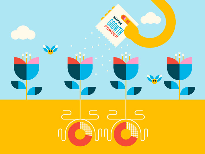
Super Growth Powder
With spring on its way this is just what we need. Beautiful geometry and color palette. Strong illustration in its pure simplicity.
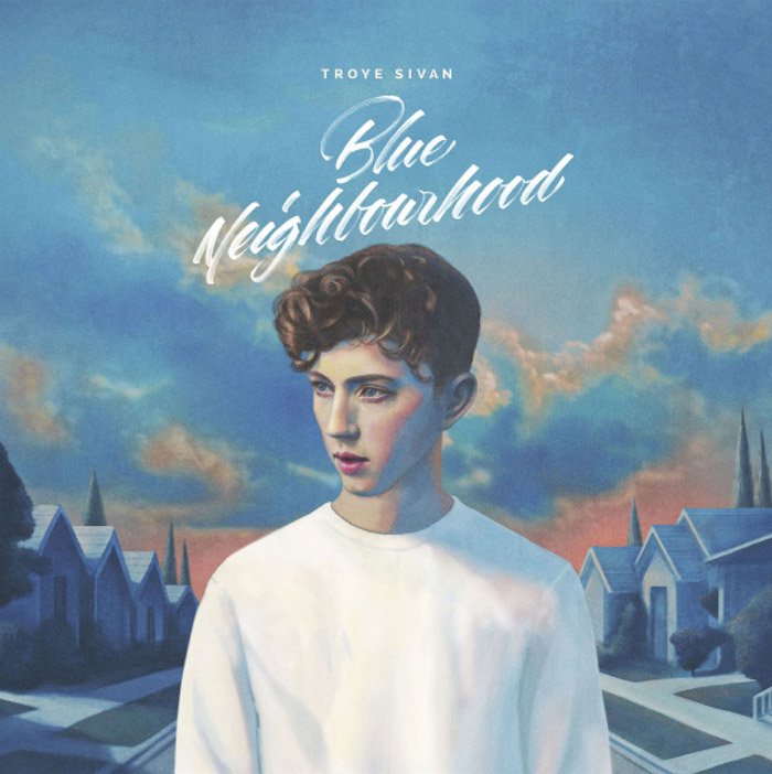
Troye Sivan’s Blue Neighbourhood
The custom lettering and the painterly style work so well together on this album cover.
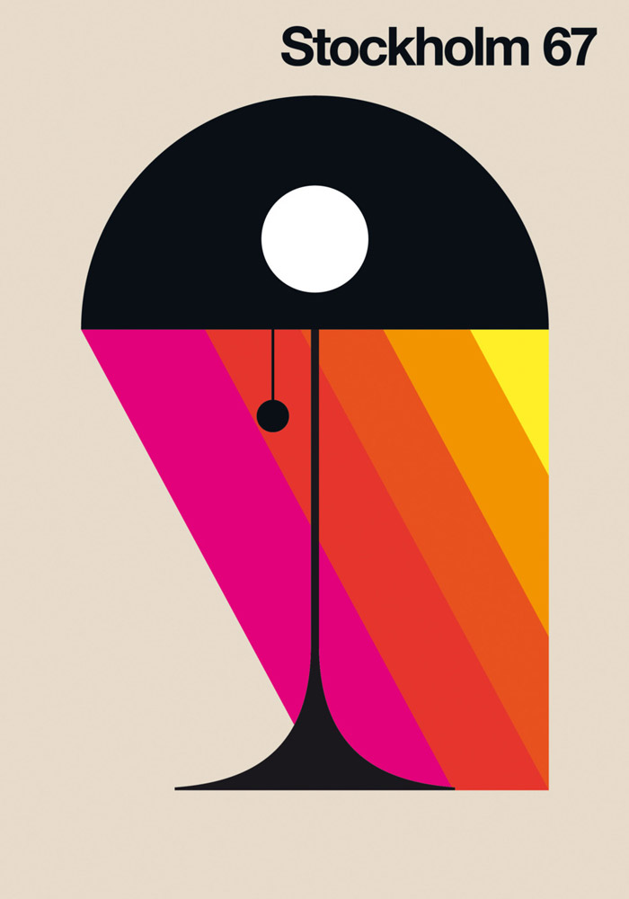
Stockholm 67
Visual communication in its simplest form. Never gets old. So strong and eye-catching!
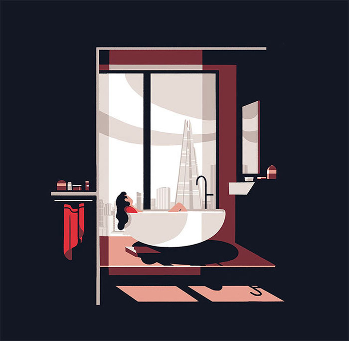
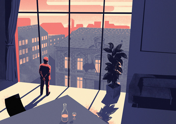
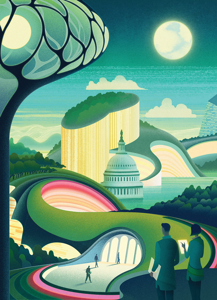
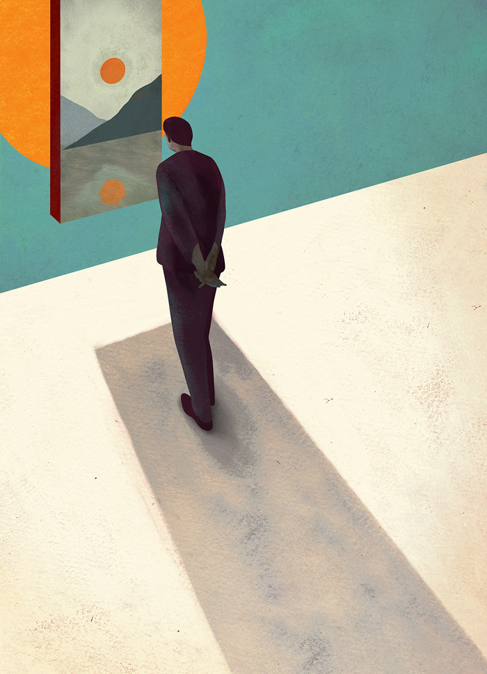
Southbank
Tom Haugomat’s cinematic poster for luxury apartments in a Southbank high-rise. Love how this one illustrates a room while the walls are invisible. I love the way the colors are applied with such contrast. It sucks you in.
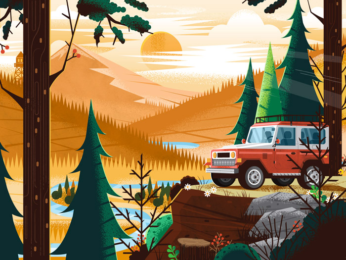
Grand Teton National Park
Part of a poster for the Grand Teton National Park. One poster of the Fifty-Nine Parks Print Series, a celebration of the US National Parks. This illustration uses different pattern and texture techniques combined, which makes it really interesting to look at.
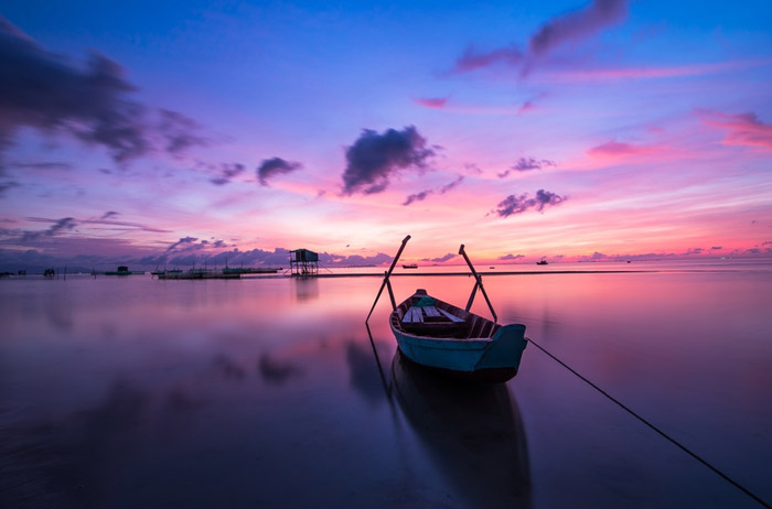
Beautiful Dawn
The tranquility in this one is super super strong. Nature has its way with its color palettes.
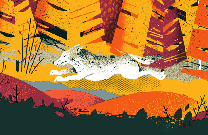
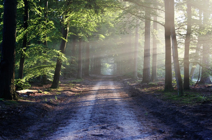
Forest Road
My favourite kind of dirt road. That light is beautiful!
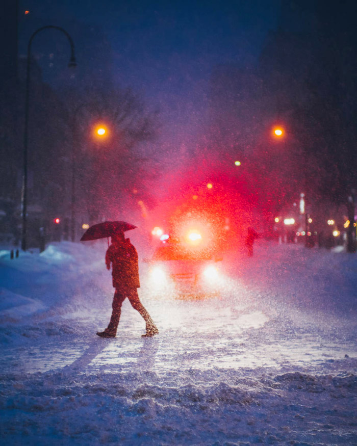
New York Snow
Photographer Dave Krugman caught some stunning pictures during the last blizzard in New York. Great color inspiration in there too.
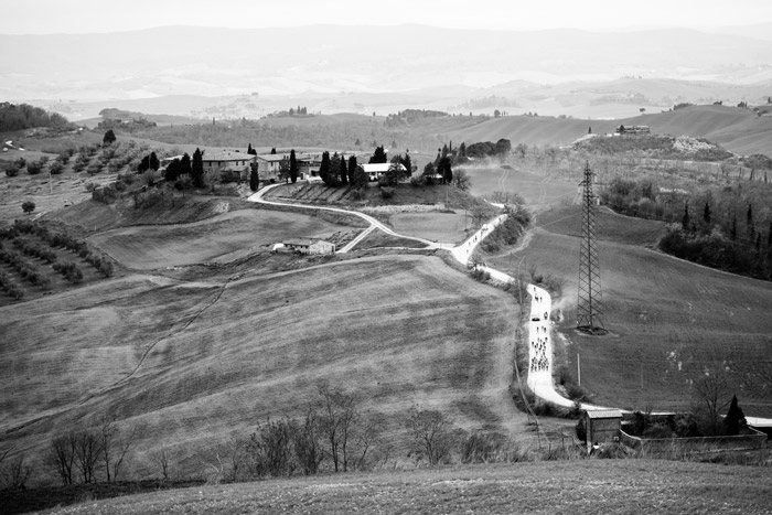
Strade Bianche: Donne
Gorgeous inspiring photo of the rolling Tuscan hills shot during the women’s cycle race of Strade Bianche shot by my friend Ashley Gruber.
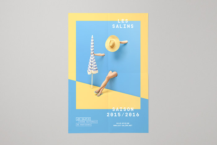
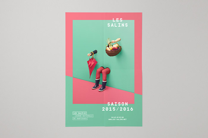
Les Salins 2015–2016
Brilliant combination of photography and graphic design.
The High Authority For Transparency In Public Life
Illustration for a French agency that works to prevent corruption (Haute Autorité pour la transparence de la vie publique). The shadow play is lovely. An excellent execution of shadow and light can elevate an illustration to a whole other level!
Lookout
Beautiful! Wouldn’t mind having a break at this lookout. This illustration has it all: shadow and light are perfectly executed, the color palette creates the exact mood it needs, and the details are all over the place – you can’t get enough of it.
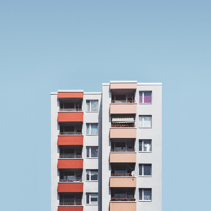
Stacked
“Stacked” is an approach to the large post-war housing estates in Berlin, often built in the form of tower blocks in a fairly uniform fashion. However, when looking closer you find a lot of variation. This photo just looks like a perfect illustration.
The Last Utopian
Love the science fiction touch to this. Brilliant texture usage as well.
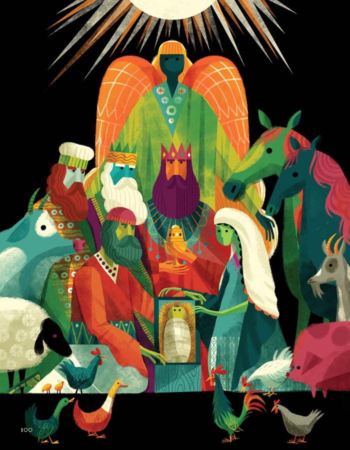
The Biggest Story
Inspiring illustration for a children’s book based on Bible stories. The colors are just so appealing, and the details in the patterns, lines and textures are just gorgeous.
Mystery Project 76.1
Super clean work and effective use of a limited color palette. The internal patterns are a nice touch.
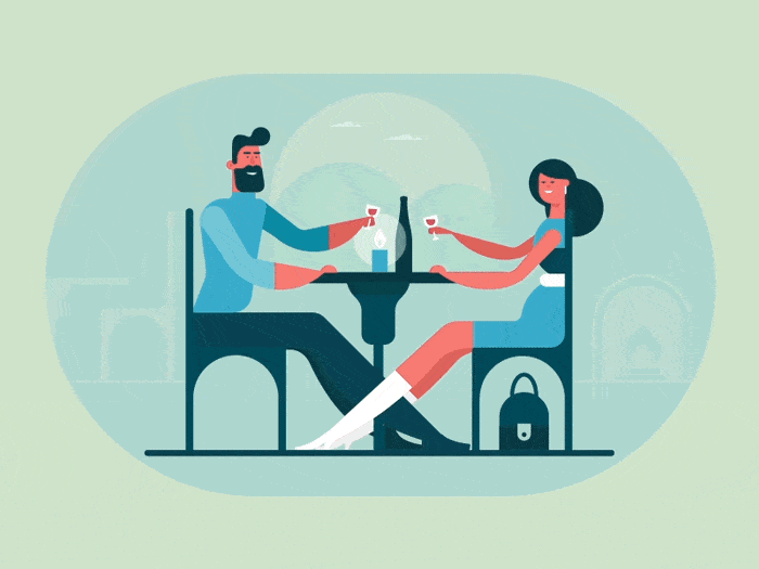
Love And Romance
Impressive character design and I like how the long curvy lines perfectly describe the body’s form.
Monsters Book Cover
The colors, the characters, the textures – they’re all so well used.
Modern Reformation
Everything is perfectly arranged in this one.
Further Reading
- Behind The Design: 5 Stories Of Great Inspiration
- If Famous Graphic Artists Were Web Designers…
- Finding Inspiration in Uncommon Sources: 12 Places to Look


