Breaking Out Of The Box: Design Inspiration (April 2016)

Email Newsletter
Weekly tips on front-end & UX.
Trusted by 182,000+ folks.


 Celebrating 10 million developers
 Custom Web Forms for Angular, React, & Vue. Your backend.
As designers, we have our good and bad days. Some days ideas come naturally. Other days we struggle or have moments where we are really stuck. We are in urgent need of inspiration. Let me help you get through these moments of pain and suffering. Let me nurture your creativity. Sit back, relax, and feed your appetite. Here’s your monthly dose.
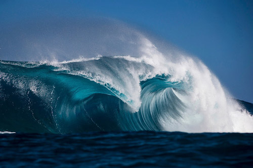
Waves
Ben Thouard is a photographer from the South of France, specialized in surf photography. The attraction for me in this shot is the smoothness of the curves and the beautiful variations of blue.
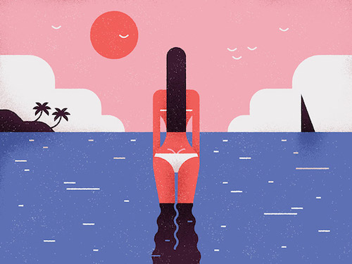
Tropical
Clever usage of very minimal elements. Just a few lines and curves are enough to convince the thought of birds and waves. Even the curves of her backside are just right. By MUTI.
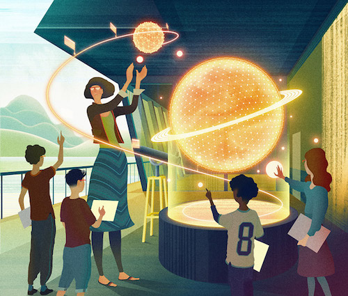
Bright Classroom
Illustration depicting the future of the classroom. Her skirt has such inspiring pattern. Feet, hands and legs aren’t easy to draw and here the elegance is done with perfection. Designed by Sam Chivers.
“Demain” Children’s Book
Great color choices and expressions is what I noticed instantly. Perfectly fitting for a children’s book. Designed by Vincent Mahé.
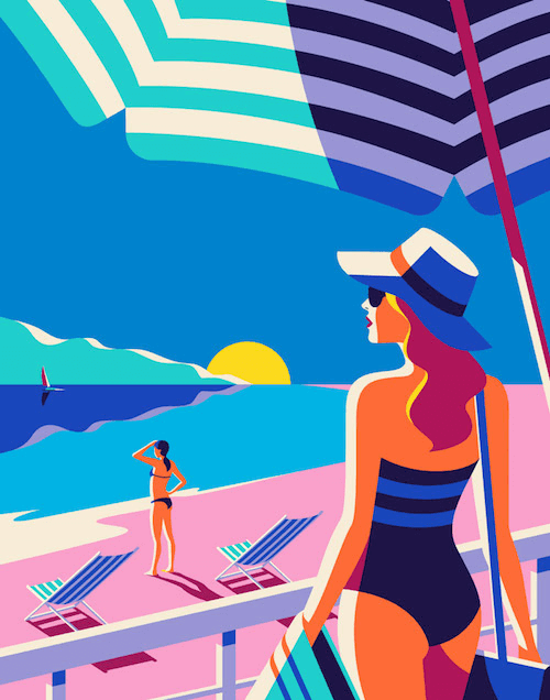
Odyssée
Malika Favre has such unmistakable style. Usually consisting of repeating lines & bright colors. The shadows are also very strong and achieved with minimal color use. Designed by Malika Favre.
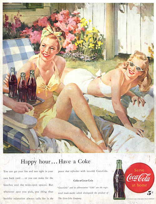
Happy Hour… Have A Coke
I’ve always enjoyed the era of advertising where they still illustrated everything. What inspires me in here are the structure of the paper, the watercolor feel and the expressions on the faces. Designed by Leifpeng.
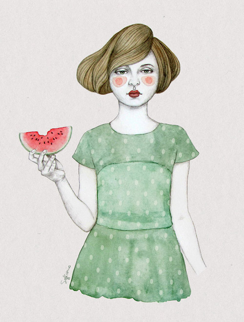
Girl With Fruit
This one also has the water color palette in combination with ink. The hair is the masterpiece in this one. Love how the hair flows with the subtle shadows to show volume. This illustration looks so real it’s like a photo. Designed by Sofia Bonati.
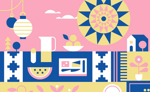
Facebook Events
Illustration for Facebook events. This one is for a picnic. It’s not a color palette I would come up with but it works very well in this case. Designed by Eight Hour Day.
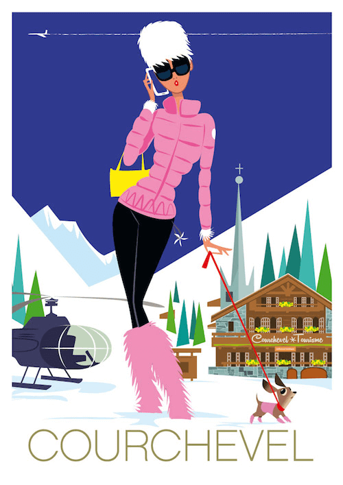
Chihuahua In Courchevel
Every little detail in this illustration perfectly shows how the ladies in Courchevel behave. It’s all in the details, her sunglasses, the way her hand and fingers are drawn. The dog is also adorable. Designed by Richard Zielenkiewicz.
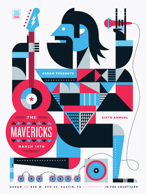
Mavericks Poster
That hair and beard combo are the center pieces that gives this poster its rock’n roll feel. I also really dig the variety of patterns within the torso. Designed by Steve Wolf.
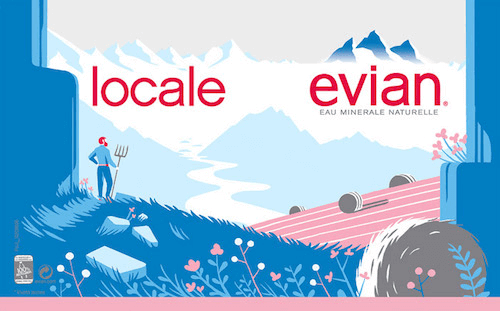
Evian Illustrated Campaign
The atmosphere is just right for water. The hay rolls are a nice touch. This limited color palette fits the brand. Designed by Tom Haugomat.
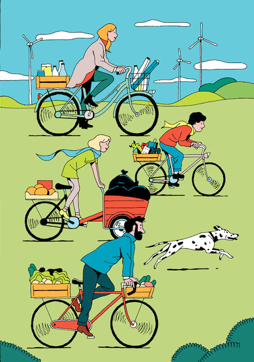
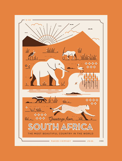
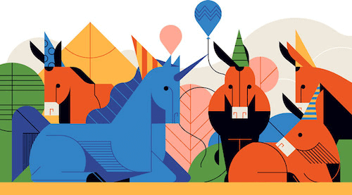
African Postcards
I always struggle with simplicity and this illustration is a great inspiration because the animals are so perfect. They only consist of a few lines and the rest is done by color.
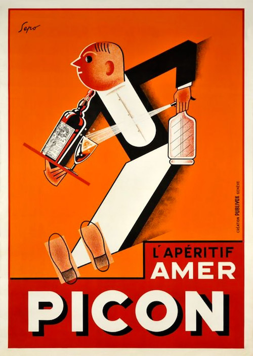
Picon
L’apéritif Amer Picon by Sepo Pozzati Severo / 1928. Pretty amazing that such an old illustration still serves as great inspiration. Love how the feet/shoes are done and create the illusion of breaking. Genius.
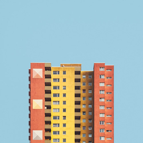
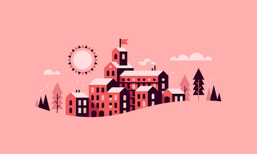
Stacked II
“Stacked” is an approach to the large post-war housing estates in Berlin. On the surface they may look the same but when examined closer you’ll find a lot of variation. The receptiveness in this one works so well together. Designed by Malte Brandenburg.
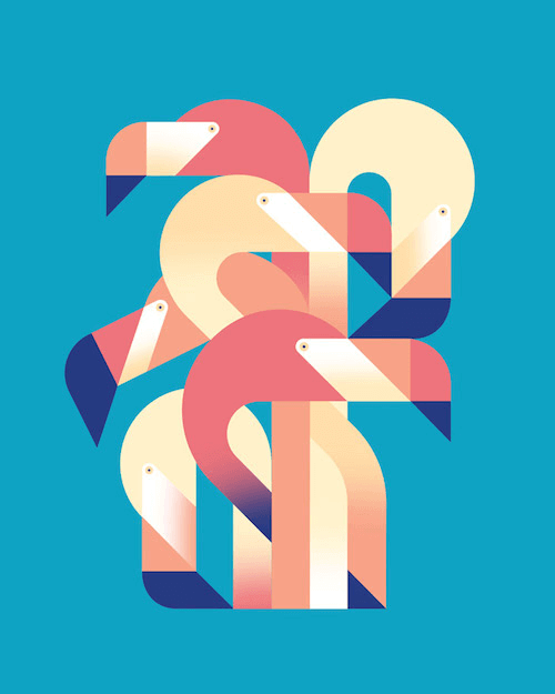
Flamingo Dance
Clever how the flamingos are wonderfully simplified. The six birds together are so well integrated and create a perfect geometry. Smart use of shapes and colors. Beautiful! Designed by Pavlov Visuals.
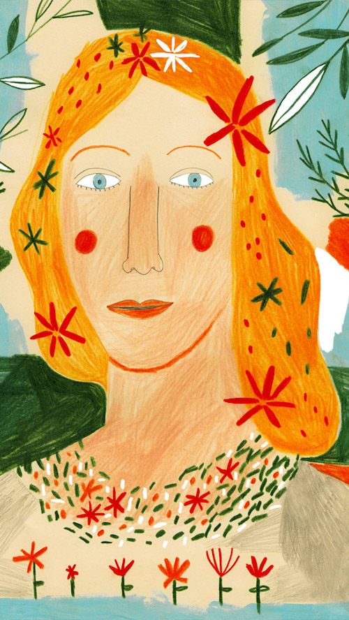
Spring
A wonderful color palette by Inma Lorente that invites you into the drawing. The sharper pencil lines are also working well together with the color pencils look.
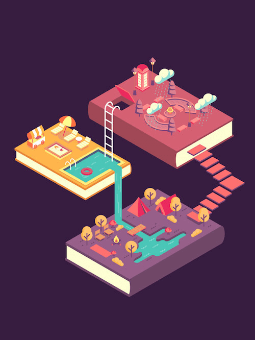
Books Can Take You Places
I always love to see how someone translates a title into an illustration. In this case it triggers your imagination and makes you fantasize. Love how the books are connected. Designed by Max Reyes.
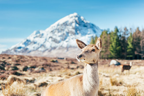
Visit Scotland
Nature photography is one of my favorites. Getting the colors just right is one of the hardest things in photography I think. In this instance it’s just perfect and even with the snow in the back it still gives a perfect balance between warm & cold tones. Found on George the Explorer.
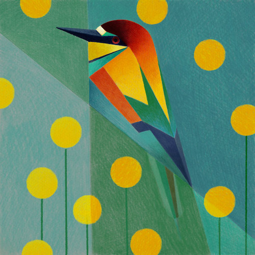
Geometric Birds (Procreate-iPad Pro)
Everything that ticks off my boxes. Great color choices and geometry. I still mainly doodle in notebooks but this is another example that makes me want to try the iPad Pro and Apple Pencil. The textures and colors look so real. Designed by Samy Halim.
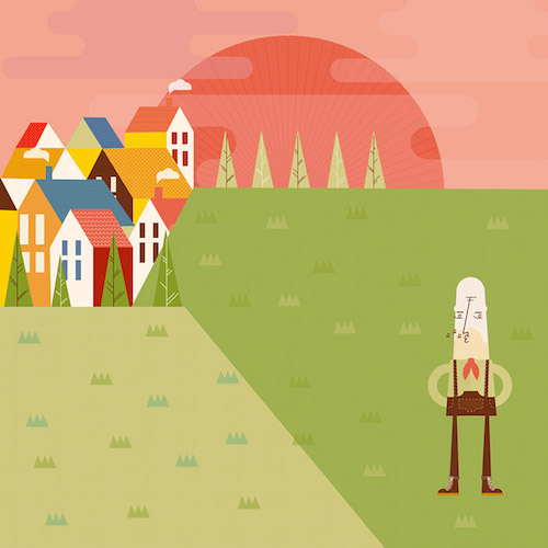
Day Time
Pur simplicity on first look, but if you examine closer you’ll find some amazing details. For example the different patterns of the roofs of the houses or all the beautiful details of his shoes. Be sure to check out the larger version to discover all of them. Found on Poolga.
Social Marketing
Original how the inside of the mouth is divided into 3 different color pieces to create the illusion of depth. Not your everyday color palette as well. Designed by Helbetico.

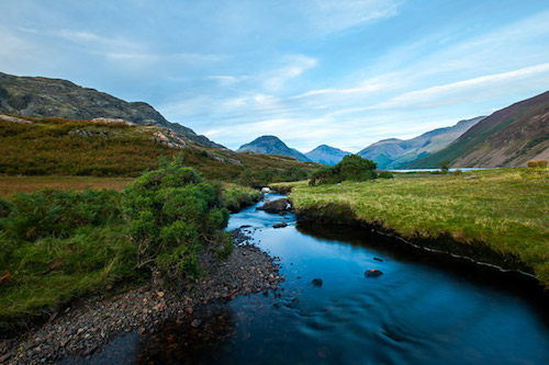
Lake District
The peace and tranquility is strong in this one. It’s one of those places you want to be in. That’s what great photography does to me. Again, George The Explorer.
Fun :)
The layering of the trees is genius — super simple, yet effectively adding depth to the design. There much to discover also. Designed by Made by Radio.
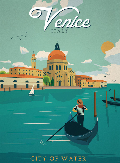
Venice Italy
Lovely vintage style and color palette. The subtle reflection on the water is beautifully done.
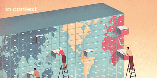
In Context
I really love the fantasy in this one, and how the lines in between the drawers of the archive wall go from dark to very light color. It creates this effect of perfect reflection. Designed by Davide Bonazzi.
AI-CIO
The shapes of the people are just prefect. Creating this out of proportion differences is what makes this illustration so great, but also the subtle color palette and pattern details are very inspiring. Designed by Keith Negley.
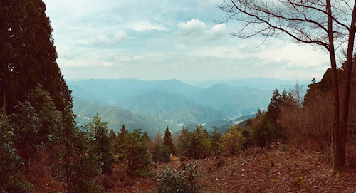
Kumano Hongū Taisha
One of those vistas that makes you feel like you are on top of the world. I especially like the color transitions between the mountains and the clouds.
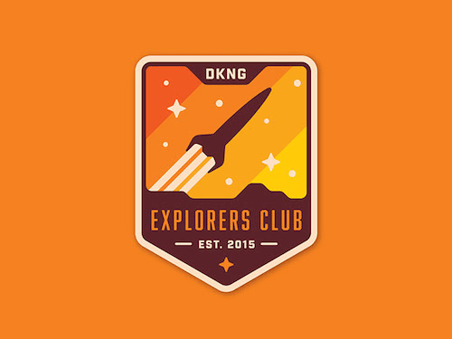
Mystery Project 76.3
I love badges. This one is very attractive and is transmitting emotions. Colours are also working very well together.
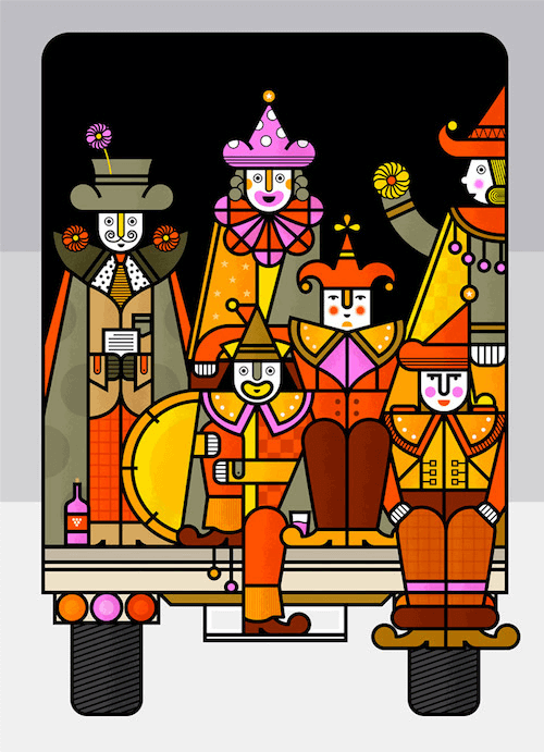
Carnival Poster
Great usage of lines, not easy to maintain balance when they are that heavy. Those pink accents are very well done. These extra bright touches result in a perfect color palette. Designed by Martín Azambuja.
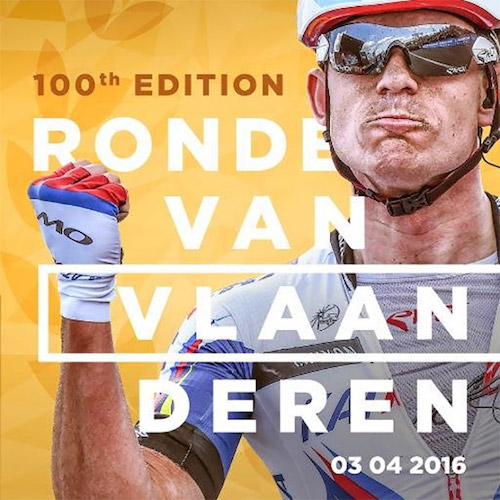
Ronde Van Vlaanderen 2016 - 100th Edition
One of the great classics! Great photography by Kristof Ramon combined with some smart graphic design. Beautiful tone of colors. Featured by Ronde van Vlaanderen.
Meat Balloon
A bit of humor in an illustration is almost always a winning combo. I could swear this was an illustration done by the Spanish Brosmind brothers. A very similar illustration style.

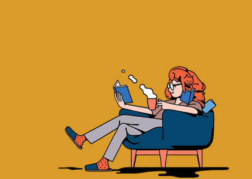
Read
The humor you also find in this illustration. I hadn’t seen it immediately but on closer inspection you’ll see it. Designed by Modi Shibuya.
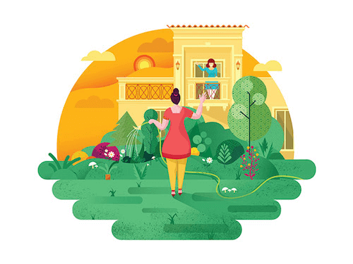
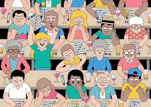
Neighbors
Many little details create an inspiring illustration. There are quite a few in this one.
Sky Cities
Created with the purpose to practice composition and color techniques. Great experiment with a very satisfying result. Perfect shadow and light effects too. Designed by Alex Pasquarella.
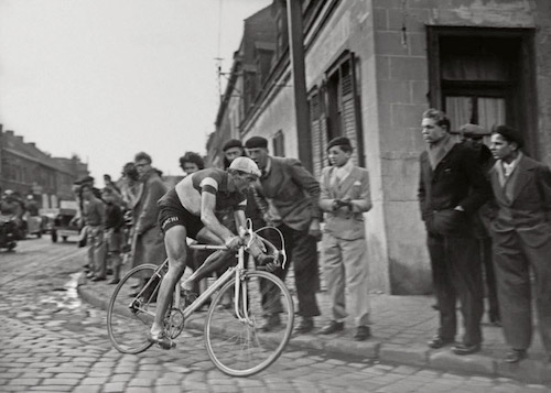
Coppi - Paris-Roubaix 1950
Legend Coppi cornering on cobbles on the way to victory in Paris-Roubaix, 1950. So well captured considering the technology that they didn’t have back then.
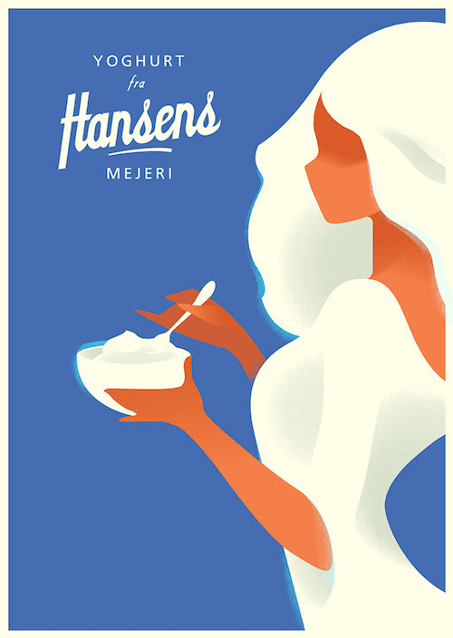
Yoghurt Hansens Mejeri
A perfect example of how to let go every detail and only remain the basic shapes. An illustration style you recognise from far. Very strong.
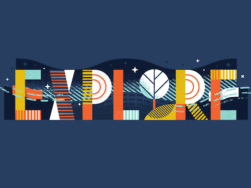
G&M Website - Explore
This speaks to me because of the very inspirational and smart use of lines, colors and textures.
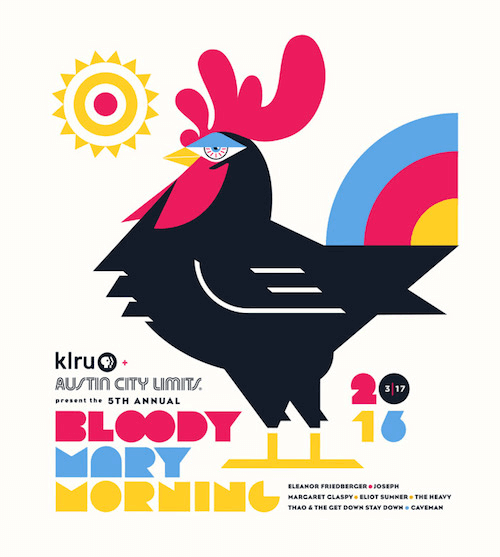
Bloody Mary Morning SXSW
Look at that eye of the roaster. Love it! That roaster looks very confident. The straight lines are in perfect proportion and adds to his tough attitude. Designed by Steve Wolf.
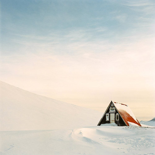
Snow Cabin
That light is pretty spectacular! Look at those perfect gradients in the sky and snow, and how the light falls on the roof o the cabin. Featured by UK FilmLab.
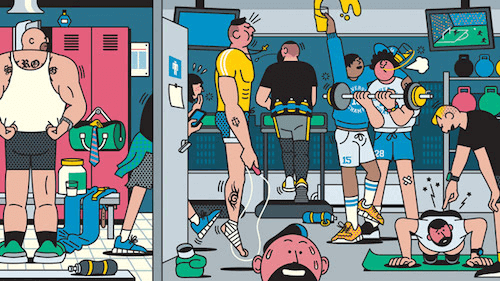
Mr. Porter
The expressions on the faces are so cleverly done with just minimal design. The dotted pattern is also a nice touch. Lots of fun details to look at, that adds to the atmosphere of suffering at the fitness. Designed by Rami Niemi.
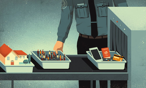
Security Vs Privacy
A wonderful color palette. One of those editorial illustrations so well expressed. Love how small the little people look. Not easy. Designed by David Bonazzi.
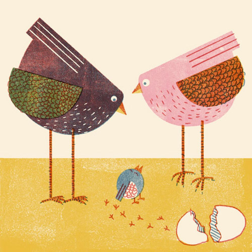
Easter Weekend
Adorable Easter illustration. Inspiring organic feel. Designed by Barbara Dziadosz.
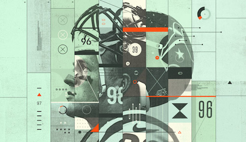
Five Thirty Eight
A piece on the process/data of making NFL players into madden game gods. One first sight you may think such a collage is easy to accomplish but it isn’t. Hardest thing of all is keeping everything well balanced so it doesn’t become overcrowded.
Urban Walkabout
A book cover illustration drilled down to just the basics. Clever use of colors that speak. Designed by Yuki Bang.

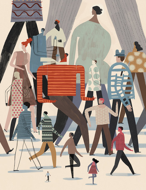
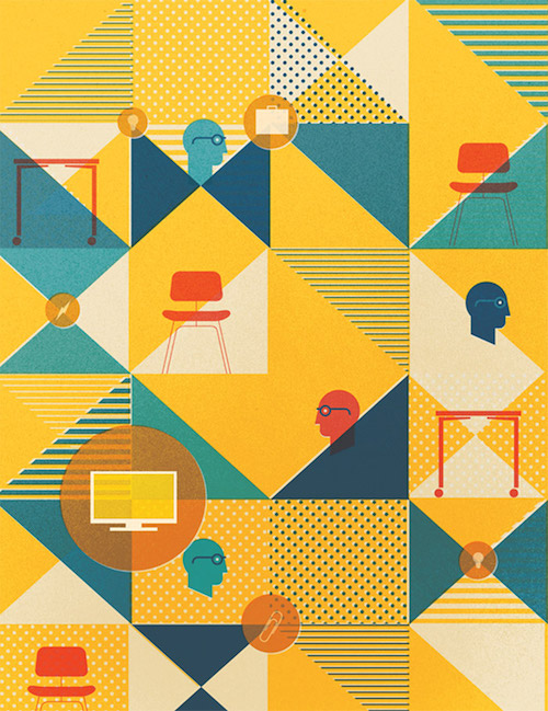
Herman Miller’s Small Business Catalog
Illustration for the legendary furniture company Herman Miller. The randomness of pattern use is wonderfully combined with a series of objects. Love the off color registration effect. Designed by Script & Seal.
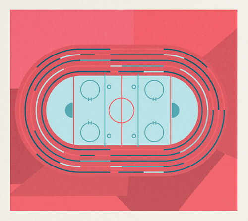
Queen Houses The Ice Rink
Sometimes you don’t need many elements to create a visually inspiring piece. Those colors contrast so well. Designed by Script & Seal.
JetAway Magazine
Fantastic illustration that covers a whole range of facial emotions expressed in just a few lines. So great to learn from. I can look at this for a while. Designed by Dan Woodger.
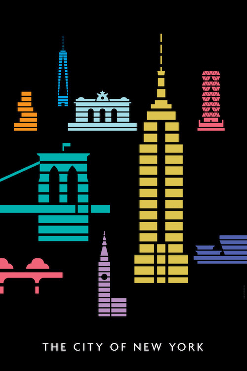
The City Of New York
Another example of how to leave things out and only remain the absolute essentials while still keep it recognisable. Designed by Christopher Dina.
What About You?
What projects inspire you the most? What helps you stay creative? Let us know in the comments below!
Further Reading
- Colorful Inspiration For Gray Days: Illustration And Photography
- Beautiful Photoshop Illustrations By Artists Around The World
- Inspiring Illustrator Artworks By Artists Around The World
- Design Something Every Day!


