Better Interface Design: Logins, Menus, Toggles And Other Fancy Modules

Email Newsletter
Weekly tips on front-end & UX.
Trusted by 182,000+ folks.
 Celebrating 10 million developers


 Custom Web Forms for Angular, React, & Vue. Your backend.
CodePen has become the playground for developers. The sandbox where you can build whatever your imagination fancies. Practical things, experimental concepts — it’s a treasure chest, bound to fuel your ideas. We’ve done some digging around and found some interesting UI demos and concepts for you to indulge in and build upon: dialog and modal windows, signup and login screens, navigation and menus, sliders and toggles. Small bits of delight that make the user’s interaction with a website or app more pleasant. Enjoy!
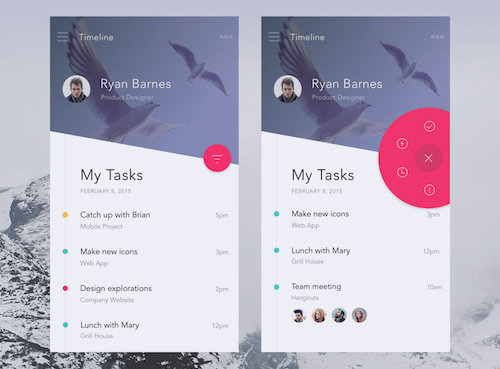
Dialog & Modal Windows
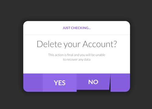
Flappy Dialog
Alex Wright’s Flappy Dialog is based on a Dribbble concept by Peter Main. The dialog window features two flaps. Once a user hovers over one of them, it starts moving, and as soon as he has clicked, the entire window flips to the front and disappears. An interesting and fun way to make a window and its content more prominent, especially for routine interactions like “Yes” and “No” which users usually don’t pay a lot of attention to.
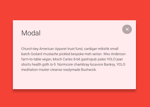
Modal Window Destroy Concept
The question whether this is something you might want to use in an actual project or not could give room to a lot of discussions, but the idea is simply impressive: LegoMushroom’s Modal Window Destroy Concept. Once a user closes the modal window, it bursts into pieces. A surprising effect.
Material Design Modal
The key part of Ettrics’ Material Design Modal is the animation that happens when you click the button that makes the modal expand. It seems the button itself is expanding, but it’s actually a dynamically added <div> that gets appended to the button and expands to the size of the modal. As soon as the modal becomes visible, the <div> is hidden. Clever.
Signup & Login
Interactive Signup Form
Riccardo Pasianotto’s take on the signup form is innovative and anything but boring or tedious for the user. He doesn’t confront them with the complete form from the very beginning but asks for the necessary information in small, digestible chunks. The form essentially consists of three cards which are stacked on top of another. As soon as you start typing, the small icon next to the form field becomes a button with an upwards pointing arrow. Once clicked, the form field flips and presents the next field. A beautiful and exciting interaction.
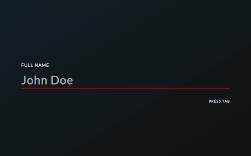
CSS-Only Interactive Form
Emmanuel Pilande’s interactive form demo is very sleek, not only visually but also in regards to the code — it was built entirely with CSS. Each form field is presented individually, as one long, red line accompanied by a field label and placeholder text. Pressing the Tab key leads to the next field. Elegant.
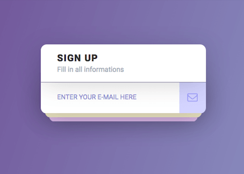
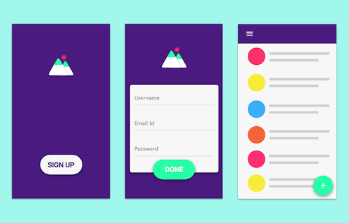
Material Signup Interaction
Srikant Shetty’s material signup interaction consists of three states — all of them designed around the “Sign Up” button — that blend into each other harmoniously. The signup button on the signup screen expands to the signup form; once the form is filled in and the “Done” button is clicked, the button transforms into a circle and floats to the bottom right corner of the profile screen where it is assigned a new role. A seamless interaction, coded to life by Kyle Lavery.
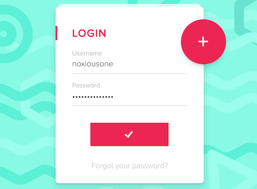
Compact Login
The Compact Login by Boris Borisov unites login and register. A red “+” circle on the login screen hides the register form which, when clicked, expands to cover the login screen. Another nice effect: The look of the “Go” button changes from a very subtle light gray text on white background to bold red depending on the progress the user has made filling out the form. Andy Tran and Yusuf Bakir coded variations of the concept.
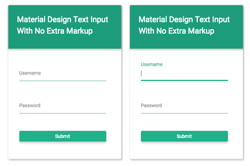
Material Design Text Input
A very lightweight text input demo comes from Ben Mildren. The placeholder tags in his form fields move up and change color on input:focus. As soon as a user starts typing, they disappear completely. Clean and simple.
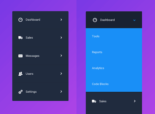
Navigation & Menu
Filter Menu
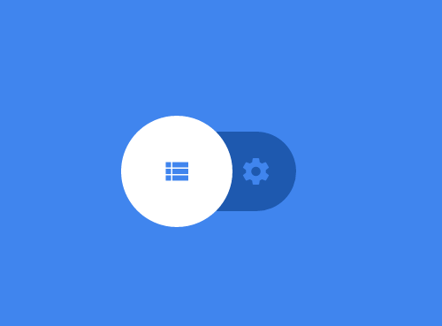
The Filter Menu hides its filter options behind the menu button, but not as you would expect it. Once clicked, the menu button transforms into a close button, that expands from the circle’s center to create an outer circle in which the filter options are arranged. Sleek and beautiful.
Pure CSS Drop Down Menu
Jamie Coulter’s Swanky Pure CSS Drop Down Menu is a nice addition to any non-JavaScript interface. It uses the menu labels to toggle an animation that reveals the sub-menu. Made with pure CSS.
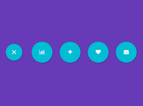
CSS Gooey Menu
The CSS Gooey Menu by Lucas Bebber uses CSS and SVG filters to achieve its effect, no JavaScript. The menu is hidden behind a circle with a hamburger icon. Once you click it, the circle spits out a blob that dissolves and forms four round menu icons, neatly arranged next to each other. The hamburger icon itself becomes a “close” icon. A playful effect.
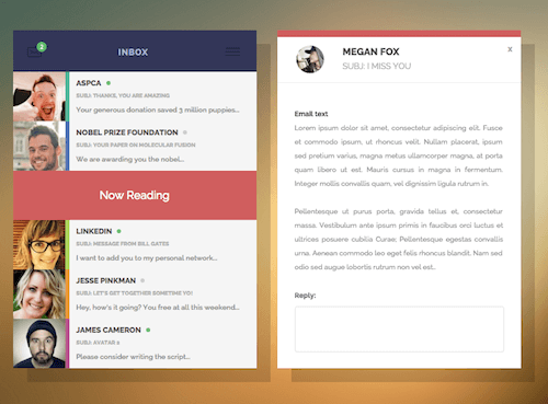
CSS Inbox User Interface
Another example of pure CSS goodness is Jamie Coulter’s CSS Inbox User Interface. Once a user clicks on a message, it slides open to the right to display the entire email; the preview in the original screen is replaced by a “Now Reading” note. A nice effect that could be adapted to other navigation purposes, a full-width navigation, for example.
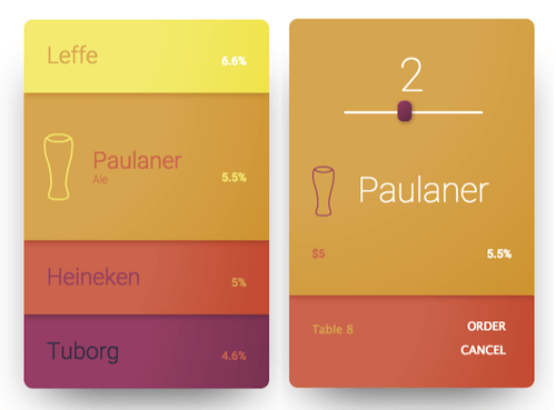
Responsive Menu App
The Responsive Menu App was designed as an actual menu to order drinks at a bar, but it also provides some interesting ideas that could be transfered to an app menu or to e-commerce. In its default state, all menu options occupy the same space. When hovering over one item, the item expands, revealing more information about it. As soon as it gets clicked, it expands further to fill the entire screen, then a footer slides into view from the bottom with the option to purchase the product.
Sliders & Toggles
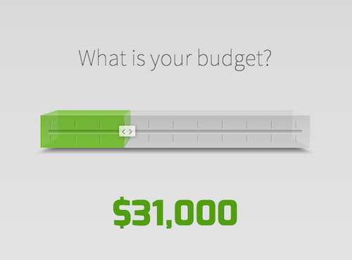
Budget Slider
The jQuery Budget Slider is a welcome alternative to the flat design trend. As you drag the slider, a three-dimensional bar fills up with color.
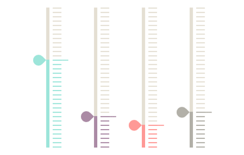
Pure CSS Flat Sliders
Ana Tudor’s flat sliders are made entirely of CSS and remind a bit of an analog thermometer. Simple yet stylish. Inspired by her demo are also Simon Goellner’s responsive sliders. They come with a subtle growth effect on the active tick and display the number value on the needle.
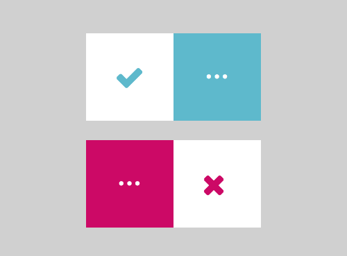
Pure CSS Toggles
Rafael González’s Pure CSS Toggles are different from the ones we are used to. His toggles consist of two squares, and instead of the known “switch” animation that slides from one side to another, his toggles change state by flipping like a book page, making 180-degree turns, or sliding from one side to the other like a caterpillar. Also notable is how Rafael used color to support the animations: One setting is blue, the other red, and when you switch from one to the other, the color gradually transitions from blue to red and red to blue respectively.
Fluid Switch
Leonardo Zakour’s concept of the Fluid Switch uses a droplet animation to slide from one toggle state to the other. Codearmada brought it to life with their Material Radio Button demo.
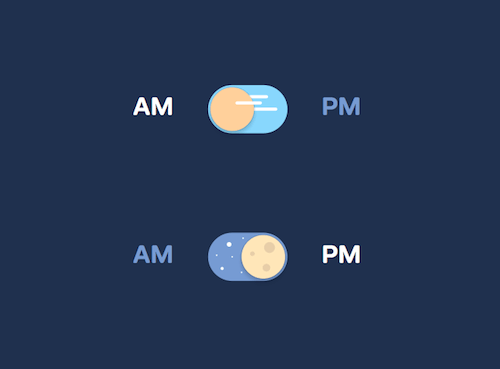
Pure CSS Day And Night Toggle
The CSS Day And Night Toggle is a cheerful take on visualizing AM and PM time. When set to AM, the toggle switch and its background show a sun with a blue sky, when switching to PM it transforms to a moon with a starry sky.
You’ve stumbled across an inspiring, innovative or delightful UI demo lately? Let us know in the comments below!
Further Reading
- The Beauty Of Imperfection In Interface Design
- User Interface Design – 12 Useful Techniques
- Copy If You Can: Improving Your UI Design Skills With Copywork
- Material Design Icons, Goodies And Starter Kits
- Designing Card-Based User Interfaces


