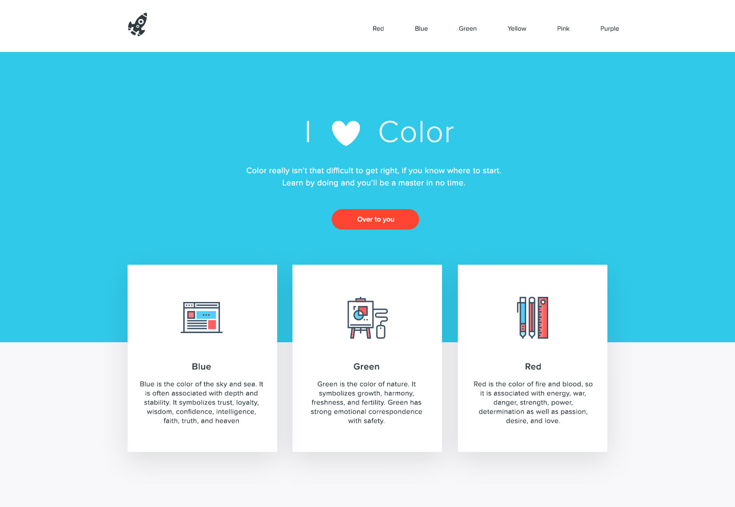
A Simple Web Developer’s Color Guide

Email Newsletter
Weekly tips on front-end & UX.
Trusted by 182,000+ folks.


 Celebrating 10 million developers
 Custom Web Forms for Angular, React, & Vue. Your backend.
I’ve never been a fan of color theory. I think it’s because I’ve always been a bit hopeless at it. I’d love to be able to sit there, color wheel in hand, and pick out complementary, split-complementary and triad color schemes, impressing all of my friends, family and clients in the process.
But the theory has always eluded me, and, truthfully, I’ve never found it useful when trying to use color in my projects. Somewhat ironically, I’ve been finding that the better I get at choosing and using color, the better I become in the theory behind it.
Of course, that doesn’t really help when you’re just starting out, does it? That’s why, in this article, you won’t see a single color wheel. Instead I’m going to show you a simple color workflow that you can use in your next web project.
You will, of course, subconsciously be learning the theory along the way. So, just for funsies (yes, I said “funsies”), I recommend coming back in a few months time and giving the theory another go.
Everything will make so much more sense then, I swear.
Choosing A Base Color
We can see something ridiculous like 10 million colors at any given time. Think about that for a second. 10 million.
And out of those, we need to choose one — just one color — to be the base of our website, for our brand.
Everything will stem from this one color, so it’s kind of important. But don’t worry: You can’t go wrong.
How To Choose A Starting Color
Now, picking a color out of the blue (pun intentional) would be quite easy, but we’re not going to do that. For any project in which you’re dealing with clients, you should really try to justify as many of your choices as you can. If you don’t, it’ll be a case of your favorite color versus their favorite color. They’re the client. They’re paying you. They will win.
Don’t overthink it. Just make sure you have some kind of reasoning behind your color choice (and every choice, for that matter). It’ll make you look good.
Tips On Choosing A Starting Color
- Use what you have.
If the client has a logo with an established color, that will usually be your starting color. - Eliminate your competitors’ colors. If one of your main competitors has a strong brand color, don’t copy it if you can help it. Find your competitors’ colors to eliminate them from your own color schemes.
- Think about your target audience.
The colors of a website for a funeral home would likely be very different from the colors for a kids club. Think about who will be using the website and how you want them to feel (excited, serious, taken care of, etc.). - But don’t default to stereotypes.
If you’re designing a website for young girls, you don’t have to use pink. Avoid clichés to gain credibility. - Play a word game.
If you’re struggling, write down any words that you associate with the client’s business. This list should give you some ideas for colors. If you’re really struggling, hop on any website about color meanings and see which fits best.
You should now have a base color in mind for the design. It should be something simple like red, green, blue, yellow or pink. We’ll get to the exact shade next.
Let’s say you choose blue. (Great choice, by the way!)
Choosing A (Nice) Base Color
Instead of messing about with Photoshop’s color-picker to find a nice shade of blue, we’re going to steal like an artist and use other people’s design choices to help us out.
First, go to Dribbble and Designspiration and click on the “Colors” link in both.
These should present you with similar screens:
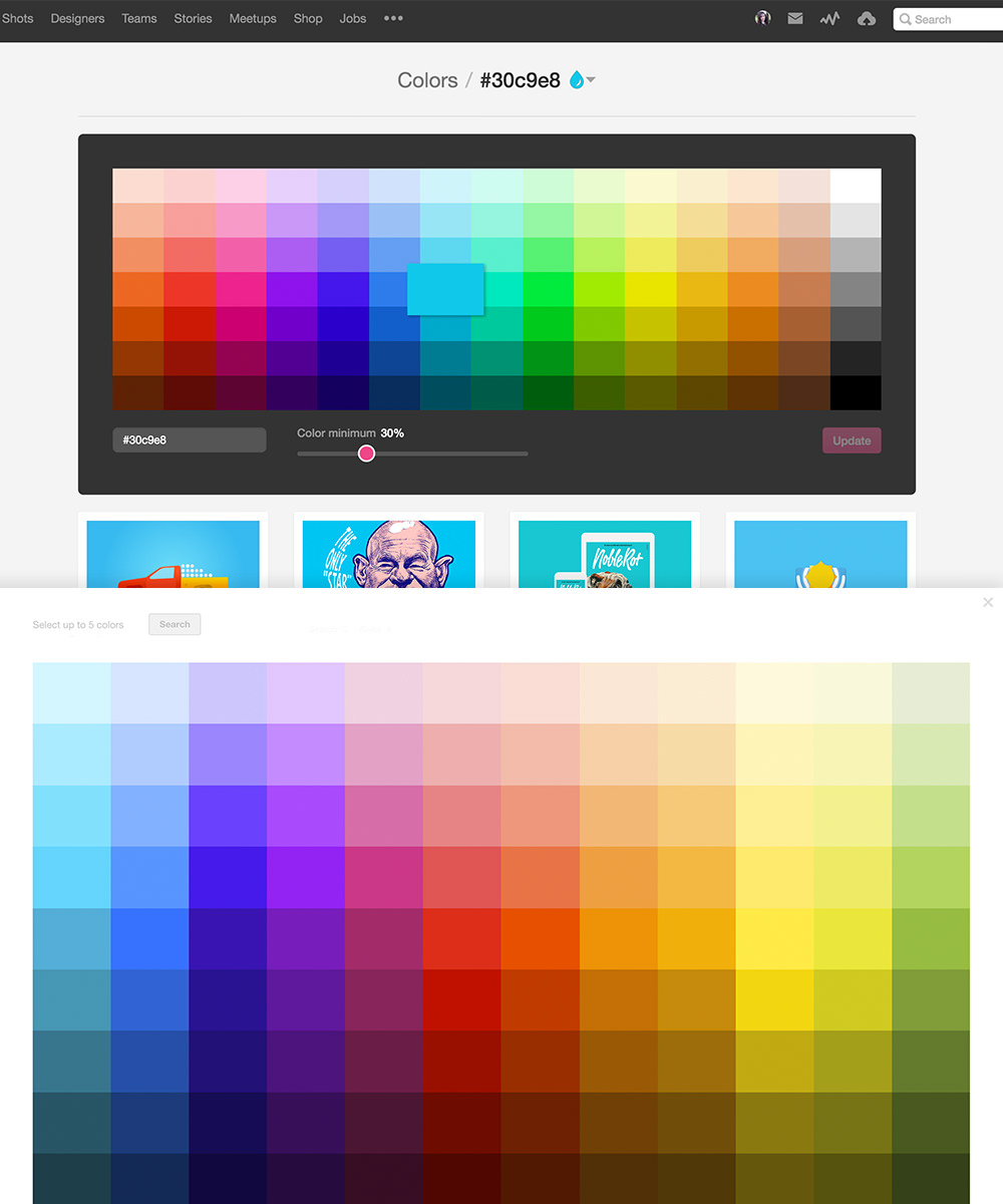
You can use this as the next step to find the right shade of blue.
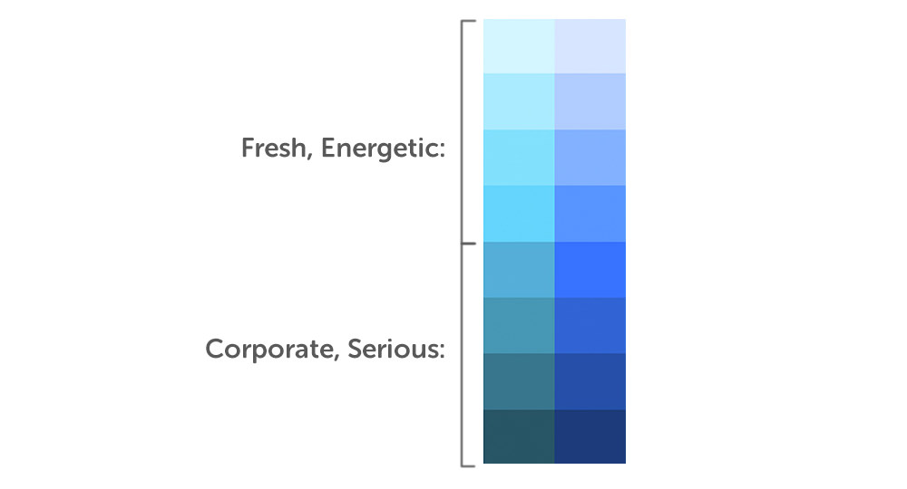
For a fresh and energetic brand, go for one of the lighter, brighter blues (one of the top five options). For something a bit more corporate and serious, the bottom five should be a better fit.
Choose a shade from each website to see actual designs that use that color. You can then use any of CSS-Tricks’ color-picking techniques to grab the exact colors right in the browser.

Not only will you see different versions of your base color, but you will easily see colors that match.
Creating A Cohesive Color Palette
All right, you should now have a HEX value for your color. Mine is #30c9e8. Now we’re going to make a palette out of that color. And it’s easier than you think.
When you think of the process of creating a color scheme, you might picture things like this:
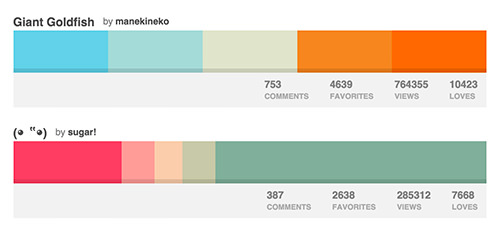
The problem with this kind of color palette is that applying it to a real design isn’t very practical. Most palettes have way more colors than you’d ever need, especially considering that we need to add an average of three neutral colors to every scheme:
- white,
- dark gray,
- light gray (optional).
If you tried to add five or six colors to the neutrals, it would be a mess. All you really need are two colors:
- a base color (in our case,
#30c9e8), - an accent color (we’ll get to this in a jiffy).
If you can create a website using only these five colors, you’ll get a much better result than if you were to go overboard with complementaries, split-complementaries, triads and the rest.

Finding Your Accent
Your accent color will be used in very small amounts on your website, usually as a call to action. So, it needs to stand out.
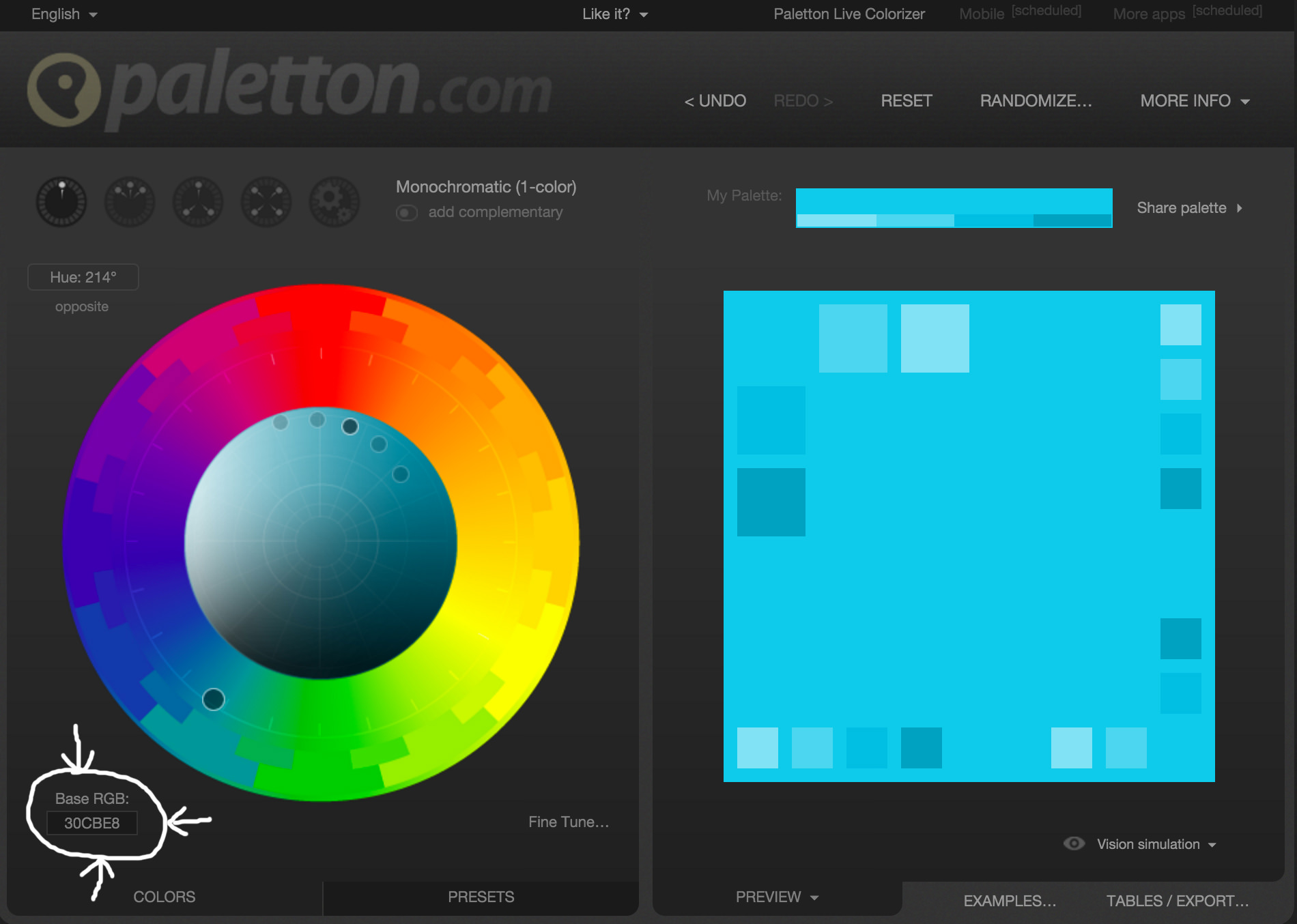
Your next step is to go to Paletton and type your HEX code into the color box:
From here, you can find your accent in one of two ways.
First, you could click the “Add Complementary” button and wham! That orange there? That’s your accent.
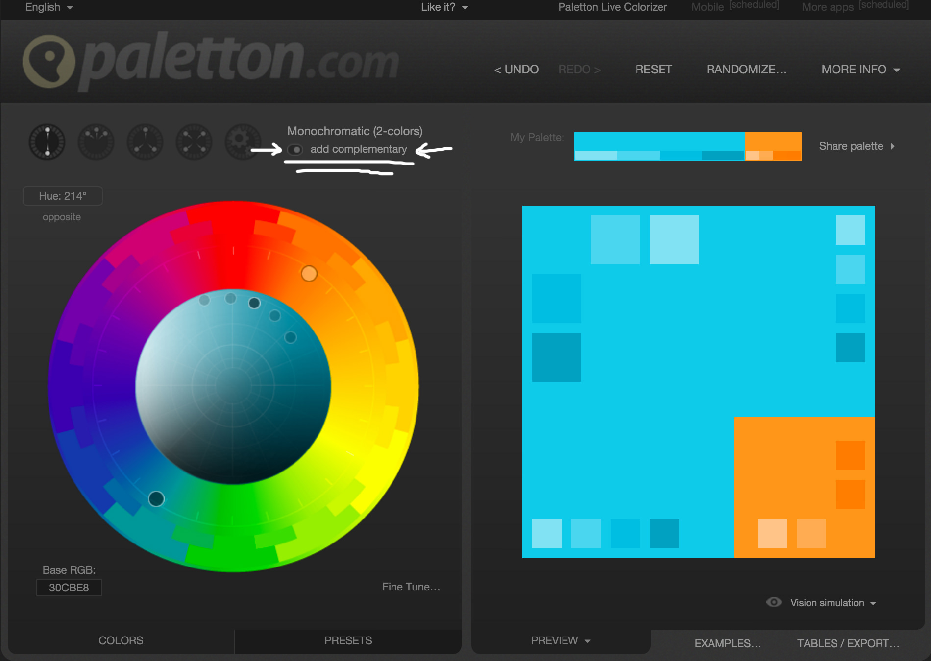
Alternatively, if you don’t like the color it has generated, you can click around the icons at the top to find something more suitable.
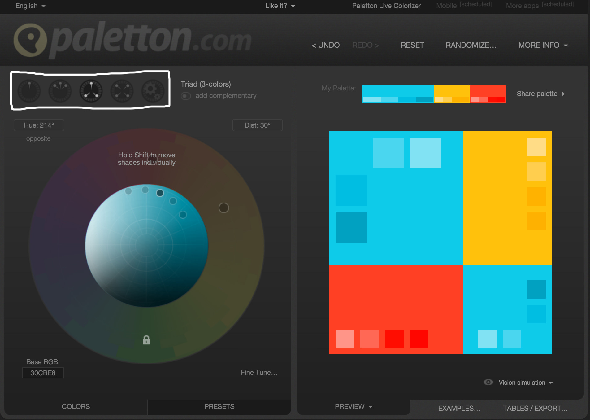
Personally, I quite like the red that comes up under the triad icon, so I’m going to use that for our scheme. There is, of course, science and stuff behind what Paletton is doing; but, for now, let’s put a pin on it. You’ll learn the theory a bit later, and all will become clear.
So, below is our color scheme as it is now. We’ve got a nice base color and a shot of an accent. Let’s add white to the mix, because white is always good.

All that’s missing now are some grays.
Adding The Gray
For most of my web projects, I find having two shades of gray to be infinitely useful — one dark, one light. You’ll use them a lot.
The dark is usually used for text, and the light for when you need subtle differentiation against all that white (usually for backgrounds).
You can choose your grays in one of two ways:
- You could use Dribbble and Designspiration again to find a nice gray from your previous results that matches your base color. But usually it’s easier to type
blue websitein the search bar, which will show more grays in the results. - If you have Photoshop or the like, you could use Erica Schoonmaker’s technique to harmonize your grays with the base color.
Creating Harmonious Grays
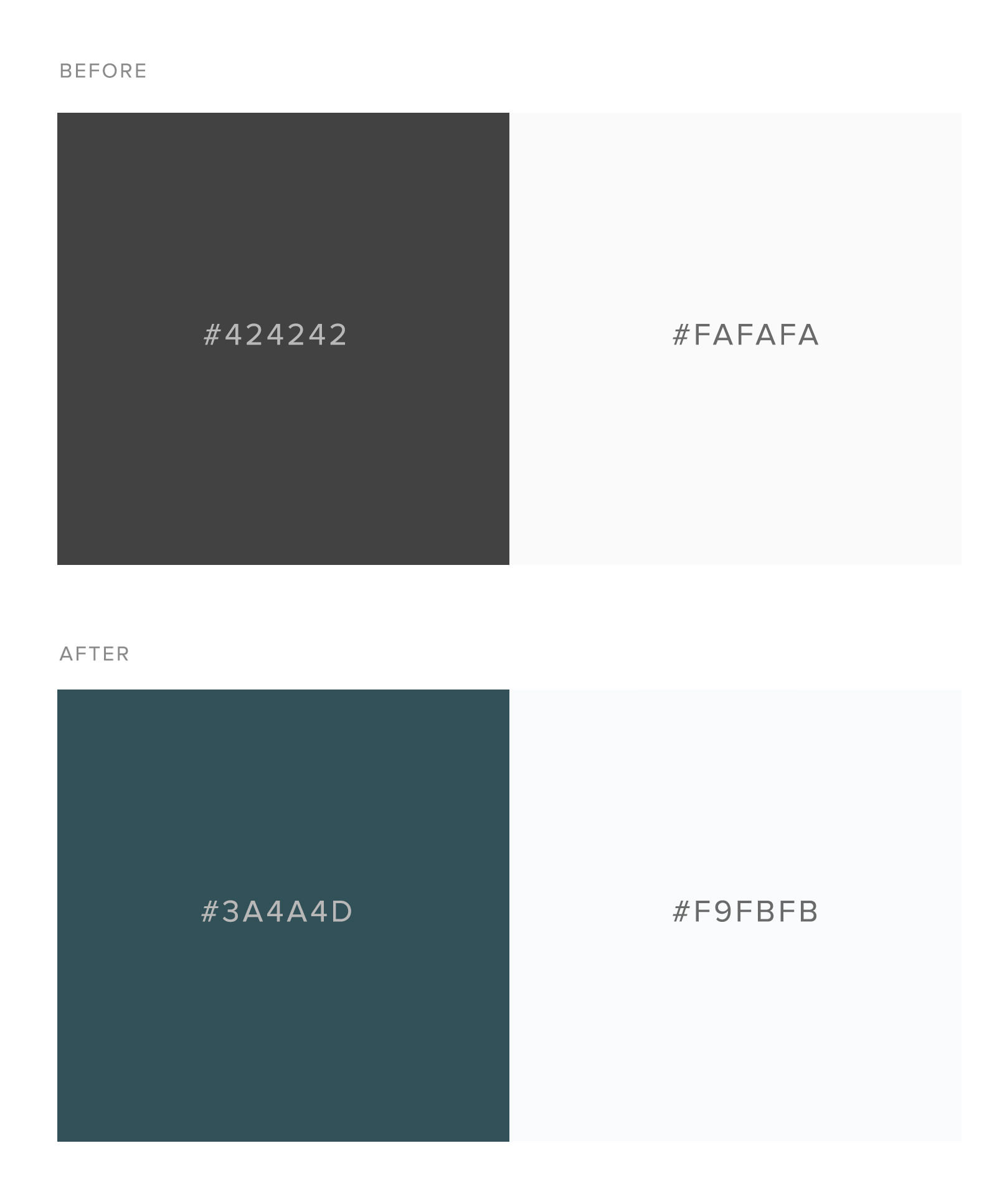
To get our shiny new harmonious grays using Erica’s method, we’ll start by picking two default grays out of a hat. Then, follow these steps:
- Create two shapes and fill them with
#424242and#fafafa. - Insert a color fill layer above your two shapes.
- Change that fill to your base color (
#30c9e8). - Set the blending mode to overlay, and bring the opacity right down to between 5 and 40% (in the example below, it’s set at 40%).
- Use the color picker and copy your new values.
I should point out that this method works exceptionally well when your overlay color is blue. For any other color, you will want to either bring the opacity right down to 5 to 10% or stick with your original grays.
Voila! We Did It!
Our color scheme is complete. I hope you feel proud, because I sure do. Here it is, in all its glory:

Applying Your Color Scheme
Now that we’ve got our color scheme, it’s time to apply it. This is a whole other article unto itself. But to give you an idea, here’s a mockup of a page design in grayscale and with the colors applied.
Tip: If you struggle with color, a good trick is to create your website layout in grayscale first. Figure out the hierarchy, and then experiment with the color later.
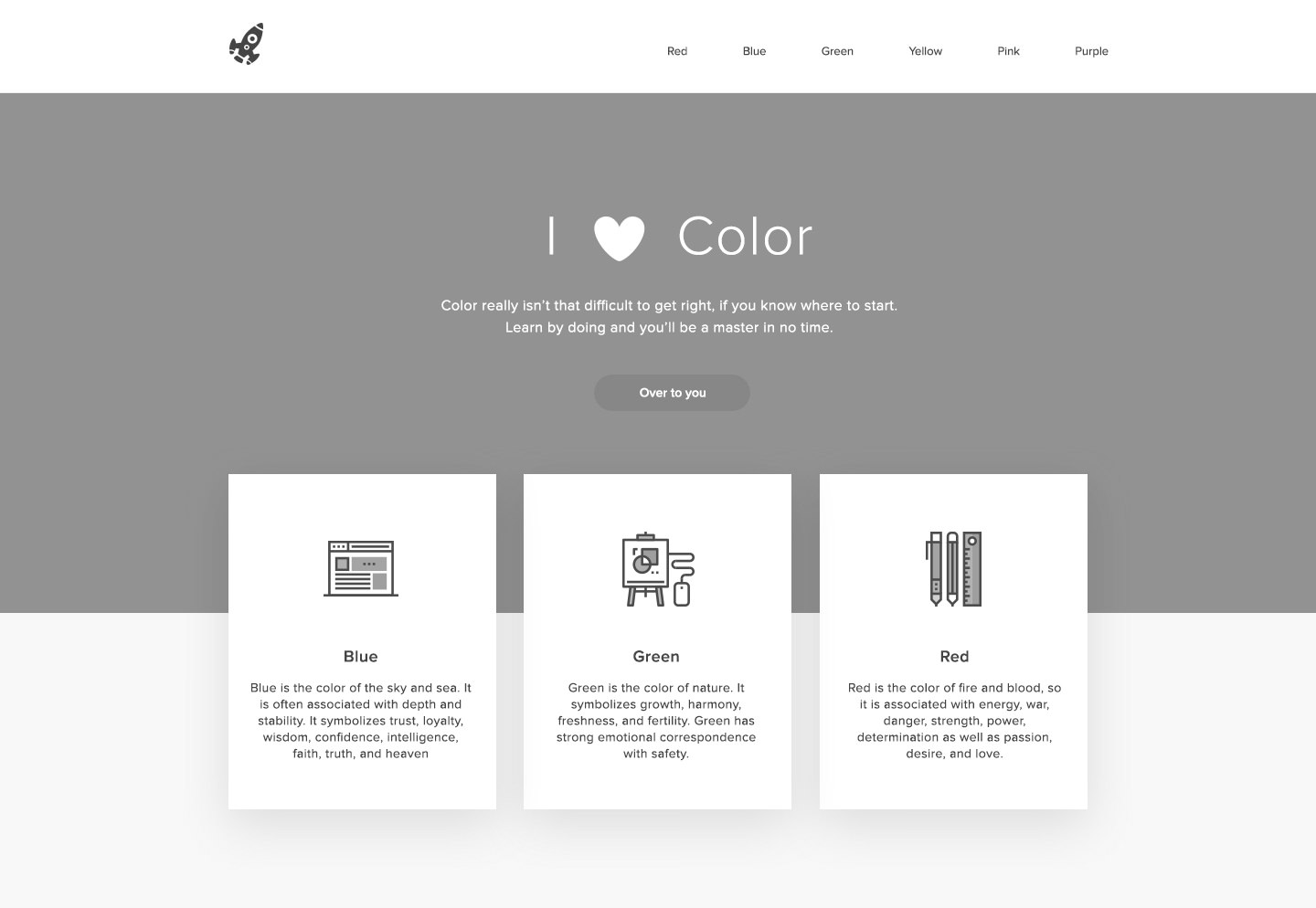
As you can see, blue is the featured color here. It’s used on large areas and in the icons, too.
Our accent, red, stands out beautifully against the base color. This is used in very small areas, for buttons and in the icons. The less you use this color, the more it will stand out.
The dark gray is used for the text, logo and icon outlines. (Don’t skip putting the colors in your icons. It’s a small detail but makes a big difference.)
The white and light gray form the background. The light gray doesn’t have to be here at all, but I find it is another small detail that really makes a website look polished.
It is important to note than when using color and text you need to ensure that there is sufficient contrast between the background and the copy. This will help people with color blindness or low vision read the text on your website. There are many tools you can use to find colors that comply with the WCAG Guidelines. Two popular ones are the WebAim Color Contrast Checker and Contrast Ratio by Lea Verou.
Color Guide Final Note
As you can see, we really don’t need much more than the palette we’ve created today. But that doesn’t mean you are limited to these colors, oh no!

As you’re designing, you might decide it’s appropriate to introduce some more colors to your palette. That’s totally fine! As long as you’re attentive, you can use the steps above to find more colors that work with your scheme.
The beauty of this is that the more you do it, the better you’ll become at choosing colors. You’ll get to know what works together and what doesn’t. Sometimes, the method above will yield results that are less than desirable, so feel free to tweak things. Play around and have fun learning color theory — without the theory!
Further Reading
- Hex Colors: The Code Side Of Color
- The Underestimated Power Of Color In Mobile App Design
- Creating Your Own Color Palettes
- Understanding Color Concepts And Terminology


